The Top 10 Bird Logos Ranked: Winners, Losers, and Legends
Birds represent freedom, vision, and aspiration—qualities every brand wants to be associated with. It’s no wonder bird logos have become one of the most enduring and influential design choices across industries. But what separates the truly iconic bird logos from the forgettable ones?
I’ve spent the last decade analysing thousands of logos. I can confidently tell you that not all bird logos are created equal. The difference between a mediocre bird emblem and one that becomes legendary often comes down to a few crucial design elements that many designers overlook.
Today, I’ll break down the top 10 bird logos that have stood the test of time and continue to resonate with audiences in 2025. Whether you’re considering a custom logo design for your brand or appreciate exceptional design, these examples offer valuable insights into what makes bird symbolism powerful in visual branding.
- Bird logos represent freedom and aspiration, making them powerful symbols in branding across various industries.
- Success of bird logos hinges on simplicity, appropriate symbolism, and versatility to ensure recognisability.
- Well-designed bird logos evolve subtly, maintaining relevance while creating strong emotional connections with audiences.
Why Birds Make Compelling Logo Choices
Before diving into our rankings, let’s consider why birds have such universal appeal in brand identity:
- Universal symbolism: Birds transcend cultural boundaries, carrying positive associations across the globe
- Versatility: From fierce eagles to elegant swans, birds offer a wide range of characteristics to match any brand personality
- Visual distinctiveness: The unique silhouettes and features of birds make for instantly recognisable logos
- Metaphorical power: Flight represents progress, ambition, and breaking free from limitations
Studies show that logos with animal symbolism create a 37% higher brand recall than abstract designs. Among animal logos, birds consistently rank in the top three for positive emotional response, behind only dogs and dolphins.
Let’s examine what makes the elite bird logos soar above the competition.
The Essential Elements of Exceptional Bird Logos
What separates the best bird logos from the mediocre? After analysing hundreds of examples, these five factors emerged as critical:
- Simplicity with distinction: The logo must be simple enough to be recognisable at any size, but distinctive enough to stand out
- Appropriate symbolism: The bird species must align with the brand’s values and personality
- Versatility: Effective bird logos work across all applications, from tiny favicons to building-sized signage
- Memorability: The design contains a “sticky” element that lodges in viewers’ memory
- Timelessness: The best bird logos evolve subtly rather than requiring complete redesigns
With these criteria in mind, let’s rank the top 10 bird logos that exemplify excellence in design.
The Top 10 Bird Logos of All Time
1. Twitter’s Blue Bird (Now X)
Despite the recent rebrand to “X,” Twitter’s blue bird remains one of the most recognisable logos in history.
What makes it exceptional:
- Perfect simplicity: The bird silhouette contains just enough detail to be distinctly avian while remaining clean and versatile
- Ownable colour: The specific shade of blue became synonymous with the brand
- Directionality: The upward trajectory suggests optimism and forward movement
- Adaptability: The design worked at tiny sizes (favicon) and massive implementations (headquarters building)
The Twitter bird demonstrates how a simple silhouette can become a cultural icon when expertly crafted. Though the company has moved away from this design, its impact on logo design history remains undeniable.
2. Eagle of the United States Postal Service
The USPS eagle represents one of the most successful modernisations of a traditional bird emblem.
What makes it exceptional:
- Geometric precision: The eagle is constructed from clean, geometric forms that maintain their integrity at any size
- Balanced asymmetry: The rightward movement creates energy while maintaining visual balance
- Negative space mastery: The white space forms crucial parts of the design without requiring additional elements
- Cultural continuity: It honours the organisation’s heritage while feeling thoroughly contemporary
The USPS Eagle proves that government institutions can achieve design excellence that rivals private corporations. Its staying power (relatively unchanged since 1993) demonstrates the value of investing in quality design that doesn’t chase trends.
3. NBC Peacock
Few logos utilise colour as effectively as the NBC peacock.
What makes it exceptional:
- Colour symbolism: The peacock’s feathers represent the network’s colour broadcasting capability—a purpose baked into the design
- Distinctive silhouette: The fan-like shape is instantly recognisable even as a monochrome silhouette
- Visual balance: Despite its complexity, the design maintains perfect visual balance
- Evolution, not revolution: Each update has refined rather than reinvented the core concept
NBC’s peacock demonstrates how a more complex bird logo can work when the complexity serves a specific purpose. The logo’s ability to work in complete and single-colour applications shows exceptional versatility.
4. Penguin Books
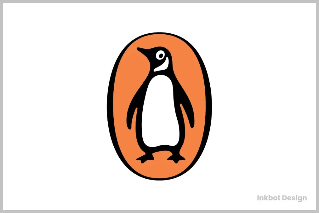
The Penguin Books logo proves that charm and personality don’t have to come at the expense of professionalism.
What makes it exceptional:
- A character with restraint: The penguin has a personality without becoming cartoonish
- Perfect enclosure: The oval frame creates a self-contained unit that works in any context
- Adaptability across products: The design maintains integrity across thousands of book covers and formats
- Multi-generational appeal: The logo connects with both children and adults
The Penguin Books emblem demonstrates how a bird logo can become so synonymous with quality that it transforms into a stamp of approval. Few logos can claim to have shaped an entire industry’s visual language like this simple penguin.
5. American Eagle Outfitters
American Eagle Outfitters’ bird emblem shows how a simple silhouette can anchor an evolving brand identity.
What makes it exceptional:
- Bold simplicity: The eagle silhouette is reduced to its essential form
- Flexibility within identity: The logo works across the brand’s evolving aesthetics from vintage to contemporary
- Scalability: The design remains clear at tiny sizes on clothing tags and massive implementations on storefronts
- Cross-generational appeal: The logo resonates with multiple age demographics
American Eagle demonstrates how a minimalist bird logo can provide a stable foundation for a brand while allowing the broader visual identity to evolve with changing fashion trends.
6. Phoenix Suns (2021 Rebrand)
The Phoenix Suns’ rebrand features one of the most successful modern interpretations of the mythical phoenix.
What makes it exceptional:
- Dynamic movement: The design captures the energy of basketball and the rising phoenix in a single form
- Clever ball integration: The basketball sun works seamlessly with the bird imagery
- Colour psychology: The gradient from purple to orange evokes both the sunset and the phoenix’s fiery rebirth
- Cultural relevance: The design incorporates subtle nods to Arizona’s landscape and culture
This logo demonstrates how mythical birds can be represented in contemporary, dynamic ways that feel authentic rather than clichéd. The Phoenix Suns’ emblem works exceptionally well in motion design applications—a crucial consideration for modern sports branding.
7. Dove
Dove’s bird logo exemplifies how simplicity can create robust brand recognition.
What makes it exceptional:
- Pure simplicity: The silhouette contains just enough detail to be recognised as a dove
- Peace symbolism: The dove instantly connects the brand with gentleness and purity
- Timeless quality: The logo has required minimal updates over the decades
- Versatility across products: Works across diverse packaging from soap bars to deodorants
Dove’s logo demonstrates that a literal but elegantly simplified representation can be the perfect solution when your brand name is already a bird. The design’s simplicity has allowed it to remain relevant through changing design trends.
8. Continental Airlines (Historical)
Though Continental has merged with United, its globe and bird logo represents one of the finest examples of aviation branding.
What makes it exceptional:
- Movement suggestion: The design implies flight without being literal
- Global context: The bird appears to circle the globe, suggesting international reach
- Strong geometric foundation: The design is built on precise geometric principles
- Colour restraint: The limited palette enhances recognisability
Continental’s logo demonstrates how abstract bird representations can be more powerful than literal ones for specific applications. The design communicates flight and global connectivity with a remarkable economy of form.
9. Thunderbird (Mozilla)
Mozilla’s Thunderbird email client logo shows how bird imagery can effectively communicate technological concepts.
What makes it exceptional:
- Concept integration: The bird and email themes merge seamlessly
- Distinctive silhouette: The spread-wing form creates a memorable outline
- Colour psychology: The blue gradient suggests trustworthiness and technology
- Scalability: The design maintains clarity even at favicon sizes
The Thunderbird logo shows how bird imagery can be adapted for digital products, creating visual metaphors that help users understand product functionality through visual cues alone.
10. Philadelphia Eagles
The Philadelphia Eagles’ logo exemplifies how to create a fierce, distinctive bird emblem that stands out in the competitive world of sports branding.
What makes it exceptional:
- Distinctive head angle: The profile view with the slight turn creates a unique silhouette
- A character without cartoonishness: The eagle appears fierce, but is not exaggerated
- Colour psychology: The specific shade of green has become synonymous with the team
- Cultural integration: The logo has become a cultural icon for the city of Philadelphia
The Eagles’ logo demonstrates how a well-executed bird design can transcend its original purpose to become a regional cultural symbol. Few logos achieve this level of emotional connection with their audience.
Bird Logo Design Trends for 2025
As we analyse the best bird logos, it’s worth noting the emerging trends shaping bird logo design in 2025:
Minimalist Bird Silhouettes Continue to Dominate
The trend toward ultra-simplified bird forms shows no signs of slowing. Designers are stripping away details while maintaining the essence of avian characteristics. These minimalist bird logos work exceptionally well across digital platforms where simplicity aids recognition.
Geometric Bird Constructions
Birds constructed from geometric shapes—circles, triangles, and straight lines—are gaining popularity. This approach creates logos with a contemporary feel while ensuring consistent reproduction across applications.
Many brands are exploring logo animation with their bird logos, particularly for digital contexts. The natural movement associated with birds makes them perfect candidates for subtle animation that brings logos to life on websites and social media.
Negative Space Techniques
The clever use of negative space within bird logos continues to create designs with multiple layers of meaning. The best examples incorporate secondary symbols within the bird form that reveal themselves upon closer inspection.
Abstract Wing Elements
Rather than depicting entire birds, some brands are focusing on abstract wing elements that suggest flight and freedom without being literal representations.
How to Choose the Right Bird for Your Brand
Selecting the appropriate bird species for your logo is crucial to communicating the right brand attributes. Here’s a quick guide to common bird symbolism:
- Eagles: Strength, leadership, precision, authority
- Owls: Wisdom, knowledge, education, insight
- Doves: Peace, purity, simplicity, gentleness
- Ravens/Crows: Intelligence, mystery, resourcefulness
- Hummingbirds: Energy, agility, quick thinking, efficiency
- Phoenixes: Rebirth, transformation, resilience, rare opportunity
- Peacocks: Pride, beauty, luxury, display, confidence
- Swans: Elegance, grace, loyalty, transformation
- Falcons: Speed, focus, precision, determination
- Penguins: Approachability, community, resilience, uniqueness
Consider your brand’s personality, values, and audience expectations when selecting which bird best represents your organisation.
Common Mistakes in Bird Logo Design
Even experienced designers sometimes fall into these traps when creating bird logos:
1. Too Much Detail
The most common mistake is including too many feathers, texture details, or colour gradients. These elements often disappear at smaller sizes and create reproduction problems.
2. Generic Silhouettes
Using stock bird silhouettes or overly generic forms fails to create distinctive branding. The best bird logos contain some unique element that makes them immediately recognisable.
3. Disconnected Symbolism
Choosing a bird species that doesn’t align with the brand’s values creates cognitive dissonance. For example, a legal firm using a parrot logo might unintentionally suggest mimicry rather than original thinking.
4. Poor Scalability
Many bird logos look excellent at large sizes but become unrecognisable when reduced to a favicon or app icon size. Always test logo designs in multiple sizes.
5. Overly Trendy Execution
Bird logos that lean too heavily into current design trends often feel dated quickly. The best designs incorporate some trendy elements while maintaining timeless qualities.
Commissioning Your Own Bird Logo: What to Expect
If you’re considering a bird logo for your brand, here’s what to expect from the design process:
- Discovery phase: A professional designer will explore your brand values, audience, and competitive landscape before suggesting appropriate bird symbolism.
- Concept exploration: Expect to see multiple approaches, from literal to abstract interpretations of your chosen bird.
- Refinement: The selected concept will undergo careful refinement, focusing on silhouette, proportions, and distinctive characteristics.
- Colour development: Bird logos often have specific colour requirements to maintain their integrity across applications.
- Testing: Rigorous testing across applications ensures your bird logo works in all contexts.
Professional design services like Inkbot Design specialise in creating custom bird logos that stand out in crowded marketplaces while communicating your brand’s unique attributes.
Case Study: The Evolution of Famous Bird Logos
What can we learn from how the best bird logos have evolved?
Twitter’s Blue Bird Evolution Twitter’s bird began as a detailed, cartoon-like character named “Larry” before evolving into the simple, elegant silhouette we recognise today. Each iteration removed details while strengthening the core shape, demonstrating the power of progressive simplification.
The Firefox Phoenix Mozilla’s logo has evolved from a literal fox encircling the globe to an increasingly abstract flame-like form that maintains the circular movement while becoming more distinctive and versatile.
These evolutions reveal a familiar pattern: successful bird logos tend to become more abstract and simplified over time, not more complex. This refinement process strengthens rather than dilutes their identity.
Should Your Brand Consider a Bird Logo?
Bird logos work particularly well for brands that want to communicate:
- Freedom and aspiration: Travel companies, airlines, and education institutions
- Precision and oversight: Financial services, security firms, consultancies
- Wisdom and perspective: Publishing, education, research organisations
- Speed and efficiency: Delivery services, technology companies, sports brands
- Transformation: Coaching, personal development, health and wellness
However, bird logos might not be ideal for brands in crowded sectors with familiar bird symbolism, such as airlines, where differentiation becomes challenging.
Beyond the Logo: Extending Bird Imagery in Brand Identity
The most successful bird logos extend beyond the primary mark into broader visual identity systems:
- Custom typography with subtle avian characteristics
- Pattern systems based on feather textures or wing shapes
- Motion principles inspired by natural bird movements
- Photography style that complements the bird symbolism
- The brand voice that echoes the qualities of the chosen bird
When these elements work together cohesively, the bird symbolism becomes more potent than the logo alone could achieve.
FAQS About Bird Logo Design
How much should I expect to pay for a professional bird logo design?
Professional bird logo design typically ranges from £500-£5,000 depending on the designer’s experience, the complexity of the project, and the deliverables included. Expect the upper end of that range or higher for a comprehensive brand identity system built around a bird logo.
Can I trademark a bird logo?
Yes, bird logos can be trademarked if they’re distinctive and not confusingly similar to existing trademarks in your industry. A professional designer will research existing trademarks to ensure your bird logo is unique.
Are there cultural considerations with bird symbolism?
Absolutely. Birds carry different symbolic meanings across cultures. For example, owls symbolise wisdom in Western cultures. Still, they can represent death or bad luck in parts of India and the Middle East. If your brand has an international reach, research cultural associations thoroughly.
How can I make my bird logo stand out in a crowded market?
Focus on creating a unique silhouette, consider unexpected colour combinations, and explore abstract or geometric interpretations rather than literal depictions. Focusing on a distinctive bird part (like an eye or wing) sometimes creates more memorable results than showing the entire creature.
Should my bird logo be literal or abstract?
This depends on your brand positioning and audience expectations. Traditional, heritage-focused brands often benefit from more literal bird representations, while contemporary, forward-thinking brands may find abstract interpretations more effective.
Can I use a generic bird silhouette for my logo?
While technically possible, generic bird silhouettes rarely create distinctive branding. Your logo needs unique elements to be legally protectable and memorably associated with your brand alone.
How do I know if my bird logo will work across all applications?
Professional designers test logos in multiple sizes and contexts—from business cards to billboards and social media profiles to vehicle wraps. This rigorous testing process identifies potential issues before finalisation.
Will a minimalist bird logo still be effective and recognisable?
When expertly designed, minimalist bird logos can be highly effective and recognisable. The key is retaining distinctive characteristics while removing unnecessary details—a delicate balance requiring professional skill.
How often should I update my bird logo?
Well-designed bird logos shouldn’t require complete redesigns for 10-20 years. However, subtle refinements every 5-7 years help keep the design contemporary without losing brand equity.
Can multiple birds work in a single logo?
Multiple birds can work in a logo, but this increases complexity and potential reproduction issues. This approach works best when the arrangement creates a distinctive shape or pattern that remains recognisable at smaller sizes.
Taking Flight with Your Brand Identity
A thoughtfully designed bird logo can elevate your brand from forgettable to iconic. The best examples blend symbolism, visual distinctiveness, and practical versatility to create lasting impressions.
Whether you choose the fierce protection of an eagle, an owl’s wisdom, or a phoenix’s transformation story, your bird logo should authentically represent your brand’s core values while standing apart from competitors.
Ready to explore how a custom bird logo could transform your brand identity? Request a quote from Inkbot Design to begin the journey toward a distinctive, memorable brand mark that helps your business take flight.
After all, in the world of brand identity, it’s not just about which bird you choose—how skillfully that bird is crafted to carry your brand’s message across every touchpoint that makes your logo soar.

