Animated Logos: Worth the Hype (and Cost)?
Animated logos are dynamic versions of brand marks designed to add movement, personality, and digital relevance to visual identities.
When executed strategically, they strengthen brand recognition, enhance storytelling, and improve engagement across digital touchpoints such as websites, apps, and video intros.
However, not every business benefits equally.
While a professionally crafted animated logo can communicate sophistication and innovation—think of brands like Google, Netflix, or Airbnb—a poorly designed or oversized animation can slow page performance and cheapen perception.
The key lies in strategy, not spectacle: animation should extend a solid static logo, not replace it.
Understanding when and how to use animation effectively determines whether it becomes a valuable brand asset or a costly distraction.
- Animated logos boost digital recognition and storytelling when strategic, but must enhance—not replace—a strong static logo.
- Technical delivery matters: provide Lottie for web/app, MP4 for video, GIF for social to avoid performance pitfalls.
- Don’t invest if budget or static identity is weak; professional animation is costly but valuable for digitally native brands.
What Is an Animated Logo? (And What It Is Not)
An animated logo is simply a variation of your primary logo that incorporates movement, transformation, or visual effects. It’s not a single thing; it’s a spectrum.
- It can be a subtle reveal, where elements of the logo fade in or slide into place.
- It can be a morph, where one shape elegantly transforms into your final logomark.
- It can be illustrative, such as a small story (e.g., a “baking” logo featuring a whisk mixing).
- It can be functional, acting as a loading icon (a “spinner”) while a user waits.
What it is NOT:
- It is not your primary logo.
- It is not a replacement for your static design.
- It is not something that can be printed on a brochure.
- It is not a silver bullet for a weak brand.
This last point is the most important. Animation can’t fix a bad concept. It only highlights its flaws. A strong brand identity, built on solid logo design and branding, is the non-negotiable prerequisite. Without that foundation, you’re just putting lipstick on a pig.
Why Bother? The Real Business Case for Motion
So, if it’s such a hassle, why would a savvy small business owner even consider it?
Because when done right, motion works. We are biologically wired to notice movement. An animated logo can cut through the visual noise of a static webpage or a crowded social media feed.
Here’s the actual business case, stripped of the hype:
- Increased Brand Recall: Studies have consistently shown that dynamic visuals are more memorable than static ones. That movement, when tied to your brand, creates a deeper neural pathway. The “ta-dum” sound and N-symbol animation for Netflix is a perfect example. You’d recognise it with your eyes closed.
- Powerful Brand Storytelling: Animation gives you a few precious seconds to tell a micro-story. You can communicate what you do without a single word.
- A logistics company logo could show a dot moving from A to B.
- A coffee roaster’s logo could have steam rising from a bean.
- A tech company logo could have circuits connecting.
- Enhanced Brand Personality: This is a big one. Is your brand playful? Serious? Tech-focused? Whimsical? Motion is a brilliant way to convey personality. Slack’s colourful, bubbly loading animation perfectly communicates its “playful but productive” ethos. A bank’s logo might use a stable, solid “build-up” animation to convey trust and security.
- Professionalism and “Digital-First” Polish: In a digital-first world, a static logo on a splash screen can feel flat… even dated. A subtle, professional animation signals that your brand is modern, tech-savvy, and meticulous. It’s a “premium” signal.
- Functional Versatility: An animated logo isn’t just for show. It can be your “loading” icon, your social media profile video, the intro/outro for your YouTube videos (a “sting”), or the icon for your app as it boots up. It becomes a functional, reusable asset.
The Golden Rule: Static-First Design
I cannot overstate this. Your logo must be designed to be static first.
Before you ever think about motion, ask these questions about your core logo:
- Does it work in one colour (black and white)?
- Is it legible when shrunk down to a tiny favicon?
- Is it recognisable when scaled up on a billboard?
- Does it convey your brand’s essence without any tricks?
If the answer to any of these is “no,” stop right here. You don’t need an animated logo. You need a better logo.
Animation is the enhancement—the next layer. It’s the ‘cherry on top’ of a strong design, not the ingredient that makes the cake. Many business owners come to us asking for animation when what they really need is a foundational professional logo design that actually works. Once that rock-solid asset is established, we can then discuss how to make it move.
A Practical Taxonomy: 5 Types of Logo Animation
Not all animations are created equal. When I storyboard for a client, we’re not just “making it move.” We’re selecting a specific method that aligns with a particular goal.
Here are the common types you’ll see:
- The “Reveal” or “Build-Up” Animation:
- What it is: The elements of your logo animate into their final, static position. Lines draw themselves, shapes slide in, text fades up.
- Why use it: It’s excellent for intros and splash screens. It guides the viewer’s eye and ends on your stable, recognisable mark. It feels clean, professional, and “put-together.”
- Example: Google’s “G” morphing from four dots.
- The “Morphing” or “Transformation” Animation:
- What it is: The logo transforms from one thing into another. An icon might morph into the company’s wordmark, or an abstract shape might resolve into the final logo.
- Why use it: Superb for brand storytelling. It can show a process (e.g., a “leaf” turning into a “book” for an e-reader brand) or a benefit. It’s complex but highly memorable.
- The “Illustrative” or “Story” Animation:
- What it is: The logo itself is the main character in a tiny 3-5 second story. The logo does something.
- Why use it: This packs the most personality. It’s less about revealing the logo and more about showing its character.
- Example: The original Twitter bird flapping its wings, or Mailchimp’s “Freddie” winking.
- The “Subtle Loop” Animation:
- What it is: The static logo is 99% complete, but one small element is in a constant, subtle, seamless loop.
- Why use it: This is my favourite for web headers. It’s not distracting but adds a “living” quality to the page. It catches the eye without hijacking it.
- Example: A tech logo with a subtle data “pulse.” A brewery logo with a single hop bouncing gently.
- The “Functional” (Loading) Animation:
- What it is: The logo (or a part of it) is used as a loading spinner or progress bar.
- Why use it: This is pure function-meets-brand. It makes “dead time” (waiting for a page or app to load) a branded, less-frustrating experience. Slack’s loader is the king of this.
Your choice of animation type is a strategic one. A “subtle loop” is great for a website header, but a “build-up” animation is perfect for a video intro.
Strategic Placement: Where Do Animated Logos Actually Go?
An animated logo is a collection of files. You can’t just slap it anywhere and expect it to work. An entrepreneur needs a plan.
Here is a practical breakdown of the where and why:
| Placement | Primary Goal | Recommended Type | Key Consideration |
| Website Header | Grab attention, add polish | Subtle Loop | Performance is #1. Must be a tiny file (Lottie). Must not be distracting or annoying. |
| App Splash Screen | Brand reinforcement, hide loading | Build-Up or Functional | This is a “captive audience.” It can be slightly longer (2-4 seconds) and sets the tone. |
| Social Media Profile | Stand out in a crowded feed | Subtle Loop or Illustrative | This is often the first impression. The animation must be clean, fast, and loop perfectly. |
| Video Intro/Outro (“Sting”) | Brand recall, professionalism | Build-Up or Morphing | This is where you can be most cinematic. It’s often paired with a sound (“audio logo”). |
| Digital Ads (Banners) | Click-through-rate (CTR) | Illustrative or Reveal | The animation’s job is to get a click. It can be more “salesy” and direct. |
| Email Signatures | Don’t do it. | None. | Most email clients block them; they appear broken, consume huge file sizes, and can get you flagged as spam. Just don’t. |
| Presentations (Deck Intro) | Professionalism sets the tone | Build-Up or Morphing | A great way to start a sales pitch or investor meeting with a polished, confident brand. |
As you can see, you don’t just get “one” animated logo. You get a system of animated assets, each in a different format and optimised for a different context.
Good vs. Bad Animated Logos: A Conceptual Guide for SMBs
It’s easy to critique big brands, but what does this mean for a small business? Let’s get practical.
I’ve seen hundreds of design briefs. The difference between a good one and a bad one is intent.
Here is a table of common small business concepts and the “Good vs. Bad” thinking.
Animated Logo Concepts (Good Intent vs. Bad Gimmick)
| Business Type | “Bad” Gimmick (No Story) | “Good” Concept (Tells a Story) | Why It Works |
| Local Coffee Shop | The logo (a coffee bean) spins around 360 degrees and sparkles. | Steam gently rises from the coffee bean logo in a seamless loop. | The “Good” version evokes warmth, freshness, and the product itself. The “Bad” version is just a generic effect. |
| Financial Advisor | The letters of the firm’s name “explode” and reassemble. | The logo (e.g., an “oak tree”) has roots that “grow” into place, followed by the trunk and leaves. | The “Good” version conveys growth, stability, and strong foundations. The “Bad” version conveys chaos and volatility—the exact opposite of what you want. |
| Tech Startup | The logo pulses with a bright “techno” glow. | The logo, composed of dots, features one dot that “travels” through a circuit to connect with the others. | The “Good” version tells a story of connection, process, and data flow. The “Bad” version is a visual cliché. |
| Shipping/Logistics | The company truck in the logo “jumps” up and down. | The box in the logo animates along a path from “A” to “B” before settling into its final position. | The “Good” version literally shows the service: movement, delivery, and process. The “Bad” version is just silly. |
| Bakery | The wordmark “bounces” onto the screen like Jell-O. | The logo (e.g., a whisk) performs a quick “mixing” motion and then settles. | The “Good” version is illustrative of the baking process, showcasing expertise and craft. The “Bad” version is distracting and unprofessional. |
The takeaway? A good animation is an extension of your brand’s core concept. A bad animation is a visual effect layered on top of it.
The Technical Hellscape: A Small Business Owner’s Guide
This is where most projects fail.
A client will get a beautiful .mp4 file from a designer and then be baffled when it won’t work in their website header, won’t loop, or looks terrible on mobile.
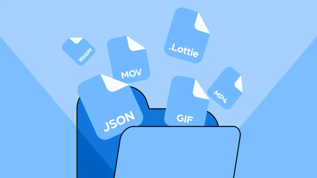
You are not buying an “animated logo.” You are buying a set of specific file formats. Understanding the difference is the most important technical detail for an entrepreneur.
There are three primary file formats you should be familiar with.
- GIF (Graphics Interchange Format):
- What it is: The old, reliable standard. It’s basically a silent video file made of images.
- Pros: Works everywhere. Email, social, websites. It’s the “safe” bet.
- Cons: Terrible file sizes. A 5-second, high-quality GIF can be 5-10MB, which can significantly impact your site’s speed. It also has a limited colour palette (only 256 colours), so it can look grainy or “dithered.
- MP4 (or WebM):
- What it is: A standard video file.
- Pros: High quality, great compression, small file sizes. Perfect for showing complex, cinematic animations.
- Cons: It’s a video. It often requires a “play” button. It doesn’t always auto-play or loop easily on all platforms (especially mobile). It’s not a logo; it’s a video of a logo. Best for video intros or social media posts, not a website header.
- Lottie (via JSON/SVG):
- What it is: This is the modern, professional solution. A Lottie is not a video; it’s a JSON file that instructs your website or app on how to render the animation in real-time using code.
- Pros: Microscopic file sizes (often just a few kilobytes). Infinitely scalable (it’s vector-based, so it’s sharp on any screen). Loops perfectly. Supports transparency. It’s the gold standard for web and app performance.
- Cons: Requires special plugins or a bit of code to implement on a website (though this is getting much easier with tools like Elementor and Webflow). Cannot be used in email or most social media platforms (use a GIF/MP4 for those purposes).
Animation File Format Showdown
| Feature | GIF | MP4 / WebM | Lottie (JSON) |
| Best For | Social media, email (if you must) | Video intros, social media posts | Website headers, app loading |
| File Size | Awful (Huge) | Good (Small for video) | Amazing (Tiny) |
| Quality | Poor (256 colours, grainy) | Excellent (Full HD/4K) | Perfect (Vector-based) |
| Scalability | Poor (Pixel-based) | Poor (Pixel-based) | Perfect (Scales infinitely) |
| Looping | Easy | Can be tricky | Perfect, seamless |
| Transparency? | Yes | No (WebM supports it) | Yes |
| Performance Impact | Very High (Bad) | High (It’s a video) | Very Low (Good) |
The takeaway: A professional designer should deliver your animation in all relevant formats.
- A Lottie (JSON) for your website and app.
- A GIF for your social media profiles.
- An MP4 for your video content and presentations.
If your designer only sends you an MP4, the job isn’t finished.
When Not to Use an Animated Logo
As a consultant, my job is often to tell clients “no.” An animated logo is a bad idea if…
- Your Budget is Tight. A custom logo animation from a professional agency is typically a 10- to 40-hour project. We’re talking thousands, not hundreds. If you only have $1,000 for your entire brand identity, spend it all on a world-class static logo.
- Your Static Logo is Weak. I’ve said it before, but it bears repeating. Animation amplifies what’s already there. If your logo is complex, confusing, or poorly designed, animating it will just create a complex, confusing, and poorly designed animation.
- You’re in a Very Formal Industry. If you’re a law firm, a funeral home, or a high-level government contractor, a “playful” animation can erode trust. A subtle and “build-up” animation might work, but anything more is a risk.
- You Have No Digital Presence. This is obvious, but if your business is primarily print, signage, and word of mouth… You have nowhere to put an animated logo.
- You Can’t Implement It Correctly. If your website is an old, locked-down template that doesn’t support Lottie files and you’re forced to use a massive GIF, the performance hit will hurt your business more than the animation helps it.
The Real Cost: Why Is This So Expensive?
This is the conversation I have all the time. A small business owner sees a 5-second animation and thinks, “That’s an hour of work, right? You just… click the ‘animate’ button in Illustrator?”
No.
A professional logo animation is a bespoke piece of motion-graphics design, just like your logo was a bespoke piece of brand design.
Here’s what you are actually paying for:
- Concept & Storyboarding: The designer has to brainstorm how it should move. What’s the story? What’s the timing? They will sketch out a “storyboard” (like a comic strip) to plan the motion.
- Asset Preparation: A static logo file is often “flat.” The designer must break it apart into its individual layers and pieces so that each can be moved independently. This is meticulous work.
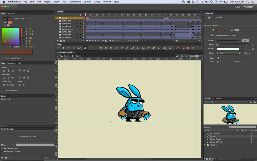
- Animation (The Hard Part): This is typically created using professional software, such as Adobe After Effects. The designer isn’t just “moving” things; they are managing “keyframes,” “easing curves,” “velocity,” “parenting,” and “masking.”
- Easing: This is what separates pros from amateurs. Do objects stop and start instantly (looks cheap)? Or do they have “inertia”—speeding up and slowing down naturally? This “easing” takes time and skill.
- Rendering & Exporting: The designer must export the final animation into all the different formats we discussed (Lottie, GIF, MP4), testing each one to make sure it loops perfectly and isn’t a massive file.
What Are You Paying For? (Animated Logo Cost Breakdown)
| Tier | Price Range (USD) | What You Get | The Risk |
| DIY Tool | $10 – $50 | A template-based animation. A generic “swoosh,” “pulse,” or “reveal.” | Looks cheap and generic. Thousands of other businesses will have the same effect. Damages the brand. |
| Freelancer (Basic) | $200 – $600 | A basic “build-up” animation. They will likely use a template in After Effects but customise it for your logo. | Hit or miss. You might get a good result, or you might get a slow, clunky GIF and nothing else. |
| Professional Agency | $1,500 – $7,000+ | A fully custom storyboarded animation. Includes concept, multiple file formats (Lottie, MP4, GIF), and strategic advice. | The only “risk” is the high up-front cost. This is a professional-grade strategic asset. |
You get what you pay for. A cheap animation looks cheap.
My Final Take: Is It Worth It for You?
An animated logo is a “Vitamin,” not a “Painkiller.”
It will not save a dying business. It will not fix a bad product. It will not make up for a terrible brand.
However, if you are a strong, digitally-native small business and you have…
- A rock-solid static logo.
- A clear understanding of your brand personality.
- A website and social presence where it can live.
- The budget to do it professionally.
…then yes. An animated logo is a fantastic investment. It’s a “level-up” moment for a brand, a signal of quality that sets you apart from 90% of your competitors who are still using static JPEGs.
It’s a strategic upgrade, not a starting point. Treat it as such.
Ready to Build a Real Brand?
Before you even think about complex animation, you need a powerful, memorable, and timeless static logo. That is the engine of your entire brand.
At Inkbot Design, we build those engines. We specialise in foundational logo design and branding that gives your business the platform it needs to grow.
If you’re ready to stop tinkering with gimmicks and build a professional-grade brand identity, let’s talk. You can request a quote, and we can have a no-nonsense conversation about what your brand actually needs.
Animated Logo Design FAQs
What is an animated logo?
An animated logo is a version of your static logo that incorporates movement, transformation, or visual effects. It’s an enhancement, not a replacement.
Are animated logos worth the cost for a small business?
They are worth it if you already have a strong static logo, a clear brand, and the budget to do it professionally. It’s a “Vitamin,” not a “Painkiller.”
How much does a custom animated logo cost?
Expect to pay anywhere from $1,500 to $7,000+ from a professional agency for a fully custom, storyboarded animation delivered in all the right formats. Cheaper options exist, but they often look generic.
What is a Lottie file, and why do I need one?
A Lottie (JSON) file is a modern, code-based animation format. It’s the gold standard for websites and apps because it’s tiny in file size, scales perfectly (as a vector), and loops seamlessly, ensuring your site stays fast.
What’s the difference between a GIF and a Lottie?
A GIF is an old image-based format with a huge file size and limited quality. Lottie is a new code-based format with a small file size and high quality. Use Lottie for your website; use GIF (if you must) for social media.
Can I use an animated logo in my email signature?
No. You should not. Most email clients (like Outlook and Gmail) block them, so they won’t play, will appear broken, and will get your emails flagged as spam.
Should I animate my logo first?
No. Always design your static logo first. Your logo must be strong, legible, and memorable when it’s perfectly still. Animation is an add-on to an already successful design.
Where is the best place to use an animated logo?
The best places are digital: your website header (as a Lottie), your app’s loading screen, your social media profile videos, and as an intro/outro (“sting”) for your video content.
How long should a logo animation be?
Short. For a web header, a 2-4 second seamless loop is best. For a video intro, 3-5 seconds is the absolute maximum. Shorter is almost always better.
What makes a “good” logo animation?
A good animation tells a micro-story that reinforces your brand. A “bad” one just moves for the sake of moving (e.g., a generic “spin” or “explode”).
Do I need special software to use an animated logo?
To use it, no. Your designer will provide the files. To implement a Lottie file on your website, you may need a simple plugin for WordPress/Shopify or a built-in tool if you use Webflow.
Can an animated logo hurt my SEO?
Yes, absolutely. If you use a large GIF or MP4 file in your website header, it will drastically slow down your page load speed, damage your Core Web Vitals (LCP/CLS), and cause Google to rank your site lower.

