
The Power of Lettermark Logos for Small Business Branding
Good branding plays a pivotal role in the modern oversaturated market. Focusing on a brand image is especially critical for small businesses seeking to stand out and gain a competitive edge.
One of the most effective yet often neglected branding elements is a lettermark logo. This is the first thing that catches an eye, making it a potent tool for converting interested seekers into payable buyers.
The visual appeal of custom letters and abbreviations can help startup businesses establish strong brand recognition and credibility.
This article dispels all the doubts about hiring a professional lettermark logo company. Read on to unleash why it is the most intelligent investment for branding purposes of small businesses.
- Lettermark logos enhance small business branding by providing simplicity, memorability, and a professional appearance.
- These logos transform lengthy or complex names into easy-to-remember initials, boosting customer engagement and brand recognition.
- Lettermark logos adapt well across various marketing platforms, maintaining clarity and readability in different sizes.
- They are an affordable branding solution, aligning with current trends favouring minimalist, impactful designs.
Reasons to Incorporate Lettermark Logos

Simplicity and Memorability
Lettermark logos reduce volume and complexity by avoiding overly elaborate designs and long business titles. Instead, they condense branding into a clear, easy-to-remember symbol. This simplicity allows consumers to instantly associate the initials with your brand, mitigating the cognitive endeavours required to recall.
A common misconception is that an intricate logo means greater brand recognition. However, global brands such as CNN, NASA, and HBO vividly showcase the opposite. All these corporations use memorable lettermark logos to promote their brand reach. Small businesses can adopt the same strategies to create a lasting impact with minimalist-designed logos.
Optimal Solution for Enterprises with Long or Intricate Names
Complex or lengthy names directly equal struggles in branding. A lettermark logo solves this problem by shrinking the business name to its acronym or initials. This makes pronunciation, writing, and remembering a breeze, entailing heightened customer engagement.
Let's see it in practice. A law firm called ‘Smith, Anderson & Roberts Legal Services' is difficult to memorise. If professional lettermark logos are harnessed, the company will achieve a promising tailored solution, such as SAR Legal. This approach eliminates the risk of mispronunciation or confusion without compromising brand recognition.
Professional and Modern Aesthetics
When a brand wants to communicate authority and reliability, lettermark logos are the go-to solution. Their sleek and professional appearance manifests modernity and sophistication, emphasising that an organisation keeps up with trends. So, a well-crafted lettermark logo can enhance credibility for small businesses.
Such logos would serve well in the ever-growing finance, real estate, law, and technology industries. These sectors require stability and expertise, which can be embodied via advanced lettermark designs.
Flexibility Across Marketing Platforms
Adaptability is among the key highlights of lettermark logos. They can seamlessly fit into various branding tools, from business cards and websites to social media and promotional materials. Their concise nature ensures accurate, high-quality display within various platforms and sizes.
Lettermark logos outshine traditional ones, typically known for losing clarity during scaling. Customers can enjoy nice readability and visual aesthetics, whether placed on billboards or tiny tags.
Economically Friendly and Straightforward Design
Designing a lettermark logo is affordable for businesses with a limited branding budget. Priority at typography rather than intricate pictures or graphics comes with a simplified creation process and significantly lower costs.
In addition, lettermark logos often need minimum changes across different branding materials. This saves money on design outlay, letting investing in more essential marketing efforts in the long run.
Tips on Creating Effective Lettermark Logos

Small businesses pursuing to unlock the full potential of lettermark logos should:
- Select Appropriate Typography and Fonts. The chosen typography determines the overall logo's perception. For example, serif fonts represent tradition and trustworthiness, while sans-serif fonts indicate modernity and minimalism. The brand personality should align with the font style to ensure the core message is clear. Embracing custom typeface designs is another stellar strategy. You can differentiate your business from niche competitors by tailoring a unique, trademarkable identity.
- Understand Colour Psychology. Different colours are responsible for conveying specific feelings or connotations. For example, red symbolises energy and passion, while blue is often a colour of trust and professionalism. The right hue can balance the brand's values and target audience, thus enhancing the logo's leverage. However, checking that the logo maintains clarity and visibility over various backgrounds and mediums is imperative.
- Ensure Proper Balance and Whitespace. The reasonable use of whitespace contributes to readability and visual appeal by removing the risks of cluttering. A well-designed logo is about elements that ideally complement each other, ending up in a harmonious identity. At the same time, it promises nifty scalability, meaning a clear and impactful look as a website header or social media profile picture.
- Consider Uniqueness and Trademark Issues. Generic designs that resemble existing logos can undermine the brand identity. Trademark search should be the initial step to developing a lettermark logo. It will help ascertain that your company does not violate anyone's intellectual property, securing you from potential legal disputes in the future.
Common Pitfalls to Avoid
- Inconsistent Branding. To support a brand identity, a logo must align with branding elements like tone of voice and marketing materials. Small companies that fail to follow consistency in colours, typography, and design style have little chance of boosting their recognition.
- Poor Font Pairing. Using conflicting or overwhelming fonts can make the logo appear low-quality. Keeping a single, well-chosen font or complementary font pairings sleek and professional is advisable.
- Disregarding Industry Relevance. If typography and design don't correlate with the corresponding business industry, it can have detrimental effects. For example, a financial consulting agency is likely to succeed using a formal serif typeface. In contrast, a creative agency might thrive with a bold, modern sans-serif font.
Examples of Captivating Lettermark Logos

- HBO. The typeface is minimalist yet bold, stressing the company's entertainment sector supremacy.
- LV. The logo, given two interlocked letters, perfectly symbolises premium luxury and exclusivity, resonating with the brand's high-end image.
- HP. The logo's sleek, modern font illustrates their commitment to cutting-edge technology and innovation.
These few examples show how lettermark logos encapsulate the essence and values of the brand into a single emblem.
Wrapping Up
In 2025, lettermark logos are proving to be a game-changer for small business branding. These minimalist designs, which focus on initials or acronyms, are not just timeless but are evolving to meet the demands of a digital-first world. With 95% of companies using one or two colours in their logos and the rise of dynamic, scalable designs, lettermarks are becoming the go-to choice for businesses aiming to establish a professional and memorable identity.
Why Lettermark Logos Work
Lettermark logos distil a brand's essence into a compact, recognisable form. They are especially effective for businesses with long or complex names, offering simplicity and universal appeal. For instance, brands like IBM and NASA have demonstrated the power of initials in creating global recognition. Their clean typography ensures adaptability across platforms, from social media favicons to large-scale billboards.
Statistics from 2024 reveal that small businesses typically invest $300–$1,300 in logo design, with only 15% willing to spend over $1,000. This affordability makes lettermark logos an attractive option for startups and SMEs. Moreover, their minimalist nature aligns with current trends, favouring uncluttered designs that perform well on digital and print mediums.
Emerging Trends in 2025
The design landscape is shifting towards innovation within simplicity. Key trends for lettermark logos this year include:
- Gradient-Filled Lettermarks: Adding depth and vibrancy to otherwise flat designs.
- Retro-Inspired Typography: Leveraging nostalgia while maintaining modern appeal.
- Animated Lettermarks: Incorporating motion to enhance engagement on digital platforms.
Additionally, bold typography is gaining traction. Custom fonts and creative ligatures are being used to inject personality into lettermarks, making them stand out in saturated markets.
Predictions for the Future
Looking ahead, AI-driven design tools will likely dominate logo creation, enabling hyper-personalised and adaptive branding. Holographic and augmented reality (AR) logos could further enhance interactivity, making branding more immersive. However, authenticity will remain key—brands must integrate these advancements without losing their core identity.
For small businesses in 2025 and beyond, investing in a lettermark logo isn't just about aesthetics; it's about building trust and recognition in an increasingly competitive market. By embracing these evolving trends while staying true to their brand values, businesses can create logos that resonate today and stand the test of time.
FAQs: The Power of Lettermark Logos
What is a lettermark logo, and why should my small business consider one?
A lettermark logo uses your business's initials as your visual identity. They work because they're simple, memorable, and versatile. When resources are limited, a strong lettermark gives you a professional brand identity without the complexity or cost of intricate designs.
Won't my business look too corporate or boring with just letters?
Nope. The most iconic brands in the world use lettermarks – HBO, IBM, NASA, LV. It's not about being boring—it's about being recognisable. A well-designed lettermark stands out in a crowded market where everyone's trying to be clever with complex symbols.
How do I know if a lettermark suits my business?
If your business name is long, hard to pronounce, or has multiple words, a lettermark is perfect. The test is simple: do your initials create something more memorable than your full name? If CNN had to use “Cable News Network” everywhere, would they be as recognisable? Exactly.
What differentiates between a mediocre lettermark and one that builds tangible brand equity?
Typography, negative space, and colour. The best lettermarks aren't just letters—they use custom typography that conveys your brand personality. They manipulate negative space to create additional meaning and use strategic colour psychology to trigger the right emotions in your audience.
How can a simple lettermark help my business stand out in a crowded market?
Counterintuitively, the simplicity is what makes it work. In a world of visual noise, clarity wins. Your customers will remember one strong, distinctive mark far better than a complex illustration—a lettermark scales ideally across all touchpoints, from tiny favicon to billboard.
I'm just starting—isn't a lettermark logo too minimalist for building brand recognition?
The opposite is true. As a new business, you need maximum recognition with minimal cognitive load. A distinctive lettermark is easier for customers to process, remember, and associate with your business than a complex logo that requires more mental energy to interpret.
What are the practical advantages of lettermark logos for small businesses with limited resources?
They're incredibly versatile. A good lettermark works on everything—business cards, social media profiles, app icons, merchandise, signage, and vehicle wraps—without losing impact or requiring multiple versions. This saves you thousands in implementation costs and creates consistency across all touchpoints.
Isn't a lettermark too simple to convey my brand's unique personality and values?
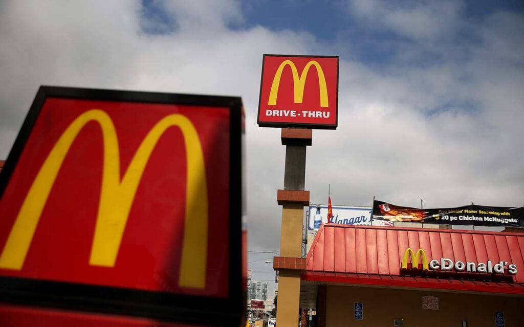
This is where execution matters. McDonald's doesn't need a burger in their logo to tell you they sell food. The personality comes through in HOW you design your lettermark—the typography style, the spacing, the weight, the colour. These elements communicate as much about your brand as any illustration.
What's the process for creating a powerful lettermark that builds brand equity?
Start with strategy, not design. Define what you want your brand to communicate. Then, explore typography that matches those attributes—test variations in different sizes and contexts. And finally, ensure it works in one colour. It won't work anywhere if it can't work in black and white.
How do I measure the success of my lettermark logo over time?
Three metrics: recognition, attribution, and association. Can people recognise your mark instantly? Do they correctly attribute it to your company? And most importantly, does it trigger the correct associations about your brand values? Test these regularly, and you'll know if your lettermark builds tangible equity.

