Top 10 Grocery Store Logos: A Visual Feast
Have you ever found yourself staring at a supermarket logo and wondering how those clever designs came to be? You’re not alone.
In our day-to-day rush, we often need help recognising the visual representations of the brands that feed us. But not today. This article looks into grocery store logos — precisely the top 10 that have found a place in our hearts (and shopping trolleys).
This guide focuses on major UK grocers to keep comparisons fair and familiar. That mix spans discounters like Aldi and Lidl, and premium-led names like Waitrose and M&S Food.
Those aren’t just random squiggles or fancy fonts; they’re deliberate symbols crafted to say much about what the company stands for, where it’s been and where it promises its consumers it’s going. From the strategic use of colour psychology to hidden messages in negative space, these logos are a branding masterclass.
So grab a cart and cruise down the aisles of design brilliance together. We’ll unpack visual strategies, decode hidden meanings and maybe even stumble upon surprises along the way. Ready to look at your favourite grocery store through new eyes?
- Colour psychology drives recognition: red grabs attention, blue builds trust, green signals freshness, yellow suggests optimism.
- Typography matters: custom fonts like FS Me improve legibility and convey personality across distances and screens.
- Discounter strategy: Aldi and Lidl use high-contrast primary colours and thick borders to shout value from roadside.
- Heritage and trust: Co-op’s cloverleaf revival and Morrisons’ "Since 1899" strapline evoke community and longevity.
- Future-ready logos: designs must be scalable, AR-ready, accessible and optimised for app icons and dark mode.
The Technical Anatomy of a Retail Icon
Designing a grocery logo is a high-stakes engineering feat. These symbols must be legible from a 70mph motorway approach, on a flickering smartphone screen, and on the crinkled plastic of a frozen pea bag.
In 2026, the transition to Digital-First Branding means logos are often audited for their “Scalable Vector” performance before they are even approved for store fascias.
The “Big Six” Design Specifications
| Retailer | Primary Typeface | Primary Hex Code | Design Agency |
| Tesco | Tesco Modern (Custom) | #EE1C2E (Red) / #00539F (Blue) | Publicis Sapient |
| Sainsbury’s | FS Me (Accessibility-focused) | #F06C00 (Sainsbury’s Orange) | M&C Saatchi |
| Waitrose | Waitrose Sans | #535C2B (Waitrose Green) | Pentagram |
| Co-op | Co-op Cloverleaf (Custom) | #00B1E1 (Co-op Blue) | North |
| M&S Food | Founders Grotesk | #000000 (Black) / #718063 (Sage) | Landor |
| Asda | Asda Sans | #78BE20 (Asda Green) | Wolff Olins |
The choice of FS Me by Sainsbury’s is a landmark case in Inclusive Design. Developed in collaboration with Mencap, the font features elongated ascenders and descenders to ensure maximum legibility for shoppers with visual impairments or learning disabilities. When you see a grocery logo today, you aren’t just looking at “pretty letters”; you are looking at a highly tuned accessibility tool.
1. Tesco: The Red and Blue Powerhouse
Tesco’s logo is British, like a cup of tea on a rainy day. But what does it take to make this brand work?
It isn’t just pretty, you know. Those bold reds and blues are psychological powerhouses. Red is attention-grabbing and stimulates appetite (smart move!), while blue inspires trust.
The current wordmark pairs bold red letters with blue horizontal stripes below. Those stripes double as a brand device on signs and packs, making Tesco recognisable at a glance.
They almost say, “Come on in, we’ve got everything you need – and we won’t let you down.”
Have you ever noticed the slightly rounded letters? They’re not just there for cuteness’s sake – this softens up the brand, making it more accessible and friendly.
Since its birth as a simple text design, Tesco’s logo has come quite some way — each iteration reflecting the company’s growth alongside changing times. It’s similar to watching a family photo album… but with brands!
2. Sainsbury’s: Orange You Glad It’s Simple?
Sainsbury’s logo is straightforward but not as plain as it seems.
Why the colour orange? Because it’s warm, lively and eye-catching. In many red and blue supermarket logos, Sainsbury’s orange is like a happy “Oi!” in a packed room.
The clean sans-serif typeface does all the talking. It’s modern, legible, and gets straight to the point. No frills, no fuss — just like their commitment to quality products at fair prices.
Have you ever noticed that cheeky apostrophe? It is grammatically correct and pays homage to the brand’s beginnings as a family firm. It’s almost like a little nod to the discerning consumer.
The possessive form reflects the company’s name, J Sainsbury plc, which signals heritage and continuity. Retail branding and communications have consistently used the apostrophe across stores and packaging.
3. Asda: The Walmart of the UK
Asda’s logo may appear simple, but there is more to it than meets the eye.
The core logo uses bold uppercase for ASDA, with open, friendly shapes. Walmart acquired Asda in 1999, and in 2021, majority ownership moved to the Issa brothers and TDR Capital. The bright green identity held its ground through those changes.
That bright green colour is not just visually appealing; it also represents freshness and growth. It’s like a promise for crisp fruit and vegetables – new beginnings with every shop.
Friendly and approachable – those lowercase letters make Asda seem down-to-earth. It’s as if they’re saying: ‘We’re not posh, we’re your local store.’
4. Morrisons: A Fresh Take on Tradition
That stylised tree is not only good-looking but also meaningful. It stands for development, preservation and the company’s dedication to providing fresh food. In other words, there is a little green pledge in each store.
Morrisons introduced the current leaf motif and refreshed wordmark in 2016. Many applications pair the logo with the strapline “Since 1899” to underline long-standing roots. It blends freshness cues with a clear story of origin.
Green and yellow are not chosen by chance. Green represents freshness, nature, etc., while yellow adds some sunny, positive attitude, like saying “Good morning!” visually every time you look at it.
Boldness with a touch of oddity in font design gives Morrison its character; neither too assertive nor too playful — simply friendly. The font might be typographically compared to a firm handshake with a warm smile.
5. Waitrose: Elegance in Simplicity
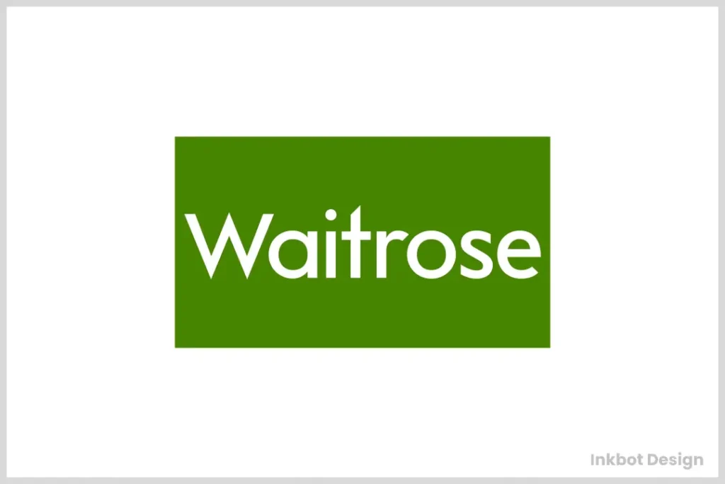
The Waitrose logo is a perfect example of a simple yet effective design. However, you might think that it’s too basic.
In 2018, the supermarket rebranded as Waitrose & Partners as part of the John Lewis Partnership’s update. Pentagram set refined typography and clean line motifs for packaging and communications. The naming shift placed Partners at the heart of the promise.
It’s not just some green box. It represents quality, like an assurance of excellence in a small package.
While the crisp white typeface provides contrast against its backdrop, it also symbolises purity, hygiene and transparency – all things necessary to Waitrose.
Do you see how they made ‘W’ uppercase? This minor alteration softens an otherwise very polished emblem, making it more inviting. Imagine someone giving a friendly nod at some formal event.
6. Aldi: Bold and Unapologetic
Aldi’s logo is like the brand itself — simple, direct and hard to miss.
In the UK, Aldi operates under Aldi Süd, one of the two Aldi groups. That structure keeps logo standards tight across markets, so the stores feel consistent.
Those blue, red, yellow and orange colours aren’t just lovely to look at — they’re meaningful. Blue stands for trust, red for energy, yellow for optimism and orange for friendliness. It’s as though the Aldi logo were a visual representation of the company’s values.
The chunky letters aren’t the only things that are easy to read and use when making a statement. They say, “We’re here. We’re confident. And we have great deals.” It’s akin to shouting out a friendly greeting across a crowded room.
Notice that thin white border around the letters? That’s not just there for looks; it helps the logo pop on any background, so Aldi’s message always comes through. Neat trick, huh?
7. Lidl: A Fresh Face in the Crowd
Lidl’s logo in the grocery world is a breath of fresh air. Let’s talk about this character filled with colours.
Lidl is owned by the Schwarz Group, which also owns Kaufland. The primary colour roundel has changed only in small ways over the decades to aid clarity in print and apps.
These loud primary colours are more than just attractive; they also have meaning. Blue symbolises trustworthiness; yellow represents cheerfulness; and red represents energy. It is like a visual boost every time you visit the store.
This rounded font with slight slanting isn’t only attractive but also makes Lidl appear approachable and amiable. It’s as if saying “Hi” with a smile, typographically.
The Discounter Blueprint: High-Contrast “Value” Branding
Aldi and Lidl use a visual language that is fundamentally different from that of the “Big Four.” While Waitrose seeks to “blend in” with a sophisticated streetscape, the discounters want to “shout” from the roadside.
- Primary Colour Bombardment: Both use the “Primary Triad” (Red, Blue, Yellow). In Colour Theory, this is the most high-contrast combination possible. It signals “Basic,” “Essential,” and “Direct.”
- The Border Effect: Both logos use thick white or yellow borders. This ensures the logo never “bleeds” into the background of a billboard, maintaining a high Visual Saliency Score.
- The “No-Frills” Serif: Lidl’s use of a quirky, slightly tilted ‘i’ is a masterclass in “Friendly Budgeting.” It suggests the brand doesn’t take itself too seriously, which lowers the barrier for price-conscious shoppers.
8. Co-op: The Strategy of the “Cloverleaf” Revival
In 2016, the Co-operative Group undertook one of the most successful rebrands in UK history. Rather than inventing something new, they looked back to 1968. By reviving the classic Cloverleaf logo, designed originally by Western Design and modernised by the agency North, the brand instantly tapped into “Generational Trust.”
Why the “Blue Bloom” Works
The cloverleaf is more than a shape; it is a Tessellating Entity. It represents the cooperative principles of self-help and solidarity.
- The Power of Blue: While competitors fight over red and green, the Co-op’s specific “Sky Blue” (#00B1E1) feels civic and calm. It suggests a community hub rather than a corporate warehouse.
- Visual Continuity: The cloverleaf works perfectly as a social media avatar, a staff lapel pin, and a giant neon sign. In the 2026 landscape of “Simplified Icons,” this 60-year-old design is more modern than its contemporaries.
Scenario: Imagine walking down a high street in Manchester. The blue cloverleaf stands out precisely because it doesn’t look like a “shop”—it looks like a symbol of the neighbourhood. This emotional resonance is what experts call Brand Salience.
9. Iceland: Cool and Contrasted
Iceland’s logo is as cool as its products. Let’s thaw out this frosty design.
To be clear, this is Iceland Foods, the UK supermarket chain, not the country. The brand built its name on frozen food, then expanded its range to include fresh and ambient lines.
That bold red is not just beautiful – it’s brilliant. It immediately juxtaposes the brand with cold, frozen goods. It’s a visual assurance of freshness.
Bold and dynamic, the text conveys movement and adds energy to the logo. It seems to say: ‘We never stop, we keep going forward’.
The red does more than decorate – it adds warmth to the cold brand name and grounds the logo. This visual full stop underlines the brand’s confidence.
10. M&S Food: Luxury in Letters
M&S Food’s logo could be described as the perfect example of modest sophistication. Let’s appreciate this delicate design for a moment.
That dark green isn’t just any old shade – it’s deliberate. It connotes excellence, freshness and even some glamour. So you might say it’s like setting the bar high visually.
This stylised ampersand not only joins M and S together; it is also a design star in its own right. It brings out fun and character within an otherwise very formal logo.
This crisp serif font is legible and hints at M&S’s roots and reputation for high quality. So you could think of it as being akin to what a well-tailored suit does for someone’s appearance, typographically speaking.
The Power of Supermarket Branding
You must be wondering why we did all this stuff on supermarket logos. Does it matter? I can assure you it does, and more than you think.
Creating Trust Through Design
These marks are not just pretty pictures – they’re silent advocates of their brands. They toil day and night without rest to build trust and foster recognition.
When your eyes catch the Tesco red and blue or Sainsbury’s orange, it makes connections in your mind and forms opinions, like a repeated visual connection.
Inspiring Brand Loyalty
A well-crafted emblem can create an emotional bond with customers.
Think about how often you have chosen an unfamiliar brand simply because it was recognisable by its logo. That’s good branding for you.
Differentiating From Others In A Crowd
Grocery retail is a highly competitive sector where being unique matters most.
A unique identification symbol may make people choose your shop when they walk past several others on their way home from work or elsewhere; otherwise, they would have gone straight into the nearest store.
The Evolution of Grocery Store Logos

Supermarket logos have changed over the years, just as the stores themselves have. Let’s take a quick walk through history.
From Words to Pictures
In the beginning, many supermarket logos were nothing more than text. But as time passed, they began incorporating icons and symbols that helped them stand out from one another—like a caterpillar becoming a butterfly.
Getting Simpler
For a while, there has been an ongoing trend toward simplicity in logo design. Compare some old ornate logos with today’s streamlined versions—it’s almost like going from Victorian fashion to modern minimalism.
Going Digital
With online shopping becoming increasingly popular, it was only natural that logos would change, too. They need to look good on everything from giant store signs to tiny app icons on your phone – brands had to learn a whole new visual language.
The Psychology of Colour in Supermarket Logos
Colour is not just about being pretty – it is a robust branding tool. Let us consider how supermarkets utilise colour psychology to their advantage.
Red: The Attention-Grabber
Red is often used in supermarket logos (like Tesco) because it catches your eye and whets your appetite. It’s like saying “Hello there” visually!
Blue: The Trustworthy Choice
Trust and dependability are evoked by blue (seen in the Tesco and Asda logos). This brand won’t let you down; at least, that’s what its appearance suggests.
Yellow: Optimism and Value Cues
Yellow accents signal warmth, visibility and price-conscious energy, drawing the eye fast. You will see it in Morrisons’ materials and in bold bands used by discounters.
Green: The Fresh Option
Green is associated with freshness, healthiness and nature (Morrisons and Waitrose use it). It’s like looking at an apple or a head of lettuce.
White: Clarity and Cleanliness
White space suggests hygiene, simplicity and openness, which shoppers read as honest. It helps wordmarks like Waitrose feel calm, clear and premium on the shelf.
Orange: The Friendly Face
Warmth and energy come across from orange (Sainsbury’s uses it). This is like a happy sign saying, “Come on in!”
The Role of Typography in Supermarket Logos
The font selection in a logo is not just about legibility; it also has to have personality. Typography has always been an essential factor in design and branding.
Serif vs Sans-Serif
There’s something about serif fonts (such as the M&S logo) that makes us associate them with tradition and reliability. On the other hand, sans-serif typefaces (like the one used in the Asda logo) often come across as more modern or approachable — think of the difference between receiving a handwritten letter and getting a text message.
Upper vs Lowercase
Using uppercase letters (e.g., ALDI) can make brands seem bold or self-assured, while lowercase ones (as seen on the Asda logo) tend to feel friendlier and more down-to-earth, like someone speaking softly instead of shouting at you.
Custom vs Standard Fonts
To establish themselves among competitors, many supermarkets opt for custom typefaces. This way, it’s akin to having your voice amidst the noise.
Rounded vs Geometric Letterforms
Rounded letterforms feel friendly and human, like Co-op’s soft geometry. Geometric sans-serifs read as brisk and efficient, which suits Lidl’s neat wordmark. Shape choices nudge how a store wants you to feel.
Legibility at Distance and on Screens
Good fascia type uses open counters, taller x-heights and steady stroke weight. Generous spacing and strong colour contrast aid recognition on mobiles, in line with WCAG guidance. That helps shoppers spot you fast, even on a small app icon.
The Impact of Logo Design on Consumer Behaviour
Think about it. How much can a logo affect me? Trust me, it can do wonders.
First Impressions Do Count
Usually, the customer sees the logo first. It could also be responsible for how they feel about the shopping process. It’s just like judging a book by its cover – we all do it, even when we are unaware.
Recognition Of The Brand
In half a second, you can identify a good logo design. This immediate knowledge affects our purchase choices, especially when time is not on our side. It’s similar to seeing someone you know in a crowd – there’s comfort in familiarity.
Connecting On An Emotional Level
The thing about logos is that they make us feel some type of way. When we come across an emblem connected with positive memories, it automatically gives us satisfaction while shopping there. Think of your favourite meal scent – it brings back good times.
The Science of “Freshness”: How Logos Trigger Your Appetite
In grocery retail, the logo is the first “bite.” Research in Gastrophysics suggests that our brains associate specific wavelengths of light with food safety and nutritional density.
The “Green-Yellow” Freshness Axis
Retailers like Morrisons and Waitrose lean heavily into the “Green Axis.”
- Chlorophyll Cues: Darker greens (Waitrose) signal “Premium Organic,” mimicking the deep hues of kale or spinach.
- Sunlight Cues: Yellow accents (Morrisons) trigger associations with citrus, butter, and sunshine. This combination creates a “Halo Effect,” where the customer perceives the produce inside as fresher than in a store with a “Cold” logo (like a blue-heavy discounter).
Shape and Texture
Notice the soft, rounded edges of the M&S Food ampersand or the Lidl yellow circle. High-frequency, sharp angles are rarely used in grocery branding because they trigger a “Threat Response” in the amygdala. Organic Shapes—those that mimic fruit or leaves—lower the heart rate and encourage a “Browsing Mindset,” which is essential for increasing Average Basket Value.
How to Design a Grocery Logo in 2026: A 5-Step Guide
If you are launching an independent deli or farm shop, you don’t need a Pentagram budget to look professional. Follow this framework:
- Define Your “Freshness Signature”: Choose one primary “Nature” colour. For 2026, the trend is moving toward Terracotta and Sage Green to distance brands from “Industrial” supermarkets.
- Select a “Workhorse” Font: Use a typeface with a “Large X-Height” (the height of the lowercase ‘x’). This ensures your name is readable on small price tags. Inter or Montserrat are excellent, free alternatives to custom retail fonts.
- The “Bag Test”: Print your logo in black and white at 2cm wide. If the details disappear, the design is too complex.
- Embrace the Ampersand: If your name has two parts (e.g., “Hale & Hearty”), make the ampersand a unique design feature. It adds “Boutique” character.
- Audit for Accessibility: Use a Contrast Checker to ensure your text stands out against its background. Aim for a ratio of at least 4.5:1 to meet WCAG 2.1 standards.
Beyond the Fascia: The Future of Grocery Branding
By 2027, the “Static Logo” will be a relic of the past. We are entering the era of the Responsive Brandmark.
- AR-Ready Icons: Logos are being redesigned with “High-Contrast Anchor Points” so that Augmented Reality glasses (like Apple Vision Pro) can recognise the store from a distance and overlay live stock data or “Clubcard” discounts.
- The “Carbon Logo”: Expect to see logos that change colour based on the store’s real-time energy efficiency or the “Food Miles” of the products currently in stock.
- App-Icon Optimisation: As “Quick Commerce” (delivery in 15 minutes) dominates, logos like Tesco Whoosh are being stripped of all text, leaving only the “Swoosh” or “Stripe” symbols to save space on mobile home screens.
Conclusion: The Logo Lowdown
So there you have it – an in-depth exploration of supermarket logos. It’s incredible how much thought goes into such a simple design! Whether it’s the psychology behind colours, hidden messages, or even consumer behaviour, these symbols are working hard to get noticed and earn trust.
Look up at those logos next time you’re pushing your trolley down the supermarket aisle. They’re more than just signs – they’re silent storytellers with a brand story. Who knows? You might start seeing your favourite grocery store in a whole new light.
After all, in retail, where everything has a price tag, pictures are worth thousands of dollars, sometimes too many zeros to count. So here’s to those humble little emblems that lead us through deals, good and bad, until we find ourselves standing before shelves full of great products, wondering how we got there.
FAQs
Who designed the Waitrose and John Lewis logos?
The 2018 “Partnership” rebrand was created by the world-renowned agency Pentagram. They introduced the “Brand Lines” motif, in which the weight and spacing of the lines represent the business’s divisions, all united under a common grid.
What is the Sainsbury’s logo font called?
It is a custom typeface called FS Me. It was specifically commissioned to be the most legible font in UK retail, featuring distinct character shapes that help people with visual impairments or dyslexia read store signs more easily.
Why do many grocery logos use a circle?
In Visual Psychology, the circle represents “Unity,” “Inclusion,” and “Cycle” (as in the seasons). For brands like Lidl or the Co-op Cloverleaf, the circular geometry feels “Complete” and safe, which builds subconscious trust during a high-frequency activity like food shopping.
Are there rules for using the Royal Warrant in a logo?
Yes. Only companies that provide goods or services to the Royal Household for at least five years can apply. In grocery branding, Waitrose and M&S often display the Royal Arms. It must be placed discreetly and cannot exceed the main brand logo.
How does “Dark Mode” affect supermarket logos?
Many brands now have a “Negative” version of their logo. For example, a logo with dark text may switch to white text on a dark grey background in a shopping app. Designers must ensure that “Brand Colours” (such as Tesco Red) remain vibrant on dark backgrounds without causing “Visual Vibration” (eye strain).


