How to Choose the Best Font for Logo Design
Most business owners choose their logo font like a song on the radio: they pick something that gives them a good feeling.
This is a mistake—a fatal one.
Your font choice isn’t an artistic flourish. It’s the voice of your company, distilled into a visual form. The wrong choice makes a brilliant business look amateurish, untrustworthy, and cheap.
The right choice communicates your value before a potential customer reads a word.
This isn’t another pointless list of “10 Pretty Fonts You’ll Love.” Those lists are useless because they lack context.
This is a strategic framework. It’s a series of questions and tests to ensure your chosen font is a powerful asset, not a liability.
- Your font choice is essential; it represents your brand's voice and professionalism.
- Consider your logo's environment; it must remain legible across various sizes and platforms.
- A unique logotype enhances brand distinctiveness and creates a memorable identity.
Stop Asking “What Font Should I Use?”
The perfect font for a fintech startup is terrible for an artisan baker. Context is everything. Before looking at a single typeface, you must define your strategic criteria.
Question 1: What Are My Brand’s Core Personality Traits?
A font has a voice. It can be loud, quiet, serious, or playful. If your brand voice is professional and authoritative, but your logo font looks like it belongs on a child’s birthday invitation, you have a problem.
Draw a line. Write a descriptor on one end; on the other, its opposite. Figure out where your brand lands.
- Traditional vs. Modern
- Friendly vs. Authoritative
- Luxurious vs. Affordable
- Playful vs. Serious
- Rugged vs. Elegant
Use a bold, geometric sans-serif to feel modern and approachable. Use a classic, high-contrast serif to feel luxurious and traditional.
Your font must be an honest reflection of your business.
Question 2: Where Will This Logo Live?
A logo rarely exists in a vacuum. Its environment dictates what works. A stunning font on a 27-inch monitor might completely fall apart in the real world.
Think about every single place this logo needs to function:
- A tiny 16×16 pixel favicon in a browser tab.
- A massive sign on the side of a building.
- Embroidery on a polo shirt.
- A social media profile picture on a phone.
- Printed on the side of a pen.
Extremely thin, delicate, or complex fonts will vanish when scaled down. They become unreadable smudges. Your logo must be robust enough to survive in every context.
Question 3: Who Am I Competing With?
Look at the logos of your direct competitors. Don’t do this to copy them. Do it to differentiate yourself.
You have a massive opportunity if every competitor in your space uses a heavy, blue, sans-serif font.
A refined, elegant serif could instantly position you as the premium, more established choice. The goal is to own a visual space they have abandoned. Stand out by making a deliberate, contrasting choice.
The Great Font Divide: Decoding Serif vs. Sans-Serif
This is the most fundamental choice you will make. It sets the entire tone for your brand’s visual language.
Serif Fonts: The Voice of Tradition, Authority, and Trust
A serif is the minor stroke or “foot” at the end of a letter’s main line. They originate from ancient Roman stonemasons and carry a sense of history and gravitas.
- Psychology: Established, reliable, traditional, formal, respectable, and elegant.
- When to use them: Brands that want to convey a sense of heritage, expertise, and trust. Think law firms, financial institutions, universities, and high-end fashion or publishing.
- Real-world examples: The New York Times logotype feels authoritative and journalistic. Zara’s logo feels like high fashion.

Sans-Serif Fonts: The Language of Modernity, Clarity, and Tech
“Sans-serif” literally means “without serif.” These are fonts with clean, simple letterforms, lacking the extra feet. They became popular in the early 20th century with modernist design movements.
- Psychology: Modern, straightforward, clean, minimalist, and approachable.
- When to use them: Brands that want to feel current, efficient, and user-friendly. This is the native language of tech startups, lifestyle brands, and modern consultancies.
- Real-world examples: Google’s logo is clean, simple, and accessible. Spotify is modern and feels perfectly at home in a digital interface.
What About Slab Serifs?
Slab serifs are a hybrid. They have the “feet” of a serif but are thick, blocky, and rectangular. They have a bold, confident, and often industrial or retro feel.
They are less formal than traditional serifs but more declarative than most sans serifs. Think of brands like Sony or Honda.
Beyond the Basics: When to Use Script and Display Fonts
These font categories are powerful but dangerous. They are the specialist tools in the typography workshop. Use them with extreme caution.
Script Fonts: The Personal Touch
Script fonts mimic handwriting, ranging from elegant calligraphy to casual scrawls. They can add a human, personal feel to a brand.
The problem? Most are incredibly difficult to read, especially at a small size or when used for more than one or two words. The iconic Coca-Cola logo works because it’s one memorable, custom-drawn shape. It’s been burned into our collective consciousness for over a century.
Your new, off-the-shelf script font doesn’t have that luxury. If you must use a script, ensure it’s for a very short brand name and that its legibility is beyond question.
Display Fonts: All Character, No Subtlety
Display fonts are built for one purpose: to grab attention in large headlines. They are expressive, stylised, and often eccentric.
Using a display font for a logo is like shouting all the time. It might work for a niche brand like a heavy metal band or a video game title, but for 99% of businesses, it lacks the versatility needed for a functional logo. A logo needs to work in quiet moments, too.
4 Technical Checks Every Font Must Pass
Aesthetics are subjective. Functionality is not. No matter how good it looks, a font that fails these objective tests is not a professional option.
1. Scalability: The Billboard and Favicon Test
Type your business name in your chosen font. First, look at it filling your screen. Then, zoom out until it’s the size of a postage stamp.
Can you still tell what it is? Does it become a fuzzy line? Thin strokes are the first casualty of downscaling. Your logo must be identifiable at 500 pixels wide and 16 pixels wide.
2. Legibility: The Squint Test
This is brutally effective. Look at your potential logo on the screen and squint your eyes until it’s blurry. Can you still make out the general shape of the word? Or does it collapse into an unreadable blob?
Pay close attention to letter pairs that can merge, like ‘c’ and ‘e’ or ‘r’ and ‘n’. If it’s hard to read when you’re paying attention, it will be impossible to read with a passing glance.
3. Weight & Versatility: Does it Have a Family?
A single font is just one tool. A font family is a whole toolbox. A professional-grade typeface comes in multiple weights and styles (e.g., Light, Regular, Medium, Bold, Italic, Black).
Your logo might use the “Bold” weight, but your brand system will need the “Regular” weight for a tagline or the “Light” weight for other applications.
Choosing a font with a robust family ensures your brand’s visual identity remains consistent across all materials.
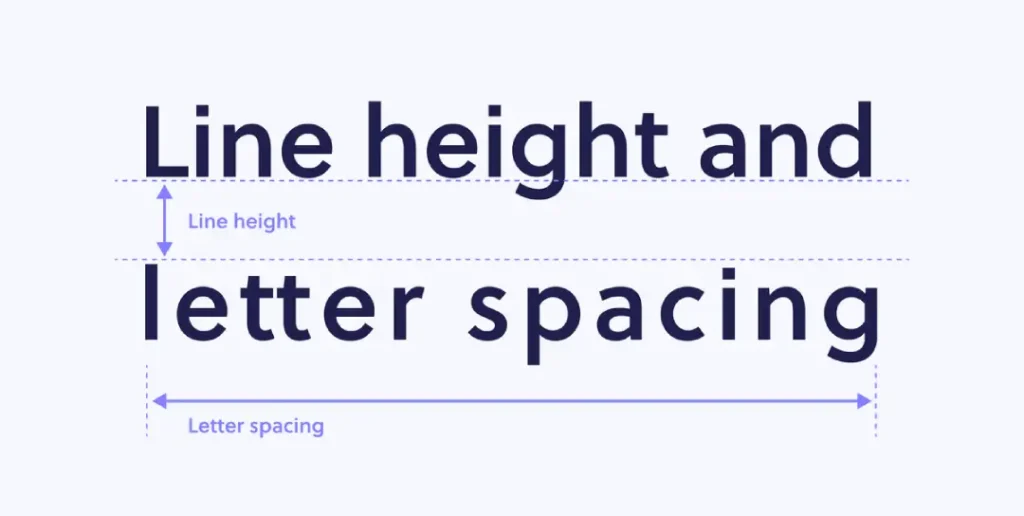
4. Kerning: Check for Awkward Gaps
Kerning is the spacing between individual pairs of letters. A well-designed font has carefully considered default kerning. A poorly made one does not.
Type out your business name and look for odd gaps or letters crashing into each other. Common problem pairs are ‘A’ and ‘V’ (AV) or ‘T’ and ‘o (To).
The famous design joke is “kerning” turning into “keming” because the ‘r’ and ‘n’ are too close. If the spacing looks wrong out of the box, it’s a sign of a low-quality font.
The Real Risk of “Free” Fonts (And How to License Properly)

The temptation to use a free font is immense, especially for a new business. But this decision often carries hidden costs that can cripple a brand before it even starts.
Problem #1: Overuse and Dilution
This is the “Canva Effect.” If a font is free and readily available on a significant platform, it is being used by tens of thousands of other businesses. Your logo, by default, will look generic.
Fonts like Montserrat, Raleway, and Lobster are good typefaces, but have been so overused that they’ve lost all distinctiveness. Using them for your logo is like showing up to a black-tie event in a default rental tuxedo. You’re there, but nobody will remember you.
Problem #2: The Legal Minefield of Licensing
This is the pet peeve that keeps designers up at night. Many fonts on “free font” websites are listed as “Free for Personal Use.”
A business logo is the definition of commercial use.
Using a personal-use font for your logo violates the licensing agreement. It’s copyright infringement. The original type designer can legally demand that you stop using it and seek financial damages. It’s a lawsuit waiting to happen.
Where to Find Professional, Commercially Safe Fonts
Don’t download fonts from sketchy aggregator sites. Use reputable sources that provide clear licensing information.
- Google Fonts: A fantastic resource for open-source fonts. Almost all are licensed under the Open Font License (OFL), which permits commercial use.
- Adobe Fonts: Included with an Adobe Creative Cloud subscription, offering a massive library of high-quality, commercially licensed fonts.
- Professional Foundries (MyFonts, Fontspring, etc.): These are marketplaces where you can purchase licenses for premium, unique fonts. The investment often pays for itself in distinctiveness.
The Case for a Custom Logotype

Choosing a well-made font using the framework above will put you ahead of 90% of your competition. But for a brand to become truly iconic, it must be unique.
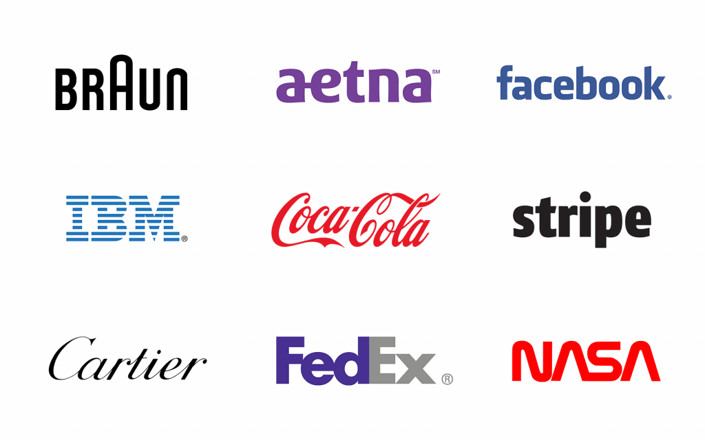
The world’s most memorable logos—Coca-Cola, Google, FedEx—are not just typed-out fonts. They are logotypes.
They may have started as a base font (FedEx uses a modified Futura), but have been meticulously customised. The kerning is perfected, the letterforms are tweaked, and unique ligatures are created.
This customisation process turns a public-domain tool into a private, ownable, and defensible brand asset. It’s the difference between buying a suit off the rack and having one tailored to fit you perfectly. No one else can wear it.
Working with a professional designer to create a custom logotype is an investment in your brand’s long-term value.
If you’re serious about building a memorable business, it’s a step that can’t be skipped—our work at Inkbot Design centres on creating unique brand assets that stand the test of time.
You can explore our logo design process to see how this comes to life.
Conclusion
Your logo font isn’t just a choice; it’s the voice of your business. It communicates your personality, professionalism, and position in the market.
Don’t leave it to chance. Don’t follow a trend. Don’t pick what you “like.”
Use this framework. Ask the hard questions. Test for technical soundness. Treat it like a critical business decision. Make sure your font is saying the right thing.
Best Font for Logo Design FAQs
What is the difference between a font and a typeface?
Can I use a font from Google Fonts for my logo?
Yes, most fonts on Google Fonts are licensed under the Open Font License (OFL), which allows for commercial use, including in logos. Always double-check the license for the specific font you choose.
How many fonts should be in a logo?
Ideally, one. A strong logotype uses a single, well-chosen typeface. If you have a tagline, it can be in a different, complementary font (often a simple sans-serif), but the core logo should be unified. Simplicity is key.
What are the most overused fonts in logo design?
Fonts that are default options in popular free software are the most overused. These include Montserrat, Raleway, Lobster, Pacifico, and Oswald. While they are not bad fonts, they will make it difficult for your brand to look unique.
Is a serif or sans-serif font more timeless?
Both can be timeless. Timelessness comes from classic proportions and high-quality design, not the category. Garamond (a serif from the 16th century) and Helvetica (a sans-serif from 1957) are considered timeless. Avoid overly trendy or decorative fonts.
Should my logo font match my website font?
Not necessarily, but they must be compatible. Your logo font might be more stylised. Your website’s body font must prioritise readability above all else. They should belong to the same brand world, often achieved using a font from the same family as the logo or a neutral, complementary typeface.
How much does licensing a professional font for a logo cost?
Costs vary dramatically. A license for a single font weight from a professional foundry can range from $20 to over $500. A whole family can cost several thousand dollars. This one-time “Desktop” license cost covers use in a logo.
What is a logotype?
A logotype (a wordmark) is a logo based entirely on the stylised typography of the company’s name, such as the logos for Google, FedEx, or NASA.
Can I just modify a font to make it unique?
It depends on the font’s license (EULA – End User License Agreement). Some licenses explicitly forbid modifying the letterforms. If you plan to customise a font heavily, it’s best to work with a type designer or start from scratch to avoid legal issues.
Why is scalability so important for a logo font?
A logo must be recognisable everywhere it appears. A font on a business card must also be clear when it’s shrunk down to a tiny app icon on your phone’s screen. If the font details get lost at small sizes, the logo fails.
Ready to Create a Logo That Truly Stands Out?
If you’ve gone through this process and realised that an off-the-shelf font won’t cut it, that’s a good thing. It means you’re serious about building a distinctive brand. When you’re ready to create an instantly communicated value, our Inkbot Design team has a unique and ownable logotype that communicates your value instantly. Our team at Inkbot Design is here to help.
Explore our logo design services to see our work or request a quote to begin the conversation.

