You’ve Got 3 Seconds: Make Visual Hierarchy Count
When someone lands on your website or glances at your design, you’ve got about 3 seconds to grab their attention. 3 seconds to communicate what matters. 3 seconds to guide their eyes exactly where you want them to go.
That’s it.
And if you waste those precious moments, they’re gone. The bounce rate is up, conversions are down, and opportunities are missed.
The secret weapon that separates mediocre designs from exceptional ones? Visual hierarchy. It’s not just some fancy design term — it’s the difference between a visitor who converts and one who clicks away.
- Effective visual hierarchy captures attention in 3 seconds to guide user engagement and reduce bounce rates.
- It arranges design elements by importance, helping users scan information in predictable patterns.
- Implementing size, colour, typography, and spacing controls enhances usability and drives conversions.
- Testing and adapting hierarchy ensures designs meet user expectations and facilitate smoother interactions.
What Is Visual Hierarchy (And Why Should You Care?)
Visual hierarchy is the arrangement and presentation of design elements in order of importance. It’s how you structure visual information to influence the order of importance in which the human eye perceives what it sees.
Think about it this way. When you look at any design — a webpage, poster, or cereal box — certain elements catch your eye first, then second, and so on. That’s not random. That’s hierarchy at work.
And here’s why it matters: users don’t read digital content, they scan it. Eye-tracking studies from the Nielsen Norman Group show that people follow predictable scanning patterns (like F and Z patterns) when viewing digital content. Visual hierarchy helps you work with these natural patterns instead of against them.
When done well, visual hierarchy:
- Guides users through your content in the exact sequence you intend
- Reduces cognitive load, making information easier to process
- Creates focal points that drive attention to key messages or calls to action
- Establishes relationships between pieces of information
- Improves overall usability and user experience
Get it wrong, and your visitors waste precious mental energy trying to figure out where to look and what to do next.
The 7 Core Principles of Visual Hierarchy That Work
I’m not going to waste your time with theory. Instead, let’s dive into the practical principles you can apply immediately to create effective visual hierarchies in your designs.
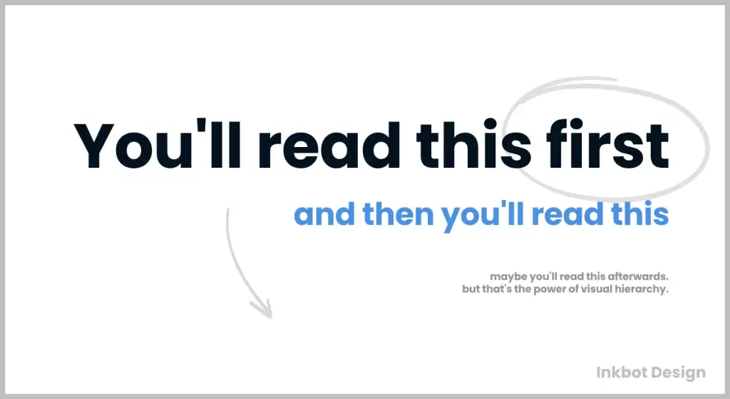
1. Size and Scale: Bigger Demands Attention
The bigger an element is, the more attention it commands. It’s that simple.
Your most important elements should be larger than the less important ones. This isn’t rocket science, but I’m amazed how often I see designs where everything competes for attention at the same size.
Look at any successful landing page, and you’ll notice how the main headline is substantially larger than subheadings, which are larger than body text. This size graduation isn’t arbitrary — it’s deliberate visual hierarchy.
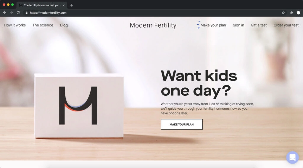
For instance, Inkbot Design’s branding services page uses size brilliantly to draw attention to the main value proposition before guiding you through the supporting content.
Practical application: Establish 3-4 text sizes for your design system and stick to them. For the web, consider:
- H1: 32-40px for primary headlines
- H2: 24-32px for section headings
- H3: 18-24px for subsections
- Body: 16-18px for readable content
2. Colour and Contrast: The Attention Magnets
Nothing creates focal points faster than the strategic use of colour and contrast.
High-contrast elements jump forward while low-contrast elements recede. This is particularly effective for call-to-action buttons, which should stand out prominently from their surroundings.
Colour psychology also plays a role here. Warm colours (red, orange, yellow) advance and grab attention, while cool colours (blue, green, purple) recede and feel more passive.
Practical application: Choose a primary accent colour that contrasts with your main colour scheme and use it sparingly for your essential elements, especially calls to action. Ensure text has at least a 4.5:1 contrast ratio with its background for accessibility.
3. Typography Hierarchy: More Than Just Size
Typography hierarchy goes beyond mere font size. It involves the strategic use of:
- Weight (bold vs. regular)
- Style (italic, underlined)
- Case (uppercase, sentence case)
- Spacing (tracking and leading)
- Font pairing (contrasting header and body fonts)
Each variable can establish a hierarchy independently or in combination with others.
For example, using a bold sans-serif for headings paired with a regular serif for body text creates natural separation and flow between different types of content.
Practical application: Limit your design to 2-3 font families maximum. Establish clear typographic rules for each level of your content hierarchy, considering size, weight, style, and spacing. For instance:
- Headlines: Montserrat Bold, 36px, letter-spacing 0.5px
- Subheadings: Montserrat Medium, 24px, letter-spacing normal
- Body: Open Sans Regular, 16px, line-height 1.5
4. White Space: The Breathing Room That Guides the Eye
White space (or negative space) isn’t empty space — it’s a crucial design element that creates relationships between objects and guides the eye.
Elements surrounded by more white space appear more important and receive more attention. Look at Apple’s product pages — they give hero products massive breathing room, isolating them for maximum impact.
White space also groups related elements together through proximity while separating unrelated ones, creating visual “chunks” that are easier to process.
Practical application: Increase padding around your most important elements by 50-100% compared to secondary elements. Use consistent spacing to group related items (like navigation options) and larger gaps to separate different sections or concepts.
5. Visual Weight and Position: The Layout Leverage
Elements with greater visual weight (through size, colour, texture, etc.) naturally draw more attention. But position matters tremendously, too.
In Western cultures, we read from top to bottom and left to right. This creates natural priority zones:
- Top left: Prime real estate, seen first
- Top right: Secondary focal area
- Centre: Natural focal point
- Bottom: Least important information
The infamous “F-pattern” for text-heavy content and “Z-pattern” for more visual layouts demonstrate how users naturally scan pages.
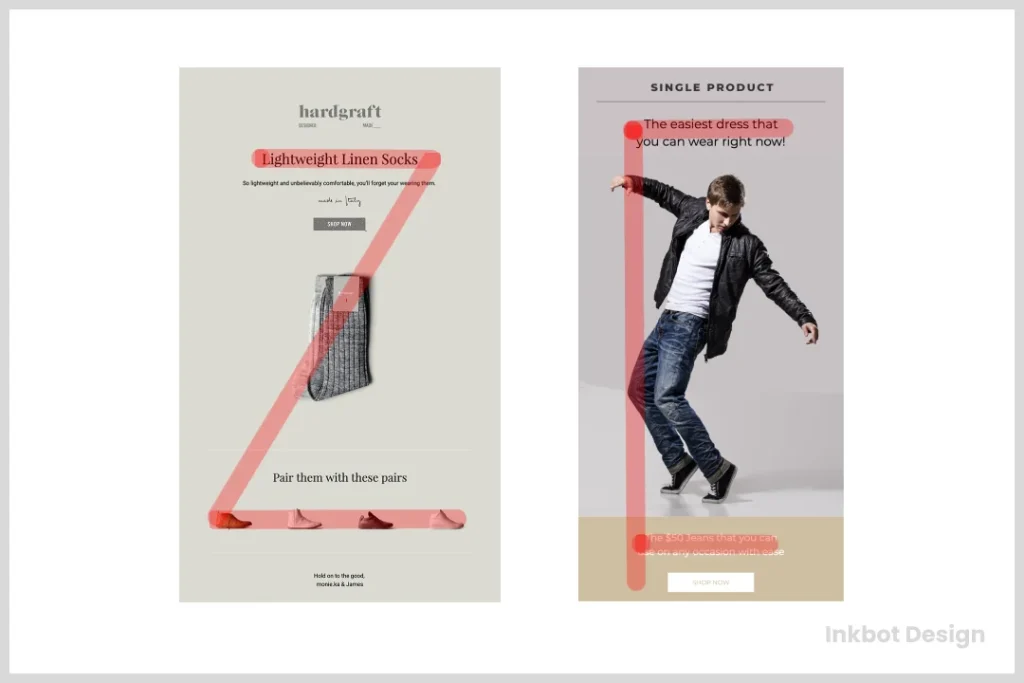
Practical application: Place your essential elements in high-priority zones (top and left for Western audiences). For landing pages, consider a Z-pattern layout, placing key aspects at the Z’s start, middle, and end points to capture attention during natural eye movement.
6. Alignment and Direction: Creating Flow
Alignment creates order and helps users scan information efficiently. Strong alignment establishes invisible lines that guide the eye through the content.
Directional cues like arrows, lines, or even the direction of people’s gazes in photos can powerfully direct attention. If you have an image of a person looking toward your call-to-action, visitors will naturally follow that gaze.
Practical application: Maintain consistent alignment throughout your design (left, centre, or right). Use visual cues like arrows or lines to point toward key elements. If using images of people, have them face toward your content rather than away from it.
7. Repetition and Pattern: The Consistency Key
Repetition of visual elements establishes patterns that users quickly learn to recognise, creating a visual rhythm that makes content more scannable and predictable.
When you establish clear patterns for different content types (e.g., how blog post cards look, how section headings are styled), users can quickly identify information types without conscious effort.
Practical application: Create reusable component styles for recurring elements like buttons, cards, and section headers. Apply them consistently throughout your design to build familiarity and reduce cognitive load.
How Visual Hierarchy Impacts User Behaviour: The Numbers Don’t Lie
Let’s talk data.
A study by Google found that users form aesthetic judgments about websites in as little as 50 milliseconds. That’s faster than you can snap your fingers.
Another study by the Nielsen Norman Group found that users typically spend only 10-20 seconds on a webpage before deciding whether to stay or leave.
These statistics underscore the critical importance of visual hierarchy. When users make split-second decisions about your design, you must ensure they immediately see what matters most.
The tangible results of effective visual hierarchy include:
- Decreased bounce rates: Users are likelier to engage than leave when vital information is immediately visible.
- Increased conversion rates: Clear visual pathways to call-to-action elements naturally increase conversion rates. One case study saw a 35.6% increase in conversions simply by improving the visual hierarchy of a landing page.
- Improved user satisfaction: Designs with a clear visual hierarchy reduce cognitive load, making the experience feel effortless and pleasant.
- Better information retention: When information is structured hierarchically, users remember more of what they see.
Practical Visual Hierarchy Examples Across Different Design Contexts
Let’s examine how visual hierarchy functions across different design scenarios:
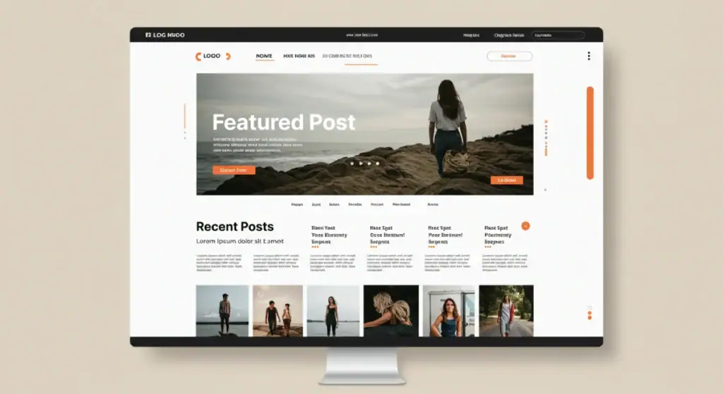
Web Design Hierarchy
Effective websites typically follow this visual hierarchy:
- Primary focal point: Usually a hero image with a headline
- Call to action: High-contrast button in a prominent position.
- Benefits or key features: Secondary information supporting the main proposition
- Social proof: Testimonials, client logos, or case studies
- Supporting details: Additional information for those who want to dig deeper
Check out the Inkbot Design homepage to see this structure in action. Notice how the visual weight of elements decreases as you scroll down the page, creating a natural information hierarchy.
Print Design Hierarchy
Print materials like brochures or posters typically structure visual hierarchy through:
- Headline: Large, bold, and positioned at the top or as the most significant element
- Supporting imagery: Visual that reinforces the headline message
- Subheadings: Introducing different sections or benefits
- Body copy: Detailed information in smaller, more readable text
- Call to action: Contact details or next steps, often highlighted through colour or position
Mobile Interface Hierarchy
Mobile interfaces require even more disciplined hierarchy due to limited screen space:
- Primary action: The main thing users come to accomplish
- Secondary actions: Alternative paths or options
- Navigation: Menu access, usually minimised to prioritise content
- Supporting information: Details available but not prominent
Common Visual Hierarchy Mistakes (And How To Fix Them)

I’ve reviewed hundreds of designs, and these hierarchy problems come up consistently:
1. Too Many “Important” Elements
When everything screams for attention, nothing gets it. This is the most common hierarchy mistake I see.
The fix: Apply the 60-30-10 rule. Primary elements get 60% of the visual weight, secondary elements get 30%, and accent elements get 10%. Ruthlessly demote elements that aren’t truly a priority.
2. Ignoring Reading Patterns
Designs that fight against natural eye movement patterns create cognitive friction.
The fix: Map your content to the appropriate pattern. Use F-patterns for text-heavy content and Z-patterns for more visual layouts. Place key messages at the points where eyes naturally pause.
3. Insufficient Contrast Between Hierarchy Levels
When the difference between hierarchy levels is too subtle, users can’t quickly distinguish what’s most important.
The fix: Create a clear visual separation between levels. The jump from H1 to H2 should be evident at a glance, and careful inspection should not be required. Increase the differentiation in size, weight, or colour between adjacent hierarchy levels.
4. Neglecting Mobile Hierarchy
Many designs look great on desktop but become confusing on mobile when the hierarchy collapses.
The fix: Design for mobile first, establishing your core hierarchy for small screens. Then expand to larger screens, maintaining the same priority relationships between elements.
5. Visual Clutter
Too many visual elements competing for attention dilute the impact of what’s truly important.
The fix: Embrace the principle of reduction. Remove decorative elements that don’t contribute to communication. Increase white space around key elements to give them room to breathe.
Visual Hierarchy in Action: Before and After Case Studies
Let’s look at some real-world examples where improved visual hierarchy transformed effectiveness:
Case Study 1: E-commerce Product Page
Before: A cluttered product page with equally weighted product title, price, description, shipping info, and add-to-cart button.
After: Redesigned with a clear hierarchy:
- Large product image
- Bold product name
- Prominent price
- High-contrast add-to-cart button
- Collapsed description available with a click
- Shipping and return info moved to secondary position
Result: 24% increase in add-to-cart actions.
Case Study 2: Blog Homepage
Before: A blog with a grid of the same-sized post thumbnails competing for attention.
After: Featured post given 2x the size of others, with larger headline and excerpt, secondary posts are arranged in descending importance.
Result: 37% increase in article reads, with featured content getting 3x more engagement.
Case Study 3: Mobile App Onboarding
Before: Text-heavy onboarding screens with multiple buttons and options of similar size.
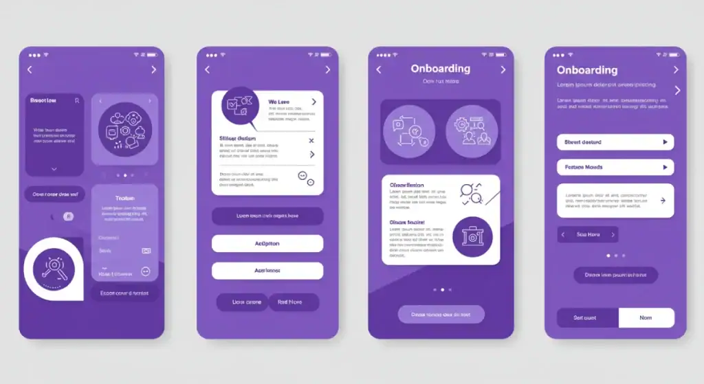
After: Simplified to one main headline, supporting visual, brief explanation, and one primary CTA button (with secondary option in much smaller text).
Result: 28% improvement in completion of the onboarding flow.
Tools and Techniques for Testing Your Visual Hierarchy
How do you know if your hierarchy is working? Test it.
5-Second Test
Show your design to someone for 5 seconds, then take it away and ask what they remember. The elements they recall first are the ones with hierarchical dominance.
Squint Test
Squint until your design becomes blurry. The elements you can still make out are your dominant hierarchy elements.
Heat Map Testing
Use tools like Hotjar or Crazy Egg to generate heat maps showing where users look and click. This reveals whether your intended hierarchy matches actual user behaviour.
Hierarchy Audit
List all elements in your design and assign them a hierarchy level from 1-5 (most to least important). Then compare this intended hierarchy with how they’re represented visually. Are your level 1 elements truly the most visually dominant?
Adapting Visual Hierarchy for Different Audiences and Contexts
Visual hierarchy isn’t one-size-fits-all. Different audiences and contexts require different approaches:
Age Differences
Older audiences typically benefit from:
- Larger text sizes
- Stronger contrast
- More explicit visual cues
- More generous spacing
Younger audiences can process more complex hierarchies and denser information.
Cultural Variations
Reading patterns vary across cultures:
- Western cultures: left-to-right, top-to-bottom
- Eastern cultures: right-to-left, top-to-bottom
- Some cultures: top-to-bottom, right-to-left
Your visual hierarchy should respect these cultural reading patterns.
Industry Context
B2B designs often prioritise clarity and information density, while B2C designs might emphasise emotional appeal through larger imagery and more dynamic hierarchies.
The Future of Visual Hierarchy: Emerging Trends
As design continues to evolve, so does our approach to visual hierarchy:
Responsive Hierarchy
Modern designs increasingly adapt hierarchy based on screen size and user context. The same interface might present different priority elements depending on the user’s stage in their journey.
Micro-interactions as Hierarchy Signals
Subtle animations and micro-interactions now serve as hierarchy cues, drawing attention to key elements through motion rather than static visual properties.
Voice and Multimodal Interfaces
As voice interfaces become more prevalent, visual hierarchy must work in concert with auditory cues, creating cross-modal hierarchies that work across senses.
AI-Driven Personalised Hierarchies
Machine learning is beginning to enable designs that automatically adjust their visual hierarchy based on individual user preferences and behaviour patterns.
How to Implement Visual Hierarchy in Your Design Process
Let’s make this actionable. Here’s how to implement a strong visual hierarchy in your design workflow:
1. Content Inventory and Prioritisation
Before touching any design tools:
- List all content elements that need to appear
- Rank them in order of importance to the user
- Group related elements together
- Identify any content that could be removed or deprioritised
2. Wireframing with Hierarchy in Mind
Create low-fidelity wireframes that:
- Size elements according to their importance
- Position critical elements in prime real estate
- Establish clear grouping through proximity
- Map content to appropriate reading patterns (F or Z)
3. Apply the Visual Treatment Systematically
Once the structural hierarchy is established:
- Develop a type scale with clear separation between levels
- Create a colour system with primary, secondary, and accent colours
- Apply contrast deliberately to reinforce the intended hierarchy
- Use white space strategically to isolate essential elements
4. Test and Refine
- Conduct hierarchy-specific user testing (5-second tests, etc.)
- Gather feedback explicitly focused on what users notice first, second, etc.
- Refine the design to strengthen or adjust the hierarchy as needed.
Visual Hierarchy FAQS
How many levels of hierarchy should my design have?
Most effective designs stick to 3-5 levels of hierarchy. Beyond that, the distinctions become too subtle for users to process quickly.
Should visual hierarchy be consistent across all pages of a website?
The overall hierarchy system should be consistent, but the specific elements that receive prominence may change from page to page based on the primary goal of each page.
How does visual hierarchy differ for print versus digital design?
Print designs must establish their complete hierarchy in a single, static view. Digital designs can leverage progressive disclosure, revealing hierarchy through interaction and scrolling.
How do I create a visual hierarchy while maintaining accessibility?
Never rely solely on colour to establish hierarchy; this excludes users with colour vision deficiencies. Always combine multiple hierarchy cues (size, weight, position).
Can I break established visual hierarchy rules?
Yes, but with a purpose. Breaking hierarchy conventions can create interesting tension and draw attention, but should be done deliberately, not accidentally.
How do animation and motion affect visual hierarchy?
Motion naturally attracts attention and can be used to elevate the importance of elements in your hierarchy. Use it sparingly and purposefully.
How do I balance brand identity with effective visual hierarchy?
Your brand elements should work within your hierarchy system, not against it. Adapt your brand guidelines to create a clear hierarchy while maintaining brand consistency.
How minimalist should my design be to have an effective hierarchy?
There’s no single answer. Complex interfaces can still have a clear hierarchy if the relationships between elements are well-defined. The key is intentional organisation, not necessarily minimalism.
What’s more important for establishing hierarchy: colour or size?
Size tends to be a stronger and more universally perceived hierarchy signal than colour, which can be subject to cultural variations and accessibility concerns.
How does typography affect visual hierarchy beyond just size?
Font weight often has a more substantial impact on hierarchy than size alone. A bold 16px headline can command more attention than a light 24px headline.
Design is Invisible When It Works
A great visual hierarchy feels invisible to users. They know where to look and what to do without thinking about it. That’s the magic.
When users move effortlessly through your interface, understanding information without conscious effort and taking desired actions without hesitation—that’s when you know your visual hierarchy is working.
Remember: in design, clarity trumps cleverness every time. Your goal isn’t to create a design that people admire for its beauty (though nice), but one that gets out of their way and helps them accomplish their goals with minimum friction.
The next time you’re crafting a design, ask yourself: “If someone looked at this for just 3 seconds, would they get the message I want them to get?”
If the answer is yes, your visual hierarchy is doing its job.
Because ultimately, that’s all the time you’ve got.

