Logo Design Psychology: The Science Behind High-Converting Brands
Most entrepreneurs treat their logo as a decoration. They pick a colour they like, ask their nephew to draw a shape, and slap it on a business card. This is why most small businesses fail to build brand equity.
Your logo is not art. It is a strategic tool designed to bypass the logical brain and trigger an immediate, subconscious response. It takes consumers approximately 400 milliseconds to form an impression of your visual identity.
In that split second, before they have read your headline or checked your pricing, their brain has already decided if you are trustworthy, expensive, cheap, or irrelevant.
This is the domain of logo design psychology. It is not about “feelings” in the abstract sense; it is about cognitive bias, pattern recognition, and the physiological impact of visual stimuli on the brain’s decision-making centres.
If you ignore this, you are effectively gambling with your marketing budget.
- Logos are strategic tools that trigger subconscious judgments within 400 milliseconds, shaping trust and perceived value.
- Simplicity and processing fluency increase recognition and trust; cluttered designs create cognitive strain and distrust.
- Colour and shape must be chosen by context to stand out; follow the Grayscale Test to ensure form works without colour.
- Typography and distinctiveness build mental availability; avoid "blanding" and ensure responsive logos for all devices.
What is Logo Design Psychology?
Logo design psychology is the study of how visual elements—specifically colour, typeface, and shape—influence human emotion, perception, and behaviour. It combines marketing strategy with behavioural science to create visual identities that align with specific business goals.
The core components include:
- Colour Theory: The physiological and cultural associations triggered by specific hues (e.g., Red raising blood pressure).
- Shape Psychology: How geometric and organic forms communicate stability, aggression, or community (Gestalt Principles).
- Typographic Association: The personality traits attributed to font styles (Serif vs. Sans Serif).
The Brain on Branding: Why Design Dictates Revenue
Before we analyse the specific elements, you must understand the mechanism at play. The human brain seeks to conserve energy. It employs mental shortcuts, known as heuristics, to process the daily bombardment of visual data it receives.
When a potential client sees your logo, they are not analysing it artistically. They are processing it for fluency.
Processing Fluency and the “Mere Exposure Effect”
Processing Fluency refers to how easily the brain can interpret a stimulus. High fluency generates a positive emotional response. If your logo is cluttered, over-detailed, or confusing, the brain experiences “cognitive strain.” The viewer subconsciously associates that difficulty with your product or service.
This is why the world’s most valuable brands—Apple, Nike, McDonald’s—use incredibly simple marks. They are low-friction. They are easy to process, easy to remember, and easy to recall.
Consultant’s Note: We often see clients ask for logos that “tell the whole story.” They want a spanner, a house, and a tree all in one icon. This is a mistake. A logo is for identification, not explanation. Overloading the design kills processing fluency and damages trust.
Colour Psychology: It’s Not Just About “Blue Means Trust”
Most blog posts will tell you that blue represents trust and red represents passion. While true on a surface level, this is an oversimplification that can lead to disastrous branding errors.
Colour psychology is context-dependent. It relies on the Isolation Effect (also known as the Von Restorff Effect). If every bank uses blue to signify security (e.g., Barclays, Chase, Halifax), using blue can make you invisible. In that context, a purple or red logo becomes the psychological hook because it breaks the established pattern.
The physiological impact of hue
Colours are light waves, and different wavelengths of light hit the retina with varying intensities.
- Red (Long Wavelength): Red actually physically stimulates the body, causing a slight increase in heart rate. It creates urgency. This is why clearance sales and fast-food chains (McDonald’s, KFC) use red. It triggers appetite and impulse.
- Blue (Short Wavelength): Blue is a non-threatening and calming colour. It is the safe bet for corporate entities. However, in the food industry, blue is an appetite suppressant (there are very few naturally blue foods). Using blue for a restaurant logo is psychologically counterintuitive unless you are selling seafood or frozen goods.
- Yellow: The first colour the human eye processes. It screams “Caution” or “Value”. It is highly visible but causes eye fatigue if overused.

Strategy: Picking Colour by Context
Don’t pick a colour because you “like” it. Pick it to stand out.
- If you are in Banking: The sea is Blue. Disrupt with: Purple or Orange (Monzo/Starling strategy).
- If you are in an eco-friendly area, the sea is Green. Disrupt with: Earthy Brown or Sky Blue (Oatly strategy).
- If you are in Tech: The sea is Black/Blue. Disrupt with: Multicolour or “Blurple” (Discord strategy).
Real-World Failure: The Heinz “Green” Ketchup
While not a logo, the product failure of Heinz EZ Squirt (specifically the purple and green varieties) is a testament to the biological hardwiring of colour.
Even though the brand (Heinz) was strong, the disconnect between the colour (green) and the expected taste (savoury tomato) caused a cognitive dissonance that consumers rejected. The same applies to your logo.
If you are a funeral director, a bright neon yellow logo will create a jarring emotional disconnect that feels “unsafe” to the grieving mind.
The “Grayscale Test”
A critical aspect of logo design and branding is that colour should be a secondary attribute. A strong logo must work in black and white first.
If your logo relies on colour to be understood, it is a failed design. We design in monochrome to ensure the form carries the weight of the message before emotion is added via colour.
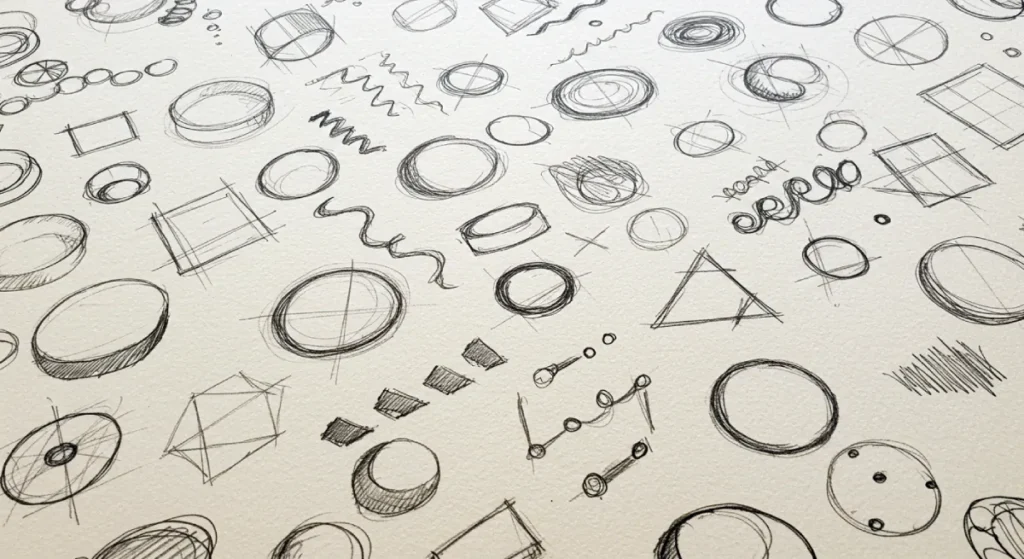
Shape Psychology: The Gestalt Principles
The human brain is wired to find order in chaos. This is described by Gestalt Psychology, a theory developed in the 1920s by German psychologists. It suggests that “the whole is other than the sum of its parts.”
In logo design, shapes are not random; they are vocabulary.
1. Circles, Ovals, and Ellipses
Curved lines imply femininity, community, movement, and eternity. There are no sharp edges to “hurt” the viewer.
- Psychological trigger: Safety, Continuity.
- Example: The Olympic Rings. The interlocking circles represent unity and global continuity.
2. Squares and Rectangles
Straight lines and right angles suggest stability, balance, and efficiency. They are “man-made” shapes that imply structure.
- Psychological trigger: Trust, Professionalism, Strength.
- Example: Microsoft. Four squares. It says, “We are the structure upon which you build.”
3. Triangles
Triangles are dynamic. They have energy and direction. Depending on their orientation, they can be stable (sitting on the base) or unstable/aggressive (inverted or pointing).
- Psychological trigger: Power, Science, Religion, Law.
- Example: Adidas. The mountain shape formed by the three stripes represents the challenges athletes must overcome.
The Hidden Arrow: Negative Space
One of the most powerful tools in a designer’s arsenal is negative space—the space between the elements.
The FedEx Example:
Look closely at the FedEx logo. Between the ‘E’ and the ‘x’, there is a perfect white arrow created by the negative space.
- Why it works: It triggers a “reward” mechanism in the brain. When the viewer discovers the hidden arrow, they feel a moment of cleverness. This “Aha!” moment aids retention. The arrow subconsciously communicates speed and precision without needing to write “We are fast.”
The Shape Semantics Matrix
What is your logo saying behind your back? Check your geometry against this list.
| Shape | Psychological Signal | Best Industry Fit |
| Circle | Unity, Community, Femininity, Safety (No sharp edges). | Non-Profits, Healthcare, Social Media. |
| Square | Stability, Logic, Structure, Trust (Man-made). | Finance, Construction, Law, Tech. |
| Triangle | Power, Direction, Danger, Energy (Sharp edges). | Sports, Transport, Innovation. |
| Vertical Lines | Growth, Ambition, Strength. | Investment, Architecture. |
| Horizontal Lines | Calm, Speed (Motion blur), Community. | Spas, Logistics (IBM). |
Typography Psychology: The Voice in Their Head
When a customer reads your company name, the font determines the “voice” they hear in their head. Typography is the body language of the written word.
The “Bouba/Kiki” Effect
This is a robust psychological finding. In experiments, subjects are shown two shapes: one spiky and jagged, and the other round and bulbous.
They are told that one is called “Kiki”, and the other is “Bouba.” Across cultures and languages, 95% of people identify the spiky shape as Kiki and the round one as Bouba.

- Kiki (Spiky/Sharp): Associated with sharp sounds, precision, danger, or excitement. (e.g., Heavy Metal band logos, Tech startups).
- Bouba (Round/Soft): Associated with soft sounds, comfort, and approachability. (e.g., Disney, Innocent Smoothies).
If you are a luxury spa (Bouba context) using a jagged, sharp font (Kiki visual), you are creating subliminal friction.
Serif vs. Sans Serif
- Serif (with feet): Traditional, established, reliable. Banks, law firms, and luxury fashion brands (such as Vogue and Rolex) utilise serifs to lend authority to their designs by borrowing from history.
- Sans Serif (without feet): Modern, clean, human, accessible. Tech companies (Google, Facebook, Spotify) use Sans Serif to appear user-friendly and forward-thinking.
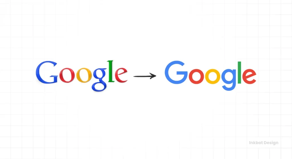
The Google Rebrand (2015):
Google shifted from a Serif font to a Sans Serif “Product Sans.” Why? Because Serifs do not render well on small mobile screens (pixelation issues), and they feel “old internet.” The switch signalled that Google was no longer just a library (Serif) but a utility for daily life (Sans Serif).
| Feature | Serif Fonts (The Traditionalist) | Sans Serif Fonts (The Modernist) |
| Psychological Vibe | Authority, Tradition, Respect, Luxury | Clean, Modern, approachable, Tech-savvy |
| Best Industry Use | Law, Finance, High Fashion, Editorial | Tech, Startups, Manufacturing, Media |
| Brand Example | Times, Tiffany & Co., Rolex | Google, Netflix, Jeep |
| Risk Factor | It can look outdated or “stuffy” | It can look generic or “cheap” |
The Danger of “Blanding”: A Crisis of Distinctiveness
In the last decade, we have seen a trend known as “Blanding.” This is where distinct, quirky logos are flattened into generic, geometric Sans Serif wordmarks. Think of the rebrands of Yves Saint Laurent, Burberry, and Balmain. They all started looking identical.
While this aids readability on mobile devices, it destroys Distinctiveness.
The Ehrenberg-Bass Institute for Marketing Science argues that the primary goal of brand assets is to build “Mental Availability.” You want to be easy to think of. If you look like everyone else, you increase the cost of retrieval for the customer.
The Gap Disaster (2010):
Gap attempted to rebrand by ditching its iconic blue box and elongated serif font for a generic Helvetica font with a gradient square.
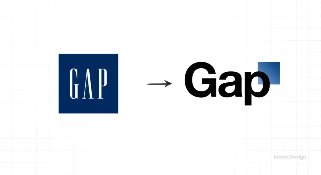
- The Reaction: The public was overwhelmingly negative. It lacked soul. It looked like an accounting firm, not a clothing retailer.
- The Cost: Gap reverted to the old logo after just six days, incurring an estimated $100 million in wasted rollout and PR damage control costs.
- The Lesson: Consumers form emotional bonds with logos. Changing them without a clear strategic upgrade triggers “Loss Aversion.”
If you are considering a rebrand or logo redesign, ensure that you are not sacrificing your distinctiveness on the altar of modern minimalism.
2026 and Beyond: The Rise of Dynamic Branding
As we move through 2026, the static logo is becoming less relevant. We are entering the era of responsive logo design.
This is not just about scaling size; it is about scaling complexity.
- Desktop: Full logo with wordmark and tagline.
- Mobile Header: Icon and Wordmark.
- App Icon/Social Avatar: Simplified Icon only.
Psychological Impact: This consistency across devices builds trust. If your logo is illegible on an iPhone watch, you look incompetent. Competence is a key driver of trust.
We are also seeing the integration of motion. Animated SVGs (Scalable Vector Graphics) that draw themselves or pulse on the screen capture the eye’s “orienting reflex”—an evolutionary trait that causes movement to grab attention, allowing the eye to scan for threats or opportunities. A static logo is passive; a motion logo is active.
The 3-Step Logo Stress Test
Before signing off on the design, conduct a thorough review.
- The “Favicon” Test: Shrink the logo to 16×16 pixels. Is it still recognisable? If it turns into a smudge, it fails.
- The “Fax” Test (Grayscale): Convert it to pure black and white (no greyscale). Does it lose its meaning? If yes, you are over-relying on colour.
- The “Upside Down” Test: Flip it 180 degrees. Does it inadvertently appear to be something rude or weird? (You would be surprised how many logos hide accidental phallic shapes when inverted.)
Principles of Logo Design
Your logos are cluttered, forgettable, and trapped in current trends. This is the fix. Principles of Logo Design is the award-winning blueprint for creating visual marks that stand the test of time. George Bokhua—the master of the clean, iconic line—demystifies the art of minimalism and shows you that less isn’t just more; it’s everything.
As an Amazon Partner, when you buy through our links, we may earn a commission.
The Consultant’s Reality Check
I have audited hundreds of businesses. A common pattern I see is the “Kitchen Sink Syndrome.” An entrepreneur will say:
“We are an eco-friendly construction company that values heritage but uses modern tech. Can we have a green leaf, a hammer, a shield, and a microchip in the logo?”
This is a request for a failure.
When you try to say everything, you say nothing at all. The most psychologically potent logos are often those that convey a clear message.
- Nike: Motion (The Swoosh).
- Apple: Desire (The bitten fruit).
- Target: Focus (The bullseye).
Do not ask your logo to do the job of your sales team. Your logo is the flag on the castle, not the manifesto in the library.
If you are unsure whether your current identity is effective, you may want to review common logo design mistakes that can cheapen a brand.
Alternatively, if you are ready to stop guessing, you can explore our logo design services.
The Verdict
Logo design psychology is not magic, and it is not subjective. It is a calculated application of colour, shape, and form to reduce cognitive load and increase brand recall.
- Simplicity wins: High processing fluency equals trust.
- Context is king: Blue is only good if your competitors aren’t all blue.
- Consistency builds equity: Don’t change your logo because you are bored. Change it only if it is broken.
If your brand identity was created on a whim or if you bought it for £50 on a crowdsourcing site, you are likely leaving money on the table. Your logo is the face of your business. Make sure it isn’t pulling a weird expression.
Next Step: Are you concerned your current logo is sending the wrong psychological signals? You can request a quote for a professional audit and redesign today.
Frequently Asked Questions (FAQ)
What is the most trusted colour in logo design?
Blue is statistically the most associated with trust, security, and competence, which is why it is favoured by banks and tech firms (e.g., PayPal, Facebook). However, context matters; in the food industry, blue can be unappetising.
Does a logo need to show what the business does?
No. In fact, literal logos often look amateurish. Apple does not sell fruit; Starbucks does not sell mermaids. A logo should be an identifier, not a descriptor. It should embody the brand’s essence, not its inventory.
Why are simple logos better for psychology?
Simple logos rely on “Processing Fluency.” The human brain tends to prefer visual stimuli that are easy to process. Simple shapes are memorised faster and recognised more easily, leading to a more positive emotional response.
What is the “Von Restorff Effect” in branding?
Also known as the Isolation Effect, it predicts that an item that “stands out like a sore thumb” is more likely to be remembered. If all your competitors use red, a black logo will be psychologically more distinct and memorable.
How much should I spend on a logo design?
Logo design cost varies wildly. A cheap template (£50) risks copyright issues and genericism. Professional agencies typically charge between £2,000 and £15,000+, depending on the strategy, research, and usage rights required.
What is a responsive logo?
A responsive logo adapts its layout or complexity according to the screen size. It might be a full wordmark on a desktop, but simplified to just an icon on a mobile app to maintain legibility.
Why did the Gap rebrand fail?
The 2010 Gap rebrand failed due to “Loss Aversion.” Consumers had a deep emotional connection to the classic blue box. The new design was generic and lacked the brand’s heritage, sparking a consumer revolt.
What font is best for a luxury brand?
Serif fonts are generally preferred for luxury brands (e.g., Vogue, Gucci). They imply history, tradition, and craftsmanship. Minimalist Sans Serif fonts are gaining popularity, but can sometimes feel too utilitarian for high-end goods.
Can a logo change customer behaviour?
Yes. Studies show that visual cues can prime behaviour. For example, exposure to “discount” colours (red/yellow) can trigger impulse buying, while “luxury” cues (black/gold) can increase willingness to pay a premium price.
What are the best file formats for logos?
You must have Vector formats (AI, EPS, SVG). These allow the logo to be scaled infinitely without pixelating. Raster files (JPG, PNG) are for web use only and are not suitable for print master files. Read more about logo file formats.
