The Reebok Logo: Brand Identity Crisis and Redemption
If you want a masterclass in how not to manage a brand’s visual heritage before finally getting it right, look no further than Reebok.
For entrepreneurs and business owners, the history of the Reebok logo is more than just trivia about trainers. It is a volatile, high-stakes lesson in consistency, audience alienation, and the immense cost of trying to fix what isn’t broken.
We often look to giants like Nike or Apple for logo design inspiration, praising their unwavering consistency. Reebok, conversely, offers a different kind of value: it shows us what happens when a brand has an identity crisis on a global stage.
From the Union Jack to the aggressive “Vector,” to the sterile “Delta,” and back again—this is the definitive analysis of the Reebok visual identity.
- Reebok’s repeated logo changes harmed brand equity; consistency drives recognition and long‑term value.
- The Vector succeeded by embodying speed, distinctiveness and cultural cool; the Delta alienated core consumers.
- Heritage is an asset: restoring the Vector leveraged nostalgia and repaired market position.
The Origins: J.W. Foster and the Union Jack (1895–1986)

Before we explore the sharp angles we know today, we must examine their roots. Reebok started as J.W. Foster and Sons in Bolton, Lancashire.
Why does this matter to a modern business owner? Provenance.
For nearly a century, the brand leaned heavily on the Union Jack. In the design world, we refer to this as leveraging “Country of Origin” equity. At the time, British manufacturing was associated with quality, craftsmanship, and athletic pedigree.
The logo wasn’t minimal. It was literal. It shouted, “We are British, and we make fast shoes.”
The Strategic Shift:
In 1958, the grandsons of the founder renamed the company Reebok (after the Grey Rhebok, an African antelope). Yet, they kept the flag.
Don’t be ashamed of where you come from. If you are a local coffee roaster in Seattle or a tech firm in Berlin, your location can be a badge of quality. However, realise that as you scale globally, specific national flags can sometimes become political baggage or limiting factors. Reebok eventually dropped the flag, not because they hated Britain, but because they wanted to be a global citizen.
The Golden Era: The “Vector” (1986–2014)
This is the icon. If you grew up in the ’90s, this is Reebok.
In 1986, Reebok moved away from the literal flag and introduced the Vector logo. This abstract mark was designed to signify speed, movement, and positive trajectory. It coincided with the brand’s explosion in the US market.
Deconstructing the Design
The Vector is a brilliant piece of abstract geometry. It consists of two distinct elements:
- The Side Stripe: Represents the track or the path.
- The Cross Check: Represents the athlete crossing the line.
Mathematically, it creates a sense of forward momentum. If we examine the angular velocity implied by the design, the “Cross Check” intersects the stripe at an acute angle, roughly 30 degrees to 45 degrees, creating visual tension and energy.
The Vector strikes this balance perfectly. It is rigid enough to look stable (trustworthy) but angled enough to look fast (athletic).
Why it Worked:
- Scalability: It looked good on the side of a shoe, a t-shirt, or a stadium banner.
- Distinctiveness: It didn’t look like the Nike Swoosh (fluid) or the Adidas Stripes (regimented). It was aggressive.
- Cultural Impact: This was the logo of the Reebok Pump. It was the logo of Shaq. It had “street cred.”
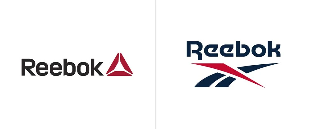
The “Delta” Disaster: The Pivot to Fitness (2014–2019)
Here is where the story gets painful for design purists.
In 2014, Reebok decided it was no longer a sports brand for professional athletes. It aimed to be the brand for fitness—specifically, for the CrossFit, Spartan Races, and “Tough Mudder” crowds.
To signal this shift, they ditched the iconic Vector and introduced the Delta.
The Design Critique
The Delta is a triangle composed of three distinct trapezoidal segments. Reebok claimed these represented the physical, mental, and social changes that occur through fitness.
My Professional Opinion:
It looked like a bank logo. Or perhaps an antivirus software icon.
By adopting the Delta, Reebok committed a cardinal branding sin: They threw away their visual equity.
Imagine if Mercedes-Benz suddenly replaced its three-pointed star with a generic square because it wanted to focus on “safety.” Consumers would be baffled. That is exactly what happened here.
- The Problem: It was sterile. It lacked the aggression and “cool factor” of the Vector.
- The Alienation: The “Sneakerheads” (a massive market) hated it. You cannot sell a retro-style “Classic” sneaker featuring a futuristic corporate logo in the form of a triangle. It clashes visually and thematically.
Nicheing down too hard can kill your mass appeal. Reebok tailored its entire visual identity to the CrossFit community (a niche) and alienated the general lifestyle market (the masses). Unless you are exclusively serving a micro-niche, do not let a sub-segment dictate your entire brand hierarchy.
The Return of the King: Restoring the Vector (2019–Present)
Sanity prevailed.
In late 2019, Reebok announced that it was unifying its brand under the original Vector logo and the “drop-R” wordmark.
Why? Because Nostalgia is a currency.
We are living in an era of “Retromania.” Brands like Champion, Fila, and Ellesse made massive comebacks not by innovating, but by digging into their archives. Reebok realised they were sitting on a goldmine of 90s heritage that the Delta logo was actively suppressing.
The “new” Vector is slightly refined. The curves are smoother, and the spacing is optimised for digital screens, but the soul is back.
| Feature | The Union Jack | The Classic Vector | The Delta | The Modern Vector |
| Primary Association | Quality, Heritage | Speed, 90s Culture, Shaq | CrossFit, Gyms, Software | Lifestyle, Retro-Cool |
| Visual Energy | Static (Stately) | Kinetic (High Energy) | Static (Balanced) | Kinetic (Refined) |
| Readability | High | High | Medium | High |
| Market Reception | Respectful | Iconic | Confused | Celebratory |
Typography: The “Motter Tektura” Factor
We cannot discuss the Reebok logo without discussing the font. The type is just as important as the symbol.
The original and most famous Reebok font was a custom typeface heavily inspired by Motter Tektura.
Why is this font effective?
- The “Drop-R”: The distinct gap in the letter ‘R’ and the ‘k’ created a futuristic, stencil-like aesthetic.
- Weight: It is bold and sans-serif. It commands attention.
During the Delta era, the font was refined to a generic, geometric sans-serif style. It was clean, yes, but it was boring. The return to the Vector brought back a modified version of the classic font—cleaner than the 80s version, but with the character restored.
If you are looking to update your typography, consider professional logo design services rather than simply selecting a font from Word.
The nuance in kerning (the space between letters) and weight distribution makes the difference between a “brand” and a “project.”
Strategic Analysis: Why the Flip-Flopping Hurts
Reebok’s logo history is a warning sign about Brand Consistency.
Every time you change your logo, you reset your relationship with the customer.
- Cognitive Load: Customers have to “re-learn” who you are.
- Production Costs: Changing signage, packaging, uniforms, and digital assets is a costly endeavour.
- Counterfeiting: Frequent changes make it easier for counterfeiters to pass off fake goods, as consumers aren’t sure what the “current” logo is supposed to look like.
Comparative Case Study:
- Nike has used the Swoosh since 1971. Minimal changes. Result: arguably the most recognised logo on earth.
- Adidas uses the “Trefoil” (Heritage) and the “Three Bars” (Performance) logos. They separate the lines but keep the concept (three stripes) consistent.
- Reebok: Switched from Flag > Vector > Triangle > Vector. Result: confusion and a loss of market share in the 2010s.
5 Actionable Branding Lessons for Entrepreneurs
Based on Reebok’s journey, here is what you need to apply to your business immediately:
1. Heritage is an Asset, Not Baggage
I often see small businesses trying to look “modern” by erasing their history. If you have been in business for 20 years, flaunt it. Retro is in. Trust is built on longevity. Don’t delete your founding date from your logo just to look like a startup.
2. Separate “Corporate” from “Consumer”
Reebok’s mistake with the Delta was forcing a corporate shift (to fitness) onto consumer lifestyle products. If you want to pivot your business strategy, you don’t always need to nuke your visual identity.
3. The “T-Shirt Test”
When designing your logo, ask yourself: Would someone wear this on a t-shirt if they didn’t work for me?
- The Vector? Yes. It looks cool.
- The Delta? No. It looks like a uniform for a gym employee.
- Your Logo: Does it have aesthetic value beyond being a label?
4. Consistency Compound Interest
Think of brand recognition like compound interest in a bank account.
Every time you undergo a dramatic rebrand, you start from scratch. You lose the compound growth of recognition. Stick to your guns unless the brand is toxic.
5. Don’t Chase Trends
The Delta logo was a victim of the “Flat Design” and “Minimalist” trend of the early 2010s. Trends fade. Styles like the Union Jack or the Vector were born out of the company’s DNA, not a Pinterest mood board. Design from the inside out, not the outside in.
Conclusion: The Visual Equity of Redemption
Reebok’s return to the Vector logo in 2020 was not a step backwards; it was a realisation of value. They understood that in a crowded marketplace, being “Reebok” (the heritage brand) was more valuable than being “Generic Fitness Brand B.
For the entrepreneur, the takeaway is clear: Know who you are.
Your logo is the shorthand for your reputation. If you keep changing the shorthand, people stop reading the message. Whether you are selling trainers or tax services, build a mark that stands for something, and then have the courage to stick with it.
Is your current branding telling the right story, or are you suffering from your own “Delta” moment?
If you are unsure if your brand identity has the longevity to survive the next decade, it might be time for a professional audit.
Next Step: Would you like me to analyse your current logo against these principles of longevity and scalability? You can also request a quote for a complete identity refresh that respects your history while looking forward.
Frequently Asked Questions (FAQ)
What is the Reebok symbol called?
The most famous Reebok symbol is called the Vector. It features an abstract representation of a side stripe and a cross-check, symbolising speed and movement. The triangular logo used from 2014–2019 is called the Delta.
Why did Reebok change its logo to a triangle?
In 2014, Reebok pivoted its business focus entirely to fitness (CrossFit, Yoga, Training) rather than general sports. The Delta symbol represented the three pillars of positive change: physical, mental, and social.
Did Reebok revert to its old logo?
Yes. In late 2019/2020, Reebok unified its brand under a refined version of the classic Vector logo and the original “drop-R” wordmark, effectively retiring the Delta for most products.
Why did Reebok remove the Union Jack?
While the Union Jack represented their quality roots, Reebok removed it from the primary logo in 1986 to appeal to a broader global market and to position themselves as a performance brand rather than just a British novelty.
What font is the Reebok logo?
The classic Reebok logotype is a custom design, but it is heavily based on the typeface Motter Tektura. The modern iteration creates a proprietary font based on those original geometric shapes.
Who designed the Reebok Vector logo?
The exact individual designer of the 1986 Vector is often debated within internal corporate history, but it was developed during the era when Paul Fireman (the distributor who brought Reebok to the US) was pushing for a more aggressive, speed-focused identity to compete with Nike.
Is the Reebok Delta logo still used?
It is rarely used on new lifestyle products. You may still find it on specific technical apparel or older inventory, but the Vector is now the primary brand mark across footwear and apparel.
What does the Reebok name mean?
The name originates from the Afrikaans spelling of “rhebok,” a type of African antelope or gazelle. It was chosen to represent speed, grace, and agility.
How does the Reebok logo compare to Nike and Adidas?
Nike’s Swoosh suggests fluid motion. Adidas’s Three Stripes suggest structure and performance. Reebok’s Vector suggests aggressive speed and intersection. All three rely on simple geometric shapes, but Reebok has struggled the most with consistency over the years.
Should I use a retro logo for my business?
If your business has a history, yes. “Heritage branding” builds trust. If you are a brand-new startup, using a “fake retro” style can work if it fits your niche (e.g., a barbershop or craft brewery), but be careful not to look dated instantly.
How much does a rebrand like Reebok’s cost?
A global rebrand for a company of Reebok’s size costs millions. This includes agency fees, market research, and the physical cost of changing retail signage, packaging, and product moulds worldwide.
Why is the “Drop-R” important?
In typography, distinct features create recognition. The “Drop-R” (where the right leg of the R doesn’t connect fully) acts as a visual hook. It makes the word image unique, so the brain recognises it as a logo, not just text.
