7 Reasons Redesigning Your Logo Drives Real Business Growth
Your logo is not a piece of art. It’s a piece of equipment. It’s a tool that’s supposed to do a particular job for your business.
Yet most businesses treat their logo like a framed painting they hung on the wall a decade ago.
They know it’s there, they’re used to it, and they never consider if it’s working for them anymore. The prevailing wisdom is “if it ain’t broke, don’t fix it.”
This is a dangerously passive approach.
An outdated, misaligned, or technically flawed logo isn’t just “not broken”—it’s actively costing you. It confuses potential customers, undermines your price point, and makes you look irrelevant.
Redesigning your logo isn’t a vanity project. It’s a strategic business decision. It’s about taking a critical piece of your business machinery, sharpening it, and putting it back to work. This article isn’t about colours or fonts. It’s about the seven strategic business cases for a logo redesign.
- A logo is a strategic tool, not just art; it should evolve with your business needs.
- Redesigning signals market repositioning, helps differentiate from competitors, and clarifies brand value.
- Technical failures in logos can hinder branding efforts; simplicity enhances recognition and recall.
- A logo's outdated aesthetics can alienate modern audiences; a redesign aligns visual identity with current values.
First, Let’s Be Honest About Why Most Redesigns Happen
Before we get into the legitimate reasons, let’s clear the air. Many redesign projects are launched for terrible reasons that are doomed from the start. They are born from emotion, not strategy.
The “Founder is Bored” Redesign
This happens when a founder or CEO has been staring at the same logo for years and gets tired of it. They crave something new and fresh, not because the business needs it, but because they need it. This is the business equivalent of buying a sports car during a midlife crisis. It’s expensive and solves no real problem.
The “Our Competitor Just Did It” Redesign
A competitor unveils a slick new brand identity, and panic sets in. The immediate reaction is to copy them, to modernise just to keep up. This reactive approach puts you in a permanent game of catch-up and often leads to adopting trends that don’t fit your brand, a phenomenon known as “blanding.
The “Design by Committee” Disaster
This is the most painful one to watch. A logo design process is opened up to the entire management team, the marketing department, and maybe even the CEO’s spouse.
Everyone gets a vote. The result is always the same: a compromised, safe, and utterly forgettable design that tries to please everyone and inspires no one. It’s a camel designed by a committee to build a horse.
If your motivation for a redesign falls into one of these categories, stop. You’re not ready. A fundamental redesign requires a genuine business reason.
Reason 1: Your Business Has Fundamentally Changed
The most straightforward reason for a redesign is that your business today is not the business you were when the logo was created. A logo designed for a local one-person consultancy poorly fits a 50-person national firm.
Your logo is a visual summary of your business promise. When that promise changes, the summary must be updated.
You’ve Pivoted Your Services or Products
Imagine a local bakery whose logo features a quaint illustration of a loaf of bread. For years, it was perfect. But now, they’ve pivoted.
They’ve closed their storefront and become a national e-commerce business shipping high-end cake decorating kits. The cosy bread logo isn’t just irrelevant; it’s misleading new customers about what they do.
You’re Targeting New Geographic Markets
A name or symbol that works perfectly in one culture can have unintended meanings in another. As you expand, your visual identity must be vetted for global appeal and appropriateness. A logo with a hyper-local reference will fail to connect with an international audience.
You’ve Merged or Acquired Another Company
This is a clear-cut case. A merger creates a new entity with a combined vision and culture. Sticking with one of the old logos signals that it’s a takeover, not a partnership, potentially alienating employees and customers of the other company. A new, unified identity is required to signal a fresh start.
Reason 2: You Need to Reposition Your Brand in the Market
Sometimes your business model is the same, but you must change how people perceive it. A logo redesign is the most visible and immediate way to signal a shift in market position.
To Command a Higher Price (Moving Upmarket)
You’ve improved your quality, refined your service, and increased your prices. But does your brand look expensive? If your logo still screams “cheap and cheerful,” you’ll face constant resistance to your premium pricing. Perception is reality.
Look at Burberry. For years, they struggled with a reputation more tied to football terraces than high fashion. Under Riccardo Tisci, they dropped their classic Equestrian Knight logo for a stark, minimalist, all-caps wordmark.
The move was a clear signal: this is a new, modern, and unapologetically high-end luxury brand. It was designed to appeal to a new generation of global luxury consumers.
To Shed an Outdated or Unwanted Reputation
Brands can accumulate baggage. Perhaps your company was known for poor customer service in the past, or its products were seen as technologically behind. A bold visual change and genuine operational improvements can be a powerful statement that the old ways are gone.
To Connect With a Completely New Audience
The visual language that connected with Baby Boomers is not the same as that that connects with Gen Z. If your growth depends on capturing a new demographic, you need to speak their visual language.
This might mean simplifying, using bolder colours, or adopting a tone that feels more current and less corporate.
Reason 3: Your Current Logo is a Technical Failure
This is the least glamorous reason, but it’s often the most urgent. Your logo might look fine on your website’s homepage, but it fails miserably in the many other places it needs to exist in 2025.
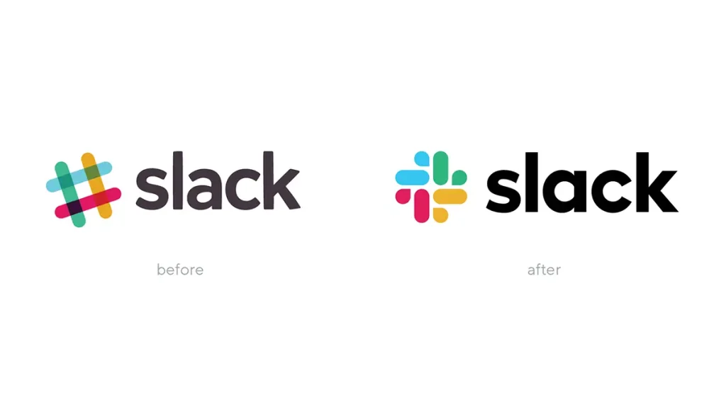
It Fails at Small Sizes (The Favicon Test)
Shrink your logo to 16×16 pixels, the size of a browser tab favicon. Is it a recognisable symbol or an unreadable smudge?
In an era of app icons and social media profile pictures, a logo must be legible and impactful at tiny sizes. Intricate details and thin lines that looked great on a business card in 2005 are a liability today.
A perfect case study is Slack. Their original logo was a colourful hashtag. The problem? It was set at a specific angle and contained 11 different colours, making it incredibly difficult to place on any background that wasn’t white. It was an infamous technical headache.
Their 2019 redesign to the simpler, pinwheel-like shape solved this. It uses fewer colours and works consistently at any size and background. It was a redesign driven by pure practicality.
It’s Too Complex for Modern Applications
How much does it cost to embroider your logo on a shirt? If it’s full of gradients and complex details, the answer is “a lot,” and the result will probably look bad.
A simpler logo is cheaper and easier to reproduce across various physical media, from company signage to promotional products.
It Lacks a Functional Visual System
A logo isn’t just one image file. A modern brand needs a comprehensive visual system: a primary logo, a secondary version, a wordmark, a symbol-only version (icon), and clear rules for using them.
If all you have is a single JPG file your original designer emailed you seven years ago, you don’t have a brand identity; you have a picture.
Reason 4: You Need to Reconnect with a Modern Audience
Sometimes, a logo doesn’t have technical flaws but feels old. Like fashion or architecture, design aesthetics evolve. Clinging to a dated look can make your business seem out of touch.
Your Look is Genuinely Dated
The most famous example is Instagram. Their original logo was a detailed, skeuomorphic illustration of a Polaroid camera. It was charming, but by 2016, the design world had moved to a flatter, simpler aesthetic.
Their switch to the now-iconic simple camera outline with a vibrant gradient was a textbook move in modernisation. It aligned the app’s look with the modern interface of the smartphones it lived on.
It No Longer Reflects Your Company’s Values
Company culture changes. A business founded with a formal, corporate identity might evolve to be more innovative, fun, and employee-centric. A stiff, serif wordmark might no longer represent who you are.
The redesign becomes a way to broadcast your internal culture externally, helping to attract both customers and talent who align with your new values.
Reason 5: To Differentiate in a Sea of Sameness

When you started your business, your logo might have been unique. But now your market is saturated, and half of your competitors have logos that look suspiciously like yours.
You’ve Fallen Into an Industry Cliche
Every industry has them. Tech startups get a clean, sans-serif wordmark. Coffee shops get a crossed-cup-and-bean stamp. Eco-friendly brands get a green leaf. Following these cliches makes you invisible.
A strategic redesign can be a deliberate move to break category conventions and create a genuinely distinctive, memorable mark.
To Improve Brand Recall and Recognition
Which logos are most memorable? The simplest ones. The Nike swoosh. The Apple apple. The Target bullseye. Complex, busy logos are hard for the human brain to process and remember.
Simplifying a logo by focusing on a single, strong concept makes it easier to recognise and recall, which is a massive advantage in a crowded market.
Reason 6: To Signal Growth and Professionalism
The logo you designed in Canva when you were a one-person operation served its purpose. It got you started. But now you have 20 employees and are pitching for six-figure contracts. That DIY logo is holding you back.
Graduating From “Startup” to “Established Player”
A polished, professional logo communicates stability and credibility. It tells potential customers you are a serious, well-run organisation, not a fly-by-night operation. It builds trust before they’ve even spoken to you.
The delivery service GoPuff recently underwent a redesign in 2024. Their old logo was quirky and had a distinct startup feel. Their new identity is bolder, cleaner, and more structured.
It’s a visual signal that they have moved beyond their scrappy beginnings and are now a major, established player in the logistics space.
To Build Trust with Higher-Value Clients
Every detail matters when trying to land bigger clients or justify a premium price. A sophisticated brand identity shows an investment in your business and an attention to detail that implies you’ll bring the same care to their projects.
Reason 7: To Radically Simplify Your Message

Over time, brands accumulate clutter. Taglines, extra swooshes, and “.com” additions get bolted onto logos. A redesign is an opportunity for a clean slate.
Removing Years of Accumulated Visual Clutter
The best redesigns often involve subtraction, not addition. It’s about stripping away everything non-essential to reveal the core idea. This process of simplification forces you to clarify your brand’s message. What is the one thing you want your logo to communicate?
Creating a Timeless Mark That Lasts
The simpler a logo is, the more likely it is to stand the test of time. Ornate details and trendy fonts date quickly. A clean, classic logomark or wordmark can stay relevant for decades. The goal of simplification isn’t just to look modern today; it’s to avoid looking dated tomorrow.
But Be Warned: A Redesign Is Not Without Risk
When done for the right reasons, a redesign is a powerful tool. But a poorly executed one can be a disaster. It’s not a decision to be taken lightly.
The Danger of Alienating Your Loyal Customers
Your existing customers have a relationship with your current logo. It’s familiar. A radical change can feel jarring and break that connection, especially if they think they weren’t considered.
The cautionary tale every designer knows is The Gap’s failed 2010 redesign. They abruptly switched their classic, beloved blue box logo for a generic wordmark with a small gradient square.
The public backlash from loyal customers was so swift and severe that they were forced to revert to the old logo in less than a week. They ignored decades of brand equity and paid the price.
The Hidden Costs of Implementation
The fee for the designer is just the beginning. You have to update everything. Your website. Your business cards. Your social media profiles. Your company vehicles. Your building signage. Your employee uniforms. Your invoices.
The list is long, and the total cost of implementation can far exceed the price of the design itself. This needs to be budgeted for from day one.
A Simple Test: Do You Need a Logo Redesign?
If you’re still unsure, ask yourself these direct questions. If the answer to two or more is “yes,” it’s time to have a serious conversation about a redesign.
- Is your business strategy or target audience significantly different from when your logo was created?
- Does your logo look blurry, complex, or unreadable as a social media profile picture or browser favicon?
- Is your logo visually out of place or less professional when seen next to your top three competitors?
- Are you embarrassed to hand out your business card because you feel it no longer represents the quality of your work?
- Does your current logo contain dated visual elements like gradients, drop shadows, or overly complex illustrations from a bygone design era?
- Are you raising your prices significantly or trying to attract a more premium clientele?
Answering these honestly will give you your answer.
A logo is a tool for a job. If that job has changed, you need a new tool. Redesigning your logo isn’t about chasing trends or indulging a whim. It’s about strategic alignment.
It’s about ensuring your most visible brand asset works as hard for your business as you are. When done right, it isn’t an expense—it’s one of the best investments you can make in your future growth.
If asking these questions has made you realise it might be time for a professional review, you’re already on the right track. A proper logo design process isn’t about picking colours; it’s about aligning your visual identity with your business goals. When you’re ready to see what that process involves for your brand, you can request a quote from our team at Inkbot Design.
Frequently Asked Questions (FAQs)
What is the main benefit of redesigning a logo?
The main advantage is strategic alignment. It ensures your most visible brand asset accurately reflects your current business goals, target audience, and market position, which can lead to improved customer perception, differentiation, and trust.
How often should a business redesign its logo?
There’s no set timeline. A redesign should be driven by business strategy, not the calendar. Revisit your logo’s effectiveness when your business undergoes a significant change, such as a new target market, a considerable service pivot, or a merger.
What is the difference between a logo refresh and a redesign?
A logo refresh involves minor tweaks to an existing logo to modernise it without altering its core concept (e.g., changing the font slightly, adjusting colours). A redesign is a more significant change, often resulting in an entirely new logo concept.
Can redesigning my logo hurt my brand?
Yes. If the redesign is poorly executed, ignores existing brand equity, or alienates loyal customers, it can cause significant damage. The 2010 Gap redesign is a classic example of this.
How do I know if my logo is outdated?
Signs of an obsolete logo include over-complex details that don’t scale down, skeuomorphic or 3D effects, dated typography (like heavy serifs from the 90s), and a general aesthetic that aligns with a previous decade’s design trends.
Is a logo redesign expensive?
The cost varies wildly. A professional redesign is an investment. Remember to budget for the design fee and the cost of implementing the new logo across all your brand assets (website, signage, print materials, etc.).
Should I involve my customers in the redesign process?
Involving customers directly in design decisions can be risky (design by committee). However, gathering feedback on their perception of your current brand and what they value about your business is wise before you begin the design process.
What’s the first step in a logo redesign project?
The first step is strategy, not design. Begin with a brand audit. Clearly define why you are redesigning, what you want the new logo to communicate, and who you are trying to reach.
Can a simple logo really be effective?
Yes, often the simplest logos are the most effective. Simple, iconic marks like the Nike swoosh or the Apple logo are highly memorable, versatile, and timeless.
What if I like my current logo, but it has technical problems?
This is an excellent case for a logo “refresh” rather than a complete redesign. A skilled designer can simplify the logo for better versatility (e.g., for favicons) and create a complete visual system without losing the core equity of your original mark.

