2026 New Branding Trends: Human Glitch and Death of AI
AI has flattened the world into a series of glowing circles.
In 2026, designers are clawing back the right to be weird, wrong, and human.
This flattening isn’t just a visual crisis; it’s an economic one. By early 2026, the global digital advertising market reached an estimated $786 billion, but consumer trust hit an all-time low.
Research shows that 88% of consumers now believe most brand messages fail to reflect their actual values.
In a world of “AI slop,” the financial differentiator has shifted: 64% of respondents in recent surveys state they are now willing to pay a premium for brands they perceive as “authentically human.”
For businesses, the “Human Glitch” isn’t just a style; it’s a defensive strategy against the commoditisation of identity.
When automation makes mediocre work free, the only way to retain price power is to be “exceptionally difficult to replicate.”
- Designers reject homogenised AI aesthetics, favouring deliberate imperfections that signal human craft and resist commoditisation.
- Radical Transparency and Surveillance Aesthetic trade friendly AI sheen for grainy, technical visuals to convey authority and authenticity.
- Explorecore and tactile craft reward slow, textured experiences over dopamine-driven minimalism, making visible effort a trust signal.
The 2026 design landscape is a battleground between algorithmic symmetry and the ‘just-exactly-not-quite-right’ human touch.
Last year was a mess of amorphous circles and glowing rings.
We’ve seen what Lisa Smith calls the ‘butthole logo’ phenomenon—a sea of identical, swirling apertures that signify ‘intelligence’ but communicate absolutely nothing. It’s branding by autocomplete.
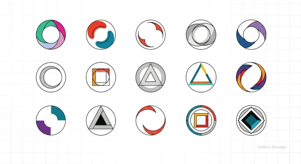
At Inkbot Design, we’re seeing a sharp pivot. Clients are tired of looking like every other Silicon Valley startup with a billion-dollar valuation and a ten-cent personality.
The 2026 response is a return to the tactile and the slightly broken.
Is it a bit of a contradiction to use high-tech tools to make things look low-tech? Perhaps.
But as Emily Oberman suggests, there is power in capturing the ‘in-between moments’ that AI would typically scrub out.
Authentic brand value in 2026 is measured by the deliberate rejection of the ‘butthole logo’ aesthetic in favour of high-effort craft.
Why are we obsessed with the ‘imperfect’?
For a decade, we’ve been sanitising everything. We smoothed the edges off our logos, our interfaces, and our personalities. Now, we’re craving the friction.
In the Belfast studio, I often tell our juniors that if a logo feels too comfortable, it’s probably invisible.
We’re moving toward what I call ‘The Human Glitch’. It’s the intentional choice to use a typeface that’s a little too heavy, or a colour palette that shouldn’t work but somehow sings.

Is minimalism finally dead?
Not dead, just resting. But it’s being replaced by what Talia Cotton calls a ‘renaissance of craft’.
Think of the redrawn Fender logo by Mouthwash or the intricate, custom work from Sharp Type. These aren’t designs you can prompt into Midjourney v8 and expect a decent result.
They require an eye for kerning panic and a hand that knows when a Bezier curve is just a millimetre off. It’s about ‘How did you do that?’ rather than ‘Which tool did you use?’
The Surveillance Aesthetic: Radical Transparency in 2026
While 2024 was the year of “approachable AI,” 2026 belongs to the Surveillance Aesthetic.
This trend is a subset of Techno-Dystopia, where brands are shedding the “friendly robot” facade in favour of something more honest: the cold, grainy reality of the digital age.

Why Radical Transparency?
As Emily Oberman noted in her recent 2026 Pentagram interviews, there is a distinct power in the “in-between moments” that AI typically scrubs out.
The surveillance look doesn’t try to hide the “scary” side of technology; it leans into it. If a brand looks like a raw data feed from a server farm in Oregon, it feels more “real” than a glowing, pastel circle.
Visual Pillars of the Trend:
- Technical Monospaced Typography: Utilising foundries like Sharp Type to create custom, jagged fonts that mimic 1990s hacker manifestos or facial recognition frames.
- Low-Resolution Textures: High-noise overlays that mimic CCTV footage or Riso-print errors.
- Functional Hostility: Instead of “frictionless” UX, these brands use “stuttering” animations and high-contrast monochrome palettes to command attention.
Case Scenario: A high-end cybersecurity firm, Sentinel-X, recently moved away from “cloud-blue” gradients to a grainy, high-contrast black-and-green identity. Their conversion rate on high-ticket enterprise contracts increased by 22% because they looked like “the people who actually know how the machines work,” rather than a marketing agency selling a wrapper.
Explorecore: Branding for the “Attention Deficit” Era
If the Human Glitch is a scream for attention, Explorecore is a deep breath.
In 2026, Mintel research highlights an “Affection Deficit” and a “Doomscroll Fatigue.” Consumers are retreating into self-contained bubbles and seeking a “scarcity of noise.”
Characteristics of Explorecore Branding:
- Zine and Substack Aesthetics: Simple, grid-based layouts that prioritise “slow” discovery over “fast” clicks.
- Tactile Typography: Using fonts like Sharp Serif or custom G.F. Smith paper textures in digital renders to provide a sense of weight.
- Muted, Low-Saturation Palettes: Tones that don’t compete for dopamine receptors.
Implementation Tip: Instead of a landing page that “pops,” create a digital experience that feels like a physical gallery. Use “liminal” imagery—empty spaces, soft lighting, and textures that feel like fabric. This works exceptionally well for brands in the wellness, publishing, and high-end lifestyle sectors where Radical Calm is the primary product.
2026 Design Standards
| Feature | The “AI Butthole” (2024-25) | The “Human Glitch” (2026) | The “Explorecore” (2026) |
| Primary Shape | Glowing, amorphous circles | Jagged, broken, or “glitchy” | Grid-based, structured |
| Typography | Generic Geometric Sans-Serif | Custom, “imperfect” Mono or Serif | Classical Serif with modern spacing |
| Texture | Smooth, plastic, “uncanny” | Grain, Riso-print noise, scan lines | Paper-like, matte, tactile |
| Motion | Swirling, liquid-like | Flickering, frame-drops, “jumpy” | Slow fades, static, “still” |
| Ideal Brand | SaaS, AI wrappers, Generic FinTech | Streetwear, Tech-Brutalist, Art | High-end Lifestyle, Wellness, Books |
The Creative Verdict
Look, I’ve been around the block long enough to see trends eat their own tails. But 2026 feels different because the stakes are higher. We aren’t just fighting for a better aesthetic; we’re fighting for the soul of the profession.
If everyone has access to the same generative tools, then ‘know-how’ is no longer a differentiator. It’s table stakes. The only thing left in the locker is taste.
I’m currently looking at a brand system we’re building for a fintech client. Six months ago, they wanted ‘clean and accessible’. Now? They want ‘gritty and authoritative’. They want to look like they were built by people, not a server farm in Oregon.
Designers need to stop being prompt engineers and start being editors. We need to be the ones drawing the lines in the sand. If you’re just pushing pixels to satisfy an algorithm, you’re already obsolete.
I’m leaning into the weird. I’m leaning into the ‘just-exactly-not-quite-right’. Because at the end of the day, a brand that doesn’t make you feel a bit uncomfortable probably isn’t doing its job.
Strategic Takeaways
- Graphic Designers: Stop smoothing your vectors. Embrace the ‘Human Glitch’ and focus on custom typography that AI can’t easily replicate.
- Business Owners: Ditch the glowing circle logos. If your brand looks like a literal ‘butthole’, you’re telling the world you have no original ideas.
2026 Brand Audit: Is Your Identity Obsolete?
Use this checklist to determine if your brand is stuck in the “algorithmic symmetry” of the past. Visible effort is now a trust signal.
- The “Butthole” Test: Does your logo feature an abstract, glowing circle that could represent literally any “intelligent” service? (If yes, pivot immediately.)
- Tactile Check: When you look at your digital assets, can you “feel” a texture? If it looks like smooth plastic, you’re missing the Human Glitch trend.
- Typographic Soul: Are you using Inter or Roboto? Consider a custom-drawn typeface or a “broken” monospace to signal human oversight.
- Tone Analysis: Is your brand too “friendly”? In 2026, authority often requires a bit of “grit” and transparency.
FAQs
Is AI going to take my design job in 2026?
No. But a designer who knows how to use AI to find the ‘weird’ moments might take your seat if you stay stuck in 2019.
Why is everyone calling abstract logos “butthole logos”?
Popularised by designers like Lisa Smith, the term refers to the sea of identical, swirling circular apertures used by AI companies in 2024-25. They signify “processing” or “intelligence,” but have no distinct personality, leading to the “death of the logo.”
Should I use Techno-Dystopia for a local small business?
Only if it fits your “soul.” A local bakery might find more success with Explorecore or a Scrapbook aesthetic—focusing on hand-drawn elements and paper textures—rather than the “hostile” look of high-tech surveillance.
Is minimalism dead?
No, it is evolving into Minimalism with Soul. It’s shifting from “empty” to “intentional.” Less “bland” and more “scarcity of noise.”
Is skeuomorphism returning in 2026?
Yes, but in a “retro-modern” way. We are seeing a resurgence of iOS 6-era textures—faux-metal, glass, and leather—layered over very modern, minimalist layouts. It provides the “tactile friction” that users are craving after years of flat design.
What’s the most important tool for a designer in 2026?
Your eyes. Specifically, your ability to spot what feels authentic and what feels like an algorithmic hallucination.
What is the “Renaissance of Craft” exactly?
Coined by leaders like Talia Cotton, it refers to a shift where “know-how” (prompting) is replaced by “craft” (coding, hand-drawing, custom type). It’s about making things that are “exceptionally difficult to make” to stand out from automated competition.
How do I create a “Human Glitch” effect without it looking messy?
The key is “deliberate imperfection.” Don’t just throw filters at a design. Work on the kerning (the space between letters)—making one or two letters slightly “off” can signal that a human eye made the final call, rather than an algorithm.


