The LEGO Logo: A 90-Year Masterclass in Brand Evolution
The real story behind a great logo isn’t a flash of creative genius. It’s a long, grinding, and often boring story of strategic patience.
If you want a real-world lesson in branding, forget novelty. Look at LEGO.
The history of the LEGO logo design isn’t a lesson in typography. It’s a masterclass in building brand equity.
It’s a 90-year case study proving that consistency is the most powerful tool in your entire marketing arsenal.
What you’re about to read is a deep analysis of how logo design and branding function as a core business asset, not just a pretty picture.
- Brand equity is earned through decades of disciplined consistency, not frequent redesigns.
- Align logo evolution with real product or strategic changes, not fleeting trends.
- Treat the logo as a functional system asset—scalable, registerable and optimised for all touchpoints.
A Note On This Analysis
I’m not a LEGO historian. I’m a logo and brand designer who has worked with hundreds of businesses, from one-person startups to established seven-figure companies.
I’m not here to tell you fun facts about Ole Kirk Christiansen. I’m here to dissect the commercial decisions LEGO made about its brand identity at every crucial stage. We’re going to look at the LEGO logo as a business tool.
We will examine:
- When the logo changed.
- Why it changed (the business reason).
- What is the tangible lesson for you, the business owner?
This type of analysis enables you to make informed decisions for your own brand.
1. The Pre-Brick Era (1932-1949): When a “Logo” is Just a Stamp
Initially, there was no brand. There was a product.
Ole Kirk Christiansen’s 1932 company made wooden toys, ladders, and ironing boards. The “logo” wasn’t a logo at all. It was a functional stamp, a basic invoice header.
- 1934 Logo: The first use of the name. It was an ink stamp burned onto the wooden toys. “LEGO Fabriken Billund.”
- 1936 “Klodser” Logo: A decal on wooden blocks. Still just descriptive.
- 1940s: A period of total inconsistency. LEGO used several different logos, from a script wordmark to a blocky, mechanical-looking one. They were all just labels.
The Business Lesson
Your first logo doesn’t matter.
Stop agonising over it. Your “Version 1” logo has one job: to exist. It’s a placeholder. Its job is to identify, not inspire. The LEGO logo was a mess for its first 15 years, and it didn’t slow them down one bit. Why? Because they were busy perfecting their product.
Your priority is sales and product-market fit, not a perfect brand identity. Get a functional, clean logo and get back to work.
2. Finding a Shape (1950-1954): The First Intentional Brand Mark
This is where things get interesting. In 1949, the company introduced the “Automatic Binding Bricks,” a precursor to the modern LEGO brick made of plastic.
With a new, innovative product, the old “utility” logos wouldn’t cut it. The logo’s job changed from “who made this?” to “what does this stand for?”
- 1950 Logo: A simple, bold, sans-serif “LEGO” wordmark. Often embossed on the bricks themselves. This is the first time we see the brand on the product in a consistent way.
- 1953: The First “Oval” Logo. This is the first designed logo. It was a red oval with “LEGO” written in a blocky, white sans-serif. It was big, bold, and looked like a sticker you’d slap on a toy box.
The Business Lesson
Your brand identity must evolve with your product. When LEGO transitioned from generic wooden toys to a specific, unique plastic system, its logo underwent a significant transformation.
As your business matures, your logo should mature in tandem with it. The transition from a simple stamp (utility) to a designed mark (brand) represents a shift from merely producing to marketing.
3. The “Dog Bone” & The System of Play (1955-1959)
In 1955, the founder’s son, Godtfred Kirk Christiansen, had a moment of inspiration. He codified the “System of Play,” the idea that all bricks should interlock and be part of a larger, coherent system.
The product was now a concept. And a concept needs a strong brand.
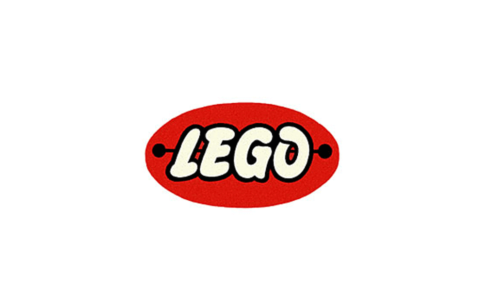
- 1955: The “Dog Bone” Logo. This is the first truly iconic mark. It was a bright red oval, but the text was now a custom, rounded, script-like “LEGO.” It was registered globally.
- Why this shape? It was designed to be instantly recognisable on shelves across Europe as LEGO began its massive export push.
- Why this font? It was playful, child-like, and soft. It was friendly.
This logo was used for five solid years. It was the face of the “LEGO System” as it conquered the world. In 1958, the modern stud-and-tube coupling system was patented, perfecting the product. The brand was now ready for its final form.
The Business Lesson
When your business finds its “Big Idea” (like the “System in Play“), your brand must communicate it. The 1955 logo was a sales tool. It was designed for export, for recognition, and to convey “play.”
Does your logo communicate your core value proposition? Or is it just a nice font?
4. The “Square” Era Begins (1960-1972): Building a System
The 1960s saw the brand attempt to standardise all its newfound success. This led to a brief, but crucial, “square” logo phase.

- 1960 Logo: The first square. It’s a bit of a dog’s breakfast, frankly. A red square, “LEGO” in white, and a yellow bar below with “System” in black. It’s clunky.
- 1965 Refinement: This is the one. They cleaned it up. A red square, the custom “LEGO” font in white, and a five-colour rainbow bar underneath, representing the different product lines (such as DUPLO).
This was a logo system in its infancy. The logo wasn’t just a mark; it was a container for other brands within the portfolio. It communicated, “This is LEGO, and this is the specific part of the system you’re buying.”
The Business Lesson
A logo’s job is to create order. As your business grows and offers more services or products, your logo needs to be the “parent” brand that unifies all of them.
The 1965 logo was a functional design. It solved a business problem: “How do we sell different product lines (like DUPLO) while making it clear they are all part of the same quality LEGO family?
5. The Final Form (1973): The Birth of a Global Icon
In 1973, the world was undergoing significant changes. The oil crisis hit plastic prices. Competition was fierce. LEGO needed to consolidate its global brand into one single, undeniable, bulletproof mark.
They took the 1965 square, threw out the rainbow bar, and refined it into a masterpiece of simplicity.
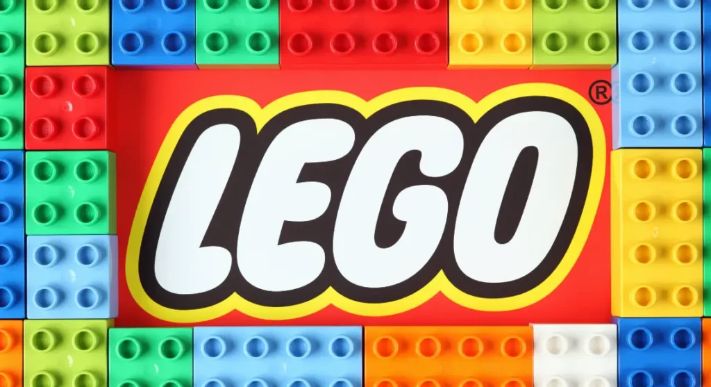
This is the logo we know today.
- Shape: A soft, squared-off “brick.” Stable, friendly, simple.
- Colours: Primary red (action, excitement), white (purity, potential), and a yellow border (joy, optimism) with a black outline (strength, definition). It’s a perfect, high-contrast, primary-colour palette that screams “TOY!”
- Typography: The custom, bubbly “LEGO” font was slightly refined. It’s perfectly legible, friendly, and utterly ownable.
This logo was designed to be a single, universal mark that could be registered and used in every country on Earth, on every product, at every size.
The Business Lesson
This logo is a tool for global standardisation. It was a business decision. LEGO needed one mark to rule them all, to build impenetrable brand equity and cut through the noise.
It’s simple, but not simplistic. It’s friendly, but not childish. It’s bold, but not aggressive. It’s the perfect balance. And for a business, “perfect” means it works.
6. The 1998 “Tweak”: The Most Important Lesson of All
This is my favourite part. This is the single biggest lesson for every business owner on Earth.
For 25 years, the 1973 logo was untouched. Then, in 1998, LEGO “redesigned” it.
And by “redesigned,” they made it functionally identical.
They digitally re-scanned the original design, brightened the red slightly, tightened the kerning (the space between the letters), and made the lines fractionally cleaner.
Why? The Internet.
The 1tweak wasn’t for style. It was a functional update to make the logo render more cleanly on a 72dpi computer screen. It was a technical correction, not a creative “refresh.”
Think about that. The company was facing bankruptcy in the early 2000s. Its brand was “old.” The temptation to throw it all out and “relaunch” with a trendy, new-millennium logo must have been immense.
And they didn’t.
They had the discipline. They knew the logo wasn’t the problem. They knew the red square was their single greatest asset, holding billions of dollars in brand equity. They didn’t panic and destroy their most valuable asset.
Compare that to Gap’s disastrous 2010 rebrand, which lasted only six days and cost the company an estimated $100 million. They got “bored,” tried to be “modern,” and their customers revolted.
The Business Lesson
Discipline is more valuable than novelty.
The 1998 tweak is a masterclass in respecting your own brand equity. Don’t change your logo because you’re bored. Don’t change it because a new trend (like “minimalist” web 2.0 logos) comes along.
You only change your logo for one of two reasons:
- A massive strategic pivot (e.g., you no longer sell what you used to).
- A functional necessity (e.g., it’s unreadable on a screen).
LEGO’s 1998 change was purely functional. They protected their equity.
The LEGO Logo Evolution (1934-2026)
This is a brief overview of the history of the LEGO logo design. The real takeaway is the acceleration of changes early on, followed by 50+ years of rock-solid consistency.
| Year Range | Logo Description | Key Strategic Change | 💡 Lesson for Business Owners |
| 1934-1949 | Various ink stamps & labels. (“LEGO Fabriken Billund”) | Utility: Product identification. | Your first logo just needs to exist. Focus on your product, not perfection. |
| 1950-1954 | Red oval, blocky white “LEGO” font. | First “Brand”: Moving from generic toys to a specific plastic product. | When your product becomes serious, your brand identity needs to take on a serious tone. |
| 1955-1959 | The “Dog Bone.” Red oval with a white custom “playful” font. | Global Expansion: Creating a single, friendly, recognisable mark for export. | A logo is a sales tool. Design it for your target market and sales channel. |
| 1960-1972 | The “Square” era. A red square with a white logo, featuring “System” text or a rainbow bar. | Brand System: The logo now had to organise a growing portfolio of products. | As your business grows, your logo must become a “system” to manage complexity. |
| 1973-1997 | The “Modern Icon.” Red square, white/yellow/black logo. | Global Standardisation: One single, bulletproof mark for all products, all countries. | Aim for a single, cohesive brand identity. Simplicity and consistency win. |
| 1998-Present | The “Digital Tweak.” Identical logo, but digitally redrawn for screens. | Functional Update: A technical correction for the digital age, not a style change. | The Master Lesson: Have the discipline to not change your logo. Protect your equity. |
This table shows a clear pattern: a flurry of iteration, and then locked-in consistency. If you’re looking for a similar level of professional analysis for your own brand, please request a quote to explore how a strategic identity can be developed.
The LEGO Logo as a “System,” Not Just a Mark
The real genius of the LEGO logo isn’t the red square. It’s the brand system that the red square anchors.
This is what most entrepreneurs miss. They want a “cool logo.” They don’t build the rules around it.
The LEGO logo is the keystone of a massive, global identity system:
- On Packaging: The logo is a “corner block.” It sits in the top right of almost every box, creating a “red brick” of LEGO products on a store shelf. You can spot it from 50 feet away.
- On Bricks: The logo is on every single stud. This is the ultimate quality-control “stamp.” It’s the 1934 utility stamp, perfected. It’s a physical promise that “this brick will fit.”
- On Digital: The 1998 tweak ensured it works as a tiny app icon or a massive website header.
- In Experiences: At LEGOLAND, the architecture, the signs, the uniforms—everything is built from the same DNA: primary colours, soft-cornered “brick” shapes, and the bubbly font.
That is a brand system. A set of rules, assets, and guidelines that ensures the brand is 100% consistent, 100% of the time, everywhere.
It’s what we at Inkbot Design specialise in. We don’t just deliver a file; we deliver a framework.
What You Can Actually Learn from the LEGO Logo
Forget “be like LEGO.” You can’t. You don’t have 90 years.
Instead, be strategic like LEGO. Here are the five hard lessons.
- Your First Logo is a Placeholder. Stop agonising. Get a clean, professional logo and go sell something. The 1934 logo was a stamp.
- Evolve When Your Business Does. LEGO’s logo got serious after its product (“System of Play”) got serious. Your brand should reflect your business reality, not your aspirations.
- Consistency is Your Greatest Asset. LEGO has used the exact same logo for over 50 years. Every time you change your logo, you are resetting the clock on brand recognition and flushing your equity down the toilet.
- A Logo is a Functional Tool. The 1973 logo was created for global registration. The 1998 tweak was for digital function. Ask: “Does my logo work?” Can it be one colour? Can it be tiny? Can it be stitched on a hat?
- Patience > Novelty. The 1998 tweak is the whole story. They had the discipline to polish their asset, not replace it. The hardest part of branding is sitting back and letting consistency do the work.
Your logo is a business asset, not an art project. It’s an investment. This is why a professional logo design isn’t just a cost; it’s the foundation of your entire brand. It’s not about what you like. It’s about what works.
The Hardest Brick to Build is Patience
The LEGO logo isn’t powerful because it’s a red square. It’s powerful because it’s been the same red square for half a century.
That red square is a container. It embodies over 50 years of “play well,” “quality,” “creativity,” and “system.” You can’t design that. You have to earn it.
The LEGO logo design history teaches us one profound truth: Brand equity is a product of time and consistency.
Your job as a business owner isn’t to create the next “iconic” logo. Your job is to create a functional, professional logo, and then have the patience to stick with it for the next 20 years.
That’s the real work.
❓ Frequently Asked Questions (FAQs)
What does the LEGO logo represent?
It represents the “System of Play.” The red “brick” shape is stable and a container for the brand. The custom bubbly font represents “play,” and the primary colours (red, yellow) evoke excitement, joy, and childhood.
When did the LEGO logo first appear?
The “LEGO” name was first used on wooden toys in 1934 as an ink stamp. The first designed logo (a red oval) appeared in 1953, and the modern square logo was born in 1973.
Why did LEGO change its logo in 1998?
It was a technical refinement, not a redesign. The 1998 update was created to make the logo render more cleanly on digital screens, which were becoming a primary brand touchpoint.
What is the font used in the LEGO logo?
It’s a custom-created typeface, often simply referred to as the “LEGO” font. It was created in-house and is designed to resemble the soft, rounded, and playful appearance of the bricks themselves.
Why is the LEGO logo so effective?
Because of consistency. Its effectiveness stems from over 50 years of a single, unified, simple, and bold design. It’s instantly recognisable from a distance and scalable from a tiny brick stud to a theme park sign.
What are the colours in the LEGO logo?
The official logo uses LEGO Red, LEGO Yellow, White, and Black (for the outline).
Who designed the modern LEGO logo?
The 1973 logo was an in-house design, a refinement of the 1965 square logo. Its final form was a group effort to create a single mark that could be standardised and registered globally.
What was the “Dog Bone” logo?
This was the name for the 1955 logo, which featured a red oval with playful white script reading “LEGO.” It was the company’s first globally registered trademark, used from 1955 to 1960.
What’s the single biggest lesson from the LEGO logo’s history?
That brand equity is built through discipline and consistency, not constant “refreshes.” The 1998 tweak (not a redesign) is the best example of this.
How is the LEGO logo a “brand system”?
The logo is the “keystone” for all brand elements. The logo on every stud promises quality. The logo on every box creates a “red brick” on shelves. The logo’s colours and shapes inform the design of LEGOLAND and the company’s website. It’s a complete, consistent visual language.
Why did the early LEGO logos change so much?
The company was still finding its core product. The logos were just utility labels. Only when the “System of Play” was perfected in the 1950s did the brand identity start to solidify.
What’s the story with the “LEGO System” text?
From 1960 to 1972, the logo often included the words “System” or a multi-coloured bar. This was a functional addition to explain the product concept (“it’s a system of play”) and to help organise different product lines, such as DUPLO. It was removed in 1973 to create a simpler, more universal global brand mark.
Looking at a giant like LEGO can be intimidating. But the principles are the same, whether you’re selling billions in bricks or running a local service business.
Your logo is your commitment. It’s your promise of quality and consistency.
If you’re still in the early, “messy” phase (like LEGO from 1934 to 1950), that’s fine. But when you’re ready to get serious—to build a brand “system” that works for you—that’s when it’s time to invest in a professional.
We’ve helped hundreds of businesses build their own “red brick.” We can help you build yours.
- Explore our logo design services to discover how we create comprehensive brand systems.
- Read more of our analysis on the Inkbot Design blog.
- When you’re ready to build a 50-year asset, request a quote and let’s talk strategy.


