The 20 Iconic Graphic Design Styles That Define Modern Branding
Your graphic design style isn’t just decoration. It’s a powerful, non-verbal signal.
It’s the visual shorthand that tells customers what you stand for—premium or budget, traditional or rebellious, serious or playful—before they read a single word of your copy.
Choosing the wrong style is like using Comic Sans for a law firm. It creates an instant, jarring disconnect.
You don’t need an art degree to make the right choice, but you do need to understand the language you’re speaking. Understanding these core styles is more than an academic exercise; it’s a crucial part of understanding the entire history of graphic design and how we arrived at the visual landscape of today.
This isn’t another boring list of art history. This is a practical guide for entrepreneurs.
We’ll cut through the academic jargon to focus on one thing: what does this style communicate to your customer?
What You Won’t Find Here
- Fluffy praise for trends. Just because 3D Surrealism is “in” doesn’t mean it’s right for your accounting firm.
- “Retro for retro’s sake.” I’ve seen too many brands use an Art Deco font just because it looks “classy,” without understanding it communicates 1920s luxury—a potential mismatch for their SaaS product.
- The “one right answer.” Your brand is unique. This guide is a toolbox, not a prescription.
First, let’s start with the cheat sheet.
- Design style is a non‑verbal promise—choose one that aligns with your brand's truth, not just what's trendy.
- Swiss/Corporate Modernism = clarity, trust, scalability; ideal for finance, pharma, and global tech.
- Minimalism signals premium, focused quality but requires flawless execution to avoid looking cheap.
- Expressive styles (Grunge, Street Art, Pop Art) communicate authenticity, youth, and urban culture—use selectively.
- Contemporary trends (Material, Retro Futurism, 3D Surrealism) suit digital‑first, premium brands but are costlier and campaign‑centric.
The Business Owner’s “Style-to-Strategy” Translator
Here’s a quick reference table I use to help clients map visual language to business goals.
| Style | Vibe | Best For | Common Mistake |
|---|---|---|---|
| Art Deco | Luxury, Precision, Glamour, Exclusive | High-End Spirits, Fashion, Boutique Hotels, Jewellery | Using it for a budget-friendly or “everyman” brand. It feels cold and unapproachable. |
| Bauhaus | Efficiency, Function, Logic, Rational | Tech, B2B, Architecture, Engineering, Manufacturing | Too rigid or “cold” for a personal, B2C brand (e.g., a bakery or children’s toy). |
| Swiss (Int’l) Style | Clarity, Trust, Order, Global, Neutral | Pharmaceuticals, Finance, Global Tech (Microsoft), Transport | It can feel soulless, corporate, and utterly generic if not executed with precision. |
| Pop Art | Bold, Playful, Ironic, Mass-Market, Loud | Consumer Goods, Food & Bev, Music Festivals, Retail | Too “loud” or flippant for serious B2B services, healthcare, or high finance. |
| Psychedelic | Experimental, Counter-Culture, Fluid, Chaotic | Music, Events, Craft Beer, Cannabis Brands, Niche Fashion | Looks unprofessional, unstable, or even illegible for any traditional business. |
| Grunge | Raw, Authentic, Anti-Corporate, Analogue | Streetwear, Craft Breweries, Music, Skate Brands | Looks messy, unprofessional, and of low quality for any premium or corporate service. |
| Minimalism | Simple, Calm, Confident, Premium, Focused | Luxury Goods, Tech (Apple), Wellness, High-End Agencies | “Minimal” is often mistaken for “easy.” Bad minimalism just looks empty and cheap. |
| Flat Design | Modern, Simple, User-Friendly, Approachable | SaaS, Apps, Tech Startups, Corporate Comms | It can be forgettable. The original “pure” flat design can lack visual interest and depth. |
| Brutalism (Web) | Raw, Honest, Unpolished, Functional, Rebellious | Niche Agencies, Art Collectives, Fashion, Portfolios | Intentionally “ugly.” It will alienate 99% of mainstream audiences. A massive risk. |
Now, let’s dig into the full timeline. We’ve grouped them into four major movements that directly influence the brands you see every day.
🟤 1. Foundational Movements (1890s–1930s)
This is where design broke away from traditional art and found its voice, mixing craft with the new power of industrial manufacturing.
1. Art Nouveau (1890s–1910s)
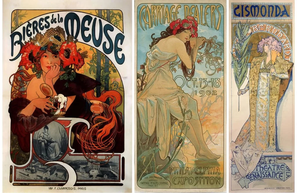
- What It Is: A romantic, highly decorative style defined by flowing, organic lines, intricate floral motifs, and “whiplash” curves. It was a direct reaction against the uniformity of the new industrial age.
- The Vibe: Elegant, ornate, natural, romantic, and handcrafted.
- Iconic Examples: Alphonse Mucha’s posters (especially for Sarah Bernhardt), Paris Metro entrances.
- The Business Takeaway: Today, Art Nouveau serves as a powerful signal for artisanal or heritage brands. Consider craft distilleries (such as The Botanist gin), organic skincare, or artisanal chocolatiers. Its handcrafted feel builds a sense of quality and personal touch. Avoid it if your brand is centred on technology, speed, or affordability.
2. De Stijl (1917–1931)
- What It Is: The Dutch word for “The Style.” This movement boiled everything down to pure abstraction. It used only primary colours (red, yellow, blue), plus black and white, all locked into strict vertical and horizontal grids.
- The Vibe: Orderly, structural, mathematical, and universal.
- Iconic Examples: The artwork of Piet Mondrian, Gerrit Rietveld’s Red and Blue Chair.
- The Business Takeaway: You rarely see pure De Stijl today, but its DNA is everywhere in modern web design (think of “card” layouts), infographics, and modular branding. It’s the grandfather of grid-based design. Using its blocky, primary-colour logic can make a brand feel structured, logical, and intentional.
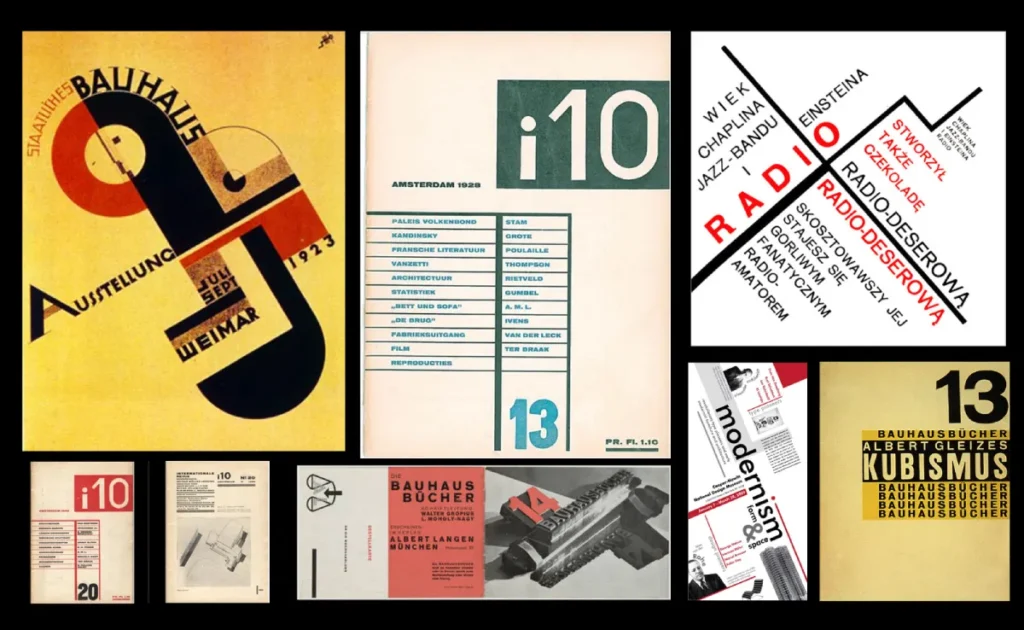
3. Bauhaus (1919–1933)

- What It Is: A German school that forever linked art, craft, and technology. Its mantra was “form follows function.” This meant stripping away all ornamentation to focus on clean lines, simple geometric shapes (such as circles, squares, and triangles), and functional, sans-serif typography.
- The Vibe: Functional, efficient, modern, logical, and rational.
- Iconic Examples: The Wassily Chair, Herbert Bayer’s universal typography, the entire IKEA business model (in spirit).
- The Business Takeaway: Bauhaus is the visual language of efficiency and problem-solving. It’s perfect for B2B services, tech startups, engineering firms, and any brand that wants to communicate “we are logical, functional, and we get the job done.” It’s the antithesis of the emotional, romantic Art Nouveau.
4. Constructivism (1915–1940s)
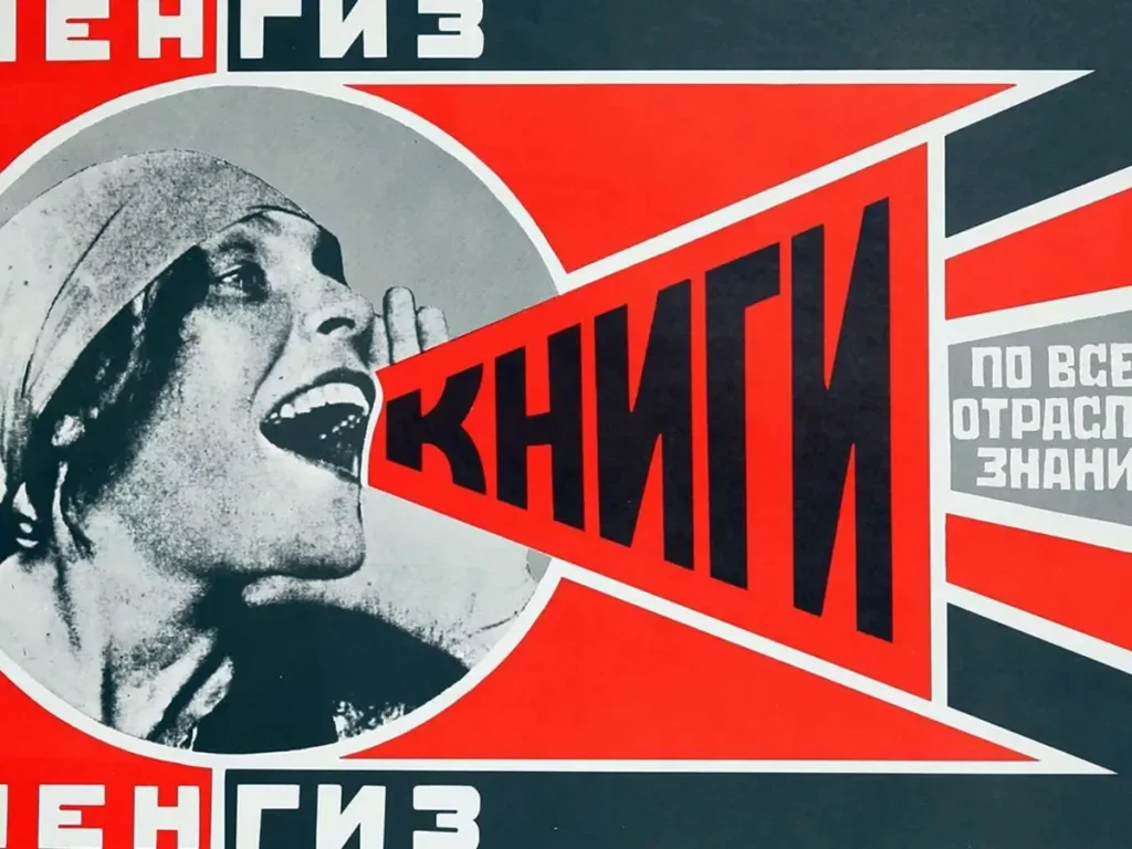
- What It Is: A Soviet art style that was bold, political, and industrial. It was propaganda designed to look modern. It’s defined by dynamic diagonal lines, a stark palette (red, black, white), and experimental, layered typography.
- The Vibe: Urgent, revolutionary, bold, dynamic, and industrial.
- Iconic Examples: Alexander Rodchenko’s posters, the work of El Lissitzky.
- The Business Takeaway: Pure Constructivism is intense, but its elements are fantastic for brands that want to convey energy, action, and rebellion. The heavy use of diagonals creates a sense of movement and urgency, making it ideal for sports brands, political causes, or social change initiatives. Shepherd Fairey’s “Obey” and “Hope” posters are direct descendants.
5. Art Deco (1920s–1940s)

- What It Is: The look of machine-age luxury. Art Deco is characterised by glamour, symmetry, and sleek, industrial forms. It’s The Great Gatsby, the Chrysler Building, and opulent poster design. It celebrates metallic finishes, sharp angles, and stylised, geometric ornamentation.
- The Vibe: Luxurious, premium, confident, sophisticated, modern (for its time), and slightly exclusive.
- Iconic Examples: The Metropolis film poster, branding for the Orient Express, and the classic Chrysler Building spire.
- The Business Takeaway: This is not a style for a budget-friendly, “everyman” brand. Art Deco is your visual language for high-end, premium positioning. Use its symmetrical lines and metallic hues (think gold foil) for spirits brands, boutique hotels, high-fashion labels, or artisan chocolatiers. The risk? It can feel cold, historical, or unapproachable if you’re trying to build a “friendly” community brand.
🟡 2. Mid-Century Modernism (1940s–1960s)
After the chaos of war, the world craved order, clarity, and purpose. This era gave birth to the “corporate” look and the principles that still dominate design today.
6. Swiss / International Typographic Style (1950s–1960s)
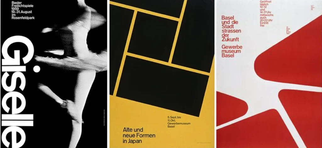
- What It Is: Arguably the most important design movement for modern business. This is the blueprint. It championed asymmetric layouts on a strict mathematical grid, clean sans-serif type (like Helvetica), and objective photography. It was all about clarity above all else.
- The Vibe: Clean, orderly, trustworthy, objective, rational, and universal.
- Iconic Examples: Josef Müller-Brockmann’s grid-based posters, signage for the New York City subway system, and countless corporate logos (Microsoft, American Airlines, Crate & Barrel).
- The Business Takeaway: This is the default style for trust and clarity. It’s the language of finance, pharmaceuticals, technology, and any global corporation that needs to convey stability, reliability, and neutrality. The challenge? It’s so common that it’s incredibly hard to stand out. It’s the “sensible beige suit” of design—safe, but rarely exciting.
7. Minimalism (1960s–present)
- What It Is: The philosophy of “less is more.” Minimalism strips design down to its absolute essential elements. It relies heavily on negative space (white space), a limited colour palette, and simple, clean typography.
- The Vibe: Calm, focused, confident, premium, and intentional.
- Iconic Examples: Apple’s product design and advertising, high-end fashion branding (like Calvin Klein), and luxury wellness and spa brands.
- The Business Takeaway: Minimalism is a confident approach. It implies your product or service is so good, it doesn’t need to shout. It’s the visual language of premium quality and focus. This is why luxury brands and high-end tech use it. The common mistake is confusing “minimal” with “simple” or “low-effort.” True minimalism is incredibly difficult; every single element must be perfect because there’s nowhere to hide.
8. Pop Art (1950s–1970s)
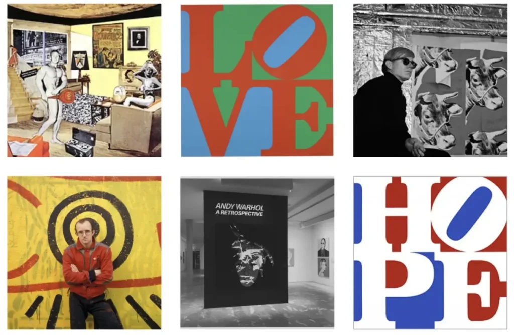
- What It Is: A playful, ironic style that took inspiration from mass-market advertising, comic books, and everyday consumer goods. It features bright, saturated colours, bold outlines, and a sense of mass-produced repetition.
- The Vibe: Playful, bold, ironic, youthful, and energetic.
- Iconic Examples: Andy Warhol’s Campbell’s Soup Cans, Roy Lichtenstein’s comic-panel paintings.
- The Business Takeaway: Pop Art is perfect for FMCG (Fast-Moving Consumer Goods) brands. Think sweets, sodas, snack foods, or any B2C product that wants to feel fun, accessible, and not too serious. It’s also great for music festivals and pop-up retail. It’s a terrible choice for a B2B consultancy or a bank.
9. Psychedelic (1960s–1970s)
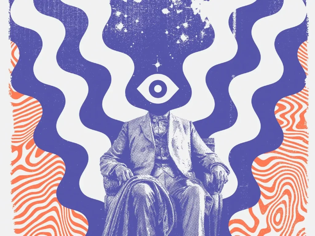
- What It Is: The visual language of the 1960s counterculture. This style is defined by wildly fluid, melting, and distorted forms, vibrating high-contrast colours, and typography that’s often warped to the point of illegibility. It was made to look “trippy.”
- The Vibe: Experimental, free-spirited, chaotic, and anti-establishment.
- Iconic Examples: Wes Wilson’s concert posters for The Grateful Dead, Yellow Submarine by The Beatles.
- The Business Takeaway: This is a niche style. Using it is a very loud statement. Today, it’s used effectively by craft beer labels, cannabis brands, music festivals, and other businesses that are explicitly counter-culture. For 99% of businesses, it’s a non-starter—it screams “unreliable” and “unprofessional.”
10. Corporate Modernism (1960s–1980s)
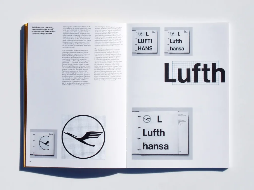
- What It Is: This is what happened when the Swiss Style and Bauhaus were adopted by global corporations. It was about creating rational, scalable, and systematic brand identities. Think clean, abstract logos, modular systems, and comprehensive brand guidelines.
- The Vibe: Rational, systematic, global, stable, and authoritative.
- Iconic Examples: The logos for IBM (Paul Rand), NASA (the “worm”), and Lufthansa.
- The Business Takeaway: This style is the foundation of modern branding. Its principles—consistency, scalability, and a clear logo—are non-negotiable. While the look may feel somewhat dated and reminiscent of the 80s corporate era, the strategy remains timeless. Understanding this movement is crucial for any business seeking to grow.
This is the point where branding became a true business discipline. Deciding on a system that works across business cards, websites, and advertising is a complex process. It’s where professional graphic design services stop being a simple cost and become a critical investment in your brand’s future.
🔵 3. Postmodern & Cultural Styles (1970s–1990s)
This was the rebellion. After decades of clean, rigid modernism, designers started to break the rules. This era is defined by expression, chaos, and cultural identity.
11. Postmodernism (1970s–1990s)
- What It Is: The “anti-rules” movement. If Modernism said “less is more,” Postmodernism said “more is more.” It’s an eclectic, expressive, and often ironic style that mashes up collage, chaotic layouts, historical references, and vivid colours.
- The Vibe: Expressive, chaotic, ironic, deconstructed, and subjective.
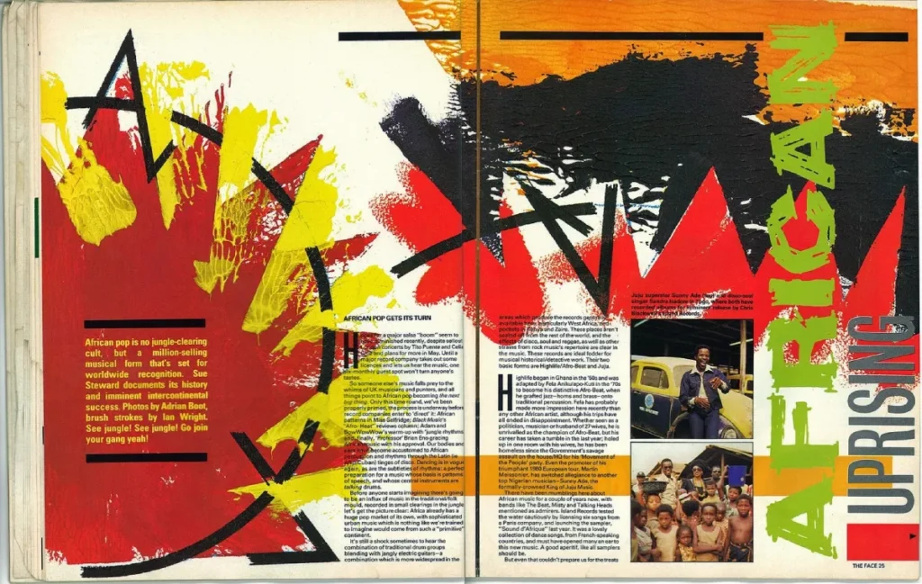
- Iconic Examples: The Face magazine, early work from Neville Brody.
- The Business Takeaway: This style is challenging to execute effectively in a business context, as it can appear disorganised. However, its spirit of eclectic expression is perfect for brands that are inherently creative, such as design studios, independent magazines, or avant-garde fashion.
12. Memphis Design (1980s)
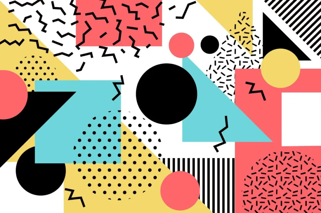
- What It Is: A famous, short-lived offshoot of Postmodernism. The Memphis Group was an Italian design collective that rejected the concept of “good taste.” Their style is defined by clashing pastel and primary colours, laminate materials, and bold, child-like geometric shapes (squiggles, triangles).
- The Vibe: Playful, absurd, energetic, loud, and 80s-kitsch.
- Iconic Examples: The “Carlton” room divider by Ettore Sottsass, a visual identity associated with the Saved by the Bell series.
- The Business Takeaway: Memphis is back in a big way, and this trend is here to stay. Use it with caution. It’s ideal for a short-term campaign, a pop-up shop, or a youth-focused brand that wants to convey a fun and irreverent vibe. Be warned: this style has a short shelf-life and can quickly look dated. Don’t build your entire corporate identity on it unless you plan to rebrand in 2027.
13. Grunge (1990s)
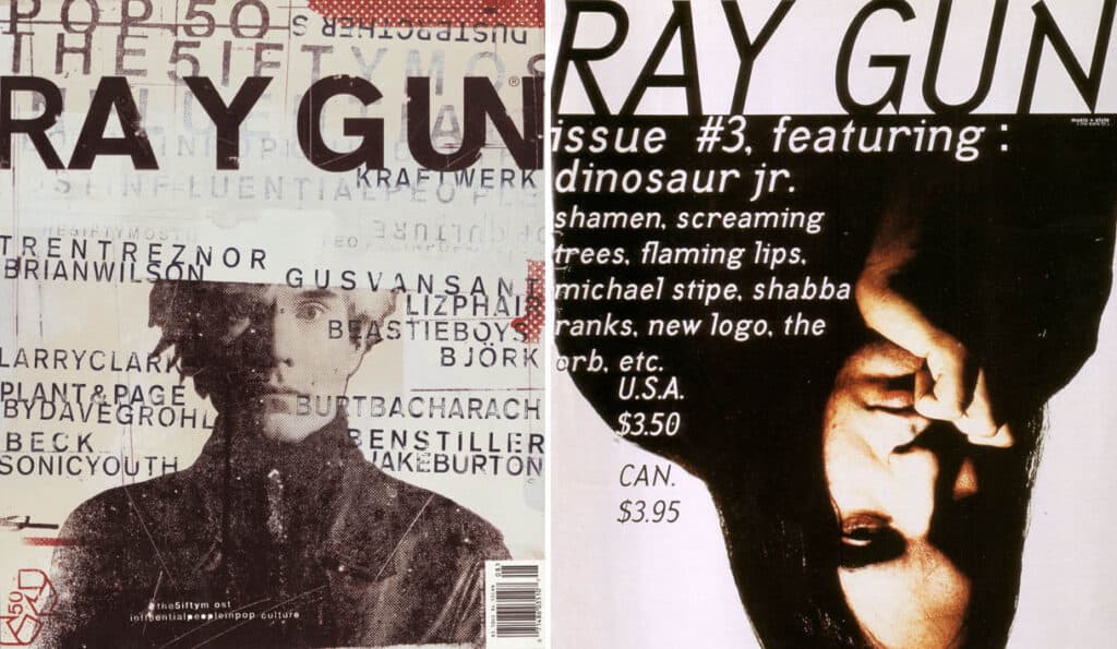
- What It Is: The visual equivalent of a Nirvana B-side. Grunge design is raw, distressed, and proudly DIY. It embraced imperfection as a form of authenticity, using torn paper textures, ‘dirty’ overlays, distressed typography, and low-fi, photocopied aesthetics.
- The Vibe: Raw, authentic, anti-corporate, analogue, and imperfect.
- Iconic Examples: David Carson’s work for Ray Gun magazine (which was often intentionally illegible), and Nirvana’s album art.
- The Business Takeaway: Grunge is the ultimate “we’re not a slick corporation” signal. It’s the visual language of authenticity and grit. It works perfectly for streetwear brands, independent music labels, craft breweries, and coffee roasters. It tells customers your product is handmade, raw, and real.
14. Street Art / Urban Graphic Style (1980s–2000s)
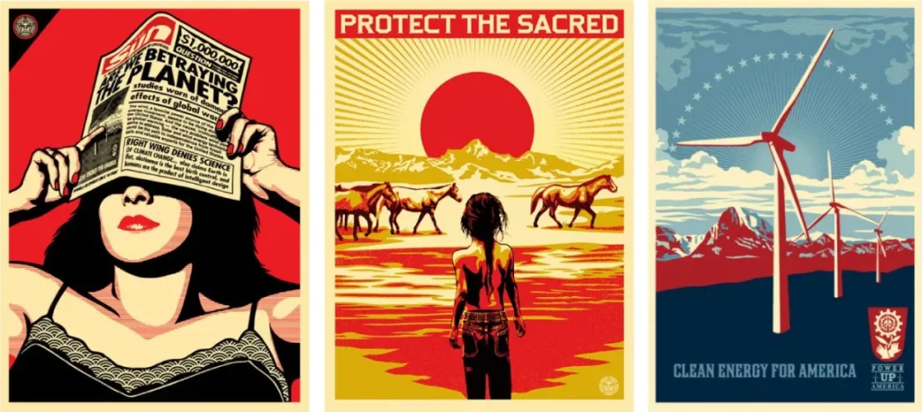
- What It Is: The energy of graffiti, hip-hop, and urban rebellion, translated into graphic design. This style features vibrant, high-contrast colours, hand-drawn and “tag” style typography, stencilling, and dynamic, overlapping compositions.
- The Vibe: Energetic, rebellious, urgent, cultural, and bold.
- Iconic Examples: The work of Keith Haring and Jean-Michel Basquiat, as well as early Obey Giant (Shepard Fairey) posters.
- The Business Takeaway: This style instantly communicates a connection to urban culture and youthful energy. It’s a natural fit for sports brands (Nike, Adidas), streetwear, and any company seeking to establish credibility with a younger, urban-based demographic.
15. Cyberpunk / Techno-Futurism (1980s–1990s)
- What It Is: The ’80s and ’90s vision of a high-tech, low-life future. Think neon-drenched dystopias, Blade Runner, and the dawn of the internet. It features high contrast, glitch effects, metallic textures, computer-grid motifs, and dark, moody colour palettes.
- The Vibe: Dystopian, futuristic (from a ’90s perspective), digital, and edgy.
- Iconic Examples: Blade Runner‘s title card, artwork for the Wipeout video game series.
- The Business Takeaway: This is a subculture style, now often referred to as “glitch art.” It’s perfect for gaming, cybersecurity, or electronic music brands. It creates a feeling of being on the digital edge, slightly dangerous, and technologically advanced.
🟢 4. Contemporary & Digital Trends (2000s–present)
We now live in a digital-first world. These styles are not just made with digital tools—they are about our digital experience.
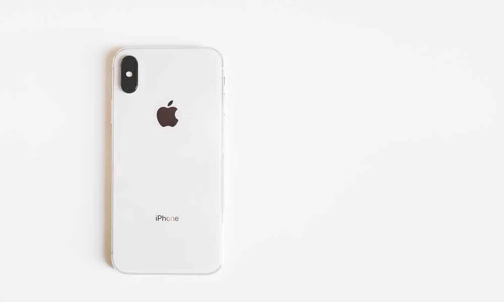
16. Flat Design (2010s)
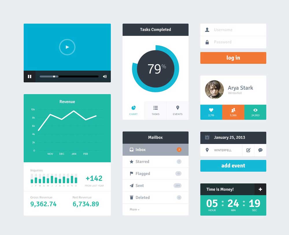
- What It Is: A direct rebellion against the “skeuomorphism” (fake-realistic textures like leather and wood) of early iPhones. Flat design is digital clarity: simple icons, bright blocks of colour, clean vectors, and no shadows, gradients, or textures.
- The Vibe: Simple, modern, user-friendly, clean, and approachable.
- Iconic Examples: Microsoft’s Windows 8 interface, the original “flat” app icons for Apple’s iOS 7.
- The Business Takeaway: This became the default visual language of the SaaS and tech startup world. It’s clean, loads fast, and is incredibly easy to understand (user-friendly). The problem? It became so popular that it led to a sea of “blands”—brands with the same friendly illustrations and simple icons that are totally forgettable.
17. Material Design (2014–present)

- What It Is: Google’s answer to the “boring” problem of pure flat design. It’s an evolution, sometimes referred to as “Flat 2.0.” It retains the simplicity and bold colours, but adds subtle, physics-based layers, shadows, and motion to create a sense of tactile reality.
- The Vibe: Intuitive, layered, realistic, functional, and organised.
- Iconic Examples: The entire Google app ecosystem (Gmail, Google Calendar, Android OS).
- The Business Takeaway: This is the de facto standard for modern app and UI/UX design. It provides the perfect balance of flat design’s clarity with the real-world logic that helps users understand how an interface works (e.g., “this button is on top, so I can click it”).
18. Brutalism (2015–present)

- What It Is: Named after “brutalist” concrete architecture, this is an intentionally raw, unpolished, and “ugly” web design style. It features clashing colours, awkward layouts, bare-bones HTML, and default system fonts. It’s a rebellion against the safe, clean, corporate uniformity of flat design.
- The Vibe: Raw, honest, challenging, functional, and anti-design.
- Iconic Examples: The Balenciaga website, Bloomberg’s “Businessweek” (in its early redesign), many independent creative portfolios.
- The Business Takeaway: This is a high-risk, high-reward style. For 99% of businesses, it’s a terrible idea that will alienate your audience. For the 1%—such as a high-fashion label, a provocative art collective, or a design agency—it can be a powerful statement of ‘we are so confident, we don’t need to look ‘pretty’.’ Use at your own peril.
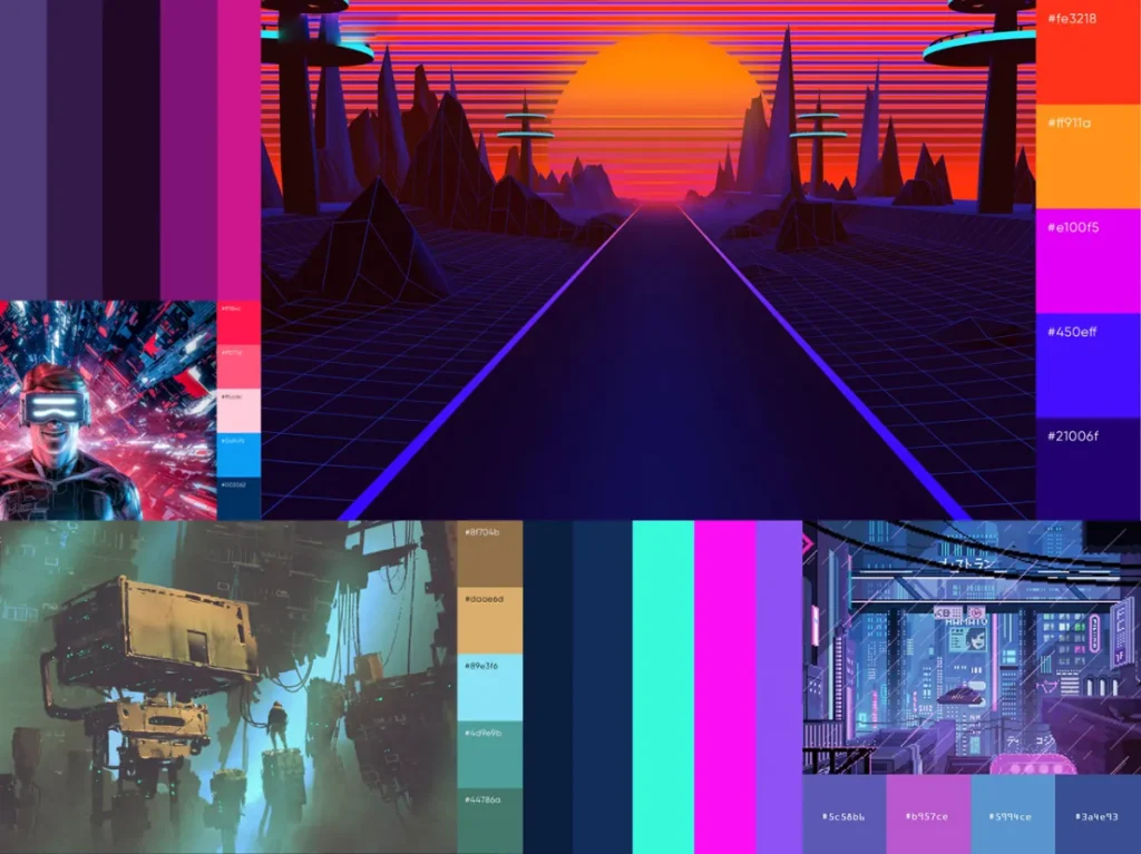
19. Retro Futurism (2010s–present)
- What It Is: A hybrid style that blends nostalgia with sci-fi. It’s what people in the 1950s, 1960s, or 1980s thought the future would look like. It features chrome, neon, synthwave colour palettes (pinks and purples), and a sense of ironic optimism.
- The Vibe: Nostalgic, optimistic, ironic, and surreal.
- Iconic Examples: The movie Drive, the Stranger Things title sequence, and countless synthwave album covers.
- The Business Takeaway: This style is fantastic for creating a strong, nostalgic mood. It’s used heavily in entertainment, fashion, and marketing campaigns that want to tap into a specific ’80s or ’90s cultural memory. It’s more of a campaign style than a timeless corporate identity.
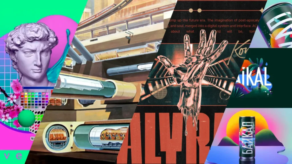
20. 3D Surrealism / Digital Collage (2020s–present)
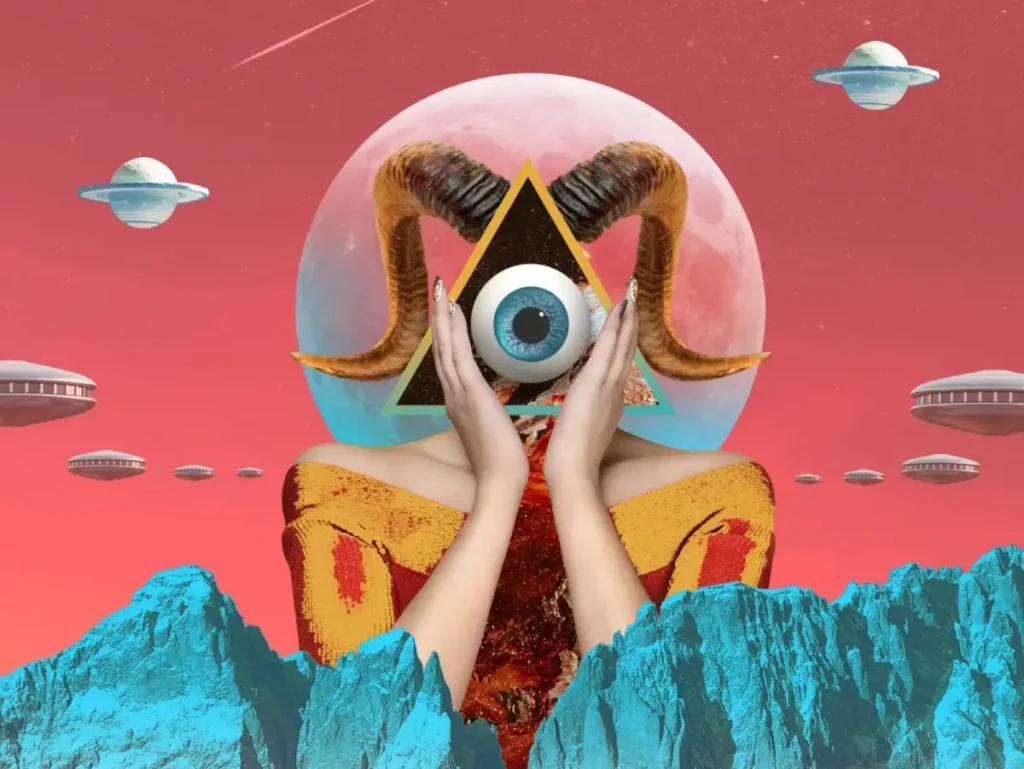
- What It Is: The current frontier. Driven by powerful 3D rendering software like Revit AI tools, this style features hyper-realistic renders, abstract shapes, dreamlike compositions, and impossible, surreal juxtapositions. It often blends digital art with photography.
- The Vibe: Surreal, hyper-real, abstract, premium, and digitally native.
- Iconic Examples: High-end tech product launches (such as new phones or headphones), branding for creative conferences, and editorial illustration in major magazines.
- The Business Takeaway: This is the new visual language for cutting-edge tech and premium digital-first brands. It’s expensive to produce (requiring 3D artists), which in itself sends a signal of quality and investment. It’s a way to look futuristic, artistic, and sophisticated all at once.
Your Style Is Your Strategy
Choosing a design style isn’t like picking a font. It’s the most fundamental promise you make to your customer.
Are you the trustworthy, grid-based Swiss Style bank? The raw, authentic Grunge craft brewery? Or the sleek, minimal, premium-tech brand?
Don’t just pick what’s “cool” or what your competitor is doing. Examine this list and ask a more challenging question: Which of these visual languages conveys the same truth as my business does?
Get that right, and you’ve done 80% of the work before a customer ever clicks “buy.”
Build a Brand That Lasts
Stop chasing trends. If you’re ready to build a cohesive brand identity that conveys the right message every time, the Inkbot Design team is here to help. We translate business goals into powerful, timeless visual systems.
Explore our professional branding and logo design services. If you’re ready to get started, request a quote today.
❓ Frequently Asked Questions (FAQs)
What is the most popular graphic design style for new startups?
This heavily depends on the industry. Tech and SaaS startups continue to lean heavily on Flat Design and Material Design for their apps and websites, as they prioritise user-friendliness. For the brand’s identity, many new startups are adopting a minimalist approach to appear premium and focused.
What’s the main difference between Bauhaus and Swiss Style?
Think of it this way: The Bauhaus was a school focused on uniting all the arts (architecture, product design, and graphics) around the idea of “form follows function.” Swiss Style is a graphic design methodology that evolved from it, focusing specifically on clarity in typography and the use of a strict mathematical grid for layout.
Is Minimalism a good choice for my brand?
Minimalism is a great choice if your brand’s core values are simplicity, clarity, and premium quality (like Apple or a luxury skincare line). It’s a bad choice if your brand is about being playful, budget-friendly, or “loud” (like a children’s toy store or a snack food).
What is the ‘Memphis’ design style?
Memphis was a rebellious 1980s style known for its clashing pastel colours, black-and-white patterns, and child-like geometric shapes (like squiggles). It was intentionally “kitsch” and a reaction against the “good taste” of modernism.
What’s the difference between Art Nouveau and Art Deco?
Art Nouveau (1890s) is organic and flowing, inspired by nature (vines, flowers, curves). Art Deco (1920s) is geometric and symmetrical, inspired by the machine age (sharp angles, metallic finishes).
Why is it called ‘Swiss Style’?
It originated and was perfected by designers in Switzerland in the 1950s and 60s, who championed its principles of neutrality, clarity, and grid-based order.
Is Grunge Design professional?
For most businesses (like a law firm or bank), no. It looks messy. But for the right business (a craft brewery, a streetwear label, an indie band), that “messy”, authentic, anti-corporate look is exactly the professional signal of authenticity they need to send.
What is ‘Brutalism’ in web design?
Brutalism is an intentionally raw, unpolished, and “ugly” style. It rejects “pretty” design and focuses on bare-bones function, often using default fonts, clashing colours, and stark layouts. It’s a rebellious statement.
Can I mix different graphic design styles?
Yes, but with extreme care. This is where a professional designer is crucial. You might mix the clean typography of Swiss Style with the authentic textures of Grunge, or the bold colours of Pop Art with the simple icons of Flat Design. It’s a hybrid approach, but it must be done with a clear strategy.
What style is best for a financial or legal business?
Trust and stability are paramount. The Swiss International Typographic Style is the classic choice due to its clarity, order, and neutrality. Corporate Modernism and Minimalism also work well to convey stability, authority, and premium confidence.
What is ‘Retro Futurism’?
It’s a style that reimagines past visions of the future. Think of ’80s sci-fi: neon grids, chrome, and synthwave music. It blends nostalgia (for the 80s) with futurism (what they thought the 2020s would look like).
What’s the newest trend on this list?
3D Surrealism / Digital Collage is the most contemporary. It relies on powerful modern 3D rendering software to create hyper-realistic, dream-like images that are becoming the standard for high-end tech and cutting-edge creative brands.


