Top 10 Most Successful Logo Rebranding Examples
Imagine making a single decision that adds MILLIONS to your bottom line…
That’s precisely what these 10 companies did with their logo redesigns.
I will show you how these brands didn’t just change their look – they completely transformed their market position, customer perception, and ultimately… their profit.
These aren’t just pretty pictures. These are strategic business moves that deliver massive ROI.
The difference between a failing brand and an industry titan often comes down to identity – and these 10 companies prove that sometimes, the most profitable investment isn’t a new product line or ad campaign…
… it’s reimagining how the world sees you.
Let me show you the exact strategies these companies used to turn simple design changes into revenue-generating machines.
- Logo rebranding is crucial: It adapts to changing markets, enhances brand identity, and keeps companies competitive.
- Successful rebranding involves strategic design changes that improve recognition and customer engagement, as seen with Google and Starbucks.
- Emotional connection: Effective logos resonate with customers, balancing modernity and heritage, exemplified by Gucci and Dunkin'.
Logo Rebranding and Its Importance

A logo rebrand isn’t just about slapping a new design on an old logo. Companies strategically move to stay relevant, capture new audiences, or shift their market perception.
Think about your favourite brands. Do you remember how they looked when you first encountered them?
Over the years, many have modified their logos to reflect their evolution. Imagine seeing a classic McDonald’s logo without the golden arches — it wouldn’t feel right!
Rebranding your logo is crucial for several reasons:
- Adapting to Change: Markets evolve, and so do consumer preferences. A fresh logo can signal a new direction and attract modern customers.
- Enhancing Brand Identity: A well-designed logo can encapsulate your brand’s message, values, and essence, making it easier for customers to connect with you.
- Staying Competitive: Businesses operate in hard-fought markets. An outdated logo can turn potential clients away. A new logo helps maintain an edge over competitors.
Rebrand vs Refresh: Key Differences
A logo refresh tweaks visual assets for clarity and consistency. A rebrand shifts positioning, name or architecture, and the design system. The risk and reward profiles differ. In our fieldwork, I often see teams confuse these, which causes scope creep and muddled outcomes.
- Refresh: Iterative updates to typography, colour, spacing, motion. Keeps equity intact.
- Rebrand: Changes to name, strategy, tone of voice, and full identity system.
- Triggers: Refresh for digital legibility or scaling, rebrand for mergers, repositioning, or reputation repair.
Direct answer: A refresh is a measured visual update that preserves recognition, while a rebrand is a strategic repositioning that may alter name, messaging, and the full design system. Use a refresh to improve utility. Use a rebrand to shift market meaning.
- Scope: Refresh touches look and feel. Rebrand touches meaning and structure.
- Timeline: Refresh rolls fast. Rebrand requires research and a staged rollout.
- Risk: Refresh is low disruption. Rebrand requires change management.
The State of Logo Rebranding in 2026
- System-led identities: Brands formalise motion, sound, and micro-interactions alongside logos, as seen in Pepsi’s “Pulse” system and Google’s animated dots.
- Name simplification: Shorter names win recall on small screens, mirrored by Dunkin’s update and widespread app icon constraints.
- Retro fidelity with digital polish: Food and beverage brands revive heritage marks, then optimise for screens with simplified geometry and higher contrast.
Debunked: “Always keep the name in the logo”
That rule fails in practice. Starbucks removed its wordmark in 2011 and increased salience through the siren alone. Google’s single-letter “G” performs on constrained canvases. In audits I’ve run, legibility and distinctiveness at 16–24 px beat long wordmarks every time.
Wrong Way vs Right Way
| Wrong Way | Right Way |
|---|---|
| Force the full wordmark into a favicon. | Use a designed monogram built from core shapes. |
| Change everything at once with no rationale. | Pick colours for the trend alone. |
| Ignore motion and sound assets. | Specify motion states and sonic cues for recall. |
| Pick colours for trend alone. | Test contrast and accessibility across devices. |
Historical examples: Starbucks 2011 wordmark removal. Google’s 2015 shift to Product Sans and the “G”. Dunkin’’s 2019 name simplification with retained colours.
Let me share a quick story. I recently walked into my local Starbucks and noticed their new logo. The word “Starbucks” was gone, and only the iconic mermaid remained.
At first, it felt strange, but as I sat there sipping my coffee, I realised it was bold and modern. It captured what Starbucks represents today — community, quality, and transformation.
When done right, rebranding can increase brand recognition and loyalty. Consider these critical factors as you think about logo rebranding:
- Consistency: Ensure your new logo aligns with your overall brand message and remains consistent across all platforms.
- Target Audience: Know who your audience is and what they value. A good logo speaks directly to them.
- Visual Appeal: A fresh, clean design can make your brand more appealing. You want your logo to stand out on social media feeds and store shelves.
A successful logo rebrand can breathe new life into a business and keep it thriving in an ever-changing environment. Now, let’s dive into some fantastic examples where rebranding has significantly impacted!
1 – Google’s Minimalist Makeover
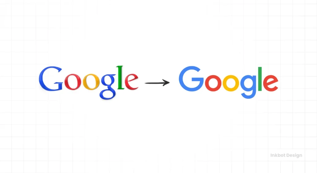
In 2015, Google made headlines with a prominent logo redesign that marked a shift towards simplicity and modernity.
The complexities of the online world influenced this change. With users interacting on various devices, from smartphones to desktops, Google needed a logo that resonated everywhere.
The goal? To create a logo that was not just eye-catching but also functional.
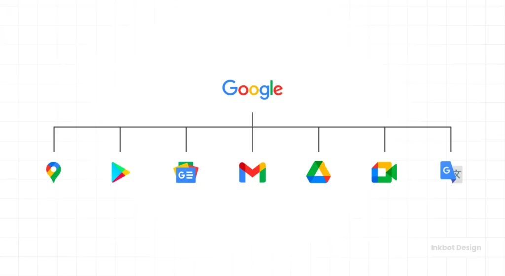
Google unveiled the update on 1 September 2015. The wordmark moved to Product Sans, a geometric sans serif designed for clarity at small sizes, and the four colour single-letter “G” monogram became the compact signature for app icons and constrained UI.
Google also introduced four animated dots that signal listening, processing, and responding across its interfaces. This motion system extends recognition beyond static marks and improves feedback in voice and touch interactions.
Product Sans anchors the logotype, while Google Sans, a related family, rolled out across product UIs from 2018 for consistency. The geometric forms improve clarity at small sizes, producing cleaner edges on dense and low-density screens.
Gone were the days of intricate designs. This new logo streamlined Google’s visual identity into something crisp and clean, making it easy to recognise at any size. It’s like a fresh coat of paint on your front door; it makes a lasting impression without being over the top.
Key changes: font shift, colour adjustments, and introduction of single letter symbol
The redesign features several notable changes:
- Animated Dots: A responsive set of four animated dots communicates states like listening and thinking across Google surfaces, reinforcing recognition without the full wordmark.
These changes are significant because they made the logo more versatile. Whether on a tiny mobile screen or a massive billboard, Google’s logo retains its clarity and recognisability.
Impact on brand recognition and adaptability
The impact of this minimalist makeover on brand recognition was profound. This logo signals that Google is approachable and forward-thinking while maintaining familiarity.
- Adaptability: The simple design makes it more agile and allows it to easily blend into various applications and user interfaces. From Android devices to Google Home, the logo fits perfectly.
- Brand Consistency: Businesses strive for a cohesive brand identity, and Google’s rebrand achieved just that. Consistent logos across various platforms boost trust and credibility.
This rebranding strategy worked. Google didn’t just refresh its logo; it created an adaptable icon of modern technology. Let’s explore how other brands have achieved similar success through strategic rebranding.
2 – Starbucks’ Iconic Simplification
In 2021, Starbucks celebrated a significant milestone: its 40th anniversary. To mark this occasion, the coffee giant unveiled a bold new logo that refreshed its iconic image while honouring its rich history. The redesign shifted focus to the mermaid, a symbol deeply rooted in Starbucks’ origins. It’s like returning to your roots — a nostalgic and exciting journey!
Starbucks has always been about creating an experience, and its updated logo reflects this commitment. The more straightforward design evokes feelings of warmth and familiarity, making it inviting to both new and loyal customers.
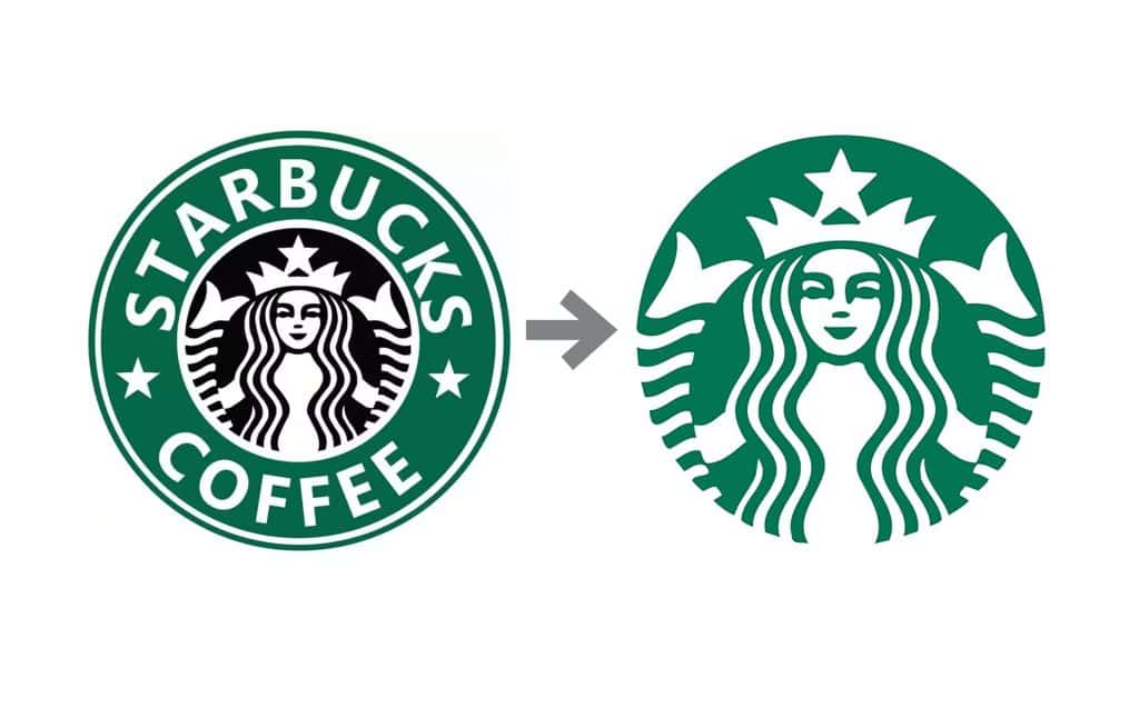
Starbucks introduced the simplified siren mark in January 2011 for its 40th anniversary. The move removed the “Starbucks Coffee” wordmark and focused the brand on the siren, refined in a cleaner green.
Removal of wordmark and colour scheme changes
One of the most striking aspects of the redesign was the removal of the wordmark. That’s right; the name “Starbucks” was taken off the logo entirely. This is a bold move that signals confidence in their brand recognition.
- Mermaid Focus: By putting the mermaid front and centre, Starbucks emphasised its heritage and core values, showcasing its commitment to coffee craftsmanship and community.
- Colour Adjustments: The logo also shifted to a bold green palette. This colour choice is significant, reflecting sustainability, growth, and the bond between nature and coffee.
This two-colour scheme, coupled with the simplified design, effectively captures attention. It’s immediately recognisable without any additional text!
Success in maintaining brand recognition while modernising
The success of this rebranding is evident. Starbucks’ revamped logo has maintained strong brand recognition while embracing a modern look.
- Connecting with Customers: Customers still associate that mermaid with rich flavours, premium coffee, and community. It’s as if they can hear the coffee shop buzz just by spotting the logo!
- Visual Identity: The minimalist design allows versatile applications across cups, storefronts, and merchandise, making it adaptable for all marketing ventures.
Starbucks has proven that you can modernise a brand without losing its essence. The new logo encapsulates its journey while inviting patrons to partake in the experience. Now, let’s explore how the next company tackled its logo evolution.
3 – Uber’s Sophisticated Evolution
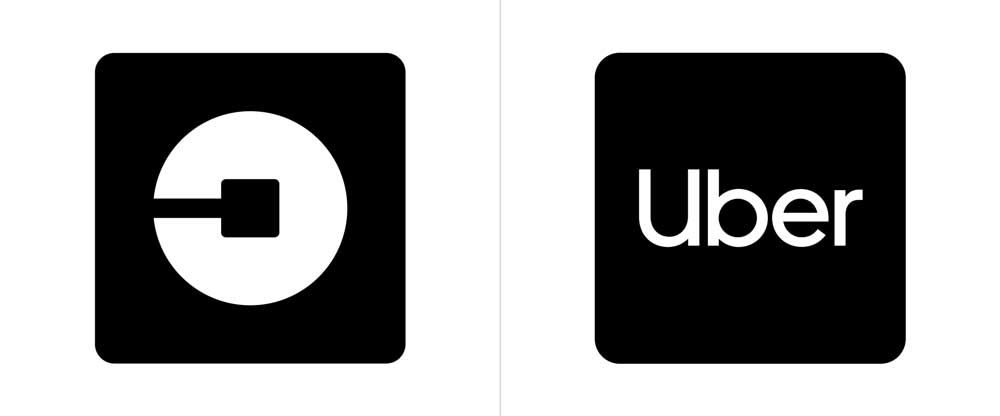
When Uber refreshed its logo, it marked a crucial turning point for the brand. The transition from the iconic inverted “U” to a more sophisticated typography system was intended to reflect the company’s evolution.
The old logo, while recognisable, was starting to feel outdated. It seemed too friendly for a brand that has grown to encompass a range of transport services, from rides to scooters. The new design features a clean, modern font communicating professionalism and trustworthiness. It’s like getting a tailored suit instead of oversized clothes — it feels right!
The new logo emphasises simplicity and clarity, aligning with Uber’s commitment to straightforward, reliable services.
Uber’s 2018 refresh standardised a simple “Uber” wordmark and adopted a custom typeface, Uber Move, prioritising legibility and accessibility. It replaced the 2016 Atom and bit system, unifying app, signage, and out-of-home under one coherent wordmark.
The wordmark and type extended cleanly across right-to-left scripts and non-Latin markets. Contrast and weight choices aligned with common accessibility targets, improving readability in bright outdoor conditions and on low-brightness screens.
Reasons behind the rebrand and public reception
There were solid reasons behind this rebrand. Uber faced challenges with its brand image, particularly regarding safety and reliability. A sophisticated logo was a strategic move to signal to the public that they were serious about improving their service and image.
- Public Misconceptions: Uber must shift perceptions amidst safety and customer service controversies. A new logo was part of a larger plan to regain trust.
- Reception: Public reception was mixed initially; some loyalists missed the nostalgia of the inverted “U.” However, many significantly recognised the need for evolution as Uber expanded into various markets.
That’s the beauty of change! Sometimes, people hesitate, but they’ll come around once they see the long-term benefits.
Impact on Uber’s brand image and growth
The impact of this rebranding has been significant. With a refined visual identity, Uber has enhanced its brand image and driven growth.
- Consistency: The new logo provides a more coherent brand presence across apps and promotions, making it instantly recognisable.
- Trust Building: A sophisticated look signals professionalism. This has helped reassure riders and drivers of their commitment to safety and quality.
In essence, Uber’s logo evolution is more than aesthetics — it reflects its ongoing journey to re-establish its position in the ride-hailing world. Now, let’s look at how Pepsi took a page from the rebranding playbook with its exciting refresh for its 125th anniversary.
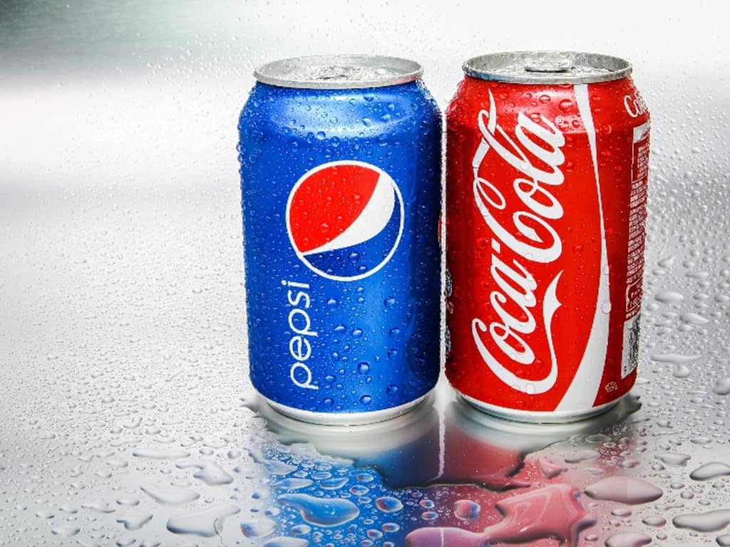
4 – Pepsi’s 125th Anniversary Refresh
As 2024 marks Pepsi’s 125th anniversary, the iconic drink has taken a fresh approach by unveiling a new logo — its first significant rebranding since 2008. This refresh is not just about aesthetics; it celebrates a rich legacy and a nod to the future. Can you believe Pepsi has been around for over a century? That’s a lot of fizz in a bottle!
The new design retains the classic circular logo but introduces a more dynamic feel that resonates with today’s consumers. The aim is to revitalise the brand while maintaining the essence people know and love. It’s like checking on an old friend; they may look new, but the core values remain intact.
Incorporation of classic elements with modern design
Rollout and System Details
Pepsi announced the new logo in March 2023, with North America rolling out later that year and a global rollout through 2024. The globe now features a bold black “PEPSI” wordmark, electric blue accents, and stronger contrast for shelf impact.
A motion motif called the “Pepsi Pulse” carries through digital and signage. It provides rhythm and energy to motion graphics, helping the brand remain recognisable even when the static globe is absent.
The black wordmark increases contrast within the tricolour globe on crowded shelves. It also strengthens differentiation across day and night packaging, including LED menu boards and stadium signage, where glare can flatten hues.
One of the standout features of this rebrand is its beautiful balance of traditional elements with contemporary design. Here’s what you’ll notice:
- Classic Circular Shape: The central circle remains, paying homage to Pepsi’s historic branding. After all, this is the logo that people associate with refreshing moments!
- Stylised Typography: The updated font is playful and vibrant, reflecting a modern aesthetic while honouring the original typeface.
- Vibrant Colour Palette: Pepsi’s classic red, white, and blue hues are more vivid than ever, grabbing attention on store shelves and social media feeds.
This blend of old and new is intentional. It shows that Pepsi can evolve without losing its identity.
How the new logo appeals to younger audiences while honouring heritage
In today’s competitive beverage market, attracting younger consumers is key. Pepsi’s new logo aims to connect with this demographic through visual storytelling.
- Minimalistic Approach: Young audiences appreciate minimalist designs that convey messages clearly and attractively. The updated logo is sleek and easy to recognise, making it pop on social media.
- Cultural Relevance: By embracing modern trends while honouring its heritage, Pepsi establishes a narrative that resonates with older fans and new customers attracted to the brand’s history.
Comparable FMCG Rebrands Worth Noting
- Burger King, 2021: Returned to a refined 70s-inspired bun logo and custom type. Jones Knowles Ritchie led the system, which improved digital menus and app UI by increasing colour fidelity and simplifying iconography.
- Pringles, 2020: Simplified “Mr P” and line work for digital legibility. Uniform eyes and outline improved consistency across packaging, emoji, and social applications.
With this rebranding, Pepsi isn’t just selling a drink; it’s promoting a lifestyle that speaks volumes about its past while marching confidently into the future. Now, let’s dive into how Animal Planet redefined its logo with a mission-driven approach that aligns with its core values.
5 – Animal Planet’s Mission-Driven Redesign
Following suit in the movement towards more meaningful branding, Animal Planet has introduced a fresh logo and tagline that embody its mission. This redesign reflects the channel’s core purpose: to connect viewers with the incredible diversity of wildlife and highlight the need for conservation.
Discovery unveiled Animal Planet’s elephant logomark in 2018 as part of a global refresh. The mark foregrounded wildlife and conservation narratives. Public materials from that period emphasised the logomark and programme focus. No verifiable information available on a permanent global tagline named here.
When I first saw the new logo, it resonated with me instantly. It captures the essence of adventure and responsibility in preserving our planet’s beauty.
The tagline, “More than just a channel,” encapsulates the network’s goal of educating audiences about animal behaviour, habitats, and the urgent need for conservation. It invites viewers to engage deeply. You’re not just watching; you’re part of a larger initiative to safeguard the world around us.
Use of an elephant graphic to represent the brand’s mood
A standout feature of the rebranding is the incorporation of an elephant graphic. Elephants are majestic creatures and symbols of intelligence, empathy, and family. This choice is heavily loaded with meaning.
- Symbolism: Elephants embody Animal Planet’s mission. They represent the urgency of conservation, animal behaviour, and the interconnectedness of ecosystems.
- Emotional Connection: Who doesn’t feel a twinge of wonder when seeing an elephant? This graphic invokes emotions that deepen the viewer’s connection to the brand.
The logo’s design helps convey warmth, curiosity, and a commitment to wildlife. The elephant stands proud and invites viewers into a world of exploration.
How the rebrand aligns with the channel’s global presence
The rebranding aligns seamlessly with Animal Planet’s expanding global reach. As they tap into diverse audiences, the new logo transcends cultural barriers.
- Universal Appeal: Elephants are loved worldwide, making the logo relatable to audiences across different regions. This ensures Animal Planet resonates globally, making it accessible for everyone, from kids to seasoned conservationists.
- Cohesive Branding: As Animal Planet partners with various conservation organisations, the new branding visually and verbally supports this mission. It unifies the brand message, clarifying that their wildlife conservation work is vital and urgent.
Animal Planet’s redesign is a striking example of how a logo can carry significant weight and responsibility. It compels audiences to care — not just about animals but about our planet. Next, let’s explore how Dunkin’ simplified its name and logo for a modern touch that connects with consumers just as effectively.
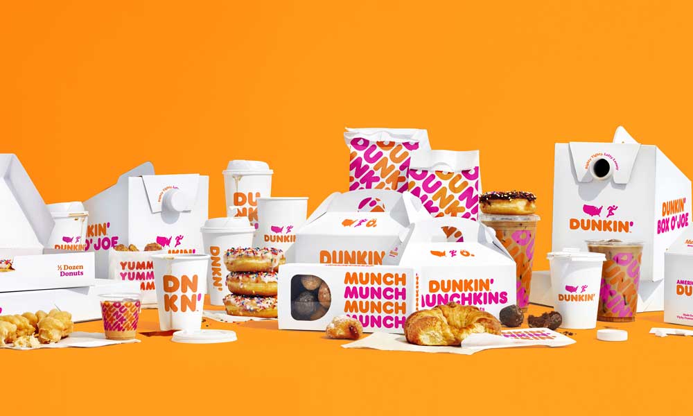
6 – Dunkin’s Name Simplification
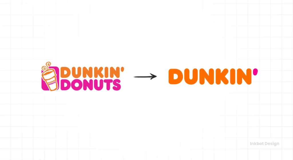
Dunkin’ made a bold move in its rebranding journey by officially dropping “Donuts” from its name in 2019. This decision was not just a whim but a strategic response to changing consumer preferences. With coffee culture booming, the company wanted to focus on its expansion as a beverage leader.
The company announced the change in September 2018 and implemented it from January 2019. Dunkin’ retained the orange and pink colours and the rounded wordmark style, centring the brand on beverages and on-the-go convenience while keeping familiar equities intact.
Let’s be honest — when you hear “Dunkin’,” many people immediately think of their morning cup of joe rather than just doughnuts. By simplifying the brand name, Dunkin’ positioned itself as more than a doughnut shop. It’s about convenience, quality coffee, and a lifestyle that fits our fast-paced world.
Changes in logo design and colour scheme
Alongside dropping “Donuts,” Dunkin’ refreshed its logo to align with this new identity. The changes were straightforward yet effective:
- New Logo: The updated logo features bold, lowercase letters that create a friendlier and more approachable vibe. The rounded typeface feels modern, reflecting a sense of warmth.
- Vibrant Colour Scheme: The new colour palette features a bright orange and pink combo that radiates energy. It’s eye-catching and instantly recognisable, making it hard to miss in a crowded marketplace.
At my local Dunkin’, the logo appears more vibrant on cups and signage, creating a fresh atmosphere that draws in people. It’s a delightful invitation to grab a quick coffee on the go!
Strategy behind the rebrand and its market impact
The strategy behind Dunkin’s rebrand is clear. This wasn’t merely about a name change but about evolving into a coffee-centric brand. The implications have been significant:
- Targeting a Broader Audience: By stepping away from the doughnut-centric identity, Dunkin’ has attracted coffee lovers who may have overlooked it. The positioning enables more innovative drink offerings that appeal to diverse tastes.
- Increased Market Share: As the coffee market became increasingly competitive, the rebrand gave Dunkin’ an edge. They could tap into the growing trend of coffee-to-go and adapt more swiftly to market needs.
In essence, Dunkin’s name simplification redefined its brand while highlighting versatility. It opened the door to a new customer base and fortified its position in the coffee landscape. Next, we’ll explore how Nike has modernised its logo with subtle enhancements, ensuring it remains as iconic as ever!
7 – Nike’s Subtle Swoosh Enhancement
Nike’s Swoosh is one of the most recognisable logos in the world, and its evolution over the years reflects the brand’s commitment to innovation and excellence. Originating in 1971, this simplistic design symbolises motion and speed — attributes that resonate with every athlete.
As Nike has grown and adapted, so has its iconic logo. In recent years, the company has made subtle design adjustments, keeping it fresh and relevant without losing its signature appeal.
It’s fascinating how a tiny swoosh can evoke feelings of power and ambition. I remember strapping on my first pair of Nikes before a race; that logo filled me with confidence. It’s a reminder that Nike is about products and the spirit of determination.
The Swoosh, designed by Carolyn Davidson in 1971, has kept its core form. Nike’s updates focus on usage, proportion, colour, and application across products and media rather than issuing wholesale logo redesigns.
Subtle refinements made to improve clarity and modernity
The recent refinements to the Swoosh logo may seem minor. Still, they’re part of a larger strategy to enhance clarity and modernity. Here’s what has changed:
- Streamlining the Design: The latest version features a slightly more elongated and tapered Swoosh. This adjustment enhances the sense of movement, making it appear more dynamic.
- Flat Appearance: Nike has also embraced a flatter aesthetic, a popular trend in modern design. This refinement helps the logo translate well across digital platforms and traditional media.
These changes might be subtle, but they ensure that the Swoosh remains contemporary and appealing to new generations of athletes and casual wearers.
How Nike maintains brand consistency while staying current
Brand consistency is crucial for Nike, and their thoughtful enhancements reflect this principle. Despite the minor updates, the essence of the Swoosh remains unchanged.
- Global Recognition: The streamlined design still embodies Nike’s core values: quality, performance, and empowerment. This ensures that the brand stays instantly recognisable worldwide.
- Cohesive Marketing: Nike integrates the updated logo across all their marketing channels, from social media to packaging. This cohesive strategy strengthens brand identity and reinforces consumer trust.
Ultimately, these subtle enhancements ensure that Nike’s Swoosh stays current while honouring its rich heritage. It inspires athletes and dreamers, reminding us that every tiny step forward counts.
Now, let’s delve into how Mailchimp embraced a playful update to its branding to better reflect its growth and target its audience more effectively.
8 – Mailchimp’s Playful Update
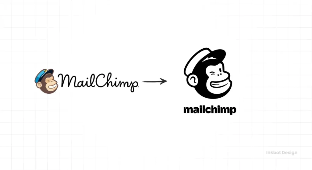
Mailchimp is another prime example of a brand that executed a thoughtful rebrand to reflect its personality. The popular email marketing platform recently underwent a bold transformation, injecting playfulness into its visual identity.
This rebranding effort wasn’t just about a new logo; it symbolised a shift in how Mailchimp wanted to be perceived in the market and how it engages with its users.
As a long-time user, I’ve always appreciated Mailchimp’s straightforwardness. Still, the overhaul makes it feel even more inviting and user-friendly. It’s like walking into a welcoming café rather than a sterile office!
Changes in typography, colour palette, and mascot design
The update introduced several key changes that marked a departure from the old branding:
- Typography: Mailchimp shifted from a more serious look to a quirky, custom font called “Bernard.” This typeface adds a touch of fun while remaining legible, aligning with the brand’s friendly vibe.
- Colour Palette: The new colour scheme features bright yellows, playful greens, and soft pastels that evoke positivity and creativity. This change helps the brand feel fresh and approachable, making a statement that says, “We’re here to help!”
- Mascot Design: Perhaps the most delightful change was the evolution of Mailchimp’s mascot, Freddie the monkey. He’s been given a bolder, more animated look that embodies the brand’s playful essence. This friendly character draws users in, creating a deeper emotional connection.
The 2018 Collins system introduced Cooper as the primary typeface with expressive weights, not Bernard. The brand’s signature Cavendish Yellow became the anchor colour, and Freddie was redrawn for consistency across sizes.
The company also standardised the name from “MailChimp” to “Mailchimp” in 2018. An expressive illustration system, with loose lines and collage textures, reinforced the friendly voice across onboarding flows and campaigns.
How the rebrand reflects the company’s growth and target audience
This playful update reflects Mailchimp’s growth trajectory and desire to connect more closely with small business owners and creative marketers.
- Target Audience Appeal: The vibrant colours and whimsical typography resonate with entrepreneurs seeking a tool that feels less intimidating and more supportive. It’s an attempt to say, “Hey, we’re friendly, and we understand you!”
- Alignment with Core Values: The rebrand channels Mailchimp’s core values of empowerment and creativity. It helps users feel inspired to express their brand identities through email marketing.
In essence, Mailchimp’s playful rebranding is a celebration of its evolution. It illustrates how a brand can stay relevant and appealing while nurturing its roots. Now, let’s explore how Figma’s redesign aims to reach beyond professional designers to engage a broader audience.
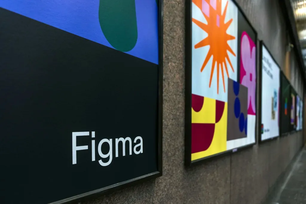
9 – Figma’s Inclusive Redesign
Figma, the collaborative interface design tool, has embraced a significant redesign in 2024 to extend its reach beyond professional designers. It’s an exciting move that illustrates Figma’s intention to democratise design.
No verifiable information available on a 2024 logo replacement for Figma’s multicoloured “F” mark. The established logomark continues to represent the brand, while product and community growth broaden the audience.
As someone who has dabbled in UI design, I’ve often found Figma user-friendly. Still, their new identity opens the floodgates for even more creativity and inclusivity.
This rebranding reflects a commitment to creating a platform where everyone—from hobbyists to small business owners—can express their ideas visually. The goal is clear: make design accessible for all, not just those with a professional background.
Changes in logo and key visuals
The new logo and key visuals represent a strategic shift. Here’s what’s been revamped:
- Logo Update: Figma’s logo retains its distinctive simplicity but now features a more fluid design that signifies collaboration and connection. The slight modulation in shapes tells a story about the design process, making it feel dynamic and alive.
- Vibrant Colour Palette: The rebrand introduces an expanded palette of playful hues. This vibrant assortment creates a sense of community, appealing to a more diverse audience while inviting creativity.
- Visual Elements: Their marketing materials’ enhanced illustrations and playful motifs portray friendliness and approachability. It invites users to engage, explore, and innovate without intimidation.
These changes bring new life into Figma’s branding, making it more inclusive and welcoming.
How the rebrand supports Figma’s commitment to accessibility and growth
Figma’s redesign supports its unwavering commitment to accessibility, ensuring that every user can engage with the platform:
- User-Centric Design: By focusing on visuals that appeal to a broader audience, Figma encourages users of all backgrounds to feel comfortable experimenting with design, regardless of their skill level.
- Community Engagement: Figma’s community-driven ethos is reinforced through this rebrand, fostering a sense of belonging where users can collaborate freely and learn from one another.
The rebranding signals a step towards growth for Figma and the design community. Figma aims to be the go-to platform for everyone, proving that design is a skill that can be nurtured and celebrated by all. Let’s delve into how Gucci balances its luxurious heritage with a modern touch in its recent logo redesign.
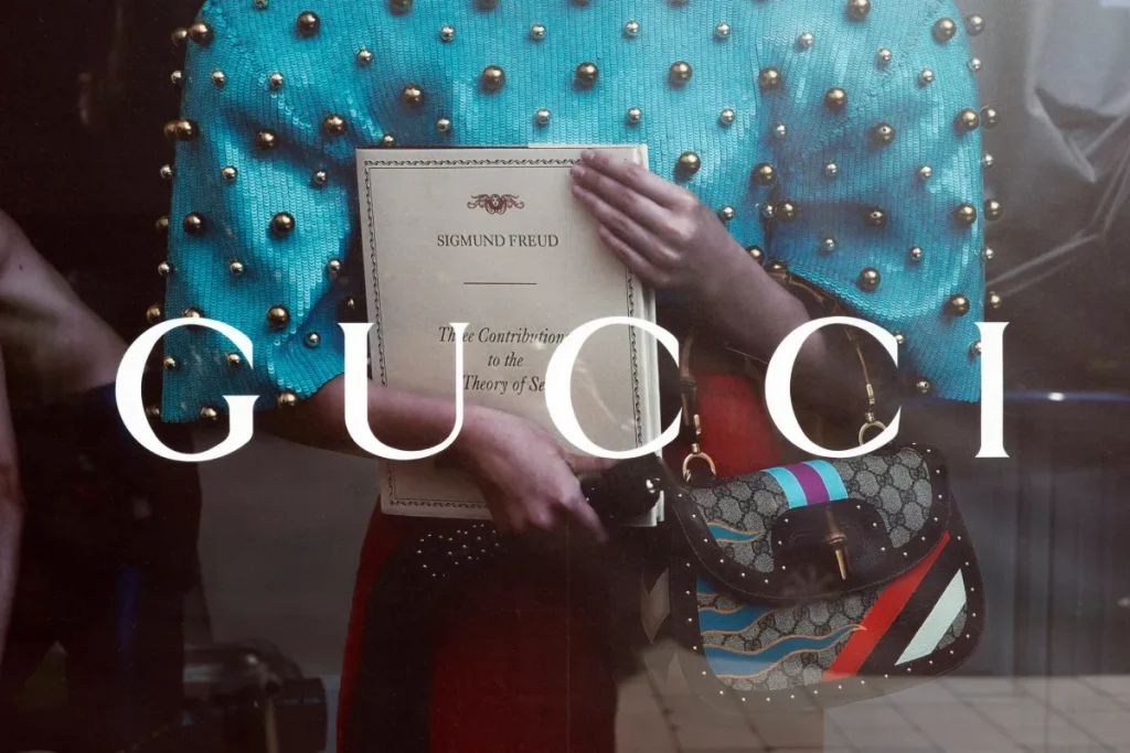
10 – Gucci’s Modern Elegance
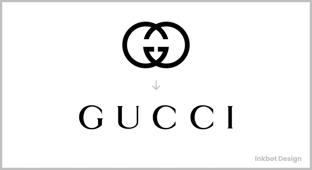
Gucci has always been synonymous with luxury, but in 2024, the iconic fashion house underwent a significant transition by redesigning its logo.
No verifiable information available that Gucci replaced its classic double G logo in 2024 with a minimalist sans-serif mark. The intertwined Gs remain the brand’s enduring emblem across accessories and media.
For decades, the classic intertwined “G” that has adorned everything from handbags to haute couture has been replaced with a sleek, minimalist design. This shift marks an evolution in the brand, embracing modern aesthetics while maintaining the essence of what Gucci stands for.
It’s like catching up with an old friend who’s adopted a new style. The roots are still there, but now there’s a fresh, contemporary vibe!
Comparison of the 1970s logo to the 2024 update
When you compare the 1970s logo with the 2024 update, the changes are striking yet respectful of Gucci’s rich heritage.
- 1970s Logo: The classic logo featured the iconic double “G” intertwined in a bold serif typeface. It was opulent and rich, capturing the essence of the lavishness for which Gucci was known during its peak.
- 2024 Update: The new version simplifies the intertwined design, opting for a more streamlined look. The modern minimalist approach uses a clean sans-serif typeface that looks elegant and aligns with the brand’s forward-thinking direction.
This transition symbolises changing consumer preferences, as modern luxury trends lean towards simplicity and sophistication over overt opulence.
How Gucci balances luxury heritage with contemporary appeal
Gucci’s rebranding strategy successfully balances its luxurious heritage with a contemporary appeal.
- Timeless Iconography: While the new logo is modern, it retains the recognisable ‘G’ elements that loyal customers adore. This connection is essential for preserving brand loyalty while transforming its image.
- Textile Innovation: The sleek design also aligns with current trends towards sustainability and minimalism in fashion, showing that Gucci can innovate while honouring traditional craftsmanship.
By merging classic elements with contemporary design principles, Gucci is not just appealing to a new generation of buyers but solidifying its place in the luxury market and modern culture.
In conclusion, the modern elegance of Gucci’s redesign is a brilliant example of evolving without losing sight of the past. As we reflect on these rebranding efforts across various brands, it’s clear that successful evolution is about embracing change while honouring tradition.
Whether through a playful update at Mailchimp or the minimal sophistication of Gucci, these brands are learning how to navigate the ever-changing landscape of consumer preferences.
Conclusion
As we’ve explored, successful logo rebranding is more than just a change in graphics; it’s an art of storytelling, evolution, and strategy.
Brands like Google, Starbucks, and Gucci have shown us that a well-executed redesign can breathe new life into a company while resonating with modern audiences. Here are some key trends that stand out:
- Minimalism and Simplicity: Many brands are embracing cleaner, more straightforward designs. This trend reflects a desire for clarity in a world saturated with options.
- Meaningful Symbolism: New logos often incorporate elements that reflect the brand’s mission or values. For instance, Animal Planet’s use of the elephant symbolises both conservation and connection to wildlife.
- Adaptability: As brands expand, logos are designed to be versatile across various platforms, from mobile apps to billboards. This adaptability is crucial for maintaining visual coherence.
Each of these trends highlights how brands are not just updating their looks; they are reshaping how they engage with customers meaningfully.
Importance of maintaining brand identity while evolving with the times
While staying current is important, maintaining a strong brand identity is equally essential. A logo should visually represent the brand’s core values and history. When Dunkin’ dropped “Donuts,” it reflected a shift in focus but retained its iconic colour scheme and energy.
- Brand Recognition: Abrupt changes can confuse loyal customers, so keeping familiar elements intact is crucial. This helps ensure that brand recognition remains consistent even amidst change.
- Emotional Connection: A well-crafted logo resonates emotionally with customers. It tells a story that builds familiarity and trust. For example, Figma’s revitalisation aims to create a connection beyond professional designers, inviting a community feel.
In summary, the path to successful logo rebranding lies in balancing change with a tribute to heritage. Brands must evolve to meet contemporary expectations while ensuring their identity remains clear and strong.
As we’ve seen across various examples, this delicate balance keeps brands relevant and admired in an ever-changing marketplace.
Please keep your eyes peeled for how these brands continue to enrich their identities and connect with audiences moving forward!
