Good App UI/UX Design: Build Apps That Win Users & Drive Results
Your app. Is it a masterpiece that users can’t get enough of? Or is it gathering digital dust, another forgotten icon on a crowded screen? The difference, more often than not, comes down to one thing: good app UI/UX design.
Forget the fluff, the jargon, the endless debates about shades of blue. We’re talking about building experiences that actually work. Experiences that solve problems. Experiences that make users’ lives a tiny bit easier, or a whole lot better.
This isn’t about chasing design awards that gather dust on a shelf. This is about results. Pure and simple. If your app’s UI/UX isn’t delivering, it’s failing. And that failure costs you users, reputation, and cold, hard cash.
So, if you’re ready to ditch the guesswork and start building apps that truly deliver, you’re in the right place. Let’s crack on.
- UI/UX design significantly influences user satisfaction, which directly impacts search engine rankings.
- User experience metrics like dwell time and click-through rate are critical for SEO success.
- Page speed optimisation is essential for better SEO performance and user experience.
- Website aesthetics, including colour and font, can attract or deter visitors.
- Accessibility features enhance user experience and improve overall SEO rankings.
Why ‘Good Enough’ App UI/UX Kills Your Business
Let’s be brutally honest. “Good enough” is where brilliant app ideas go to die a slow, painful death. You think you’re saving a bit of time or money by cutting corners on design? Think again. You’re actively sabotaging your chances of success.
Bad UI/UX isn’t just a minor inconvenience for your users; it’s a major roadblock for your business. It leads to:
- Rock-bottom engagement: Users open it once, can’t figure it out, and boom – they’re gone. For good.
- Sky-high churn rates: Even if they initially try, a frustrating experience will send them running to your competitors.
- Wasted development dosh: What’s the point of perfectly coded features if no one can find or use them? That’s money straight down the drain.
- Tanking reputation: Word gets around. An app that’s a pain to use? People will talk, and not in a good way.
Consider this: a frequently cited figure suggests that around 25% of users abandon an app after only one use if the experience isn’t up to scratch.
One in four. Vanished. Because the design wasn’t just “not pretty enough” – it was fundamentally broken from a user’s perspective.
The “good enough” trap is seductive. You’re keen to launch, to get it out there. But “good enough” UI/UX means users struggle. It means they get annoyed. It means they leave. And it means your app, and potentially your business, withers.
Investing in good app UI/UX design isn’t a cost; it’s one of the smartest investments you can make. It’s about understanding the ROI of good UX design – it pays back in user loyalty, positive reviews, and a healthier bottom line.
Sidestep the common app UI/UX mistakes from the get-go, or pay the price later.
Foundation First: Nailing User-Centric Design Principles Like a Pro
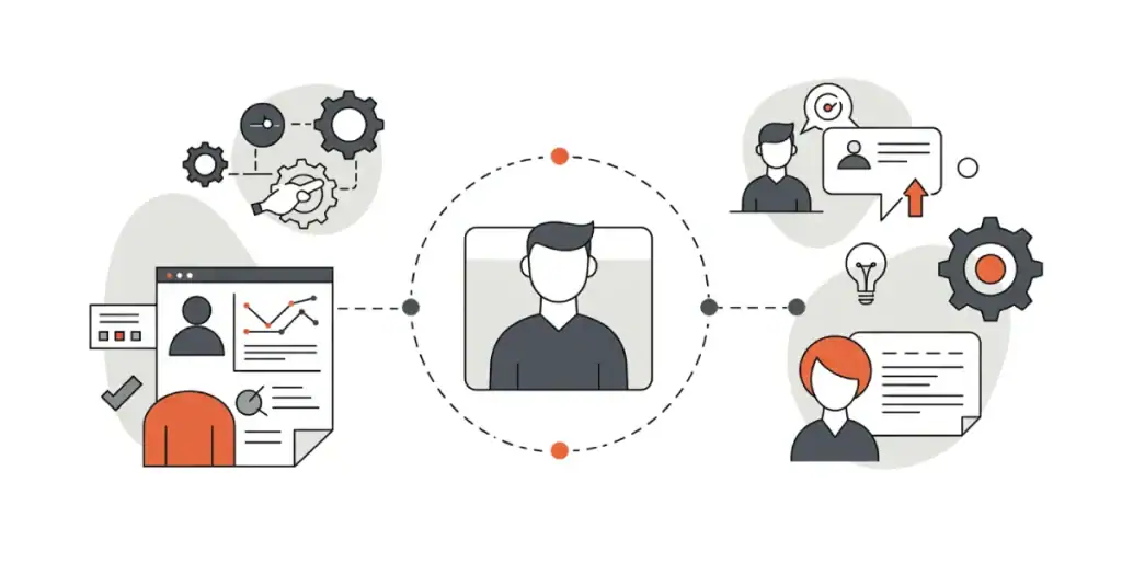
Alright, so what does “good” actually look like? It starts with user-centric design principles. Sounds fancy, but it’s dead simple: stop thinking about what you want, or what you think is cool. Start obsessing about what your user needs and wants. Your app exists to serve them. Not the other way around.
Here are the non-negotiables:
- Clarity: Is it blindingly obvious what to do next? Can users instantly understand what each button, icon, or piece of information means? If they have to pause and think, you’re adding friction. Aim for crystal clarity.
- Simplicity: Less is almost always more. Every extra element on the screen is another thing to process. Strip it back. Does this feature really need to be there? Does this button really need that fancy animation if it slows things down? Focus on the core tasks and make them effortless.
- Efficiency: How quickly and easily can users achieve their goals within your app? Are there too many steps? Too much tapping and swiping for a simple action? Streamline those pathways. Respect their time.
- Feedback: Your app needs to communicate. When a user taps a button, does something happen? A visual cue? A loading spinner? Silence is confusing. Good feedback reassures users that the app has understood their action and is working on it. This is a core part of mobile usability best practices.
- Consistency: Don’t make users learn a new set of rules for every screen. Navigation should be in the same place. Buttons for similar actions should look and behave similarly. Consistency breeds familiarity and reduces cognitive load. They learn it once, then it’s easy.
Pro Tip: Stuck on a design decision? Ask yourself this one simple question: “What problem does this solve for the user, right now, on this screen?” If you don’t have a crystal-clear answer, rethink it.
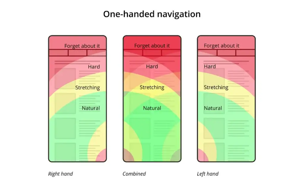
Structuring Your App for Brain-Dead Simple Navigation
Now, let’s talk about how users find their way around. Information Architecture for applications (IA) isn’t the sexiest part of design, but it’s like the plumbing in your house – get it wrong, and everything else is a mess, no matter how pretty it looks.
Your goal? Intuitive app navigation. If users need a manual or a search party to find a key feature, you’ve already lost. They should feel their way to what they need, almost without thinking.
Common pitfalls in app navigation are everywhere:
- The infamous “hamburger menu” hides away critical features. Sure, it saves space, but out of sight is often out of mind.
- Too many top-level navigation items overwhelm the user.
- Inconsistent labelling. What’s called “Profile” on one screen is “My Account” on another. Confusion guaranteed.
- Deeply nested structures that require endless tapping to get anywhere.
Practical Tips to Get Navigation Right:
- Think like your user (again!): How would they categorise information? What terms would they use? Basic card sorting exercises, even with a few representative users, can be incredibly insightful.
- Clear, concise labels: Use language your users understand. Avoid jargon.
- Visual hierarchy: Make it obvious what the primary navigation options are. Use size, colour, and placement to guide the eye.
- Follow platform conventions (mostly): Users are familiar with standard UI design patterns for mobile (like tab bars on iOS or navigation drawers on Android). Don’t stray too far unless you have a very, very good reason. Consistency with the operating system reduces the learning curve.
- Test it! Watch real users try to find things in your app. Their struggles will tell you more than any expert review.
Good IA and intuitive navigation aren’t just about convenience; they’re fundamental to usability. Get this right, and users will glide through your app. Get it wrong, and they’ll hit a brick wall.
The Real Deal on Wireframing and Prototyping
Right, imagine trying to build a house. You wouldn’t just grab some bricks and start cementing, would you? You’d want blueprints. Detailed plans. That’s exactly what wireframes and prototypes are for your app. Skipping this stage is pure madness, yet so many do it.
Wireframing and prototyping tools (and the process itself) are your first chance to give structure to your ideas.
- Wireframes: These are the basic skeletons. Low-fidelity, black and white, just boxes and lines. They define the layout, the information hierarchy, and the basic flow. No colours, no fancy fonts, no distractions. The beauty of wireframes? They’re quick and cheap to create and change. You can explore dozens of layouts without wasting precious development time. This is where you answer: “What goes where?”
- Prototypes: This is where things get interactive. Prototypes can range from simple clickable wireframes (low-fidelity) to designs that look and feel almost like the final app (high-fidelity). They allow you to simulate the user flow and test interactions. “How does it work? How does it feel to move from screen A to screen B?”
Why are these so important?
- Early feedback: Put a prototype in front of users (or even just colleagues) and watch. You’ll spot confusion, awkward flows, and missed requirements before a single line of code is written. This is gold.
- Clarify requirements: Visuals are way better than written specs for getting everyone on the same page – developers, stakeholders, designers. Everyone sees what’s being built.
- Iterate rapidly: Got an idea? Mock it up. Test it. Tweak it. Test it again. This iterative design loop is massively cheaper and faster with prototypes than with fully coded products.
- Save a fortune: Catching a major flaw at the wireframe stage might cost you an hour. Catching it after development? That could be days, weeks, or even a complete rebuild. Ouch.
I remember one project, a complex data management app. The initial concept was a bit of a beast. We spent a solid week just on interactive wireframes, testing different ways to present and filter information.
The first version we showed the client? They were polite, but you could see the confusion. We went back, simplified massively based on their initial (hesitant) feedback, and the second prototype clicked.
That early, slightly awkward, wireframe testing probably saved us months of development pain and a product nobody would have used.
So, don’t even think about skipping this. Whether it’s rough sketches on paper or slick mockups in Figma or Adobe XD, the value is in the thinking and the early validation.
Secrets to User Research That Actually Tell You Something Useful

You think you know what your users want? Let me stop you right there. You probably don’t. Not really. And that’s okay, as long as you’re willing to find out. That’s where user research methodologies for apps come in.
It’s about systematically understanding your users – their needs, their behaviours, their pain points. Stop guessing. Start knowing.
- User Personas: These aren’t just fluffy demographic profiles (“Sarah, 35, likes cats”). Good personas are research-backed representations of your key user types. What are their goals when using your app? What are their biggest frustrations with existing solutions (or your current app)? What motivates them? What are their tech skills? A deep understanding here helps you make design decisions with specific users in mind.
- User Journey Mapping for apps: This is powerful. You visually map out every single step a user takes to achieve a goal with your app (or even before they get to your app and after they leave). From initial awareness, to download, to onboarding, to regular use, to getting support. At each step, you note their actions, thoughts, feelings, and pain points. This helps you identify critical moments of friction and opportunities for improvement. It builds user empathy because you see the experience through their eyes.
- Surveys & Questionnaires: Good for gathering quantitative data or opinions from a larger group. Keep them short and focused.
- User Interviews: Sit down (or video call) with real or potential users and talk to them. Ask open-ended questions about their habits, needs, and experiences related to the problem your app solves. Listen more than you talk.
- Observation (Contextual Inquiry): Watch users in their natural habitat trying to perform tasks your app is designed to help with (or using your existing app). You’ll see workarounds, frustrations, and unmet needs that they might not even be able to articulate.
Even on a shoestring budget, you can do user research. Five well-chosen user interviews can uncover a huge percentage of the common usability issues. Talk to your customer support team – they’re on the frontline of user problems.
The point is to get out of your own head and into the user’s world. What you learn will be the bedrock of good app UI/UX design.
Testing, Testing… Is This Thing On? Making Usability Testing Your Secret Weapon
You’ve done your research, crafted your personas, mapped the journeys, and designed what you think is a brilliant interface. Job done? Not even close. Now you need to see if it actually works in the hands of real people. Enter usability testing methods for apps. This is non-negotiable.
Here’s a hard truth: You are not your user. You know the app inside out. You know where everything is. Your users don’t. What’s obvious to you can be baffling to them. Your opinion on whether the design is “good” is far less important than a real user’s ability to actually use it effectively.
Why is usability testing your secret weapon? Because it shows you, clear as day, where your design is falling short. It takes the guesswork out of improvements.
Simple ways to conduct tests (you don’t need a fancy lab):
- Hallway Testing: Grab anyone who isn’t on your project team (colleagues from other departments, your mum, the barista if they’re willing). Give them a couple of key tasks to perform on your prototype or app. Watch them. Don’t help. Just observe.
- Remote Moderated/Unmoderated Testing: Use online tools to have users (who fit your target profile) test your app from their own devices. Moderated means you’re there (virtually) to guide and ask questions. Unmoderated means they record their screen and thoughts as they go.
- The “5 Second Test”: Show a user a screen for just 5 seconds. Then hide it. Ask them what they remember, what the screen was about, and what they think they could do there. Great for checking initial clarity and impression.
What to look for during testing:
- Task completion rates: Can users successfully complete the key tasks you set them?
- Error rates: How often do they make mistakes or go down the wrong path?
- Time on task: How long does it take them to complete tasks? (Longer isn’t always worse if the task is complex, but watch for signs of struggle.)
- Qualitative feedback: Listen to their comments, sighs of frustration, or moments of delight. Ask them to “think aloud” as they navigate.
Industry wisdom, often attributed to Jakob Nielsen, suggests that testing with just 5 users can uncover around 85% of the usability problems in an interface.
Think about that. Five users. Massive insights.
Don’t wait until your app is fully built. Test early with wireframes. Test with prototypes. Test your live app. Make it a continuous loop: Design -> Test -> Learn -> Iterate. This is how you move from “hoping it’s good” to knowing it works.
Beyond Function: Crafting an App People Actually Enjoy Using
Okay, so your app is usable. People can complete tasks. That’s the baseline. But “good” app UI/UX goes beyond mere function. It aims to create an experience that people actually enjoy.
This is where emotional design in app interfaces comes into play. It’s about those little touches that make users feel good, understood, and maybe even a bit delighted.
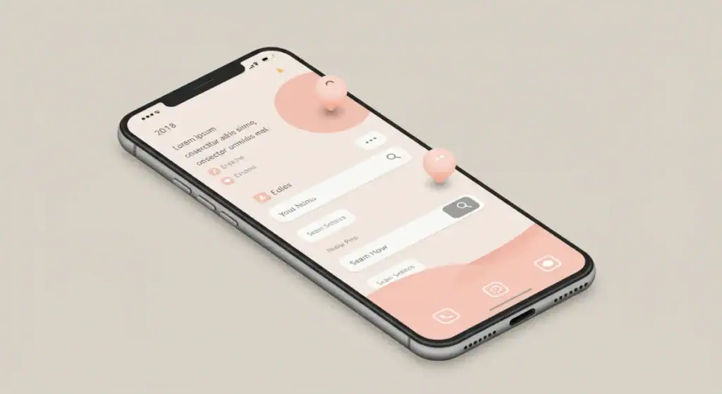
- Microinteractions: These are the small, contained moments when a user interacts with your app and the app responds. Think about the satisfying “swoosh” when you send an email, the subtle animation when you “like” a post, or the way a button changes state when you tap it. Microinteractions examples done well provide feedback, guide the user, and can inject a bit of personality. They make the app feel alive and responsive. Done poorly, they’re annoying and distracting. The key is subtlety and purpose.
- Visual Design that Supports Usability: Aesthetics matter, but not just for prettiness. Good visual design (colour, typography, imagery, layout) should enhance usability and clarity.
- Visual Hierarchy: Guide the user’s eye to the most important elements on the screen. What do you want them to see and do first?
- Colour Psychology (light touch): Colours evoke emotions and can be used strategically to reinforce your brand and guide actions (e.g., green for success, red for errors – but be mindful of cultural differences and accessibility).
- Typography in apps: Choose fonts that are legible on small screens. Ensure good contrast and appropriate sizing. Reading tiny, low-contrast text is a recipe for user frustration.
- Thoughtful Animations and Transitions: Smooth transitions between screens can make the app feel more polished and intuitive, helping users understand the spatial relationship between different parts of the app. But avoid long, gratuitous animations that just slow things down.
The goal here isn’t to turn your serious business app into a video game (unless it is a video game). It’s about making the interaction feel smooth, considered, and respectful of the user’s attention.
When an app feels good to use, people are more forgiving of minor flaws, more likely to explore its features, and more likely to stick around.
Accessibility: Good Design is Inclusive Design (And It’s Not Optional)
This is a big one, and too often an afterthought. App accessibility standards aren’t just a niche concern for a tiny fraction of users. Designing for accessibility means designing for everyone, including people with visual, auditory, motor, or cognitive impairments. And guess what? It usually makes your app better for all users.
Think about it:
- Bigger Audience: You’re not excluding a significant portion of the population.
- Better SEO (for web-based app components): Some accessibility practices align with SEO best practices.
- Legal Compliance: In many regions, there are legal requirements for digital accessibility (e.g., adherence to WCAG for apps – Web Content Accessibility Guidelines).
- It’s the Right Thing To Do: Simple as.
Key Insight: Designing for accessibility often results in a better experience for all users. Clearer contrast benefits people in bright sunlight. Keyboard navigability helps power users. Simple language helps those who aren’t native speakers.
Simple starting points for more accessible app design:
- Sufficient Colour Contrast: Ensure text and important UI elements have enough contrast against their background. Tools can check this.
- Alternative Text for Images (if your app uses informative images): Describe the content of images for screen readers.
- Clear Touch Targets: Make buttons and interactive elements large enough to be tapped accurately, especially on mobile.
- Support for Keyboard Navigation (for apps that might be used with keyboards): Can users navigate and interact with all features without a mouse/touch?
- Resizable Text: Allow users to increase text size without breaking the layout.
- Clear and Simple Language: Avoid complex jargon where possible.
Inclusive design isn’t about ticking boxes; it’s a mindset. It’s about empathy and ensuring your app provides a positive experience for the widest possible range of people. Don’t treat it as an add-on; bake it into your design process from the start.
Measuring What Matters in Your App’s UI/UX
You’ve launched. Users are trickling in. How do you know if your UI/UX is actually good? Gut feeling isn’t enough. You need data. Measuring user engagement in apps and tracking the right Key Performance Indicators (KPIs) for UX is crucial. What gets measured gets managed (and improved).
Which metrics should you be looking at?
- Task Success Rate: Can users actually complete the key tasks your app is designed for? (e.g., making a purchase, finding information, completing a profile). This is a fundamental measure of usability.
- Time on Task: How long does it take users to complete those tasks? Is it efficient?
- Error Rate: How often are users making mistakes or encountering errors? Where are these happening?
- Conversion Rates: For specific goals like sign-ups, purchases, or feature adoption. This is where conversion-focused app design shows its worth. If your design helps users convert, it’s working.
- User Engagement Metrics: Daily Active Users (DAU), Monthly Active Users (MAU), session length, frequency of use. Are users coming back? Are they spending meaningful time in the app?
- User Retention/Churn Rate: How many users stick around after a week? A month? How many are abandoning the app? High churn is a massive red flag for UX problems.
- Customer Satisfaction (CSAT) / Net Promoter Score (NPS): Direct feedback on how users feel about your app.
The key is to connect these UX metrics to your overall business goals. How does improving the task success rate impact your sales? How does reducing churn affect your revenue?
This is where data-driven UI/UX improvements come in. Use analytics tools (there are many good ones) to track these metrics. Look for patterns. Where are users dropping off? Which features are they struggling with?
Use A/B testing to try out different design solutions for problem areas and see which performs better based on real data. Don’t just change things because you think it’s better; change things because the numbers prove it’s better.
A study by Forrester Research found that, on average, every dollar invested in UX brings 100 dollars in return. That’s an ROI of 9,900%.
The numbers speak for themselves. Good UI/UX, backed by data, isn’t an expense; it’s a revenue generator.
Keeping It Consistent: The Cross-Platform UX Challenge
Many apps need to exist on multiple platforms – iOS, Android, perhaps a web app version. This brings the challenge of cross-platform UX consistency. Users who interact with your brand on different devices expect a certain level of familiarity. A jarringly different experience can be confusing and erode brand trust.
Why does it matter?
- Brand Perception: A consistent experience reinforces your brand identity and professionalism.
- Usability: Users who learn how your app works on one platform can more easily pick it up on another. This reduces the learning curve.
- Development Efficiency (sometimes): While platforms have unique patterns, a core consistent design language can streamline some aspects of development and design updates.
The balancing act is crucial here. You want to maintain your brand’s feel and core interaction patterns, but you also need to respect the native conventions of each platform. iOS users expect things to work in a certain “iOS way,” and Android users have their own expectations. Forcing an Android design pattern onto an iOS app (or vice-versa) usually feels clunky and out of place.
Strategies for achieving good cross-platform consistency:
- Define a Core Design Language: Your brand colours, typography, core iconography, and interaction principles should be consistent.
- Adapt, Don’t Just Copy-Paste: Adapt your core design language to fit the native patterns of each platform where it makes sense. For example, navigation might be handled by a tab bar at the bottom on iOS, but a navigation drawer or bottom navigation bar (increasingly common) on Android.
- Focus on Consistent Task Flows: The steps a user takes to achieve a key goal should be logically similar across platforms, even if the individual UI elements look slightly different.
- Test on Each Platform: Make sure the experience feels natural and intuitive to users familiar with that specific operating system.
The cost of getting this wrong? Users might find your app unintuitive on their preferred platform, leading to frustration and abandonment. Aim for a “cousins, not clones” approach – recognisably part of the same family, but with their own individual platform personalities.
The Evolution of App Design: What’s Cooking for 2025 and Beyond?
The world of app design doesn’t stand still. What was cutting-edge a few years ago is standard practice today. And what’s emerging now will shape the apps of tomorrow.
As of 2025, one of the most significant evolutions is the deepening integration of Artificial Intelligence (AI) into both the UI/UX design process and the user experience itself. This is a key aspect of the future of app design (AI-driven UX).
Here’s how AI is changing the game:
- Hyper-Personalisation: AI can analyse user behaviour, preferences, and context in real-time to deliver incredibly personalised experiences. Think of app interfaces that dynamically adapt content, features, and even layouts to individual users. This goes way beyond just showing a username.
- Predictive Interfaces: Apps are getting smarter at anticipating user needs. AI can suggest actions, pre-fill information, or surface relevant content before the user even explicitly asks for it. This can make apps feel incredibly intuitive and efficient.
- Smarter Assistance & Chatbots: AI-powered chatbots and virtual assistants within apps are becoming more sophisticated, capable of understanding natural language better and handling more complex queries and tasks.
- AI in Design Tools: AI is also transforming the tools designers use. We’re seeing AI-assisted features for generating design variations, automating repetitive tasks (like creating multiple screen sizes), checking for accessibility issues, and even suggesting A/B testing ideas based on design patterns. This frees up designers to focus on higher-level strategic thinking and creativity.
- Generative UI: While still early, the concept of AI generating significant portions of an app’s UI based on high-level prompts or data inputs is on the horizon. This could massively speed up initial development and prototyping.
Beyond AI, other trends continue to shape app design:
- Voice User Interfaces (VUI): Integrating voice commands and interactions is becoming more common, especially for hands-free scenarios.
- Augmented Reality (AR): For apps where overlaying digital information onto the real world adds value (e.g., retail, education, navigation), AR capabilities are becoming more accessible.
- Continued Focus on Inclusivity and Ethical Design: As apps become more powerful and integrated into our lives, the responsibility to design inclusively and ethically (especially concerning data privacy and AI bias) is paramount.
How to stay ahead? Continuous learning is key. Experiment with new tools and technologies. Pay close attention to how user behaviours and expectations are shifting.
The core principles of good UI/UX – clarity, simplicity, and user-centricity – will always be vital, but the way we deliver on those principles will continue to evolve. Those who adapt and embrace these changes will build the next generation of successful apps.
Common App UI/UX Pitfalls to Sidestep (Seriously)
We’ve talked a lot about what to do. Now let’s hammer home some of the most common app UI/UX mistakes that can absolutely cripple your app’s chances. Avoid these like the plague:
- Over-designing / Feature Creep (“Kitchen Sink” Syndrome): Trying to cram every conceivable feature into version 1.0. The result? A bloated, confusing mess. Focus on solving a few core problems exceptionally well. You can always add more later, if users actually need it.
- Ignoring User Feedback (Or Not Asking For It): You think you know best? Pride comes before a fall. If users are telling you something is confusing or broken, listen. They’re usually right.
- Horrible Onboarding (Or No Onboarding): The first few moments a user spends with your app are critical. If they’re dumped into a complex interface with no guidance, many will just bail. A smooth, clear, and concise onboarding process is vital.
- Inconsistent Design Language: Buttons that look different on every screen. Icons that mean one thing here and another there. Navigation that randomly changes. This creates cognitive dissonance and makes your app feel amateurish and hard to learn.
- Poor Performance & Slow Load Times: This is a massive UX killer. If your app is sluggish, unresponsive, or takes forever to load content, users will get frustrated and leave, no matter how beautiful it looks. Optimise your images, code, and server response times.
- Making Users Think Too Much (The “Don’t Make Me Think” Rule): Every time a user has to stop and try to figure out what to do next, you’re adding friction. Good design is intuitive. It guides the user effortlessly.
- Information Overload: Presenting too much information on the screen at once. Users get overwhelmed and can’t find what they need. Prioritise. Use progressive disclosure (show only what’s needed, when it’s needed).
- Ignoring Accessibility: As discussed, this isn’t just bad form; it’s bad for business and excludes users.
- Hidden Navigation or Key Features: If users can’t find it, it doesn’t exist. Make sure primary actions and navigation are easily discoverable.
- Annoying Notifications: Begging for reviews too early, sending too many irrelevant push notifications. This is a quick way to get your app uninstalled.
I once worked with a startup that had a brilliant idea for a productivity app. But they fell into the feature creep trap. They kept adding “just one more thing” before launch. The app became so complex that beta testers were completely lost.
They had to go back to the drawing board, strip out 70% of the features, and relaunch with a much simpler, focused product. It was a painful lesson, but the simpler version actually started to gain traction. Don’t make the same mistake.
Good App UI/UX Isn’t a Cost, It’s an Investment (That Pays BIG)
Let’s cut to the chase. Investing in good app UI/UX design is not a “nice-to-have” luxury. It’s not an expense you can trim when budgets are tight. It is a fundamental, non-negotiable driver of success in today’s app market.
Think about it:
- Good design leads to intuitive app navigation and mobile usability best practices, meaning users can actually achieve their goals.
- This, combined with user-centric design principles and insights from user research methodologies for apps, creates a positive experience.
- Positive experiences drive user engagement in apps, leading to higher retention and lower churn.
- A focus on conversion-focused app design means more users take the actions you want them to take.
- All of this translates into better reviews, word-of-mouth referrals, and ultimately, a stronger bottom line. The ROI of good UX design is real, and it’s substantial. It’s about aligning UX with business goals.
Stop thinking of design as just the pretty pictures. It’s the underlying strategy that makes your app work for your users, and therefore, for your business.
It’s about understanding how to use wireframing and prototyping tools effectively, how to conduct meaningful usability testing methods for apps, and how to interpret Key Performance Indicators (KPIs) for UX to make data-driven UI/UX improvements.
So, the question isn’t whether you can afford to invest in good app UI/UX design. The real question is: can you afford not to?
Are you going to keep building apps that just occupy space, or are you ready to build experiences that command attention, earn loyalty, and actually deliver results?
The choice, as they say, is yours.
FAQs
What is the main difference between UI and UX design in an app?
UX (User Experience) design is about the overall feel and effectiveness of the experience – how easy and enjoyable it is to use the app to achieve a goal. UI (User Interface) design is about the visual look and feel – the screens, buttons, icons, and how users interact with those specific elements. UX is the journey; UI is the vehicle’s controls and aesthetics.
How important is user research for good app UI/UX design?
Absolutely critical. Without user research, you’re just guessing what users need and want. Research helps you understand their goals, pain points, and behaviours, forming the foundation for designs that truly resonate and solve real problems.
What are some key principles of good app UI design?
Clarity (is it obvious?), simplicity (less is more), consistency (predictable patterns), feedback (the app communicates actions), and efficiency (users achieve goals quickly). Visual hierarchy and good typography also play vital roles.
How can I measure the success of my app’s UI/UX design?
Track Key Performance Indicators (KPIs) like task success rates, time on task, error rates, user engagement (DAU/MAU, session length), conversion rates, and user retention/churn rates. Also, gather qualitative feedback through surveys and usability tests.
What are wireframes and prototypes, and why are they important for app design?
Wireframes are basic skeletal layouts of app screens. Prototypes are interactive mockups that simulate user flow. They’re crucial for visualising ideas, getting early feedback, testing usability, and iterating on designs before costly development begins.
What’s a common mistake in app navigation design?
Overly complex or hidden navigation. If users can’t easily find what they’re looking for (e.g., due to a poorly organised hamburger menu or confusing labels), they’ll get frustrated and abandon the app. Intuitive app navigation is key.
How does accessibility fit into good app UI/UX?
App accessibility standards ensure your app can be used by people with diverse abilities (visual, auditory, motor, cognitive). It’s not just ethical; it expands your audience and often improves usability for everyone.
What is “user-centric design”?
It’s an approach that places the user at the heart of every design decision. It means understanding their needs, behaviours, and motivations deeply, and designing the app to meet those needs effectively and efficiently.
How can microinteractions improve app UX?
Subtle animations or visual feedback for user actions (e.g., tapping a button, refreshing content) make an app feel more responsive, engaging, and polished. Good microinteractions examples enhance the experience without being distracting.
What’s the ROI of investing in good app UI/UX design?
The ROI of good UX design can be massive. It leads to increased user satisfaction, higher conversion rates, better retention, reduced support costs, and enhanced brand loyalty – all contributing directly to business revenue and growth.
How often should I conduct usability testing for my app?
Continuously. Test early with prototypes, test before major releases, and test existing features periodically. Even small, regular tests can uncover critical issues and opportunities for data-driven UI/UX improvements.
What is information architecture in app design?
Information architecture for applications is the art and science of organising and structuring content and features within an app so that users can easily find what they need and understand where they are. It’s the blueprint for navigation.


