Form and Function in Web Design: Create Stunning, Effective Websites
Have you ever landed on a website that looked like Picasso designed it on a sugar high? 🎨
Or worse, one that functioned about as smoothly as a rusty bike with square wheels? 🚲
I’ve been there. And let me tell you, it’s not pretty.
When I first started Inkbot Design, my branding and design agency, I thought I had it all figured out. I’d create the most visually stunning website the internet had ever seen.
Spoiler alert: It was a disaster.
Sure, it looked fancy. But trying to navigate it? You’d have better luck deciphering ancient hieroglyphics while blindfolded.
That’s when I learned the hard truth about web design: form without function is like a sports car without an engine. It might look impressive, but it will get you nowhere.
In this guide, we’re diving deep into the world of form and function in web design.
We’ll explore:
- Why balance matters (and how to achieve it)
- The psychology behind good design
- Practical tips for creating stunning, functional websites
- Common pitfalls to avoid
- And much more
So buckle up, fellow design enthusiasts. It’s time to create websites that turn heads and convert visitors into loyal customers.
Let’s dive in, shall we?
🔰 TL;DR: Balancing form and function in web design is crucial for creating visually appealing and user-friendly websites. This guide explores the principles of aesthetics and usability, offering practical tips to achieve harmony between design and functionality. Learn how to craft websites that look great, deliver exceptional user experiences, and drive conversions.
- Balance between form and function is essential for creating visually appealing and user-friendly websites.
- Inkbot Design emphasises that mobile-first design is crucial as mobile traffic dominates website visits.
- Effective navigation should be clear, consistent, and intuitive for users on any device.
- Visual hierarchy guides users through a site, highlighting the most important content.
- Regular testing and analytics help maintain the balance of form and function in web design.
The Dance of Form and Function: Why Balance Matters
Imagine walking into a restaurant. The decor is breathtaking. Chandeliers sparkle overhead, plush velvet seats beckon and the ambience is pure luxury.
But then you sit down. The menu is indecipherable. The waitstaff is nowhere to be found. And when your food finally arrives, it’s cold and unappetising.
Would you go back?
This, my friends, is the perfect analogy for a website that prioritises form over function (or vice versa).
The Cost of Imbalance
According to a 2023 study by the Nielsen Norman Group, 88% of online shoppers say they wouldn’t return to a website after a bad user experience. That’s a lot of potential customers lost because of poor design choices.
But here’s the kicker: 94% of first impressions are design-related. If your site looks like it was cobbled together in 1995, you might not even get to showcase your fantastic functionality.
The solution? Balance.
Finding Harmony
Balancing form and function isn’t about compromise. It’s about synergy.
Think of it like a dance. Form leads with grace and beauty, while function follows with purpose and direction. When they move in harmony, the result is nothing short of magical.
In practical terms, this means:
- Your website should be visually appealing enough to capture attention
- But also intuitive enough that users can easily find what they’re looking for
- Elements should be aesthetically pleasing without sacrificing usability
- Content should be engaging and valuable, not just pretty filler
Remember: A well-designed website is about more than just about looking good. It’s about creating an experience that delights and converts.
The Psychology of Good Design: What Makes Users Tick
Ever wonder why some websites just feel right? It’s not magic. It’s psychology.
Understanding how the human brain processes visual information is critical to creating resonating designs.
The Power of First Impressions
It takes about 50 milliseconds (0.05 seconds) for users to form an opinion about your website.
That’s faster than you can say “bad design”.
This rapid judgement is based on visual appeal and is closely tied to the perceived usability of the site. In other words, if it looks good, users assume it works well too.
Colour Theory: More Than Just Pretty Hues
Colours aren’t just about aesthetics. They evoke emotions and influence behaviour.
For instance:
- Blue conveys trust and professionalism (no wonder it’s so prevalent in corporate designs)
- Green is associated with growth and nature (perfect for eco-friendly brands)
- Red can create a sense of urgency (hello, sale banners!)
But here’s the catch: cultural differences can impact colour perception. What works in one market might flop in another.
The F-Pattern: How Users Read Your Content
Spoiler alert: They don’t. At least, not in the way you might think.
Eye-tracking studies have shown that users typically scan web pages in an F-shaped pattern. They read across the top, then down the left side, with occasional horizontal scans.
What does this mean for your design?
- Put your most important content in the top left
- Use headings and subheadings to break up text
- Utilise bullet points and short paragraphs for easy scanning
The Rule of Thirds: Balance in Visual Design
Have you ever noticed how some websites just look… balanced?
Chances are, they’re using the rule of thirds. This principle divides the screen into a 3×3 grid, with crucial elements placed along the lines or at their intersections.
It’s a simple way to create visually appealing layouts that naturally guide the user’s eye through the content.
Practical Tips for Stunning, Functional Websites
All right, enough theory. Let’s get our hands dirty with practical tips you can implement now.
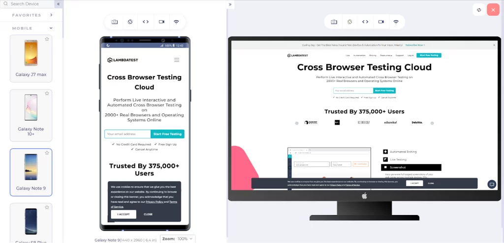
1. Prioritise Mobile-First Design
As of September 2024, mobile devices accounted for 63.38% of global website traffic. If your site isn’t mobile-friendly, you potentially alienate over half your audience.
Mobile-first design isn’t just about shrinking your desktop site. It’s about rethinking your entire approach to prioritise the mobile experience.
Tips for mobile-first design:
- Use responsive layouts that adapt to different screen sizes
- Simplify navigation for touch interfaces
- Optimise images and media for faster loading on mobile networks
- Use larger, touch-friendly buttons and form elements
2. Embrace White Space
White space (or negative space) isn’t wasted space. It’s breathing room for your content.
Proper use of white space:
- Improves readability
- Highlights important elements
- Creates a sense of elegance and sophistication
Don’t be afraid to let your content breathe. Sometimes, less really is more.
3. Use Clear, Consistent Navigation
Nothing frustrates users more than being unable to find what they’re looking for.
Your navigation should be:
- Clear and descriptive
- Consistent across all pages
- Easy to use on both desktop and mobile
Consider using a sticky header on longer pages to keep navigation accessible as users scroll.
4. Optimise Page Load Speed
In the age of instant gratification, speed matters. A lot.
According to Google, 53% of mobile site visits are abandoned if pages take longer than 3 seconds to load.
To speed up your site:
- Optimise images (compress and use appropriate formats)
- Minimise HTTP requests
- Use browser caching
- Consider using a Content Delivery Network (CDN)
5. Implement Accessible Design
Accessibility isn’t just a nice-to-have. It’s essential for creating inclusive websites that everyone can use.
Key accessibility considerations:
- Use sufficient colour contrast for text readability
- Provide alternative text for images
- Ensure keyboard navigation is possible
- Use semantic HTML to structure your content
6. Utilise Visual Hierarchy
Visual hierarchy guides users through your content, highlighting what’s most important.
Techniques to create a visual hierarchy:
- Use size to denote importance (more prominent elements draw more attention)
- Apply colour and contrast to highlight critical areas
- Use whitespace to separate and group elements
- Implement typography to create structure (headings, subheadings, body text)
7. Incorporate Micro-interactions
Micro-interactions are small, subtle animations that provide feedback to users.
Examples include:
- Button hover effects
- Form field highlights
- Loading animations
- Scroll-triggered animations
These small details can significantly enhance the user experience, making your site more responsive and engaging.
Common Pitfalls to Avoid

Even the best designers can fall into these traps. Don’t worry; I’ve got you covered.
1. Overcomplicating Designs
Remember my earlier anecdote about my first Inkbot Design website? Yeah, that was a classic case of overcomplication.
Keep it simple. Every element should serve a purpose. If it doesn’t, it’s just clutter.
2. Ignoring Content Strategy
Design without content is just decoration. Your design should enhance and support your content, not overshadow it.
Work closely with content creators to ensure harmony between design and messaging.
3. Neglecting Performance
A beautiful site that takes ages to load is like a sports car stuck in traffic. Frustrating and pointless.
Always test your designs on various devices and connection speeds. Optimise ruthlessly.
4. Forgetting About SEO
What good is a stunning website if no one can find it?
Incorporate SEO best practices into your design process:
- Use semantic HTML
- Optimise for page speed
- Ensure mobile-friendliness
- Use descriptive URLs and meta tags
5. Ignoring Analytics
Data is your friend. Use analytics to understand how users interact with your site and make informed design decisions.
Key metrics to track:
- Bounce rate
- Time on page
- Conversion rate
- User flow
Case Study: Inkbot Design’s Website Revamp
Let me share a quick story about how we applied these principles at Inkbot Design.
After realising our initial website was all style and no substance, we decided to revamp our approach.
Here’s what we did:
- Simplified the design, focusing on clean lines and ample white space
- Implemented a clear, consistent navigation structure
- Optimised for mobile, ensuring a seamless experience across devices
- Incorporated micro-interactions to enhance user engagement
- Focused on telling our brand story through a balance of visuals and compelling copy
The results?
- 40% increase in time on site
- 25% decrease in bounce rate
- 50% boost in mobile conversions
The lesson? When form and function work together, magic happens.
Conclusion: The Art of Balancing Form and Function
Designing websites that are both beautiful and functional can be challenging. But it’s worth the effort.
Remember:
- Good design is invisible. It should enhance the user experience, not distract from it.
- Function without form is tedious. Form without function is useless. Strive for balance.
- Always put the user first. What looks cool to you might be confusing to them.
- Test, iterate, and improve. Great design is a journey, not a destination.
By applying the principles and tips we’ve discussed, you’ll be well on your way to creating stunning websites that deliver real results for your business.
Ready to take your web design to the next level? At Inkbot Design, we’re passionate about creating beautiful, functional websites that drive results. Let’s chat about how we can help bring your vision to life.
FAQs: Form and Function in Web Design
What’s more important, the form or function of web design?
Both are equally important. A well-designed website should be visually appealing (form) and easy to use (function). The key is finding the right balance for your specific audience and goals.
How can I make my website more visually appealing without sacrificing usability?
Focus on clean layouts, consistent colour schemes, and purposeful use of white space. Incorporate visual elements that enhance rather than distract from the content and user experience.
What are some fundamental principles of functional web design?
Key principles include straightforward navigation, fast loading times, mobile responsiveness, accessibility, and intuitive user flows. Always prioritise the user’s needs and goals.
How does responsive design impact the balance of form and function?
Responsive design ensures your website looks good and functions well on all devices. It’s crucial to maintain aesthetic appeal and usability across different screen sizes.
Can a visually simple website still be effective?
Absolutely! Often, simpler designs are more effective as they allow users to focus on the content and critical actions without distraction. Remember, simplicity doesn’t mean boring.
How do I know if my website has a good balance of form and function?
User testing and analytics are critical. Look at metrics like bounce rate, time on site, and conversion rates. Also, qualitative feedback from actual users about their experience should be gathered.
What role does typography play in balancing form and function?
Typography is crucial. It affects both readability (function) and visual appeal (form). Choose fonts that are easy to read and align with your brand’s aesthetics.
How can I incorporate brand identity into my web design without overwhelming the user?
Use your brand colours, fonts, and style consistently but subtly. Your brand should be present without dominating the user experience.
What are some common mistakes in balancing form and function?
Common mistakes include overdesigning, neglecting mobile users, slow load times, confusing navigation, and prioritising flashy elements over usability.
How often should I update my website’s design to maintain balance?
There’s no fixed schedule, but regularly reviewing your site’s performance and user feedback is crucial. Major redesigns might be needed every few years, but minor optimisations should be ongoing.