50 Best Football Logos: Soccer’s Sporting Identity
When I was a child, I didn’t know what the offside rule meant and could only name three players at Man Utd, but one thing that always fascinated me was the red devil on their badge.
There was something about that powerful image – it represented history, pride and belonging in one little emblem you could put on a scarf or mug.
Later in life, I discovered I wasn’t alone in my obsession with logos; across pubs and playgrounds up and down the country, passionate arguments would break out over which team had the best one.
Was it Manchester United’s devil? Wolverhampton Wanderers’ snarling wolf? Liverpool’s Liver Bird? These weren’t just pictures to people; they were standards representing battles fought and won, family coats of arms for the working class, and shorthand signals for whole communities.
So when someone suggested whittling down the 50 best football logos of all time into a list – well. Of course! A chance to provoke global disputes is an opportunity not to be missed.
Because that’s what these crests are: identity cards waved defiantly under rivals’ noses. Even if your club is Real Madrid, Barcelona, or Manchester City rather than Accrington Stanley, Rochdale, or Derry City.
Now then. From now on, we will go if you walk with me. Let us take a slow wander through some of the strangest sights ever rendered in footballing iconography, from lions to locomotives via castles and canaries; prepare yourself for an exploration of how much pure emotion lurks within a scrap of cloth no more significant than your hand…
- Football logos serve as powerful symbols of identity, history, and cultural pride for clubs and their fans.
- Innovative designs foster loyalty, enhance marketability, and elevate a club's brand presence globally.
- Logos reflect local traditions while also reaching international audiences, bridging community and cultural pride.
- Evolution in design balances modern aesthetics with tradition, creating timeless icons that resonate with fans.
Why Football Logos Matter

Before we begin, let us answer the most critical question: why do football logos matter so much?
Well, they are the team’s face. They’re more than just pretty pictures; they tell stories, represent brands and unite millions of fans. A well-designed football logo can foster loyalty, evoke emotions, or enhance a club’s marketability.
Creating a memorable football logo is more complex than simply combining a ball and some initials. It is an art that combines visual appeal with strategic branding – a perfect mix of science and creativity.
However, these badges do more than simply adorn the kits; they are cultural icons. Picture them as the towering emblems on Tifos, draping over the shoulders of strangers and sparking instant recognition and connection among fans worldwide. Whether it’s a minimalist design that piques curiosity or an elaborate coat of arms that captures history, each badge speaks volumes about the club’s identity.
Cultural Resonance
Football club badges aren’t just local symbols; they transcend borders, engaging global audiences while still rooted in local traditions. Each badge captures a slice of history or regional pride, making it a key piece in the cultural mosaic of the sport.
Marketing Impact
In the marketing realm, these badges are invaluable. They are crucial for merchandise and branding and in shaping public perception. A well-loved badge can enhance a club’s image, attract sponsorships, and expand its international fan base.
Thus, the art of designing a football badge goes beyond aesthetics. It is about crafting a symbol that resonates deeply with fans, captures the club’s spirit, and stands the test of time as a cultural and marketing powerhouse.
Is Your Club Badge “Pro Tier”?
The world’s iconic logos share 5 specific traits. Compare your current crest against professional design standards to get your League Tier Rating.
The best logos are both timeless and contemporary; they should be effortless yet profound. These marks must look great, from giant stadium banners to minuscule smartphone screens.
It is time to lace our boots tight because 50 fantastic football logos await us there. We will delve into their histories/designs/meanings and meanings to determine what makes them stand out among other sports badges.
Top 50 Football Logos
FC Barcelona: The Club of Clubs
The logo of FC Barcelona is a masterful example of symbolism. The shield shape is traditional; the red and blue stripes represent the club’s colours (Blaugrana). However, the St George’s Cross and the Catalan flag speak volumes, telling us how deeply rooted this team is in Catalan culture.
Manchester United: Emblems of the Red Devils
You can’t miss Man Utd’s badge. It shows a red devil – a reference to their nickname – standing on top of a shield with a ship. That ship represents Manchester’s industrial heritage; together, those elements make up one hell of a logo dripping with history and determination!
The Manchester United badge has undergone significant changes from its 1970-1973 version to its current design. Let’s explore the differences:
1970-1973 Badge
- Colour Palette: This badge introduced a splash of yellow, offering a vibrant contrast to other elements.
- Design Elements: Diagonal lines were a notable feature, echoing the badges of other clubs from that era.
- Aesthetic: The overall look was reminiscent of the 70s, capturing the spirit and style of the time.
Current Badge
- Colour Palette: Modern iterations have shifted, focusing primarily on the club’s signature red, white, and black.
- Design Elements: The current design showcases a more streamlined and minimalist approach, reflecting contemporary tastes.
- Aesthetic: Gone are the playful lines, replaced by a consistent, polished look emphasising the club’s identity.
Key Differences
- Incorporation of Colours: The inclusion of yellow in the early 70s badge is absent today, with a return to traditional colours.
- Graphic Style: The former badge embraced creative lines, whereas the current badge opts for clear, bold simplicity.
- Era Influence: The vintage badge captured the quirkiness of the 70s, while the present design aligns with modern branding strategies.
Understanding these changes highlights how Manchester United’s badge has evolved to reflect both shifts in design trends and the club’s enduring legacy.
Real Madrid: Simple Royalty
Sometimes, less really is more. Real Madrid’s crest epitomises this idea with its clean lines and regal aesthetic. A crown sits above an intertwined MCF monogram (Madrid Club de Fútbol), which says everything that needs to be said about their royal backing and place at football’s pinnacle.
Liverpool FC: You’ll Never Walk Alone
Tradition meets modernity in Liverpool’s badge design. A mythical Liver bird (a symbol of the city) takes pride in its place, flanked by eternal flames on either side as well as the Shankly Gates beneath; altogether, these elements serve as poignant reminders not just for what has been achieved but also for those who have fallen along the way.
Since 2012, Liverpool’s badge design has undergone a notable transformation. The modern emblem on their shirts has been streamlined from the traditional, intricate design associated with the club. Instead of the classic imagery featuring the Anfield gates and Hillsborough torches, the contemporary badge prominently displays a simple white liver bird perched above the club’s acronym.
This minimalistic approach maintains the essence of the club while moving the torches to the shirt’s collar. This subtle yet meaningful shift ensures that the legacy of the 96 who lost their lives in 1989 is honoured without overwhelming the badge design itself. This evolution strikes a balance between remembrance and simplicity, embodying what a truly impactful badge should be.
Juventus: Brave New World
When Juventus rebranded itself back in 2017, it certainly made waves! Their traditional badge was replaced by a minimalist ‘J’, which divided opinion like nothing else before or since… love it or hate it. However, you cannot deny its boldness or effectiveness across digital platforms where simplicity rules supreme!
Yet, while the new logo has its admirers, it’s worth noting that it was intentionally left out of our list of favourite badges due to its polarising nature. Many fans have expressed disappointment with the departure from tradition, leading to a mix of criticism and praise. This controversy played a key role in its exclusion, as we aimed to focus on universally beloved designs.
In branding, though, causing a stir can be just as impactful as pleasing everyone. That’s the power of design—its ability to provoke thought and conversation, even when it’s not universally adored.
Bayern Munich: Bavarian Bounceback
For Bayern, every day should be Oktoberfest because their crest oozes Bavarian pride! The club initials sit proudly atop the beautiful blue and white diamond pattern (inspired by Bavaria’s flag), which serves as a perfect backdrop; this is the local identity on an international stage, if ever there was one.
But how did it come to be? Bayern Munich’s emblem has a storied history, evolving through quirky and less-than-ideal designs before finding its iconic form in 1954. The simplicity of the current design is its brilliance, with the Bavarian flag’s diamonds encased in a bold red ring embossed with the club’s name.
This emblem isn’t just a symbol; it’s a testament to the quality, efficiency, and dominance that the club has embodied for decades. It’s not merely about aesthetics; it’s about a rich heritage that resonates with fans worldwide.
Arsenal: The Gunners’ Boom
Arsenal’s cannon badge pays tribute to the club’s roots. Workers from Woolwich’s Royal Arsenal established AFC in 1886, so it is only fitting that such an emblem reflects power and precision. This sleek, modern design strikes a balance between heritage and contemporary values.
AC Milan: Familiarity Breeds Contempt?
The emblem of AC Milan features a bold red cross on a white background – the flag of their city. This iconic symbol also carries the imprint of English influence, which dates back to the club’s founding.
In the late 19th century, English expats Alfred Edwards and Herbert Kilpin established AC Milan as a cricket and football club. Their influence is still evident today, not only in the club’s emblem but also in the anglicised spelling of “Milan” instead of the Italian “Milano.” The cross is a nod to the flag of St. George, a symbol strongly associated with England, seamlessly intertwining the club’s Italian roots with its English heritage.
By understanding the historical context, you can appreciate how AC Milan’s badge reflects its local pride and international origins.
Borussia Dortmund: Black & Yellow
Dortmund have kept things simple with its circular logo – and why not? Those colours are as unmistakable as any other in world football, while ‘BVB’ lettering makes itself heard loud and clear! No fuss necessary here; just like this club…
The badge has undergone only a handful of changes since 1945. The yellow disc is complemented by bold black lettering, a combination that remains a constant and beloved symbol of the club’s identity.
At the heart of the design is the “09”, a nod to the club’s founding year, 1909. This historical touch adds depth to its simplicity, encapsulating Dortmund’s rich legacy.
The badge is straightforward yet striking—perfectly reflecting the club’s enduring spirit.
Paris Saint-Germain: City of Lights
PSG went all out for their crest, didn’t they? You’ve got the Eiffel Tower representing Paris itself, fleur-de-lis nodding towards Saint-Germain-en-Laye (birthplace of Louis XIV), but what about that cradle below it? That’s right – every element tells a story with this badge!
The Paris Saint-Germain badge from 1992 to 1996 presented a unique design with its three initials prominently displayed in white. These letters were set against jagged rectangles, creating a distinct and edgy appearance. The standout feature was the middle letter, which was highlighted in red. This design choice was a nod to the iconic “Hechter shirt,” featuring a bold red stripe on a blue background.
Compared to today’s sleeker and more refined badges, this version had a certain rawness, reflecting the club’s developing stage during that time. It was an era marked by achievements like winning the Cup Winners’ Cup and notable signings, including talented players like Jay-Jay Okocha. This period blended excitement and chaos, much like the badge itself.
Atletico Madrid: The Bear and the Tree of Strawberries
One of football’s most distinctive logos is Atlético’s emblem, featuring a bear reaching for fruit from a strawberry tree — symbols from Madrid’s coat of arms. It’s a badge that grounds the club in its city.
The emblem’s origins are deeply rooted in Madrid’s history. The bear and the strawberry tree, known locally as the “madroño,” are prominent features of the city’s coat of arms, symbolising growth and harmony. These elements serve as a nod to the city’s rich heritage and natural landscape.
Adding to the historical tapestry, the badge includes seven stars representing the Ursa Major constellation. Each point of the star signifies one of the five neighbouring provinces surrounding Madrid, illustrating the club’s connection to the broader region.
Interestingly, the bear has been a longstanding symbol in the area. Like Alfonso XI, historical records describe Madrid as “a good place for pork and bear.” This anecdote adds a layer of historical charm, showcasing the city’s past as it seamlessly blends with the modern identity of Atlético Madrid.
Thus, the badge reflects the club’s dedication to its roots and encompasses a narrative that spans history and geography, making it more than just an emblem—a story etched in symbols.
Chelsea FC: The Lion Rampant
Chelsea’s logo features a lion rampant regardant, holding a staff. This is a heraldic design that signifies strength and nobility. The blue circle and ‘CFC’ lettering anchor it within the club’s identity.
Tottenham Hotspur: The Cockerel
Spurs’ cockerel logo is one of football’s most distinctive. Perched on top of a football, it represents pride and vigilance. Its clean, modern look means it can be applied universally well.
In 2006, Tottenham Hotspur streamlined their badge by making significant changes focused on simplicity and strength. Previously, the badge was a complex design featuring elements like Bruce Castle, red lions, and trees, all framing the iconic cockerel, Harry Hotspur.
However, during the redesign, the decision was made to emphasise the cockerel by placing it prominently at the centre. This new design stripped away the extraneous details and highlighted the cockerel in a minimalist style. The resulting badge is versatile and can stand out in any colour scheme while maintaining a bold and straightforward appearance.
Inter Milan: Intertwined Excellence
Recently redesigned, Inter’s logo still keeps the essence of what it stands for. The intertwined I and M (for Internazionale Milano) make for an eye-catching modern emblem that respects their heritage.
Ajax Amsterdam: The Greek Hero
Ajax’s logo pays homage to the Greek hero the club is named after—a simple but powerful stylised portrait of Ajax, instantly recognisable to fans worldwide. This emblem isn’t just about aesthetics; it reflects the club’s deep-rooted philosophies and historical connections.
Considered one of the coolest clubs in Europe, Ajax’s identity is steeped in “Cruyffian philosophies” and a relentless commitment to nurturing young talent. These ideals are seamlessly woven into their badge, which features Ajax, the legendary Greek warrior from Homer’s Iliad.
The design is clever and symbolic, with the portrait constructed using just 11 lines, representing the 11 players on a football team. This ties back to the sport and underscores the club’s commitment to teamwork and unity.
Ajax’s badge is a perfect blend of myth, philosophy, and football tradition, making it a true icon in the world of sports.
Celtic FC: Faith & Football
Celtic’s logo beautifully weaves football with the club’s Irish Catholic roots. A four-leaf clover contains a football; while forming part of it, it is also a Celtic cross. This badge design is rich in symbolism!
The evolution of Celtic’s badge is a fascinating journey through the club’s history. Initially featuring a simple Celtic cross, the badge gained new meaning in the 1920s with the addition of the four-leaf clover. While many believe this symbolises good luck, fans often link it to the 1927/28 season when the Bhoys clinched four trophies—each leaf representing a triumph.
Over the decades, the club has celebrated its achievements with special anniversary badges, each telling its own story. Notably, badges commemorating the 1967 European Cup victory stand out, often incorporating intricate Celtic patterns. Yet, for many, the 1888-2013 badge remains a timeless favourite with its elegant embellishments.
This rich tapestry of history and achievement is woven into every thread of the Celtic emblem, making it a symbol of pride and legacy.
Rangers FC: Ready
The Rangers logo features the ‘RFC’ monogram within a football shape, accompanied by ‘Ready’ below as their motto – no nonsense here!
Benfica: The Flight of the Eagle
An eagle is featured in Benfica’s logo, which symbolises the club. The shield has its initials, and so does the football. It is a symbolic design representing the club’s ambitions and rich history.
Beyond the symbolic eagle, a lesser-known feature is the bicycle wheel hidden within the badge, a nod to the club’s multifaceted origins. This unique element has been part of the emblem since 1906, adding layers to its storied past.
Interestingly, the badge incorporates blue, green, and white—shades typically associated with their fierce rivals, Porto and Sporting. This unexpected colour palette doesn’t detract from the badge’s grandeur but enhances its stately and majestic appeal.
Together, these elements create a complex tapestry reflecting Benfica’s identity and legacy, blending tradition with a rivalry-influenced audacity.
Porto: The Dragons
Porto’s emblem combines several elements, including blue and white colours, which are also used in the design of a football and, indeed, a dragon – it’s an emblem of Porto city. Such a design may seem complicated, but everything fits together perfectly.
In 1922, a Porto midfielder named Augusto Baptiste Ferreira significantly impacted the team’s identity by redesigning their club badge. Not only did he showcase his skills on the field, but he also applied his talent as a part-time graphic designer to transform the logo.
The original design was a simple blue football adorned with straightforward white lettering. Augusto took this basic concept and elevated it by integrating the crest of Porto City into the top portion of the ball. He then adjusted the positioning of the white lettering by moving it to the base of the new design. This iconic redesign has stood the test of time and remains in use to this day, a testament to his lasting contribution.
Olympique Lyonnais: The Lion’s Roar
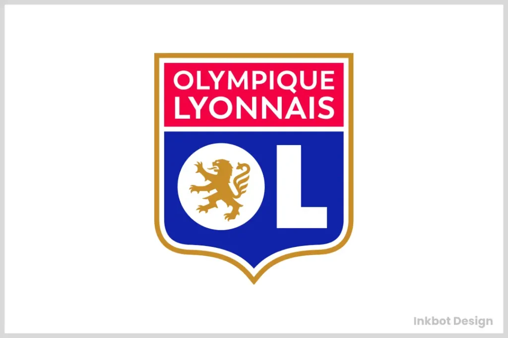
Besides being the symbol of Lyon, a lion, which represents strength and power, is also depicted on Lyon’s badge. Red-blue colours also express its identity.
Marseille: French Flair
Marseille’s emblem looks simple but friendly at once. There is an ‘OM’ monogram with the founding year on top, set within a plain circle framework that surrounds it all – an immaculate, modern design.
AS Roma: The Yellow and Reds
AS Roma’s badge is a masterful blend of mythology and style, reflecting the rich heritage of Rome itself. At the heart of the design lies the legendary she-wolf. According to myth, this she-wolf nurtured the twins Romulus and Remus, who would go on to establish the city of Rome. This iconic image speaks to the deep-rooted history and mythological grandeur that permeates the city.
The badge also employs Rome’s signature colours: red and yellow. These hues are directly taken from the city’s flag, symbolising its vibrant culture and enduring legacy. Together, the badge elements encapsulate a narrative of historical significance, celebrating the city’s ancient lore and modern flair. This clever design ensures that every glance at the AS Roma badge is a nod to the past while exuding a sense of contemporary elegance.
Feyenoord: Rotterdam Pride
Feyenoord’s logo uses red and white colours within the shield; a hand-star crest is taken from the coat-of-arms of Rotterdam, creating a strong bond between these two entities being represented here.
Schalke 04: the Miners
Schalke pays tribute to their origins in Gelsenkirchen with this design; stylised “G” representing Gelsenkirchen weaves through “04”, which signifies the foundation year alongside the mine shaft wheel – everything about a mining town can be found right there!
Borussia Mönchengladbach: Foals
Green is supplied as a backdrop of a black/white diamond pattern, so as not only to reflect traditional colours associated with Foal’s nickname but also to link it back to the club’s roots through the stadium name Bökelberg.
Sevilla FC: Saints of Sevilla
Religious motifs dominate Sevilla’s badge, where Fernando, Isidoro and Leandro serve as patron saints for the city; this is further complemented by the colours red & white with an SFC monogram.
Valencia CF: The Bat
The enduring recognition of the Valencia badge lies in its timeless design and deep-rooted symbolism. Since its inception over a century ago, the badge has maintained a consistent design that embodies the essence of Valencia’s rich heritage.
Key Elements of the Badge’s Recognition
- Historic Colours: The bold red and yellow palette is drawn from Valencia’s official coat of arms. These colours are culturally significant and are instantly associated with the region.
- Iconic Imagery: At the heart of the badge lies a bat, a nod to the mythical dragon from the coat of arms, reimagined to resonate with local folklore. This unique symbol sets the badge apart and pays homage to Valencia’s heritage.
- Balanced Design: The badge excels in simplicity, avoiding unnecessary complexity while maintaining a unique identity. The careful arrangement of elements ensures a harmonious and visually appealing composition.
- Legacy and Tradition: By maintaining its foundational design through decades, the badge embodies a sense of continuity and respect for tradition, which resonates with the community and fans alike.
Combining these elements, the Valencia badge has stood the test of time, remaining a beloved emblem in football. It successfully reflects Valencia’s cultural values and storied history through minimal modifications, making it instantly recognisable to fans across generations.
Lazio: The Eagle of Rome
This simple yet effective design for Lazio’s badge features a stylised golden eagle placed upon a sky-blue shield; everything about the club is perfectly captured here.
Everton FC: Toffees Tower
Everton’s crest contains Prince Rupert’s Tower enclosed within a shield – the motto “Nil Satis Nisi Optimum” (Nothing but the best) can also be found below it.
Aston Villa: The Rampant Lion
Aston Villa has always used potent symbols such as lions when designing its emblems and badges; claret blue is unmistakably the Villa colour, and so is the preparedness motto beneath the rampant lion emblem depicted here.
Athletic Bilbao: Basque Pride
Red stripes represent the Athletic Club, while white ones stand for traditional Basque region colours, also seen in the flag so much loved by locals who support this team; modern style lettering saying “Athletic Club” adds a finishing touch to an otherwise simple but effective logo design!
Leeds United: White Rose
The white rose symbolises Leeds United strongly, a significant part of Yorkshire history and culture, so the LUFC script was added to create a modern look.
Newcastle United: The Magpies
A pair of magpies is on Newcastle’s logo, and one of the birds is on each side – a representation of the club’s nickname. It has a shield between them, which contains the city’s coat of arms and is packed with symbolic meaning that reflects local culture and history.
Between 1983 and 1988, Newcastle United made several changes to their badge that reflected a shift in style and symbolism. Initially, the club introduced a design featuring a magpie, a nod to the team’s nickname. This magpie was placed under a uniquely styled, upturned “C,” which gave the emblem a modern yet simplistic look, similar to the early digital art styles.
This combination was bold and made a statement, easily fitting into a circular badge shape. However, there was a minor downside as some believed that featuring just one magpie was a symbol of bad luck, based on folklore. Despite this, the badge from 1983 stood out for its distinctive and memorable design.
These changes emphasised a blend of tradition and modern design, aiming to create a badge that was identifiable and unique and resonated with the fans of Newcastle United.
West Ham United: The Hammers
The crossed hammers occupy most space in West Ham’s logo – a homage paid to its roots as Thames Ironworks FC. The background features a castle, representing King Henry VIII’s royal castle, as he had built many during his reign.
Sporting CP: The Lion’s Roar
Sporting Lisbon has a rampant lion on their badge, seen as an embodiment of power and bravery. Stripes coloured green and white serve to represent the team, adding a traditional touch with their circular design.
Zenit Saint Petersburg: The Blue-White-Sky Blues
When examining the Zenit Saint Petersburg badge, you’ll notice a harmonious combination of elements that captivate the eye. The badge prominently features a sleek, modern design, setting it apart with its distinctive artistic flair.
The central focus is the bold, iconic letter ‘З’, rendered in Cyrillic script, instantly attracting attention. This unique styling adds an international touch, inviting curiosity and appreciation for its cultural richness.
Highlighted in the design are elements of simplicity and elegance. Clean lines and balanced proportions give the badge a streamlined appearance, while the subtle use of colour—predominantly in shades of blue—reinforces the team’s identity, paying homage to its roots and locale.
Furthermore, the badge showcases a perfect blend of tradition and modernity. It respects historical design aspects yet presents them with a fresh perspective that appeals to contemporary aesthetics.
Overall, the Zenit Saint Petersburg badge is a testament to outstanding design principles. Its innovative use of typography, colour, and composition speaks volumes, making it a noteworthy emblem in sports branding.
VfB Stuttgart: The Wild Horse
Stuttgart incorporates energy into its logo through dynamic imagery, such as rearing black horses set against yellow backgrounds taken from the Württemberg coat-of-arms, where they were derived -this gives off a vibrant feel fitting for clubs like VFB.
Wolfsburg: The Wolf Crowd
The emblem of Wolfsburg is a modern interpretation of the city’s name, featuring a bold W in a contemporary form. This is associated with the club’s traditional colours; green and circular shapes also make it look current.
RB Leipzig: The Red Bulls
Two red bulls charging at each other are featured on RB Leipzig’s logo, representing their energy drink sponsor. It differs from other German football club badges in that it is modern and dynamic in design.
Hertha Berlin: The Old Lady
In blue and white, Hertha’s logo features flag-design elements, with BSC being an abbreviation for Berliner Sport-Club, which translates to Berlin Sports Club but could also have a different meaning entirely.
Southampton FC: The Saints
Southampton’s logo features a halo above a scarf that is half red and half white – these represent their nickname ‘the saints’. Surrounding this imagery are leaves representing a new forest, which links them back down to where they belong.
Crystal Palace: The Eagle has Landed
An eagle perched atop a football would best describe Crystal Palace’s badge. It always tends to be shaped like a shield, though sometimes it may have different colours, such as red and blue, but no matter what it looks like, there is no mistaking that this crest belongs to none other than CPFC!
Fulham FC: The Cottagers
A shield containing black & white stripes represents Fulham Football Club; however, its centrepiece, which appears to be a cottage, pays homage towards Craven Cottage -the team’s home stadium from 1896 up until now.
Brighton & Hove Albion: The Seagulls
The seagull in flight, featured on Brighton’s logo, symbolises their coastal location and nickname. The blue & white colours used here ensure that nobody forgets who they are looking at whenever they see this crest anywhere around town or during matches played by them.
Boca Juniors: The Twelfth Player
The Boca Juniors badge stands out for its distinctive blend of elements that capture tradition and style. The badge features a striking shield design in the club’s signature blue and gold at its core, creating a bold visual impact.
Key Design Features:
- Colour Scheme: The deep blue background with vivid gold accents is instantly recognisable, reflecting the club’s identity and legacy.
- Star Pattern: The inclusion of stars scattered across the badge enhances its appeal, adding a touch of prestige and historical significance.
- Typography: The initials “CABJ,” representing Club Atlético Boca Juniors, are styled in a font reminiscent of American college insignias. This choice of typography gives the badge a classic yet modern feel.
- Overall Shape: The shield is protective and empowering, symbolising the club’s strength and resilience.
These elements combine to create a badge that’s not just a symbol for the team but also a cultural emblem resonating with fans worldwide, worthy of its association with football legends.
Wolverhampton Wanderers: The Wolf’s Head
The gold and black wolf’s head featured in the Wolverhampton Wanderers crest is instantly recognisable as that of a stylised wolf. This logo design plays with the club’s nickname and incorporates colours commonly associated with wolves.
River Plate: The Millionaires
If one shirt design in football truly stands out, it’s the sash. Among the various teams that have adopted this stylish look, River Plate has set the gold standard. Situated in Buenos Aires, this club’s signature sash is not just a fashion statement—it’s a symbol steeped in history and pride.
The Timeless Sash
River Plate’s sash is more than just a stripe across the chest; it visually represents the club’s long-standing tradition and influence in the sport of football. This diagonal stripe cuts through the classic white, exuding elegance and timelessness. It’s a design that others have emulated, but few have captured with the same charismatic flair.
The Crest: A Testament to Legacy
Complementing the sash is the River Plate’s emblematic badge. The badge is ingeniously integrated with the sash, featuring stylised typography that proudly displays the club’s initials: CARP (Club Atlético River Plate). This logo is encased within a shield shape that is both distinctive and revered worldwide.
Together, the sash and the badge create a powerful visual identity that commands respect in every stadium. It’s not just a feast for the eyes; it’s an embodiment of the club’s glory and the fierce loyalty of its supporters.
In a world of ever-changing football kit designs, River Plate’s sash and badge stand as enduring icons, celebrated and recognised by fans worldwide.
The Evolution of Football Logos
As we know, football logos are made in all different shapes and sizes. However, they’re not forever. Many clubs have modified their logos to strike a balance between tradition and modernity. In 2017, for example, Juventus went through a dramatic rebrand, a bold move into minimalist design that drew both praise and controversy among fans.
In today’s digital world, logos must be effective across multiple platforms. An excellent football logo should fit perfectly on a massive stadium display one day and as an avatar on social media sites the next. This has resulted in more straightforward, more adaptable designs being created. But simplicity doesn’t mean a lack of identity – just look at how much symbolism Liverpool was able to incorporate into their streamlined logo!
A well-designed logo can become an icon in its own right. The red devil of Manchester United and Barcelona’s distinctive crest are good examples. These logos go beyond football; they become recognised symbols around the globe, representing far more than just marketing tools – but also components woven into the fabric of our culture within sports worldwide.
What is there left for us regarding football logos? As clubs expand internationally, we may see a design with overseas spectatorships in mind. Yet, heritage and localism are still being increasingly valued at this time. Therefore, it becomes difficult for establishments that wish to communicate universally without severing ties with their origins by creating them.
Conclusion
Pictures of football are not just beautiful. They are symbols with power capacities that contain the history, values and dreams of both clubs and their supporters. From the heraldic designs of old English clubs to the streamlined logos of modern teams, each emblem has a unique story.
When we went through these 50 finest football badges, we realised how many ideas can be expressed by a straightforward picture. Whether it is Barcelona paying tribute to Catalonian culture or Juventus embracing minimalism with all its might, there is plenty of diversity and creativity regarding football branding.
Therefore, I recommend not paying attention to every soccer badge from now on! Usually, there’s much more than what meets the eye at first glance. It isn’t just an insignia sewn onto shirts — rather than this being regarded merely as such, let us consider that these represent visually all those emotions linked with love of community spirit around this world game called football (soccer).
FAQs
What are the usual standards used to judge football logos?
Design aesthetics, historical significance, brand recognition, and representation of the club’s identity are critical factors in assessing football logos.
Which football club still uses the oldest logo today?
Sheffield FC claims to have the longest-serving active football logo design. The mark is simple and features a shield with the club’s initials.
Do many top football logos have anything in common?
Yes, shields, animals (especially lions and eagles), stars, and club colours are frequently incorporated into highly-regarded football logos.
How often do professional football clubs update their logos?
There is a wide range for how often clubs rebrand — some may only make minor changes every few years, while others undergo major redesigns once every decade or two.
How does a well-designed logo impact a football club’s merchandise sales?
Fans are more likely to purchase attractive and meaningful design items. Therefore, a strong logo can significantly boost the sales of merchandise.
Have any football logos caused controversy?
Yes, Leeds United’s 2018 badge was met with widespread criticism from supporters who felt disconnected from its design. As a result, they abandoned this particular version before involving fans in an alternative creation process.
Which football logo is considered the most valuable in terms of brand value?
Real Madrid’s crest is often mentioned among these because it represents such success on both national and global levels, thus making people recognise its value more readily than other organisations might realise about their own marks’ potentialities, let alone those outside their respective countries where they operate too.
How do international football teams’ logos differ from club logos?
National team badges tend to be more straightforward in design compared to those belonging to clubs; they also incorporate patriotic symbols or colours.
Are there any football logos that don’t feature the club’s name?
Yes, Arsenal’s cannon and Liverpool’s liver bird are instantly recognisable marks that do not include words such as “club”.
How has digital media influenced football logo design in recent years?
Simplified, scalable designs that work well across various screen sizes and applications have become more common due to the rise of digital platforms.
