
Top 50 Soccer Club Logos: Football’s Iconic Crests
A soccer club logo isn’t just a crest; it’s a multi-billion-pound commercial asset.
Forget “pride and passion.” We’re talking about a weapon for building a global tribe of paying customers.
The best logos aren’t just “meaningful”; they are engineered to be symbols of brand loyalty and market dominance.
This isn’t a gallery of pretty pictures.
It’s a strategic breakdown of the 50 crests that have mastered the art of turning a football club into a global super-brand.
- Soccer transcends cultures, with club crests representing deep-rooted pride and passion among supporters.
- Elite crests focus on simplicity, historical representation, and visual metaphors for instant recognition.
- Logos are meticulously designed to blend tradition and modernity, capturing each club's unique narrative.
- Effective crest designs evoke emotions, encouraging fans to connect with their clubs on a deeper level.
- Reflective of local identities, successful crests often incorporate cultural symbols and vibrant colours.
The Commercial Power of the Badge
In 2026, a club crest is more than a symbol; it is a high-yield financial instrument.
According to Deloitte’s latest Football Money League reports, clubs in the top 20 generate an average of £120m–£250m annually from commercial licensing alone.
The Manchester United “Red Devil” and the Real Madrid “Crown” are registered trademarks that allow these entities to penetrate markets in Asia and North America.
Clubs typically register their crests and wordmarks in multiple jurisdictions and Nice classes, most commonly Class 25 for apparel and Class 16 and 28 for printed goods and sporting goods. This enables broad merchandising, takedown of counterfeits, and consistency across partners. Manchester United, Real Madrid and Juventus all operate extensive global licensing programmes built on these registrations.
When a club like Juventus simplified its crest to a double ‘J’, it wasn’t just for “style”—it was to ensure the logo performed flawlessly on smartphone lock screens and lifestyle apparel, moving beyond the pitch into the global streetwear market.
Setting the Stage: What Makes an Elite Crest?
With all that said, what elements truly make an elite, iconic soccer crest? Let’s break it down:
Simplicity & Memorability
Nobody wants some overly busy, confusing mess plastered across their favourite kit. The best crests nail that sweet spot of simple yet striking visual imagery that instantly burns into your brain.
Reproducibility and Contrast
High contrast colours and clean silhouettes print cleanly on shirts, scarves and signage. Thin lines and gradients fail at badge size and at 16×16 favicons, so flat vectors win. This is why many clubs strip back shading, reduce colour counts, and favour bold outlines.
Historical Representation
We touched on this earlier, but delving into a club’s roots and representing that meaningfully in crest design is enormous. Whether it’s geography, tradition, or cultural heritage, having those deeper ties makes supporters feel that personal connection.
Visual Metaphors
Some of the most iconic crests use imagery as brilliant metaphors. Are they taking abstract qualities like unity, strength, and resilience and translating them into Animals like rampant lions, towering trees or mythical beasts? Sign me up!
Instant Recognition
You know you’ve got a quality crest when it’s immediately identifiable at a glance. Put it this way – you shouldn’t need to squint, tilt your head, and mane for five minutes to figure out what team it represents. Elite logos hit you right between the eyes with that “oh yeah, that’s ___” feeling.
The 2026 Digital Shift: Why Minimalism Wins
The trend toward flat design and vector-optimised logos is a response to Generative Engine interfaces.
Inter Milan and Ajax have mastered the use of negative space and geometric balance.
For a logo to be “Pro Tier” in 2026, it must pass the Favicon Test: can you recognise the entity when it is only 16×16 pixels?
Recent Digital‑First Crest Rebrands (2016–2021)
Manchester City, 2016. Returned to a heritage roundel with ship and red rose to improve clarity on broadcast and digital. The redesign restored legibility and historical symbols while cleaning line work across sizes.
Juventus, 2017. Introduced the ‘J’ monogram, created with Interbrand, to scale across streetwear, apps and packaging. The move reduced clutter, improved lock‑screen recognition, and widened lifestyle use.
Inter Milan, 2021. Adopted a simplified “IM” monogram, designed with Bureau Borsche, tightening geometry and strokes. The mark reads clean on social avatars and small UI components without losing brand equity.
| Club | Primary Design Style | Scalability Score (1-10) | Key Entity Feature |
| Juventus | Ultra-Minimalist | 10/10 | Monogram J |
| Ajax | Line Art | 9/10 | 11-line Hero Silhouette |
| Man Utd | Illustrative Heraldry | 6/10 | Intricate Red Devil |
| Liverpool | Iconic Symbolism | 8/10 | Liver Bird Silhouette |
| Manchester City | Heritage Roundel | 8/10 | Ship & Red Rose |
| Inter Milan | Monogram Minimalism | 9/10 | “IM” Monogram |
The 50 Best Soccer Club Logos & Crests
All right, enough preamble – let’s get into the good stuff! Here are 50 of the most elite, iconic soccer crests worldwide. We’ll kick things off with a few honourable mentions first:
Honourable Mentions:
- SL Benfica (Eagle and bicycle wheel, linking motto “E Pluribus Unum” and cycling roots)
- Santos FC (Black and white striped shield with “SFC” monogram, a Brazilian classic)
50. Colo-Colo (Chile)
The emblem of Club Social y Deportivo Colo-Colo features a historical figure deeply rooted in Chilean history.
The image portrays the Mapuche chief, Colocolo, known for his leadership and valour. Colocolo played a significant role during the Arauco War, a series of conflicts between the indigenous Mapuche people and Spanish colonial forces.
The logo symbolises his enduring legacy, capturing the spirit of resistance and cultural pride. Using the national flag’s colours further enhances the cultural significance of this symbol, making it one of the most recognisable in football.
49. Feyenoord (Netherlands)
Simple. Striking. Iconic. Feyenoord’s badge is minimalist, featuring a bold red-and-white shield framing the club’s iconic initials and the founding year “1908”. What more do you need?
The roundel also frames “1908,” a direct nod to the club’s founding. That single date, set in a bold ring, helps the badge stay readable at small sizes. It is heritage made legible.
48. Tigre (Argentina)
Ok, coolness points through the roof for having a snarling tiger as your crest! Tigre’s fearsome feline emblem screams ferocity and intensity – precisely what you want representing your squad on the pitch. Plus, those scratches underlining the name? Chefs kiss
47. Cruz Azul (Mexico)
Elegant symmetry and symbolism abound with Cruz Azul’s iconic crest. The blue cross and iconic box are unmistakable, while the regal crown above is the perfect classy touch. For a massive Mexico City giant like La Máquina, it’s quite the fitting royal emblem.
46. Galatasaray (Turkey)
Have to give props for the originality of Galatasaray’s horizontal crest design, featuring a snarling lion (representing the club’s famous “Aslanlar” or “Lions” nickname) bracketed by towering red-and-yellow tusk accents. It uniquely catches your eye.
45. Boca Juniors (Argentina)
Intimidating and instantly recognisable, Boca’s trademark yellow-and-blue crest blends its distinct initials with those iconic hooped socks and a giant red velvet ribbon accent. Simple yet impactful – very fitting for such a giant Argentinian club.
44. Valencia (Spain)
The bat featured atop the Valencia CF logo is significant beyond its aesthetic appeal. This creature is a historical emblem of the city of Valencia itself, symbolising protection and endurance.
The association between the bat and Valencia dates back centuries. Legend suggests that a bat landed on King James I of Aragon’s flag during the Reconquista, heralding a divine omen of victory. This event cemented the bat as a symbol of good fortune and protection, leading to its incorporation into the city’s heraldry.
Incorporating the bat into Valencia CF’s logo links the football club with the city’s rich history and cultural identity. Alongside other elements, such as the vertical red and yellow stripes reminiscent of the Valencian flag, the bat transforms the logo into a tapestry of historical references, making it a distinctive and meaningful emblem.
The combination of the bat, the red and yellow stripes, and the classic football iconography creates a uniquely striking badge. This design captures not just the essence of the team but also the spirit and resilience of Valencia, which is celebrated by fans and residents alike.
43. Huracán (Argentina)
Huracán’s name and emblem have a fascinating origin tied to an iconic figure and a record-breaking adventure. In early 20th-century Argentina, Jorge Newbery was a celebrated aviator, motor racer, and intellectual. Among his many endeavours, he proposed a daring hot-air balloon flight in 1909.
Newbery’s balloon, “El Huracán,” embarked on an ambitious journey over Argentina, Uruguay, and Brazil. This remarkable feat captured the imagination of many, including the members of a newly established football club. Initially named “Verde Esperanza y Nunca Pierde” (Green Hope and Never Lose), the club found this name cumbersome.
During a visit to a stamp shop, where they sought to create a club seal, the shopkeeper suggested a shorter, more economical name. On the shop wall hung a poster of Newbery’s balloon. Inspired, they adopted “Huracan” as their new name and emblem.
To formalise this homage, the club wrote to Newbery to request permission to use Huracán as their name and on their club badge. Newbery graciously gave his wholehearted approval, forever linking the club to his adventurous spirit.
42. Guangzhou Evergrande (China)
For a bold, eye-catching Chinese Super League emblem, you can’t top Guangzhou’s Evergrande crest. That fierce Cantonese-style winged-lion form, framed by red-and-orange accents and a Taoist yin-yang circle, screams power and momentum.
41. Columbus Crew (USA)
The Columbus Crew’s old “Crew96” circular crest is incredibly crisp, with “96” nodding to the club’s founding year, bolded yellow lettering framed by sleek black brushstrokes, and a sharp banana yellow streak. It’s a perfect blend of old-school and new energy.
In May 2021, the club briefly adopted “Columbus SC,” then reverted to “Columbus Crew” after fan backlash. The updated crest kept the angular “C” monogram with a notch for “96,” marking the team’s founding MLS season. Name restored, modern mark retained.
40. Chivas Guadalajara (México)
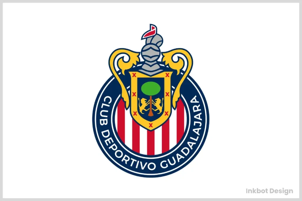
You’ve got to love a classic like Chivas’ iconic red-and-white striped crest with the rooster head centrepiece. It’s an emblem that bleeds tradition and practically jumps off the jersey at you with its bold, no-nonsense pride.
The badge integrates the coat of arms of Guadalajara, with its shield and supporters. It roots the club in the city’s heraldry, which is why the mark feels civic as much as sporting.
39. CSKA Moscow (Russia)
CSKA’s crest proudly honours the club’s Soviet Army origins and the famous Soviet hammer-and-sickle imagery (albeit a more stylised version here). That powerful crimson-red backdrop and yellow accents provide the perfect fiery pop.
38. Fenerbahçe (Turkey)
Between that fierce, snarling Kaplan (golden tiger) emblem overlaying Fener’s iconic red-and-yellow half-moon backdrop, this crest truly makes a statement. The symbolism beautifully intertwines the club’s on-field ferocity with Turkey’s identity.
37. Deportivo La Coruña (Spain)
Clean, distinct, and buoyed by an unforgettable blue-and-white colour scheme, Depor’s crest exemplifies Spanish simplicity. That centred silhouette illustration of the famous Torre de Hércules lighthouse ties it perfectly to La Coruña’s maritime heritage.
36. Club Tijuana (Mexico)
Club Tijuana’s emblem prominently features a unique canine, specifically a hairless Xoloitzcuintle. This breed, native to northeastern Mexico, serves as the club’s mascot. Established only in 2007, Club Tijuana pays homage to this distinct dog breed through its vibrant logo.
35. Palmeiras (Brazil)
Sometimes simple geography-inspired crests can hit the mark, and that’s undoubtedly the case with Palmeiras’ distinct pale green circle accented by those crossed sepals at the centre and crisp dark lettering. Can’t you practically smell the lush Brazilian palm tree foliage?
34. FC Barcelona (Spain)
Ok, ok…I know what you’re thinking. How is one of the world’s most famous club logos only no. 34 on this list? Hear me out – while unquestionably memorable and iconic, there’s just a serviceable cleanness to Barça’s crest that keeps it from actual elite status.
The top left shows Saint George’s Cross, Barcelona’s patron. The top right carries the Senyera, the Catalan stripes. The lower half combines the blaugrana bars with the club monogram, binding the city and club identity.
33. Real Madrid (Spain)
Perhaps an even bigger surprise than Barça, right? However, there is a similar deal here – a legendary club with an exceptionally iconic emblem… yet one that’s almost too simple and minimalist. I’ll admit that the regal crown centrepiece is difficult to top, in any case.
King Alfonso XIII granted the “Real” title and crown in 1920, formalising the royal link. The crown was removed during the Second Spanish Republic from 1931, then restored in the 1940s. That history explains the enduring prominence of the coronet.
32. Olympique Lyonnais (France)
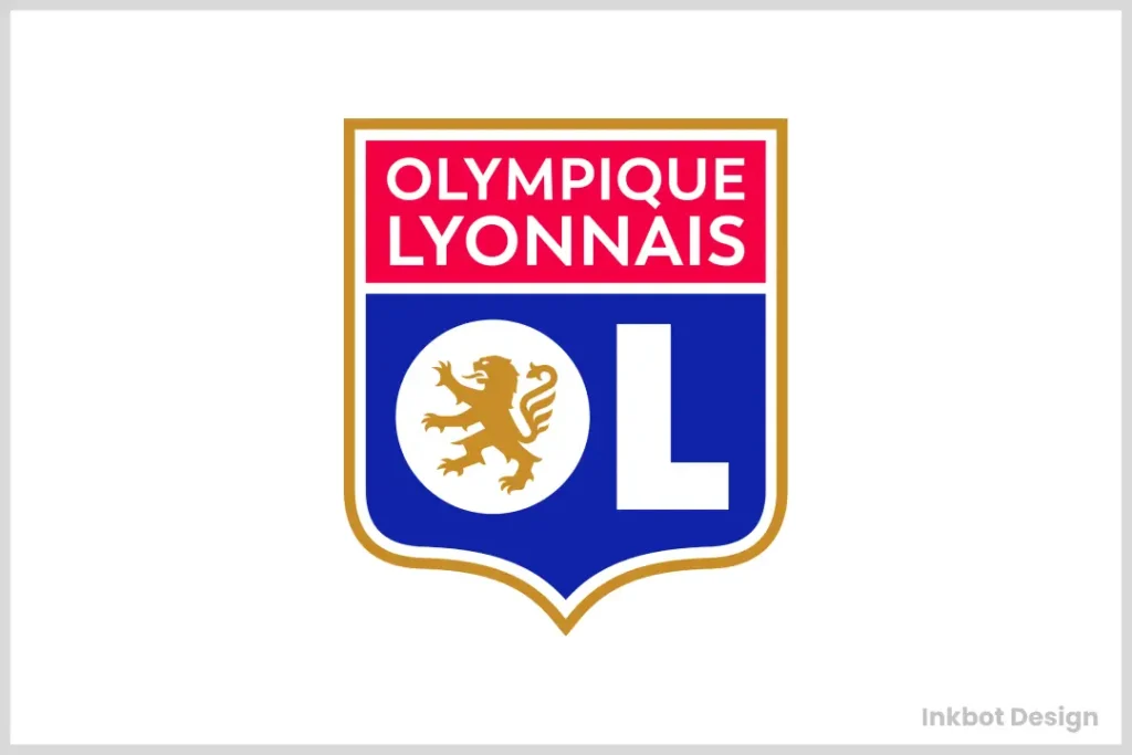
With vibrant colours, powerful visual metaphors, and beautiful French fleur-de-lis symbolism, the Olympic Lyonnais crest expertly blends these elements into a cohesive stunner. Between the menacing lion and proud historic nod, this one roars French pride.
31. AS Roma (Italy)
AS Roma’s emblem uniquely captures the legendary tale of Rome’s origins. This captivating logo illustrates the myth of Romulus and Remus, two infant brothers whose story is foundational to Roman history.
According to legend, Romulus and Remus were abandoned on the waters of the Tiber River. The myth tells of a nurturing she-wolf who discovered these helpless twins and took them under her care. This iconic image of the wolf nursing the twins is central to AS Roma’s badge.
Romulus and Remus, as the myth goes, would later play pivotal roles in the founding of Rome, with Romulus giving the city its name. Though integral to the tale, the she-wolf remains unnamed in historical reports.
Incorporating this myth into AS Roma’s logo connects the football club to Rome’s rich historical tapestry, celebrating both the city’s ancient roots and its enduring legacy. The logo is a constant reminder of strength, nurturing, and heritage significance.
30. Club Universidad Nacional (México)
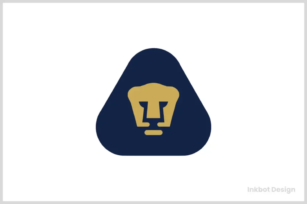
Club Universidad Nacional, often referred to simply as Pumas, boasts a logo that is symbolic and stylish. Here’s a breakdown of its key design elements:
Visual Balance: The overall layout showcases a fluid geometric balance. This harmony in design underscores the University’s fundamental ideals, emphasising the synergy of various components working in unison.
Colour Scheme: The logo features a striking combination of blue and gold. These colours were inspired by the University of Notre Dame, reflecting a rich heritage connected to American football coaching history.
Mascot Integration: The design cleverly incorporates the club’s mascot. By forming the shape of the nose and mouth, it creates the letter “U” for University, which also doubles as a visual representation of a cup or trophy—symbolising victory and achievement.
Geometric Shapes: The logo’s blue triangle is not only aesthetically pleasing, with its smooth, rounded corners, but also holds deeper meaning. This shape represents the institution’s three core pillars: education, research, and cultural enrichment.
29. Borussia Dortmund (Germany)
BVB might take the cake for Most Underrated Iconic Crest. I mean, that vibrant yellow-and-black colour scheme, the stoic twin team crests gently intersecting at the centre…it’s so simple yet so stylish and impactful at the same time.
“BVB” abbreviates Ballspielverein Borussia, and “09” marks the 1909 founding. Paired with the Schwarzgelb colours, those two elements make the roundel instantly recognisable worldwide.
28. Tottenham Hotspur (England)
The Spurs’ emblem is a work of art, possibly the English Premier League’s most regal and distinguished crest. That powerful, rampant cockerel centrepiece, encircled by regal flourishes, heraldic lions and old-school typography…it’s quintessentially Londoner class at its finest.
Spurs introduced the pared‑back crest in 2006, with the cockerel standing on a football. The cockerel‑and‑ball motif dates to the early 20th century and appeared on shirts in the 1921 FA Cup Final. Minimal form, century‑old roots.
27. Newcastle United (England)
Newcastle United’s badge features a pair of stylised seahorses. These seahorses, which may seem mythical or unusual to those unfamiliar with them, are intricately designed. They uniquely represent the city and are also featured on Newcastle’s coat of arms, highlighting the connection between the football club and its cultural heritage.
At the top of the badge, there’s a proud lion. This lion stands tall, perched in a turret with a flag in its paw, adding a touch of regal symbolism to the emblem. Combining these creatures highlights artistic creativity and serves as a heraldic nod to the area’s rich history.
The current crest, adopted in 1988, lifted the seahorses from the city’s coat of arms. A castle turret and a pennant crown the shield, tying the badge to maritime trade and civic iconography. It is Tyneside, on a ribbon.
26. PSV (Netherlands)
There’s just something so sleek and modern about PSV Eindhoven’s abstract, angular red-and-white emblem. Those sharp forms could symbolise anything from a set of bird wings to pure forward momentum – a perfect representation of an innovative Dutch power.
Two stars above the badge mark 20 league titles, adopted from the KNVB convention. The diagonal red and white flag with “PSV” sits within the oval, clear at a distance. PSV’s name, Philips Sport Vereniging, flags the club’s Eindhoven and Philips origins.
25. Atletico Madrid (Spain)
I love how Atleti’s crest merges the traditions of Spain and Atlético Madrid in one iconic design. From the rampant bear and tree to the classic red-and-white striping to nods to the club’s 1903 founding… it screams capital city heritage and underdog mentality in the best way.
The oso y madroño, bear and strawberry tree, is a Madrid symbol taken from city heraldry. Seven stars reference the Ursa Major constellation and appear on the Madrid flag. The badge, red and white, is a capital identity on fabric.
In 2017, Atlético softened the shield shape, simplified the bear and tree, and tuned the palette. The stars and stripes stayed, but line work tightened for screens and broadcast. Same Madrid DNA, cleaner read at icon sizes.
24. Kaizer Chiefs (South Africa)
The intriguing choice of a Native American chief appearing on the Kaizer Chiefs’ logo has historical roots intertwined with the journey of a celebrated South African footballer, Kaizer Motaung.
After showcasing his talents in the North American Soccer League, Motaung played for the Atlanta Chiefs. Upon his return to South Africa, he established his football club. “Kaizer Chiefs” is a blend of his name and a tribute to the team he once played for, the Atlanta Chiefs. Thus, the logo reflects this connection, paying homage to his past while laying the foundation for his iconic new team.
23. Liverpool (England)
The Liverpool logo is a rich tapestry of symbolic elements with deep meaning. At its centre is the Liver Bird, a revered emblem representing the city itself. This iconic creature signifies the club’s strong community roots and history.
Above the liver bird is the club’s enduring motto, which captures the team’s ethos and spirit. This motto serves as a guiding principle for both players and fans.
Flanking the logo are flames, a poignant tribute to the victims of the 1989 disaster. These flames are a reminder of the tragic event and a promise never to forget those who lost their lives.
Overall, each logo element combines to tell a story of resilience, pride, and unity.
A shield‑based crest introduced in the early 1990s added the Shankly Gates and “You’ll Never Walk Alone.” The eternal flames commemorate the 1989 Hillsborough disaster. For clarity in kits, simplified versions are often used, while the full mark remains official.
22. Arsenal (England)
The Gunners’ striking 2002 rebrand combined the best of old and new. That classic Tudor-inspired cannon endures as a respectful nod to the club’s 1888 origins among its workers. But the hyper-modern font and stylish red background accent add a distinctly 21st-century flair. Past and future rolled into one sleek package.
21. Chelsea (England)
That rampant lion perfectly captures Chelsea’s fiery spirit and never-say-die attitude. Originally depicting an antique statue from the club’s grounds, this revamped 2005 logo maintains a vintage crest feel with a modern twist. Timeless yet fresh – just like the Blues themselves.
In 2005, Chelsea adopted a modern take on its 1950s badge, with a lion rampant regardant holding a staff from the Borough of Chelsea arms. It replaced the 1986 “lion CFC” roundel. Heritage framing, cleaner execution.
20. Vasco Da Gama (Brazil)
Ahoy, mateys! Vasco Da Gama’s unforgettable Portuguese cross-and-castle serif logo screams high-seas adventure. Could you picture a more fitting maritime-inspired crest representing Rio’s famous “Gigante da Colina” club?
But wait, there’s more to the emblem than just its adventurous spirit. Founded by Portuguese immigrants in Rio de Janeiro in 1898, the Club de Regatas Vasco da Gama was named in honour of the renowned explorer Vasco da Gama. This intrepid navigator was the first to sail directly from Europe to India, a groundbreaking voyage that took place 400 years before the club’s inception.
The emblem symbolises the explorer’s daring voyages and celebrates the rich cultural ties between Portugal and Brazil. By adopting the name and logo, the club pays homage to a legacy of exploration and discovery, bridging continents and bringing a piece of historic maritime triumph into the heart of Rio. Now, that’s a tribute worthy of the high seas!
19. Sporting Lisbon (Portugal)
It appears to have been plucked straight from the heights of 14th-century nobility. Sporting CP’s green-and-white emblem featuring two foxes and a striking minimalist castle is brimming with old-world Portuguese regality. That kind of historic charm resonates.
18. Olympique Marseille (France)
Don’t tell me you don’t feel the sheer power practically exuding from Olympique de Marseille’s fearsome crest design. The all-caps stencilled typography, aggressive sash accents, and centred French soccer ball icon… It’s intimidating in the very best way.
The ribbon “Droit au but,” straight to goal, sits under the crest and has for decades. A single gold star above marks the 1993 European Cup win, France’s first. Minimal colour, hard messaging, silverware recorded in one glyph.
17. Sporting Kansas City (USA)
How flawlessly does Kansas City’s iconic branding capture its civic identity? The initials “SC” are overlaid with sleek stripes evoking the Kansas waterways, and the sun’s rays peek through. It’s so exquisite and symbolic, isn’t it?
The club rebranded from Kansas City Wizards to Sporting Kansas City in 2010. The new shield references the Missouri and Kansas state line, with river‑like stripes and the “SC” monogram. Place, initials, waterways, all working in concert.
16. Independiente Santa Fe (Colombia)
Independiente Santa Fe’s logo is often regarded as a prime example of minimalist art, thanks to its simple yet striking design. The logo centres around a white shield elegantly outlined in red. This clean, uncluttered composition highlights the team’s name in capital letters at the top, ensuring immediate recognition and a straightforward visual message.
What truly sets it apart is the red dot, strategically positioned at the bottom right. This seemingly minor element adds a unique focal point, drawing the eye and balancing the overall design.
Unlike logos that clutter their space with complex images or numerous colours, this design communicates identity through simplicity, harnessing the power of restraint.
The logo’s careful use of space and colour embodies minimalist principles, focusing on essential features without unnecessary embellishment. The elegance and clarity of this design turn it into a beautiful piece of minimalist art, appreciated for its ability to captivate with its curious restraint.
15. Juventus (Italy)
Does it get more iconic for Italian club branding than Juve’s classy black-and-white stripes paired with that timeless bull emblem? Whether you support the Old Lady or not, that crest screams calcio heritage and robust styling.
In 2017, Juventus replaced the oval shield with the “J” monogram, created with Interbrand. The shift targeted fashion crossovers and app icons, trimming detail for tiny sizes. The bull remains a symbol of Turin, still present in civic iconography and in some club contexts.
14. Wolverhampton Wanderers (England)
Wolves’ crest legitimately looks like some ancient Anglo-Saxon treasure you’d discover in an archaeological dig. It’s a stunning piece with its towering regal wolf, almost Gaelic cross insignias, and flawless Black Country gold & black colours.
13. Ajax (Netherlands)
“Greek mythology meets Dutch soccer most triumphantly with this one! Ajax’s sleek, modern take on the iconic Amsterdam city shield and Greek warrior crest is perfection. Those bold lines, fonts, and shading take this crest to the next level.
But there’s more to this design than just its visual appeal. The crest features the legendary Greek hero Ajax, a nod to ancient tales like The Iliad.
In a clever twist, the image is crafted using 11 lines, symbolising the 11 players on a football team. This thoughtful design honours the past and celebrates the spirit of teamwork and unity in the beautiful game.
It’s a seamless blend of history and modernity, capturing the essence of the mythological and the athletic worlds in one striking emblem.”
The current portrait arrived in 1991, replacing a busier emblem with a stripped, 11‑line hero. Eleven strokes for eleven players was the brief, giving Ajax a crisp, modern mark. It kept the myth while fixing reproduction on kits, scarves and print.
12. Portland Timbers (USA)
You must respect the energy and movement that the ferocious axe-wielding logger squirrel brings to the Portland Timbers’ immensely creative crest design. Every fan knows Timber Joey isn’t to be trifled with!
But there’s more beneath the surface of this dynamic emblem. The bold, clean lines of the crest aren’t just for show—they’re a tribute to the deep green forests of Oregon, encapsulating the region’s spirit and history. And let’s not forget the mighty axe, proudly propped up in the centre. This isn’t just a nod to the area’s logging heritage; it’s a symbol of strength and resilience, reflecting the team’s and its fans’ unwavering spirit.
In this way, the Portland Timbers crest becomes more than just a logo; it embodies the team’s spirit. It’s a vibrant tapestry of local pride wrapped in a design as engaging as it is meaningful.
11. Paris Saint-Germain (France)
PSG’s crest is like a physical embodiment of French sophistication. The iconic Eiffel Tower stands tall, stylised by sweeping, minimalist curves that ooze Parisian chic. Throw in that gorgeous navy blue and red colour scheme. Chef’s kiss, magnifique!
In 2013, PSG refined the badge, enlarging “Paris” and simplifying strokes. The fleur‑de‑lis nods to Saint‑Germain‑en‑Laye, birthplace of Louis XIV, and remains alongside the Eiffel Tower. Fewer details, stronger read on screens.
10. Fluminense (Brazil)
Talk about elite attention to detail – just LOOK at all the granular flourishes and symbology packed into Fluminense’s magnificent crest. From the intricate laurel wreath and rampant greyhound centrepiece to the nautical star accents nodding to Rio’s maritime heritage… It’s a masterwork of Brazilian design.
9. Peñarol (Uruguay)

Few crests anywhere pack as much sheer ferocity into one concise design as Uruguay’s Peñarol. How those piercing yellow eyes and snarling fangs leap off that stark black background is downright menacing. To supporters, it’s a perfect avatar of their beloved Manyas’ intense, never-say-die spirit.
8. LA Galaxy (USA)
Ok, prepare your eyeballs for massive impressment here. Have you studied all the details and metaphors woven into the LA Galaxy’s cosmic sci-fi-inspired logo? We’re talking rocket trajectories, jet trails, and even the shining fan depicting Earth’s perspective from the moon! Once you see those intricate nods to space travel and celestial bodies, you’ll never unsee them. Brilliant.
7. Rangers (Scotland)
Scaling new heights of powerful geometry and simple yet bold symbolism, the Rangers’ iconic crest stands tall in a class of its own. The rampant lion ripped straight from British heraldry. The perfectly positioned scroll highlights the club’s founding in 1872. That unmistakable blue, red and white colour scheme…it’s rugged, it’s regal, and 100% befitting Scotland’s most decorated club.
6. Inter Milan (Italy)
Have you ever felt the raw intensity and fury of seeing that famous curling blue-and-black serpent motif up close on an Inter jersey? It’s utterly mesmerising, conveying coiled power and perpetual forward momentum. Matched with those stylised “FC” initials, you have one utterly perfect logo.
The serpent, or Biscione, comes from the Visconti family symbol tied to Milan. In 2021, the club introduced a crisp “IM” monogram, tightening circles and strokes for digital clarity. The snake lore stays, the badge reads sharper.
5. Corinthians (Brazil)
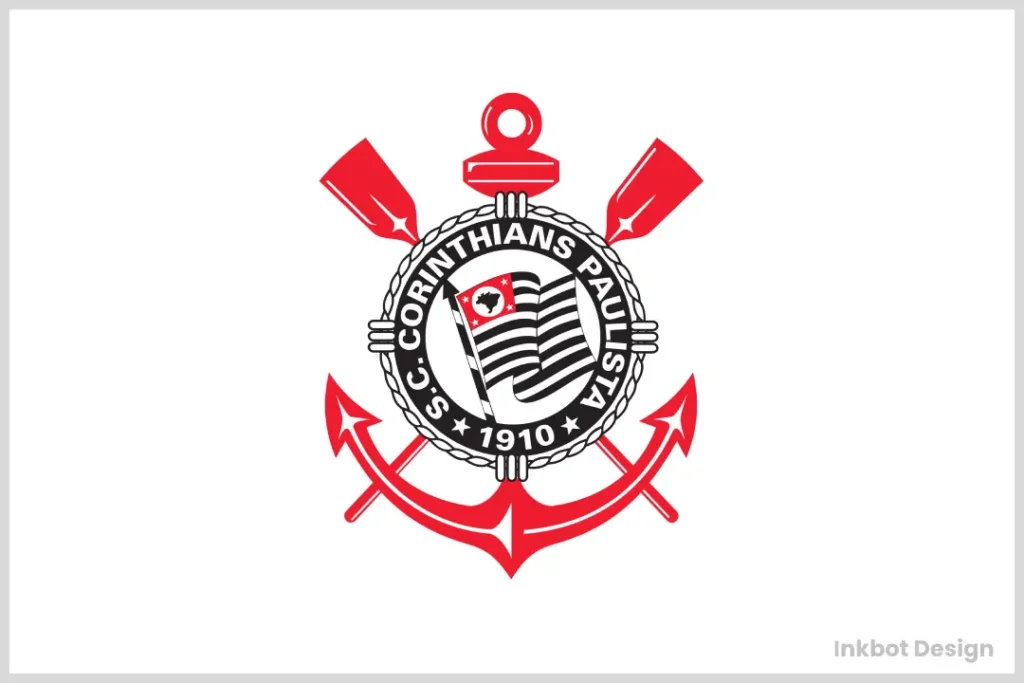
Folks, this might be the most visually inventive and metaphorically brilliant crest in club soccer. Those two intertwined ribbons simultaneously depict an hourglass (representing Corinthians’ perpetual, timeless identity) and the iconic stitch pattern of a soccer ball. Mind-blowing craftsmanship!
4. Celtic (Scotland)
Proudly displaying its Irish roots for all to see, Celtic’s iconic green-and-white crest showcases sheer mastery of symmetry and simplicity. The bowl-shaped, intricate knot and interwoven shamrock leaves alone are enough to make this an unforgettable logo. But are they then topping it off with that classic green-on-white “Celtic FC” typeface? Magnifique.
The single star above the crest was added in 2003 to honour the 1967 European Cup. The Lisbon Lions’ triumph is now baked into the shirt in one mark. Circle, clover, star, job done.
3. River Plate (Argentina)
Hot DAMN, does River Plate’s robust red-and-white crest ever pop like few others! Between the Art Deco fonts, sleek borders, and the iconic full-diagonal “CARP” initialism proudly emblazoned across the whole thing… it practically crackles with energy. A logo fitting for one of Earth’s biggest, most passionate clubs.
“CARP” stands for Club Atlético River Plate, set in a tight monogram at the badge centre. The diagonal red band echoes the shirt’s famous sash, an identity line since the 1930s. Typography and stripe, locked together, are the club’s instant tell.
2. Bayern Munich (Germany)
The quintessential German machine in crest form. We’re talking about industrial-strength precision craftsmanship and design, featuring Bayern’s legendary logo. From the embossed 3D borders to the regal woven accents and the stoic red-and-navy Bavarian coat of arms at the centre… it doesn’t get more flawlessly executed. No surprise coming from efficient Bayern.
The blue and white diamonds are the Bavarian state lozenges, the Rautenflagge. They anchor the club’s identity in its region and give the centre a distinct, patterned hit at a glance.
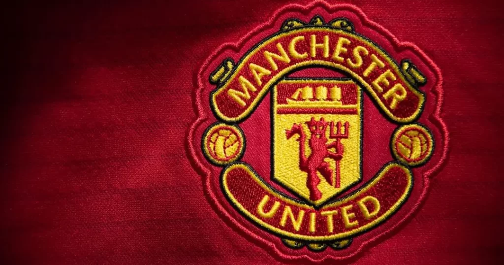
1. Manchester United (England)
Was there any doubt that the most iconic, globally recognised crest belongs to Manchester United?
That badge of the fearsome red devil, wielding a bramble cross, is absolute perfection. Time-honoured symbolism and imagery. Striking colours and shapes. Timeless, historic, yet utterly modern styling all at once. It’s the soccer logo by which all others are measured – and in a class by itself.
But what makes this emblem truly stand out?
- The Red Devil: Central to the design, this gnarly figure brandishes a trident, a nod to its fierce moniker and a feature dating back to 1970.
- The Ship: At the top, a ship sails proudly, a tribute to Manchester’s rich maritime history and coat of arms.
The red devil first appeared on the badge in 1970, tying in with the club nickname. In 1998, the ribbon text dropped “Football Club,” leaving “Manchester United” to streamline the wordmark. The ship, from the city’s coat of arms, remains a constant.
These elements blend seamlessly into a simple yet elegant design that captures the essence of the club’s storied past while projecting its modern-day dominance. Whether you’re a die-hard fan or just someone who appreciates striking design, Manchester United’s crest is undeniably a work of art that tells a story with every detail.
Conclusion
Well, there you have it, folks – the 50 greatest soccer crests of all time! From powerful animal emblems to symbolic nods to geography and heritage, to just downright eye-catching geometry… these iconic designs are so much more than random logos.
Each one is a visual representation of a club’s identity, history and the undying passion of its supporters. When you see the unmistakable River Plate diagonal carp or the fierce eyes of Peñarol’s snarling black beast, you feel that visceral connection to what those clubs stand for.
More than simply branding, elite soccer crests spark emotion and stoke the flames of seemingly boundless fandom. They make you want to grab a scarf, march to the stadium and get fully immersed in the culture of your beloved squad. That’s the true magic and timeless artistry behind these beautiful icons of the beautiful game.
5 FAQs on Elite Soccer Crests
What are the most common visual elements/symbols featured in iconic soccer crests?
Lions, eagles, and other powerful animals are popular centrepiece emblems representing ferocity and strength. Many also feature nods to cultural heritage, like fleur-de-lis for French clubs or shamrocks tied to Irish roots. Coats of arms and heraldic elements are often used to convey regality.
How important is a colour choice in crest design?
Colour plays a massive role in an elite crest’s impact and memorability factor. Bold, vibrant shades like red, blue, and yellow allow club logos to ‘pop’ off jerseys and stand out. Meanwhile, more understated tones like hunter green or navy can lend an elegant, prestigious feel in the proper context.
What makes some simpler crests more iconic than complex ones?
The most memorable and enduring logos often achieve that sweet spot of simplicity without being plain or boring. Intricate detailing can be unique, but too much busyness defeats the streamlined aesthetic. A straightforward yet impactful use of shape, colour and representative symbols is often the most effective.
How have some MLS clubs been able to create such well-designed crests so quickly?
Teams like Sporting KC, Portland Timbers, and LA Galaxy demonstrate the importance of clever branding and incorporating stadium/city cultural touchstones into the design. Using colours, icons and patterns that immediately evoke the region and the fan base’s spirit is critical.
How does AI impact logo design in 2026?
AI is used to test logo salience, predicting how quickly a human eye identifies a brand in a crowded SERP or social media feed.
