25 Famous Logo Designers Behind the World’s Best Brands
Forget the hero-worship of famous logo designers.
The real lesson isn’t about their art but their ruthless ability to solve commercial problems.
We celebrate the simple mark but ignore the strategic battles required to boil a complex business down to a single, memorable symbol.
This isn’t a history lesson. It breaks down the strategic thinking and design principles that turned these designers into business-building legends.
- Famous logo designers solve commercial problems rather than just creating art.
- Enduring logos are built on principles of simplicity, memorability, and appropriateness.
- Logos should reflect a brand's identity and evolve meaning over time.
- Effective branding requires strategy before style, focusing on function over fame.
Why You Should Care About Famous Logo Designers
This isn’t a history lesson. It’s a masterclass in longevity.
We live in an era of disposable design. Trends flash and burn out on Instagram, and logos are created with online generators in five minutes, only to be redesigned 18 months later. It’s a frantic cycle of visual noise.
The designers on this list created work that has lasted for 30, 50, or even 70 years. They worked without Photoshop, the internet, and a client committee of 25 people chiming in on a Slack channel.
They focused on timeless principles that still form the bedrock of any effective brand identity:
- Simplicity: Can it be recognised at a glance?
- Memorability: Does it stick in your brain?
- Appropriateness: Does it fit the business it represents?
Studying their thinking is the perfect antidote to the trend-chasing that weakens many modern brands. It’s about building an asset, not just making a pretty picture for a launch party.
The Mid-Century Masters: Forging Corporate Identity
The post-war economic boom created corporate giants. These giants were clumsy, faceless, and desperately needed a clear, modern identity to communicate their scale and ambition. This first generation of designers was the architects of what we now call “corporate identity.”
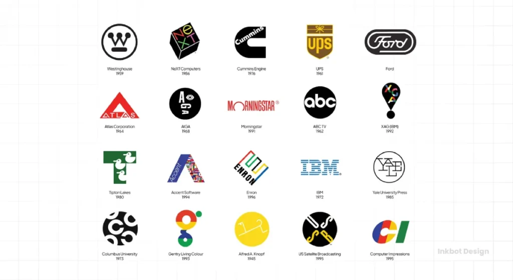
1. Paul Rand (1914-1996)
Known For: IBM, ABC, UPS, Westinghouse, NeXT. Paul Rand was the quintessential corporate modernist. He didn’t just design logos; he designed trust. He famously convinced IBM that paying for a comprehensive identity system was a vital business investment, not an expense.
The Takeaway: A logo is a promise. Rand knew the symbol was just a vessel; the company’s reputation fills its value. He sold strategy and thinking, and the logo was the artefact of that thinking.
2. Saul Bass (1920-1996)
Known For: AT&T (the 1983 “globe”), United Airlines, Kleenex, Girl Scouts. Before Saul Bass, logos were often static shields or emblems. With his background in film title sequences, Bass brought a sense of story and motion to his work. He saw logos as living symbols that could adapt and endure.
The Takeaway: Aim for a symbol with a long life. Bass once said, “Design is thinking made visual.” His logos weren’t just marks; they were the beginning of a conversation.
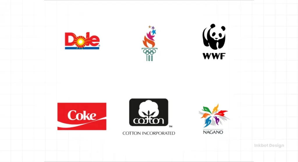
3. Ivan Chermayeff (1932-2017) & Tom Geismar (1931-Present)
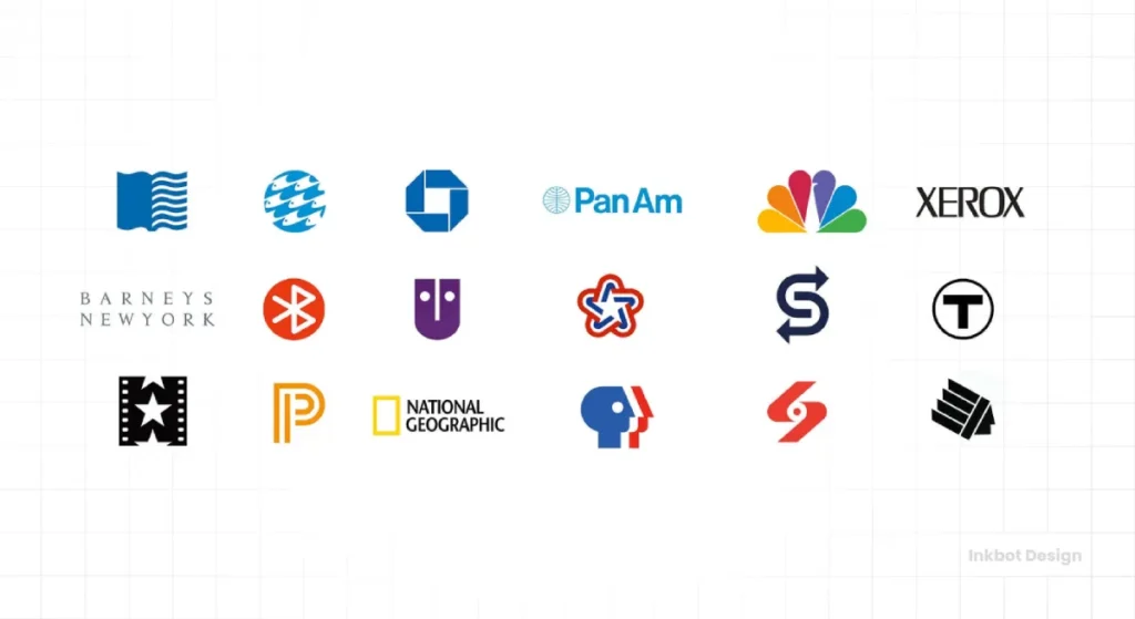
Known For: NBC, Mobil, PBS, Chase Bank, National Geographic. This legendary partnership, later joined by Sagi Haviv, proved that abstract forms could become some of the most recognisable symbols in the world. Their work is a masterclass in reducing an idea to its absolute essence.
The Takeaway: You don’t need to show what a company does. The Chase Bank octagon has nothing to do with banking. Through decades of consistent application, this abstract shape became the bank.
4. Massimo Vignelli (1931-2014)
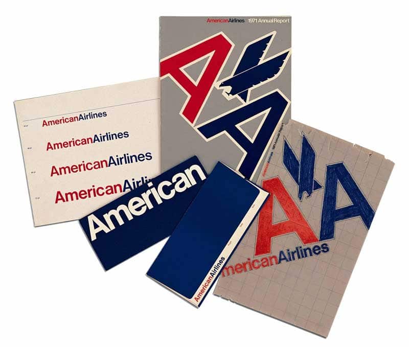
Known For: American Airlines (1967), Knoll, Bloomingdale’s, NYC Subway Map. Vignelli was a systems evangelist. To him, a logo was a single component in a vast, meticulously organised visual language governed by the grid. He believed design should be a framework for clarity, not a vehicle for self-expression.
The Takeaway: A logo doesn’t live in a vacuum. Design a system, not a jewel. How it functions on a business card, a sign, and an app is more important than how it looks on a presentation slide.
5. Milton Glaser (1929-2020)
Known For: I ❤ NY, DC Comics bullet logo, Brooklyn Brewery. Glaser was the artist among the modernists. While his peers were pursuing corporate minimalism, he championed a more expressive, illustrative approach. His “I ❤ NY” rebus wasn’t the product of a long strategic process but a flash of insight sketched in a taxi.
The Takeaway: Emotion connects. While systems are essential, sometimes a powerful, human idea can defy all the rules and become an icon.
6. Herb Lubalin (1918-1981)
Known For: Avant Garde Magazine, PBS (1971), Mother & Child. Lubalin made typography the star. He didn’t just choose fonts; he bent, broke, and fused letterforms to create visual puns and powerful new meanings. He saw letters as images in their own right.
The Takeaway: Words are pictures. Don’t underestimate the power of a custom logotype to communicate a brand’s entire personality before a single word is read.
7. Lance Wyman (1937-Present)
Known For: 1968 Mexico Olympics, Minnesota Zoo. Wyman is a master of creating complete visual systems for complex environments. His work for the Mexico Olympics is legendary—a vibrant, modular system that communicated across language barriers and defined the look and feel of an entire event.
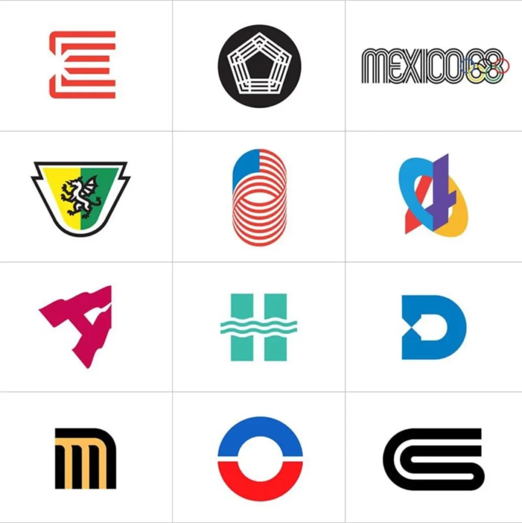
The Takeaway: Your identity needs to work in the real world. Wyman’s work proves that a strong visual system can bring order and excitement to even the most chaotic environments.
8. Walter Landor (1913-1995)
Known For: The classic Coca-Cola script refinement, Levi’s “batwing,” and Bank of America. Landor was a pioneer of branding research. He didn’t rely on his designer’s eye; he rigorously tested his work with consumers. He founded the powerhouse agency Landor Associates on a converted ferry boat in San Francisco Bay.
The Takeaway: Don’t guess, test. Understanding your audience is just as important as having a great design idea.
9. Wally Olins (1930-2014)
Known For: BT, Renault, 3i. Olins wasn’t just a designer but a brand strategist. He was among the first to articulate that branding was about managing identity across an entire organisation—from the logo to how the receptionist answered the phone.
The Takeaway: The logo is just the tip of the spear. Proper branding is about the culture and behaviour of the entire company, and the visual identity must reflect that reality.
10. Raymond Loewy (1893-1986)
Known For: Shell, Exxon, TWA, and former BP shield. Loewy, an industrial designer by trade, brought a streamlined, futuristic aesthetic to corporate identity. He understood the power of a bold, clean symbol to project progress and efficiency.
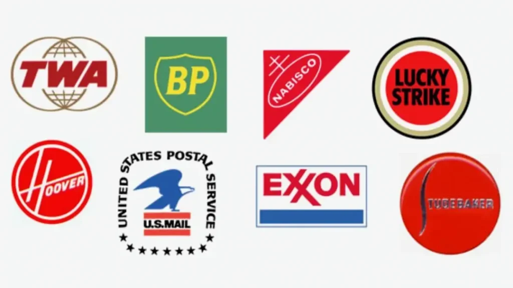
The Takeaway: A strong mark can signal a company’s forward momentum. Loewy’s work felt like the future, and it helped his clients own that perception.
The Modern Mavericks: Pushing Boundaries
Building on the foundations of the masters, this next generation of designers embraced technology, wit, and a more conceptual approach to logo design.
11. Paula Scher (1948-Present)
Known For: Citibank, MoMA, The Public Theater, Tiffany & Co. A partner at the legendary design firm Pentagram, Scher is a force of nature. Her work is often typographic, using letterforms as expressive building blocks. The famous Citibank logo, a merger of “Citi” and a red arc representing an umbrella (Travelers), was sketched on a napkin in a meeting.
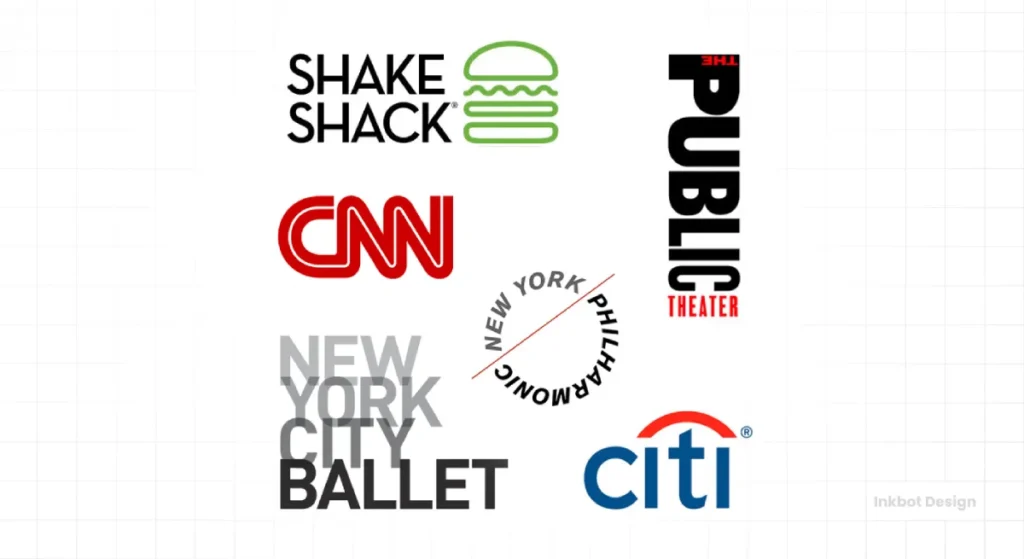
The Takeaway: Don’t discount the “napkin sketch,” but understand it’s the product of decades of experience. The ability to see a simple solution instantly is earned, not accidental.
12. Lindon Leader (1949-Present)
Known For: FedEx, Hawaiian Airlines Leader is the undisputed master of negative space. His FedEx logo is perhaps the most celebrated example in history. The “hidden” arrow between the ‘E’ and ‘x’ is a perfect, subtle symbol of speed and precision. It wasn’t a happy accident; it was the entire point of the design.

The Takeaway: What you don’t show is as important as what you do. Negative space is an active tool to add a layer of discovery and intelligence to a mark.
13. Alan Fletcher (1931-2006)
Known For: V&A Museum, Reuters, IoD (Institute of Directors). A founding partner of Pentagram, Fletcher was known as “the ideas man.” His work was infused with a distinctively British wit and a playful intelligence. He saw design as a way of thinking, not just a way of styling.
The Takeaway: A logo can be innovative. A clever twist or visual pun can make a mark far more memorable and engaging than a sterile corporate symbol.
14. Michael Bierut (1957-Present)
Known For: Hillary Clinton 2016 Campaign, Saks Fifth Avenue, Verizon, Mastercard. Another Pentagram partner, Bierut, is a brilliant writer and thinker on design. He excels at creating simple, robust identity systems that can withstand the complexities of massive organisations. He is a pragmatist who designs for real-world applications.
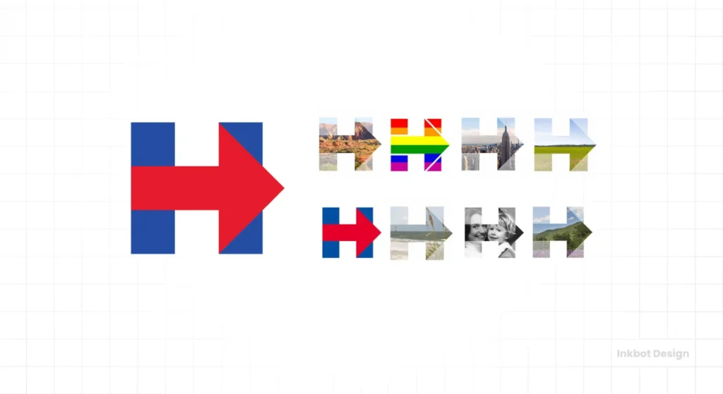
The Takeaway: Good design is a practical tool. Bierut focuses on creating identities that are easy for clients to use correctly, ensuring the brand stays consistent long after the designers have left the room.
15. Sagi Haviv (1974-Present)
Known For: Library of Congress, US Open Tennis, National Geographic, Armani Exchange. Now the principal partner at Chermayeff & Geismar & Haviv, Sagi carries the torch of minimalist, concept-driven design. He masters finding unforgettable ideas and executing them with absolute precision.
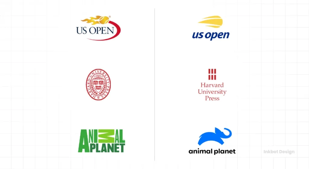
The Takeaway: There is power in a single idea. Resist the urge to cram multiple meanings into a logo. Find the one thing you need to say and say it clearly.
16. George Lois (1931-2022)
Known For: Esquire covers, MTV. Though more famous as an ad man, Lois’s work on the original MTV logo was groundbreaking. He took a rigid, corporate “MTV” wordmark and encouraged doodling and defacing it, creating a dynamic identity that perfectly captured the rebellious spirit of music television.
The Takeaway: A brand can be a platform, not a straitjacket. Allowing for variation and playfulness can make an identity feel more alive and relevant.
17. Shigeo Fukuda (1932-2009)
Known For: Countless posters and corporate identities in Japan. A master of illusion and visual trickery, Fukuda’s work often played with perspective and negative space in mind-bending ways. While much of his fame comes from his poster design, his logos carry the same minimalist wit.
The Takeaway: A little bit of illusion can make a logo unforgettable. Engaging the viewer’s brain to solve a small visual puzzle creates a powerful connection.
18. Steff Geissbuhler (1942-Present)
Known For: Time Warner Cable, NBC (co-design), Univision. A former partner at Chermayeff & Geismar, Geissbuhler has a clean, intelligent, and enduring corporate marks portfolio. His work exemplifies the Swiss principles of clarity, order, and precision.
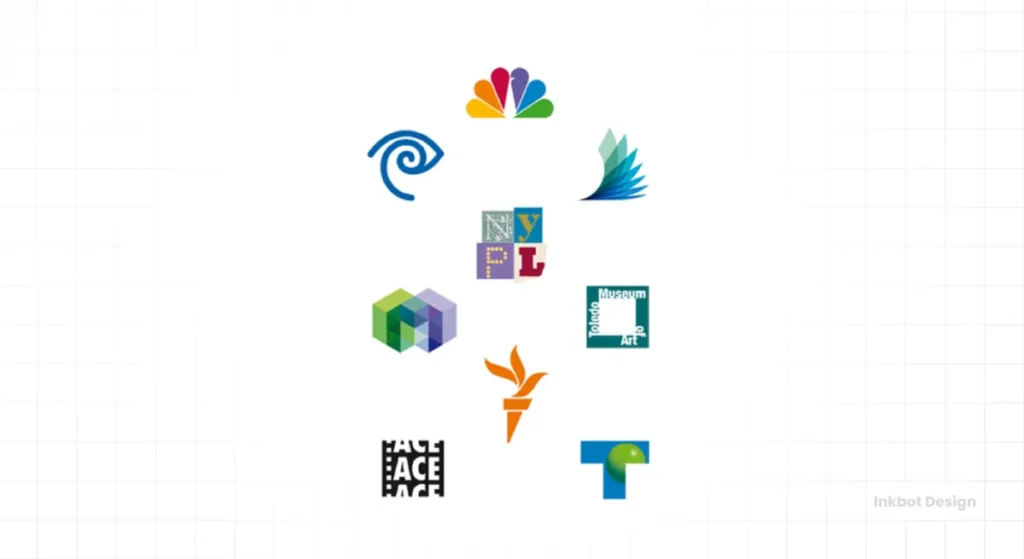
The Takeaway: Professionalism and clarity never go out of style. A simple, well-crafted geometric logo can communicate trust and stability for decades.
19. Gerard Huerta
Known For: AC/DC, Pepsi, HBO, and Swiss Army Brands. Huerta is a master of lettering. His work is instantly recognisable and has graced some of history’s most iconic album covers and brands. He creates letterforms that are so unique they become the entire brand.
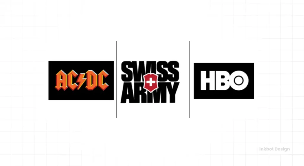
The Takeaway: Custom lettering gives a brand a voice that no off-the-shelf font ever can. It is a powerful tool for differentiation.
20. Joe Finocchiaro
Known For: Aetna, DuPont Finocchiaro is an expert in evolving legacy brands. His work involves taking established, well-known marks and carefully updating them for a modern context without losing their core brand equity.
The Takeaway: Redesigning a logo doesn’t always mean starting from scratch. Sometimes, a careful evolution is a smarter business move than a revolution.
The Unsung Heroes & In-House Geniuses
Not every iconic logo comes from a famous design guru or a high-priced agency. Sometimes, young, unknown, or in-house designers who strike gold create the most enduring marks.
21. Carolyn Davidson
Known For: The Nike Swoosh. In 1971, a graphic design student at Portland State University, Davidson, designed the Swoosh for Phil Knight’s fledgling shoe company. Her fee? $35. She was later gifted stock in the company, which is now worth a fortune.
The Takeaway: A logo does not become iconic overnight. The Swoosh was not universally loved at first. Its power comes from decades of association with world-class athletes and the “Just Do It” ethos. The brand builds the logo, not the other way around.
22. Rob Janoff
Known For: The Apple Logo. In 1977, Janoff, a designer at the agency Regis McKenna, was tasked with creating a logo for a new computer company. He made the apple with a bite out of it for one simple, practical reason: scale. He wanted to ensure that even when small, it wouldn’t be mistaken for a cherry.
The Takeaway: The best design decisions are often the most practical. All the myths about the “bite” representing the Tree of Knowledge or a “byte” of data are just myths. It was a functional choice.
23. Ruth Kedar
Known For: The original Google logo. As a consulting art professor at Stanford, Kedar was approached by two PhD students named Larry Page and Sergey Brin. She designed the playful, multi-coloured wordmark using the Catull typeface that defined Google’s look for its first decade.
The Takeaway: A logo should reflect the company’s culture. In a world of stuffy blue corporate logos, Google’s colourful, almost naive mark stood out and perfectly communicated its mission to make information accessible and fun.
24. Frank Mason Robinson (1845-1923)
Known For: The Coca-Cola logo. Robinson wasn’t a designer; he was the bookkeeper for Dr. John Pemberton, the inventor of Coca-Cola. In 1886, he suggested the name and penned the now-iconic script logo in Spencerian script, the dominant form of formal handwriting at the time.
The Takeaway: Sometimes the most enduring brand asset is born from simple, available tools. That script has outlasted every design trend for over 130 years.
25. The Team at The Chase Manhattan Bank (1960)
Known For: The Chase Bank octagon. The famous Chermayeff & Geismar firm did not design the first Chase logo. An internal team developed it, and it became one of America’s first abstract corporate logos. Chermayeff & Geismar were hired later to build the whole identity system around the existing mark.
The Takeaway: Great ideas can come from anywhere. While design legends are often hired to build the systems, the core concept for a brilliant logo can originate from within a company itself.
What Can You Actually Learn From All This?
After looking at these 25 designers, a few clear lessons emerge for any entrepreneur thinking about their brand.
- Strategy Before Style. The masters didn’t start by picking colours. They started by understanding the business problem. Your logo design process should begin with questions, not answers.
- Simplicity Wins. The most enduring logos can be drawn from memory. They are free of clutter, effects, and trendy nonsense. Aim to remove, not to add.
- A Logo is Part of a System. Think beyond the mark. How will your colours, fonts, and logo work together on your website, packaging, and social media? A consistent system builds recognition.
- Meaning is Built Over Time. Don’t expect your logo to do all the heavy lifting on day one. Your logo is an empty vessel. You fill it with meaning through your products, service, and story.
Stop Chasing a “Famous” Logo. Start Building a Solid Brand.
The obsession with having a “famous” logo misses the entire point. You don’t need a logo that will be studied in art schools in 50 years.
You need a hard-working tool.
You need a mark that is clear, memorable, and professional. It works everywhere you need it to work without causing problems. The goal isn’t fame; it’s function.
That’s what the masters understood. They weren’t artists decorating a corporation. They were engineers building a functional asset. You’ll be miles ahead of the competition if you approach your brand identity with that same practical mindset.
Need a hand crafting that hard-working tool for your business? The team here at Inkbot Design specialises in creating professional, no-nonsense logo design that serves your business for the long haul.
Frequently Asked Questions About Famous Logo Designers
What makes a logo design famous?
A logo becomes famous primarily through the success and visibility of the company it represents. While sound design principles (simplicity, memorability) are crucial, a logo’s fame is built by consistent application and a large marketing budget over many years.
Who is considered the most famous logo designer?
Paul Rand is often cited as one of the most influential logo designers of the 20th century due to his work on foundational corporate identities like IBM, ABC, and UPS, as well as his influential writings on design theory.
How much did the Nike logo cost?
The Nike “Swoosh” was designed in 1971 by Carolyn Davidson, a graphic design student at the time. She was paid $35 for her work.
What is the “negative space” in a logo?
Negative space is the empty or blank space surrounding and between the main subjects of a design. Famous logos, like the FedEx logo with its hidden arrow, use negative space to create a secondary, clever image or meaning.
Why are simple logos better?
Simple logos are easier to recognise, remember, and reproduce across various sizes and media. Their clean, uncluttered nature allows them to remain timeless and avoid feeling dated as design trends change.
Can I design my own logo?
While you can use online tools to create a logo, working with a professional designer ensures your logo is built on a solid strategy, is technically sound for all applications, and is unique enough to be trademarked.
What is the difference between a logo and a brand?
A logo is a visual symbol used to identify a company. A brand is people’s entire experience and perception of your company—your reputation, customer service, products, and voice. The logo is a key part of the brand, but it isn’t the whole thing.
How many logo concepts should a designer present?
The number varies, but quality is more important than quantity. Many top-tier agencies present only one to three ideas deeply rooted in strategy, rather than offering dozens of disconnected options.
What is a logotype?
A logotype, also known as a wordmark, is a logo based entirely on the stylised name of the company, such as Google, Coca-Cola, or IBM.
How long should a logo last?
A well-designed, timeless logo can last for decades with only minor refreshments. Brands like Coca-Cola and IBM have used the core of their visual identity for over 50 years. Avoid trendy designs to maximise longevity.
What is Swiss Style design?
Swiss Style, or the International Typographic Style, is a design movement from the 1950s that emphasises cleanliness, readability, and objectivity. It is characterised by sans-serif typography, grid-based layouts, and a minimalist aesthetic, which heavily influenced modern corporate logo design.
Who designed the original Apple logo?
The first Apple logo, featuring Isaac Newton under an apple tree, was created by co-founder Ronald Wayne. This was quickly replaced in 1977 by the iconic rainbow apple with a bite, designed by Rob Janoff.
Ready to Build a Logo That Lasts?
Chasing trends is exhausting and expensive. Building a strong, functional brand identity is an investment that pays for itself. If you’re ready to create a logo based on sound strategy, not fleeting fads, we should talk.
See our Logo design services or request a quote to get started.

