25 Famous Fonts in Logos: What You Can Steal for Your Brand
Most business owners pick a font because it “looks cool.” That’s a mistake.
Famous brands choose fonts like weapons. The font is the voice. A font choice can tell a customer you’re “premium” or “cheap,” “modern” or “traditional,” “friendly” or “corporate” before they even know what you do.
We’re not just listing 25 fonts. That’s trivia. We’re breaking down the strategy behind them so you can apply it.
- Fonts act as a brand’s voice; choose typography to signal premium, modern, friendly, or traditional traits.
- Custom typefaces are costly; most brands smartly modify stock fonts instead of commissioning fully bespoke families.
- Make a stock font unique via expert kerning, precise weight selection, and contextual brand elements.
- Start with brand strategy and test fonts in real-world applications; font choice is the final 10% of design.
Before You Steal: Custom vs. Off-the-Shelf Fonts
You don’t need to spend $50,000 on a custom font. That’s a myth. Understanding the difference is the first step.
The Myth of the “100% Custom” Font
Small businesses obsess over needing a “100% custom” font. It’s almost always a waste of money.
The “custom” logos you see from giants like Google or Amazon are often heavily modified existing typefaces. They found a strong base and tweaked it to make it ownable.
A stock font used brilliantly will always beat a bad custom font. Context and application are everything.
When to Use a Stock Font (And How to Make it Yours)
You use a stock font when your budget is focused on strategy, not on reinventing the wheel.
You make it yours through three things:
- Expert Kerning: The custom spacing between letters.
- Precise Weighting: Choosing the perfect thickness (e.g., Light, Regular, or Bold).
- The Context: The colours, shapes, and other brand elements you surround it with.
When to Commission a Custom Typeface
You commission a full, custom typeface when you are a global brand like Netflix, Intel, or Coca-Cola.
The goal is 100% legal ownership and perfect consistency across millions of screens, apps, and physical products. It is very expensive and not a priority for a small business.
Group 1: The Ubiquitous Sans-Serifs (The “Corporate Workhorses”)
These are your clean, modern, “safe” choices. A sans-serif font (one without the little “feet” on the letters) communicates clarity, efficiency, and neutrality.
1. Helvetica: The Neutral Default
- Brands: Jeep, Crate & Barrel, American Apparel, 3M.
- The Takeaway: Helvetica is typography’s “blank slate.” It’s so neutral it takes on the personality of the brand using it. It simply says, “I am a modern, no-nonsense company.”
- The danger? It’s boring. It’s the default. Using it can make you look forgettable if you’re not careful.
2. Futura: The Geometric Futurist
- Brands: Volkswagen, Supreme, Nike (wordmark).
- The Takeaway: Futura is built from perfect circles, triangles, and sharp angles. It feels efficient, forward-thinking, and strong.
- The Supreme logo proves context is king. Futura itself isn’t revolutionary, but Futura Bold Italic in a red box became a cultural icon.
3. Akzidenz-Grotesk: The Original Grotesque
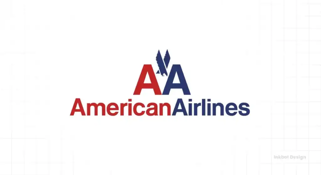
- Brands: American Airlines (old logo), New York City Transit Authority.
- The Takeaway: This is the grandfather of Helvetica. Using it signals a deeper design knowledge. It’s slightly warmer and more humanist (less rigid) than Helvetica, giving it a touch more personality.
4. Gotham: The American Optimist
- Brands: Obama ’08 Campaign, Twitter (old), Netflix (old), Spotify (old).
- The Takeaway: Gotham was the font of the 2010s. It’s geometric but friendly, strong but accessible. It was designed to feel “American” and authoritative.
- It’s now so common it’s bordering on a cliché. It’s the new Helvetica—safe, clean, but overused.
5. Avenir: The Humanist Sans
- Brands: LG, Toyota (modified), The City of Amsterdam.
- The Takeaway: Avenir is a warmer, more human version of Futura. It’s geometric, but its slight imperfections (like the ‘o’ not being a perfect circle) make it feel less robotic. It’s for brands that want to be “tech-forward” but also “people-focused.”
Group 2: The Classic Serifs (The “Old Guard” of Trust)
Serifs—those little “feet” on the ends of letters—are the original. They communicate tradition, authority, luxury, and trustworthiness. They feel established.
6. Garamond: The Timeless Academic
- Brands: Apple (“Think Different” campaign), Rolex (modified), Adobe (original).
- The Takeaway: Garamond is the definition of readability and elegance. It feels classic, intelligent, and sophisticated. Apple used it to position themselves as tools for creative thinkers, a direct contrast to IBM’s cold, blocky logos.
7. Trajan: The Epic Movie Font
- Brands: Countless movie posters (Gladiator, Titanic), universities, law firms.
- The Takeaway: This font is based on the engravings on Trajan’s Column in Rome. It screams “epic,” “authority,” and “prestige.”
- Be warned: It’s so overused for this one purpose that using it for your local plumbing business looks pretentious and silly. Context is everything.
8. Bodoni: The High-Fashion Diva
- Brands: Vogue, Calvin Klein (old).
- The Takeaway: Bodoni is all about drama. The extreme contrast between its thick and thin strokes makes it feel elegant, sharp, and luxurious. It’s the supermodel of fonts—it demands to be printed large and given space.
9. Didot: The Parisian Sibling
- Brands: Armani, Harper’s Bazaar, CBS (the “eye”).
- The Takeaway: Very similar to Bodoni, Didot shares that high-contrast, luxury feel. It’s often seen as slightly more refined or “French” than Bodoni’s “Italian” flair.
10. Clarendon: The Confident Slab-Serif
- Brands: Sony (modified), Wells Fargo.
- The Takeaway: Slab serifs have thick, blocky “feet.” They are the confident middle ground, blending the readability of a serif with the punch of a sans-serif. They feel solid, dependable, and a bit “industrial.”
Group 3: The Custom Scripts (The “Uncopyables”)
This is the ultimate brand move: a logo that is a signature. These are 100% ownable. They are assets, not just fonts.
11. Coca-Cola: The Timeless Original
- Font: Custom Spencerian Script.
- The Takeaway: This is branding’s holy grail. Created in 1887, it is synonymous with the product. It conveys nostalgia, joy, and classic Americana. You can’t steal this, but you can learn from its 130+ years of consistency.
12. Disney: The Magic Signature
- Font: Custom “Waltograph” (based on Walt’s signature, but cleaned up).
- The Takeaway: Like Coke, the Disney script is the brand. It doesn’t just say “Disney”; it feels like magic, dreams, and childhood. A custom script creates an immediate emotional connection.
13. Ford: The Heritage Stroke
- Font: Custom script, heavily modified over 100+ years.
- The Takeaway: This script feels reliable, historical, and trustworthy. It’s the signature of a company founder, which implies accountability and legacy.
14. Cadbury: The Regal Swirl
- Font: Custom script based on William Cadbury’s signature.
- The Takeaway: The flowing script with its distinctive loops feels indulgent, premium (but accessible), and special. It’s the visual equivalent of smooth milk chocolate.
15. Instagram: The Friendly Throwback
- Font: Billabong (original), now custom “Instagram Sans”.
- The Takeaway: The original “Insta” script (the font Billabong) felt nostalgic, personal, and “analog.” It was perfect for a quirky photo app.
- Their rebrand to a custom sans-serif is a perfect example of “blanding.” They traded all their personality to look like every other global media giant. A strategic move, but a boring one.
Feeling stuck between a script and a serif? A logo design project isn’t just about picking a font; it’s about finding your brand’s voice. Inkbot Design’s logo design services focus on strategy first.
Group 4: The Modified Workhorses (The “Smart Tweaks”)
These brands didn’t waste money reinventing the wheel. They took a great font and gave it a custom tweak to make it 100% theirs. This is the smart move for most businesses.
16. Google: The Friendly Geometric
- Font: Custom “Product Sans” (based on Futura).
- The Takeaway: Google’s old logo was a classic Garamond (a serif). The 2015 switch to “Product Sans” was massive. It signaled a shift from “academic search engine” to “friendly, simple, accessible tech for everyone.” The slanted ‘e’ is the one piece of retained quirk.
17. Amazon: The A-to-Z Smile
- Font: Officina Sans (modified).
- The Takeaway: The font itself is a simple, hardworking sans-serif. The genius is the modification: the orange arrow. It’s a smile (customer-friendly) and it points from ‘A’ to ‘Z’ (we sell everything). This is a concept, not just typography.
18. eBay: The Quirky Overlap
- Font: Univers (heavily modified).
- The Takeaway: The original chaotic, overlapping eBay logo perfectly reflected its flea-market roots. The 2012 redesign cleaned it up, using a modified Univers. The letters just touching keeps a tiny bit of that original “quirky community” energy.
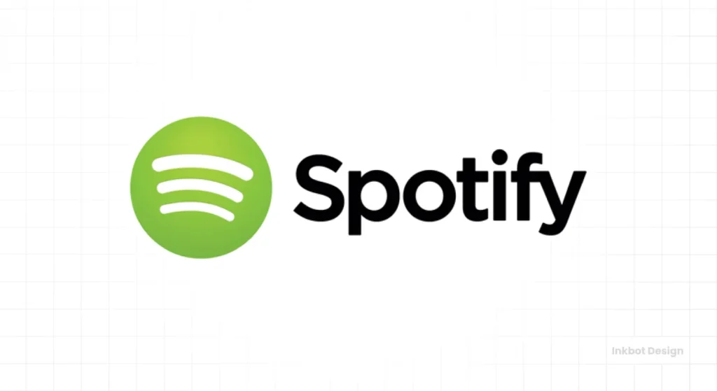
19. Spotify: The Circular Rhythm
- Font: Based on Gotham, now custom “Spotify Circular.”
- The Takeaway: They needed a font that worked everywhere, from a tiny app icon to a massive billboard. They modified Gotham to make it their own (“Circular”). It’s clean and legible. The three “sound wave” lines in the icon do the heavy lifting for the brand.
20. Intel: The Simple Enclosure
- Font: Custom “Intel Clear.”
- The Takeaway: The old “dropped e” logo (Intel Inside) was iconic. The new one uses a custom font, “Intel Clear,” plus a swoosh. The font is technical and precise, and the swoosh “enclosing” the name carries the “Intel Inside” concept forward.
Group 5: The “Clever Concept” Fonts (The “Aha!” Moments)
Sometimes, the font is just a vehicle for a brilliant idea. The magic here isn’t the typeface itself, but the “negative space” or the visual pun hidden inside it.
21. FedEx: The Hidden Arrow
- Font: Futura Bold (modified).
- The Takeaway: This is the most famous “hidden meaning” logo. The font is Futura, but the ‘E’ and ‘x’ are kerned perfectly to create a white arrow in the negative space. This arrow is the brand: forward-moving, fast, precise. A masterclass in strategic typography.
22. Baskin-Robbins: The “31 Flavors”
- Font: Custom.
- The Takeaway: The logo looks playful and fun. But look closer. The pink parts of the “B” and “R” form the number 31, for their famous 31 flavours. The font is a container for the core concept.
23. Toblerone: The Bear in the Mountain
- Font: Matterhorn (custom, based on Bodoni).
- The Takeaway: The logo is the mountain (the Matterhorn). But hidden in the mountain’s negative space? A bear, the symbol of Bern, Switzerland, where Toblerone was created. This grounds the brand in its heritage.
24. Tostitos: The Shared Dip
- Font: Custom.
- The Takeaway: A playful, custom font. The magic is in the middle. The two ‘T’s are people, and the ‘I’ between them is a bowl of salsa. It visually represents the act of using the product: sharing chips and dip.
25. Gillette: The Sharp Cut
- Font: Custom (based on a bold sans-serif).
- The Takeaway: This looks like a standard, strong, masculine font. But the ‘G’ and the dot on the ‘i’ have been “sliced” with perfect precision, as if by a razor. This modification reinforces the product’s core attribute (sharpness) directly into the logotype.
So, What Font Should Your Logo Use?
Don’t just pick one from this list. That’s missing the point.
Start with Your Brand’s Voice, Not a Font
Ask yourself what you want to say.
- Are you (Serif): authoritative, traditional, luxurious?
- Are you (Sans-Serif): modern, clean, friendly, techy?
- Are you (Script): personal, elegant, human?
Test, Test, and Test Again
How does the font look on a tiny app icon? How does it look on a business card? How does it look next to your competitor’s logo?
A font that looks great on a website might look terrible embroidered on a shirt. Test it in real-world applications.
The Real Work is in the Strategy
The hard part isn’t finding a font on a list. The hard part is building the brand strategy that dictates the font. That’s the real work.
Tired of ‘looking cool’? Let’s build a brand that works.
Choosing a font is the last 10% of the logo design process. The first 90% is strategy.
If you’re ready to build a logo based on a solid strategy, not just fleeting trends, let’s talk. Check out our logo design process or request a quote to get started.
Frequently Asked Questions About Fonts in Logos
What is the most popular font used in logos?
Helvetica is one of the most popular and widely used fonts in logos, known for its neutrality, clarity, and modern feel.
What’s the difference between a serif and sans-serif font in a logo?
Serif fonts have small “feet” (e.g., Garamond) and feel traditional, authoritative, and elegant. Sans-serif fonts (e.g., Futura) lack these feet and feel modern, clean, and direct.
Can I use a free font for my logo?
Yes, but check the license. Many “free” fonts (like Google Fonts) are licensed for commercial use. However, they are available to everyone, so your logo may look generic without strategic modification.
Why do so many tech companies use sans-serif fonts?
Tech companies use sans-serif fonts because they render clearly on screens of all sizes (from watches to TVs) and convey values like simplicity, efficiency, and modernity.
What is a custom logotype?
A custom logotype (or wordmark) is a logo where the company name itself is the main design element, often using a custom-drawn or heavily modified font (e.g., Coca-Cola, Google).
How much does a custom font for a logo cost?
A simple custom logo from a designer can cost a few hundred to a few thousand pounds. A full, exclusive custom typeface (a whole font family) for a large corporation can cost tens or even hundreds of thousands.
What font does the Supreme logo use?
The Supreme logo uses Futura Bold Italic, placed inside a red box. The design itself is famously “borrowed” from the conceptual artist Barbara Kruger.
What is the font in the Coca-Cola logo?
It is not a font you can buy. It’s a custom-drawn logo created in the Spencerian script style, which was a popular form of handwriting in the late 1800s.
What is the font in the FedEx logo with the arrow?
The font is Futura Bold, with the ‘E’ and ‘x’ kerned (spaced) perfectly to create the hidden arrow in the negative space.
Should my logo font match my website font?
Not necessarily, but they must be harmonious. Brands often use a distinctive display font for the logo and a simpler, highly readable body font (like Open Sans or Lato) for their website text.
How do I choose a font for my business logo?
Start with brand values, not fonts. First, define your brand’s personality: is it playful, serious, cheap, or luxurious? Then, find a font category (serif, sans-serif, script) that matches that personality.
What makes a logo font “timeless”?
Timeless fonts have classic proportions, high readability, and a neutral personality (e.g., Garamond, Futura). They avoid trendy gimmicks, which is why they don’t look dated after a few years.


