The 12 Types of Fonts: A Simple Framework for Making the Right Choice
Typography is about 95% of the design that your customers interact with. Your logo, your website, your emails—they are all, fundamentally, just words in a chosen font.
Get it wrong, and you look amateurish, cheap, or untrustworthy. It doesn’t matter how good your product is; a bad font choice is like showing up to a board meeting in a clown costume.
Get it right, and nobody notices. And that’s the point. Good typography is invisible. It communicates a feeling, a personality, and a level of professionalism without screaming for attention.
This isn’t an art class. This is a practical guide for business owners. We will demystify the main types of fonts and give you a no-nonsense framework for choosing the right one. Stop guessing and start making strategic decisions.
- Typography influences 95% of customer interaction, impacting perception of professionalism and trustworthiness.
- There are five main font families: Serif, Sans-Serif, Slab Serif, Script, and Display.
- Select fonts based on brand personality and prioritise legibility and readability for effective communication.
- Master font pairing with a maximum of two fonts for headlines and body text to maintain consistency.
- Ensure proper font licensing to avoid legal issues by sourcing fonts from reputable platforms like Google Fonts.
First, Let’s Settle This: Font vs. Typeface
You’ll hear designers get precious about this, so let’s clear it up in 10 seconds.
A typeface is the design family. Think of it as the surname, like Helvetica.
A font is a specific member of that family. Think Helvetica Bold, 12-point.
Everyone uses the word “font” to describe the whole thing. We will too. Anyone who corrects you in a real-world business conversation is just being pedantic. Now, let’s move on.
The 5 Main Font Super-Families You’ll Actually Use
There are millions of fonts, but they almost all fall into one of five major categories. Master these, and you’ve mastered 99% of what you need to know.
1. Serif Fonts: The Old Guard of Trust and Tradition

These are the original fonts. A serif is the small foot or stroke at the end of a letter’s main lines. Think of the font used in a physical book or a university diploma.
- The Psychology: Traditional, respectable, reliable, authoritative, and classic. They convey a sense of history and trustworthiness.
- When to Use Them: Use a serif font if your brand needs to project authority and heritage. They are perfect for professional services like law firms, financial institutions, and consultants. They are also highly readable in long blocks of printed text.
- Real-World Examples: The New York Times, Rolex, and Yale University logos all use serif fonts to communicate authority and prestige.
- Classic Examples: Garamond, Georgia, Times New Roman.
2. Sans-Serif Fonts: The Modern, Clean Standard
“Sans” is French for “without.” These are fonts without the little feet. They are clean, crisp, and the default choice for the digital world.
- The Psychology: Modern, minimalist, approachable, straightforward, and clean. They feel current and are incredibly easy to read on screens.
- When to Use Them: Use a sans-serif font if your brand is modern, digital-first, or wants to appear accessible and transparent. Tech companies, startups, and modern retail brands live here. They are the workhorse for website body text.
- Real-World Examples: The logos for Google, Apple, and Spotify are all sans-serif. They are built for clarity and modernity on a global, digital scale.
- Classic Examples: Helvetica, Arial, Open Sans, Montserrat.
3. Slab Serif Fonts: The Bold, Confident Cousin
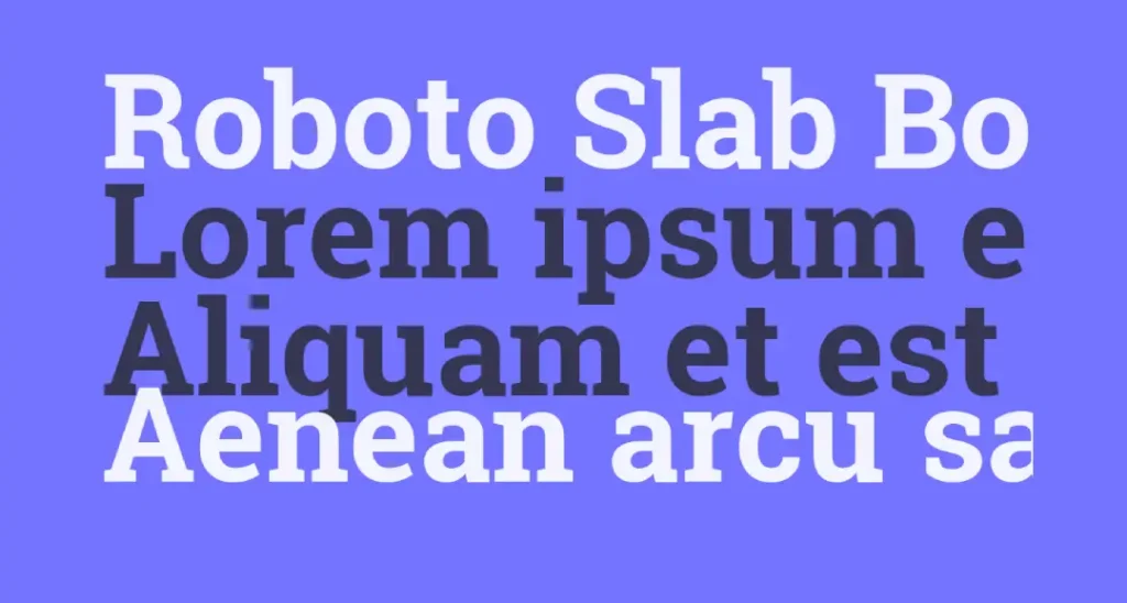
Slab serifs are like a serif font that’s been hitting the gym. The serifs (the feet) are thick, blocky, and rectangular. They make a statement.
- The Psychology: Bold, confident, strong, industrial, and sometimes quirky. They feel sturdy and dependable but have more personality than a standard serif.
- When to Use Them: Use a slab serif to appear reliable but with a contemporary edge. They work well for headlines and logos that need to feel solid. Car manufacturers and tech hardware companies often use them.
- Real-World Examples: Volvo, Sony, and Honda logos use slab serifs to project a feeling of robust engineering and confidence.
- Classic Examples: Rockwell, Courier, Archer.
4. Script Fonts: The Human Touch (Handle With Care)
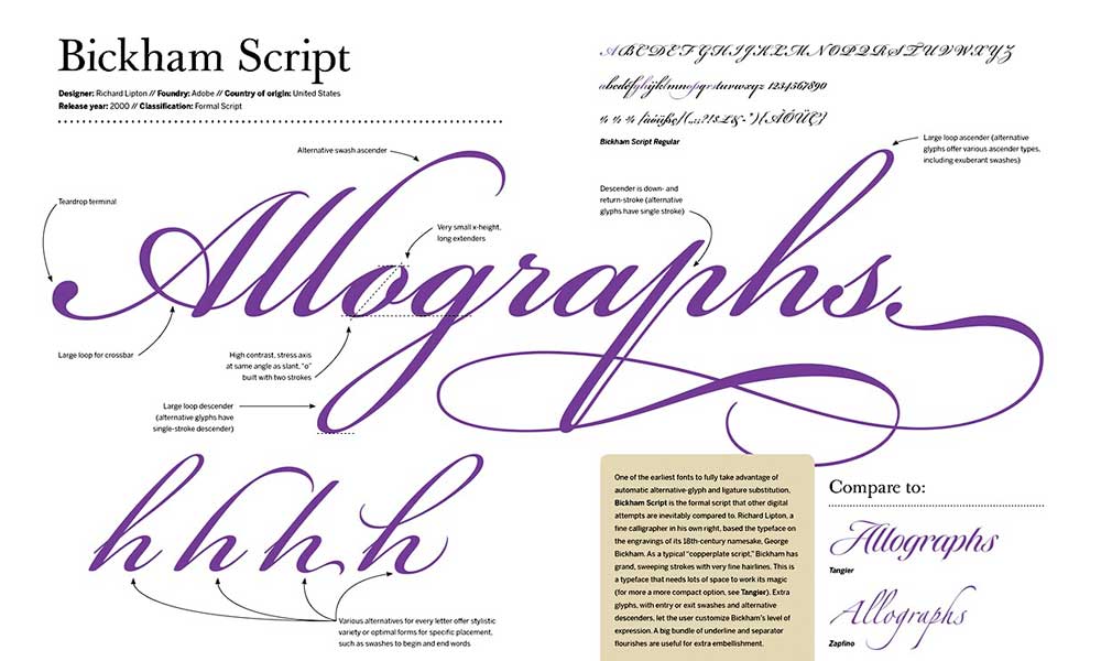
Script fonts mimic the fluid strokes of handwriting or calligraphy. They can range from elegant and formal to casual and playful.
- The Psychology: Personal, elegant, creative, luxurious, or friendly. They add a human element that other fonts lack.
- When to Use Them: Use a script font sparingly. They are for logos, short headlines, or accents. They should rarely be used for body text because they are challenging to read in long form. This is one of the biggest rookie mistakes we see.
- Real-World Examples: The iconic logos for Coca-Cola, Ford, and Instagram (the original) use a script to feel personal and timeless.
- Classic Examples: Pacifico, Lobster (a classic example of a font that became too popular and is now overused).
5. Display Fonts: The Eccentric Show-Offs
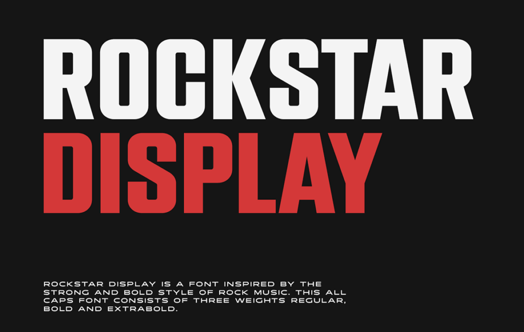
This is a catch-all category for any font designed to grab attention. They are decorative, stylised, and packed with personality. They break all the rules on purpose.
- The Psychology: Highly variable. Can be fun, quirky, dramatic, unique, whimsical, or aggressive. Their entire purpose is to create a specific mood.
- When to Use Them: Use a display font for one thing and one thing only: short, high-impact text. Think logos, event posters, or a single headline on a magazine cover. They are built for personality, not readability.
- Real-World Examples: The Disney logo is a world-famous display font. It’s unique, magical, and instantly recognisable. The Mailchimp wordmark is another excellent example of a friendly, custom display font.
- Classic Examples: There are no “classics” in the same way, as their uniqueness defines them. Bebas Neue is a popular choice for impactful headlines.
The 7 Niche Types of Fonts (Know They Exist, Use Them Rarely)
These are mostly sub-categories or specialised fonts. You probably won’t use them for your core brand, but knowing the language is good.
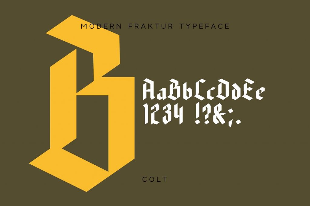
6. Blackletter Fonts: Also known as Gothic. Highly decorative and historic. Think old newspaper mastheads (The Times) or heavy metal band logos. Use with extreme caution.
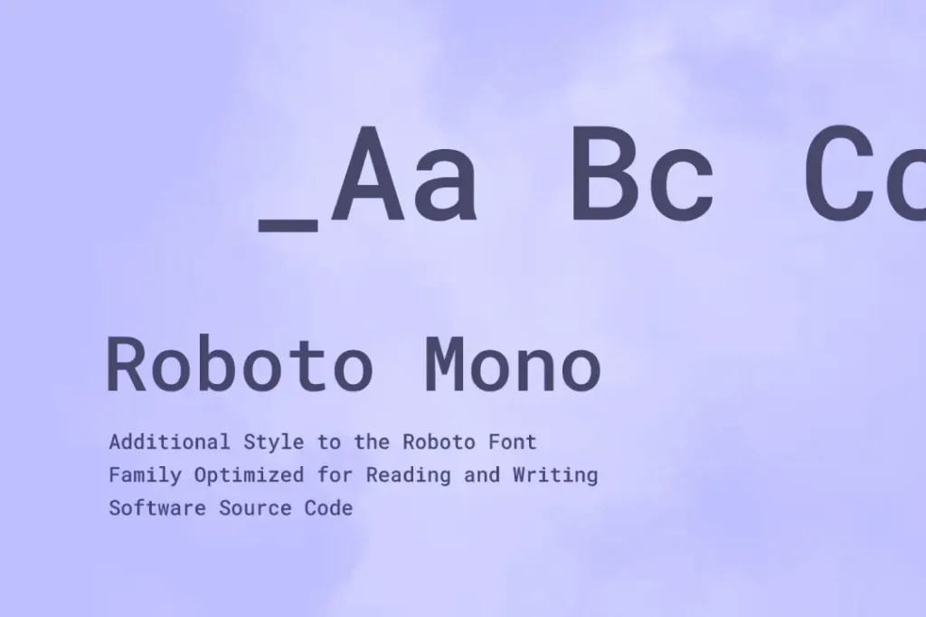
7. Monospaced Fonts: Every letter and character occupies the same horizontal space. This creates a typewritten or computer code feel. The IBM logo is a famous example.
8. Handwritten Fonts: A more casual, messy cousin of script fonts. They can add a personal, informal touch, but look cheap if not chosen carefully.

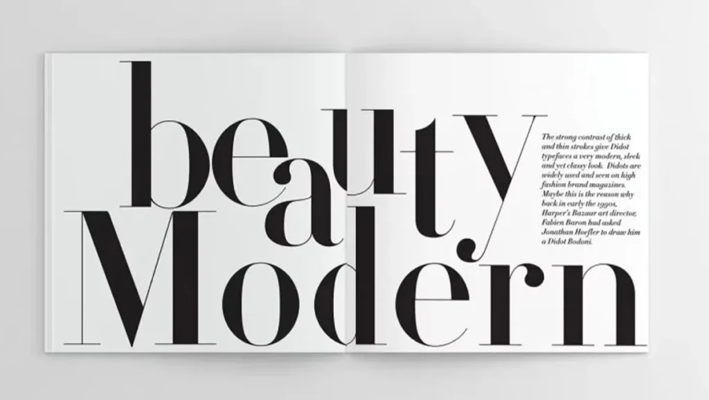
9. Didone / Modern Fonts: A serif type with a dramatic contrast between thick and thin strokes. They look very high-fashion and elegant. Think of the masthead for Vogue.
10. Geometric Fonts: A sub-type of sans-serif built from basic geometric shapes like circles and squares. Futura is the quintessential example. They feel modern, clean, and sometimes a bit retro.
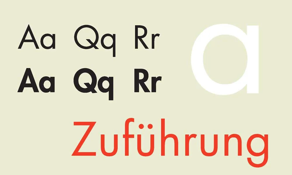
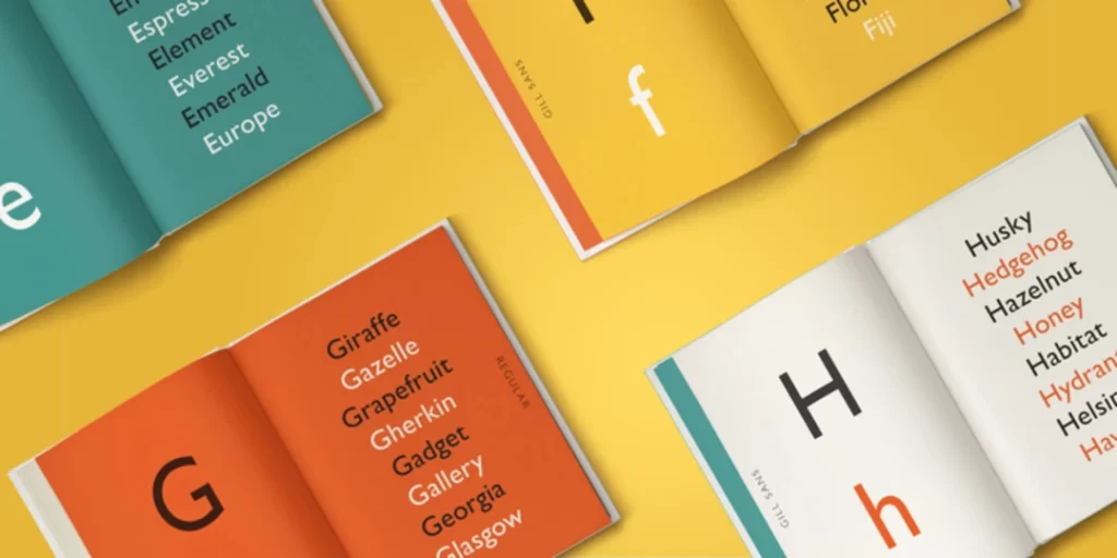
11. Humanist Fonts: A sub-type of sans-serif that includes more calligraphic, natural-feeling strokes, mimicking handwriting. Gill Sans is a classic example. They feel warmer and more approachable than other sans serifs.
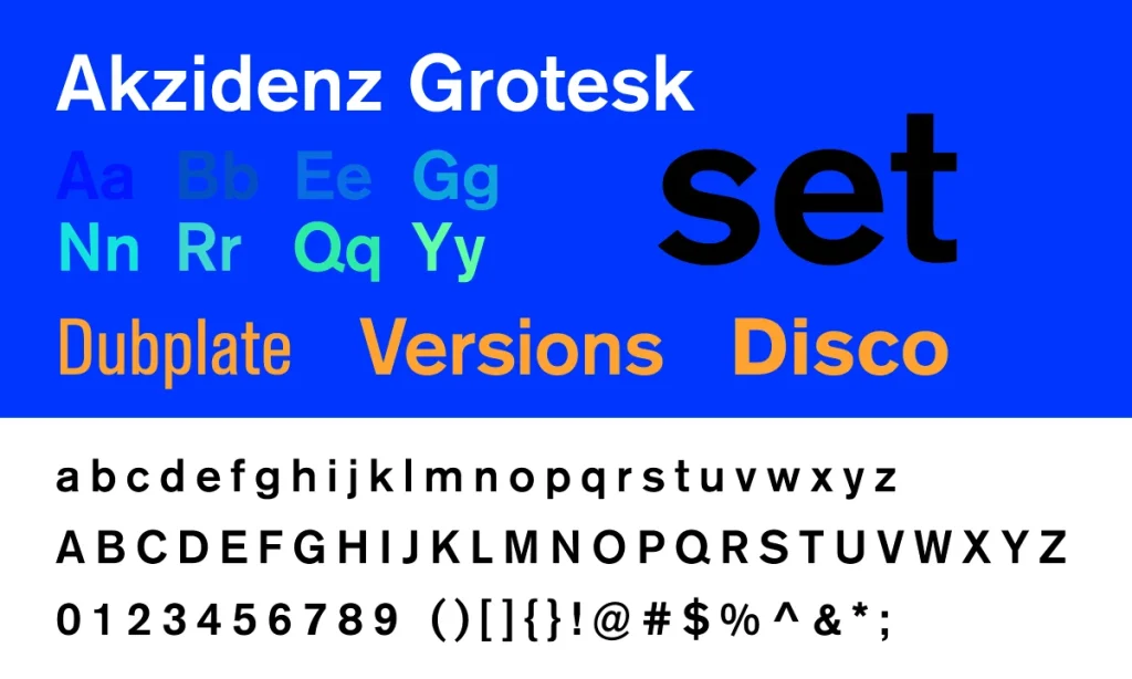
12. Grotesque Fonts: These were the earliest sans-serif designs from the 19th century. They can feel clunky or industrial but have a lot of character. Akzidenz-Grotesk is the grandfather of Helvetica.
How to Choose a Font Style: A No-Nonsense 4-Step Framework
Stop endlessly scrolling through Google Fonts. That’s a recipe for disaster. Choice is not your friend here; process is. The goal is to find a font that works for your brand, not one you “like.”
Step 1: Define Your Brand’s Personality (Just 3 Words)
Before you look at a single font, describe your brand’s desired personality in three words. Are you:
- Traditional or Modern?
- Luxurious or Affordable?
- Playful or Serious?
- Friendly or Authoritative?
Write them down. Now, map those words back to the font families. “Authoritative” points toward a Serif. “Modern and Friendly” points toward a Sans-Serif. This simple exercise narrows your search from millions of fonts to a few specific categories.
Step 2: Prioritise Legibility & Readability Above All Else
Here’s the difference:
- Legibility: Can you easily distinguish one letter from another? An “h” shouldn’t look like a “b.”
- Readability: Can you comfortably read a whole block of text set in this font?
My biggest pet peeve is watching a business choose a “cool” display font for their website’s body text. It’s a cardinal sin. Your font must be functional before it is fashionable.
Test your font choices. Type out a full sentence. Look at it in bold and regular. View it at 12px, 16px, and 72px. Check it on your phone. If it’s hard to read at any size, throw it out.
Step 3: Master Font Pairing (The 2-Font Rule)
You do not need five different fonts on your website. This is Font Anarchy, and it makes you look unprofessional. Stick to the Rule of Two.
You need one font for headlines (H1, H2, H3) and one for body text (paragraphs). A third font for a special accent (like a call-to-action button) is acceptable, but only if you know what you’re doing.
Here are two foolproof pairing strategies:
- Contrast is Key: This is the easiest win. Pair a Serif headline font with a Sans-Serif body font. The contrast creates a clear visual hierarchy and is always tasteful.
- Use the Same Family: This is the safest bet. Choose a versatile typeface with many weights (like Montserrat or Open Sans). Use Montserrat Bold for headlines and Montserrat Regular for body text. It’s impossible to mess this up.
Whatever you do, don’t pair two fonts that are too similar. Two different serifs right next to each other look like a mistake.
Step 4: Check the Licensing (Don’t Get Sued)
This boring part saves you thousands of pounds in legal fees. Fonts are software, and you need a license to use them commercially.
Just because a font is on a “free fonts” website doesn’t mean it’s free for your business logo. Many are for “personal use only.”
To stay safe, get your fonts from reputable sources:
- Google Fonts: A massive library of open-source fonts that are free for commercial use. It’s an incredible resource.
- Adobe Fonts: Included with a Creative Cloud subscription, giving you access to thousands of professional typefaces, all licensed for commercial use.
Never pull a random font off the internet for your brand. It’s not worth the risk.
Putting It All Together: Where to Apply Your Chosen Fonts

Consistency is everything. Once you have your font system (e.g., Rockwell for headlines, Open Sans for body), you must use it everywhere.
- Logo: Your logo might use a unique display font or a customised version of your primary headline font.
- Website: Use your headline font for headings and body font for everything else. Sans-serif fonts are generally the standard for on-screen body text due to their clarity on lower-resolution displays.
- Marketing Materials: Business cards, brochures, and social media graphics must use the same font system. This is how you build a recognisable brand.
You’ve Got Your Fonts. Now What?
A font isn’t a silver bullet. It’s a tool. A critical one, but still just a tool. The real magic happens when that tool is part of a coherent brand strategy.
Your typography should work in harmony with your colours, logo, and tone of voice to tell a consistent story about who you are as a business.
Choosing fonts is a core part of building a professional brand identity. It’s where the visual personality of your business takes shape and begins to communicate with your audience before they’ve even read a single word.
Your font choice is your brand’s tone of voice made visible. Choose it deliberately. Prioritise clarity over cleverness. Build a simple system and stick to it with ruthless discipline. That’s how you build a brand that lasts.
Feeling overwhelmed? That’s what we’re here for. We build brands from the ground up, starting with a strategy that informs every choice—including the fonts. It might be time for a chat if you’re ready to look as professional as you are.
Request a Quote Today and let’s build something powerful together.
Or, see how we’ve put these principles into practice by exploring our work at Inkbot Design.
Frequently Asked Questions about Font Types
What are the five main types of fonts?
The five prominent font families that cover most use cases are Serif (traditional, with ‘feet’), Sans-Serif (modern, without ‘feet’), Slab Serif (bold, blocky ‘feet’), Script (cursive, handwritten), and Display (decorative, for headlines).
What is the difference between a font and a typeface?
A typeface is the design family (e.g., Helvetica), while a font is a specific variation within that family (e.g., Helvetica Bold, 10pt). In everyday use, the terms are used interchangeably.
What is the most professional font?
There is no single “most professional” font; it depends on the industry and brand personality. However, classic Serif fonts like Garamond and Georgia and clean Sans-Serif fonts like Helvetica and Open Sans are widely considered safe and professional choices.
What fonts are easiest to read on screen?
Sans-serif fonts are generally considered the easiest to read on digital screens. Fonts like Open Sans, Montserrat, Lato, and Roboto were explicitly designed for on-screen legibility and are excellent choices for website body text.
How many fonts should I use on my website?
Stick to a maximum of two fonts: one for headlines and one for body text. Using more than that can make your design look cluttered and unprofessional. Use different weights of the same font family for an even safer approach.
Can I use Google Fonts for my business logo?
Yes. All fonts listed on Google Fonts are open source and can be used for personal and commercial projects, including logos. Always double-check the specific license for any font you use, but Google Fonts is one of the safest resources available.
What is font pairing?
Font pairing is selecting two or more different fonts that work harmoniously in a single design. A classic strategy is to pair a serif headline font with a sans-serif body font for strong contrast and visual hierarchy.
What is the most common mistake when choosing fonts?
The most common mistake is prioritising “style” over “substance.” Businesses often choose a trendy or decorative font that is difficult to read, especially in small sizes or long paragraphs. Legibility should always be the top priority.
Are serif or sans-serif fonts better?
Neither is inherently “better”; they just serve different purposes. Sans-serif fonts are the standard for digital body text due to their on-screen clarity. Serifs excel in print and can convey a sense of tradition and authority.
Why is font licensing important?
Fonts are licensed software. Using a font in a commercial project without the proper license is a form of software piracy and can lead to significant legal trouble and fines. Always use fonts from reputable sources with clear commercial licensing.
What is a display font?
A display font is a decorative font designed for use at large sizes, like in logos, headlines, or posters. They are built to be expressive and grab attention, but they are unsuitable for body text due to poor readability.
How do I choose a font for my brand?
Start by defining your brand’s personality in three words (e.g., “modern, friendly, reliable”). Then, select a font category that aligns with those traits. Finally, test your top choices for legibility across different sizes and devices before making a final decision.


