
How to Strategically Create a Business Logo Design
Let’s get one thing straight. Your business logo is not a piece of art.
It isn't meant to be pretty. It isn't meant to explain everything you do. And it certainly isn't the first thing you should be thinking about.
A logo is a tool. A functional tool for identification. Nothing more.
The problem is, most entrepreneurs and small business owners treat it like a primary school art project. They jump straight to the fun stuff—colours, fonts, and fancy shapes. They skip the one thing that matters.
Clarity.
This isn't a guide on how to use a design programme. This is a guide on how to think. It’s here to stop you from wasting a spectacular amount of time, energy, and money on a symbol that, ultimately, fails at its only job.
- A logo is a strategic tool for identification, not an art project; clarity is paramount in its design.
- Understand your brand identity and target audience before logo creation to avoid meaningless designs.
- Logos must be simple, memorable, timeless, versatile, and appropriate to effectively convey brand personality.
- Professional design processes ensure clarity and technical quality, requiring comprehensive briefs and appropriate file types.
Let's Be Clear: Your Logo Isn't Your Brand
People confuse this constantly. And this confusion is expensive.
Your brand is the public's gut feeling about your company. It’s your reputation, the experience you deliver, the promises you keep. It’s what people say about you when you’re not in the room.
Your logo is just a tiny, visual shortcut to that feeling.
The Flag vs. The Country: A Distinction You Must Understand
Think of it this way: your brand is the country. It has a culture, a population, an economy, and a reputation. Your logo is simply the flag that represents it.
Would you design a flag for a country you hadn't defined yet? A country with no name, values, or idea of who its citizens are?
Of course not. It would be meaningless.
Yet, that's what thousands of businesses do every single day. They try to design a flag for a country that doesn't exist.
So, here’s the first and most crucial advice: fix your business strategy first. Get clear on your brand. A brilliant logo for a muddled business is like putting lipstick on a pig. It doesn't change the pig.
The Foundation: Answer These Questions or Don't Bother Starting
This is the work—the hard, unglamorous, non-negotiable part of the logo design process. If you try to create a business logo without having concrete answers to these questions, you're just gambling.
Don't skip this.
1. Who are you? (Mission & Values)
Why does your business exist? And “to make money” is not an acceptable answer. That's a result, not a purpose.
What problem do you solve for people? What change are you trying to make? What do you fundamentally stand for?
Write it down in a single, clear sentence. If you can't, you're not ready for a logo. Stop here and figure that out first. Everything else flows from this.
2. Who are you talking to? (Target Audience)
“Everyone” is the worst possible answer. If you're talking to everyone, you're connecting with no one.
You need to know your audience intimately.
- Demographics are a start: age, location, and income.
- Psychographics are what matter: What do they believe? What do they value? What are their fears and aspirations?
A logo designed for a 22-year-old tech-savvy artist will vastly differ from one designed for a 65-year-old, risk-averse financial director.
I once worked with a software startup that sold complex compliance tools to corporate CFOs. They wanted a “cool, edgy, disruptive” logo. They wanted to look like a trendy consumer app. It was a complete and utter mismatch.
Their audience doesn't wish to be edgy; they want stable, trustworthy, and secure. We had to have a very blunt conversation before they wasted thousands on a logo that would have actively repelled their only customers.
3. Who are you up against? (Competitive Analysis)
You need to survey the landscape. Do not copy what your competitors are doing, but do the opposite.
Your logo's job is to differentiate you.
Look at your top 5-10 competitors.
- What colours do they all use?
- What styles of logos are common? (Wordmarks? Symbols?)
- What overall feeling do they project?
If every other plumbing company in your town uses a blue logo with a water droplet, using a blue logo with a water droplet is commercial suicide. You'll just blend into the noise. Your goal is to find the visual gap in the market and own it.
4. What's the one thing you want people to feel? (Brand Personality)
What would it be like if your brand walked into a room and was a person?
- Profound, authoritative, and wise?
- Playful, energetic, and creative?
- Luxurious, exclusive, and sophisticated?
- Friendly, down-to-earth, and approachable?
Pick three to five core personality traits. Be ruthless. “Friendly and corporate” don't go together. This list becomes the emotional target for your designer. A logo that looks friendly is different from one that looks authoritative.
The Anatomy of a Logo That Doesn't Fail: The Five Principles
Once you’ve done the foundational thinking, you can start judging the visual. These aren't my opinions. They are the universal, pass/fail criteria for a functional logo. A logo must pass all five. Four out of five is a fail.
1. Simple
The human brain is lazy. It doesn't like to work hard and doesn't want to remember complex shapes. A complicated logo is, by definition, a forgettable logo.
The Test: Can a person accurately draw it from memory after looking at it for five seconds?
Think about the world's most effective logos: Apple. Nike. Target. McDonald's. They are brutally, almost offensively, simple. That simplicity is their strength.
2. Memorable
Memorability is a direct result of simplicity and distinction. Is it unique enough to stick in someone's mind?
This is where generic concepts die. A swoosh, a globe, a generic leaf, a lightbulb… these symbols have been used to death. They mean nothing. Your logo can't be memorable if it looks like a thousand other logos. It needs a unique hook.
3. Timeless
Here’s one of my biggest pet peeves. Chasing trends. A great logo should not need a redesign every three to five years. It should be built to last.
Remember the wave of “web 2.0” logos with glossy buttons and reflections? They looked dated within a few years. The current fad for bland, geometric sans-serif fonts for every single brand from tech to coffee shops? That will look just as tired shortly.
A logo that relies on a current trend is already on its way to being obsolete. Aim for a design that would have looked good 20 years ago and still look good 20 years from now. A study from Daake showed that the world's most valuable brands rarely overhaul their core logos. The Coca-Cola script is over 130 years old. The IBM lettermark is from 1972. They lasted because they never bowed to fads.
4. Versatile (The Scalability Test)
This is the technical hurdle where most DIY logos and cheap contest entries fall flat. A professional logo has to work flawlessly in every conceivable application.
It must be perfectly legible and identifiable:
- As a giant sign on a building.
- As a tiny 16×16 pixel favicon in a browser tab.
- Embroidered on a shirt.
- Etched onto a pen.
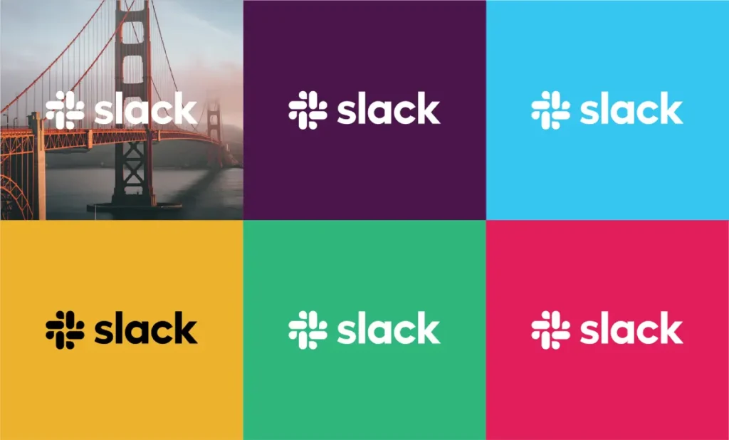
- In full, vibrant colour.
- Critically, in one solid colour (black or white).
If your logo relies on gradients or multiple colours to be understood, it's a failed design. It has to pass the one-colour test. This requires a specific type of file—a vector file, not a JPG you downloaded from some website.
Here's the rub: Getting this right is a technical challenge. It’s about creating mathematically precise vector files (.ai, .svg, .eps), not pixel-based raster files (.jpg, .png). This is where professional design earns its keep. You need an expert if you're slightly unsure about a vector file.
Don't go through all this strategic work just to end up with an unusable file. To see how this is handled properly, look at what goes into a professional process. (See: Inkbot Design's logo design services)
5. Appropriate
This is common sense, yet it’s incredible how often it's ignored. The tone and style of the logo must match the industry and the audience.
You wouldn't use a playful, balloon-animal font for a funeral home. You wouldn't use a stark, severe corporate logo for a children's toy brand. The design choices—the font, shapes, and overall feel—must be appropriate for the business they represent.
Types of Logos: Choosing Your Weapon
The format of your logo isn't an arbitrary choice. Each type serves a different strategic purpose.
- Wordmarks (or Logotypes): Font-based logos that spell out the complete company name. Think Google, Visa, Coca-Cola.
- When to use: Great for new businesses to build name recognition. Works best if you have a distinctive and relatively short name.
- Lettermarks (or Monograms): Use the initials of a company. Think IBM, NASA, HP.
- When to use: A wise choice for businesses with long, hard-to-pronounce, or non-descriptive names (e.g., International Business Machines).
- Brand Marks (or Pictorial Marks): An iconic, graphic-based symbol. Think the Apple apple, the Twitter bird.
- When to use: This is a high-risk, high-reward strategy. It’s incredibly powerful once established, but requires a significant marketing budget for a new business to connect the abstract symbol with their name.
- Abstract Marks: A non-representational geometric shape. Think the Pepsi circle, the Chase Bank octagon.
- When to use: When you want to create something unique that conveys a feeling or business idea (e.g., convergence, flow) without being literal.
- Mascots: An illustrated character that represents the brand. Think of the Michelin Man or KFC's Colonel Sanders.
- When to use: Excellent for creating a friendly, approachable, and family-oriented brand personality.
- Combination Marks: A logo that pairs a wordmark with a brand mark, abstract mark, or mascot. Think Adidas, Doritos, Burger King.
- When to use: The most popular choice for a reason. It's versatile. It builds name recognition while also creating a symbolic shorthand. Over time, you can even separate the elements once the symbol is strong enough to stand alone.
- Emblems: A logo where the company name is inseparable from a symbol or container. Think of the Harley-Davidson shield or the Starbucks siren.
- When to use: Creates a very traditional, established, and official feel. Due to intricate detail, it can sometimes have versatility issues when scaled down to tiny sizes.
A Word on Colour and Typography (Because You're Itching to Talk About It)
Alright. You've done the strategic work. You understand the principles. Now, and only now, can you think about the aesthetics. But even here, your choices must be strategic, not just based on what you “like.”
Colour Psychology is Mostly Bunk (The Practical Version)
You’ve seen the charts: “Red means passion! Blue means trust! Green means nature!”
It's a massive oversimplification. The meaning of colour is highly dependent on culture, context, and personal experience. A 2018 study in Psychological Science found that people's colour preferences were heavily tied to the specific positive experiences they associated with those colours. It isn't universal.
The most important role of colour in branding isn't to tap into some mythical psychological trigger. It's differentiation.
If every single one of your main competitors uses blue, using blue is the worst thing you can do. Your primary colour choice should help you stand out in your specific market.
Practical advice:
- Stick to a simple palette, typically 1-3 core colours.
- Ensure your primary colour has a strong contrast against both white and black backgrounds.
- Choose colours that support the brand personality you already defined, not a generic chart.
Typography is Not Just “Picking a Font”
A font choice is a significant signal.
- Serif fonts (with the little “feet” on the letters, like Times New Roman) tend to feel more traditional, established, and respectable.
- Sans-serif fonts (without the “feet,” like Helvetica or Arial) tend to feel more modern, clean, and direct.
But the real concerns are legibility and personality. Can it be easily read at all sizes? Does the character of the font itself align with your brand's character? Some fonts feel formal, others feel fun, some feel technical, and others feel handmade.
Straight Talk: Avoid using hyper-common systems or gimmicky free fonts from dodgy websites. Your typography is a huge part of your visual identity. It deserves care. And critically, you must ensure you have the proper commercial license to use a font for a logo. Many “free” fonts are only free for personal use. Using one commercially can land you in legal hot water.
The Process: From Brief to Final Files
When you work with a professional, it's a structured process, not a free-for-all. It looks something like this.
The Design Brief
This is the document you create that contains all the answers to the “Foundation” questions. It's the blueprint for the entire project. Any designer worth their salt will refuse to start without a clear, comprehensive brief. It's what turns design from subjective art into objective problem-solving.
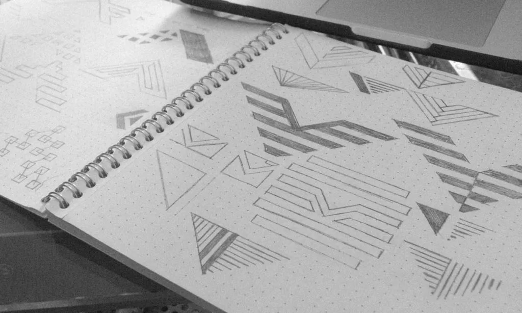
Concepts & Iteration
A designer shouldn't give you 50 slight variations of the same idea. They should show a small number (typically 2-4) of distinct, well-reasoned concepts, each exploring a different strategic direction.
Your job is to provide constructive feedback based on the brief.
- Bad feedback: “I don't like it.” “Can you make it pop more?”
- Good feedback: “Concept A feels too playful for the ‘authoritative' brand personality we defined. Concept B's typography, however, is a much better fit for that goal.”
The Handover: Getting the Right Logo Files
The project isn't finished when you “like” the design. It's finished when you have all the necessary files to use your logo. You are not just buying a pretty picture but a versatile toolkit.
A professional handover package must include:
- Vector files (.ai, .eps, .svg) are the master files. They are built with mathematical lines, not pixels, so they can be scaled to any size—from a pen to a plane—without losing quality. You need these for any professional printing or manufacturing.
- Raster files (.png, .jpg): These are pixel-based files for everyday digital use, like websites, social media, and presentations.
- File variations: You need your logo in full colour, solid black, solid white (for use on dark backgrounds), and potentially any other official brand colour variations.
If this list of file types is confusing, that's okay. It signals that you need a professional to handle the technical side. Don't invest in creating a logo only to receive a single, low-resolution JPG that's useless for half the things you need.
You need to know what you're paying for. Request a quote to see what a proper, professional design handover includes.
The Biggest Mistakes I See (And How to Avoid Them)
I see the same car crash over and over. Avoid these at all costs.
- Designing it yourself (unless you are a professional designer). Your business deserves better than your amateur attempt in a free app.
- Using a logo contest site. This is crowdsourcing mediocrity. You get dozens of un-strategic, often plagiarised, designs from people who know nothing about your business.
- Being too literal. “We sell houses, so the logo must have a house with a roof and a chimney!” It’s predictable and boring. The best logos are suggestive, not descriptive.
- Asking your spouse/parent/friend for feedback. Unless they are your target customer, their opinion is irrelevant and often misleading.
- Falling in love with your first idea. The first idea is rarely the best. The process is about exploration and refinement.
- Being too trendy. As we discussed, a fashionable logo will look foolish tomorrow.
- Paying too little. A £50 logo will look like a £50 logo. It signals cheapness and a lack of investment to your customers.
In Closing
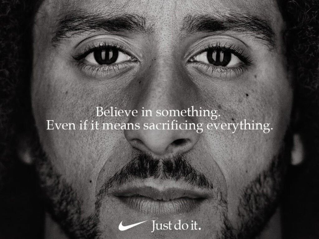
A logo is not an art project. It's a serious, strategic business asset. It is your silent ambassador, your visual handshake, the single element that will represent you more than any other.
Treat the process with the rigour it deserves. Think first. Define your strategy. Then, and only then, create a simple, memorable, timeless, versatile, and appropriate symbol.
Make sure your silent ambassador is saying the right things about you.
Ready to Create a Logo That Works?
This guide lays out the strategic thinking. But turning that strategy into a powerful, professional visual identity is a skill. If you're ready to invest in a logo built on a solid foundation designed to last, we should talk.
- Explore our Logo Design Services to see how we apply these principles.
- Read more of our brutally honest insights on the Inkbot Design blog.
Frequently Asked Questions (FAQs)
How much should a small business logo cost?
The cost varies wildly. A professional logo from a freelancer or small agency can range from a few hundred to several thousand pounds, depending on the scope. Anything less than that, especially from contest sites, often means getting a recycled, non-strategic, or technically flawed product. Think of it as an investment, not a cost.
How long does the logo design process take?
A proper, strategic process typically takes anywhere from 2 to 6 weeks. This allows for research, strategy, concept development, feedback rounds, and final file preparation. A logo delivered in 24 hours is a major red flag.
What's the difference between a logo and brand identity?
The logo is the primary symbol. The brand identity (or brand style guide) is the complete visual system, which includes the logo, a defined colour palette, specific typography, patterns, imagery style, and rules on consistently using them.
Can I trademark my logo?
Yes, and you should if you're serious about your business. Trademarking protects your logo from being used by other companies in your industry. This is a legal process and is separate from the design process.
Do I read all those different file types?
Absolutely. A printer needs a vector file (.eps, .ai) to make your business cards. Your web developer needs a .svg or .png. Your sign maker needs a vector file. Receiving only a .jpg is like buying a car but only getting the key to the driver's door.
What is a vector file?
A vector file is an image created with mathematical equations, not pixels. This means it can be scaled to any size—from a pinhead to a skyscraper—with zero loss of quality. Standard vector formats are .ai (Adobe Illustrator), .eps, and .svg.
Can I just use an online logo maker?
You can, but it's generally a bad idea. These tools often use generic templates and icons that thousands of other businesses use, making it impossible for you to stand out or trademark your logo. They produce amateurish results that can damage your brand's credibility.
How many concepts should I expect from a designer?
Quality over quantity. A good designer typically presents 2-4 strong, distinct, and well-reasoned concepts based on the design brief, rather than dozens of minor variations.
What if I don't like any of the initial logo concepts?
This is why the design brief is so important. If the concepts are off-target, it's usually because the brief was unclear. A good process includes rounds of revision where you provide specific, constructive feedback to steer the design in the right direction based on the agreed-upon strategy.
What's the most critical principle of good logo design?
Simplicity. A simple logo is easier to remember, recognise, and reproduce across various media. It's the foundation upon which memorability, timelessness, and versatility are built.
Should my logo explain what my business does?
No. It should identify your business, not describe it. Does the Apple logo show a computer? Does the Nike logo show a shoe? A logo is for recognition. The rest of your marketing and branding does the explaining.
How do I choose the right colours for my logo?
Focus on differentiation within your market and alignment with your defined brand personality. Don't rely on generic “colour psychology” charts. See what colours your competitors use and pick something that helps you stand out.

