Converting Customers Isn’t a Funnel; It’s a Relationship Built on Design
The term “converting customers” sounds a bit… clinical.
It brings to mind a lab experiment, where we apply stimulus A to subject B and hope for result C. It’s a world of heatmaps, A/B tests, and an almost religious obsession with the colour of a button.
Most of the advice out there treats conversion as a tactic. A trick. A “hack.”
But getting someone to click “Buy Now” isn’t a trick. It’s the final, logical step in a long conversation. It’s the result of a promise made and a trust established.
Obsessing over the final click while ignoring the entire conversation that precedes it is why so many businesses struggle. They’re trying to find the perfect closing line without properly introducing themselves.
Genuine conversion isn’t something you do to people. It’s something you earn from them. It’s the natural outcome of a clear, consistent, and trustworthy brand. Forget the hacks; let’s talk about what actually works.
- Genuine customer conversion is earned through trust and consistent brand promise, not mere tactics or tricks.
- Focus on foundational elements, like clear messaging and professional design, over minor optimisations for success.
- Post-purchase experiences are crucial; they convert first-time buyers into loyal advocates through ongoing positive interactions.
Why Your A/B Tests Are Wasting Your Time
The internet is awash with case studies proclaiming a 217% increase in conversions because they changed a button from red to green. This has created a cult of A/B testing, where entrepreneurs and marketers obsessively test minuscule elements of their website.
This is, for the most part, a colossal waste of time.
It’s a phenomenon known as optimising for a “local maximum.” You might discover that a green button outperforms a red one by 3%. But if your core offer is confusing, your website looks like it was designed in 1998, and your value proposition is non-existent, that 3% lift is meaningless.
It’s like meticulously rearranging the deck chairs on the Titanic. You can find the optimal arrangement of chairs, but the ship is still going down.
Before you spend another minute testing a headline variation, ask yourself the bigger questions. Is my core message clear? Does my business look credible? Is the user’s journey through my site logical and frictionless?
Fix the foundational problems first. The tiny optimisations can wait.
The Foundation of Every Sale: Your Brand Promise
A sale doesn’t begin on the product page. It starts the very first time a potential customer encounters your brand. Every element—from your logo to your language—builds a case for (or against) you. This is your brand promise.

What Are You Actually Selling? (Hint: It’s Not Your Product)
Your value proposition is the core of your brand promise. It’s a simple, clear statement of the value you deliver and the problem you solve. It’s the reason someone should buy from you and not your competitor.
If you can’t state what you do and for whom in a compelling sentence, you can’t expect a customer to figure it out.
Look at Warby Parker. Do they sell glasses? Yes, but that’s not what they sell. Their value proposition is “Designer eyewear at a revolutionary price.” In six words, they tell you the product (designer eyewear), the differentiator (revolutionary price), and imply the benefit (you get to look good without going broke). They sell style, affordability, and convenience.
This clarity removes the mental heavy lifting for the customer. They “get it” instantly. That’s the start of a conversation. Take a moment and try it for your own business. Boil down what you offer into one sentence. If it’s a struggle, you’ve just found your most significant barrier to conversion.
Does Your Shopfront Look Trustworthy? The Role of Brand Identity
Imagine walking down the street and seeing two shops. One has a dirty, peeling sign and a cluttered window display. The other is clean, with a transparent, professional logo and a well-lit, inviting entrance. Which one are you more likely to enter?
Your website is your digital shopfront. A weak, inconsistent, or amateurish design screams “amateur business.” It erodes trust before you’ve even had a chance to state your case.
This isn’t about subjective beauty. It’s about signalling credibility. Key elements of your visual identity are the non-verbal cues that tell customers you are a serious, professional operation. These include:
- A Professional Logo: It’s the face of your company.
- A Consistent Colour Palette: It creates a cohesive, recognisable world for your brand.
- Clean, Legible Typography: It ensures your message is easy to understand.
- A Clear Visual Hierarchy: It guides the user’s eye to the most critical information.
When these elements work together, they create a sense of stability and reliability. A cohesive brand identity isn’t an expense; it’s a down payment on customer trust. Without that trust, you’ll never get the sale.
Mapping the Path to ‘Yes’: The Customer Journey Reimagined

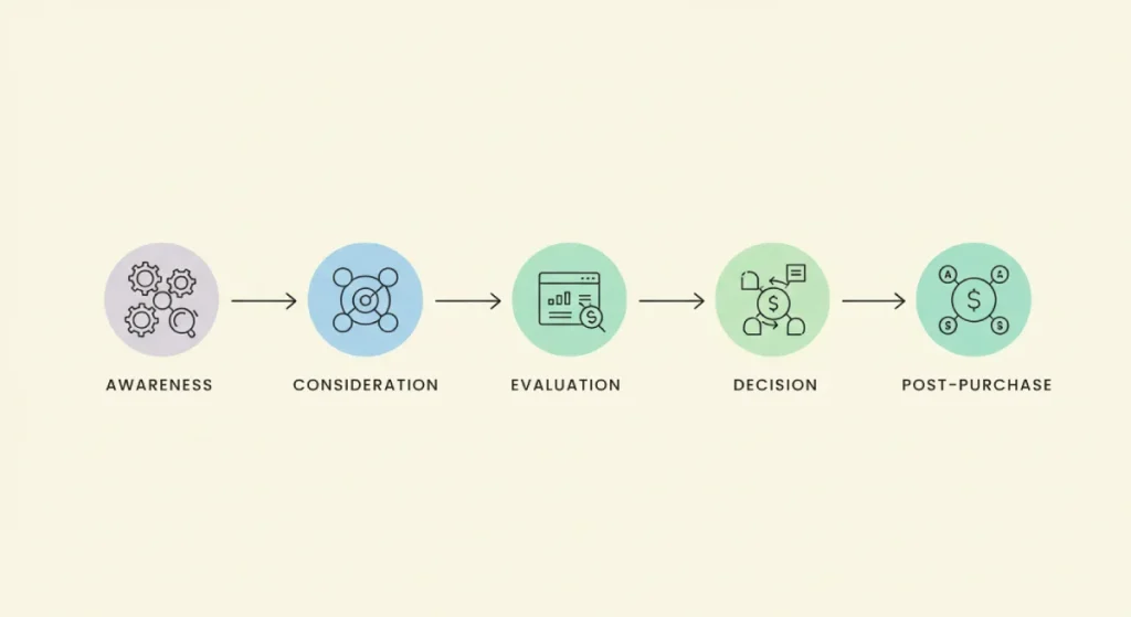
Forget the idea of a simple “funnel” where people fall neatly from the top to the bottom. The modern customer journey is more like a winding path. They might see you on social media, read a blog post six months later, and finally visit your website after a recommendation from a friend.
Your job is to make that path as smooth and confidence-inspiring as possible. Every touchpoint is a chance to earn—or lose—the conversion.
First Impressions: The Awareness Stage
This is the very first “hello.” It could be a social media post, a Google ad, or a shared article. At this stage, you aren’t going for the hard sell. You’re aiming for intrigue and a flicker of recognition.
The design here needs to be strong enough to cut through the noise and professional sufficient to establish a credibility baseline.
Think of the original Dollar Shave Club video. It went viral not because it showcased the technical specifications of their razors, but because it dripped with brand personality. It was funny, relatable, and confident. It made millions of people think, “I like these guys, I want to see what they’re about.” That’s a powerful first impression that starts the conversion process rolling.
The Investigation: The Consideration Stage
Once a user lands on your website, they have moved from awareness to active consideration. They are now an investigator, looking for evidence to support their decision to buy from you. Your website’s job is to provide that evidence clearly and quickly.
This is where user experience (UX) becomes the engine of conversion. Every ounce of friction, confusion, or doubt works against you. Focus on these four areas:
- Crystal-Clear Navigation: Can a first-time visitor find your products, pricing, and contact information in less than 10 seconds? If they have to hunt for information, they’ll give up and go to your competitor.
- High-Quality Imagery & Video: People buy with their eyes. Show your product in its best light. Use high-resolution photos, show them from multiple angles, and demonstrate them in use with video. Let them see the quality for themselves.
- Compelling, Clear Copy: Your website copy should anticipate and answer your customer’s questions. Avoid jargon. Speak like a human. Focus on the benefits of your product, not just the features.
- Obvious Social Proof: Don’t make people search for your reviews or testimonials. Integrate them directly onto your key pages. Show them that people like them have bought from you and were happy with their decision.
The Final Handshake: The Decision Stage
The final steps are checkout, contact form submission, and sign-up. After all your work to build trust and demonstrate value, this is the one place you cannot afford to fail.
The goal here is ruthless simplicity. Remove every possible point of friction.
Think about a local restaurant. One has a website where the menu is a clunky PDF you have to download, and to book a table, you have to call a number that might or might not be answered. The other has a clean, mobile-friendly menu and a simple online booking system that confirms your table in two clicks. Which restaurant is earning more business?
Common friction points that kill conversions at this stage include:
- Forcing users to create an account before checkout.
- Asking for too much information on a form.
- Surprising users with unexpected shipping costs at the very end.
- A slow, clunky, or confusing checkout process.
Make the final step the easiest one of all.
The Conversion Toolbox: Practical Tools, Not Magic Wands
Now we can talk about the specific tools of conversion. But it’s crucial to see them for what they are: tools to enhance and clarify a strong brand promise, not magic wands to create sales out of thin air.

Your Call to Action (CTA) Isn’t a Demand, It’s an Invitation
The Call to Action button or link asks for the conversion. Its design—colour, size, contrast—is essential for visibility, but its language is what truly persuades.
Your CTA language should be a natural continuation of the conversation. It should match your brand voice and the user’s mindset. “Shop Now” is direct and fine for e-commerce. “Start Your Free Trial” is a low-commitment invitation. “Request a Quote” is professional and suited for a service business.
Avoid generic, lifeless CTAs like “Submit” or “Click Here.” Instead, use action-oriented language that describes what the user will get. Change “Submit” on a newsletter form to “Get Weekly Insights.” The first is a demand; the second is a benefit.
Social Proof: Borrowing Trust When You Have None
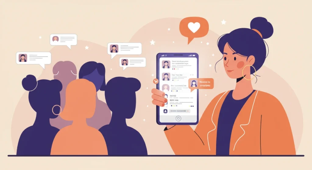
When potential customers are unsure, they look to others for clues on how to behave. This psychological principle of social proof is one of your most powerful conversion tools.
You are effectively borrowing the trust that other people have placed in you. Make this proof visible and varied. There are several types:
- Customer Reviews & Ratings: The most common form. The star-rating system popularised by Amazon is now a universal symbol of quality.
- Detailed Testimonials: Go beyond a simple quote. A testimonial with a customer’s full name, photo, and specific details about their results is infinitely more powerful. For B2B, this takes the form of a case study.
- “As Seen In” Logos: If you’ve been featured in a well-known publication, displaying its logo lends instant credibility by association.
- User Counts & Social Shares: Numbers like “Join 50,000+ happy customers” or “10,000+ shares” signal that you are a popular and safe choice.
Stop Copying Amazon: The “Best Practices” Trap
One of the most persistent and damaging pieces of advice is simply copying what the big players do. “Amazon has a one-click checkout, so you should too!”
This is a dangerous trap.
Amazon can get away with a one-click checkout because it has spent two decades and billions of dollars building an ironclad reputation for trust and reliability. Millions of users have their credit card information stored and feel perfectly safe making an instant purchase.
If your brand-new e-commerce site tries to implement the same feature, it doesn’t come across as convenient; it comes across as presumptuous and potentially insecure. You haven’t earned that level of trust yet.
“Best practices” are often just “what has worked for someone else.” Your job is not to copy them mindlessly. It’s to understand the principle behind the practice (e.g., “reduce checkout friction”) and then find the best way to apply it to your unique brand and your specific audience. The best practice for you is the one you discover through understanding your customers.
The Conversion That Matters Most: From Customer to Advocate
Here’s the biggest mistake most businesses make: They see the first sale as the finish line. They pop the champagne, record the conversion in a spreadsheet, and promptly chase the next new customer.
The reality is that the first transaction is the start of the most critical part of the relationship.
Every interaction you have after the sale is a chance to reinforce the customer’s decision, proving to them that they made a wise choice. This is how you convert a one-time buyer into a repeat customer and, eventually, a vocal advocate for your brand. This post-purchase experience is your single best marketing tool.

The Unboxing and Beyond: Reinforcing the Decision
Think about the entire experience after the checkout.
- The Confirmation Email: Is it a bland, robotic receipt, or a warm, welcoming message that thanks them and sets expectations for what happens next?
- The Packaging: If you sell a physical product, does it arrive in a generic brown box, or is the unboxing experience thoughtfully designed to create a moment of delight?
- The Onboarding: Is the initial setup intuitive and supported by clear guidance for a service or software?
These details matter immensely. They transform a simple transaction into a memorable brand experience.
Turning Buyers into Believers
The work doesn’t stop after delivery. The path from a satisfied customer to a loyal advocate is paved with proactive, positive interactions.
This means having an easy-to-understand return policy. It means providing responsive and genuinely helpful customer support. It could involve a simple follow-up email asking for feedback or a loyalty program that rewards repeat business.
When you invest in the post-purchase experience, you are building your most valuable asset: a base of customers who not only come back for more but also go out and tell others to do the same. That referral is the ultimate conversion.
Conclusion: The Only Conversion Hack Is to Be Trustworthy
For years, we’ve been told that converting customers is a science of optimisation, a game of inches won by tweaking colours and headlines.
That’s a small part of the story.
The real, sustainable path to getting more customers is far more straightforward, though not necessarily easier: Be trustworthy. Build a brand so clear in its promise and consistent delivery that buying from you feels like the world’s most natural and obvious decision.
Stop looking for the secret button. Instead, focus on building a brand that’s impossible to resist. Start by asking yourself: Are you just trying to trick people into clicking a button, or are you truly earning their business?
Frequently Asked Questions (FAQs)
What is a reasonable conversion rate for a small business?
A “good” conversion rate varies wildly by industry, traffic source, and price point. For e-commerce, an average is often cited as 2-3%. Lead generation (like a form submission) can be higher, perhaps 5-10%. The most important thing is to benchmark against your past performance and focus on continuous improvement.
How long does it take to see conversion improvements from a rebrand?
While some technical UX changes can show results quickly, the impact of a complete rebrand on trust and perception is a longer-term investment. You might see an initial lift from improved clarity, but the real value builds over months as your audience recognises and trusts your new identity.
Does changing my logo affect my conversion rate?
Directly? Not in a way you can measure overnight. Indirectly? Absolutely. A professional, well-designed logo is a key part of your brand identity that signals credibility. Over time, a strong identity builds the trust that underpins all conversions.
Is it better to focus on acquiring or converting new customers?
It’s far more cost-effective to convert an existing customer into a repeat buyer. The trust is already established. A great post-purchase experience is the best way to increase customer lifetime value and is often a neglected area of conversion strategy.
How important is page speed for conversions?
Extremely important. Studies consistently show that even a 1-second delay in page load time can cause a significant drop in conversions (some studies suggest a 7% reduction). A slow site feels unprofessional and frustrating, directly eroding user trust.
Should I force users to create an account to check out?
For most businesses, no. Forcing account creation is a central friction point that causes a high cart abandonment rate. Always offer a “guest checkout” option. You can invite them to create an account after the purchase is complete for a smoother experience.
What is the most crucial element on a landing page for conversion?
The value proposition. If a visitor doesn’t immediately understand what you offer, who it’s for, and why it’s better than the alternatives, nothing else on the page (the CTA, the images, the social proof) will matter.
How many form fields are too many?
There’s no magic number, but the rule is to ask only for the essential information to complete the transaction or follow up. For a newsletter sign-up, you only need an email address. For a checkout, you need shipping and payment info. Every additional field you add will cause some people to abandon the form.
Can bad design really hurt my sales?
Yes, significantly. Bad design—a confusing layout, poor typography, or an unprofessional logo—creates a perception of untrustworthiness and incompetence. It makes your business look risky to buy from, which directly suppresses conversions.
What’s a “micro-conversion”?
A micro-conversion is a small action a user takes on the path to a main conversion (like a sale). Examples include watching a product video, downloading a guide, signing up for a newsletter, or adding an item to a cart. Tracking these helps you understand user engagement and the health of your customer journey.
Ready to Build a Brand That Converts?
Building a brand that people trust isn’t an accident. It’s the result of strategic thinking and deliberate design. If you’re tired of chasing short-term tricks and are ready to build a credible brand identity that earns customers for the long haul, we should talk.
Explore our brand identity services to see how we help businesses like yours build the foundation for growth, or request a free quote to discuss your project.


