Branding and Logo Design Demystified: A Guide for Founders
I’ve been a professional brand designer for over 20 years.
In that time, I’ve designed, consulted on, or fixed north of 500 brand identities. And let me be blunt: most small businesses and entrepreneurs are doing branding and logo design completely wrong.
You’re focusing on the wrong things. You’re asking the wrong questions. You’re wasting money on “design” that is actively harming your business.
This isn’t an “ultimate guide” full of definitions. This is an observational guide from the trenches. It’s what I wish every single new client understood before they ever sent me an email.
Before we get into the nuts and bolts, let’s clear the air. Here are my biggest pet peeves—the phrases that tell me an entrepreneur doesn’t understand the value of their own brand:
- “I just need a quick logo.” This is like saying, “I just need a quick building.” A logo is the final, visible piece of an enormous strategic foundation. Asking for a “quick logo” is a guarantee of failure.
- “Can you make it pop?” This, along with “make it sexy,” “give it more wow-factor,” or “it needs to be more dynamic,” is meaningless feedback. It’s a symptom of not having a strategy.
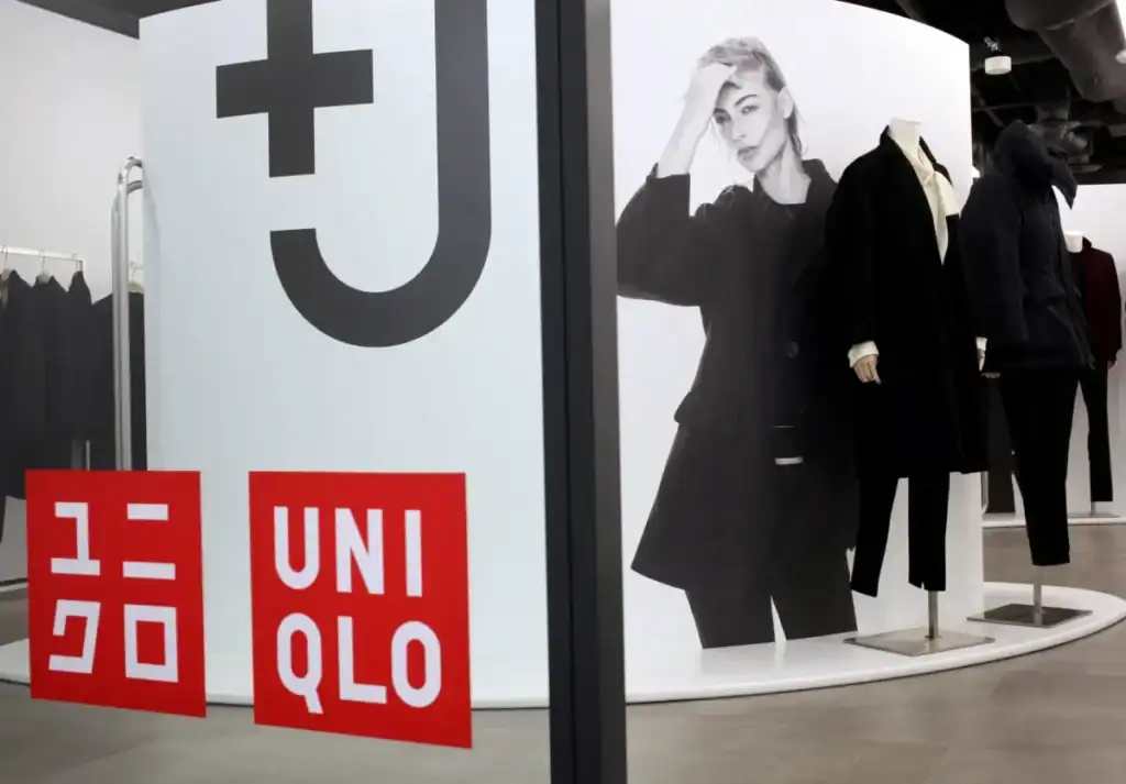
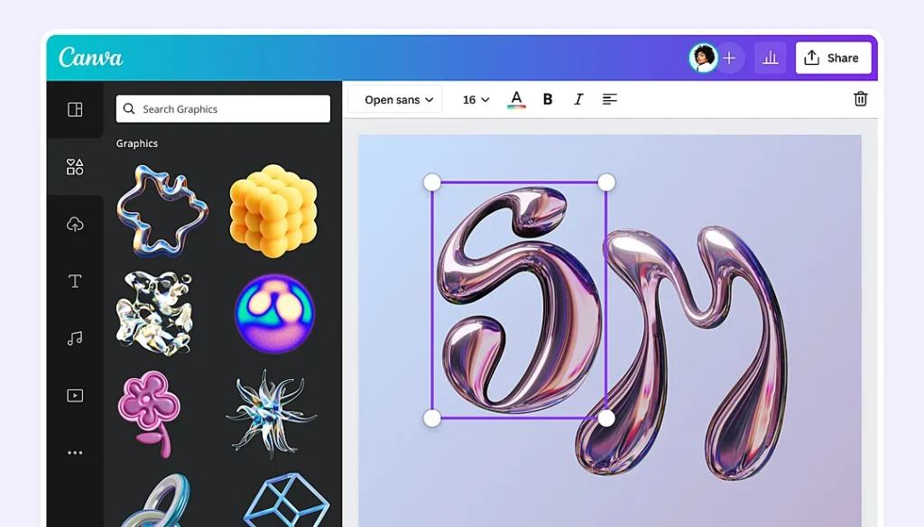
- “My nephew designed it in Canva.” I have nothing against Canva; it’s a brilliant tool for making social media graphics. It is not a professional branding suite. A template is not a brand identity.
- “I don’t need a strategy, I just know what I like.” This is the kiss of death. Your personal taste is irrelevant. The only thing that matters is what resonates with your target customer.
- “Here’s my main competitor’s logo. Can we do something like that, but different?” Copying your competition is a strategy for blending in, not standing out. It’s lazy, and it’s a failure of positioning from day one.
If you’ve said any of these, don’t worry. It’s not your fault. You’re an expert in your business, not mine. My job is to make you an expert in your brand.
This guide will dismantle the myths and give you the framework you need. We’re going to cover the critical difference between brand, identity, and logo.
We’ll walk through the entire professional design process from start to finish. We’ll explore why cheap design is the most expensive mistake you can make.
Let’s get to work.
- Brand ≠ logo: build strategy first—logo is the final expression of an earned brand, not a quick decorative graphic.
- Effective logos are simple, memorable, timeless, versatile and appropriate—design for real applications, not trends or "wow" requests.
- Hire a pro with a clear five‑phase process, deliverables (vector files, guidelines) and full ownership—avoid cheap templates and 24‑hour promises.
The Misunderstanding That’s Costing You Money
Stop Saying “Logo.” Start Saying “Brand.”
The single biggest mistake entrepreneurs make is using “logo” and “brand” interchangeably. They are not the same thing. Not even close.
This confusion is the root cause of 90% of branding failures. When you think you just need a “logo,” you shop for the cheapest, fastest designer. You get a pretty picture, slap it on a website, and wonder why nobody trusts you, remembers you, or buys from you.
You didn’t get a brand. You got a graphic.
- Your Brand is the intangible perception of your company. It’s the gut feeling, the reputation, the emotional connection people have with you. It’s what they say about you when you’re not in the room. It’s a promise.
- Your Brand Identity is the collection of tangible assets you create to communicate that brand. This includes your logo, yes, but also your colour palette, typography, photography style, tone of voice, and more.
- Your Logo is the symbol used to identify your company. It’s the face of your brand identity. A single, critical piece, but still just one piece.
A logo is a tool for identification. A brand is the reason for identification.
It’s the foundation built on your brand strategy—the “why” behind every single decision. Without that strategy, your logo is just an empty vessel, a pretty picture with no meaning, no direction, and no commercial power.
Here’s a simple breakdown.
| Concept | What It Is | An Analogy | Example |
| Brand | The intangible perception and reputation. The “gut feeling.” | The Person | Volvo = “Safety” |
| Brand Identity | The sensory elements used to express the brand (visual, verbal). | The Person’s Style | Volvo’s iron mark, their specific font, their minimalist ads. |
| Logo | The primary visual symbol for identification. | The Person’s Face | The “Volvo” wordmark with the iron symbol. |
You can’t “design” a brand. You earn it. You build it.
You can design a brand identity, and the cornerstone of that identity is the logo. But it must be the last thing you finalise, not the first. It must be the visual expression of a pre-defined strategy.
The Anatomy of a Working Logo
What Actually Makes a Logo “Good”? (It’s Not “Looking Cool”)
Now that we’ve established that a logo is a strategic tool, how do we judge its quality?
It has nothing to do with trends. It has nothing to do with complexity. A “good” logo is not art; it’s a piece of commercial engineering. It has one job: to identify your brand, memorably and consistently, in every possible application.
For decades, designers have agreed on five core principles of effective logo design. A working logo must be:
- Simple: Easy to recognise at a glance. Think of the Nike “swoosh.” You can see it for half a second on the side of a shoe and instantly know what it is. Complex logos become a visual mess when shrunk down.
- Memorable: Easy to recall. Does it stick in your mind? The Apple logo is so memorable that you could draw a reasonable facsimile of it right now. Could you do the same for your local plumber’s logo?
- Timeless: It must avoid trends. A logo that looks “modern” in 2026 will look dated by 2028. The Coca-Cola script has been in use since 1887. Good design lasts for decades, not months.
- Versatile: It must work everywhere. This is the one that trips up most DIY designs. Your logo must work:
- In full colour.
- In pure black.
- In pure white (reversed out).
- As a 16×16 pixel favicon on a browser tab.
- As a 2-metre-wide sign on a building.
- Stitched onto a polo shirt.
- Printed on a grainy black-and-white receipt.
If it fails any of these tests, it’s a bad logo.
- Appropriate: It must feel “right” for its industry and audience. A law firm shouldn’t have a logo in a bubbly, comic-book font. A children’s toy company shouldn’t have a stark, minimalist, corporate-goth logo. The design must align with the brand’s position.
Notice that “pretty” or “clever” isn’t on the list. A logo can be those things, but only after it has satisfied the five principles above.
The 7 Types of Logos: Pros, Cons, and My Observations
Logos are not one-size-fits-all. The type of logo you choose is a strategic decision. Here are the seven primary types, with real-world examples and my own take on them.
| Logo Type | Description | Real-World Examples | My Take (Pros & Cons for SMBs) |
| Wordmark (or Logotype) | A font-based logo that focuses on the business name. | Google, Coca-Cola, FedEx, Visa | Pro: Excellent for new businesses. It directly builds name recognition. Hard to get “wrong” if you have a strong, unique name. Con: Doesn’t work well for very long names (e.g., “Smith, Jones & Partners Accounting”). Relies entirely on distinctive typography. |
| Lettermark (or Monogram) | A typography-based logo comprised of the company’s initials. | HBO (Home Box Office), NASA, IBM, Chanel | Pro: Fantastic for long or clunky names. Creates a simple, punchy, and highly memorable symbol. Con: Requires a marketing budget to teach people what the initials stand for. Can be visually generic if not designed with extreme care. |
| Brandmark (or Pictorial Mark) | An icon, symbol, or graphic that represents the company. | Apple, Twitter (the bird), Target | Pro: The holy grail of branding. This symbol becomes synonymous with your brand. Language-independent and highly scalable. Con: A terrible choice for most new businesses. It takes millions in marketing spend to link an abstract symbol to a brand name (e.g., Nike). You’re not Nike. Yet. |
| Abstract Mark | A non-representational, conceptual shape. A type of brandmark. | Nike (swoosh), Pepsi (the circle), BP | Pro: Truly unique. Avoids the baggage of a literal “thing.” Can convey a feeling or idea (e.g., the swoosh conveys motion). Con: Same as the Brandmark, but even harder. It’s a shape with zero inherent meaning. You have to create the meaning, which costs a fortune. |
| Mascot | A logo illustrated with a character that represents the brand. | KFC (Colonel Sanders), Mailchimp (Freddie), Michelin Man | Pro: Creates a powerful, friendly, and approachable “spokesperson.” Great for family-oriented or B2C brands. Con: Can feel dated, cartoonish, or unprofessional if not executed well. Doesn’t work for serious B2B or luxury brands. Expensive to illustrate well. |
| Combination Mark | A logo that combines a wordmark/lettermark with a brandmark/abstract/mascot. | Adidas, McDonald’s, Lacoste | Pro: The best of both worlds. The name and symbol are paired, reinforcing each other. The symbol can eventually be used alone once recognition is built. Con: Can become cluttered. The two elements must be balanced perfectly to work together and separately. Harder to scale down than a simple mark. |
| Emblem | A logo where the name is encased within a symbol or shape (like a crest or badge). | Starbucks, Harley-Davidson, UPS (the old one) | Pro: Creates a very traditional, established, and authoritative feel. Often implies heritage and quality. Con: Often inflexible. They are notoriously difficult to scale down (all the detail gets lost) and don’t embroider well. Can feel old-fashioned. |
My advice for entrepreneurs?
Start with a Wordmark or a Combination Mark.
A Wordmark puts your name front and centre, which is your number one priority.
A Combination Mark does the same but gives you a symbolic element (a “logomark”) that you can pull out for use as a favicon or social media profile picture.
Avoid the “Brandmark-only” trap. Don’t ask a designer for “just a symbol.” You don’t have the marketing budget of Apple, and you’ll spend the next three years explaining what your company is called.
The Process: How a Professional Identity Is Actually Built
This is where the magic happens. This is what you are actually paying for.
You are not paying for a logo file. You are paying for a specialised, multi-week strategic process that involves research, psychology, and technical expertise.
Anyone who promises a logo in 24 hours is skipping all of these steps. They are selling you a graphic, not a brand asset.
Here is the 5-phase process we follow. Any reputable designer or agency will have a similar structure.
Phase 1: Discovery & Strategy
This is the most important phase. We don’t open Adobe Illustrator. We open a notebook. The goal here is to define the “why.”
- The Brief: We start with a deep-dive questionnaire or workshop. I ask questions like:
- What problem do you actually solve?
- Who is your ideal customer (demographics, psychographics, pain points)?
- Who are your top three competitors, and what are their brands doing (good and bad)?
- What is your “brand position”? Are you the cheapest, the most luxurious, the fastest, the most eco-friendly?
- What five words describe your brand’s personality? (e.g., “playful, authoritative, simple” vs. “traditional, premium, exclusive”).
- Market Research: We analyse your competitors. What colours are they all using? (Good, we’ll avoid those). What’s their tone of voice? What are their logos like? The goal is to find the “gap” in the market—the visual space nobody else owns.
- The Strategy Document: We distil all of this into a single-page document. This is our North Star. It defines the mission, audience, personality, and position. Every single design decision from this point forward is measured against this document. If a design doesn’t support the strategy, it’s binned, even if it’s “pretty.”
Phase 2: Concept & Sketching
Now, and only now, do we start thinking about visuals.
- Mood Boards: We create 2-3 visual “moods.” These are collages of images, textures, typography, and colours that feel like the brand personality we defined. One might be “warm, rustic, and human,” while another is “clean, technical, and precise.” The client reviews these to help us align on a creative direction before any logos are made.
- Sketching: This is the most creative part. We grab a pen and paper. We sketch. Dozens, sometimes hundreds, of ideas. We explore wordmarks, combination marks, and symbols. We play with letterforms. We get all the bad ideas out. This is where the real “ah-ha” moments happen, not by idly moving pixels around a screen.
Phase 3: Digital Design & Refinement
We select the 2-3 strongest concepts from the sketch phase and bring them into the computer.
- Vectoring: We build the logos as “vectors” (in a program like Adobe Illustrator). This is critical. A vector graphic can be scaled to any size—from a pinhead to a building—with zero loss of quality. A logo built in Canva or Photoshop (a “raster” program) is useless.
- Typography: We test hundreds of fonts for the wordmark. We look for letterforms that have the right personality. Is it strong? Elegant? Modern? Friendly? Often, we will manually customise the letters (kerning, ligatures) to create a truly unique logotype.
- Colour Palette: We build a full colour system. We don’t just pick “a blue.” We define a primary blue, a secondary blue, and 2-3 accent colours (plus black and white) that work in harmony and support the brand’s personality. We check these colours for psychological resonance and digital/print consistency (HEX vs. CMYK vs. Pantone).
Phase 4: Presentation & Feedback
This is a formal presentation, not an email with a JPG attached.
- The Presentation: We present the top 2-3 concepts. But we don’t just show the logos. We show them in context. We show what they look like on a website, on a business card, on a van, on a T-shirt. This helps the client see how the system works, not just judge a symbol in a vacuum.
- Strategic Feedback: We walk the client through why each concept works, referencing the strategy document from Phase 1. “We chose this font because it feels ‘authoritative,’ which was one of your key personality words.”
- Feedback Cycles: The client gives feedback. But because we have a strategy, the feedback is now strategic: “I like Concept A, but the symbol feels a bit too ‘playful’ for our ‘authoritative’ position.” This is so much better than “I don’t like it” or “make it pop.” We then take this feedback for one or two rounds of refinement.
Phase 5: Finalisation & Delivery
Once a final design is approved, the project isn’t over. We now build the assets and the rulebook.
- Logo File Package: We deliver a folder of everything you will ever need.
- Vector files: .ai, .eps, .svg (for professional printers, sign makers, etc.)
- Raster files: .png (with transparent backgrounds for web), .jpg (for general use)
- All logo variations: Full colour, all-black, all-white.
- All logo lockups: Primary logo (e.g., symbol + wordmark), symbol-only, wordmark-only.
- Brand Guidelines: This is the most valuable deliverable you’ll get. It’s an instruction manual for your brand. It’s a PDF document that defines:
- The logo and its “clear space” rules (how much room it needs).
- The wrong ways to use the logo (don’t stretch it, don’t change the colours).
- Your full colour palette, with all the codes (CMYK, RGB, HEX).
- Your brand typography (e.g., “Use ‘Montserrat Bold’ for headlines, ‘Lato Regular’ for body copy”).
- Photography style, icon style, and more.
This document is what ensures your brand stays consistent, professional, and recognisable for the next 10 years, no matter who designs your next brochure or social media post.
This is the comprehensive brand identity design process we’ve refined over hundreds of projects. It’s a system designed to eliminate guesswork and build a lasting commercial asset.
The DIY Trap: Why Canva Can’t Save Your Brand
I see this every single week. An aspiring entrepreneur, trying to save cash, spends a weekend on a DIY logo maker or buys a $50 logo from a contest site.
Six months later, they come to us, frustrated and embarrassed. Their brand looks amateurish, nobody takes them seriously, and they’ve just received a cease-and-desist letter because their “unique” logo is being used by 500 other companies that used the same template.
They didn’t save money. They just paid for a 6-month delay and a mandatory, expensive rebrand.
The “hidden costs” of cheap design are staggering:
- Lack of Originality & Ownership: That $5 logo template? It was sold 1,000 other times. You can’t trademark it. You don’t own it. You’ve built your company’s “face” on rented land that’s also a public park.
- Lack of Strategy: The template maker doesn’t know your audience, your market position, or your competitors. The design is generic by definition. It says nothing about you.
- Technical Failure: You almost never get the right files. You’ll get a low-resolution JPG or a PNG. The first time you try to get a sign made, the printer will reject it. The first time you try to put it on a T-shirt, it will look like a blurry mess. You won’t have a vector file, you won’t have a reversed-out version, and you won’t have CMYK colour codes.
- The Cost of Rebranding: The worst cost. You spend a year building what little brand equity you can. You print cards, flyers, and build a website. Then, you’re forced to rebrand. You have to scrap everything. All that time, money, and recognition… gone. You’re back at square one, but now you’re also out of the money for the first failed attempt.
Investing in Your Brand: What to Hire, What to Expect, and What to Demand
Hopefully, I’ve convinced you that professional design is an investment, not an expense. So, how do you hire the right person and not get ripped off?
How to Review a Designer’s Portfolio
Don’t just look for pretty pictures. A portfolio of 50 beautiful but random logos is a red flag.
Look for case studies.
You want to see how they got to the final design. Do they show their process? Do they talk about the client’s problem and how the design solved it? Do they show the brand guidelines? Do they show the logo in different real-world applications?
A strong portfolio shows thinking, not just drawing.
Red Flags to Watch For
Run away. Immediately.
- “Logo in 24 Hours!” They are using templates. Period.
- Contest Sites (e.g., 99designs): This is speculative work. You’re getting 100 rushed, non-strategic ideas from designers who know nothing about your business, all competing to win $100. It’s a race to the bottom.
- No Contract: A professional has a detailed contract that outlines scope, deliverables, payment, and timelines. No contract means no professionalism.
- No Discovery Phase: If they don’t start by asking you dozens of hard questions about your business, they are not a brand designer. They are a “logo maker.”
- “Unlimited Revisions”: This sounds good, but it’s a trap. It means they have no confidence in their process. A professional process (like the one above) is designed to get it right with 1-2 refinement rounds.
What to Demand from Your Designer
You are an active partner in this. To get the most from your investment, you must demand:
- A Clear Process: Ask them to walk you through their step-by-step process. If it doesn’t sound like the 5 phases I outlined, ask why.
- A Fixed-Project Price: Don’t hire a brand designer by the hour. It punishes them for being efficient and gives you an unpredictable bill. A professional can quote the entire project up front because they have a defined process.
- Full Ownership: Your contract must state that upon final payment, you own 100% of the copyright for the final, approved artwork.
- The Full Deliverables Package: At a minimum, you must receive the full Logo File Package and a basic Brand Guidelines PDF. Don’t let them just email you a JPG.
When Is It Time to Rebrand? (The Rebrand vs. The Refresh)
Finally, what if you already have a brand? How do you know if it’s working?
First, distinguish between a Refresh and a Rebrand.
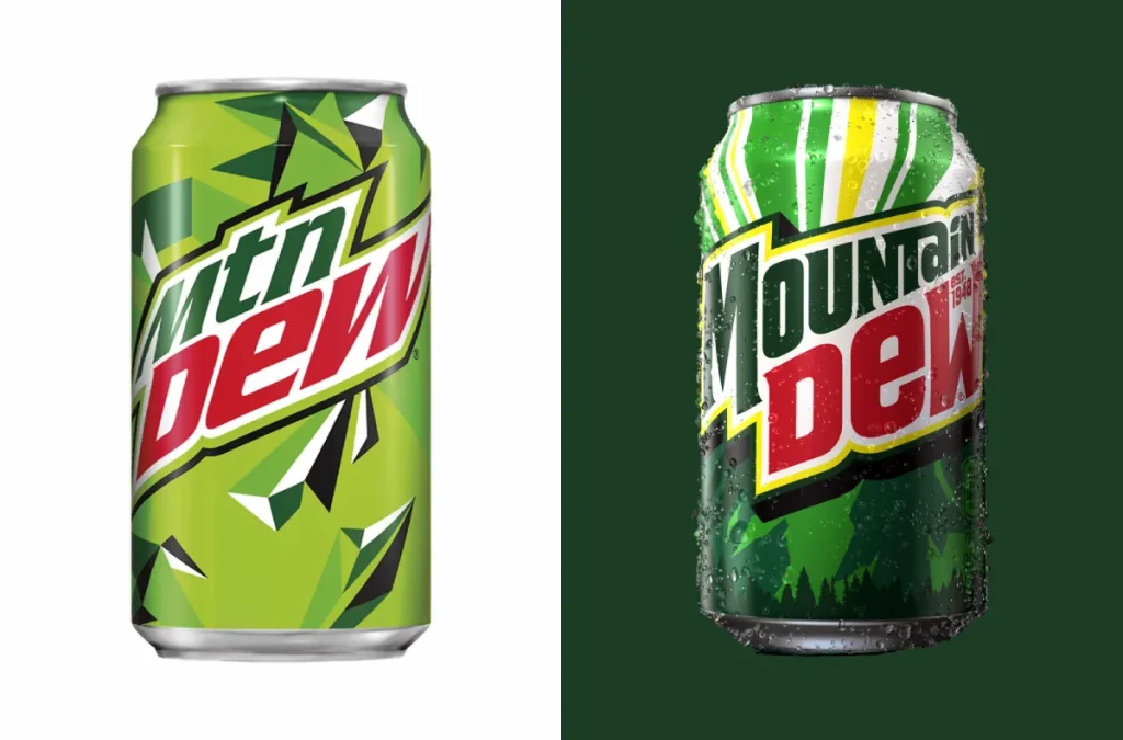
- A Refresh: This is a gentle update. You keep the core elements of your logo and identity, but modernise them. You might sharpen the font, simplify the icon, or tweak the primary colour. Google has done this several times. It’s maintenance.
- A Rebrand: This is a complete overhaul. You’re changing your name, your logo, your position—everything. This is major surgery, and it’s dangerous. You will lose brand equity. You only do this if the old brand is actively harming you. The Twitter-to-“X” transition is a (famously chaotic) example of a rebrand.
Signs You Need a Rebrand or Refresh
- Your Business Has Pivoted: You started as a plumber, but now 80% of your business is high-end kitchen remodelling. Your “leaky faucet” logo is now hurting you.
- You’ve Outgrown Your “Cheap” Logo: You look amateurish, and you know it. Your brand no longer reflects the quality or price point of your service.
- It’s Technically Broken: Your logo is a low-res JPG. It’s too complex. It doesn’t work in one colour. You’re embarrassed to send it to people.
- It’s Just… Old: It was designed in 1995, features bevels and drop shadows, and looks like it belongs on a Geocities page. It signals that your business is out of touch.
- You’re Blending In: You and all your competitors use a blue “swoosh” or a green “leaf.” You have no differentiation.
A rebrand is a strategic business decision, not an aesthetic one. It must be done for a clear commercial reason and with an even more rigorous process than a new brand launch.
Your Logo Is the Face; Your Brand Is the Person
Let’s circle back to the beginning.
Your logo is a vital tool, but it’s just a tool. It’s the face. Your brand identity is the rest of the body—the clothes, the voice, the style. And your brand is the person—the reputation, the personality, the trust you’ve earned.
Entrepreneurs who obsess over “just a logo” are focusing on the face while ignoring the person.
The work we do in branding and logo design is not art. It is the commercial engineering of perception. It’s about building a coherent, memorable, and professional system that communicates exactly who you are, what you do, and why you matter.
It’s a foundational investment. Do it right the first time, and it will pay for itself for a decade. Do it on the cheap, and it will cost you far more in lost revenue and missed opportunities.
What To Do Next
If this guide has resonated with you, and you’re tired of guessing, you have a few options.
- If you’re ready to get serious, you understand that this is a strategic investment and you’re ready to build a professional brand identity. We’d be happy to discuss your project. You can request a quote here.
- If you’re still learning: That’s great. The best clients are educated clients. You can explore more of our articles on branding and design on the Inkbot Design blog.
- If you want to see our process, take a look at our core brand identity design services to see exactly what’s included in a professional engagement.
Branding and Logo Design FAQs
What’s the real difference between a brand, brand identity, and a logo?
Brand: Your reputation and the “gut feeling” people have about you.
Brand Identity: The collection of tangible things you use to show your brand (logo, colours, fonts, tone of voice).
Logo: The single, primary symbol for identifying your brand.
How much should a logo design cost?
It varies wildly, but “logo design” is the wrong question. You should be paying for a “brand identity package.” In the UK/US, a professional freelancer or small studio will charge anywhere from $2,000 to $10,000+ for a full identity process (strategy, logo, colours, typography, guidelines). Anything under $1,000 is almost certainly a red flag.
Why can’t I just use a logo generator or a $50 contest site?
You’ll get a generic, non-unique, and often plagiarised graphic. You won’t get a strategy, you can’t trademark it, and you won’t receive the correct (vector) files needed for professional printing. It’s the most expensive “cheap” option.
What files do I actually need for my logo?
You need a “vector” file (usually .ai, .eps, or .svg) as your master file. This can be scaled to any size. You also need “raster” files for daily use, like .png (with a transparent background) for your website and .jpg for general documents.
What is a “brand guidelines” document, and do I really need one?
Yes. It’s an instruction manual for your brand. It defines your logo rules, colour codes (CMYK, RGB, HEX), and brand fonts. It ensures your brand looks consistent and professional, no matter who is designing a new marketing asset for you.
What’s the best type of logo for a new small business?
A Wordmark (your name in a unique font) or a Combination Mark (a symbol paired with your name). Both focus on building name recognition, which is your #1 priority. Avoid a “symbol-only” logo until you have a multi-million-dollar marketing budget.
How long does a professional branding process take?
Typically, 4 to 8 weeks.
Phase 1 (Strategy/Discovery): 1-2 weeks
Phase 2 (Concept/Sketching): 1-2 weeks
Phase 3-4 (Design/Presentation/Feedback): 1-2 weeks
Phase 5 (Finalisation/Delivery): 1 week
Anyone promising it in “24 hours” is skipping 99% of the work.
What’s the difference between a “rebrand” and a “refresh”?
A refresh is a minor update to modernise your existing logo and identity. A rebrand is a complete, strategic overhaul—often including a new name, new logo, and new market position. A rebrand is major surgery; a refresh is a check-up.
What’s the biggest mistake entrepreneurs make with branding?
Confusing their personal taste with a brand strategy. It doesn’t matter if you “like” the colour green. All that matters is whether green is the right strategic choice to communicate your brand’s position to your target audience.
What’s the first step to starting a branding project?
Stop thinking about the logo. Start thinking about your strategy. Answer these three questions:
Who is my exact customer?
What is the one thing I do better than anyone else?
What is the personality of my business (e.g., “playful,” “authoritative,” “elegant”)?
Only then should you contact a designer.


