Brand Colour Trends: The End of “Safe” Branding
In the commercial arena, colour is not about preference. It is about physics, psychology, and distinctiveness.
It is the first signal your customer’s brain processes—microseconds before they read your logo or parse your offer. If you get it wrong, you are invisible. If you get it right, you own a piece of their mental real estate.
As we move into 2026, the landscape is shifting violently. The “Blanding” era—marked by generic sans-serif logos and pastel indiscernibility—is dead.
The new guard of Brand Colour Trends is aggressive, digital-native, and deeply rooted in a psychological response to a chaotic world.
Here is what you need to know to stop blending in.
- Colour is the first, fastest brand signal—choose distinct hues to own mental real estate or remain invisible.
- 2026 demands bold choices: Bio‑Synthetic neon or Radical Naturalism—mid‑ground “safe” palettes fail.
- Design digital‑first in P3 with Dark Mode variants and WCAG‑level contrast; accessibility equals market reach.
- Colour must match operational reality—no greenwashing or hollow high‑tech promises; authenticity matters.
What Are Brand Colour Trends?
Brand Colour Trends are the shifting preferences in commercial colour usage, driven by technological capabilities (such as screen fidelity), cultural movements (including sustainability and AI anxiety), and consumer psychology. They are not random; they are reactions to the global context.
For 2026, successful colour strategies rely on three core components:
- Luminescence: Colours that utilise the full brightness of modern OLED and Retina displays.
- Sustainability Signals: Pigments and hues that communicate “eco-conscious” without using generic leaf greens.
- Accessibility First: Palettes engineered for high contrast to meet stricter digital inclusivity standards (WCAG).
The Strategic Shift: Why 2026 is Different
We are seeing a bifurcation in the market. On one side, we have the “Synthetic Realism” driven by AI and the Metaverse—colours so bright they vibrate. On the other hand, a desperate clawing back to “Radical Naturalism”—earthy, messy, imperfect tones that prove a human was involved.
Your choice between these paths defines your brand’s stance on the future.
1. The Rise of “Bio-Synthetic” Hues
Forget the flat colours of the early 2010s. The screens in our pockets have evolved, and so must our assets. Brands are now adopting colours that sit on the edge of the visible spectrum for print but explode on a screen.
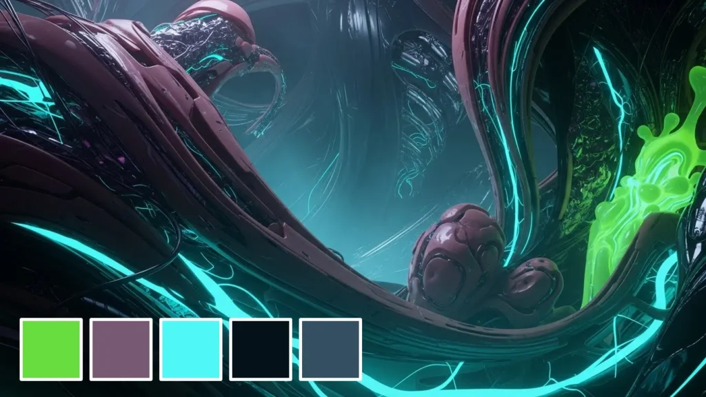
We call this “Bio-Synthetic.” It’s the intersection of nature and code. Think of the iridescent sheen of a beetle’s wing or the glow of bioluminescent algae. These are natural colours, but amplified.
The Data: According to WGSN and Coloro, a key colour for 2026 is “Transformative Teal”—a hue that bridges the gap between digital blue and organic green. It appeals to a consumer base that lives online but is concerned about the climate.

Why it works:
It signals “Future-Ready.” Legacy banks use navy blue. Fintech disruptors use neon coral and electric teal. If you want to signal that your technology is superior, you cannot use the palette of a 1990s law firm.
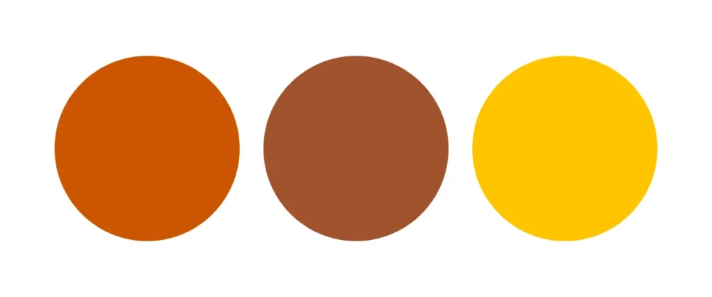
2. “Uncomfortable” Warmth
For a decade, “Millennial Pink” was the dominant colour. It was safe, soft, and unthreatening. 2026 kills it.
The trend is moving toward “baked” and “spiced” tones—Terracotta, Paprika, Blood Orange, and Deep Ochre. These are aggressive, warm colours that feel physically hot.
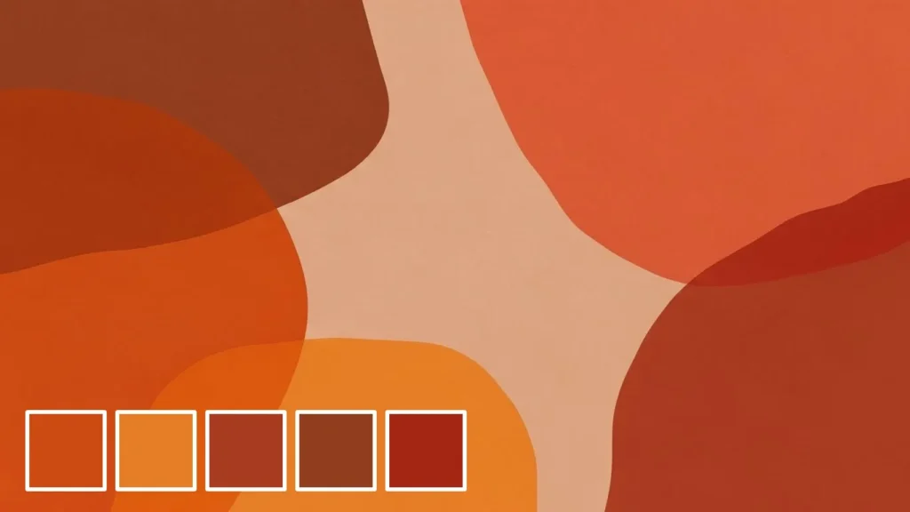
Consultant’s Note: We recently audited a D2C food brand that was using standard “appetite red” (McDonald’s style). It felt cheap. We shifted them to a roasted paprika tone. The result? They stopped looking like fast food and started looking like “artisanal culinary craft.” The price point perception jumped instantly.
These colours trigger a primal response. They feel grounded and tangible in a digital world that feels increasingly fake.
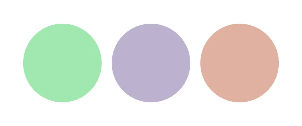
3. The “Anti-AI” Aesthetic
As Generative AI floods the internet with perfectly smooth, hyper-rendered images, human consumers are developing a subconscious aversion to perfection.
The counter-trend is Gritty Pastels. These aren’t the sweet pastels of an Easter egg. These are “dirty” pastels—muted, greyed-out, slightly off. A dirty mint, a grey-ish lavender, a muddy peach.
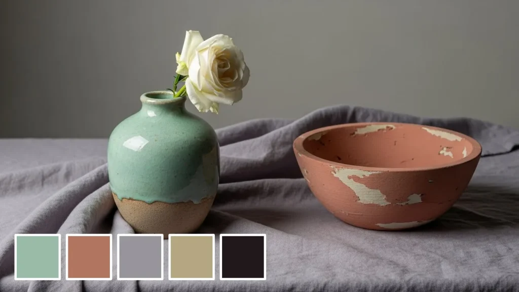
The Psychology:
Perfection now signals “AI-generated” (and therefore, potentially untrustworthy). Imperfection signals humanity. Brands using slightly “off” colours are perceived as more authentic and transparent.
The 2026 Palette Bank (Hex & P3)
Don’t just guess. Here are the starting points for the three macro-trends. Test these in your design software (Figma/Illustrator) to see the difference between standard sRGB and P3.
Trend 1: Bio-Synthetic (The Tech Disruptor)
- Electric Teal: #00FFA3 (P3: High Intensity)
- Deep Violet: #4A00E0
- Hyper-Coral: #FF4D4D
- Vibe: Cyberpunk meets Nature.
Trend 2: Uncomfortable Warmth (The Human Connector)
- Burnt Ochre: #CC5500
- Baked Clay: #A0522D
- Spiced Turmeric: #FFC300
- Vibe: Tactile, heat, spice, earth.
Trend 3: The Anti-AI (The Authentic Mute)
- Dirty Mint: #A0E8AF (Desaturated)
- Greyed Lavender: #BDB0D0
- Muddy Peach: #E0B0A0
- Vibe: Nostalgic, imperfect, calm.
Technical Reality: The P3 Colour Gamut
This is where the amateurs get left behind. If you design your brand identity in CMYK (print) first, you are planning for a medium that is on the decline.
Most modern devices (Apple, high-end Androids) support the P3 Colour Gamut, which displays 25% more colour than the standard sRGB space.
- sRGB: The old standard. Safe, but dull.
- P3: capable of displaying intense cyans, neon greens, and vibrant oranges that simply do not exist in sRGB.
If your brand colour is a standard sRGB blue, and your competitor uses a P3 electric blue, their app icon will literally shine brighter on the user’s home screen. It is a physical advantage.
The Wrong Way vs. The Right Way
| Feature | The Amateur Approach (Failing) | The Pro Approach (2026 Standard) |
| Primary Format | CMYK (Print First) | Hex/P3 (Digital First) |
| Contrast | Aesthetic-based (“It looks nice”) | WCAG AAA Compliant (Data-based) |
| Palette Size | 2-3 static colours | Dynamic system (Light/Dark Mode variants) |
| Neutrals | Pure Black (#000000) | Tinted Greys/Dark Blues (Rich Black) |
| Gradients | Linear, simple fades | Mesh gradients, noise-textured blends |
Accessibility is Not Optional (It’s Profitable)
You might think accessibility is just a legal box-ticking exercise. It isn’t. It is about market reach.
Approximately 15% of the world’s population experiences some form of disability. If your trendy pale grey text on a white background is unreadable to a 55-year-old with deteriorating eyesight, you are wasting money.
In 2026, the European Accessibility Act and updated WCAG standards will punish brands with low-contrast interfaces.
The Strategy:
Do not choose a brand colour without testing it against white and black text. If it fails the contrast ratio (4.5:1 for standard text), it is not a brand colour; it is a decoration.
We incorporate colour psychology into branding to ensure that, while we meet these technical standards, we do not lose the emotional connection. High contrast does not mean boring; it means confident.
Real-World Evidence: Who is Doing it Right?
You want proof? Look at the market leaders who pivoted before 2026.
1. Monzo (The Neon Disruption)
When Monzo launched, banks were grey, blue, and black. Monzo chose “Hot Coral.”
It was obnoxious. It was searingly bright. And it was genius.
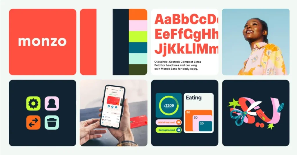
When someone pulled a Monzo card out at a dinner, everyone saw it. It became a viral loop. The colour was the marketing strategy. They didn’t need a billboard; they had customers flashing neon rectangles in every pub in London.
2. Tiffany & Co. (The “Yellow” April Fools)
Tiffany owns “Tiffany Blue” (Pantone 1837 C). It is a legal asset. However, they recently ran a campaign featuring “Tiffany Yellow.”
It broke the internet.
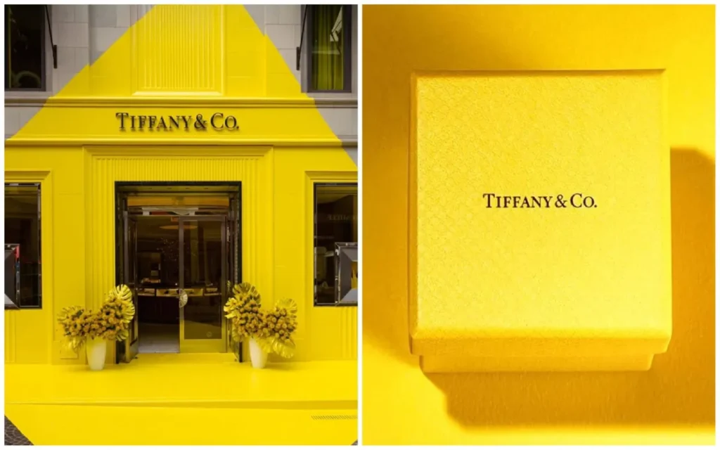
They understood that to stay relevant to Gen Z, they had to subvert their own sacred cow. It proved that even heritage brands must play with colour trends to generate noise, even if they return to their roots afterwards.
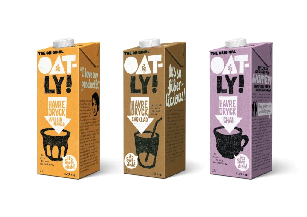
3. Oatly (The Anti-Design)
Oatly uses muted, muddy colours and disjointed typography. It appears to have been designed by mistake. This is calculated. It stands out on a shelf of polished, shiny dairy cartons. It uses the “Uncomfortable Warmth” and “Gritty” trends to signal: “We are not Big Milk. We are different.”
Which Trend Fits Your Sector?
Not every trend works for every industry. A funeral home should probably avoid “Bio-Synthetic Neon.”
| Industry | Recommended Trend | Why? |
| Fintech / SaaS | Bio-Synthetic | Signals speed, innovation, and “future-proof” technology. Separates you from legacy banking blues. |
| D2C / Food & Bev | Uncomfortable Warmth | Stimulates appetite (reds/oranges) and signals “craft/ingredients” rather than factory processing. |
| Wellness / Skincare | Anti-AI (Dirty Pastels) | Signals organic imperfection and “real skin” rather than photoshopped beauty standards. |
| Legal / Consultancy | High-Contrast Monochromes | (The Safe Bet). Stick to deep blacks and off-whites. Use one Bio-Synthetic accent for a modern edge. |
The “Dark Mode” Imperative
In 2026, over 80% of users prefer Dark Mode on their devices.
If your logo is a dark blue symbol with black text, you disappear on a dark background.
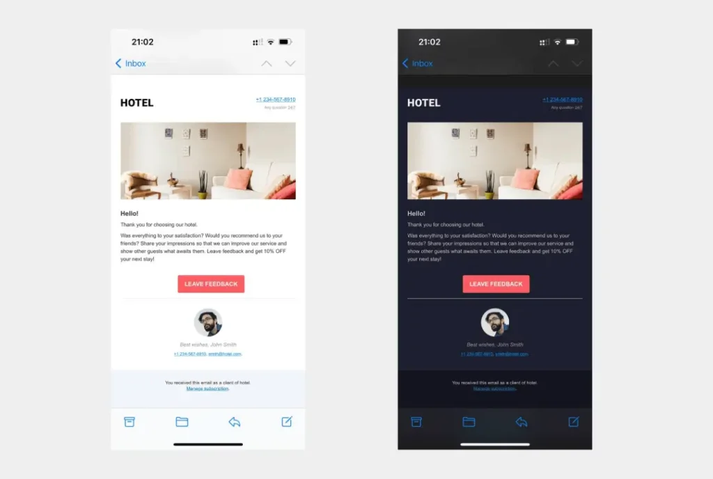
You can no longer have a single colour palette. You need a bi-directional system.
- Light Mode: Your standard brand colours.
- Dark Mode: Desaturated, pastel versions of your primary colours.
Why desaturated?
Pure saturated colours on a pure black background cause “halation”—a vibrating effect that can be visually distressing. To look professional in Dark Mode, you must paradoxically lower the saturation of your bright colours to make them readable.
If your brand guidelines do not include a specific “Dark Mode Token Set,” they are incomplete.
Consultant’s Reality Check
I often sit in boardrooms where a CEO says, “I want our brand to look like Apple.”
What they mean is they want to use white. Lots of white.
However, Apple does not own the colour “white.” Apple owns a philosophy of extreme subtraction. If you are a chaotic B2B logistics company and you try to use “Apple White,” you won’t look premium; you will look empty.
The Hard Truth:
Do not chase a trend if your operations cannot support it.
- If you choose “Eco-Beige” but ship your products in excessive plastic, the consumer will spot the disconnect. This is “Greenwashing” via palette.
- If you choose “Neon Cyber-Lime” but your website takes 4 seconds to load, the “high-tech” promise of the colour is broken by the reality of your tech stack.
Your colour must match your reality.
The Colour Compliance Toolkit
To execute these trends without breaking accessibility laws, use these tools:
- Stark (Plugin): The industry standard for checking contrast ratios directly inside Figma, Sketch, and Adobe XD.
- ColorSlurp: A colour picker that allows you to sample colours from your screen and convert them between sRGB, P3, and CMYK instantly.
- Khroma: An AI tool (ironically) that learns your preferences and generates infinite palettes based on the “Bio-Synthetic” or “Earthy” inputs you give it.
- WhoCanUse: A visual simulator that shows you how your colour palette looks to people with different types of colour blindness (Protanopia, Deuteranopia).
The Verdict
The Brand Colour Trends for 2026 are not about picking a pretty shade from a Pantone book. They are about visibility in a saturated, OLED-lit, sceptical world.
- Go Bright or Go Earthy: Commit to the Bio-Synthetic Digital Future or Radical Naturalism. The middle ground is death.
- Audit for P3: Ensure your digital assets use the full colour spectrum available on modern hardware.
- Test for Contrast: Accessibility is the baseline for usability.
If your brand identity looks like it was made in 2019, it feels like it was made in 1999 to a Gen Z consumer. The speed of visual culture has accelerated.
Do not let a stale palette cost you a sale.
Ready to build a brand system that survives the trends?
Request a Quote for a comprehensive brand audit, or explore our Brand Identity Services to see how we build future-proof businesses.
Frequently Asked Questions
What is the predicted colour of the year for 2026?
While Pantone and WGSN release specific forecasts (such as Transformative Teal or Electric Walnut), the dominant trend is “Bio-Synthetic”—colours that blend organic tones with digital neon brightness, suited for high-definition screens.
How do I choose a brand colour that won’t go out of style?
Focus on brand psychology over trends. Identify your core emotional value (e.g., Trust, Energy, Calm) and choose a hue that universally represents that. Then, use trends for your secondary or accent colours, which are easier to change later.
What is the P3 colour gamut and why does it matter?
The P3 colour gamut is a colour space used by modern displays (Apple, Android) that contains 25% more colour than standard sRGB. Designing in P3 enables more vibrant and intense branding that stands out on mobile devices.
Can I use my print colours for my website?
Directly converting CMYK (print) to RGB (web) often results in dull, muddy colours. You should select specific Hex codes for digital use that approximate your print colours but take advantage of screen brightness.
Why is accessibility important in colour selection?
Legally, you may face lawsuits if your site is unusable. Financially, low-contrast text can alienate users with visual impairments (approximately 15% of the population). High contrast ensures your message is readable by everyone.
What is the best colour for a tech startup in 2026?
Avoid generic “Tech Blue.” Trends suggest moving towards “Electric Purples,” “Cyber Limes,” or deep, rich blacks with neon accents to signal innovation and stand out from the sea of blue competitors.
How do I adapt my logo for Dark Mode?
You need a specific “Dark Mode” variant. Usually, this involves swapping black text for white and desaturating your primary brand icon slightly to prevent visual vibration against the dark background.
What is ‘Greenwashing’ in colour design?
This occurs when a brand uses “Eco-friendly” colours, such as natural greens and browns, to imply sustainability, despite having environmentally harmful business practices. Consumers are increasingly savvy to this and may reject the brand.
Should I rebrand if my colours are not ‘trendy’?
Not necessarily. Brand equity (recognition) is valuable. Instead of a complete rebrand, consider a “Brand Refresh”—updating your secondary palette or adjusting the saturation of your primary colour to feel more modern without losing recognition.
How many colours should be in a brand palette?
A robust system needs a Primary colour (60% usage), a Secondary colour (30%), and an Accent colour (10%). However, digital systems also require functional colours for success, error, and informational states (red, green, blue, and yellow).


