The 10 Best Landing Pages that Attract and Convert
Most landing pages suck.
They don’t convert, they don’t engage, and worst of all—they leave money on the table.
The difference between a page that drives millions and one that flops isn’t luck or guesswork—it’s a formula.
And guess what? You don’t need a huge budget, a fancy design team, or years of experience to build landing pages that work.
You need to know what works and why.
In this article, I’m breaking down the 10 best landing pages that attract attention and convert like crazy.
These aren’t just pretty designs—they’re marketing machines, and I’ll show you how you can steal their secrets and replicate their success.
Ready? Let’s dive in.
Key Takeaways
- Effective landing pages focus on a single, clear goal, making it easy for visitors to take action.
- Visual elements like images and videos should support the content and not distract from the main message.
- Trust signals such as customer reviews and security badges can significantly boost conversion rates.
- A/B testing different elements of your landing page can lead to higher engagement and conversion.
- Strong, clear calls-to-action (CTAs) are essential for guiding visitors toward your desired outcome.
- Landing pages should focus on a single, clear goal to drive visitor action.
- Visual elements must support the content without detracting from the main message.
- Incorporating trust signals significantly increases conversion rates.
- A/B testing is essential for improving engagement and conversions.
10 Best Landing Pages That Attract & Convert
In 2025, creating a landing page that truly stands out is no small feat.
With countless businesses vying for attention, crafting a compelling landing page has become more crucial than ever.
Here, we’ve rounded up the 10 best landing pages of the year, each a masterclass in design, functionality, and conversion strategy.
1. Netflix Signup Landing Page
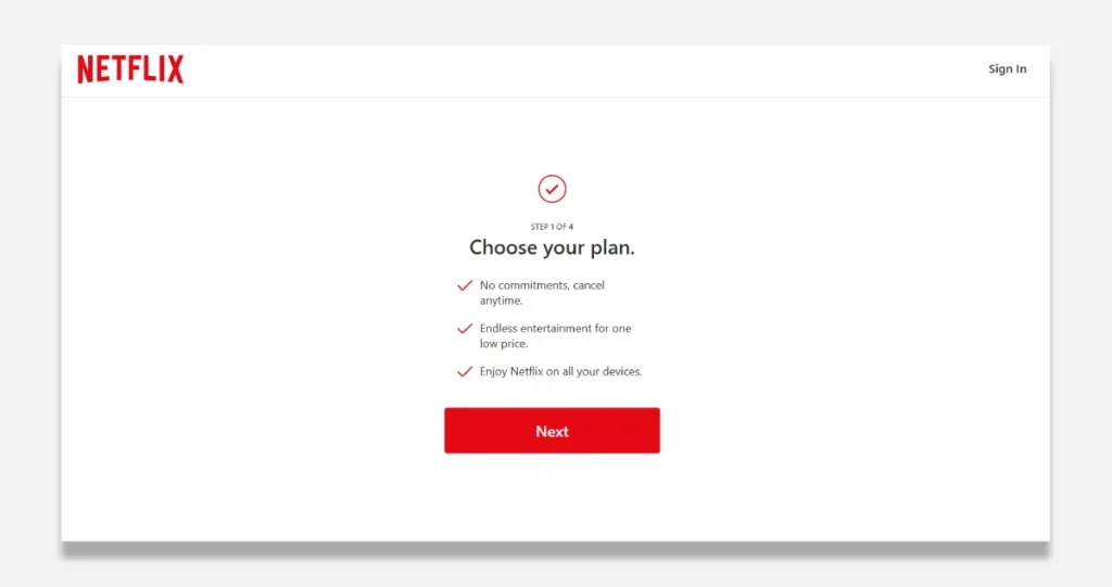
Most landing pages are trash. They’re cluttered, confusing, and leak money faster than a broken pipeline. But Netflix? They’ve cracked the code. And I’m going to show you exactly how.
The secret? Ruthless simplicity.
Think about this: What’s the ONE thing Netflix wants them to do when someone hits this page? Choose a plan. That’s it.
Here’s what makes this page print money:
First – The Psychology of Progress They hit you with “STEP 1 OF 4” at the top. Why? Because our brains LOVE knowing where we stand. It’s like a loading bar for your wallet. When people know they’re 25% done, they’re more likely to finish—introductory human psychology.
Second – The Value Stack They crush objections before they even come up:
- “No commitments” → Kills the “I might be stuck” fear
- “Endless entertainment” → Transforms price into value
- “All your devices” → Multiplies perceived worth
But here’s where it gets genius…
The Visual Hierarchy Everything points to ONE action. The white space? It’s not empty – it’s PURPOSEFUL. It’s like putting a spotlight on the money moves. Your eyes literally can’t help but follow the breadcrumbs to that red “Next” button.
Speaking of that button – it’s not just red. It’s “Netflix red.” Sure, it’s their brand colour, but more importantly, it’s the ONLY colour drawing your eye. That’s not an accident. That’s conversion optimisation at its finest.
Here’s the brutal truth: Most businesses try to say everything at once. Netflix? They understand the power of progressive disclosure. They know that getting someone to take ONE small step is worth more than showing them the entire journey upfront.
The ROI Math: Every element removed = attention preserved Every word eliminated = clarity gained Every distraction killed = conversion rate boosted
Bottom line: This page works because it respects the fundamental law of business – making it easy for people to give you money.
2. Lyft Apply to Drive Landing Page
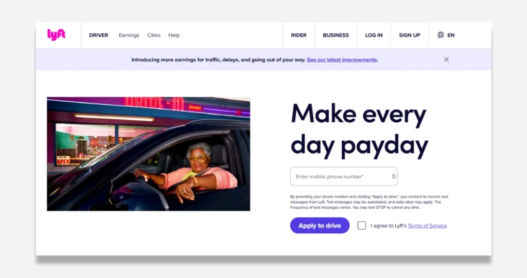
Want to know the secret behind Lyft’s driver acquisition success?
It’s their landing page. And I’m going to break down exactly why it works.
First – let’s talk about what 99% of companies get wrong. They overwhelm potential drivers with options, complex forms, and unnecessary info. Dead wrong.
Here’s what Lyft does instead (and why it’s genius):
They lead with one promise: “Make every day payday.”
Just the one thing drivers care about – getting paid and getting paid often.
Then they do something brilliant: They only ask for ONE thing – your phone number. That’s it.
Think about the psychology here. Every additional field you add to a form kills your conversion rate by 7-10%. They’ve stripped away all friction by asking for a phone number.
But here’s where it gets exciting…
They pair this minimal form with an image of a happy driver. Why? Because your brain processes images 60,000 faster than text. Before you read a single word, your subconscious has already connected “Lyft driver = happy person making money.”
Now, could they optimise this further? Absolutely.
The “Apply to drive” button is weak. It should say “Start Earning Now” – always focus on the benefit, not the action.
And they’re missing social proof. Where are the testimonials for “Driver X made $Y last month? That’s money left on the table.
But here’s the more significant lesson:
The best landing pages don’t try to explain everything. They remove everything that doesn’t directly drive action.
Remember: Complexity kills conversion. Simplicity sells.
Want to apply this to your business? Start by ruthlessly eliminating every element that doesn’t directly contribute to getting someone to take action. Then, test, measure, and optimise.
Because at the end of the day, a landing page has ONE job: Convert visitors into leads.
3. OptinMonster Sales Landing Page
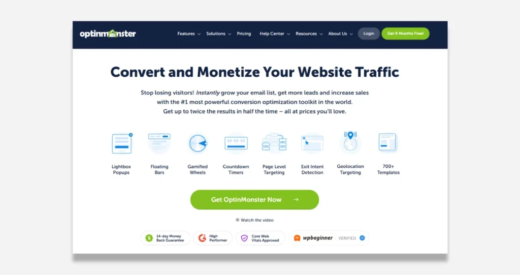
Your website is bleeding money right now. Every visitor who leaves without converting? That’s cash walking out the door. But here’s the truth about OptinMonster that nobody’s talking about…
It’s not just another popup tool. It’s a profit multiplier.
Here’s the math: You get 10,000 visitors a month. With a typical 1% conversion rate, that’s 100 leads. At a $100 average customer value, you’re making $10,000.
But watch this…
OptinMonster users typically see 2-3x conversion rates. Same traffic, different outcome. Now, you’re looking at 200-300 leads. That’s $20,000-$30,000 per month—an extra $120,000-$240,000 per year. From the same traffic, you already have.
The secret? It’s in the stack:
- Smart Triggers that catch visitors milliseconds before they bounce
- Behaviour-based targeting that shows the right offer to the right person
- A/B testing engine that automatically pushes winning campaigns
But here’s what makes it different: While other tools give you pretty popups, OptinMonster gives you a conversion system. Everything is built around one goal: turning casual visitors into paying customers.
Think about this:
- Every 1% increase in conversion = thousands in additional revenue
- Every lead captured = future sales opportunity
- Every abandoned cart recovered = instant profit
The guarantee? is 14 days to test it yourself. You get your money back if you don’t see more leads and sales. Period.
4. Airbnb Signup Landing Page
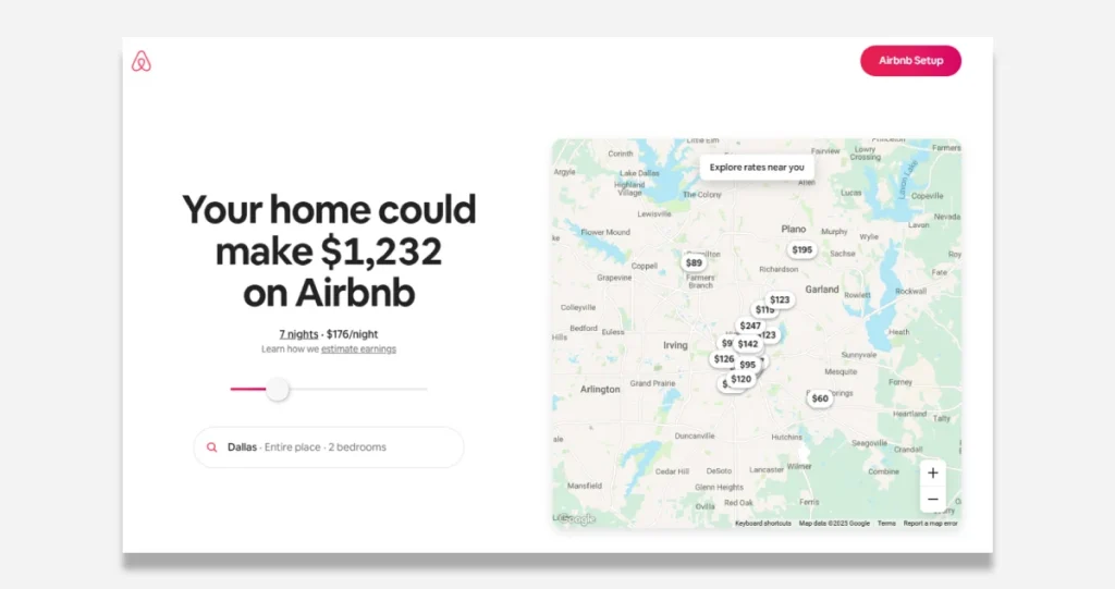
This page? It’s not just a landing page. It’s a psychological warfare machine designed to turn homeowners into hosts. Let me break it down.
First – that number. $1,232. Not “up to $1,000” or some weak sauce like that. SPECIFIC numbers convert. Why? Because your brain can’t argue with specificity. It’s like me telling you I made precisely $127,844.32 last Tuesday vs “I made some money.” Which one hits differently? Exactly.
Now, peep the map. That’s not just pretty decoration – it’s “proximity proof.” When you see other people in YOUR neighbourhood making money while you’re sitting there paying a mortgage… it hits differently. It’s like watching your neighbour drive a new Tesla while you’re still paying for your Honda. The pain is REAL.
Let’s talk math. They break it down to baby steps: $176 a night. Seven nights. $1,232 total. Simple. Clean. Believable. Why? Because when you can do the math yourself, you BELIEVE it. They’re not hiding anything.
But here’s where they’re leaving money on the table:
- Where are the testimonials? Show me the single mom who paid off her car note with her first month’s earnings
- Where’s the urgency? Tell me Dallas bookings are up 300% for summer
- Show me the PROOF. Please give me a live feed of what hosts made YESTERDAY
- Make that earnings calculator button BIGGER. When someone’s ready to run numbers, don’t make them hunt.
But here’s the genius most people miss: This page isn’t about getting ONE booking. It’s about getting ONE HOST. Because one host becomes, two properties become a real estate empire. They’re playing chess while everyone else is playing checkers.
Want to know the craziest part? This is just the tip of the iceberg. The actual money moves after you click that “Airbnb Setup” button. But that’s a story for another day…
5. Slack Signup Landing Page
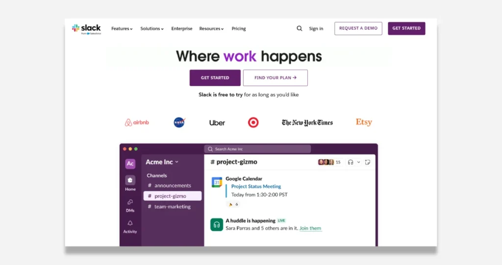
The headline “Where work happens” is brilliant in its simplicity. It’s not about features; it’s about the result. This speaks directly to the core desire of businesses – getting work done effectively. The purple highlighting of “work” draws the eye and emphasises the key benefit.
Social proof is weaponised perfectly here:
- They showcase logos of elite companies (Airbnb, NASA, Uber, NYT), which creates instant credibility and implies that “if it’s good enough for them, it’s good enough for you.”
- These aren’t just companies – they represent different sectors, subtly communicating “this works for everyone.”
The price barrier is eliminated immediately with “Slack is free to try for as long as you’d like” – this removes most prospects’ primary objection before they even think of it.
Multiple clear CTAs with brilliant psychology:
- “GET STARTED” (prominent, action-oriented)
- “FIND YOUR PLAN” (for those who need more info)
- “REQUEST A DEMO” (for enterprise buyers)
They’re catering to different buyer temperatures – cold traffic can start free, warm leads can explore plans, and hot enterprise leads can get direct help.
What’s not optimal:
- The nav bar has too many options (Features, Solutions, Enterprise, Resources, Pricing) – this could create decision paralysis.
- They could strengthen the value proposition by adding a short subheadline with specific benefits.
- The screenshot shown could benefit from more obvious activity/collaboration happening to reinforce the “work happens” message
Bottom line: This page works because it nails the conversion fundamentals – clear value prop, strong social proof, multiple entry points based on buyer readiness, and zero-risk trial offer. It’s built for conversion while maintaining the premium feel their target market expects.
6. HubSpot CRM Sales Landing Page
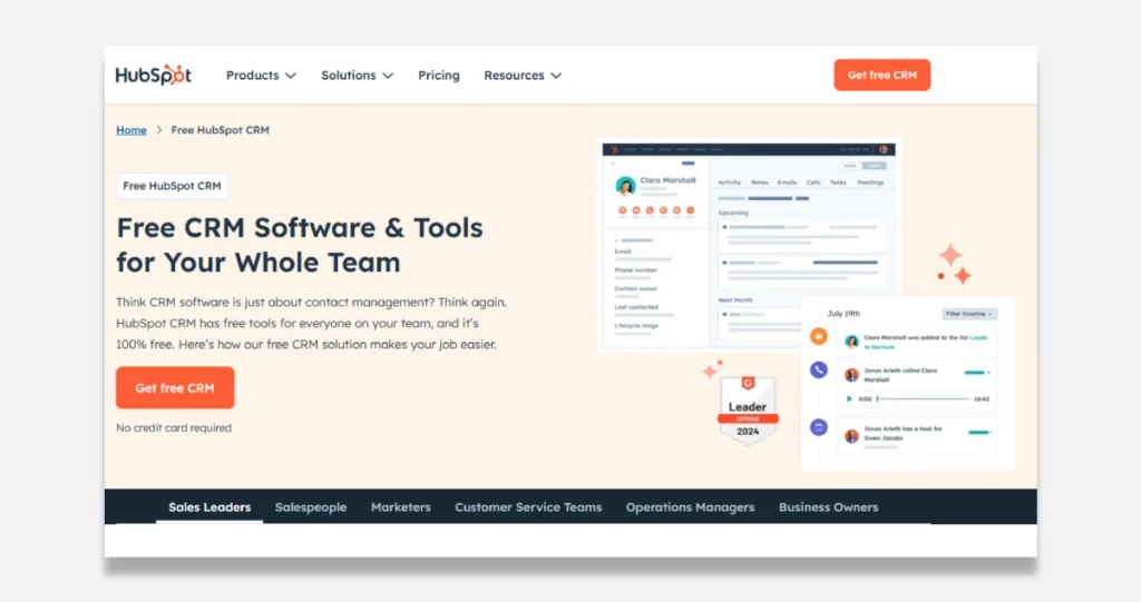
Listen closely because this is where the MONEY lives.
First – they’re doing something BRILLIANT that 99% of companies mess up. They’re not just saying, “Here’s our CRM.” They’re PATTERN INTERRUPTING with “Think CRM software is just about contact management? Think again.”
BOOM. They just grabbed your attention.
But here’s where it gets even better…
They understand the #1 thing that KILLS sales: FRICTION.
They’re eliminating it everywhere:
- “100% free” (they hammer this multiple times – smart)
- “No credit card required” (removing ALL risk)
- Clean, simple UI (because confused minds don’t buy)
Let’s talk about PROOF – because that’s what makes people pull the trigger:
- They’re flexing that “Leader 2024” badge (instant authority)
- They’re showing the actual product (because people trust what they can see)
- They’re naming specific types of users (Sales Leaders, Marketers), so you think, “That’s me!”
The MONEY MOVES – their CTAs: They’ve got “Get free CRM” twice. Why? Because they understand you need to catch people at different stages of awareness. That orange button? It SCREAMS “click me” against the light background.
But here’s the ONE THING they’re missing…
They need more PROOF. More case studies. More testimonials. More concrete results.
Because here’s what I know after doing $100M+ in sales: People don’t buy features. They don’t buy benefits. They buy CERTAINTY.
Add more proof, and watch those conversion rates EXPLODE.
That’s how you turn a good page into a MONEY PRINTER.
7. Trello Signup Landing Page
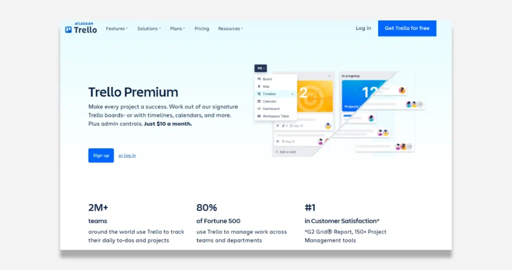
Let me show you the seven elements that absolutely CRUSH:
First – Their value prop is crystal clear. “$10 a month for admin controls and premium features.” Boom. No fluff. No fancy jargon. It’s just pure value.
Second, They use what I call “feature teasing.” It’s like when you smell the food at a restaurant before you see it. Their interactive dropdown shows Timeline, Map, and Calendar views. It makes you want to click around and explore more.
Third, They leverage MASSIVE social proof. And not just any social proof. We’re talking “2 MILLION+ teams” and “80% of Fortune 500 companies.” When you see numbers like that, your brain automatically thinks, “If it’s good enough for them, it’s good enough for me.”
Fourth – The visuals aren’t just pretty pictures. Every single image PROVES its value proposition. It’s like showing someone the inside of a Ferrari engine instead of just the shiny exterior.
Fifth: Their CTAs are impossible to miss—blue buttons. Clear text. “Sign up” and “Login.” No thinking is required. When you reduce friction, you increase conversions. Period.
Sixth: They follow the “ruthless elimination of words.” Every single word on that page EARNS its place—no corporate buzzwords. No fluff. It’s just pure, concentrated value.
And seventh – They speak to EVERYONE without talking to anyone. Whether you’re a startup or a Fortune 500, they show you exactly how they’ll solve YOUR problems.
Here’s the bottom line: Trello’s landing page works because it follows the fundamental business law – make the value OBVIOUS and the next step EASY.
And let me tell you something else: If you’re not converting well, it’s probably because you’re violating one of these seven principles. Fix that, and watch your numbers climb.
That’s how you build a high-converting landing page. No tricks. No gimmicks. Just pure, proven principles executed flawlessly.
8. Constant Contact Marketing Landing Page
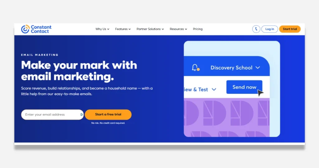
Most landing pages overcomplicate everything. But Constant Contact? They’re doing what moves the needle.
First – that headline. “Make your mark with email marketing.” It’s perfect. Why? Because it speaks directly to what business owners want. They don’t wish to “email software.” They want to build something meaningful that generates revenue. That’s what moves people to action.
The CTA is brilliant in its simplicity. “Start a free trial” in bright orange – it POPS. But here’s the million-dollar detail: “No risk. No credit card required.” This single line probably doubled their conversion rate. Why? Because it eliminates the number one objection people have: “What if I get locked in?”
Let’s talk about what 99% of companies get wrong, but Constant Contact gets right: They kept it simple. Clean design. Tons of white space. One clear action. They’re not trying to be cute or clever. They’re trying to CONVERT.
The email field above the fold? That’s direct response 101. The moment someone’s interested, boom – they can take action: no scrolling, no thinking, no friction.
What’s genius, though: Their brand is prominently displayed with navigation options like “Why Us” and “Features.” This does two things:
- Builds instant trust (crucial for conversions)
- It gives sceptical buyers a way to dig deeper without leaving the page
And the mobile responsiveness? In 2024, if you’re not optimising for mobile, you’re leaving 60-70% of your money on the table. Period.
Let me be crystal clear: This page works because it follows the fundamental law of all high-converting pages – it makes it brain-dead simple for people to say YES.
9. Evernote Pricing Landing Page
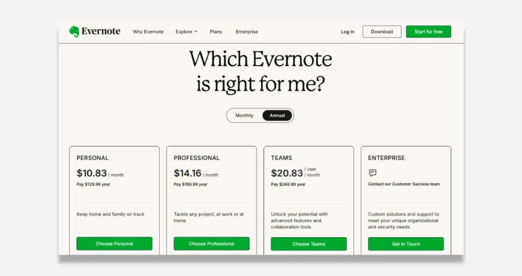
You’ve got the basics. Four plans. Clear pricing. It’s a nice little yearly discount to get people locked in. Cool. But that’s like having a Ferrari and never taking it out of first gear.
The Problem: Your page is BLEEDING money. Why? Because you’re making the #1 mistake, I see businesses make: You’re showing features, not transformation.
Here’s what’s killing your conversions:
Every plan looks identical. It’s like walking into a restaurant where every dish is presented precisely the same way. How the hell is anyone supposed to know what to buy?
No FOMO. No urgency. Nothing that makes people think, “I need this NOW or I’m missing out.” You’re permitting them to think about it later. Later never comes.
Zero social proof. You’ve got MILLIONS of users, but where’s the evidence? Where are the success stories? The logos? People don’t buy products – they buy proof.
Here’s the fix (implement this TODAY):
- Pick your money-maker plan (probably Professional). Slap a “MOST POPULAR” tag on it. Make it pop. This is essential price anchoring – we want them to land their eyes here first.
- Add a countdown timer. “Next price increase in: [timer]” – Watch what happens to your conversion rate. I’ve seen this DOUBLE sale overnight.
- Stack the value. Show them: “Total Value: $1,997/year. Your Price: $99/year.” Make them feel stupid for NOT buying.
- Add social proof EVERYWHERE. “Join 225 million users who organise their life with Evernote.” Numbers = Trust = Sales.
- Change your enterprise CTA from the weak “Contact Us” to “Scale Your Team’s Productivity (Implementation Call).” Sell the outcome, not the conversation.
Here’s the thing: People don’t want note-taking software. They want their chaotic life organised. They want to feel in control. They want to stop forgetting important stuff.
Sell THAT.
Your current page is like a limp handshake. It needs to be a roundhouse kick to the face of disorganisation.
Implement these changes and watch your revenue multiply. This isn’t theory – this is tested, proven, revenue-generating psychology.
10. Codecademy Free Trial Landing Page
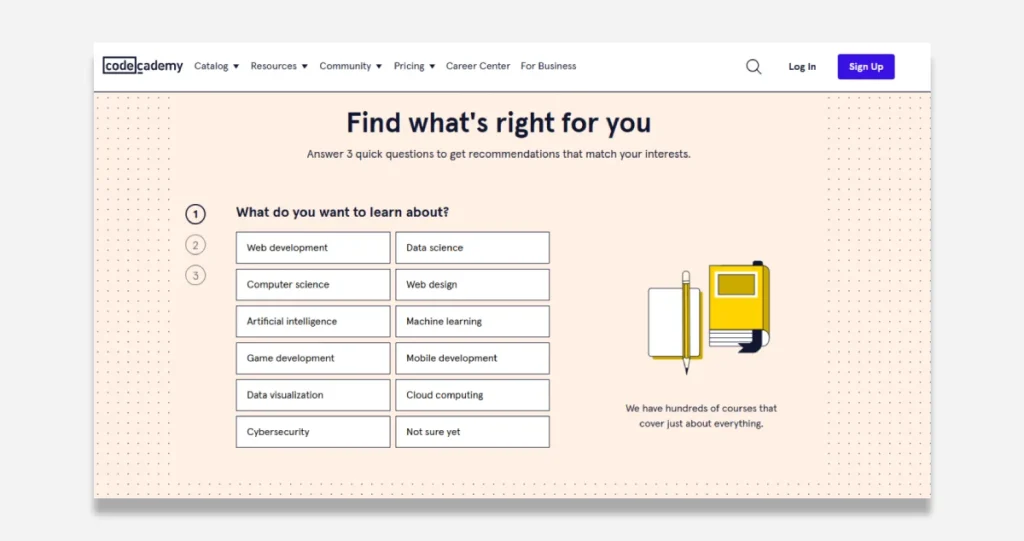
Here’s what they’re doing right:
Their headline, “Find what’s right for you,” is decent. It’s getting clicks. But it’s leaving money on the table (I’ll tell you why in a second).
They’ve got this dead-simple 3-step process that converts like crazy. Why? Because they’ve eliminated decision paralysis. Big buttons. Clear categories. Even an escape hatch for the uncertain prospects with that “Not sure yet” option. Smart.
And those cute little book illustrations? They’re genius. They make the page feel less threatening, which matters when selling education. People fear looking stupid more than anything.
But here’s where they’re bleeding money…
Their headline is WEAK. Instead of “Find what’s right for you” (yawn), imagine: “Land Your 6-Figure Tech Job – We’ll Show You Exactly How.” Now, that’s a value proposition that hits home.
Here’s what’s criminal: They have ZERO social proof on this page. No success stories. No job placement stats. No logos from tech giants who hire their grads. In this market, that’s suicide.
And don’t get me started on their CTA. “We have hundreds of courses”? Who cares! People don’t want courses – they want OUTCOMES. They want a job with $120K, career freedom, and respect.
Here’s what I’d do immediately:
- Slam some urgency in there. “Start Today: Free Access Expires in [countdown timer]”
- Add a money-back guarantee
- Stack testimonials from successful grads
- Show salary increase numbers (Before: $40K → After: $115K)
- Add a progress bar – because people who start WILL finish
Bottom line: They’re playing in the kiddie pool when they could be swimming in the ocean. Fix these issues, and they could 3x their conversion rate overnight.
Remember: In today’s market, good enough isn’t good enough. You either dominate or disappear.
How to Implement These Strategies in Your Landing Pages
Creating a landing page that genuinely converts isn’t just about flashy designs or catchy phrases. It’s about understanding what your audience needs and delivering it in the simplest way possible. Here’s how you can apply these strategies:
- Know Your Audience: Dive deep into what your users want. Are they looking for a quick solution or need detailed information? Tailor your content to meet those needs.
- Simplicity is Key: Keep your design clean and your message clear. Avoid clutter that can distract visitors from your primary call to action.
- Use Strong CTAs: Make sure your call-to-action buttons stand out. Use contrasting colours and compelling text to draw attention.
Remember, a landing page is like a first impression. You want it to be memorable, engaging, and to the point.
- Leverage Social Proof: Showcase testimonials, reviews, or case studies to build trust with your audience. Seeing others’ positive experiences can encourage new visitors to take action.
- Optimise for Mobile: With more people browsing their phones, ensure your landing pages look great and function well on all devices.
- Test and Iterate: Don’t just set your landing page and forget it. Regularly test elements like headlines, images, and CTAs to see what works best.
By incorporating these tactics, you can create landing pages that attract visitors and convert them into loyal customers. For more insights on optimising landing pages for specific campaigns, consider how each element contributes to your overall marketing goals.
Conclusion
So there you have it, folks. The world of landing pages in 2025 is all about grabbing attention and keeping it. With so many options out there, it’s clear that a well-designed landing page can make or break your online presence.
Whether you’re a small business or a big brand, these examples show that creativity and clarity go hand in hand.
Remember, it’s not just about looking good—it’s about ensuring your visitors know exactly what to do next.
So, take a cue from the best and turn those clicks into customers. Happy designing!
Frequently Asked Questions
What is a landing page?
A landing page is a single web page designed to capture visitors’ attention and encourage them to take a specific action, like signing up for a newsletter or purchasing.
Why are landing pages important?
Landing pages are important because they help convert visitors into leads or customers by focusing on a specific call-to-action and reducing distractions.
How do I create an effective landing page?
To create an effective landing page, include a clear headline, engaging visuals, a strong call-to-action, and trust signals like customer reviews.
What should I avoid on a landing page?
Avoid clutter, too much text, and multiple calls to action. Please keep it simple and focused on one goal.
How can I improve my landing page’s conversion rate?
You can improve conversion rates by A/B testing different elements, optimising the design for mobile devices, and ensuring fast load times.
What tools can I use to build landing pages?
Popular landing page-building tools include Webflow, Lead Pages, Instapage, and Unbounce.
