10 Examples of Bad Logos (And the Lessons They Teach)
A logo is not art.
It’s a business tool. It’s an identifier, a shortcut for recognition, and the cornerstone of your brand’s visual identity. It’s designed to establish trust, convey value, and differentiate you from the competition.
And when it fails, it’s not a subjective “I just don’t like it” problem. It’s a “you are actively losing money” problem.
As a branding consultant, I’ve seen it all. I’ve seen logos that are unintentionally rude, logos that are completely illegible, and logos so generic that they get mistaken for those of three other competitors. These aren’t just aesthetic slip-ups; they are fundamental logo design mistakes that have real-world, financial consequences.
My biggest pet peeves aren’t just about bad taste. They’re about bad business:
- Illegibility: If I have to squint to read your name, you’ve lost.
- Accidental Filth: The logo that makes you blush. A complete failure of due diligence.
- The “Blanding” Epidemic: Cowardly rebrands that strip all personality for the same sans-serif font.
- Trend-Chasing: That “cool” gradient and puff-script font that looked dated 12 months later.
This isn’t a “funny list” to mock designers. This is a collection of case studies. We’re going to dissect 10 examples of bad logos, from multi-million-pound disasters to local-level catastrophes, to extract the critical business lessons you, as an entrepreneur, must learn.
- Logos are business tools, not art—prioritise clarity, recognition and commercial value over designer vanity.
- Test for illegibility and unintended meanings using the Squint and Fresh Eyes tests before launch.
- Avoid “blanding”: don’t sacrifice distinctiveness for trendy sans‑serif sameness that erodes differentiation.
- Ensure scalability—provide a vector logo system and a simplified icon that works at 16×16 pixels.
- Base redesigns on clear strategy and audience fit, not shock value, pseudo‑science or fleeting trends.
The “Brand Liability” Checklist: Common Logo Failures
Before we examine the examples, let’s define the types of failures. Most bad logos fall into one of these five categories. This is the checklist I use to audit a brand’s visual identity.
| Failure Type | Description | The Business Risk (What it Costs You) | How to Spot It (The “Test”) |
| 1. Illegibility | The logo is difficult to read or understand, particularly at small sizes (e.g., social media icons or app icons). | Loss of Recognition. Customers can’t find you, remember you, or recommend you. Total brand friction. | The “Squint Test.” Look at your logo. Now squint. Does the core shape or name disappear? |
| 2. Unintentional Meaning | The design accidentally creates an inappropriate, rude, or negative image. | Loss of Trust. Massive public embarrassment. Your brand becomes a meme for all the wrong reasons. | The “Fresh Eyes Test.” Show the design to 10 people (of different ages/backgrounds) who know nothing about the project. Ask “What’s the first thing you see?” |
| 3. Generic “Blanding” | The logo is so simple, “clean,” and “minimal” that it has zero personality and looks like all your competitors. | Loss of Differentiation. You become invisible. You look like a cheap template, not a premium brand. | The “Lineup Test.” Place your logo next to your top 5 competitors. Cover the names. Can you tell them apart? |
| 4. Poor Scalability | The logo is too complex, detailed, or reliant on gradients/effects. It looks great on a 27-inch monitor but turns into a digital smudge on a favicon. | Technical Failure. Inconsistent branding across platforms. Your website icon is a grey blob. Looks unprofessional. | The “Favicon Test.” Shrink your logo down to 16×16 pixels. Is it still recognisable? (Hint: It should be a vector). |
| 5. Strategic Misalignment | The logo’s “vibe” (e.g., playful, corporate, cheap) completely contradicts the business’s actual service, price point, or target audience. | Loss of Customers. You’re attracting the wrong people and repelling the right ones. A law firm with a “bouncy” cartoon logo. | The “Adjective Test.” Write 3 adjectives that describe your brand (e.g., “Reliable, Premium, Fast”). Does your logo visually communicate those same adjectives? |
10 Logo Failures and What to Learn From Them
Right, let’s get to the examples.
1. The GAP (2010 Rebrand)
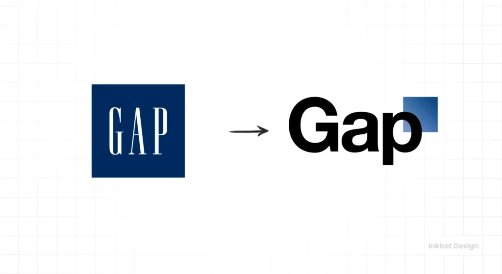
The Brand & Context: The GAP, an iconic American apparel brand with one of the most recognisable logos in the world (the tall, serif-font name inside a navy blue box).
The Logo’s Core Failure: Generic “Blanding” & Loss of Brand Equity.
In 2010, they abruptly swapped their 20-year-old, equity-rich logo for one built in… Helvetica. The name was in a standard bold font, with a small, gradient-blue square awkwardly clipped to the “p”. It looked like a PowerPoint default.
The Business Impact:
The public and design community backlash was immediate and visceral. It was seen as a lazy, cheap, and cowardly attempt to “modernise” that threw away decades of brand recognition.
It wasn’t just “ugly”; it was a betrayal. It signalled that The GAP didn’t understand its own value. The company famously attempted to “crowdsource” a fix after the backlash, which only made the situation worse.
They pulled the new logo and reverted to the old one in just six days. The entire experiment is estimated to have cost them $100 million in wasted effort and lost sales.
The Consultant’s Prescription (The Lesson):
Do not mistake brand equity for an “old” logo. Your logo’s familiarity is a priceless asset. If you must rebrand, it should be an evolution, not a radical change. Any rebrand must have a powerful strategic “why” behind it, not just “we felt like we needed a change.”
2. London 2012 Olympics
The Brand & Context: The official logo for the 2012 Olympic Games, a global event watched by billions.
The Logo’s Core Failure: Illegibility & Unintentional Meaning.
This one, designed by the prestigious Wolff Olins for a reported £400,000, was controversial from the second it was unveiled. It’s a jagged, abstract representation of the numbers “2012”.
The problem? Almost no one saw “2012”.
The Business Impact:
The public reception was disastrous. People saw:
- A “broken swastika.”
- Lisa Simpson performing a sex act.
- A random, jagged mess.
It was widely mocked as an expensive, elitist piece of “art” that completely failed its primary job: to be a clear, uplifting identifier for the games. It was a communication failure on a global scale. While the games themselves were a success, the logo remains a source of amusement.
The Consultant’s Prescription (The Lesson):
A logo is not a puzzle for the viewer to solve. Clarity must come before cleverness. If you have to explain your logo, it has failed. Especially in a global, cross-cultural context, your message must be instantaneous and unambiguous.
3. Arlington Pediatric Center (c. 2005)
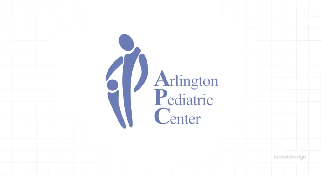
The Brand & Context: A (now-defunct) healthcare provider for children in Virginia, USA.
The Logo’s Core Failure: Unintentional (and Egregious) Meaning.
This is the hall-of-fame example of “Did nobody else see this?” The logo depicts an adult holding a child, framed by the clinic’s acronym (APC).
Unfortunately, due to the shapes and placement, it appears to be something deeply inappropriate and precisely the opposite of child-friendly.
The Business Impact:
This logo went viral as one of the “worst logos of all time.” It became a global joke, completely overshadowing the clinic’s actual medical services. Instead of “trustworthy healthcare,” the brand’s first impression became “embarrassing, horrifying design fail.”
This is the ultimate failure of due diligence.
The Consultant’s Prescription (The Lesson):
Run the “Fresh Eyes Test” and then rerun it. Show your design to people who have zero context. Show it to your mother, your partner, your friend in accounting, and a complete stranger. If one person says, “Hmm, that looks a bit like [something bad],” you have a problem. Go back to the drawing board immediately.
4. Kudawara Pharmacy
The Brand & Context: A Japanese pharmacy.
The Logo’s Core Failure: Unintentional Meaning (Cross-Cultural).
This is another classic of the “oh, dear” genre. The logo is intended to feature two figures, possibly a pharmacist and a customer, interacting under the “K” of the brand name.
However, the dot-based figures, their placement, and their interaction appear incredibly suggestive to a Western audience. It looks like an advert for a very different kind of “service.”
The Business Impact:
While this may have been perfectly innocuous in its home market, the internet is a global platform. The logo became a viral sensation for all the wrong reasons. For a business in the health and trust sector, having a logo that becomes a “rude logo” meme is a brand disaster.
The Consultant’s Prescription (The Lesson):
Your brand exists in a global context, whether you like it or not. Before finalising a design, do a basic visual search. What other-language “gestalts” (or shapes) does your logo create? This is especially true for abstract human figures—they are a minefield of unintentional meanings.
5. Animal Planet (2008 Rebrand)
The Brand & Context: A popular cable channel focused on… animals. Its original logo (1996) was iconic: a simple “Animal Planet” with a silhouette of an elephant and the globe.
The Logo’s Core Failure: Strategic Misalignment & Loss of Brand Equity.
In 2008, the channel rebranded. They dropped the beloved elephant and globe for a new logo. This design featured a bold, aggressive, sans-serif font. The “M” in “Animal” was turned on its side, for… reasons? To be “edgy”?
The Business Impact:
The audience was baffled. The original logo perfectly communicated “animals, world, nature.” The new logo communicated… “angry, loud, confusing.” It felt like a logo for a failing energy drink, not a nature channel.
It completely misread the audience and threw away two decades of positive brand association (the elephant) for a design that was tonally deaf. They eventually brought the elephant back in a 2018 rebrand, tacitly admitting the 2008 design was a strategic error.
The Consultant’s Prescription (The Lesson):
Your logo must be strategically aligned with your service, product, and audience. Avoid pursuing an “edgy” or “modern” aesthetic if your brand is intended to be “calm,” “natural,” or “family-friendly.” A rebrand should amplify what people love about you, not alienate them.
Halfway Point: Are You Feeling Nervous?
Seeing multi-million pound companies make these kinds of mistakes can be terrifying. The good news for you, as a small business owner, is that you can avoid all of them.
These failures all stem from the same root: a process that failed. They forgot to test, they ignored their core audience, or they treated the logo as a piece of art instead of a business tool.
This is precisely why a professional, strategic logo design process is a business investment, not an expense. It’s a structured system designed to prevent these failures.
Let’s continue.
6. A-Style
The Brand & Context: An Italian apparel company.
The Logo’s Core Failure: Intentional… but still a Problem.
This is a tricky one. Unlike the unintentional failures, this one is very much intentional. The logo, an “A,” is also clearly designed to resemble two people… well, you get the idea.
The company’s founder, Marco Bruns, admitted he created the “viral” logo first in 1999 and built a company around it after it spread via stickers.
The Business Impact:
This is the “shock value” logo. It was successful in the sense that it garnered massive attention. The brand grew rapidly. But here’s the catch: the brand became defined by the joke. It’s a one-trick pony.
This makes it impossible to pivot, to be taken seriously, or to build a timeless brand. The logo’s shock value has a short shelf life, and what’s left is a gimmick. It’s a “bad” logo from a long-term business strategy perspective, even if it was a “good” short-term marketing stunt.
The Consultant’s Prescription (The Lesson):
Shock value is not a brand strategy. It’s a marketing tactic. Building your entire brand identity on a rude joke is a high-risk gamble. What happens when the shock wears off? Does your product (in this case, clothing) have anything else to say? For 99% of businesses, the answer is “no.” Don’t build on a foundation of novelty.
7. The “Great Blanding” Epidemic (Burberry, YSL, etc.)
The Brand & Context: In the late 2010s, a wave of high-fashion and tech brands (Burberry, Yves Saint Laurent, Balmain, Google, Spotify) all redesigned their logos.
The Logo’s Core Failure: Generic “Blanding” & Loss of Differentiation.
They all converged on the exact same aesthetic: a bold, geometric, sans-serif font. All character, all history, all personality—gone. Burberry’s iconic, quirky “Equestrian Knight” was benched for a font you could get in Microsoft Word.
The Business Impact:
This wasn’t a “failure” in the sense of public backlash (like The GAP), but a slower, more insidious failure. It was a failure of courage.
In a quest to look “clean,” “digital-friendly,” and “modern,” these brands stripped away their single greatest asset: their differentiation. They paid millions to look identical. When every “luxury” brand uses the same visual language, the very concept of “luxury” (which relies on uniqueness) is diluted.
The Consultant’s Prescription (The Lesson):
Do not follow trends; create value. Your logo’s job is to make you stand out, not blend in. The bravest and most profitable thing you can do in a “bland” world is to have a personality. If your competitors are all zigging to sans-serif, that’s your cue to zag with a brilliant serif, a unique wordmark, or a powerful icon.
8. Sherwin-Williams “Cover the Earth”
The Brand & Context: A global paint company, one of the largest in the world.
The Logo’s Core Failure: Strategic Misalignment & Negative Connotations.
Their logo, in use since 1905, is… a can of red paint being poured over the entire planet Earth. The tagline: “Cover the Earth.”
In 1905, this was a bold statement of ambition. In the 21st century, it’s an environmentalist’s nightmare.
The Business Impact:
This logo is tone-deaf. The company (which, to be fair, has many “green” initiatives) is stuck with a primary visual asset that communicates “We are covering the planet in red chemicals.”
It’s visually aggressive, messy, and environmentally problematic. The brand’s visual identity is in direct conflict with modern consumer values (sustainability, eco-friendliness). It’s a “bad” logo because it’s a strategic liability that sends the wrong message.
The Consultant’s Prescription (The Lesson):
Your logo must be re-evaluated in its current cultural context. What was a symbol of “global reach” in 1905 is a symbol of “global pollution” today. Your brand doesn’t exist in a vacuum. You must ask, “What does this symbol communicate to my customers right now?”
9. Any Logo That Fails the “Favicon Test”
The Brand & Context: Any small business (or university, or city) that insists on using a complex, detailed illustration or “crest” as its primary logo.
The Logo’s Core Failure: Poor Scalability (Technical Failure).
I see this constantly. A new business owner pays for a beautiful, intricate illustration. It looks fantastic on their shop window or the side of their van.
Then they try to use it as their Instagram profile picture. Or their website’s favicon (the little icon in the browser tab). It becomes an unreadable, pixelated blob.
The Business Impact:
This is a technical failure that leads to a brand failure. Your brand looks broken, unprofessional, and inconsistent across different (and vital) digital touchpoints. If your logo doesn’t work as an app icon, it’s not a logo; it’s an illustration.
This often happens when a logo isn’t created as a vector (which can be scaled to any size) but as a raster image (such as a JPEG or PNG), or is simply too complex to begin with.
The Consultant’s Prescription (The Lesson):
A modern logo must be “responsive.” It needs to work at 200 feet wide on a billboard and at 16 pixels wide on a browser tab. Your designer must provide you with a logo “system,” which includes the full logo, a simplified wordmark, and a standalone “icon” or “bug” for use in small spaces. Always demand a vector file (.ai, .eps, .svg).
10. Pepsi (2008 Rebrand)
The Brand & Context: Pepsi, a global beverage giant, is in its endless “cola war” with Coke.
The Logo’s Core Failure: The “Emperor’s New Clothes” (Process Failure).
The 2008 logo itself—a minimalist tweak of the classic “globe”—isn’t the worst thing ever. It’s a bit bland and somewhat asymmetric.
The “bad” part was the process, which was leaked in a document from the design agency. The 27-page pitch, titled “Breathtaking,” was a masterpiece of pseudoscientific nonsense. It claimed the new logo was based on “the golden ratio,” “the Earth’s magnetic fields,” and “the harmony of the universe.” It was a $1 million logo justified by pure corporate fluff.
The Business Impact:
When the document leaked, Pepsi and the agency were ridiculed. It exposed the worst, most self-indulgent side of the design industry. It was a failure of substance. Instead of being based on a clear business strategy (e.g., “We want to look more youthful”), it was based on pretentious nonsense.
The Consultant’s Prescription (The Lesson):
Your brand strategy must be built on substance, not fluff. There should be a “why” behind your design, but that “why” should be rooted in your business goals. For example: “We are changing the ‘P’ to uppercase to appear more premium” or “We are simplifying the icon to work better on mobile.”
If your designer starts talking about “magnetic fields” or “cosmic energy,” show them the door. A good logo is a simple and effective tool, justified by straightforward logic.
Conclusion: A Bad Logo Is an Unforced Error
The common thread in all 10 examples? The logo stopped being a helpful tool and became a problem.
- It created confusion (London 2012).
- It caused embarrassment (Arlington Paediatrics).
- It destroyed value (The GAP).
- It made the brand invisible (The “Blanding” Wave).
As an entrepreneur or small business owner, your logo is your most valuable asset. It’s the first thing customers see and the last thing they remember. You cannot afford for it to be lazy, confusing, or, worst of all, a liability.
These multi-million-pound companies can survive these mistakes. You can’t.
The good news is that avoiding every single one of these failures is straightforward. It’s not about having a “creative” logo; it’s about having a professional and strategic one. It’s about a process that includes testing, strategic alignment, and technical expertise. This is a philosophy we at Inkbot Design build into every project.
If you’re looking at your own logo and feeling that pit in your stomach, it might be time for a chat. Don’t let a “bad logo” be an unforced error that costs you business.
What’s Next?
If you’re ready to ensure your logo is a high-performing asset that builds trust and wins customers, request a quote from our team of professional designers.
Or, if you’re still in the research phase, dive deeper into our guide on how to spot a cheap logo design to learn more about what to avoid.
FAQs About Bad Logos
What technically makes a logo “bad”?
A logo is “bad” if it fails at its business-driven job. This includes being difficult to read (illegibility), hard to remember (generic), challenging to use (poor scalability), or conveying the wrong message (inappropriate or misaligned).
Can a “bad” logo really hurt my business?
Yes. A bad logo can cause customer confusion, make you look unprofessional, fail to differentiate you from competitors, or, in worst-case scenarios, become a source of public ridicule that damages your brand’s trust.
What is the biggest logo design mistake?
The biggest mistake is a tie between illegibility and failing to test for unintentional meanings. If people can’t read your name or see something rude, your logo has failed catastrophically.
How do I avoid an “unintentionally” bad logo?
Use the “Fresh Eyes Test.” Before you approve a design, show it to at least 10 people outside your company and industry. Ask them, “What do you see?” If you get even one “Hm, that’s a bit…” response, listen to it.
Is a simple logo always better?
Not always, but clear is always better. Simplicity often leads to easier recognition (Nike, Apple) and better scalability (it works well when small). A complex logo can be great (e.g., a university crest), but must be paired with a simplified version for digital use.
What is “blanding”?
“Blanding” is a term for the trend of brands redesigning their unique, character-filled logos into minimalist, generic, sans-serif fonts. They “bland” themselves to “modernise,” but often end up looking identical to their competitors.
Can I just use a cheap logo generator?
You can, but you’ll get what you pay for. Your logo will be based on a template used by thousands of other businesses, making it difficult to stand out and avoid trademark infringement. It’s the definition of a “generic” logo.
Why did The GAP’s rebrand fail so quickly?
It failed because it threw away decades of brand equity (their iconic, known logo) for a generic, low-effort design (Helvetica and a gradient box). The public felt a sense of ownership and betrayal, and the $100 million backlash led to a reversal within a week.
How often should I update my logo?
You should “evolve” your logo when it no longer functions well (e.g., it’s not scalable for digital use) or no longer accurately represents your business’s values. You should not change it just “for a fresh look.” A great logo can last decades.
What’s the difference between a bad logo and one I just don’t like?
Subjectivity vs. Functionality. You might not like the Amazon logo, but it’s not “bad”—it’s instantly recognisable, scalable, and cleverly communicates “A to Z.” A “bad” logo is one that functionally fails at its job, regardless of your personal taste.
