Your Unified SaaS Design System Should Let Marketing and Product Look Different
A firm finishes a rebrand, and the marketing site is genuinely good—big confident type, motion that earns its place, a colour that finally means something.
Then the same oversized type and the same saturated palette get pushed into the product in the name of consistency, and the dashboard people open forty times a day becomes harder to read.
Marketing conversion goes up. In-product task completion goes down. Both teams followed the brand guidelines to the letter.
That is precisely the failure a unified SaaS design system is meant to prevent, and the reason most of them don’t is that they were built to enforce sameness rather than to govern a brand.
The instinct is understandable.
Around 78% of customers expect a consistent experience across a company’s touchpoints, yet fewer than half of brands — roughly 45% — actually deliver it. Faced with that gap, teams over-correct. They read “consistent” as “identical,” bolt every surface to one component library, and call it unification.
A proper approach to SaaS brand identity starts with a different question.
It sits inside the broader set of strategic branding services a growing SaaS or platform business needs: not “how do we make everything match,” but “which brand decisions must never change, and where should this surface be allowed to do its own job?”
- Design systems must govern brand invariants, not enforce identical visuals; aim for recognition and meaning across surfaces.
- Allow marketing and product to diverge where jobs differ: marketing persuasive with saturated colour and motion, product restrained for clarity and speed.
- Set a small invariant list then govern local rules; with AI and faster tools, explicit governance prevents strategic incoherence across outputs.
What a unified SaaS design system is actually for
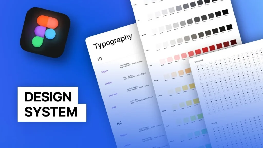
A unified SaaS design system is the shared set of brand principles, tokens, components and rules that keep marketing, product, sales, and support recognisably one brand.
The part most definitions miss: its job is to ensure consistency across those surfaces, not to ensure identical appearance on each. Recognition is the target. Replication is a mistake that costs you on both surfaces.
- It is a governance layer before it is an asset library: its real work is deciding which brand rules are fixed and which are local to a surface.
- It reaches well past product UI. Marketing campaigns, sales collateral and support experiences all draw from the same source.
- Consistency here means shared meaning and instant recognition, not pixel-identical layouts.
A unified SaaS design system governs brand principles that remain constant across marketing and product, while allowing each surface to diverge where its job differs.
Should your marketing site and your product look the same?

No. And the cost of forcing it lands on both.
Start with why intelligent teams pursue sameness anyway, because the reasoning is sound as far as it goes. Inconsistency is real and expensive.
Reuse ships faster, and the numbers get quoted constantly: F1Studioz cites a $50k–$200k build against roughly $1.5M in annual rework prevented, and up to three-times-quicker delivery. Treat those as the case for consistency at full volume. The case holds — right up to the point where “consistent” quietly becomes “identical.”
Here is where it breaks. Marketing and product do different jobs, and the design decisions that serve one actively harm the other.
A marketing page is a persuasion instrument. Its job is to make someone feel something and act so that it can be expressive: high contrast, large type, motion, and emotional weight.
A product screen is a tool. Its job is to let someone finish a task with the least possible cognitive load, so it wants restraint, density, predictability and legibility.
Push the marketing site’s palette and type scale into the product, and you raise cognitive load on the exact screens where you need it lowest. Push the product’s neutral UI kit into the marketing site, and you get a page that looks like a settings menu and sells nothing.
Two companies that most SaaS leaders already use prove the point. Stripe’s marketing site is expressive and animated, built to convince; the Stripe Dashboard alongside it is calm, dense and deliberately quiet, built to get out of your way. Shopify maintains Polaris, a plainly utilitarian design system for data-heavy merchant admin, while its marketing brand stays loud and green.

Same brand, recognised instantly, in both cases. Unified. Not uniform.
“Recognition does not require replication. A customer recognises Stripe across its marketing site and its dashboard precisely because each surface is allowed to look like the job it does, under the same brand.”
The objection writes itself: won’t visible differences confuse our customers?
They will not, as long as the invariant signals hold. Customers key off the logo, the core colour’s meaning, the typographic voice and the tone. Change those, and you confuse people. Change the type scale between a landing page and a settings panel, and nobody notices, because it is what they expect a landing page and a settings panel to do.
What stays invariant, and what should be allowed to diverge
The useful move is to sort every brand element into one of two buckets before you build a single component.
Some decisions are constitutional: identical in meaning on every surface, no exceptions.
Others are local: they should adapt to the surface’s job, on purpose.
Most failed “unified” systems never draw this line, which is why they end up governing the wrong things — locking the type scale that should flex while leaving the tone of voice, which should be fixed, to whoever happens to be writing that week.
The constitutional set is smaller than people expect—the logo and its clear space.
The core brand colour and what it signifies. The typographic voice — the family and its personality, not necessarily its size. The tone of voice and naming conventions. The iconography style.
And accessibility, which belongs here and is treated far too often as a product-only concern; a brand that quietly excludes users is off-brand everywhere, which is why digital accessibility sits among the invariants rather than the nice-to-haves.
The divergent set is where performance is won or lost.
| Brand element | Invariant or divergent | Why |
| Logo and clear-space | Invariant | Recognition depends on the same mark being used consistently everywhere. |
| Core brand colour (its meaning) | Invariant | The colour must signify the same thing across all surfaces. |
| Colour application ratio | Divergent | Marketing can saturate; the product keeps neutrals dominant so that the brand colour can mark actions and states. |
| Typeface family (the voice) | Invariant | The type personality carries the brand; the family stays constant. |
| Type scale and density | Divergent | Marketing wants impact; product wants legible density on task screens. |
| Motion | Divergent | Expressive in marketing; quiet and functional in product, where it signals state, not personality. |
| Accessibility standard (WCAG 2.2) | Invariant | Non-negotiable on every surface. |
The hard calls live at the boundary, and this is where judgement beats a rulebook.
Take the most common one: does the product’s primary button have to be the exact hero colour from the marketing campaign? Usually no.
Inside the product, the action colour should be governed by contrast and state logic, so that “the thing you click” is unmistakable and consistent across every screen — not by whatever the current campaign happens to look like.
A rote system that says “use the brand token” gets this wrong and produces products in which the primary action competes with three other brand-coloured elements for attention.
The distinction between the fixed brand and its flexible application is exactly the line between a brand system and a design system, and treating them as one thing is what causes most of the damage.
Why governed divergence matters more in 2026 than it did in 2023

This distinction used to be a matter of taste. It is now a growth problem with numbers attached.
Forrester’s 2026 Total Experience research evaluated 406 brands across 13 countries and 11 industries, drawing on more than 350,000 consumer perceptions, and joined brand, customer and — new for 2026 — employee experience into a single score.
The stakes of this distinction have risen sharply in recent years for three reasons.
The first is that fragmented experience is now understood as a growth problem rather than a polish problem. Forrester’s 2026 Total Experience research evaluated 406 brands across 13 countries and 11 industries, drawing on more than 350,000 consumer perceptions, and joined brand experience, customer experience and — new for 2026 — employee experience into a single score.
It argues that growth suffers when these are managed in separate silos, because customers never experience an organisation as a single entity with separate marketing, product and support departments.
The corrective is shared governance of the promise and its delivery. It is not a shared appearance, which does nothing to resolve whether the promise and the delivery actually agree.
The second is AI inside the workflow, which changes the risk entirely.
The 2026 Design Systems Report from zeroheight found that 56% of design-system teams are now using AI, but only 15% said it was living up to expectations.
A related survey of 900 designers found weekly AI use for design tasks rising from 54% in 2025 to 91% in 2026, with 75% reporting daily use.
When far more people can generate screens, copy and campaigns at speed, the danger is no longer a mismatched button here and there. It is a flood of superficially polished, strategically incoherent output — screens and campaigns that each look fine and collectively mean nothing consistent.
Faster generation makes an agreed system of brand, UX, accessibility and content rules more important, not less. Around 47% of customers reduce their spending after a single poor experience, and AI does not know your brand’s boundaries unless the system tells it.
The third is that the old excuse for accidental divergence is dissolving.
Figma’s 2026 Config announcements point to a connected design-and-code workflow rather than a linear hand-off from marketing to product design to engineering:
- Code layers that make interactive code a first-class object on the canvas, with early-access rollout beginning July 2026;
- Figma Motion, bringing motion into the same environment as components and variables;
- and an expanded Figma agent with Model Context Protocol connectors to tools such as Notion, Slack, GitHub and Atlassian.
When design and code form a loop, the friction that once forced surfaces to drift apart is going away. What remains should be a decision, not an accident. That only 14% of organisations report delivering genuinely strong digital experiences suggests most are still losing this to accident rather than choice.
Govern the principles, not the pixels.
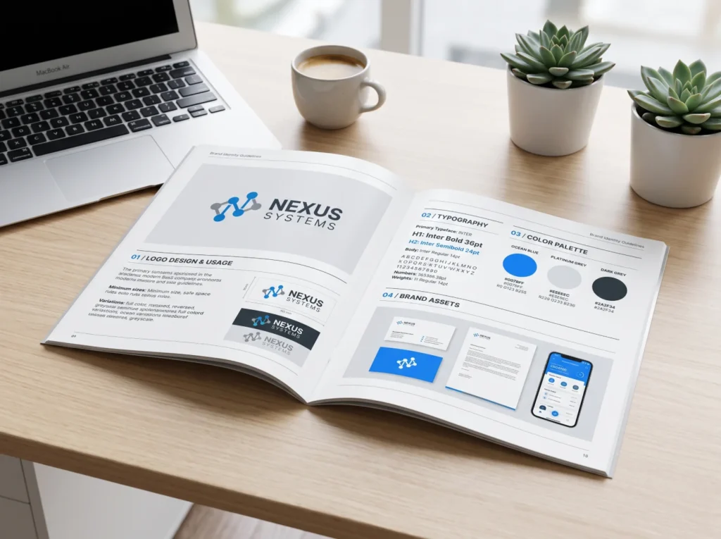
The teams that get this right stop asking “does it match?” and start asking “is this the same brand, doing a different job here?”
That single change is what a unified SaaS design system exists to enforce.
It fixes the small constitutional set — mark, colour meaning, typographic voice, tone, accessibility, and then hands each surface the freedom to serve its actual purpose.
Sameness was never the goal. A brand that survives contact with real surfaces was.
The first move today costs nothing. Put one marketing page and one core product screen side by side and mark every element as either invariant or local.
Wherever your team cannot agree on which bucket an element belongs in, you have just found the exact gap your governance needs to close.
If you want that judgement made rigorously across your whole brand, request a free Brand Equity Audit™ — a structured diagnostic that shows where your brand is losing commercial ground across its surfaces, and what to change first.
FAQs
What is a unified SaaS design system?
A unified SaaS design system is the shared set of brand principles, tokens, components and rules that keep marketing, product, sales, and support recognisably one brand. Its job is governed by consistency across surfaces — shared meaning and recognition — rather than identical appearance on each surface.
Should marketing and product use the same design system?
Yes — but “same system” means one shared set of governing principles, not one identical visual output. Marketing and product should draw from the same brand constitution while diverging in colour ratio, type scale, density and motion, because a persuasion surface and a task surface have genuinely different jobs.
What is the difference between brand consistency and uniformity?
Consistency means every surface carries the same brand meaning and is instantly recognisable as one company. Uniformity means every surface looks identical. Consistency is the goal; uniformity is a common misreading of it that produces flat marketing, clumsy product UX, or both, because it ignores what each surface is for.
What should stay the same across marketing and product?
The logo and its clear space, the core brand colour and what it signifies, the typographic voice, the tone of voice and naming, the iconography style, and accessibility standards. These are the invariants. Colour application ratio, type scale, density and motion should be allowed to differ by surface, on purpose.
When should a SaaS company build a unified design system?
No, not while pre-product-market-fit with a single person touching the UI; a ready-made UI kit is enough. Build once; multiple people shape the interface; developers keep rebuilding the same components; or marketing and product have visibly drifted apart. For most companies, that window opens around Series A to B.
Is AI removing the need for a design system?
No — it is raising the need. Zeroheight’s 2026 report found that 56% of design-system teams were using AI, but only 15% were satisfied with the results, and weekly AI use among designers rose to 91% in 2026. Faster generation of screens and copy makes agreed brand, UX and accessibility rules more important, not less.
