The 5-Step Brand Refresh Process: Start-to-Finish Guide
Look, let’s be honest. Most small business owners I talk to think a “brand refresh” means getting a new logo. They’ve been using the same one for ten years, their nephew designed it for free, and now they want something “more modern.”
They come to me asking for a logo, and I have to be the one to tell them that’s the last thing we should be talking about.
As a brand consultant who’s been in the trenches for years, I’ve seen “refreshes” go beautifully right and horrifically wrong. The difference isn’t a magic wand or a genius designer. It’s a process.
A brand refresh is a strategic operation, not a mere cosmetic update. If you skip the process, you’re just wasting money on expensive guesswork.
This is the 5-phase process we use to execute a brand refresh that actually works.
- Start with a rigorous Phase 1 audit: internal, external, competitive reviews and a full asset inventory to know your true starting point.
- Create a concise Phase 2 Creative Brief: positioning, brand personality, tone, audience and measurable goals to guide all decisions.
- Phase 3 builds a cohesive identity system: evolve the logo, define palette, typography, imagery and accessible design choices.
- Document usage in Phase 4: practical brand guidelines and templates to ensure consistent application across teams and vendors.
- Plan Phase 5 rollout strategically: launch internally first, choose big-bang or phased approach, tell the story and measure impact.
Refresh vs. Rebrand: The “Are You Sure?” Test
First, let’s make sure we’re having the right conversation. Entrepreneurs often use “refresh” and “rebrand” interchangeably, but these terms refer to distinct operations with varying price tags and levels of risk.
- A Brand Refresh is an evolution. It’s like getting a sharp new suit, a modern haircut, and updating your LinkedIn profile. You are still fundamentally you, but a more current, polished, and confident version.
- A Rebrand is a revolution. It’s like changing your name, your career, and moving to a new country. It often involves a new name, a new mission, or a fundamental shift in your business model.
Most businesses I meet think they need a rebrand, but 90% of the time, what they actually need is a refresh.
Here’s a simple way to tell which camp you’re in.
Refresh vs. Rebrand (What’s the Real Scope?)
| Feature | 🎨 Brand Refresh (Evolution) | 🔥 Brand Rebrand (Revolution) |
| The “Why” | Your look is dated. You’ve outgrown your old identity. You’re adding new services. Your audience has evolved. | Your core mission has changed. You’ve merged or been acquired. You have a major reputation problem. Your name is legally unusable. |
| Core Strategy | Stays the same. You’re reinforcing your existing mission, vision, and values. | Changes completely. You are redefining your mission, vision, and values for a new purpose. |
| Brand Name | Stays the same. | Often changes. (e.g., Twitter to X, Facebook to Meta). |
| Visual Identity | Evolves. The logo is tweaked, not replaced. Colours are updated. Fonts are modernised. | Replaced. The logo is new. The entire visual system is built from scratch. |
| Risk | Low to medium. You’re building on existing brand equity. | High. You are intentionally discarding brand equity and starting over. Very expensive. |
| Example | Google, Starbucks, and Coca-Cola are updating their logos and visual styles over time. | Andersen Consulting is becoming “Accenture.” |
If you’ve looked at this table and realised your problems are bigger—that your core business model, name, or reputation is the real issue—you need to stop here. The operation you’re considering is far more complex. You should research when and how to rebrand, as that’s a much more comprehensive and strategic procedure.
For everyone else, let’s get on with the refresh.
The 5-Phase Brand Refresh Process
A successful brand refresh isn’t a single event; it’s a structured, five-phase project. Each phase builds on the last, and skipping one (especially Phase 1) is a recipe for disaster.
- Phase 1: The Audit & Discovery (Stop Guessing, Start Knowing)
- Phase 2: The Strategy & Positioning (Your Brand’s “True North”)
- Phase 3: The Design & Development (The “Fun” Part, Built on Facts)
- Phase 4: The Toolkit & Guidelines (Creating the “Rulebook”)
- Phase 5: The Launch & Rollout (Going Live, Internally & Externally)
Let’s break down each one.
Phase 1: The Audit & Discovery (Stop Guessing, Start Knowing)
This is the most important phase, and it’s the one everyone wants to skip.
The Goal: To get a brutally honest, 360-degree view of your brand as it exists today. You can’t chart a course to your destination if you don’t know your starting point.
This isn’t about your opinion. Or your marketing manager’s. It’s about data.

1. Look Inwards (Internal Audit)
Get your team in a room (or on a survey) and ask them hard questions. Be prepared for answers you don’t like.
- “In one word, how would you describe our brand?”
- “What do you hate about our current branding?”
- “What’s one thing our competitors do better than us?”
- “If our brand were a person, who would it be?”
I find the sales and customer service teams always have the best insights. They’re on the front lines, hearing what customers really think.
2. Look Outwards (External Audit)
Now, do the same for your customers. This is where the real gold is.
- Talk to them: Interview 5-10 of your “best” customers. Ask them why they chose you. Ask them what words they’d use to describe you.
- Survey them: Send a short, simple survey to your email list.
- Read the reviews: Scour your Google, Yelp, and Trustpilot reviews. Look for recurring words and themes.
Your customers’ perception is your brand. It doesn’t matter what you think your brand is; it only matters what they think it is.
3. Look Sideways (Competitive Audit)
Pick 3-5 of your top competitors. Put them side-by-side.
- How do they look?
- How do they sound? (Their messaging and tone)
- What is their clear value proposition?
- Where is the “gap” in the market?
The goal isn’t to copy them. The goal is to identify the open space where your brand can stand out. If they’re all using blue, consider a bold orange instead. If they’re all formal and corporate, maybe your opportunity is to be human and witty.
4. Create an Asset Inventory
This is the “scary” part. Make a list of every single thing that currently bears your brand’s name. I mean everything.
- Website & Blog
- Social Media Profiles (all of them)
- Business Cards & Letterhead
- Email Signatures
- Invoices & Quotes
- Presentations & Pitch Decks
- Company Vans / Vehicles
- Building Signage
- Employee Uniforms
- Product Packaging
- Tradeshow Banners
This list will serve as your checklist for the rollout in Phase 5; however, for now, it provides a terrifyingly clear picture of the project’s scope.
The Quick & Dirty Brand Audit Checklist
| Audit Area | Key Questions to Answer |
| Visual Identity | Is our logo legible? Does it feel dated? Does our colour palette work online and in print? Is our typography easy to read? |
| Messaging & Tone | Is our tagline clear? Is our “About Us” page accurate? Do we maintain a consistent tone across our website, social media, and emails? |
| Audience Perception | What do our customer reviews really say? What words do our best clients use to describe us? Is there a mismatch? |
| Competitive Landscape | How do we look next to our top 3 competitors? Are we visually distinct? Is our value proposition clearer or weaker? |
| Internal Cohesion | Does our sales team describe the company the same way our marketing team does? Does our team like our brand? |
The Output of Phase 1: A “State of the Nation” report. A clear document that says: “Here’s what’s working, here’s what’s broken, and here’s the massive opportunity.”
Phase 2: The Strategy & Positioning (Your Brand’s “Focus”)
Now that you know where you are, you can define where you’re going.
The Goal: To refine your brand strategy and create the Creative Brief. This document is the “Focus” for the entire project. It’s the bible. It’s the document you’ll use to shut down “design by committee” and subjective feedback.
This isn’t about reinventing your business. It’s about articulating it better.
1. Refine Your Positioning
Based on your audit, where do you want to sit in the market? You used to be the “cheapest” option, but your quality is much higher now. Your refresh needs to communicate “expert” and “premium,” not “cheap and cheerful.”
Write a simple Positioning Statement:
“For [Target Audience], [Your Brand] is the only [Market Category] that [Your Unique Benefit/Difference].”
2. Define Your Brand Personality
This is always the most fun part. If your brand were to walk into a party, who would it be?
- Is it The Sage (wise, expert, like Google)?
- Is it The Jester (witty, playful, like Ben & Jerry’s)?
- Is it The Ruler (premium, in-control, like Mercedes-Benz)?
Choosing an archetype gives the design team a “feeling” to aim for.
3. Establish Your Messaging & Tone of Voice
How do you sound?
- Messaging: These are the core ideas you want to own. (e.g., “We are the easiest platform,” “We are the most reliable builder.”)
- Tone of Voice: This is the personality behind those messages. Are you:
- Formal vs. Casual?
- Witty vs. Serious?
- Warm vs. Authoritative?
Write down 3-5 “Tone Words” (e.g., “Confident, Witty, Direct”) and, just as importantly, what you’re not (e.g., “Not: Arrogant, Silly, or Vague”).
The Output of Phase 2: A 1-2 page Creative Brief. This document is non-negotiable. It contains your audience, your positioning, your personality, your tone, your competitors, and the “problem” the design needs to solve.
From now on, all design decisions are measured against this brief. Not “Do I like it?” but “Does it achieve the goal in the brief?“
Phase 3: The Design & Development (The “Fun” Part, Built on Facts)
This is the part you’ve been waiting for, but you’ll notice it’s Phase 3, not Phase 1. All the strategic homework in Phases 1 and 2 is what allows a designer to create something that is not only beautiful but also effective.
The Goal: To translate the strategy (the brief) into a tangible, new visual identity.
This is a system. Don’t just focus on the logo.
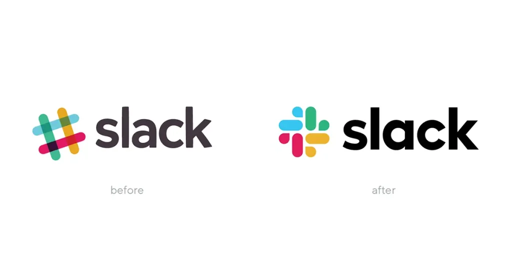
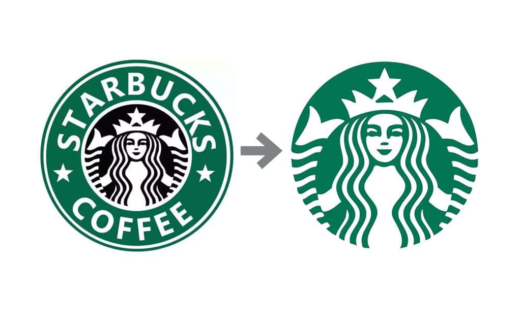
1. Logo Evolution
Notice the word: evolution. For a refresh, you’re rarely throwing the logo out. You’re making it work better.
- Is it too complex? Simplify it.
- Is the font dated? Update it.
- Does it work as a tiny favicon on a browser tab? If not, it needs work.
- Does it have a weird “container” or a .com in it? (A 90s classic). Time to free it.
A good designer will explore 2-3 concepts based on the brief, rather than presenting 20 random options.
2. Colour Palette
Your old brand probably had one or two “logo colours.” A modern brand needs a palette.
- Primary Colours: Your main, recognisable brand colours.
- Secondary Colours: A wider palette for charts, call-to-action buttons, and social media.
- Neutrals: Your greys, whites, or beiges that give the design “room to breathe.”
Crucially, the palette must be tested for accessibility. Do your light colours and dark colours have enough contrast for people to read them easily?
3. Typography
This is the most overlooked and most powerful part of a brand refresh. Good typography can single-handedly make you look more professional and legible.
I once had a local bakery client whose refresh was almost entirely a change in typography. Their old script font was unreadable on their vans and packaging. We switched to a clean, bold, sans-serif. It wasn’t “sexy” in their eyes, but their sales increased by 20% in six months simply because people could finally read their name on the side of a van. That’s not boring; that’s money.
You’ll need:
- A Headline font (to grab attention).
- A Body font (for maximum legibility).
4. Imagery, Iconography & Textures
How will you show your brand?
- Photography: Are you warm, human, and candid? Or polished, professional, and corporate?
- Illustration: Will you use custom illustrations?
- Icons: A custom set of icons can make a website or app feel incredibly premium and cohesive.
The Output of Phase 3: A new, cohesive brand identity. This isn’t just a logo file. It’s a “system” of a logo, colour palette, typography, and imagery style that all work together. This is the core of what we deliver at Inkbot Design: taking that strategy and making it a reality.
Phase 4: The Toolkit & Guidelines (Creating the “Rulebook”)
My other pet peeve. You’ve just spent all this time and money creating a beautiful, consistent system. The very worst thing you can do now is let your team run wild with it.
The Goal: To create a practical “rulebook” (a Brand Guideline document) that empowers your team, partners, and vendors to use the new brand correctly and consistently.
This isn’t a 100-page academic thesis that no one will read. It needs to be a practical, visual, “how-to” manual.

A good Brand Guideline document must include:
- Logo Usage:
- The primary logo, a secondary version (e.g., stacked), and the icon.
- Clear Space: How much “breathing room” to leave around it?
- Minimum Size: How small it can get before it’s unreadable.
- Misuse: A “Don’t” section (e.g., Don’t stretch it, don’t change the colours, don’t put it on a busy photo).
- Colour Palette:
- The primary and secondary colours.
- The digital codes (HEX, RGB) for your website.
- The print codes (CMYK, Pantone) for your printer.
- Typography:
- The headline and body fonts.
- A “type hierarchy” (e.g., H1 is 48pt Bold, H2 is 32pt, Body is 16pt).
- Tone of Voice:
- Your 3-5 personality words.
- “We sound like this…” (e.g., “Confident, clear, helpful.”)
- “Not like this…” (e.g., “Arrogant, complex, salesy.”)
- Key Asset Templates:
- Make it easy for them. Include templates for a social media post, a PowerPoint presentation, and an email signature.
The Output of Phase 4: A single, central document (probably a PDF and a private web page) that is the “source of truth” for your brand.
Phase 5: The Launch & Rollout (Going Live, Internally & Externally)
You have the strategy. You have the design. You have the rulebook. Now, you have to launch it.
The Goal: To replace the old brand with the new brand in a planned, strategic way that builds excitement and avoids confusion.
1. Launch Internally First
Your team should never find out about the new brand at the same time as the public. They are your #1 brand ambassadors.
- Hold a “launch” meeting. Get everyone together.
- Tell the story. Don’t just show them the new logo. Walk them through why you did it. Show them the audit findings (Phase 1) and the strategy (Phase 2). Explain how the new design solves the problem.
- Give them the goods. Give them the new guidelines, the new email signatures, and some new swag (a t-shirt, a new notebook). Get them excited.
2. Plan Your External Launch
Remember that asset inventory from Phase 1? It’s time to pull it out. You now have a giant checklist of everything that needs to be updated.
You have two main choices for the rollout:
“Big Bang” vs. Phased Rollout
| Approach | 💥 “Big Bang” Launch | 🚶 Phased (or “Waterfall”) Launch |
| What is it? | You update everything at once. One day you’re the old brand, the next day you’re the new one. | You roll out the new brand in stages, often starting with digital (which is easy) and finishing with physical (which is harder). |
| Pros | High-impact. Creates a big “moment.” Shows confidence. Generates PR and buzz. | Lower cost upfront. Less disruptive. Gives you time to test and learn (e.g., on the website) before printing 10,000 boxes. |
| Cons | Very high-risk. Expensive. Requires military-grade planning. If one thing is missed (like the old logo on the invoice system), it looks sloppy. | Can be confusing for customers (“Why does the website look new but the van is old?”). Can feel “weak” or unfinished. Loses all “launch” momentum. |
| Best For… | Digital-first businesses. Major strategic pivots. When you have a big budget and a dedicated project manager. | Businesses with lots of physical assets (vehicles, packaging, signage). When you’re on a tighter budget and need to spread the cost. |
3. Tell the World
When you do launch externally, don’t just “go live.” Tell the story.
Write a blog post. Post on social media. Send an email to your customers.
Don’t say: “We got a new logo!”
Do say: “For 10 years, we’ve been [X]. As we’ve grown, we realised we needed our brand to better reflect the [Y] that our customers (you!) love. Today, we’re excited to share a new look that’s built to [Solve Z].”
Explain the why. It shows strategic intent. It builds confidence.
How to Measure Success (Was It All Worth It?)

A refresh isn’t just about “looking better.” It’s about performing better. You must measure its impact, or you’ll never know if it was a good investment.
Wait 3-6 months after the launch, then check the data.
- Quantitative Metrics (The Numbers):
- Website: Has your conversion rate gone up? Has your bounce rate gone down? (This often happens when new typography makes the site more legible.)
- Social Media: Is your engagement rate higher?
- Leads: Is the quality of your inbound leads better? Are you attracting the “premium” clients you were aiming for?
- Qualitative Metrics (The Feelings):
- Customer Feedback: Are you getting comments on the new look? What’s the sentiment?
- Team Morale: Is your team prouder to work there? Are they sharing the new brand more?
- Your Own Feeling: Do you feel more confident sending people to your website? Are you proud of your new pitch deck? This matters.
A brand refresh is a powerful tool. But it’s just that: a tool. It’s a strategic process designed to align your company’s “outside” (your visual identity) with your company’s “inside” (your quality, value, and mission).
If you’ve gone through this guide and realised your brand is sending all the wrong signals, it’s probably time to talk. It’s a big job, but you don’t have to do it alone.
Ready to Align Your Brand?
A brand refresh is a serious undertaking. It’s an investment in your future. If you’re an entrepreneur or small business owner who’s ready to stop guessing and start building a brand that truly reflects the quality of your work, we can help.
We can guide you through this entire brand identity process, starting with that all-important audit. If you’re ready to proceed, please request a quote, and we’ll be happy to discuss your project. Or, if you’re still in the research phase, feel free to browse more of our articles on branding.
Brand Refresh FAQs
What is the main difference between a brand refresh and a rebrand?
A refresh is an evolution. You’re updating your existing brand’s look and feel (logo tweak, new colours, new typography) to be more modern and relevant. A rebrand is a revolution. You’re fundamentally changing your core identity, often including a new name, mission, and target market.
How long does a brand refresh process take?
It varies, but for a small to medium-sized business, I’d budget 3-6 months for the full 5-phase process. Phase 1 (Audit) can take 4-6 weeks alone, and you don’t want to rush the design or rollout.
How much does a brand refresh cost?
It’s all about scope. A simple refresh of a logo and colour palette for a solo-preneur will be a fraction of the cost of a complex refresh for a business with 50 employees, 10 vehicles, and 5-star packaging. Be cautious of anyone who offers a flat price without conducting an audit.
Why can’t I just start with the logo design?
Because you’re designing without a brief. A logo designed without strategy (Phases 1 & 2) is just a “pretty picture.” It’s an art project, not a business asset. You’re guessing at what might work instead of knowing what problem you’re trying to solve.
Do I really need a brand audit?
Yes. Non-negotiable. Skipping the audit is like a doctor prescribing surgery before they’ve even diagnosed you. You must understand what’s broken before you can fix it.
What’s the most common mistake in a brand refresh?
Design by committee. The more people you have giving subjective feedback (“I just don’t like green”), the weaker and more compromised the final design will be. You must have one, and only one, key decision-maker.
Can I just refresh my website and not my other materials?
You can, but it’s a bad idea. This creates a “broken brand.” Customers will get confused when your new, modern website links to an old, dated-looking PDF, or when they get an invoice that looks 10 years old. Consistency is the key to building trust.
When is the best time to do a brand refresh?
When your look feels visibly dated (e.g., 7-10 years old).
When your business strategy has evolved (e.g., you’re moving “upmarket”).
When you’ve added new services that your brand doesn’t reflect.
When you’re facing new, modern-looking competitors.
How do I get my team to “buy in” to the new brand?
Launch it internally first. Tell them the story of why you did it. Show them how the new brand solves problems they face (e.g., “Our new pitch deck is clearer and will help you close more deals”). Make them feel like part of the process, not like it’s being forced on them.
What’s more important: the logo or the typography?
Professionally? Both. But if you put a gun to my head, I’d say typography. You can have a mediocre logo, but if your typography is illegible, unappealing, or inconsistent, your entire brand will feel cheap and unprofessional. Legibility is a core brand attribute.
What is a “brand guidelines” document?
It’s a “rulebook” or “manual” that defines how to use your new brand assets. It includes guidelines on logo usage (dos and don’ts), colour codes (HEX and CMYK), typography, and tone of voice. It’s the key to maintaining your brand’s consistency long after the designers are gone.
My designer just gave me a logo. What else do I need?
You need the full system. At a minimum: the logo in all its variations (full-colour, all-white, all-black), file formats (vector like .ai or .eps; and raster like .png), your colour palette codes, and the names of your brand fonts. If they only gave you a .jpg, you’ve been short-changed.

