The Evolution of the Taco Bell Logo: A 60-Year History
The Taco Bell logo is more than just a bell. It's a roadmap of American consumer culture, a timeline of design trends, and a raw, unfiltered case study in strategic branding.
It’s the visual history of a fast-food behemoth that went from a single taco stand in California to a global entity under the Yum! Brands umbrella.
We’re not here to praise it or put it on a pedestal.
We’re here to dissect it for parts.
For entrepreneurs and business owners, the story of the Taco Bell logo is a masterclass filled with honest lessons. It’s about adaptation, risk, and understanding the cold, hard truth that a logo is a commercial tool.
Its only job is to help sell the product. Let's pull apart this fascinating history and see what's useful and a cautionary tale.
- The Taco Bell logo evolved to match shifting audiences and cultural moments, from 1970s earth tones to 1990s neon rebellion to 2016 minimalism.
- 2016’s redesign prioritised digital scalability and brand flexibility but sacrificed personality, exemplifying the “blanding” trade-off.
- Key branding lessons: ensure logo matches product experience, rebrand for clear strategic reasons, and prioritise mobile legibility.
Humble (and Problematic) Beginnings: The 1962 “El Taco” Logo
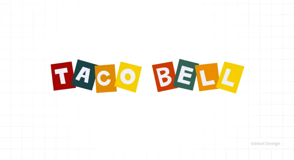
Every brand starts somewhere, and Taco Bell’s beginning was… a product of its time. The first logo from 1962, for “Taco Tia,” featured a cartoonish man sleeping against an oversized bell in a giant sombrero.
It was a bundle of clichés. The imagery was a lazy shorthand for “Mexican” that was common in 60s America. Thankfully, founder Glen Bell quickly moved on.
The official first Taco Bell-branded logo that followed was simpler, using a script font, but the stereotypical imagery persisted in its early marketing.
The business lesson here is swift and straightforward. Your first identity is rarely your final one. Many businesses start with a logo that is either generic or, in this case, misguided.
The key is recognising when your branding is holding you back and having the courage to change it decisively. Taco Bell did, and it was the first of many reinventions.
Building an Empire on Earth Tones: The Mission-Style Identity (1972-1994)
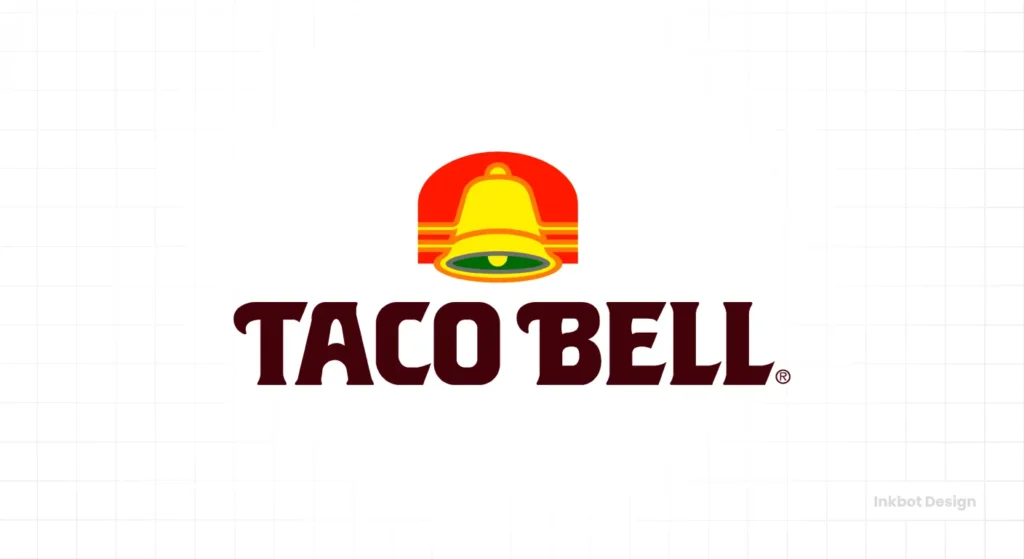
In 1972, Taco Bell introduced the logo, which would define it for over two decades. This was the design that built the empire.
The logo featured the company name stacked in three rows, nestled into a shape that loosely resembled a bell. The colour palette was a wash of 70s earth tones: gold, red, orange, and brown. It was warm, inviting, and felt grounded.
Crucially, this design didn't exist in a vacuum. It was created to align perfectly with the Mission-style architecture of the Taco Bell restaurants, with their arches and stucco walls.
This created a cohesive brand world. When you saw the logo, you thought of the building. When you saw the building, you thought of the logo.
This identity was solid and dependable, establishing a clear market position. It wasn't flashy or exciting. It simply communicated, “This is a place to get affordable, American-style Mexican food.” For 22 years, that was enough.
The lesson for a business owner is about the power of consistency. A clear, if unspectacular, identity that aligns with your physical presence can build immense brand equity over time. It builds trust. It doesn't need to shout if it shows up consistently.
The 90s Explosion: Neon, Attitude, and a Stroke of Genius (1994-2016)
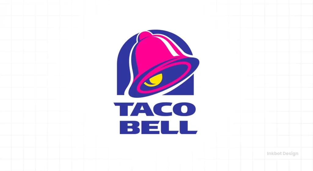
By the mid-'90s, the earthy '70s vibe was painfully dated. Taco Bell’s core customer was no longer a Boomer family; it was a teenager with a skateboard and a pocketful of change.
The brand needed a shot of adrenaline, and it got one with the 1994 redesign by the legendary firm Wolff Olins.
This logo was from the 1990s.
Out went the muted earth tones. A chaotic, eye-watering palette of fuchsia, electric purple, and taxi-cab yellow came in. The typography was thrown on a jaunty angle, bursting with a kinetic energy that was impossible to ignore. The bell shape was simplified into a bold, confident icon.
This logo had personality. It was loud, rebellious, and cheap. It perfectly mirrored the cultural zeitgeist of MTV, baggy jeans, and neon-drenched pop culture. Taco Bell was no longer just selling food; it was selling an attitude. The “Yo Quiero Taco Bell” Chihuahua mascot that followed only cemented this new identity.
For business owners, the lesson is powerful: don't be afraid of having a strong point of view. The 1994 logo was divisive.
Adults probably hated it. But its target audience—the youth of Generation X—loved it. It spoke their language.
If your brand aligns with a decisive cultural moment, lean into it hard. This logo sold billions of Crunchwrap Supremes because it was unapologetically itself.
The Great Blanding of 2016: Minimalism or a Failure of Nerve? (2016-Present)
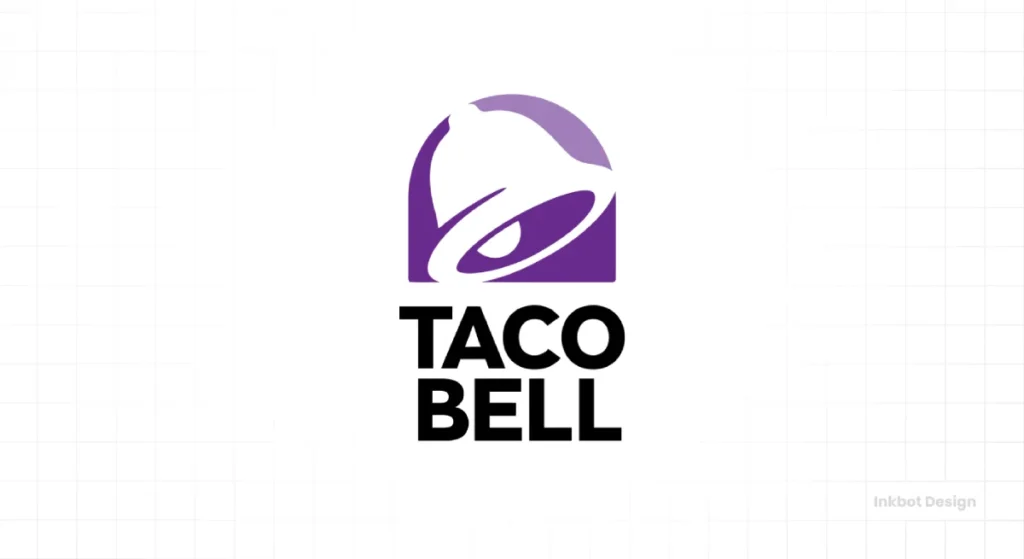
After 22 years, the 90s party had to end. In 2016, Taco Bell wiped the slate clean with a radical redesign by Lippincott. The neon chaos was gone, replaced by a stark, minimalist aesthetic.
The “official” reasons for the change were all strategically sound.
- A Digital-First World: The old logo was a disaster on small screens. Its complex colours and lines became mush as a tiny app icon or a browser favicon.
- Brand Flexibility: The new, simplified bell shape acts as a container. It can be filled with any colour, pattern, or image, making it highly adaptable for social media and merchandise.
- A More “Grown-Up” Image: Taco Bell was launching its “Cantina” concept—more upscale restaurants that serve alcohol. They needed a logo that didn't look like it belonged in a teenage bedroom.
But in solving these functional problems, they created a new one: stripped the brand of its soul.
This is a textbook case of “blanding”—the corporate design trend of sanding off every interesting edge to pursue sterile, inoffensive simplicity.
The current Taco Bell logo is clean, scalable, and professional. It is also completely devoid of personality. There is a massive disconnect between the sterile, corporate mark and the messy, indulgent, satisfyingly greasy food it represents.
The new logo could be for a banking app, a consulting firm, or a minimalist clothing line. It no longer feels like fast food.
The lesson here is a critical one. Simplicity is a tool, not a religion. When you optimise your brand identity purely for functional scalability, you risk creating a logo with no heartbeat. It might work everywhere, but it excites no one.
The Real Strategy: Why Brands Like Taco Bell Change Their Face
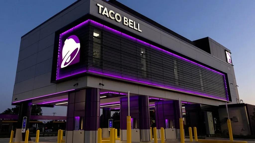
A rebrand of this magnitude isn't about aesthetics. It's about strategy, money, and survival. Every entrepreneur should understand three core business realities that drove Taco Bell’s visual evolution.
Following the Money: Chasing New Demographics
Brands follow the generation with the most disposable income. The '70s logo was for Baby Boomers. The 90s redesign directly appealed to Generation X. The 2016 minimalist pivot was a calculated move to capture the attention of Instagram-savvy Millennials and Gen Z, who value authenticity and clean design. Your brand must speak the language of the customer who pays the bills.
Repositioning the Product: From Cheap Fuel to “Lifestyle Brand”
Taco Bell doesn't want to be just a place you go at 2 a.m. anymore.
They want to be a “lifestyle brand.” They sell merchandise, from hot sauce-themed pool floats to hoodies. They host events. They have a massive, highly engaged social media presence. They needed a more sophisticated, mature logo to play in that arena.
It was a strategic move to elevate the brand's perception beyond cheap calories.
The Tyranny of the Tiny Screen
This is the most practical and least glamorous reason for the 2016 rebrand. The wild 1994 logo was designed for a world of giant roadside signs and paper wrappers. It was utterly illegible as a 16×16 pixel favicon in a browser tab.
For all its faults, the new logo is built to be instantly recognisable at any size. It's simple, high-contrast form works flawlessly on a phone screen.
In the 21st century, function often has to defeat flair. Your logo's performance on a screen is no longer an afterthought; it's the primary consideration for many businesses.
4 Brutal Truths the Taco Bell Logo Teaches Entrepreneurs
Let's distil this 60-year history into four actionable truths you can apply to your business.
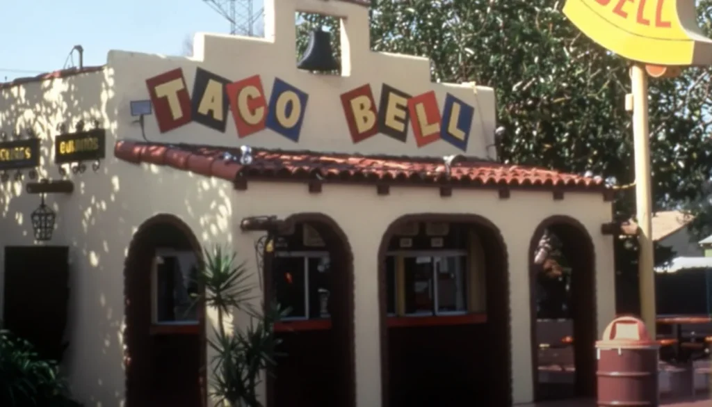
Truth 1: Your Logo Must Feel Like Your Product
The '90s logo worked because it felt like Taco Bell: cheap, fun, loud, and messy. The new one feels like a corporate PowerPoint presentation.
Ask yourself: Is your logo an honest reflection of the customer experience you deliver? A rustic, hand-drawn logo for a high-tech SaaS company creates dissonance. A sleek, minimalist logo for a cosy bakery feels cold. Congruence is key.
Truth 2: Rebrand with a Purpose, Not an Impulse
Seismic shifts in technology, culture, and consumer demographics drove Taco Bell's changes. They weren't just redecorating because they were bored. They were retooling a critical business asset. Before you spend a single pound on a redesign, you must be able to answer this question: “What is the cold, hard business reason for this change?” If you don't have a good answer, don't do it.
Truth 3: Nostalgia Has Market Value
There is a vast, passionate fan base for the '90s Taco Bell aesthetic. The company knows this and masterfully leverages it by selling merchandise featuring the old logo. This is a brilliant move. Old brand assets have equity. Before you kill your darlings and erase your history, consider if those old designs can be repurposed for special editions, merchandise, or marketing campaigns. Don't let your past hold you back, but don't throw away free brand equity either.
Truth 4: Your Logo Will Live (or Die) on a Phone Screen
The 2016 logo may be boring, but it is perfect for the modern world. It is a stark reminder that the most creative, beautiful, and detailed logo is useless if it becomes a blurry smudge on a potential customer's phone. When designing or commissioning a logo, demand to see it mocked up as an app icon, a social media profile picture, and a website favicon. Prioritise functional clarity. It's not sexy, but it's essential for survival.
Does Your Brand Need a Revolution or a Strategic Tweak?
The history of the Taco Bell logo is a story of revolutions. Each change was a dramatic pivot, a ground-up reinvention to capture a new era.
But most businesses don't need a revolution. They need a thoughtful evolution. They need a strategic tweak to stay relevant without alienating their existing customer base.
Looking at your own logo, you have to ask the same hard questions Taco Bell's executives did. Does it still do its job? Does it connect with the people who pay your bills? Is it technologically obsolete? If the answer is a hesitant “maybe,” you have a problem. Getting a professional, outside perspective is the first step to fixing it. Exploring a professional logo design is often the most efficient way forward.
Frequently Asked Questions About the Taco Bell Logo
Who designed the new Taco Bell logo?
The current Taco Bell logo, introduced in 2016, was created by the New York-based brand agency Lippincott in collaboration with Taco Bell's internal creative team, TBD.
Why did Taco Bell change its logo in 2016?
Taco Bell changed its logo for three primary strategic reasons: to create a simpler mark that worked better on digital platforms (like app icons), to reflect a more “upscale” brand image for its Cantina locations, and to appeal to a younger, Millennial and Gen Z demographic.
What was the old Taco Bell logo?
The most famous “old” logo was used from 1994 to 2016. It featured a vibrant, chaotic colour palette of pink, purple, and yellow with slanted, energetic typography, perfectly capturing the 90s aesthetic.
What font does the Taco Bell logo use?
The current logo uses a custom sans-serif font created specifically for the brand, called “Taco Bell Sans.” Previous versions used various custom and modified typefaces.
What do the colours of the Taco Bell logo mean?
The current primary colour is purple, often accented with black and white. Purple is associated with creativity, quality, and originality. The design allows the bell shape to be filled with various colours and patterns, making it highly flexible. The colours of the logos from the previous 90s were chosen for energy, fun, and excitement.
How many logos does Taco Bell have?
Counting the major redesigns, Taco Bell has had four distinct, widely used logos since its founding: the 1972 Mission-style logo, the 1994 psychedelic logo, and the 2016 minimalist logo, preceded by a few initial concepts in the 1960s.
Was the Taco Bell rebrand successful?
From a business and functional standpoint, yes. The logo is highly scalable and works perfectly in the digital world. The company has continued to grow since the rebrand. However, from a public perception and brand personality standpoint, it's often criticised for being generic and losing the fun character of its predecessor.
What is “blanding” in logo design?
“Blanding” (a portmanteau of “brand” and “bland”) is a design term for the trend of major companies redesigning their unique, characterful logos into overly simplified, generic, and often soulless minimalist marks. The Taco Bell 2016 redesign is frequently cited as a prime example.
How much does a major rebrand like Taco Bell's cost?
While the exact figure is not public, a comprehensive rebrand for a global corporation of Taco Bell's size, including agency fees, market research, and implementation across thousands of stores, vehicles, and packaging, can easily cost millions, if not tens of millions, of dollars.
Can my small business learn from Taco Bell's branding?
Absolutely. The key lessons are ensuring your logo is functional for modern technology (especially mobile), aligning your visual identity with your target audience, and only undertaking a rebrand when there is an apparent strategic business reason.
Build a Brand That Works
The Taco Bell logo's history isn't just a design retrospective; it's a raw business playbook about adaptation and survival. Your brand tells a story, whether you design it intentionally or not. At Inkbot Design, we help business owners tell the right one.
If you're ready to build an identity that works as hard as you do, see what we offer on our logo design page. When you're ready to talk specifics, request a quote today. Let's get to work.


