Lexus Logo Evolution: The Strategic Visual Journey
Most people see a car logo and think, “Neat badge.”
What they’re looking at? A multi-billion dollar strategic asset meticulously engineered to manipulate your perception and open your wallet.
When Lexus launched in 1989, they weren’t just slapping a stylised “L” on a car hood. They were declaring war on Mercedes and BMW with a visual weapon developed through obsessive testing and psychological warfare.
That first Lexus emblem? It costs more to develop than some of the vehicle lines of competitors. Since then, every pixel-perfect adjustment has been calculated to shift market position, signal innovation, and justify price premiums.
Here’s the brutal truth: While you’ve been debating horsepower and leather quality, Lexus has been reprogramming your brain’s perception of luxury through subliminal visual cues that bypass your logical defences.
I’ve spent 15 years dissecting how the world’s most innovative brands extract maximum profit through visual identity. And Lexus’s logo evolution isn’t just fascinating design history – it’s a masterclass in visual economics that 99% of businesses fail to understand.
In the next 10 minutes, I will explain how Lexus weaponised their logo to capture market share, command premium pricing, and build an unshakeable competitive moat that generated over $88 billion in value.
Pay attention. This isn’t about pretty pictures. This is about how visual assets translate directly to profit when strategically deployed.
- Lexus meticulously crafted its logo to capture market share, signalling innovation and justifying premium pricing in the luxury sector.
- The evolution of the logo reflects Lexus's strategic response to market demands, moving from reliability to excitement and emotional engagement.
- Success lies in consistency; core design elements have built recognition equity that fosters trust and brand loyalty over decades.
Origins: Birth of a Luxury Contender (1989)
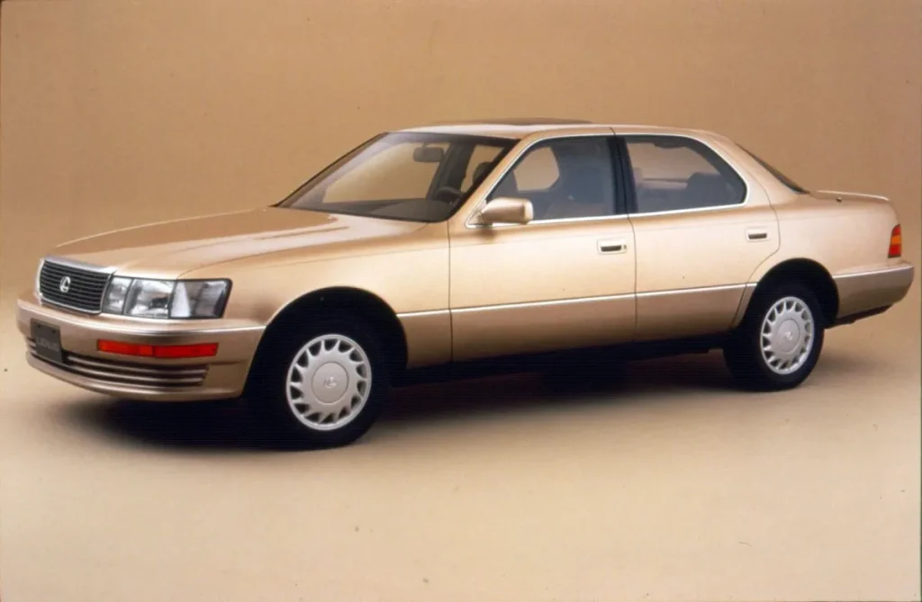
When Lexus launched in 1989, Toyota’s luxury division needed to make an immediate visual statement. Their first logo featured a stylised “L” within an oval – simple, elegant, chrome-finished. This wasn’t accidental.
Context: The late 80s luxury market was dominated by established European players like Mercedes-Benz and BMW. Lexus needed something that communicated premium quality without appearing derivative. The chrome finish signalled luxury, while the simplicity conveyed Japanese minimalism.
The original logo, paired with their slogan, “The Relentless Pursuit of Perfection”, was deliberate positioning: Lexus wasn’t just entering the luxury market but redefining expectations around craftsmanship and reliability.
The Evolution: Key Logo Transformations
First Refinement (1990s)
Visual changes: The initial refinement maintained the oval and “L” but with subtle dimensional updates. The chrome became more sophisticated with improved shading and depth.
Strategy: This period wasn’t about dramatic change but refinement – mirroring Lexus’s approach to their vehicles. They were establishing consistency while making incremental improvements.
Market alignment: While European competitors leaned heavily on heritage, Lexus positioned itself as the forward-thinking alternative. The logo reflected this through modern, clean design principles.
Digital Era Adaptation (Early 2000s)
Visual changes: The logo became three-dimensional with enhanced metallic rendering and subtle gradient work.
Strategy: This evolution coincided with the digital transformation of marketing. Lexus needed a logo that performed well across emerging digital platforms while maintaining recognizability.
This period saw Lexus expanding its lineup beyond just sedans to include SUVs like the RX. The logo’s adaptability across different vehicle sizes and digital contexts became crucial.
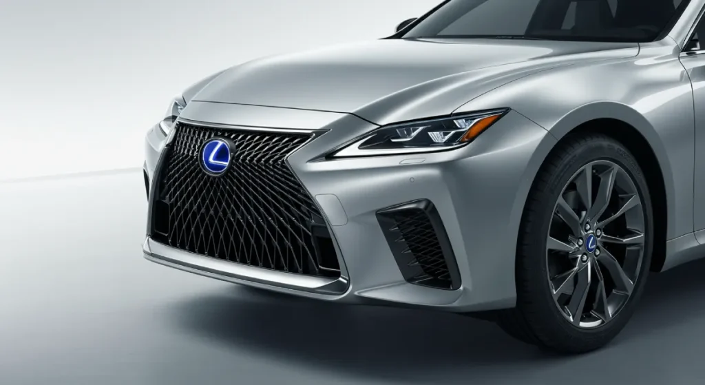
The Contemporary Refresh (2023-Present)
Visual changes: The most recent significant update featured a cleaner, more streamlined “L,” bolder lines, and a more sophisticated metallic finish.
Strategy: This update aligned with Lexus’s more aggressive design language, which was introduced with their spindle grille. They weren’t just selling luxury anymore – they were selling excitement and distinction.
The timing coincided with Lexus’s push to appeal to younger luxury buyers and distance themselves from the “comfortable but boring” reputation they had developed.
Wins and Fails
What Worked
The consistency. Lexus maintained core elements throughout, unlike some brands that completely reinvent their logos. This built valuable recognition equity over decades.
The simplicity. The logo avoids the trap many automotive brands fall into – unnecessary complexity that doesn’t scale well across applications.
The premium visual language. The metallic treatment consistently communicated luxury without appearing gaudy or overdone.
What Didn’t Work
Early recognition challenges. The stylised “L” wasn’t immediately recognisable to consumers unfamiliar with the brand – a hurdle during launch years.
Conservative approach. While consistency built recognition, Lexus occasionally lagged behind competitors in modernising their visual identity, potentially reinforcing perceptions of being less dynamic.
Business Alignment
The logo evolution closely tracked Lexus’s business transformation:
- 1989-1999: The establishment phase. The original logo represented Lexus’s focus on quality and reliability, which helped them break into the luxury market dominated by European brands.
- 2000-2012: The expansion phase. As Lexus diversified their lineup to include SUVs and performance vehicles, the logo maintained consistency while adapting to new applications.
- 2013-Present: The distinction phase. The more dynamic logo update supported Lexus’s push to be perceived as more exciting and emotionally engaging, not just the rational luxury choice.
A key business inflexion point came with introducing the “F” performance sub-brand, which required the logo to work within a new brand architecture while maintaining Lexus recognition.
Competitive Positioning
Initially, Lexus positioned itself as the rational alternative to emotional European luxury. Their logo reflected this through clean, precise execution versus the heritage-laden emblems of Mercedes-Benz and BMW.
As Japanese competitors like Infiniti and Acura evolved their visual identities with more dramatic changes, Lexus’s conservative approach to logo evolution reinforced their commitment to steadiness and reliability.
When European brands began embracing minimalism in the 2010s (simplified 2D logos for digital applications), Lexus maintained dimensional depth – a subtle counterpoint suggesting substance over trend-following.
The Psychology Behind the Elements
Form Analysis
The oval: Creates a sense of global reach and completeness. This shape does not accidentally echo Toyota’s logo – creating subtle parent-brand recognition while establishing distinction.
The “L”: The stylised letter features precise angles communicating engineering excellence. The execution suggests movement (forward-leaning) and stability (balanced proportions).
Colour Psychology
Chrome/Silver: Represents precision, technology, and luxury without the potential ostentation of gold. The metallic finish also connects to automotive materials, creating an authentic connection to the product.
Spatial Dynamics
The negative space: The “L” is positioned to create dynamic negative space within the oval – a design technique that rewards closer examination and suggests hidden depths (mirroring Lexus’s messages about craftsmanship).
Public Reception and Controversies
Unlike some automotive rebrands that faced significant backlash (BMW’s logo simplification, for example), Lexus’s evolutionary approach largely avoided controversy.
The most significant public response came with introducing the spindle grille design language, which polarised opinions. While not a logo change, this adjacent visual identity shift required the logo to work within a more aggressive design context.
Interestingly, the conservative logo evolution may have helped smooth the transition to more daring vehicle designs – providing a visual anchor of consistency while other elements changed more dramatically.
The Current Logo: Strengths and Weaknesses
Strengths:
Recognition equity: After three decades, the essential elements have built strong recognition.
Versatility: The logo works effectively across digital and physical applications.
Premium communication: It successfully signals luxury without appearing pretentious.
Weaknesses:
Innovation ceiling: The evolutionary approach, while safe, potentially limits Lexus’s ability to signal dramatic brand transformation.
Distinctiveness challenges: Among luxury automotive logos, Lexus’s emblem lacks some immediate recognition from historic competitors.
Digital simplification resistance: While many brands have embraced flat design for digital optimisation, Lexus has maintained dimensional complexity that occasionally creates reproduction challenges in some contexts.
Future Projection
Based on current design trends and Lexus’s trajectory, several developments seem likely:
- Simplified variant: A flatter, more digitally-optimised version for UI/UX applications, mainly as Lexus develops more digital touchpoints.
- Enhanced flexibility: As Lexus expands into EVs, we’ll likely see adaptations incorporating illumination capabilities and working within new grille-less front fascia designs.
- Sub-brand integration: More sophisticated integration with performance (F) and electrification sub-brands, potentially incorporating subtle colour differentiators.
What seems unlikely is any revolutionary redesign. The equity built in the current logo is too valuable to abandon, and Lexus’s brand has always valued evolution over revolution.
Key Lessons for Brands
- Consistency builds equity. Lexus’s logo evolution demonstrates the value of maintaining core elements while making refined improvements.
- Visual identity must align with product reality. Lexus didn’t adopt a more dynamic logo until their vehicles delivered more emotional driving experiences.
- Logo evolution should track business transformation. Each Lexus logo refinement is connected to meaningful business strategy shifts.
- Context matters. The logo performed different functions when Lexus was unknown versus established, requiring different considerations at different brand lifecycle stages.
- Competitive differentiation requires balance. Lexus’s logo must communicate luxury credibility while establishing a distinct identity from European competitors.
The Lexus logo journey exemplifies strategic restraint – knowing when to maintain equity and when to evolve. In a category where many brands have wholly reinvented their visual identities multiple times, Lexus’s methodical evolution has built a valuable visual asset that continues to serve the brand across expanding contexts.
FAQs
When was the first Lexus logo created, and what did it look like?
The first Lexus logo was created in 1989 when the brand launched. It featured a stylised “L” inside an oval with a chrome finish. The design was intentionally simple yet sophisticated, aiming to convey Japanese precision and luxury without imitating the more ornate European luxury emblems of competitors like Mercedes-Benz and BMW.
Who designed the original Lexus logo?
Hunter Communications and Molly Designs designed the original Lexus logo and collaborated with Toyota’s internal design team. The development process was extensive, with over 100 potential logo designs considered before selecting the final oval-and-L concept that would become iconic for the brand.
What was the strategic thinking behind the oval shape in the Lexus logo?
The oval shape served multiple strategic purposes. First, it created visual continuity with parent company Toyota’s logo (also oval-based), establishing a subtle family connection while maintaining Lexus’s distinct identity. Second, the oval represented global reach and completeness – essential for a brand with international luxury aspirations. Finally, the smooth, continuous curve communicated sophistication and harmony, core Japanese design principles that differentiated Lexus from the more angular European luxury emblems.
Has Lexus ever wholly redesigned their logo?
Unlike some automotive brands that have undergone radical redesigns, Lexus has followed an evolutionary approach, maintaining the fundamental oval-and-L design while refining finishes, dimensionality, and proportions. This strategy has allowed them to build continuous recognition equity while modernising their visual identity.
How did the Lexus logo change when introducing their performance “F” line?
When Lexus introduced their performance-focused “F” line in 2007 (starting with the IS F), they created a complementary logo system rather than changing the central emblem. The “F” designation appears as a separate logo element – squared off on the left side and curved on the right, said to be inspired by the shape of Turn 1 at Fuji Speedway. This approach allowed Lexus to maintain core brand recognition while signalling performance credentials through a sub-brand visual system.
What was the most significant update to the Lexus logo, and when did it happen?
The most significant update occurred around 2013, coinciding with Lexus’s broader design language shift that introduced the distinctive spindle grille. While maintaining the fundamental oval-and-L structure, this update featured more pronounced three-dimensionality, a more sophisticated metallic finish with better light reflection properties, and subtle adjustments to the “L” shape to create more dynamic visual tension. This update aligned with Lexus’s strategic pivot toward more emotional and distinctive design across their vehicle lineup.
How does the Lexus logo compare to other luxury automotive logos in terms of complexity?
The Lexus logo occupies a middle ground in the luxury automotive space. It’s more complex than minimalist logos like Audi’s four rings but significantly less complex than heraldic emblems like those used by Alfa Romeo or Porsche. This positioning reflects Lexus’s brand philosophy – offering sophisticated luxury without unnecessary complications. The relative simplicity has proven advantageous in the digital era, where the logo reproduces well across various screen sizes and applications.
Has Lexus faced any controversies or public backlash regarding their logo changes?
Unlike some automotive brands that have faced significant public backlash after logo redesigns (BMW’s simplified logo in 2020, for example), Lexus has primarily avoided controversy with their evolutionary approach to logo refinement. The most significant related controversy came not from the logo but from introducing the polarising spindle grille design language the logo needed to complement. Some traditionalists felt this aggressive design direction conflicted with Lexus’s established reputation for understated elegance.
How has the Lexus logo been adapted to transition to electric vehicles?
Lexus has maintained its core logo for its electric vehicle initiatives while introducing subtle adaptations. The “Lexus Electrified” badging features the standard oval-and-L logo but is often illuminated (particularly on concept vehicles) and sometimes accompanied by a specific typeface treatment for “ELECTRIFIED.” This approach balances brand continuity with signals of technological advancement. Their 2021 LF-Z Electrified concept showcased how the logo might evolve, with illumination capabilities and integration into a front fascia that doesn’t require a traditional grille.
What psychological principles has Lexus employed in their logo design?
Lexus has strategically employed several psychological design principles in their logo:
Closure: The “L” is suggested rather than completely outlined, engaging the viewer’s mind to complete the shape
Balance: The asymmetrical “L” is carefully positioned within the symmetrical oval to create dynamic tension while maintaining visual stability.
Depth perception: The metallic treatment creates a sense of substance and craftsmanship through subtle lighting cues
Gestalt principles: The logo functions as a unified whole while having distinct components, mirroring Lexus’s messaging about attention to both overall design and minute details
How does Lexus utilise their logo differently across global markets?
While maintaining consistent logo design, Lexus adapts its logo application strategy across global markets. In the United States, the logo is often presented with substantial prominence, reinforcing brand status in a market where Lexus has established strong recognition. In European markets, where Lexus faces entrenched luxury competitors, the logo is sometimes presented subtly, letting vehicle design speak first. In Asian markets, particularly China, Lexus frequently implements illuminated and prominent logo placements, aligning with regional preferences for visible brand signifiers. These regional strategies reflect Lexus’s understanding that logo perception varies significantly based on cultural context.
What future changes might we see in the Lexus logo as automotive technology evolves?
As automotive technology continues evolving, we’re likely to see Lexus adapt their logo in several ways:
Illumination integration: Expanded use of LED and light-guide technology to create illuminated versions for both exterior and interior applications
Digital optimisation: Development of simplified variants designed explicitly for in-vehicle interfaces, smartphone applications, and other digital touchpoints
Material innovation: Exploration of new finishing techniques that maintain a premium appearance while meeting sustainability requirements
Sensor compatibility: Modifications to accommodate advanced driver assistance systems that require unobstructed sensor placement in areas traditionally used for badging
Animation capabilities: Dynamic versions for digital contexts that can transform or respond to user interactions
Lexus will likely maintain their core oval-and-L foundation throughout these adaptations while ensuring the logo remains functional across expanding contexts.

