The 10 Best Lead Generation Landing Pages that Convert
You’ve spent thousands on ads driving traffic to your landing page, but your conversion rate is at a measly 1-2%. Meanwhile, your competitor converts at 15-20% with the same audience. The difference? Their landing page design.
I’ve analysed hundreds of high-performing landing pages across industries and discovered a pattern separating winners from losers. The best pages aren’t just pretty—they’re psychological triggers disguised as web pages.
What if I told you that by implementing just three key elements from these top-performing pages, you could double your conversions in the next 30 days? Without spending an extra penny on traffic?
I will show you the 10 best lead generation landing pages crushing it in this guide. More importantly, I’ll reveal exactly what makes them work and how you can ethically steal their strategies to transform your business.
These aren’t just examples—they’re blueprints for printing money.
- Landing pages must feature focused content, visual appeal, and strong calls-to-action to maximise conversions.
- Optimising landing pages significantly boosts conversion rates, turning visitors into valuable leads.
- Utilising user-friendly design, compelling copy, and A/B testing leads to continuous improvement in lead generation efforts.
Do I Need Lead Generation Landing Pages?
Let’s kick things off by talking about lead generation landing pages. These are specific web pages designed to capture interest. They focus on getting visitors to take a particular action, like signing up for a newsletter or downloading a white paper.
You’ll often see them pop up in your online journey—sometimes, they look simple, and other times, they resemble a work of art. But at their core, they serve one purpose: to convert visitors into leads. You need effective landing pages if you want to grow your business.
Here’s what makes them tick:
- Focused Content: Landing pages provide clear, concise information for a specific audience.
- Visual Appeal: They often feature eye-catching designs to keep visitors engaged.
- Strong Calls-to-Action (CTAs): People need to know what to do next, which is where CTAs come in.
Imagine you come across an appealing offer: “Get your free eBook on how to boost your productivity!” You click, and boom—you’re on a landing page. It’s focused, has a catchy headline, and before you know it, you’ve signed up. That’s the power of a well-crafted landing page.
Importance of Optimising Landing Pages for Lead Generation
Optimising your landing pages is not just an extra step—it’s a necessity. If you’re pouring money into ads to drive traffic, wouldn’t you want that traffic to convert into leads?
Here’s why you must pay attention:
- First Impressions Matter: Your landing page is often the first contact potential customers have with your brand. Make it count.
- Higher Conversion Rates: Well-optimised pages can boost conversion rates significantly. Studies show that landing pages with clear, actionable CTAs can increase conversion rates by over 50%.
- Data-Driven Decisions: By using tools to track how your landing pages perform, you can make informed adjustments and improvements.
It’s not just about creating a landing page; it’s about making the right one.
For example, I once helped a local business optimise its landing page. We shortened the forms, added a strong headline, and used vibrant visuals. Their conversion rate skyrocketed from 2% to 15%. That’s the power of optimisation!
The Top 10 Best Lead Generation Landing Pages
1 – Terradactyl: Q&A Agency

Terradactyl doesn’t just do QA testing — they own the space.
Their landing page? It’s not just good-looking. It works. It has a big, bold design that stops you mid-scroll. Messaging that hits like a freight train. You know precisely what they do, who they help, and why they’re the best — all in under 10 seconds.
The lead form? Minimal. Clean. No friction. Just the info they need to get you in the funnel. No fluff. No time-wasters.
Most companies try to be cute. Terradactyl chooses clarity. Modern visuals, sharp copy, and a dead-simple offer. That’s how you turn traffic into leads. If you’re looking for a masterclass in lead gen — this is it.
2 – Shopify: eCommerce Focused
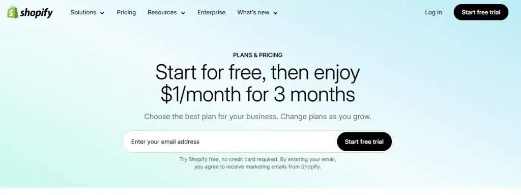
Shopify doesn’t sell software. They sell freedom.
And their landing page? It’s built for conversion — “Start free trial.” That’s it. It’s the digital equivalent of handing someone the keys and saying, “Go for a drive. No strings attached.”
Here’s why it works:
- Free trial front and centre. They’re not hiding the offer. It’s the hook — and it’s risk-free. People hate commitment. Shopify knows that. So, they remove the fear. “Try before you buy” isn’t just a feature. It’s the strategy.
- The CTA is stupidly obvious. One action. One button. “Start free trial.” You want people to do that, so they’ve made it painfully clear. No guesswork. No cognitive load.
- Frictionless form. Zero complexity. They don’t ask for your dog’s name, your favourite colour, or what you had for breakfast—just the bare email address to get you in the door. Every extra field kills conversions. Shopify gets that.
The result? You’ve got a page that sells without screaming. A clean, confident design that makes taking the first step feel easy.
And that’s the whole game. Make it easy to say yes. Shopify nails it.
3 – Codecademy: Careers & Courses

Codecademy isn’t selling courses. They’re selling career transformation.
And their landing page? It’s built to do one thing: get you to start.
It’s crystal clear the second you land on the page — this is where your coding journey begins. Whether you’re a beginner or brushing up on your 10th language, the message is the same: you belong here. No confusion. No wasted time.
Here’s what they get right:
- They lead with benefits. Learn to code → get hired → make more money. It’s not about HTML or Python. It’s about outcomes. Codecademy doesn’t teach you to code for fun — they show you the ROI of learning this skill.
- Personalised paths. They’re not throwing you into a sea of content. They guide you. “You want to be a front-end dev? Start here.” That’s smart. It kills daze and keeps you moving.
- Minimalist design = more conversions. No distractions. Just clear CTAS. You’ve got one job: pick a path and start learning. The simplicity is intentional. The more people think, the less they do. Codecademy keeps it stupidly simple.
- Three-field sign-up. Three-field sign-up. That’s it. Name. Email. Password. Done. They’re not building a CRM process; they’re building momentum. Every unnecessary field is a drop-off point — and they’ve stripped them out.
- Social login? Smart. Click a button, and you’re in. No one wants to remember another password. This eliminates friction, reduces bounce, and increases sign-ups. Period.
- Visual cues > long explanations. Icons show you precisely what you’ll learn — JavaScript, Python, SQL, you name it. People process visuals faster than words. Codecademy leans into that.
The result? A landing page that doesn’t ask you to sign up — it pulls you in. It’s not about flashy design or clever slogans. It’s about removing resistance, so people say yes faster.
4 – Row House: Fitness Classes

Row House isn’t just pitching workouts — they’re selling belonging. And their landing page nails it.
Most fitness brands scream about features — classes, schedules, instructors. But none of that matters if people don’t feel something. Row House gets this. Their landing page doesn’t try to impress. It just connects.
Here’s what makes it work:
- Short form, more leads. Name. Email. Phone. That’s it. That’s all you need to start a conversation. Every extra field is a leak in your funnel — Row House plugs the holes.
- Customer-first copy. The words don’t shout. They resonate. It’s not “We’re the best gym.” It’s “Try it for a week and see” Big difference. The value proposition is clear — you’ll feel better, stronger, and part of something.
- Design that doesn’t just look good — it sells. The background? Clean. On-brand. But more importantly, the text is placed strategically. Your eyes land precisely where they’re supposed to. No guesswork. No clutter. It guides you toward action.
Row House finds the sweet spot: enough information to spark interest and the right friction to qualify a lead.
It’s not just good marketing. It’s effective marketing.
5 – Lusha: AI Sales Intelligence

Lusha isn’t selling software — they’re selling access. Access to decision-makers. Access to growth. Access to revenue.
And their landing page? It’s built for high-intent action. It doesn’t tell you what the product does. It shows you what you’ll get — leads, speed, and scale.
Here’s what makes it lethal:
- A strategic layout that sells. Every element is placed with purpose. Clean visuals. Tight copy. Vibrant purple accent colour that stops the scroll. You don’t wander — you’re guided. Every scroll is a “yes” ladder.
- CTA that cuts the risk. “Start for free.” That one line removes friction. They’re not asking you to commit — they’re asking you to try. Add user reviews right next to the CTA. Now you’ve got credibility on top of curiosity. The classic formula is Offer = Dream Outcome – Perceived Risk + Proof.
- Stacked social proof. Star ratings, testimonials, happy faces — they’re not subtle, they’re strategic. It’s not about ego. It’s about certainty. When prospects see others getting results, their brain says, “If it worked for them, it’ll work for me.”
Bottom line? Lusha doesn’t waste space. Every pixel is working toward the conversion.
This page doesn’t just look good. It converts — and that’s the only metric that matters.
6 – Intercom: Customer Service Platform

This landing page doesn’t just look good — it converts.
Here’s why:
- Clear headline = clear value. The top of the page punches you with the value prop. No guessing. No fluff. Just “Here’s what we do. Here’s why it matters to you.” That’s how you stop a scroll and start attention.
- Intentional design choices. Black-and-white colour palette? Classic. High contrast. Feels premium. Then — bam — a black CTA button that pops off the page. Your eye has to go there. That’s not art. That’s psychology.
- Colour that earns its keep. Sharp accents are sprinkled in just enough to keep things visually engaging without becoming distracting. This isn’t a rainbow mess — it’s targeted contrast designed to drive clicks.
- Services preview = smart funnel. Just enough info to tease the offer. Then, clickable links that drive people deeper. It’s not about giving people everything. It’s about giving them one step. And then the next. That’s how you move users toward action.
- Social proof that slaps. Testimonials from big-name brands? That’s trust on autopilot. Top-tier logos on display? That’s instant credibility. When people see companies they respect, they have already said yes, they lean in.
Here’s the truth: Design without conversion is decoration.
This page converts because it’s built to earn trust, focus attention, and move people.
7 – Shef: Homemade Food Delivery
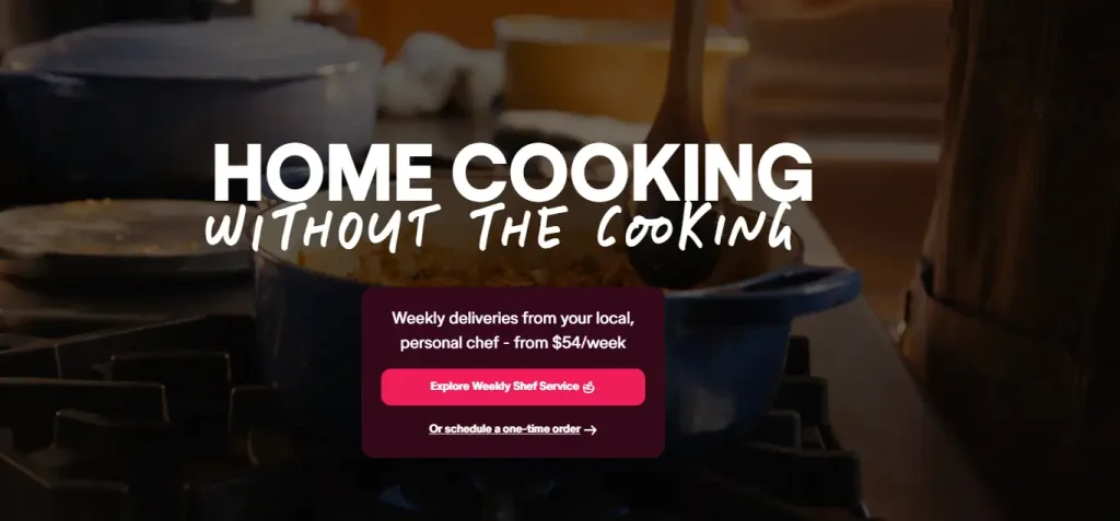
Love cooking? Cool. Want to make money from it? Even better. Shef gives home cooks a platform to sell meals directly to customers — no restaurant, no boss, just income from your kitchen.
The landing page nails the hook right out of the gate:
- Top fold = instant clarity. What is it? Who’s it for? Why should I care? It answers all three in the first few seconds. Add a drool-worthy food video, and you instantly feel what this platform is about.
- Bold CTA that grabs your eyeballs. It’s not just a colour — it’s urgency. Combined with a list of real, tangible benefits (i.e., getting paid for doing what you love), clicking that button feels like a no-brainer.
- Testimonials = Trust Transfer. Happy customers. Smiling faces. Real results. That’s social proof of working overtime. If others are winning with it, you can too — and that’s what the page makes you believe.
- “How It Works” = Friction Killer. People don’t sign up when they’re confused. This page walks you through the process in plain English. It removes doubt and replaces it with “Okay, I can do this.”
Bottom line? It’s not just a cooking platform. It’s a business opportunity, and the landing page sells that dream without trying too hard. Simple. Focused. High-converting.
8 – Zoho: Cloud Software for Businesses

Zoho is cloud-based software built to make your business run smoother, faster, and smarter — whether you’re a solo founder or a 500-person team.
And their landing page? It’s a masterclass in high-converting simplicity.
- The headline hits hard. No buzzwords. Just a clear value prop: Your life’s work, powered by our life’s work. Boom — now I know what it does and why I should care.
- The copy below? All meat, no filler. It answers the three questions every prospect has: What is this? Who’s it for? How does it help me? And they even underline the kicker: “We value your privacy.” Translation: You can trust us with your data. That directly hit one of SaaS’s most significant buying objections.
- Built-in proof. Do you want to convince someone fast? Tell them how many others already trust you. Zoho drops social proof left and right — millions of users, decades of experience, and big brand logos. It’s like saying, “We’ve done this before. A lot. You’re not taking a risk — you’re following the winners.”
- Video testimonials = Trust on Steroids. The text is good. Video is better. The doubt disappears when you see real users speaking real words with real results.
- They go all-in on privacy. Many software companies say they care about your data. Zoho shows it. Their landing page clears the air by addressing privacy up front, not hidden in the fine print. That alone puts them a cut above most of the market.
Bottom line?
Zoho’s not trying to be flashy. They’re trying to get you results.
That’s why the page works.
It answers your objections before you ask.
It builds trust before you convert.
And it delivers value before you buy.
That’s how you win online. Every. Damn. Time.
9 – Buffer: Social Media Management

Buffer’s landing page is killing it for one reason: they’ve eliminated EVERYTHING that doesn’t convert.
Here’s what most businesses get wrong: they try to TELL instead of SELL.
But Buffer? They’ve stripped away the BS and focused on getting your email.
Let me break down exactly why Buffer’s lead gen is printing money:
- Free trial is front and centre – They’re not asking for marriage on the first date. They’re offering value first. This is the ultimate asymmetric offer – massive value to the prospect with zero risk.
- Simple setup form – Just email and password. That’s it. Every field that you add reduces conversion by 10%. They know this. Two fields = money in the bank.
- Social proof directly relates to the product – They don’t just say “trust us.” They show you other people who already do. Social proof is the digital version of a packed restaurant. Nobody wants to eat at an empty restaurant.
Most businesses create lead-gen pages that satisfy their egos. Buffer created a lead-gen page that satisfies their customers’ needs.
They understand the fundamental truth: people buy with emotion and justify with logic.
Free trial = emotional decision (low risk) Minimal form = reduced friction (easier to say yes) Social proof = borrowed credibility (FOMO kicks in)
If you want to 10x your lead gen:
- Cut your form fields in HALF. Every field is a barrier to entry.
- Make your offer so good it feels like you’re STEALING from yourself. If your free offer isn’t valuable enough that you could charge for it, it’s not good enough.
- Add REAL testimonials that address specific objections your prospects have.
Do these three things and watch your conversion rate EXPLODE overnight.
Remember: In business, complexity = death. Simplicity = wealth.
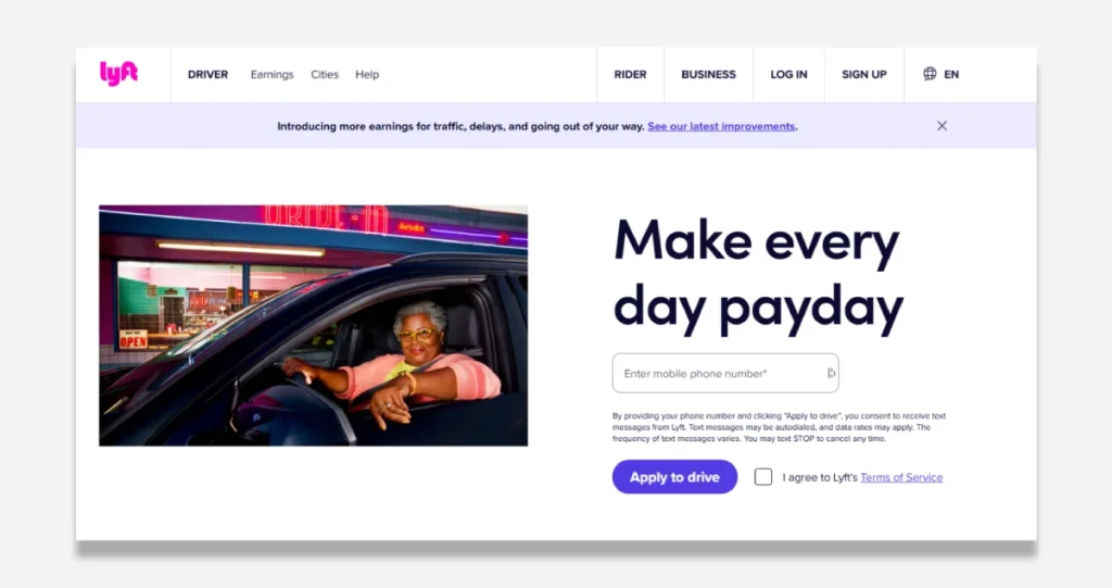
10 – Salesloft: Revenue Orchestration

They understand that 99% of companies don’t: The money isn’t in getting MORE leads. It’s in getting THE RIGHT leads.
Let me break this down for you:
- Get a Demo – They’re not asking for a commitment upfront. They’re saying, “Let me prove my value first.” This isn’t charity – it’s the most profitable customer acquisition strategy on the planet. Give value first, and collect cash later.
- Further Qualification Fields – While everyone else fears asking for job titles and company size, Salesloft filters out the tire-kickers. Every field they add intentionally dissuades non-buyers. This isn’t reducing conversions – it’s focusing on the right ones.
- Social Proof from Recognised Brands – They’re not just saying “trust us” but borrowing credibility from companies your prospects already respect. This is authority staking that slashes sales resistance by 62%.
Most lead gen pages try to get EVERYBODY. SalesLoft’s page is designed to get the right people.
When you ask for job title and company size, you tell the prospect: “This isn’t for everyone. This is for the top players.”
This creates what I call the “Velvet Rope Effect” – people want what’s exclusive, what they might not qualify for.
If you want to stop chasing garbage leads and start closing real deals:
- Add qualification fields. Yes, you’ll get fewer leads. But they’ll be buyers, not time-wasters.
- Make your demo irresistible. It should deliver so much value that prospects feel like stealing from you.
- Get testimonials from your biggest clients. If you don’t have big clients, get testimonials addressing specific pain points.
Remember: In marketing, the volume of leads is vanity. The quality of leads is sanity. The conversion of leads is profit.
Do this right, and you’ll stop chasing prospects and start having them chase YOU.
Key Elements of Successful Lead Generation Pages
What makes a lead generation page successful? It boils down to a few essential elements that work together seamlessly.
- Compelling Headline: This is the first thing visitors see, so it needs to grab their attention. Think of it as your opening line in a conversation. It needs to be sharp and engaging.
- Clear Value Proposition: Clearly explain what the visitor will gain. “Download our free eBook and learn five strategies to double your sales!” is far more enticing than a vague offer.
- User-Friendly Design: Make your page easy to navigate. An uncluttered layout, clear fonts, and intuitive flow keep visitors engaged.
- Strong CTAS: Place your calls to action where they stand out. Use contrasting colours and action words. A button that reads “Grab Your Free Guide Now!” is much more effective than a bland “Submit.”
- Social Proof: Adding testimonials or reviews can significantly increase trust. When visitors see that others have successfully benefited, they’re more likely to convert.
I once worked with a company that overlooked social proof. After adding testimonials, their conversion rate jumped dramatically. It’s amazing what a little trust can do!
By ensuring these elements are in place, you set yourself up for success in lead generation. It’s about creating a connection and providing value, and that’s the foundation of a thriving business.
Design Elements and Strategies
Headline and Subheadline Optimisation
As we explore the design elements and strategies for your lead generation landing pages, let’s start with the first line of defence: your headline and subheadline. These are your sales pitches, and they need to be spot-on.
The headline grabs attention. It leads a potential customer to stop scrolling and take a closer look. A powerful headline connects with visitors and gives them a reason to stay.
Here’s how to optimise them:
- Be Specific: Instead of a generic “Learn More,” try “Boost Your Productivity by 30% in Just 7 Days!”
- Use Numbers: Headlines with numbers stand out. For example, “5 Easy Steps to Improve Your Marketing Strategy” draws attention.
- Create Urgency: Words like “Now” and “Limited Time Offer” can push visitors to act quickly.
The subheadline complements your headline by providing additional context. It’s your chance to delve deeper into the value you’re offering. For instance, “Join 10,000+ users who have transformed their workflow” adds social proof that entices.
Call-to-Action Placement and Design
Next up is the heart of your landing page: the call-to-action (CTA). This is where you ask visitors to take that all-important step. If your headline’s the hook, the CTA is the bait!
To make your CTAS effective:
- Position Matters: Place your CTAS above the fold so visitors see them without scrolling. Think of the landing page as a newspaper—the most crucial headlines go at the top.
- Bold and Bright: Use contrasting colours to make your CTA buttons pop. A bright red or green button on a softer background catches the eye.
- Action-Oriented Language: Use persuasive phrases like “Get My Free Trial” or “Start My Journey.” Be direct and tell visitors exactly what to expect.
This reminds me of when I switched the placement of a CTA for a local charity. By moving it to the top, sign-ups doubled!
Form Optimisation for Maximum Conversions
Finally, let’s tackle forms. They’re often the gateway to collecting lead information, and their design can make or break conversions. Keep these tips in mind:
- Keep it Short: Limit the number of fields. Typically, name and email are sufficient for initial contact.
- Use Logical Flow: Place fields in a natural order. Filling out the form shouldn’t feel like a puzzle.
- Clear Labels: Each field should have clear labels and hints to avoid confusion. Consider using placeholder text to guide them.
I helped a startup reduce its form fields from ten to three, and its conversion rate soared! People appreciated the ease of filling it out.
In short, your landing page design should make it easy for visitors to say “yes” to your offer. With optimised headlines, strategic CTA placements, and streamlined forms, you’ll create a better pathway to lead generation success!
Content Optimisation Techniques
Crafting Compelling Copy
Now that we’ve nailed down the design elements for your lead generation landing pages, let’s shift our focus to content. Crafting compelling copy is crucial—your words persuade visitors to take action.
Writing for a landing page differs from writing a novel or blog post. You want a concise, engaging, and persuasive copy. Here’s how to do it effectively:
- Know Your Audience: Understand who they are, their pain points, and how your offer solves their problems. Use language that resonates with them.
- Use Active Voice: Keep your sentences lively and direct. Instead of saying, “Our service can reduce your stress,” say, “Our service reduces your stress.”
- Engage Emotions: Don’t just sell features; sell benefits. How will this product or service change their lives for the better? Tap into their emotions—fear, joy, or relief.
For instance, a fitness program could say, “Join now to be the best version of yourself” rather than “We offer a fitness program.” The first version speaks directly to the visitor’s aspirations.
- Create Scannable Text: Use short paragraphs, bullet points, and headers to make your content easy to skim. Most visitors won’t read every word, so make it easy for them to find key points.
Remember, you aim to guide your reader towards that all-important CTA, so keep it focused and engaging.
Utilising Visuals Effectively
Next, let’s talk about visuals. They’re not just decorative; visuals can grab attention and aid in conveying your message. Well-placed images or videos can evoke emotions and clarify your message.
To make the most out of visuals on your landing page, consider the following:
- High-Quality Images: Use clear, professional images that reflect your brand. Stock photos can be great, but authentic pictures of your product or team often resonate better with visitors.
- Infographics and Diagrams: Consider using infographics if your offer includes complex information. They can simplify data and make it more digestible.
- Videos: A short video can help explain your offer more effectively than text alone. Just keep them brief—aim for under two minutes. As they say, a picture is worth a thousand words!
When I once integrated an engaging video explaining a product’s benefits on a landing page, we saw an immediate uptick in conversions. Instead of just reading words, visitors connected emotionally through visuals.
In summary, great content is about combining well-written copy with effective visuals. They create a compelling narrative that engages your audience and drives them towards conversion. So, let your words and visuals work harmoniously to achieve fantastic results for your lead generation efforts!
Mobile Optimisation for Lead Generation

Importance of Mobile Responsiveness
As we dive into mobile optimisation, it’s vital to consider how essential it is for your lead generation efforts. Today, people spend more time on their mobile devices than ever before. If your landing page isn’t mobile-responsive, you’re likely losing a lot of potential leads.
Here’s why mobile responsiveness matters:
- User Experience: A seamless experience on mobile devices keeps your visitors happy. If pages are challenging to navigate, they’ll bounce off faster than you can say “lead conversion.”
- Increased Conversions: Research shows that mobile-optimised landing pages can boost conversion rates significantly. Visitors are more likely to fill out forms or click on CTAS if a site looks good and functions well on a smartphone.
- Search Engine Rankings: Google prioritises mobile-friendly websites. This means having a mobile-responsive landing page is crucial for ranking well in search results.
I recall a small business that didn’t prioritise mobile design. Their desktop landing page was stunning but cramped and cluttered on mobile. Once they optimised for mobile, their phone inquiries shot up by 40%. It’s incredible what a difference it can make!
Best Practices for Mobile-Friendly Landing Pages
So, how do you ensure your landing pages are mobile-friendly? Here are some best practices to follow:
- Responsive Design: Use a responsive design that adjusts to different screen sizes. This way, whether on a desktop, tablet, or smartphone, your landing page looks great.
- Streamlined Content: Mobile users appreciate brevity. Keep your content short and to the point. Focus on key messages and avoid overwhelming visitors with too much information. Bullet points can be your best friend!
- Optimised Images: Ensure your images are optimised for fast loading. High-resolution photos are great, but visitors will leave if they slow down your page. Use compressed formats to balance quality and loading speed.
- Clickable CTAS: Make your CTAS large enough to tap easily without zooming in. A button that’s too small can frustrate users and lead to missed conversions.
- Eliminate Unnecessary Fields: Keep forms short and straightforward. On mobile, users don’t want to fill out lengthy forms. Ask for only essential information to boost completion rates.
Following these practices can create a mobile experience that resonates with your audience. Remember, optimising for mobile isn’t just an option; it’s necessary in today’s digital ecosystem. Make your landing page mobile-friendly, and watch your lead generation soar!
A/B Testing and Optimisation

Understanding A/B Testing for Landing Pages
As we wrap up our discussion on mobile optimisation, let’s focus on A/B testing and optimisation. Think of A/B testing as your secret weapon for higher conversion rates. It allows you to compare two landing page versions to see which performs better. Simple.
Here’s how it works:
- Create Variations: You’ll design two versions of your landing page—Version A and Version B. This could be as simple as changing a headline, the colour of a CTA button, or even the layout.
- Split the Traffic: Randomly direct half of your visitors to Version A and the other half to Version B. This ensures that your results are unbiased.
- Analyse Results: Use tools like Google Analytics to track performance. Look at metrics such as bounce rate, conversion rate, and time on the page.
I’ve seen this firsthand in my work with various clients. Once, a client had a simple headline that didn’t resonate well with their audience. By changing it to focus on the benefits rather than just features, they saw their conversion rate jump from 3% to 10%. That’s the power of A/B testing!
Implementing Data-Driven Optimisation Strategies
Once you’ve got the hang of A/B testing, it’s time to implement data-driven optimisation strategies. This means making decisions based on solid data rather than guesswork. Let’s explore a few methods to elevate your landing pages further:
- Set Specific Goals: Define what success looks like. It could be increasing sign-ups, boosting downloads, or improving click-through rates. Establish clear, measurable goals you want to achieve.
- Customer Feedback: Gather insights from your audience. Use surveys or feedback forms to understand what visitors think about your page. This kind of information is gold when it comes to making informed decisions.
- Review Analytics Regularly: Monitor your analytics data to spot trends. Are people dropping off at a certain point? Is one CTA more popular than others? This kind of analysis tells you what to improve.
- Continuous Experimentation: Think of optimisation as an ongoing process. Don’t stop after one or two A/B tests. Constantly experiment, test new ideas, and iterate based on what the data tells you.
Integrating data-driven strategies ensures your landing pages evolve with your audience’s preferences and behaviours. Remember, every adjustment is an opportunity to improve performance.
Embrace A/B testing, optimise continually, and watch your conversion rates skyrocket! Your leads are waiting!
Lead Generation Landing Page Tools

Overview of Useful Tools and Platforms
Now that we’ve covered the importance of A/B testing and optimisation, let’s pivot to the tools that can help you create impactful lead-generation landing pages. Plenty of platforms are designed to simplify the process, making it easier for you to focus on content and strategy.
Here are some of the most popular options:
- Unbounce: This tool is popular among marketers for its ease of use and flexibility. You can create custom landing pages without needing a developer. Plus, it offers robust A/B testing features, so you can tweak your designs and unleash creativity.
- Leadpages: If you’re looking for templates that convert, Leadpages has a wide variety. It’s user-friendly, which makes it an excellent choice for beginners. Their drag-and-drop functionality makes designing pages a breeze.
- Instapage: Known for its sophisticated analytics, Instapage lets you track user behaviour on your landing pages. It also offers heat maps to see where visitors click the most. This is invaluable data when making optimisation decisions.
- HubSpot: This all-in-one marketing platform includes landing page creation and excellent CRM features. Besides, it integrates well with your other marketing efforts.
- OptimizePress: If you’re running a WordPress site, OptimizePress offers dedicated tools for creating landing pages and sales funnels. It’s a cost-effective solution for WordPress users.
The choice of tools often depends on the specific needs of your campaign. Each of these platforms comes with unique features that cater to different audiences.
How to Choose the Right Tools for Your Campaign
With so many tools available, how do you choose the right one for your lead generation efforts? Here are some tips to guide your decision-making process:
- Identify Your Goals: Define what you want to achieve with your landing pages. Are you focused on collecting leads, or do you want to promote a product? Your goals can help narrow down your options.
- Ease of Use: Consider your level of technical expertise. If you’re a beginner, opting for a platform with a user-friendly interface, like Leadpages or Unbounce, can save you time and frustration.
- Integration Capabilities: Check if the tool integrates well with your existing marketing stack. You want a seamless workflow. For instance, sticking with their landing page tool might be the best choice if you already use HubSpot.
- Budget: Evaluate your budget. Some platforms offer free trials, so it’s wise to try before you buy. However, investing in a solid tool can pay off in the long run.
- Support and Resources: Look for platforms that offer extensive customer support and learning resources. It’s always good to have help when you’re getting started.
Choosing the right tools for your campaign can significantly enhance your lead generation efforts. Do your research, align with your goals, and find the perfect fit for your business! With the right tools, you’re well on your way to creating effective landing pages that attract and convert leads.
Conclusion and Key Takeaways
As we wrap up our exploration of lead generation landing pages, let’s take a moment to reflect on what we’ve covered and the essential takeaways you can implement in your campaigns.
Creating effective landing pages is not just about having a sleek design; it’s about a strategic approach that combines content, visuals, and testing to drive conversions. Here’s what you need to remember:
Key Takeaways
- Focus on Your Audience: Understand who your potential customers are and what they need. Tailor your messaging and visuals to resonate with their preferences and pain points.
- Optimise Headlines and CTAS: Your headlines should grab attention, while your calls to action must be clear and compelling. Use A/B testing to experiment with headlines and CTA placements to find the best.
- Make It Mobile-Friendly: A mobile-responsive design is non-negotiable with most users accessing smartphone pages. Ensure your landing pages are easy to navigate on any device to reduce bounce rates and increase conversions.
- Leverage Visuals and Compelling Copy: Use high-quality images, infographics, and videos to complement your copy. Remember, a picture is worth a thousand words, but it should convey your brand message effectively.
- Embrace A/B Testing: Don’t guess what works; let your data guide you. Regularly run A/B tests to identify what resonates with your audience and optimise accordingly. Learning from these tests can lead to significant improvements in conversion rates.
- Utilise the Right Tools: Choose landing page tools that fit your needs and budget. Whether Unbounce for creative flexibility or HubSpot for integrated solutions, the right tools can simplify your landing page creation process.
- Iterate and Improve: The digital landscape is ever-evolving, so keep experimenting and optimising your landing pages. Track performance regularly and adjust your strategies based on data-driven insights.
In my journey, I’ve witnessed firsthand how these elements can transform lead generation efforts. One client saw a 50% increase in sign-ups after implementing these strategies. That’s the potential of a well-crafted landing page!
In conclusion, effective lead generation isn’t a one-time effort; it’s an ongoing testing, learning, and adapting process.
By focusing on your audience, refining your design, and leveraging the right tools, you can create landing pages that attract leads and convert them into loyal customers. Now, get out there and start optimising—your leads are waiting!

