How Has Website Design Changed Over Time?
What if I told you that understanding the evolution of website design isn’t just some boring history lesson but holds the secret blueprint to why some businesses dominate online while others get crushed and forgotten?
The difference between a 7-figure business and one barely surviving often comes down to this: they understand that a website isn’t just a digital brochure—it’s their most powerful sales weapon.
From crude text interfaces in the early 90s to today’s AI-powered experiences, this transformation represents the most significant shift in how businesses connect with customers. And those who master these principles aren’t just “keeping up”—they’re systematically extracting maximum value from every pixel.
Let me show you why the history of web design is the untold story of business evolution—and how understanding it gives you leverage that 99% of your competitors don’t even realise exists.
- Website design has evolved from basic text pages to interactive AI-powered platforms, significantly impacting business success.
- A well-designed website serves as a vital digital storefront, enhancing brand engagement and user trust.
- Responsive design is crucial in a mobile-first world, ensuring optimal user experiences across devices.
- Emerging technologies like AI and AR/VR are revolutionising user interactions and personalisation in web design.
- Future web design will focus on user-centric experiences, dynamic content, and enhanced security measures to maintain trust.
Evolution of Website Design

Let’s take a moment to appreciate the journey of website design. It all began in the early 90s when the internet was a novelty. The first website, launched in 1991 by Tim Berners-Lee, was a simple page of text. It didn’t do much but planted the seed for something monumental.
As the years passed, web design evolved from static, text-heavy pages to vibrant, interactive platforms. We saw the rise of HTML in the late 90s, bringing structure to the chaos.
From there, designers began experimenting with colours, fonts, and layouts. Remember when websites just had a single column of text? Now, we have multimedia-rich experiences that engage users like never before.
As technology advanced, so did design principles. In the 2000s, the introduction of CSS revolutionised how websites looked. It separated content from design, allowing for more creativity.
Suddenly, web developers were not just coders but artists sculpting digital experiences. Think about your first time navigating a beautifully designed website. It felt like stepping into a well-organised gallery rather than wading through a jumble of text.
Fast forward to now, and it’s a whole new ball game. We’ve transitioned into a mobile-first world where responsive designs aren’t just lovely but essential. Our screens range from tiny mobile phones to large monitor setups, so ensuring your website looks great on every device is critical.
Significance of Website Design in the Digital Era
Now, let’s talk about why this matters today. You might think, “Isn’t it just about aesthetics?” Well, it’s so much more than that!
A well-designed website is your digital storefront. It showcases your brand, communicates your message, and engages your audience.
Here’s why website design is significant in today’s digital realm:
- First Impressions Matter: You never get a second chance to make a first impression. With so many sites vying for attention, a stunning design can immediately grab a visitor’s interest.
- User Experience (UX): Good design leads to good UX. Visitors who can easily navigate your site without frustration will likely stay and explore. Think about it: Have you ever left a website because you couldn’t find the information quickly?
- Search Engine Optimisation (SEO): Modern websites are not just pretty faces; they must be found. Search engines favour well-structured sites that load quickly. Poor design can lead to slower speeds and a drop in search rankings.
- Building Trust and Credibility: A polished, professional website can build trust with your audience. When people see an unkempt site, their confidence wavers. Would you buy from a vendor with a poorly designed online shop? Probably not.
- Responsive to Customer Needs: Today’s audience expects a seamless device experience. If your site isn’t responsive, you risk losing potential customers. It’s as simple as that.
- Attracting the Right Audiences: Customised designs can attract your target audience. Tailoring your web experience to suit their preferences can make all the difference.
In the digital era, your website is often the first point of contact between you and your potential customers. A well-designed website can convert casual visitors into loyal customers. It’s not just a place for information anymore; it’s a digital experience that reflects who you are and what you stand for.
It’s time to embrace the evolution and significance of website design because, in this digital playground, your site is your passport.
The Early Years: 1983-1999
Introduction of the World’s First Website
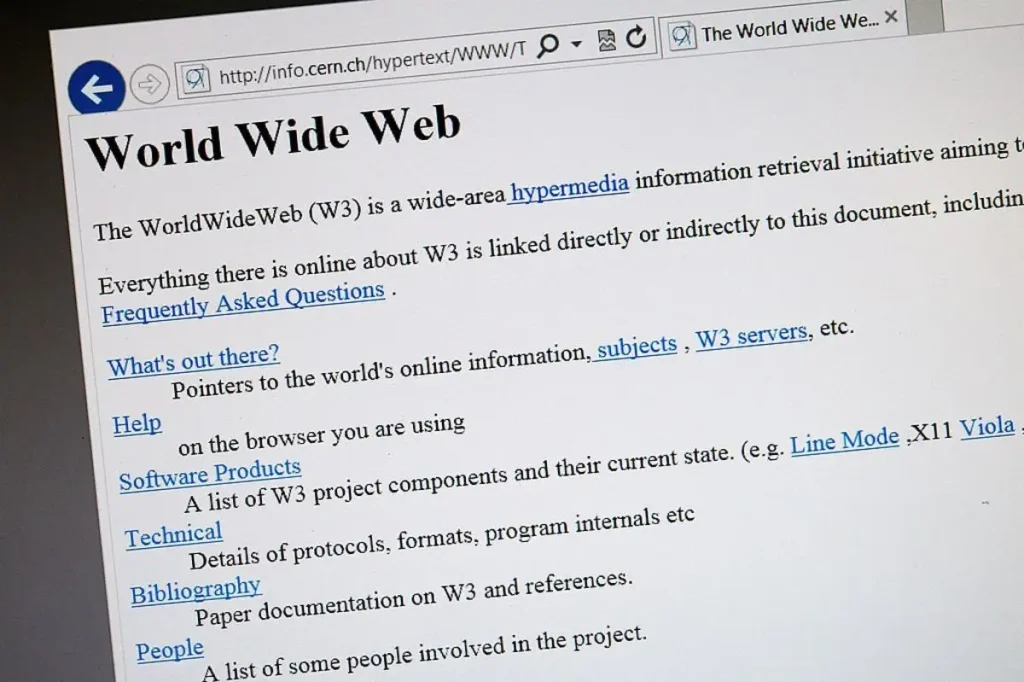
To truly appreciate the evolution of website design, we have to take a trip back to the early days, all the way to the moment when the internet was just a whisper of what it has become today. The year was 1991, and Tim Berners-Lee, a computer scientist from CERN, launched the world’s first website. It was simple—a few lines of text explaining the World Wide Web project. Yet, it was revolutionary.
Imagine dial-up connections when every page you visited felt like waiting for a kettle to boil. The first website starkly contrasted the vibrant pages we scroll through today. It didn’t have images or fancy designs. Instead, it was made up of plain text with hyperlinks. And for many, this was the beginning of a digital era.
When I first stumbled upon snippets of that website, I was fascinated. The potential of the internet was just being realised! A world where information could be shared freely and quickly! Back then, browsing felt like being an explorer, discovering uncharted territories.
Here are some key takeaways about the first website:
- Essential and Informative: Its design was no-frills—just straightforward information.
- Hyperlinks: The concept of links changed how we interacted with content, paving the way for a connected web.
- Foundation for Future Design: It set the groundwork for everything that followed, showing us that digital communication was possible.
Seeing how we have come from that initial website to the complex, interactive platforms we engage with daily is astounding.
Emergence of HTML and Basic Web Design Elements

As we gallop through the 90s, another groundbreaking development emerged: HTML (Hypertext Markup Language). Launched in 1993, HTML became the backbone of web pages. This was monumental. It allowed anyone with some know-how to create their website, leading to an explosion of new sites.
Let’s unpack what this meant for design:
- Structure Over Style: HTML provides a way to structure content on the web. You could mark text, add links, and organise a page layout. However, the design was still rudimentary. Think of a page with minimal colour and layout options.
- Introduction of Basic Elements:
- Headings and Paragraphs: For the first time, you could define different text elements.
- Links: Hyperlinks became a staple, allowing seamless navigation.
- Images: Though rudimentary, adding images started to enhance textual content.
- Creating the Web Experience: For the first time, people could share their stories, ideas, and knowledge with the world. Blogs, personal pages, and simple business sites sprang up.
Reflect on how we interact with pages now—there’s a sophistication in design that was unthinkable then. HTML was about coding, community, creativity, and shared experiences.
Back in those days, websites resembled online brochure formats. There were no fancy graphics or videos. But, those limitations sparked creativity. Designers and developers found ways to push boundaries, leading to innovations like the introduction of CSS at the dawn of 2000.
So, the early years of website design set the stage for everything we now experience. From that simple initial website to the introduction of HTML, the groundwork was laid for an explosion of creativity and innovation.
Understanding this foundation gives you a greater appreciation for the intricacies of modern design. Next, we’ll delve into the dawn of the new millennium, where web design shifted dramatically, paving the way for the user experience and aesthetic appeal we value today.
Dawn of a New Millennium: 2000-2010
Shift towards CSS for Web Layouts

As we entered the new millennium, the landscape of web design took a significant leap forward. Say goodbye to the basic HTML layouts of the 90s because Cascading Style Sheets (CSS) were here to change everything. CSS was the secret sauce if you ever wondered what made websites look polished and professional.
Imagine trying to arrange your furniture without being able to move it around; that’s how clunky web design felt before CSS. By separating content from design, CSS allowed designers to focus on aesthetics without sacrificing functionality. This shift changed the game in several ways:
- Flexible Layouts: Designers could create layouts that adjust to different screen sizes, a precursor to the responsive designs we value today.
- Consistent Styling: With CSS, you could easily style multiple pages with a single stylesheet. It’s like wearing the same outfit in different colours—simple but effective.
- Improved Load Times: CSS enabled faster loading times by streamlining code and reducing redundancy—a crucial aspect for keeping visitors engaged.
Let’s not forget the impact on creativity. Suddenly, web designers were no longer limited to just black-and-white text. They could splash colours, choose different fonts, and create a unique brand identity that popped. It was like stepping out of a monochrome world into vibrant technicolour!
The real excitement came when I first saw a website with a well-implemented CSS layout. It felt fresh and modern and sparked a newfound appreciation for design principles.
Rise of User Experience (UX) Design
As CSS flourished, the focus shifted towards a crucial element: User Experience (UX) design. No longer was it enough to create something visually appealing; now, it was essential to design with the user in mind.
Picture this: You’re visiting a website and quickly finding what you’re looking for without hiccups. That seamless interaction is the brainchild of UX design. Here’s why it became so significant during the 2000s:
- Understanding User Needs: UX design puts the user first. Designers began conducting research, gathering data, and ultimately designing with empathy. They wanted to know how users interacted with their websites, which led to more intuitive designs.
- Creating Engaging Interfaces: As the internet became more mainstream, competition heightened. Websites needed to offer information and an engaging and enjoyable experience to stand out.
- Testing and Iteration: The 2000s saw the rise of user testing. Designers started observing real users interacting with their websites. This process allowed them to gather feedback and make necessary adjustments. It was all about ongoing improvement.
- Accessibility: UX design also began to embrace the concept of accessibility. Understanding that not everyone uses the web the same way meant designing sites that anyone could interact with comfortably.
The difference was palpable for many of us navigating websites during this time. You could instantly spot a site that understood its audience versus one still clinging to the 90s.
The rise of UX design marked a significant turning point. Crafting an experience became as important as the content itself. Designers now had to balance beauty with usability.
And so, the dawn of a new millennium ushered in a remarkable era of website design. The shift towards CSS allowed for flexible and attractive layouts. At the same time, the rise of UX design pivoted the focus towards user-centric experiences.
As we look forward, these trends laid the groundwork for the modern web environments we enjoy. In the next section, we’ll explore the evolution of web design from 2010 to 2019, where mobile optimisation and responsive design began to take centre stage. Get ready for more exciting developments!
Modernisation and Mobile Optimisation: 2010-2019
Responsive Web Design for Multi-Device Accessibility

Moving into the 2010s, you might remember that the world rapidly transitioned into a mobile-first society. Smartphones were no longer just a convenience; they became an extension of ourselves. It was a pivotal moment for web design, and responsive web design emerged as a hot topic.
Before this, many websites suffered from the dreaded “mobile version” problem. You know the struggle if you’ve pinched and zoomed a page on your phone that wasn’t optimised for smaller screens. Responsive web design was the answer — enabling websites to adapt dynamically to different screen sizes.
Here’s why it was monumental:
- Fluid Grids and Media Queries: Designers started using fluid grids, letting content naturally rearrange based on screen size. Media queries allowed CSS to adjust styles according to the device being used. This meant a consistent and aesthetically pleasing experience across all platforms.
- User Convenience: With responsive designs, users can view websites seamlessly, whether on a laptop, tablet, or smartphone. Imagine visiting your favourite e-commerce site while shopping and quickly purchasing without frustration. This convenience helped drive sales and engagement.
- SEO Benefits: Google started favouring responsive sites in their rankings, making it even more critical for businesses. An optimised website attracted users and got noticed by search engines.
I vividly remember the first time I interacted with a responsive website. I was navigating through a travel site, searching for deals on my phone. The layout shifted beautifully as I swiped, and it hit me — this was the future of web design. Accessing websites quickly, regardless of the device, changed how I interacted with online content.
Importance of Page Speed and SEO in Design
As websites became more complex with rich media, another crucial factor climbed to the top of the priority list: page speed. Picture this: you click on a link, and as a user, you expect something to happen immediately. You might hit that back button and look elsewhere if a page takes too long.
Here’s why page speed became a core focus:
- User Retention: Studies show users expect a site to load in two seconds or less. If your website lags, you risk losing visitors. Fast-loading pages keep users engaged and reduce bounce rates.
- SEO Ranking: Google made it clear that speed matters. You need to optimise your site for quicker loading to rank high in search engine results. Sites that lagged saw a direct impact on their visibility.
- Optimised for Performance: As designers, we learned to optimise images, use caching, and streamline code to enhance loading times. It wasn’t just about aesthetics; it was a practical necessity.
In my own experiences, I’ve abandoned websites that took forever to load. Who hasn’t? Suppose I’m hunting for quick information or shopping online. In that case, a few extra seconds can lead to frustration and a loss of interest in a brand.
As the decade progressed, search engine optimisation (SEO) became intertwined with design. Web developers began to optimise for keywords, metadata, and mobile compatibility. The knowledge that design could influence SEO led to an awakening — designs needed to be beautiful and functional.
By the end of the decade, you could see an undeniable shift in how websites were created. The emphasis moved from static desktop layouts to dynamic, mobile-friendly designs. Today, we have an ecosystem where user experience, speed, and search visibility play crucial roles in web development.
Next, we’ll explore the current trends and innovations from 2020 to the present, where minimalist design and AI integrations are reshaping our digital experiences. Let’s keep diving deeper into this ever-evolving world!
Current Trends and Innovations: 2020-Present
Dark Mode and Minimalist Designs
As we stepped into the 2020s, something remarkable unfolded within web design. One of the standout trends was the rise of dark mode. This feature quickly gained popularity across various applications and websites. If you’re like me and enjoy browsing at night without blinding your eyes, you understand the appeal of dark mode!
Here are a few reasons why dark mode became such a phenomenon:
- Reduced Eye Strain: Dark mode is easier on the eyes, especially in low-light conditions. With less light emitted, users can comfortably browse without the harsh glare of bright backgrounds.
- Battery Saving: For OLED screens, dark mode consumes less power. This feature translates into longer user usage time, which is a win-win scenario!
- Aesthetic Appeal: Many users find dark themes sleek and modern. It’s a chic look that stands out, giving websites a sophisticated vibe.
Minimalist design also reared its head during this period. The mantra of “less is more” took hold, elevating user experience through simplicity. Here’s what you need to recognise about its importance:
- Focus on Content: Minimal designs eliminate unnecessary distractions, allowing users to focus on the content. When you land on a minimalist webpage, the message becomes clear without overwhelming visuals.
- Speed and Efficiency: With fewer elements to load, minimalist sites often enjoy faster loading times. In our fast-paced digital era, speed is critical.
- Timeless Aesthetic: Trends may come and go, but simplicity often endures. Minimal designs have that timeless flair that appeals to many users.
Integration of AI and Machine Learning in Design
The digital landscape didn’t stop evolving in dark mode and minimalism. As we moved through the 2020s, AI and machine learning began reshaping how we approach web design. It’s almost like stepping into a sci-fi movie where technology anticipates our needs!
Here’s how AI and machine learning started transforming the web design sphere:
- Personalised User Experiences: AI can analyse user behaviour and preferences, tailoring the web experience. Imagine visiting an online shop and seeing products based on your past purchases or browsing history. This level of personalisation keeps users engaged and encourages conversions.
- Automated Design Tools: AI-powered tools allow even non-designers to create stunning websites. With drag-and-drop features and pre-built templates, platforms like Wix and Squarespace now utilise AI to recommend styles and colours based on user preferences.
- Enhanced User Interaction: Chatbots have become a staple on many websites, providing instant assistance. Users can chat with AI-driven bots to resolve queries without waiting for human intervention. This not only improves the user experience but also builds trust.
- Predictive Analytics: For businesses, AI assists in analysing user data to predict future behaviour. This insight helps in designing better marketing strategies and creating more engaging content.
Reflecting on my experiences with AI-driven tools, I marvel at how intuitive they’ve become. Using a design platform that intelligently suggests layouts and styles based on my project goals was a breakthrough. It’s like having a design assistant guiding your creative process.
As we navigate through this era of web design, the combination of dark modes, minimalist designs, and the sophisticated use of AI sets an exciting stage. These trends show how we’re not just building websites; we’re creating dynamic experiences tailored for every type of user.
These innovations will undoubtedly continue to transform how we interact with the web. In the next section, we’ll peer into the future of web design from 2020 to 2025, where technologies like augmented and virtual reality promise to elevate digital experiences to new heights. Let’s buckle up for what’s next!
The Future of Website Design: 2020-2025
Augmented Reality (AR) and Virtual Reality (VR) in Web Design

As we look ahead to 2020-2025, one thing is crystal clear: Augmented Reality (AR) and Virtual Reality (VR) integration is set to transform web design in exhilarating ways. These technologies are no longer just a gimmick for gaming; they’re becoming vital tools for enhancing user interactions and experiences online.
Imagine visiting a furniture company’s website, and instead of just browsing through static images, you can place a virtual sofa in your living room using AR. That’s the future we’re stepping into! Here’s why AR and VR are making significant waves in web design:
- Realistic Interactions: AR allows users to view products in their own space before purchasing. This creates a sense of realism and connection, making online shopping more engaging and less risky.
- Immersive Experiences: VR takes users to another level, enabling them to explore new environments or scenarios. Imagine a travel agency offering virtual tours of destinations right from their site. It’s like going on a mini-vacation without leaving your home!
- Enhanced Storytelling: Businesses can use AR and VR to tell their stories. Think of a fashion brand providing a virtual runway show or a museum showcasing its exhibits through immersive tours. Users feel part of the story instead of just passive observers.
When I first encountered a car dealership’s website that offered a 360-degree view of their latest model, I was blown away. I could click and drag to explore every angle as if I were there in person. This level of engagement creates an emotional connection with users, driving them closer to making a purchase.
With advancements in mobile technology and web browsers, the future looks bright for AR and VR integration. We’ll likely see many sites adopting these technologies, offering users captivating and interactive experiences beyond traditional browsing.
Personalised User Experiences and Dynamic Content
Alongside AR and VR, the trend of personalised user experiences and dynamic content is about to hit a new peak. As we move through 2020-2025, website users increasingly crave tailored interactions that suit their unique preferences and behaviours.
Here’s how dynamic content and personalisation shape the future of web design:
- Tailored Experiences: With AI and machine learning becoming more sophisticated, websites can adjust what users see based on past interactions. Imagine visiting an online bookstore and seeing book recommendations matching your reading history. This level of personal connection makes users feel valued.
- Dynamic Content Display: Websites will become chameleons, displaying different content based on real-time data. In 2025, you might visit a website and see content that changes based on your location, weather conditions, or local events.
- Interactive Elements: Users will engage with websites in more interactive ways. Polls, quizzes, and augmented content will keep users involved, leading to longer visits and deeper brand connections.
- Behavioural Targeting: Understanding user behaviour will allow businesses to target their marketing campaigns effectively. For instance, if someone usually browses for shoes, an online retailer may offer them a discount on their next purchase, boosting sales.
Reflecting on my web browsing experiences, I recently stumbled upon a site that recognised my preferences based on previous visits. It showcased relevant articles and products, making my experience seamless and enjoyable. I didn’t have to search for anything — it was all right there, waiting for me!
Combining AR, VR, and personalised content will elevate web design to extraordinary heights as we enter this new era. Websites will no longer be static; they will be dynamic places that evolve with user interactions, creating a more significant impact than ever before.
Looking beyond 2025, imagining where technology will take us next is fascinating. Today’s foundations will shape how we interact with the online world tomorrow.
3 Hidden 2025 Stats That’ll Rewire Your Brain
- 36% of designers now deploy AI as their lead creative partner – not just a tool – with 55% of clients explicitly demanding AI-generated prototypes. This isn’t automation; it’s the creative singularity.
- 70% of SME websites still lack basic CTAs despite conversion rates doubling when using dynamic AI-powered buttons. The gap between savvy operators and clueless owners is now a canyon.
- 58% of “custom” imagery is AI-generated, yet 83% of users can’t distinguish it from human-made content. Authenticity’s corpse is rotting in the digital landfill.
Impact of Emerging Technologies on Website Design
Blockchain Technology in Web Security

As we navigate the rapid technological advancements, it’s essential to consider how these innovations influence website design, especially concerning security.
One of the most promising technologies making waves in this area is blockchain. Often associated with cryptocurrencies, blockchain’s potential as a secure and decentralised system can significantly enhance web security and trustworthiness.
So, how does blockchain impact website design? Here’s a breakdown:
- Decentralisation: Unlike traditional databases that rely on a central authority, blockchain operates on a peer-to-peer network. This decentralisation reduces the risk of one point of failure, making websites more resistant to attacks. Imagine a website where your data isn’t stored in one vulnerable location but is distributed and secure across multiple nodes. That’s the power of blockchain!
- Enhanced Data Integrity: Data in a blockchain cannot be altered retroactively without the network’s consensus. This means that users can trust the information presented, knowing it hasn’t been tampered with. For e-commerce sites, this could translate to a solid guarantee of the authenticity of a product — enhancing user confidence.
- Smart Contracts: Websites can use smart contracts—automated agreements executed on the blockchain. This feature streamlines processes like secure transactions and identity verification without intermediaries. Imagine shopping online and confidently completing a transaction with the assurance that your payment is secured and your identity verified—effortlessly!
Reflecting on my experiences, I remember dealing with online platforms that made security cumbersome. Changing passwords frequently or going through lengthy verification processes felt like a hassle. However, blockchain technology can make these processes more seamless while ensuring data safety.
We can expect increased trust between users and websites as blockchain gains traction. This will lead to innovative designs that promote security while keeping user experience in mind.
Internet of Things (IoT) Integration in Website Interactivity
Another exciting facet of emerging technologies is the Internet of Things (IoT). This technology connects everyday devices to the internet, allowing them to send and receive data. As IoT integrates with web design, it opens up a realm of possibilities for interactivity that we couldn’t have imagined just a few years ago.
Here’s how IoT is transforming website design:
- Real-Time Interactions: Picture this: You’re browsing your smart home device’s control panel via a website. The site can display real-time data from various devices in your home, allowing you to control everything from lighting to security systems in one place. That’s the kind of convenience IoT offers!
- Personalised Interfaces: Websites can adapt to the connected devices you use. For instance, if you regularly check smart kitchen appliances, the site can personalise content based on that context. This leads to a more intuitive user experience as websites respond to the user’s environment.
- Seamless Integration: IoT devices can communicate with websites, allowing the two to work together. Suppose you have smart wearables tracking your health and activity. Their data might be accessible directly through a fitness website, providing insights and personalised recommendations.
- Enhanced Customer Support: Businesses can tap into IoT data to offer proactive customer support. Suppose an appliance connected to the internet detects an issue. In that case, a dedicated website can alert users and provide troubleshooting tips before they even realise a problem.
I recently encountered an IoT-enabled home automation system that provided a companion app and web interface to manage everything. Seeing data visualisation for energy consumption in real-time was incredibly engaging, and I loved monitoring and adjusting settings directly from the website — seamless, convenient, and user-friendly.
Integrating IoT into website design will result in more engaging and interactive experiences as it expands. Users will feel more connected to their environments, and this connection can be beautifully reflected in web interfaces.
With the rise of blockchain and IoT, we’re witnessing a pivotal shift in how we approach web design. These transformative technologies promise to reshape not just how we secure data but also how we interact with the digital landscape around us.
As we step into the future of website design, staying open to such innovations will be key. Embrace the change and look forward to a digital world where interaction and security unite to create an unparalleled user experience!
Game-Changers Most Miss
- AI isn’t coming – it’s already curating your brand’s personality. The 35.9% of designers using daily AI tools aren’t just saving time – they’re creating 100x more A/B test variants than human-only teams. This turns website optimisation from a campaign into a perpetual motion machine.
- Slow sites aren’t inconvenient – they’re profit leaks. The £2.1bn annual loss from sluggish load times is the tip of the iceberg. With 50% of mobile users abandoning sites that lag by 0.1 seconds, performance is now the ultimate UX weapon.
- Brutalist design’s resurgence (seen in 22% of top-performing sites) isn’t retro – it’s algorithmic judo. By stripping sites to HTML skeletons, brands load 62% faster while standing out in a sea of homogenised templates.
Conclusion and Reflections
As we wrap up our exploration of website design, let’s take a moment to reflect on how far we’ve come. The evolution of web design reads like a captivating story. From the era of simple text-based pages in the early ’90s to the vibrant, interactive experiences we enjoy today, each phase has had its challenges and triumphs.
We began with the advent of the first website, a shocking contrast to the complex sites we navigate now. HTML laid the groundwork early, allowing designers to create basic yet functional pages. Then came CSS in the 2000s, breathing life and creativity into web design and opening doors to user experience (UX) as a fundamental element.
The 2010s introduced the necessity of responsive design, ensuring websites adapted to various devices. This shift transformed how users interact with websites, making browsing more convenient. Remember the first time you visited a mobile-optimised site? It felt like a breath of fresh air.
Today, we stand at the brink of an exciting future. The rise of dark mode, minimalist designs, and the integration of AI and machine learning is reshaping how we think about design. Emerging technologies like blockchain for security and IoT for interactivity signify advancements in tools and a shift in mindset. It’s about creating meaningful, user-centric experiences.
As I look back on the evolution, I’m struck by how each phase has focused on enhancing user connectivity — how we interact with the web, access information, and engage with brands. It’s a beautiful reminder of how technology and design go hand in hand, creating layers of interaction that enrich our online experiences.
Anticipated Trends in Future Web Design
Peering into the future, what can we expect from the world of web design in the next few years? Based on current trends and technological advancements, here are some anticipated shifts worth keeping an eye on:
- Increased Personalisation: As AI continues to evolve, so will the ability for websites to tailor experiences uniquely to individual users. Imagine a browsing experience wholly crafted for you, predicting your needs and preferences with pinpoint accuracy.
- Augmented and Virtual Reality: We’ve touched on AR and VR, and they will transform how products are showcased and experiences are shared. Web design will become more tactile, allowing users to interact with digital elements in almost physical ways.
- Sustainability in Design: As awareness increases about environmental impact, we may see a rise in sustainable web practices. Designers could favour eco-friendly hosting solutions and energy-efficient designs, shaping a greener digital footprint.
- Voice-Activated Interfaces: With the growth of smart speakers and voice assistants, websites may increasingly incorporate voice search and interaction — saying goodbye to traditional typing and embracing a more conversational way to engage with content.
- Enhanced Security Features: Given the rising concerns about data privacy, reliable security measures will be necessary. Blockchain and advanced encryption methods will become staples in web design.
Reflecting on these anticipated trends, it’s clear that the essence of web design will continue to revolve around enhancing user experience. The goal remains to connect, engage, and serve users creatively and efficiently.
As we approach these innovations, it’s vital to remain adaptable. The future of web design is bright, not just because of the technology at hand but because of the designers and developers committed to pushing boundaries and crafting experiences that resonate with users.
The web’s becoming a Darwinian battleground where AI, speed, and predictive tech separate predators from prey. Hostinger’s 2025 data shows that businesses treating web design as a “set-and-forget” cost centre are already roadkill. The future belongs to those weaponising AI to create and evolve their digital presence faster than users’ expectations can mutate.
Adapt or be remembered as fondly as Flash Player.

