
Why Website Speed Matters for SEO, UX, & Conversions
As a business owner, you probably are obsessed with the colour palette, the logo, and the “feel” of your website. But I’ll bet you barely glanced at the speed report.
Your website is slow.
How do I know? Because most of them are. And that “pretty” site you spent thousands on is now acting like a rude employee, making your customers wait at the door.
As a designer who has been in this game for over a decade, I’ve developed a few strong opinions—or, let’s call them pet peeves—that I see businesses repeat endlessly.
- The “It Looks Pretty” Fallacy. Buying a $60 bloated theme with 100 animations and a “Revolution Slider” looks impressive in the demo. In reality, you’ve just bought a digital lead balloon. It’s built to sell themes, not to sell your product.
- Death by a Thousand Scripts. The marketing team, with the best intentions, adds the Facebook Pixel. Then, a Hotjar tracking script. Then a chatbot. Then a cookie banner. Then a pop-up builder. They’ve just single-handedly torpedoed all the developer’s optimisation work.
- The “It Loads Fine For Me” Excuse. Yes, it loads fine on your 1Gbps office fibre connection, on a £2,000 laptop. It loads like absolute rubbish for a potential customer on patchy 4G, on a train, on a three-year-old phone. That’s the customer you’re losing.
Here’s the truth you need to accept: Website speed is not a ‘tech problem’ for your developer. It is a fundamental business metric, a core part of your brand experience, and a direct lever on your profit.
If your site is slow, you are actively burning money. This article is your wake-up call. We’re going to cut the jargon and talk about what actually matters: SEO, User Experience, and Conversions.
- Website speed is a core business metric: it affects SEO (Core Web Vitals), user trust, and directly reduces or increases revenue.
- Design choices—unoptimised images, bloated themes, fonts, and third‑party scripts—are the primary causes of slow sites.
- Measure and act: run PageSpeed/GTmetrix, test on mobile off‑Wi‑Fi, and adopt a performance‑first design with strict budgets.
What “Slow” Actually Means in 2026
Forget what you think is slow. Your perception is wrong.
We used to talk about the “10-second rule.” That’s ancient history. We then talked about the “3-second rule.” Even that’s dangerously lenient.
Google research shows that the probability of a user bouncing (leaving) increases by 32% as page load time goes from 1 second to 3 seconds.
- 1s to 5s? The probability of a bounce increases by 90%.
- 1s to 10s? It increases by 123%.
Your potential customer has the patience of a caffeinated gnat. They are gone—clicked back to Google—before your £5,000 hero video has even started to load.
This isn’t just about waiting. It’s about “perceived performance.” A site that feels janky, stutters, or has elements that jump around the page is perceived as unprofessional and untrustworthy.
This is the first touchpoint of your brand. A slow site screams, “we don’t care about your time” and “we’re not very good at this.” It’s a foundational part of website optimisation that simply cannot be an afterthought.
Part 1: Speed & SEO (Why Google Hates Your Slow Site)

For years, “page speed” has been a Google ranking factor. But it used to be a bit vague. Not anymore.
Now, we have Core Web Vitals (CWV).
This is Google’s specific, measurable, and public set of metrics for evaluating the user experience of a webpage. It’s no longer a suggestion; it’s a core component of how Google determines if your page deserves to rank.
CWV is made of three (currently) main metrics. Forget the technical names. Here’s what they actually mean for your user.
1. Largest Contentful Paint (LCP)
- What it is: How long it takes for the main piece of content (like your big hero image, video, or block of text) to become visible.
- What it feels like: This is the “Is this thing working?” metric. A slow LCP results in a user staring at a blank white screen, wondering if they should hit the back button.
- The Design Culprit: You, probably. You insisted on that massive, 5MB “full-screen” JPEG or an auto-playing video background. You prioritised a “wow” visual over the user’s actual experience.
2. Interaction to Next Paint (INP)
- What it is: How long it takes for the page to respond after a user clicks, taps, or types something. (This is replacing the older First Input Delay or FID).
- What it feels like: This is the “Rage Click” metric. The user clicks “Add to Cart,” and… nothing happens. So they click again. And again. The page is frozen, “thinking” about all the scripts you told it to load.
- The Design Culprit: Your page builder, your pop-up form, your chatbot, and your 15 analytics scripts all trying to run at once. The browser is like an overwhelmed waiter trying to take 10 orders simultaneously.
3. Cumulative Layout Shift (CLS)
- What it is: How much the page content jumps around unexpectedly while it’s loading.
- What it feels like: This is the “Bait and Switch” metric. The user tries to click a button, but just before their finger lands, an advert or a cookie banner loads in, pushing the button down. They end up clicking the ad by mistake. It’s infuriating.
- The Design Culprit: Poorly coded adverts, fonts that load late and change the text size, or images that don’t have their dimensions specified (so the browser doesn’t know how much space to save for them).
Human Effort: Translating Core Web Vitals into User Frustration
I find it’s easier for business owners to understand these metrics when we remove the acronyms.
| Metric (The Jargon) | The User’s Experience (The Reality) | The Business Cost |
| Slow LCP | “Is this site broken? I’m just staring at a white screen.” | High Bounce Rate. They leave before they even see your offer. |
| High INP | “I’m clicking the button, and nothing is happening. This is junk.” | Cart Abandonment. They can’t buy, so they don’t. |
| High CLS | “I tried to click ‘Next’, and it made me click an ad. This site is deceptive.” | Loss of Trust. They feel tricked and won’t return. |
Google is penalising you (or, more accurately, rewarding your faster competitors) based on these metrics because they are direct proxies for a bad user experience.
And it doesn’t stop there. A slow site also eats up your Crawl Budget. Google’s robots only have so much time to spend on your site. If your pages take forever to load, Googlebot can’t crawl as many pages, meaning your new blog post or product might not get indexed for days.
Part 2: Speed & User Experience (UX) (Your Digital First Impression)

Let’s step away from Google and talk about the human on the other side of the screen.
Your website is your brand. In many cases, it’s the only interaction a customer will ever have with you.
- A fast, responsive, stable site feels professional, reliable, and trustworthy. It’s like walking into a clean, well-lit, organised shop. You feel confident.
- A slow, janky, stuttering site feels amateur, sketchy, and frustrating. It’s like walking into a shop with a sticky door, flickering lights, and boxes cluttering the aisles. You feel anxious.
Would you hand your credit card details to the second shop?
This isn’t theory. This is psychology. Research from Deloitte shows that a mere 0.1-second improvement in site speed can lead to:
- 8.4% increase in conversions for retail sites.
- 8% increase in average order value.
- 10.1% increase in page views for travel sites.
Speed directly impacts trust. A site that performs well is perceived as being more credible. A slow site does the opposite; it creates friction and doubt at the very first hurdle.
Every second of delay introduces more friction. Every bit of friction gives the user another reason to abandon their task—whether that’s reading your article, filling out your contact form, or buying your product.
You’ve spent a fortune on branding, only to have it all undone by a 3MB background image that makes your site feel broken.
Part 3: Speed & Conversions (The Direct Line to Your Bank Account)

This is the part that matters most to you as a business owner. This is where we stop talking about “experience” and start talking about money.
Every extra second of load time is a tax on your conversion rate.
The data on this is overwhelming and has been for over a decade.
- Walmart found that for every 1-second improvement in page load time, conversions increased by 2%.
- Cloudflare data shows that sites loading in 2.4 seconds have a 1.9% conversion rate. At 3.3 seconds, it drops to 1.5%. At 5.7 seconds? It’s under 0.6%.
- Portent found that the first 5 seconds of page load time have the highest impact on conversion rates. Conversion rates drop by an average of 4.42% with each additional second of load time (between seconds 0-5).
Let’s make this practical.
Say you have an e-commerce site doing £200,000 in revenue. Your average load time is 6.5 seconds.
You hire a professional to come in and, through a proper website optimisation strategy, they get your load time down to 2.5 seconds. That’s a 4-second improvement.
Based on the data, that 4-second improvement could conservatively net you a 17.68% lift in conversions (4.42% x 4 seconds).
That’s an extra £35,360 in revenue per year.
This isn’t magic. It’s just removing friction.
My Own Observation: The £30k Image Fix
I had a small e-commerce client selling bespoke craft supplies. Their site looked lovely, but the product pages were dogs. They were loading in about 7-8 seconds.
We ran an audit. The culprit? The product gallery. Each product had 5-6 images, and they were all 2MB+ JPEGs uploaded directly from their high-res camera.
We spent a day (yes, one day) doing nothing but:
- Running all their images through an optimiser (like TinyPNG).
- Converting them to a modern format (WebP).
- Deferring the loading of their chat widget script.
The page load time dropped to 2.2 seconds.
Within three months, their “add to cart” rate had lifted by 1.2%, and their final checkout conversion rate was up by 0.9%. For them, that was over £30,000 in new, trackable revenue over the next 12 months.
They didn’t change their product. They didn’t change their prices. They just stopped making their customers wait.
Part 4: The Design-Side Culprits (How Your Creative Choices Are Sabotaging You)
This is my core territory. As a designer, I am begging you to understand this section. Your “creative” decisions are often the direct cause of your speed problems.
Your developer isn’t slow. Your brief was.
Here are the most common performance killers I see every single day.
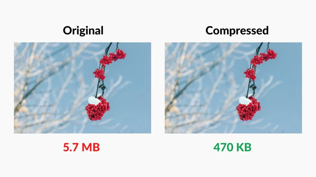
1. Unoptimised Images (The #1 Offender)
This is it. This is the big one. Almost every slow site I audit is choking on its own images.
- The Problem: Your designer gave you a 4000px-wide, 5MB JPEG for your homepage banner. You uploaded it directly. Your site now has to force every single user—even on a 360px wide phone—to download that massive file.
- The Fix:
- Resize: Never upload an image wider than it needs to be. If your content area is 1200px wide, resize the image to 1200px.
- Compress: Run every image through a compressor like TinyPNG or ImageOptim. This strips out useless data and can reduce file size by 70%+ with no visible quality loss.
- Use Modern Formats: Use WebP. It’s a modern image format that offers much smaller file sizes than JPEG or PNG at the same quality.
- Lazy Load: “Lazy loading” tells the browser not to load images that are “below the fold” (off-screen) until the user actually scrolls down to them.
2. Bloated Themes & Page Builders
- The Problem: You bought a “multipurpose” theme from ThemeForest. To look impressive, that theme packages 10 different slider styles, 50 elements, 20 portfolio layouts, and a built-in “mega menu.” You are using maybe 5% of that. But your site is forced to load the code for all of it on every single page.
- The Fix: Stop using bloated themes. A custom-built site or a site built on a lightweight, “block-based” framework will always be faster. It loads only what you need. If you must use a builder, choose a performance-focused one (like Elementor’s new “flex” engine, or Bricks/Oxygen) and be ruthless about deactivating features you don’t use.
3. Font Fetishism
- The Problem: Your brand guidelines call for three different custom fonts, each in four different weights (light, regular, bold, extra-bold). Each of those font files is a separate resource the browser has to download, and they can be 200-500 KB each. Worse, they cause that “flash of unstyled text” (FOUT) or, even worse, invisible text while they load.
- The Fix: Be a minimalist. Do you really need 12 font variants? Probably not. Stick to one or two custom fonts, and only load the weights you actually use. Better yet, consider using a “system font stack” (like the user’s default device font), which requires zero downloading.
4. Third-Party Script Bloat (Death by a Thousand Cuts)
This is the sneaky one. Your site might be fast on its own, but then you chain it to a dozen other slow services.
Every time you add a “simple script,” you are making an external request to another server.
Human Effort: The Third-Party Script “Cost” Audit
Here’s a list of common scripts and their typical performance cost.
| Script / Service | Purpose | Performance Cost (Typical) | My Observation |
| Google Analytics | Site traffic tracking | Low | Generally well-optimised. Essential for most. |
| Google Tag Manager | Container for other scripts | Medium-High | The tool itself is light, but it’s the gateway drug to adding 20 other slow scripts. |
| Facebook Pixel | Ad retargeting | Medium | Can be heavy. Delays interactivity. |
| Hotjar / Crazy Egg | Heatmapping / Session recording | High | Notorious for slowing down sites. Never leave this running 24/7. Use it for a one-week test, then turn it off. |
| Intercom / Drift (Chatbots) | Live chat | Very High | Often, the single heaviest script on a site. It loads a full application inside your page. |
| Cookie Banners | GDPR/Consent | Low-High | Depends on the provider. Some are light; some are shockingly bloated and load before anything else. |
| YouTube Embeds | Displaying video | High | A standard YouTube embed loads ~1.5MB of scripts before the user even clicks play. |
You don’t need to add all of these on day one. Be ruthless. Does the value of this tool outweigh the 5% conversion loss from the speed hit it causes?
Part 5: How to Diagnose Your Speed Problem (The 5-Minute Test)
Stop guessing. Stop using the “it feels fast to me” excuse. Use real data.
You don’t need to be a developer to do this.
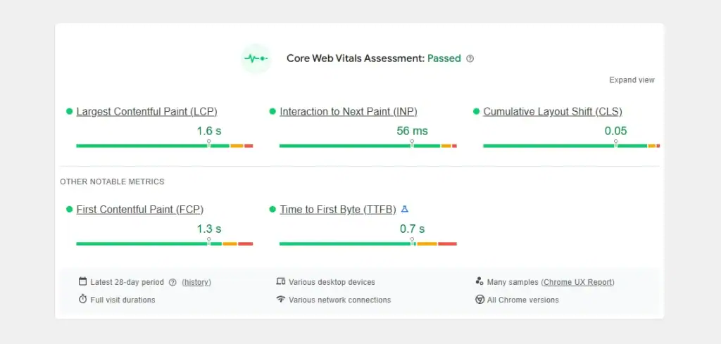
- Google PageSpeed Insights (PSI):
- What it is: This is Google’s own tool. It runs a “Lighthouse” audit and, most importantly, shows you your Core Web Vitals data.
- How to use it: Put in your URL. Look at the “Core Web Vitals Assessment” (this is real user data, if you have enough traffic). Then look at the “Performance” score and the diagnostics below. It will literally tell you “Eliminate render-blocking resources” or “Properly size images.”
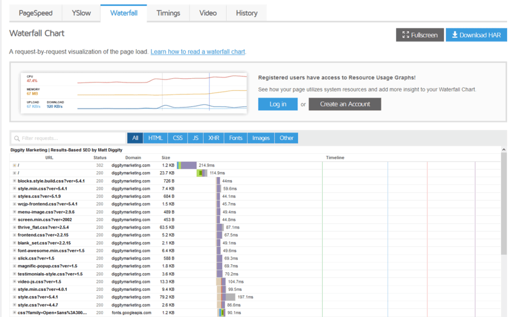
- GTmetrix:
- What it is: A more detailed tool that gives you a “waterfall” chart.
- How to use it: Run your site. The “Waterfall” tab is the goldmine. It shows you every single file your site loads, in order, and how long it took. You will quickly see that “linda-headshot-final-v2-REALLY-FINAL.jpg” is 2.8MB and took 6 seconds to load. That’s your problem.
- The Real Test (Your Phone, Off Wi-Fi):
- Turn off Wi-Fi on your mobile phone.
- Open a “private” or “incognito” browser tab (so nothing is cached).
- Now, try to use your website. Go to the homepage. Find a product. Add it to the cart. Go to checkout.
How did that feel? Was it painful? Was it frustrating?
That’s what your customers are experiencing.
If you run these tests and the results are a sea of red, or you just feel that “off-Wi-Fi” pain, it’s a huge sign. If this all looks like technical nonsense, you probably need a professional web design service to audit it properly. A good agency can pinpoint the problems in an hour.
Part 6: The “Performance-First” Design Philosophy
Here’s my final, most important piece of advice.
Stop “fixing” speed problems after launch. Build for speed from day one. This is called “performance-first” design.
It’s a mindset shift. Instead of asking “How can we make this pretty design fast?” you ask “How can we make a fast site that is also pretty?”
Here’s how you do it:
- Set a Performance Budget: Before you even start a new design, you agree on a “budget.” For example: “The homepage will not be larger than 1.5MB. It must get a ‘Good’ LCP score on a 4G connection. It will not load more than 2 custom fonts.” This gives your design and dev team creative constraints.
- Mobile-First Performance: You’ve heard of “mobile-first design.” This is its cousin. Assume every user is on a slow, patchy mobile connection. Build an experience for them first. The desktop user on fibre will have a blazing-fast experience as a side effect.
- Prioritise Ruthlessly: What must the user be able to do? Read the headline? See the “Buy Now” button? That’s what you load first. The chat widget, the footer animations, the high-res “brand” video? That can all wait. Defer it. Lazy load it.
- Demand It From Your Partners: When you hire a designer or agency, make speed one of your top 3 requirements. Ask them how they build for performance. Ask to see PageSpeed scores for other sites they’ve built.
A good design partner builds this in from the start. A bad one sends you a 10MB JPEG and calls it a day. If you’re stuck with the latter, it might be time for a new web design quote.
Speed Isn’t a Feature. It’s The Foundation.
Website speed isn’t a single line-item on a developer’s checklist.
It is the foundation upon which your entire digital strategy is built.
- It’s your SEO, determining if Google even bothers to show you to customers.
- It’s your User Experience, acting as your digital first impression and a proxy for trust.
- It’s your Conversion Rate, a direct lever on how much money your business makes.
You can have the most beautiful design in the world, but if it takes 8 seconds to load, you’ve failed. You’ve built a digital showroom with a locked door.
Stop thinking of speed as a “tech” cost. Start thinking of it as a “business” investment. Because the data is clear: the fastest sites win.
What To Do Next
If you just ran your site through PageSpeed Insights and felt a small sense of panic, that’s normal. The first step is admitting you have a problem.
The second is getting professional help.
If your site feels more like that “sticky door” example than a welcoming, high-performance machine, it’s probably time to stop guessing. We build websites for a living—websites that are designed to be beautiful, to represent your brand, and, crucially, to be fast.
- Explore our web design services to see how we build for performance from day one.
- Read more of our insights on the Inkbot Design blog.
- Or, if you’re ready to just get it fixed, request a no-obligation quote from us at Inkbot Design today.
Frequently Asked Questions (FAQs)
What is a “good” website speed in 2026?
Aim for your Largest Contentful Paint (LCP) to be under 2.5 seconds. Honestly, for a strong competitive edge, you should be aiming for under 1.8 seconds. Anything over 4 seconds is considered “poor” and is actively costing you money.
How do images really affect website speed?
They are the #1 culprit. A single unoptimised image (e.g., a 3MB PNG) can take 5-10 seconds to load on a 4G connection, all by itself. Multiplying that by 5-10 images on a page is why your site is slow. Optimising images is the fastest, easiest win.
What’s more important: a beautiful design or a fast website?
This is a false choice. A good design is a fast design. A “beautiful” design that is slow, frustrating, and unusable is, by definition, a bad design. Professional design solves for both aesthetics and performance.
What are Core Web Vitals (CWV) in simple terms?
LCP (Largest Contentful Paint): How fast your main content appears (e.g., the hero image).
INP (Interaction to Next Paint): How fast your page responds when clicked (e.g., “Add to Cart”).
CLS (Cumulative Layout Shift): How much your page “jumps around” while loading.
Will a faster website guarantee a #1 Google ranking?
No. Content, authority, and relevance are still king. But a slow site with bad Core Web Vitals puts you at a massive disadvantage. Think of it as a qualifier: you need good speed just to compete.
How much does website speed really affect conversions?
Dramatically. Data shows that for every extra second your site takes to load, conversion rates can drop by over 4.4%. A 2-second delay could cut your sales by nearly 10%.
Why is my site slow on mobile but fast on desktop?
Two reasons: 1) Mobile devices have less processing power than laptops. 2) Mobile networks (4G/5G) are often slower and less stable than your office Wi-Fi. Always test your site on a real phone, off Wi-Fi.
Can I fix my website speed myself?
You can do the basics. Compressing your images (use TinyPNG) and deleting unused plugins are great first steps. However, fixing deeper issues (like render-blocking resources or code bloat) almost always requires a professional developer.
How do third-party scripts (like Facebook Pixel) slow down my site?
Every script you add (analytics, pixels, chatbots, heatmaps) is another “request” your site has to make to an external server. Each one adds to the load time. A site with 15 scripts is like a person trying to have 15 different conversations at once—it’s slow and inefficient.
What is “lazy loading”?
It’s a smart technique where the browser only loads images or videos when they are about to scroll into view. This makes the initial page load much faster, as it doesn’t waste time downloading images the user can’t even see yet.
