15 Web Design and Development Tips: Crafting Digital Masterpieces
The web isn't just a canvas. It’s a revolution waiting.
Every pixel you place and line of code you write is not design; it's a manifesto. Your website isn’t a page; it’s a movement.
In this world filled with digital noise, the average is invisible. Mediocrity is the enemy. But that’s not you. You’re here to make art that moves, functions that transform, and experiences that resonate.
I have 15 web design and development tips that could change everything. Paradigm shifts, not tricks or loopholes. These aren’t for everyone — for the dreamers, makers, and digital revolutionaries who won’t settle for “good enough.”
This isn’t about making pretty websites. It’s about crafting digital experiences that matter. That provokes people to think. To feel something. To act.
Are you ready to challenge everything you thought you knew about web design? Push boundaries? Redefine what’s possible.
It’s up to you: Stick with what’s safe and known. Or throw in your lot with the vanguard of digital innovation?
What will it be?
- Crafting digital experiences is about creating art that resonates and challenges norms, not merely making pretty websites.
- Embrace responsive design to ensure your site looks great on all devices, enhancing user accessibility and experience.
- Prioritise user experience with intuitive navigation, readability, and accessibility to keep visitors engaged and satisfied.
- Optimise performance and load speed; an efficient site retains users and improves overall engagement.
- Continuous learning is vital; stay updated on industry trends and technologies to remain relevant and innovative.
- 1 - Embrace Responsive Design
- 2 - Prioritise User Experience (UX)
- 3 - Performance Optimisation: Speed Is King
- 4 - Mobile-First Design: Think Small, Then Grow
- 5 - Visual Hierarchy: Guide the Eye
- 6 - Typography: More Than Just Pretty Fonts
- 7 - Colour Theory: Paint Your Digital Canvas
- 8 - Grid Systems: Bringing Order to Chaos
- 9 - Interaction Design: Bring Your Site to Life
- 10 - Content Strategy: Words Matter
- 11 - SEO: Don't Get Lost in the Digital Crowd
- 12 - Testing: Measure Twice, Cut Once
- 13 - Security: Lock It Down
- 14 - Version Control: Your Digital Time Machine
- 15 - Continuous Learning: Stay Ahead of the Curve
- Conclusion: Your Web Design Journey Starts Now
- FAQs
1 – Embrace Responsive Design
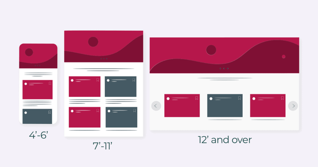
The time when websites were only visible on desktop computers is over.
At present, a single page should be displayed attractively on both a smartphone and a sizeable ultra-wide screen. This is enabled by responsive design.
1.1 Fluid Grids: The Foundation of Flexibility
Think about fluid grids as yoga masters in web design – they are flexible. Instead of fixed pixel widths, use percentages. Then, your layout will change comfortably to different screen sizes.
1.2 Media Queries: Your Design's Best Friend
Media queries work as personal stylists for your website. They help apply different styles according to the device's characteristics. For example, you should have a single-column layout for mobile but a multi-column one for desktop.
1.3 Flexible Images: Size Matters
Do not let images destroy your layout! Ensure that max-width does not exceed 100% so that no image becomes wider than its container. It can be imagined as if you tell pictures: “Never go beyond these borders”.
2 – Prioritise User Experience (UX)
UX or user experience is essential in web designing. If your site is not that easy to use, users will leave faster than the word “conversion rate.”
2.1 Make It Intuitive With Navigation: Don’t Make Me Think
Have you ever been frustrated by a website that made you feel lost, like you were stuck in a maze? Always keep your navigation simple and intuitive. Your users should be able to find what they are looking for without needing a map.
2.2 Make It Easy On Their Eyes With Readability
The font choice, size, and contrast can either make or break the readability of your site. Aim for at least 16px as the minimum font size and ensure there is enough contrast between text and background colour so that it doesn't strain their eyes too much. Thank me later!
2.3 Designing For Everyone: Accessibility
Inclusion matters more than ever, so don't treat it as another buzzword! Use proper heading structures, provide alternative texts for images, and ensure that people can navigate your site using only their keyboard. Remember – The Internet belongs to everybody!
3 – Performance Optimisation: Speed Is King
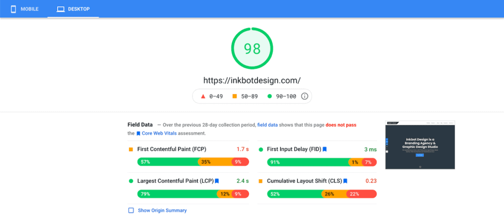
In this digital age, waiting is a luxury. If a website does not load within a few seconds, users will leave the site (and might never return).
3.1 Optimise Images: Make Them Light but Not Less Beautiful
Usually, images are the most considerable “weight” of a page. You can use programs like TinyPNG or ImageOptim to compress your images without losing quality. Consider it like reducing calories – they will still look good but won’t occupy much space!
3.2 Minify CSS and JavaScript: Do Not Ignore A Byte
You can decrease its size by deleting all unnecessary characters in your code. Think of packing things to travel – do you need everything?
3.3 Leverage Browser Caching: No Need to Reload the Same Wheel
Why should browsers download files again and again? Enable caching and store static files on the user’s device. This is similar to improving the memory of your website!
4 – Mobile-First Design: Think Small, Then Grow
Surpassing desktop mobile internet usage has made it essential to think about small screens first when designing.
4.1 Prioritise Content: What Matters?
On mobiles, screen space is limited. Stick to the basics and gradually reveal more information as screen size increases. Think of it as tidying up your digital space!
4.2 Touch-Friendly Elements: Fat Fingers Welcome
Ensure buttons and other interactive elements are big enough for even the most uncoordinated fingers. Aim for a minimum touch target size of 44×44 pixels. Your users will thank you for not making them play finger-twister on their phones!
4.3 Optimise for Portrait and Landscape: Flexibility is Key
Don’t forget that mobile users switch between portrait and landscape views. Ensure your layouts work well in both orientations. It’s like having a website that does yoga!
5 – Visual Hierarchy: Guide the Eye
Getting things pretty is not the only thing that good design does – it also leads users through content in a way that matters.
5.1 Use Size and Weight: Bigger Is (Sometimes) Better
Naturally, more attention is drawn to more prominent and bolder things. Use this to your advantage by highlighting important information or calls to action. But remember, if everything’s emphasised, nothing is!
5.2 Whitespace: Let Your Design Breathe
Do not fear space. Proper use of whitespace can make your design feel clean and uncluttered. It’s like giving your content room to stretch out and relax.
5.3 Colour and Contrast: Paint with Purpose
Colour should be used to group related elements and create visual interest among them; however, the contrast must never be overlooked, especially in text, because poor contrast acts the same as whispering amid a noisy area.
6 – Typography: More Than Just Pretty Fonts
Typography can either make or break your design. It’s not just about picking a pretty font – it’s about how you use them.
6.1 Less Is More: Limit Your Font Choices
Use at maximum 2-3 fonts. Too many fonts make your design look messy, like listening to multiple songs simultaneously.
6.2 The Goldilocks Zone: Line Length Matters
For best readability, aim for 50-75 characters per line. It gets choppy if it’s too short; if it’s too long, it becomes overwhelming. Find that sweet spot!
6.3 Create A Clear Roadmap With Type Hierarchy
Different sizes, weights, and styles should be used to establish a clear hierarchy in your text; think of this as creating a map for the reader’s eye to follow.
7 – Colour Theory: Paint Your Digital Canvas
Colour does more than just look nice – it is a powerful way to communicate and establish recognition.
7.1 Study Colour Psychology: Emotions in Pixels
Colours elicit emotions. While blue may be calming, red can be energising, and green has a natural feel. Be intentional with your palette; you set the mood for your digital space.
7.2 Make a Balanced Palette: Harmony in Hues
Create colour schemes that work well together using colour wheels or tools like Adobe Color so everything ties together within the design.
7.3 Colours for Accessibility: No One Should Be Left Out
Make sure all people understand what you’re saying through colours, even those who have trouble seeing them accurately because of visual impairments. WebAIM’s Contrast Checker, among others, can help with this. Keep in mind that inclusive design is always better design!
8 – Grid Systems: Bringing Order to Chaos
Grids are the silent workers of web design, giving order and regularity to your layouts.
8.1 Choose the Right Grid: Flexibility Meets Structure
Whatever number of columns you choose for your grid — be it 12 or any other odd number — make sure it fits well with your content. In other words, a good grid is like a supportive buddy who is always there for you but never steals your shine.
8.2 Responsive Grids: Adapt and Overcome
As flexible as you want your design to be, so should your grid system. Consider using CSS Grid or Flexbox to create responsive designs that adapt to different devices— it’s like giving them shape-shifting powers!
8.3 Break the Grid… Sometimes
Though meant to bring order, grids can be broken occasionally for more visual appeal. Think of it as adding a plot twist to your design story – doing something unexpected but exciting if done correctly.
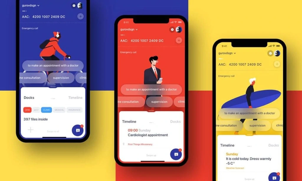
9 – Interaction Design: Bring Your Site to Life
Static websites are so old-fashioned. Nowadays, it's all about the interactive web.
9.1 Micro-interactions: The Devil’s In The Details
Small animations go a long way in improving user experience. For example, think of a button that changes colour slightly when you hover over it or a subtle loading animation; these little things are like spices in a meal – they make all the difference!
9.2 Feedback Is Crucial: Keep Users Informed
Let users know what’s happening as soon as they take action. Whether it’s registering a click on a button or submitting information through a form, it doesn’t matter – inform them! It’s like having a conversation: don’t ignore someone talking to you, do you?
9.3 Progressive Disclosure: Don't Overwhelm
Reveal information to users only when they need it. This approach keeps your interface clean and prevents cognitive overload. It’s akin to telling stories; nobody reveals the ending at the beginning!
10 – Content Strategy: Words Matter
Your creative design skills only go so far. There is no doubt that a beautiful website attracts viewers, but it is nothing more than an empty shell without engaging content.
10.1 Write for Scanners: Make It Skimmable
The majority of internet users do not read – they scan through. Use subheadings, bullet points and small paragraphs to make your work scannable. Think of it as creating highlights for your content.
10.2 Use Clear, Concise Language: Get to the Point
Your website is not a novel. Therefore, you should use clear and direct language when passing across information. Treat it as though you are conversing with a friend – would you use unnecessarily complex words?
10.3 Call-to-Action (CTA): Guide Your Users
Every page should serve its purpose while guiding users on what to do next with a call-to-action in place such as “Buy Now,” “Learn More,” or “Contact Us.” Just like being a tour guide for visitors around your site!
11 – SEO: Don't Get Lost in the Digital Crowd

Nobody will ever find even the prettiest website. That is why we have Search Engine Optimization (SEO).
11.1 Optimise Your Content: The Key is Keywords
Naturally, weave in relevant keywords throughout your content. But don’t overdo it – keyword stuffing went out of style years ago! Think of it like seasoning a dish – you want to enhance the flavour, not drown it.
11.2 Meta Descriptions: What’s Your Site About?
Write compelling meta descriptions for each page. These short blurbs appear in search results and can seriously impact click-through rates. Consider them your site’s pick-up lines – make them count!
11.3 Site Structure: Organise Your Filing Cabinet
Have a logical site structure with clear, descriptive URLs. This helps users AND search engines understand what your pages are about and their hierarchy on the site itself. It’s like cleaning up your digital files – everything should be in place.
12 – Testing: Measure Twice, Cut Once
No matter your experience, testing is essential. You don’t know how customers will interact with it until they do! Hence, this article suggests the three best ways to test your website.
12.1 Cross-Browser Testing: Be Nice
Firstly, you need to check your site using different browsers and devices. For instance, what works on Chrome may break on Safari. Therefore, think of it as learning to communicate with people who speak different languages.
12.2 User Testing: Genuine Feedback
Secondly, nothing can replace honest user feedback. So then, have some users test your website and observe how they interact. Trust me; you’ll be surprised! It’s like being invisible in a room – you get to see things from an angle that wasn’t expected.
12.3 A/B Testing: Data-Driven Design
Thirdly, If two designs seem equally appealing and cannot choose one over another – why not let numbers decide? Just compare performance indicators for each design against a selected metric during A/B tests, i.e., the best version may win!
13 – Security: Lock It Down

In this well-connected world, security is not an option but a must.
13.1 HTTPS: Encrypt Everything
Secure data transmission between your server and users’ browsers with HTTPS. It’s similar to sending information through a secret tunnel where nobody else can see it.
13.2 Input Validation: Trust No One
Always verify and sanitise user input to prevent SQL injection and other attacks. Think of it as having a doorkeeper at the entrance of your site who checks everyone’s ID before allowing them inside!
13.3 Regular Updates: Stay on Your Toes
Ensure that your CMS, plugins, and all dependencies are up-to-date as vulnerabilities get discovered and fixed frequently. Updating is like vaccinating your website, strengthening its resistance against current threats.
14 – Version Control: Your Digital Time Machine
Version control is not only for developers but also for designers.
14.1 Git: A Good Ally Of Your Design.
Use Git to keep track of the changes you make on a project. Think of it as your design’s time machine. That way, you can revert to any previous version whenever necessary.
14.2 Branching: Fearless Experimentation
You can create different branches to try out new ideas without affecting the main design. It’s like having several parallel universes for your project where you can test all sorts of possibilities without any risk involved!
14.3 Collaboration: Teamwork Makes The Dream Work
Collaboration becomes easier with version control; many team members can work on one thing simultaneously without getting in each other's way! It is just like having a dance floor in digital form where everyone can show off their moves without stepping over someone else!
15 – Continuous Learning: Stay Ahead of the Curve
The field of web design and development is rapidly changing. It’s necessary to keep learning if you wish to stay relevant.
15.1 Follow Industry Leaders: Stand on the Shoulders of Giants
Follow influential designers and developers on social media platforms. What they say could be worth its weight in gold. Think of it as getting a behind-the-scenes look into the minds of top industry professionals!
15.2 Experiment with New Technologies: Be a Pioneer
Don’t hesitate to try out different tools and technologies. A test conducted today might become an industry norm tomorrow. Consider yourself a digital pioneer – there are still many uncharted areas in web design!
15.3 Attend Conferences and Workshops: Network and Learn
Take part in events organised within your sector. They provide excellent opportunities for acquiring knowledge, making connections, and gaining motivation. Think of it like attending a family reunion for web developers – you’ll buzz away with energy and new ideas!
Conclusion: Your Web Design Journey Starts Now
These 15-pointers touch on everything from responsive web design to continuous learning; they’re the basis for any good-looking and practical website. But don’t forget – web design isn’t just about following rules. It’s an exercise in creative thinking, problem-solving, and never settling.
Most importantly, have fun with these tips. Web design is a fantastic balance between artistry and technical know-how, offering endless room for innovative thinking. Try things out, mess up a few times, and create something great while you learn.
It’s easy to forget that every fantastic website starts as one line of code or a quick sketch on paper. Who knows which project will take off next? Dive in and get lost in new designs – the digital world is your playground!
FAQs
Who is this Guide Aimed at?
The guide is meant for web enthusiasts of all levels, from beginners to veterans. Whether you’re a novice or want to hone your skills further, some valuable insights here will take your web design and development game up a notch.
How long will it take?
The time it takes to implement all 15 tips can vary depending on how skilled you are now and how complicated your projects tend to be. Some of these suggestions can be implemented immediately; others may require some practice or experimentation. For sustainable growth, try incorporating one or two at a time.
Do I need specific tools?
While specific software isn’t necessary, modern web development tools would help you follow along. Many tips can be found in free, open-source software (FOSS) and browser-based tools.
Must my website be responsive?
Yes! Responsive design principles are essential in many of these recommendations – so rest assured your creations will look beautiful and work great on any device!
Given these tips, how often should I revisit my website’s design?
Every 6-12 months, you should re-evaluate your digital presence. The fast pace at which things change online is now considered best practice, keeping an eye out for new trends/technologies as they emerge.
Can eCommerce sites benefit from adopting these suggestions?
Absolutely! – Especially where conversions & sales are concerned, user experience (UX) coupled with performance are significant considerations for such platforms.
Do I need coding skills to use all fifteen of these?
Some code is involved, but plenty revolves around design principles / best practices. HTML CSS JS knowledge would be helpful, though only required in some instances.
How do these address accessibility?
With inclusivity being a significant concern in web design, many touch on accessibility directly or indirectly, so they should help create sites that cater to everyone.
Can I share these with my colleagues/clients?
Yes! – feel free to spread the word. These would make great discussion points during team brainstorming sessions or even serve as an educational resource explaining why quality web development is essential to clients.
