Visual Merchandising That Works: 4 Core Principles
Every physical shop has a silent salesperson on the floor 24/7.
It greets every customer, guides their every move, and tells them what to think about your products.
It’s your visual merchandising. And it’s either your most profitable employee or actively driving customers out the door.
There is no in-between.
This isn’t a guide about interior design. We are not here to discuss finding pretty props or the latest colour trends from Pantone. This is about applied psychology.
It’s about strategically manipulating space and product to directly influence customer behaviour and, most importantly, drive sales.
Forget the fluff. Let’s talk about what actually works.
- Visual merchandising is crucial for influencing customer behaviour and maximising sales in retail environments.
- Avoid clutter and dead-end layouts; create clear paths that guide customers through your store.
- Implement the Rule of Three and Pyramid Principle to enhance product displays and visual appeal.
- Use colour and lighting strategically to create mood and highlight products effectively.
- Signage should reflect your brand voice, offering both information and engagement to customers.
What is Visual Merchandising, Really?
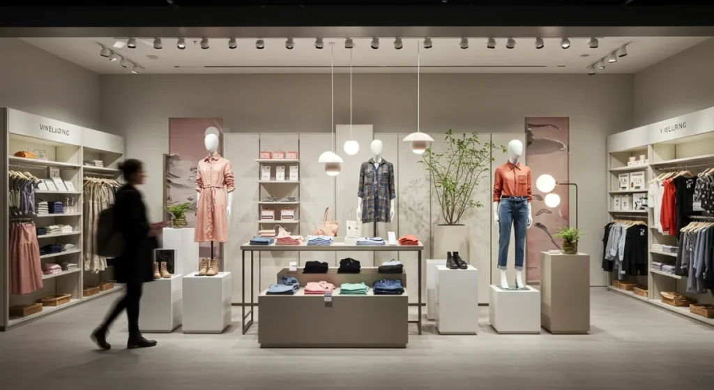
Visual merchandising is designing a retail space to be more than just a warehouse for your products.
It’s the art and science of presentation. It dictates the customer’s journey from the moment they see your storefront to the moment they complete a purchase.
It’s the difference between a customer browsing aimlessly and being led on a carefully crafted path of discovery.
This is the key distinction most business owners miss: decorating is about aesthetics; merchandising is about profit. A well-decorated shop might get compliments. A well-merchandised shop gets sales.
Why Most Small Businesses Get It Dangerously Wrong
The core problem is what I call “Decorating without Direction.” It’s the endless cycle of moving things around, adding a new plant, or printing a new sign because it feels productive. But without a strategy, it’s just shuffling deck chairs.
This approach leads to a few common, costly mistakes.
The Clutter Catastrophe vs. The Empty Shrine
On one end, you have the “more is more” approach. Every square inch of space is filled with product, creating a chaotic, overwhelming environment.
This visual noise makes it impossible for customers to focus, devalues every item, and screams “discount bin.”
On the other end is the “empty shrine.” A business owner sees an Apple Store and decides their £30 handmade candle deserves a whole table.
This doesn’t create perceived value; it looks like you’re about to leave business. This approach kills sales momentum unless you’re selling items with four-figure price tags.
The Invisible Entrance (Ignoring the Decompression Zone & Sightlines)
The first 3 to 5 metres inside your door is your shop’s most critical real estate. It’s the “Decompression Zone.” Customers are transitioning from the outside world; their eyes are adjusting, and their brains are making a snap judgment.
The rookie mistake is to bombard this area with displays, signs, or a sales counter. This is the equivalent of a salesperson shouting in a customer’s face the second they walk in.
You must keep this area relatively clear to allow customers to orient themselves and take in the view. What they see from this spot—their initial sightline—determines if they walk further in or turn around and leave.
The Dead-End Layout
A good store layout guides the customer effortlessly. A bad one creates friction. It has narrow aisles that are awkward for two people to pass through.
It has displays that lead to a dead-end, forcing an uncomfortable U-turn. It hides the checkout counter in a strange, illogical location.
Every bit of friction, every moment of confusion, is a reason for a customer to give up and walk out.
The Unbreakable Rules: Core Principles That Actually Work
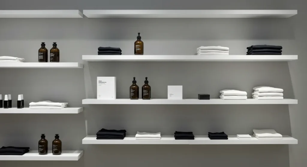
Effective merchandising isn’t magic. It’s based on a few timeless principles of human psychology and composition. Master these, and you’re ahead of 90% of your competition.
Balance & Composition: The Rule of Three and The Pyramid
The human brain is wired to find patterns. We can use this to our advantage. Instead of scattering products, group them strategically.
- The Rule of Three: Grouping items in threes is more visually appealing and memorable than other numbers. Display three related books, three different-sized candles, or three complementary clothing items. It just works.
- The Pyramid Principle: Arrange products in a triangular shape when creating a display on a flat surface. Place the tallest item in the centre and flank it with progressively shorter items. This simple technique creates a clear focal point and guides the eye naturally through the display.
Colour & Light: The Two Biggest Psychological Levers
Colour and light are your most powerful, non-verbal communication tools.
Use colour to create a mood. Warm colours like red and yellow can create a sense of urgency or excitement, while cool colours like blue and green are calming. Use a contrasting pop of colour to draw attention to a specific product you want to highlight.
Use light to create focus. The average ambient lighting in a store is not enough. You need spotlights to highlight your key displays.
A well-lit product has a higher perceived value than one in the shadows. For product displays, aim for lighting around 3000-4000 Kelvin; it’s a clean, white light that renders colours accurately.
Rhythm & Flow: Creating a Path to Purchase
Rhythm in visual merchandising is using repetition and patterns to guide the customer’s eye—and feet—through the store. It could be a repeating colour, shape, or product type.
This creates a sense of flow, a predictable journey that feels intuitive. It encourages movement, pulling customers deeper into the space from one display to the next. The path shouldn’t be a mystery; it should feel like a gentle suggestion.
Emphasis & The Focal Point: Telling Customers Where to Look
If everything is necessary, nothing is essential.
Every display, every wall, every section of your store needs a single focal point. This is the “hero” of the display, the first place you want the customer’s eye to land. It could be your most expensive item, a new arrival, or a bestseller.
Create emphasis using a spotlight, a bold colour, unique signage, or by placing it at the peak of a pyramid display. You must consciously decide what you want customers to see first.
Your Toolbox: The Key Elements of Visual Merchandising
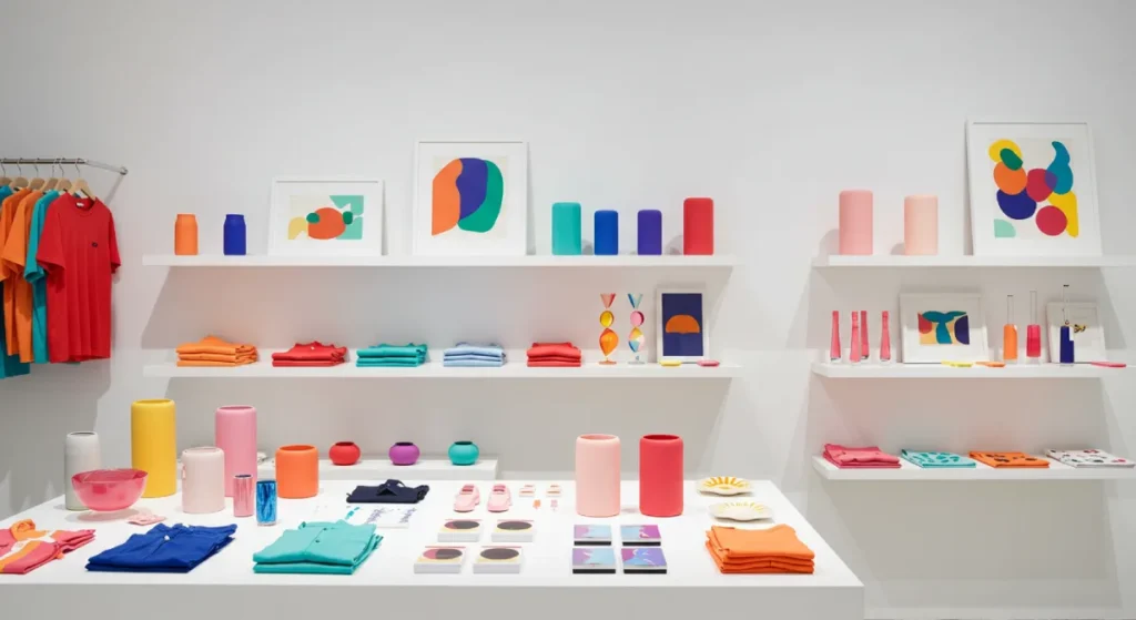
These are the physical tools you’ll use to execute the principles above.
Fixtures & Furniture: More Than Just Shelves
Your shelves, tables, racks, and counters are the stage for your products. A cheap, flimsy bookcase devalues the items on it. A solid, wooden table can make those same items feel more premium.
The height of these fixtures matters. The most valuable retail space is between 1.2 and 1.5 metres off the floor—the average customer’s eye-level and hand-level. This is where you place your most profitable, high-margin products.
Signage That Sells, Not Just Informs
Most retail signage is a missed opportunity. It’s bland, generic, and purely functional.
Your signage is your brand’s voice. It should sound like you. If your brand is playful, use a handwritten font and clever copy. If it’s sophisticated, use elegant typography and concise language.
Look at Trader Joe’s; their quirky, hand-drawn signs are instantly recognisable and build their brand identity at every turn. Good signage tells a story, answers questions, or makes customers smile.
Props & Mannequins: The Supporting Actors
A prop should have a purpose. It should help tell the story of the product. If you sell hiking boots, a few artfully placed rocks and faux moss can transport the customer to a trail.
If you sell cocktail glasses, displaying them on a bar cart with a shaker and a recipe book shows the customer the lifestyle, not just the product.
The prop should never overshadow the product. It’s there to provide context and create desire.
Putting It All Together: A Strategic Walkthrough of Your Space
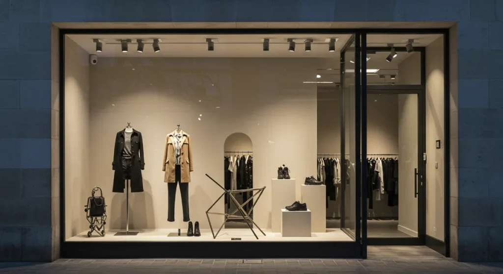
Let’s apply these principles to a typical retail environment.
The Window Display: Your 5-Second Audition
Your window display has one job: to stop a passerby and entice them to enter. It is not a place to showcase one of everything you sell.
Focus on a single, powerful story. A “Back to School” theme. A “Perfect Night In” setup. A display focused on a single colour. Keep it simple, bold, and well-lit. And change it often—at least once a month. A static window display tells the world that nothing new is happening inside.
The Decompression Zone: The First Three Metres Matter Most
As mentioned, this area just needs to be open inside the door. Resist the urge to clutter it.
This is where you can place a simple welcome mat, some subtle floor graphics, or a stunning “wow” display against the power wall—the first wall customers see when they look to their right (as most people naturally do).
The Store Layout: Designing the Customer Journey
The physical path through your store dictates the customer experience.
- Grid Layout: Think of a supermarket. It is efficient for stores with a lot of stock, but it can feel sterile.
- Loop Layout: A defined path that takes the customer past most of the merchandise. Think IKEA. Excellent for encouraging discovery.
- Free-Flow Layout: A more organic layout with no defined path. Creates a relaxed, browsing-friendly atmosphere that is familiar to boutiques.
Choose the layout that fits your brand and product type. The goal is to encourage movement and expose customers to as much product as possible without creating friction.
The Product Displays: Where the Magic Happens
This is where you execute the Rule of Three and the Pyramid Principle—group products in logical ways.
- By Colour: Create visually powerful blocks of colour.
- By Theme: A “beach day” table with towels, sunscreen, and a novel.
- By Type: Grouping all mugs.
Also, use cross-merchandising. Place the bottle opener next to the craft beer. Put the phone charging cables next to the portable power banks. Make it easy for customers to buy things they didn’t even know they needed.
When displaying a hero product, take a page from Apple’s book. Give it space to breathe. Light it perfectly. Let the product itself be the star.
Your Store is Your Brand’s Physical Form
Every decision you make—from the font on your price tags to the type of hangers you use—reflects your brand. An inconsistent or sloppy presentation suggests an inconsistent and messy business.
This is why visual merchandising can’t exist in a vacuum. A compelling retail space is the physical manifestation of a clear brand identity.
Without a solid foundation, you’re just arranging things in a room. Brands like Aesop are masters of this; every one of their stores is unique, yet every single one feels unmistakably like Aesop. That level of consistency builds immense trust and brand recognition.
A Final Word on Digital Visual Merchandising
These principles don’t die when you move online. They just change form.
Your website’s homepage is your window display. Your category pages are your store layout. Your product pages are your in-store displays. High-quality, well-lit product photography is your lighting. Clear, concise product descriptions are your signage.
The goal is to guide the customer on a frictionless journey from discovery to purchase using strategic visual cues.
Conclusion
Stop decorating. Start directing.
Your retail space is not a passive container for goods. It is an active tool for communication and persuasion. Every element should be chosen with intent. Every display should have a purpose.
Ask yourself what your shop says about your brand when you’re not there to speak for it? If you don’t know the answer, you’re letting a stranger control the most important conversation you can have with your customers.
Frequently Asked Questions (FAQs)
What is the most critical rule of visual merchandising?
The most important rule is to have a focal point. Every display and view must have one clear thing you want the customer to look at first. Without it, you just create visual noise.
How often should I change my store’s displays?
Major window displays should be changed monthly. Key in-store displays and focal points should be refreshed every 2-4 weeks to encourage repeat visits and create a sense of newness.
What is the “Rule of Three” in merchandising?
The Rule of Three is a composition guideline stating that items grouped in odd numbers, particularly three, are more visually appealing and effective than items grouped in even numbers.
What is a “decompression zone”?
The decompression zone is the first 3-5 metres inside the front door. It should be kept relatively open and transparent to allow customers to transition from the outside and get their bearings before engaging with merchandise.
What is the difference between visual merchandising and store layout?
Store layout is the blueprint of the store’s physical path and fixture placement (e.g., grid, loop). Visual merchandising is everything in that layout—the product displays, signage, lighting, and storytelling.
How can I do visual merchandising on a tight budget?
Focus on the principles, not expensive props. Use clean, uncluttered layouts, strategic lighting (even a single, cheap spotlight can work wonders), consistent and well-designed signage (which can be printed affordably), and the Rule of Three. Good merchandising is about strategy, not spending.
What is cross-merchandising?
Cross-merchandising is displaying complementary products from different categories to prompt additional purchases, such as placing wine glasses next to the wine selection.
Why is lighting so important in retail?
Lighting directs attention, creates mood, and affects the perceived value of products. A well-lit product appears more desirable and of higher quality than one in poor lighting.
Does visual merchandising apply to service-based businesses?
Yes. For firms like a salon or consultancy, your “merchandising” is the presentation of your waiting area, the organisation of your service menu, the professionalism of your staff’s appearance, and the overall cleanliness and branding of your space. It all sends a message.
What is a planogram?
A planogram is a diagram or model that indicates the placement of retail products on shelves and displays to maximise sales. It’s a detailed map for product placement, often used by larger retail chains to ensure consistency.
Your visual merchandising is an output. It’s the final, physical expression of your business. But its success depends entirely on the input.
A powerful, cohesive brand identity is that input. When you know exactly who you are, what you stand for, and who you’re for, every decision—from your logo to your store layout—becomes more transparent and effective.
If you’re ready to build a brand that makes every conversation with your customer count, let’s talk. Explore our brand identity services or request a quote to get the foundation right.
