
Brand Typography: The Technical Guide for SMBs
Typography is 95% of the web.
It is the vehicle for your message.
If your engine is broken, it does not matter how polished the paintwork is; the car isn’t going anywhere.
Bad typography increases cognitive load, reduces reading comprehension, and subtly tells your customer that you do not pay attention to details. If you can’t be bothered to fix your keming (bad kerning), why should they trust you with their credit card?
Consider the cautionary tale of Gap. In 2010, the retail giant decided to rebrand. They ditched their iconic serif font for the Helvetica font, so ubiquitous that it borders on invisibility.
The backlash was immediate, visceral, and expensive. The public outcry forced them to revert to the old logo within six days. That is the power of typography in branding. It is not decoration; it is identity.
In this guide, we are not going to talk about “feelings.” We will discuss the mechanics, economics, and technical architecture of brand typography.
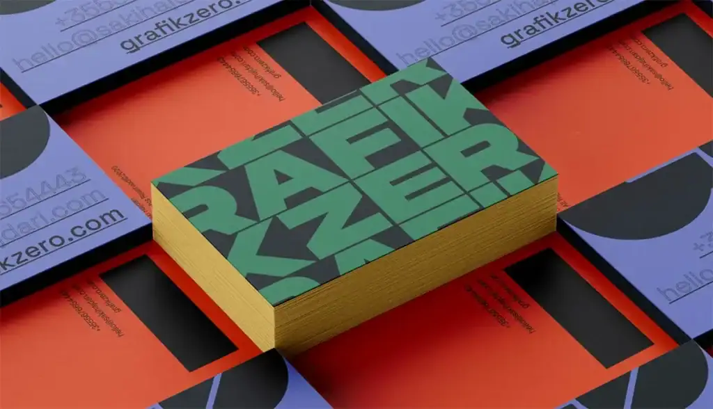
- Typography is brand identity: choose typefaces that convey semiotic meaning—serif for authority, sans for clarity, slab for boldness.
- Technical checks matter: ensure x‑height, glyph set, optical sizes, and licences suit mobile, localisation and legal requirements.
- Performance & accessibility: self‑host/variable fonts, match fallback metrics to avoid CLS, and meet contrast/line‑height WCAG standards.
What is Brand Typography?
Brand typography is the visual system of typefaces chosen to express a brand’s tone of voice, ensure legibility across mediums, and create a consistent visual hierarchy. It is a set of rules that dictates how your company speaks when it is not making a sound.
The Three Pillars of Brand Typography:
- Typeface vs. Font: A typeface is the design family (e.g., Helvetica). A font is the specific file or mechanism that delivers it (e.g., Helvetica Bold 12pt). You choose a typeface; you use a font.
- Legibility & Readability: Legibility is how distinguishable individual characters are (can you tell an ‘I’ from an ‘l’?). Readability is how easy it is to scan a block of text (is the line height sufficient?).
- Hierarchy: The strategic arrangement of text to guide the user’s eye from the most important information to the least.
The Psychology of Type: Semiotics Over “Vibes”
New designers will tell you to pick a font that matches your “vibe.” That is useless advice. You need to understand semiotics—the study of signs and symbols and their interpretation.
We associate certain letterforms with specific industries and emotions because of historical conditioning. This is not magic; it is pattern recognition.
1. Serif: The Authority Figure
Serif typefaces have small feet (serifs) at the ends of strokes. They date back to Roman stone carving. Due to this lineage, they convey tradition, reliability, and authority.
- Use Case: Law firms, luxury fashion (Vogue), and financial institutions.
- The Trap: Using a high-contrast serif (thick thicks and thin thins) on a low-resolution screen. The thin lines disappear, breaking the letterforms. This is a “dazzle” effect that kills readability.
2. Sans-Serif: The Modern Utilitarian
“Sans” means “without.” These fonts lack the decorative feet. They emerged prominently in the 20th century (Bauhaus, Swiss Style) and signal modernity, efficiency, and approachability.
- Use Case: Tech startups (e.g., Google, Spotify), transportation systems, and user interfaces.
- The Trap: Genericism. Using Arial or Helvetica makes you look like everyone else. It is the “default” setting of the internet.
3. Slab Serif: The Loudspeaker
Blocky, thick serifs. These were born in the Industrial Revolution for advertising posters. They shout.
- Use Case: Automotive and industrial brands, confident headlines (e.g., Sony).
- The Trap: Overuse. Slab serifs are heavy. Used in body copy, they create a dark, dense texture that is exhausting to read.
4. Monospace: The Code Breaker
Every character occupies the same width. Originally for typewriters, now the language of code and raw data.
- Use Case: Developer tools, “brutalist” design trends, transparency reports.
Consultant’s Note: Avoid “Script” fonts for anything other than a wedding invitation or a very specific artisanal soap brand. They are a nightmare for accessibility and rarely scale down well on mobile devices.
Summary: The Semiotics Cheat Sheet
If you are skimming, here is the shorthand for what your typeface signals to the subconscious brain:
| Category | Psychological Signal | Best For… | Avoid If… |
| Serif | Tradition, Trust, Authority, Academia. | Law, Finance, Editorial, Luxury. | You are a disruptive tech app. |
| Sans-Serif | Clarity, Modernity, Efficiency, Honesty. | Tech, Startups, UI/UX, Transport. | You want to sell “Heritage” or “Craft.” |
| Slab Serif | Confidence, Solidity, Loudness, Grit. | Automotive, Industrial, Food, Headlines. | You are a delicate beauty brand. |
| Script | Elegance, Creativity, Personal Touch. | Weddings, Boutique goods. | You need to display data or legal text. |
| Monospace | Transparency, Data, Rawness, Code. | Developer tools, Financial reports. | You want to look warm or inviting. |
The Technical Architecture: Mechanics of a System
Once you have selected a genre, you must audit the typeface for technical competency. A pretty face is useless if it cannot do the work.

1. The X-Height Factor
The x-height is the height of the lowercase ‘x’ relative to the capital letters.
- High X-Height: The lowercase letters are tall (e.g., Inter, Helvetica). This creates an open, readable shape at small sizes. This is crucial for UI design and mobile screens.
- Low X-Height: The lowercase letters are short (e.g., Futura). This looks elegant and “fashionable” but becomes illegible at small sizes because the internal counters (the holes in ‘e’, ‘a’, ‘o’) close up.
Action: If your brand has a strong mobile presence, consider mandating a typeface with a generous x-height.
2. The Glyph Set & Localisation
You are a global business, even if you don’t realise it yet. Does your chosen typeface support Central European characters? What about Cyrillic or Greek?
- The Failure Mode: You expand to Poland. Your expensive brand font doesn’t have the ‘ł’ or ‘ę’. The computer substitutes a default font (like Times New Roman) for just those characters. This is called “tofu” or ransom-note typography. It looks amateurish.
3. Optical Sizing
Pro-tier typefaces come with “Optical Sizes.”
- Display: High contrast, tight spacing. Designed for headlines.
- Text: Lower contrast, open spacing, sturdier strokes. Designed for long reading.
- Micro: exaggerated traps and width. Designed for legal text and captions.
- The Mistake: Using a “Display” version for body text. The thin lines will vanish, and the letters will clash.
The Licensing Minefield: How to Get Sued
This is where SMBs get burned. You do not “own” a font; you license the right to use it. The EULA (End-User License Agreement) is a legally binding document.
The Tiered System
- Desktop License: Allows you to install the font on your computer and design images (logos, flyers). It does not allow you to embed the font on a website.
- Webfont License: Allows you to embed the font in your CSS via @font-face. Usually billed by pageviews (e.g., 250,000 views/month).
- App/ePub License: A separate license for embedding in iOS/Android apps.
- Broadcast/Server License: Required if you are using Netflix or generating dynamic PDFs (such as invoices) with the font.
The “Google Fonts” Myth:
Yes, Google Fonts are free (SIL Open Font License). However, because they are free, they are everywhere. Roboto is the new Arial. If you want a distinct brand voice, using the same font as millions of other websites is a strategic weakness. Furthermore, from a GDPR perspective in Europe, linking directly to Google’s servers can be a compliance issue (leaking IP addresses). The pro move is to self-host these fonts.
The Custom Typeface ROI:
Why do brands like Netflix, Airbnb, and Uber commission custom typefaces?
- Netflix Sans: Saved millions in licensing fees. When you stream globally, paying per impression or per device to a font foundry is astronomical.
- Performance: They removed unused glyphs, which reduced the file size and improved app performance.
- Brand Ownership: Competitors are prohibited from using the Netflix Sans font. It is a proprietary asset.
Web Performance & Core Web Vitals
Your typography choice directly impacts your SEO and User Experience.
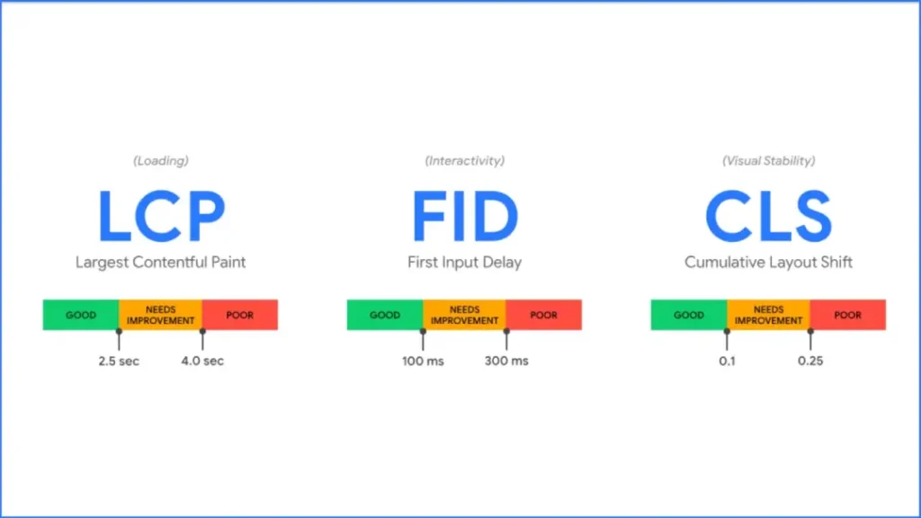
Cumulative Layout Shift (CLS)
When a browser loads a webpage, it might display a system font (like Arial) first, and then “swap” to your brand font once it downloads.
If the brand font is wider or narrower than Arial, the text may appear to jump. The paragraph shifts. The button moves. The user clicks the wrong thing.
Google penalises this via the CLS metric.
- The Fix: Use font-display: swap and ensure your fallback font metrics match your brand font metrics using CSS descriptors, such as size-adjust.
Variable Fonts
In 2026, if you are not using Variable Fonts, you are behind.
Traditionally, if you wanted Regular, Italic, Bold, and Bold Italic, you had to load four separate files (approximately 200 KB).
A Variable Font is a single file (approx 50kb) that contains every weight and width. You control it with CSS:
font-variation-settings: ‘wght’ 700, ‘wdth’ 85;
This reduces HTTP requests, speeds up the site, and gives designers infinite control over weight (e.g., using “Semi-Bold 630” instead of just “Bold 700”).
Accessibility: The Non-Negotiable

Designing for accessibility is not just altruism; it is the law in many jurisdictions (ADA in the US, EAA in the EU).
- Contrast Ratios: Text must have a contrast ratio of at least 4.5:1 against the background for WCAG AA compliance. Use tools like the WebAIM Contrast Checker to verify your brand colours.
- Line Length: A comfortable line length is 45–75 characters. Anything longer forces the eye to travel too far back to the start of the next line, causing fatigue.
- Line Height (Leading): For body text, aim for 1.5x the font size. If your font is 16px, your line height should be 24px. Tight leading makes the text appear as a solid block; loose leading allows the lines to float away from each other.
The Comparison: Free vs. Retail vs. Custom
| Feature | Free (Google Fonts/Libre) | Retail (Adobe/Monotype) | Custom (Bespoke) |
| Cost | £0 | £50 – £5000+ / year | £20,000 – £100,000+ (One off) |
| Exclusivity | None. Used by millions. | Moderate. Others can buy it. | 100%. Only you own it. |
| Quality | Mixed. Some lack kerning tables. | High. Professionally hinted. | Perfect. Tailored to your needs. |
| Licensing | Open Source (usually). | Complex. Pageview limits. | Unrestricted ownership. |
| Character Set | Often basic (Latin only). | Extensive. | tailored to your markets. |
The Consultant’s Reality Check
I once audited a mid-sized fintech firm—a client— who was baffled as to why their mobile conversion rates were plummeting. Their product was good. Their copy was sharp.
The culprit? Their typography.
They were using a trendy, ultra-thin slab serif that looked “sophisticated” on the CEO’s 27-inch Retina iMac.
On a budget Android phone in direct sunlight? It was invisible. The strokes dissolved. Users literally could not read the “Trust & Security” section.
We switched them to a robust sans-serif with a high x-height and slightly wider tracking. We didn’t change a word of the copy. Conversions increased by 14% over the course of two weeks.
Typography is an interaction cost. If the user has to squint, zoom, or guess, they are paying a tax to interact with you. Eventually, they stop paying and leave.
How to Pair Fonts (Without Looking Crazy)

Mixing fonts is like mixing drinks. Two is usually enough; three is a crowd; four is a disaster.
- The Concordance Method: Use one Superfamily. A font family that has both a Serif and a Sans version (e.g., Roboto and Roboto Slab). They are designed to work together. This is the safest bet for non-designers.
- The Contrast Method: Pair a distinctive Serif header with a neutral Sans-Serif body.
- Example: Playfair Display (Header) + Source Sans Pro (Body).
- Why it works: The personality is in the headline; the utility is in the body.
- The X-Height Rule: When mixing two fonts that are completely different, ensure they have a similar x-height. This creates a subtle visual harmony even if the shapes are different.
Avoid:
- Pairing two different Serifs (looks like a mistake).
- Pairing two similar Sans-Serifs (e.g., Arial and Helvetica). It looks like you forgot which one you were using.
The State of Brand Typography in 2026
The landscape has shifted. We are moving away from the “Blanding” era (where every tech logo looked like a geometric sans-serif) toward Expressive Typography.
- Kinetic Type: Typography is no longer static. On the web, it moves. Variable fonts allow type to react to the user’s mouse cursor, scroll position, or even ambient light sensors.
- Nostalgia Tech: We are seeing a resurgence of “soft serifs” (think Cooper Black style) and pixel fonts, driven by Gen Z’s affinity for the Y2K aesthetic.
- Globalisation First: Brands are no longer choosing a Latin font and “figuring out” Arabic or Chinese later. They are commissioning “Global Scripts,” where the Noto Sans logic applies, ensuring visual consistency across more than 100 languages.
The SMB Typography Toolkit: 5 Tools to Audit Your System
You don’t need a degree in design to check if your typography is broken. Use these free tools to audit your current site.
- WhatFont (Chrome Extension): Hover over any text on the web to see exactly what typeface, size, and line height they are using. Great for competitive analysis.
- WebAIM Contrast Checker: Enter your background colour hex code and your text colour hex code. It will give you a simple Pass/Fail grade for accessibility (AA/AAA).
- Google Fonts: The largest library of free, open-source fonts. Good for prototyping, but remember to self-host them for GDPR compliance.
- Font Squirrel: A great resource for finding high-quality “commercial-use free” fonts that aren’t as overused as the default Google options.
- Type Scale Calculator: A tool that helps you calculate the perfect ratio between your headings (H1, H2) and your body text (p) to ensure mathematical harmony.
The Verdict
Your brand typography is the clothes your words wear. You wouldn’t send your sales team to a pitch meeting in ill-fitting, dirty clothes. Do not send your content out into the world with poor typography.
- Audit your current fonts: Are they legible on mobile?
- Check your licenses: Are you using a desktop license for your website without authorisation?
- Prioritise performance: Switch to variable fonts to improve your Core Web Vitals.
If you are unsure where to start, or if your current branding feels disjointed and “off,” we can help you build a visual system that scales.
Next Step: Are you ready to professionalise your visual identity? Request a Quote for a comprehensive brand audit today.
Frequently Asked Questions
What is the difference between a typeface and a font?
A typeface is the design family (e.g., Helvetica). A font is the specific file or mechanism used to display it (e.g., Helvetica Bold.otf). Think of the typeface as the song and the font as the MP3 file.
Why shouldn’t I just use Helvetica or Arial?
While safe, they are generic. Using a system font means your brand looks like millions of other unbranded documents. It lacks distinctiveness and “ownability,” making it harder for customers to remember you.
Are Google Fonts safe to use for commercial brands?
Yes, they are typically released under the SIL Open Font License, which allows for commercial use. However, you should self-host them rather than linking to Google’s servers to avoid GDPR compliance issues in the EU.
What is a variable font?
A variable font is a single font file that acts like multiple fonts. It allows you to adjust weight, width, and slant on a sliding scale, reducing file size and improving web performance compared to loading multiple static files.
How many fonts should a brand have?
Two is the standard recommendation: one for headings (Display) and one for body text (Text). Occasionally, a third is used for accents or data, but more than three usually creates visual clutter and slows down your website.
What makes a font “accessible”?
Accessible fonts have distinct character shapes (e.g., ‘I’, ‘l’, and ‘1’ have distinct forms), open counters, and adequate spacing. They must also be used with sufficient colour contrast (4.5:1 ratio) against the background.
Can I use a font I bought for my logo on my website?
Not automatically. You likely bought a “Desktop License” for the logo. To use it as live text on a website, you typically need to purchase a separate “Webfont License,” which is often billed based on the number of page views.
What is ‘Kerning’ and why does it matter?
Kerning is the spacing between two specific characters. Bad kerning can change the meaning of words (e.g., “click” looking like “dick”) or make the brand look amateurish and neglected.
Why do companies like Netflix create custom fonts?
To save money and improve performance. Licensing a popular font like Gotham for global use costs millions annually. Creating a custom font is a one-time cost that allows for unlimited use and technical optimisation.
How do I choose a font for a mobile-first brand?
Prioritise a large x-height (tall lowercase letters) and open apertures. Avoid high-contrast serifs or intricate scripts, as thin lines often disappear or blur on smaller, lower-quality screens.
What is the F-Pattern in reading?
Research by the Nielsen Norman Group shows that users scan web content in an ‘F’ shape—two horizontal stripes followed by a vertical stripe. Your typography hierarchy (H1, H2, bullet points) must align with this behaviour to ensure key messages are read.
What is the penalty for using a font without a license?
Font foundries use software to crawl the web looking for unlicensed usage. If caught, you can face “cease and desist” orders and lawsuits demanding retrospective payment for all views, often totalling tens of thousands of pounds.
