Style Guide for Branding: Crafting Your Unique Identity
Your brand is not only a logo or tagline that catches on.
It tells us a story silently; it gives the first impression that remains in our minds and serves as the unspoken representative of who we are. A style guide for branding is more than just a book of rules – the genetic code composing your brand’s identity.
Sometimes, we think that being consistent means lacking creativity or, even worse, letting our brand go wild without guidance! But here’s the truth: natural creativity thrives within limits. A good style guide doesn’t restrict you; it sets you free to take risks confidently.
Attention has become the most valuable currency, so to open people’s minds and touch their hearts through branding, one must use styles effectively. This does not involve keeping up with trends but establishing them; it’s about differentiating yourself from others in ways only possible for you.
Will you design a style guide that merely describes your brand or one which magnifies its greatness? Let us find out how we can create an authentic identity that resonates with and mesmerises, forever changing those who come into contact with it.
- Define your Brand Archetype to unify voice, visual choices, and decision-making across every touchpoint.
- Build a living Design System with design tokens and a centralised hub for real-time, consistent implementation.
- Prioritise accessibility and neurodiversity — choose readable typography, reduce sensory load, and ensure predictable navigation.
- Make the guide usable and evolving — keep it simple, digital, collaborative, and regularly updated with governance and training.
The Psychology of Identity: Choosing Your Brand Archetype
Before you pick a font or a colour, you must identify the “soul” of your brand. Most iconic brands are built upon Brand Archetypes, a concept derived from Carl Jung’s psychological theories. These archetypes provide a universal shorthand that helps customers instantly “get” who you are.
| Archetype | Goal | Brand Example | Brand Voice |
| The Outlaw | Liberation / Revolution | Harley-Davidson | Bold, Disruptive, Raw |
| The Magician | Transformation | Disney | Visionary, Inspiring, Warm |
| The Sage | Knowledge / Truth | Intelligent, Objective, Clear | |
| The Explorer | Freedom / Discovery | Patagonia | Adventurous, Brave, Rugged |
| The Creator | Innovation / Mastery | Apple | Minimalist, Elegant, Precise |
Why This Matters for Consistency
When your team knows they are writing for “The Sage,” they won’t accidentally use the “The Jester’s” playful or sarcastic tone. The archetype acts as a focus for every decision, from the curve of a logo to the speed of a transition animation.
What Is A Style Guide for Branding?
Considered to be the bible for your brand, this document covers everything from how logos are used down to tone-of-voice guidelines – and anything else you could imagine in between.
Anyone who works on your brand should refer back to it frequently to ensure their content aligns with the identity you’ve established for yourself or your company.
Let us now discuss some tips about creating killer style guides that will make brands shine!
Why Bother with a Style Guide?
You may ask yourself, “Do I need a style guide?” And the answer is yes—definitely! Here’s why:
- Uniformity: A style guide ensures your brand looks and sounds the same everywhere.
- Saves Time: You won’t have to think about which typeface to employ or what colours are on-brand.
- Properness: A unified brand identity whispers, “We know what we’re doing!”
- Visibility: The more uniform your brand is, the more easily recognisable it becomes.
The Building Blocks of a Stellar Style Guide

The Core of Your Brand: Logo Design Love
Remember to consider how important your logo is. Think about it – this graphic represents everything you stand for. So, give it a little love in the style guide, too. Here’s what to include:
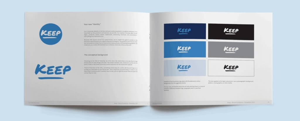
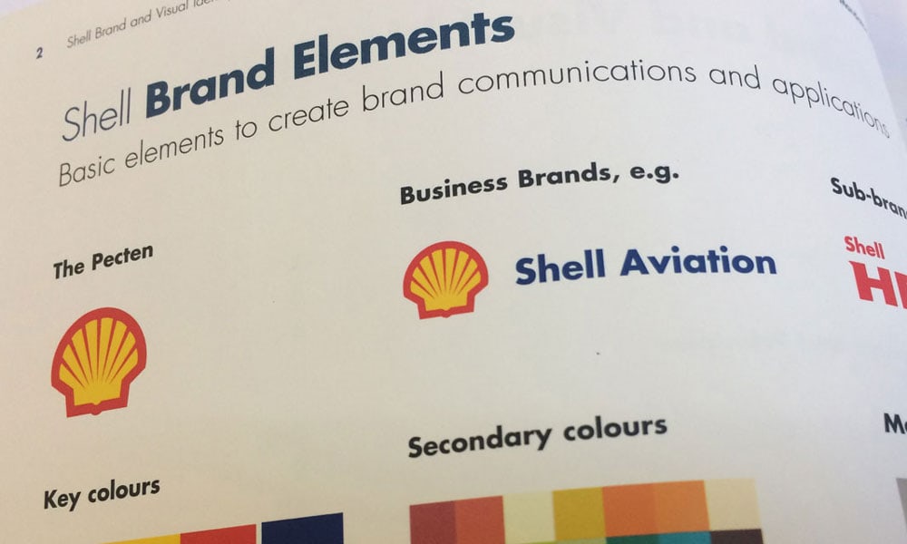
- Different logo versions (full colour, black and white, etc.)
- Minimum size requirements
- Clear space rules
- Do’s and don’ts of logo usage
Remember, someone could easily falsify your brand’s signature if they wanted to.
Your Brand’s Palette: Colour Me Impressed
Colours can say a lot more about your business than you think. Are you a calm blue or a passionate red? Let people know by spelling it out in your style guide:
- Primary and secondary colour palettes
- Colour codes (RGB, CMYK, HEX)
- Guidelines for using colours in different contexts
Pro tip: Show examples of how the colours work together – it’s like dressing up your brand!
Typography Guidelines: Font Fantastic
Typography might seem like small potatoes compared with other design elements. Still, it is crucial when establishing visual identity across touchpoints, such as website design through email campaigns and print collateral like brochures or flyers!
Make sure that these bases are covered throughout this part of the document:
- Primary and secondary typefaces
- Font sizes for various applications
- Hierarchy of text (headings, subheadings, body copy)
- Examples showing correct vs incorrect font usage.
Think about accents – will people listen differently depending on which words they hear?
Image Style: Picture Perfect
It has been said that “A picture is worth 1000 words,” so let yours tell the right story at all times by including these guidelines within its style section:
- Photography style guides;
- Illustration & icon styles;
- Image treatments (filters, overlays, etc);
- Do’s and don’ts for choosing images.
Your image style can be seen as an Instagram filter for your brand – choose wisely!
Speaking Your Brand’s Language: Tone of Voice
Looks aren’t everything, guys; personalities matter too! Give some character to your brand by defining its voice through these means:
- Defining key personality traits;
- Writing style guide;
- Vocabulary preferences;
- Examples showing on/off copy.
Like chat-up lines, make every word count!
Designing for the Spectrum: Neurodiversity in Branding
True Inclusivity in 2026 goes beyond WCAG 2.1 (Web Content Accessibility Guidelines). It involves designing for “Neurodivergent” users, including those with dyslexia, ADHD, and autism.
Visual Clarity and Sensory Load
- Avoid “Vibration”: High-contrast colour pairings (such as pure neon green on pure white) can cause visual discomfort for some users. Use “Off-Whites” or softer primary tones to reduce cognitive load.
- Dyslexia-Friendly Typography: While sleek sans-serifs like Helvetica are popular, they can be difficult for dyslexic readers because many letters look like mirror images (p, b, d, q). Consider including a “Readability Font” in your style guide for long-form content.
- Predictable Navigation: For users with ADHD, consistency in your User Interface (UI) isn’t just about aesthetics; it’s about reducing the effort required to navigate your digital space.
Beyond the PDF: The Rise of the Living Design System

A static PDF style guide is an artefact of the past. To maintain agility, leading organisations have transitioned to Design Systems.
Unlike a traditional guide, a design system is a “living” ecosystem of reusable components, governed by clear standards, that can be assembled to build any number of applications.
Design Tokens: The Genetic Code of Your Brand
The most significant shift in branding since 2024 is the adoption of Design Tokens. These are the “atomic” values of your brand—specific HEX codes, spacing units, and animation speeds—stored as data.
- Why they matter: When you update your primary brand colour in your central token library, it automatically updates across your Figma files, your website’s CSS, and your mobile app code simultaneously.
- Implementation: Instead of telling a developer to “use the dark blue,” you provide a token named
--color-primary-brand.
Centralised Brand Hubs
Rather than searching through old emails for the latest logo version, teams now use platforms like Frontify, Zeroheight, or Storybook.
These platforms serve as a single source of truth for designers, developers, and marketers to collaborate in real time. This ensures that the “brand gap”—the distance between what is designed and what is actually built—is closed entirely.
Beyond the Basics: Advanced Style Guide Techniques
Now that we’ve covered the essentials, let’s explore some advanced techniques to take your style guide from good to great.
1. Brand Story and Messaging
Your brand isn’t just a collection of visual elements; it’s a story. Include:
- Your brand’s origin story
- Key messaging pillars
- Elevator pitch
This helps everyone understand what your brand looks like and stands for.
2. Persona Development
Who are you talking to? Develop detailed buyer personas:
- Demographics
- Psychographics
- Pain points
- Communication preferences
This helps tailor your brand voice to your audience.
3. Brand Architecture
If you have multiple sub-brands or product lines, define how they relate to each other:
- Brand hierarchy
- Co-branding guidelines
- Product naming conventions
Think of it as your brand’s family tree.
4. Digital-Specific Guidelines
In today’s digital world, your style guide needs to address online-specific elements:
- Website UI components
- App design guidelines
- Social media profile styling
- Email signature templates
It’s like giving your brand a digital makeover!
5. Audio Branding
Remember sound! If your brand uses audio, include guidelines for:
- Brand music or jingles
- Voice-over styles
- Sound effects
Your brand should be music to your audience’s ears!
6. Motion and Animation Guidelines
Look, your brand doesn’t just sit there anymore. It moves. Think of motion as your brand’s body language; is it quick and energetic, or smooth and sophisticated?
You need to set some ground rules for it:
- Pacing and Timing: Decide how fast things happen. A little animation on a button should be quick, maybe 200 milliseconds. A bigger page transition can be a bit slower. Get these timings down so it feels consistent.
- Easing Style: This is about how the movement feels. Does it start slow and speed up? Or does it snap into place? This little detail says a lot about your brand’s personality.
- What to Animate: Tell your designers to stick to animating properties like ‘transform’ and ‘opacity’. It keeps things running smoothly as silk on any device and stops things from feeling laggy.
- Key Animations: Show examples for common things like loading spinners or how a menu opens. It gives everyone a clear idea of what ‘on-brand’ motion looks like.
It’s about making your digital presence feel alive, not like a flip book.
Brand Governance in the Age of Generative AI
As Artificial Intelligence becomes deeply embedded in creative workflows, your style guide must evolve to govern its use. Without clear AI guidelines, your brand risks losing its “human” soul to generic, algorithmically-generated content.
Defining Your AI Voice and Vision
It is no longer enough to define how humans write; you must define how your AI prompts are structured.
- Prompt Engineering Standards: Include a section in your guide that provides “Seed Prompts” for tools like ChatGPT or Claude. This ensures that every AI-generated caption or blog post retains your specific Brand Voice.
- Visual Authenticity: If your brand relies on Midjourney or DALL-E 3 for imagery, define the “Negative Prompts” to avoid. For example: “No hyper-realistic skin textures” or “Avoid high-gloss 3D aesthetics.”
- Ethical Disclosure: Decide your brand’s stance on transparency. Will you use “AI-Generated” labels? This is becoming a critical component of Brand Trust in 2026.
Guarding Your Intellectual Property
Ensure your style guide specifies that only “Clean Room” AI models—those trained on licensed data—should be used for final assets. This protects your brand from the legal complexities surrounding copyright in generative media.
Style Guide Best Practices
Most associations create style guides. Not many make them matter.
A style guide is not just a document; it’s a promise. A promise to your team, your customers, and your brand. Writing down some rules is easy, but creating a living, breathing guidebook that inspires and evolves is hard.
So, how do we close this gap?
Simplicity is Sophistication
Your style guide should be a lighthouse, not a wall. If it looks like a legal contract, you’ve already failed. Use language even a 10-year-old could understand. Why? Because clarity breeds confidence, and confidence breeds action.
Flexibility is Strength
Change is the only constant. Your style guide should bend without breaking. Leave room for interpretation and invention. A rigid guide becomes irrelevant faster than you can say “rebrand.”
Collaboration is Key
Your marketing team sees things your product designers don’t see. Your sales reps have insights your developers lack. Tap into this collective wisdom. A style guide built on diverse perspectives serves all.
Show, Don’t Just Tell
Abstract rules are forgettable. Real-world examples are unforgettable. Don’t just say, “Use bold colours.” Show how those bold colours turned a lacklustre ad into a showstopper. Make your guide a hall of fame.
Evolve or Evaporate
A static style guide is an artefact. Set the beat for updates. Monthly? Quarterly? Less about often and more about constantly updating it at all times, forever and ever, amen. An old-fashioned guide is worse than no guide – it’s pointing north when you’re heading south, trying to find Pluto.
Make it a Story, Not a Rulebook.
People remember stories, not statutes. Weave your brand’s narrative through every page (and make each chapter 18 parts long with five appendices). Why this font? How does this colour palette reflect our values as a society? Turn your style guide into a mystery novel.
Accessibility is Non-Negotiable
If your guide lives in a dusty binder or is buried eight folders deep on the company drive, it’s dead. Make it digital, searchable, and available to all living things. The best style guide is the one people actually use… or maybe start like this- If a style guide claps in the forest and no one hears it, is it still helpful?
Encourage Renegades (Within Reason)
Rules are made to be bent. Encourage your team to push the boundaries of your guidelines. The most iconic brands often emerge from controlled anarchy, not rigid uniformity.
Make it Human
Your brand has a personality. Let that shine through your style guide. Use humour, anecdotes, and even dad jokes (especially dad jokes). A guide that makes people laugh is a guide they’ll live by.
Measure Its Impact
How has your style guide impacted brand consistency? Cut down on design time? Has it increased customer recognition? Track these numbers. A guide showing what it’s worth will be respected for who it is.
Remember, a great style guide isn’t about restriction but liberation. It frees your team to be creative within boundaries and to speak with one voice while singing their notes.
So, will your style guide be just another corporate document? Or will it become the leading light of your brand?
As always, the choice is yours!
Implementing Your Style Guide

The only thing that matters is how the style guide is used. Here’s what you need to do so your guide gets implemented:
Train
Don’t just email a PDF and hope for the best. Run proper workshops and record quick video tutorials people can watch anytime. And for goodness’ sake, make it part of the onboarding for every new hire and freelancer.
Easy to Find
Thing is, if people can’t find it in ten seconds, they won’t use it. Stick it on a central, digital brand portal. Use a service like Frontify or Bynder, or even just a well-organised section on your company intranet. No more “Is this the latest version?”
Brand Representatives
You need some champions on the inside. Pick a person from each department to be the go-to expert. They’re not the brand police; they’re just there to offer friendly advice and help their team get it right.
Feedback Mechanism
This document isn’t a stone tablet from the heavens. Set up a simple way for people to give feedback. A dedicated Slack channel or a simple online form works a treat. It shows you’re listening and helps the guide get better over time.
Leading by Example
This one’s massive. If the gaffer’s presentations and company-wide emails look like a dog’s breakfast, why would anyone else bother? Leadership needs to use the right templates, email signatures, and tone. It all starts at the top.
Measuring the Impact of Your Style Guide
How do you know if your style guide is doing its job? Here are some metrics to track:
- Brand consistency across channels
- Time saved in design and approval processes
- Brand recognition in customer surveys
- Employee understanding of brand guidelines
Remember, a good style guide should make everyone’s job easier, not harder!
The Future of Branding: Trends to Watch
As you develop your style guide, keep an eye on these emerging trends:
- Dynamic logos that adapt to different contexts
- Increased focus on accessibility in design
- AI-powered brand management tools
- Sustainability-focused branding elements
- Hyper-personalisation in brand experiences
Your style guide should be flexible enough to incorporate these trends as they become relevant to your brand.
Sustainability as a Style: Avoiding the Greenwashing Trap
Modern consumers are highly sensitive to “Greenwashing”—the practice of making a brand seem more environmentally friendly than it is. Your style guide should govern how you communicate your Sustainability efforts.
- The “Eco” Visual Language: Avoid the cliché of simply using “Leaf Green” and “Kraft Paper” textures to signal sustainability. This is often viewed as a “deceptive” design pattern. Instead, use photography that shows real, unpolished behind-the-scenes environmental work.
- Digital Carbon Footprint: Believe it or not, your brand’s digital choices have an impact. Heavy, high-resolution videos and unoptimised images increase the energy required to load your site. A “Sustainable Style Guide” prioritises SVG graphics over heavy PNGs and recommends “System Fonts” to reduce server calls.
- Messaging Honesty: Set strict rules for using terms like “Eco-friendly” or “Carbon Neutral.” Require specific data points or certifications (like B-Corp status) to be displayed alongside these claims.
Conclusion: Your Brand, Your Rules
Writing a thorough style guide for your brand can be challenging, but it is worth the effort because this will build an understanding and effectiveness of the product.
Remember that a style guide should change and develop with the company; it is a live document. The goal is not to set limitations but to create consistency throughout every touchpoint where people interact with your brand.
To create a buzz around your business, get stuck into your brand’s DNA and start drafting what could become one of the most talked-about style guides in town. In branding, nothing beats consistency — except maybe a crown jewel like this.
FAQs
How do I choose a brand font that works for both print and mobile?
Look for “Variable Fonts.” These are modern font files that allow you to adjust weight, width, and slant dynamically. This ensures that the font remains highly legible on a small smartphone screen while looking sharp on a large-format billboard.
What is the ROI of a brand style guide?
Research consistently shows that brands with high consistency see revenue increases of up to 23%. This is because consistency builds Brand Equity and trust, reducing the “friction” customers feel during the purchasing journey.
Should I include “Motion Design” in my brand guide?
Absolutely. In 2026, brand movement is as important as the logo. Define how your menus slide, how buttons react to clicks, and the “easing” of your animations. This creates a cohesive “physicality” for your digital products.
Is it okay to use “System Fonts” (like Arial or Times New Roman)?
For body copy on websites, yes. System fonts load instantly and are highly accessible. Many modern brands use a “Distinctive Display Font” for headings to show personality, but stick to system fonts for the “heavy lifting” of reading.
How can I legally protect my brand guidelines?
While the guide itself is a set of rules, the assets within it (logos, slogans, custom fonts) should be protected via Trademarks and Copyright. Ensure your guide includes a “Legal Notice” section regarding the unauthorised use of these assets.
Can I use my competitor’s style guide as a template?
It is okay to consult other examples for inspiration; however, yours should be unique. You need to avoid copying from competitors to differentiate yourself.
How do I balance creativity with consistency in my style guide?
Be specific about what is allowed, but also leave room for flexibility. For example, under “creative use of brand elements”, you could encourage innovative thinking within the brand framework.
Should product packaging have its own section in my style guide?
Definitely! Packaging becomes a critical touchpoint for many brands when their business involves tangible goods.
How do I ensure everyone on my team can access the style guide?
You might want to consider having physical and digital copies available, so upload them onto your company’s intranet or shared drive, where people can easily find them.
Can my style guide change if my brand evolves?
Absolutely, it should! Your style guide needs to grow as your brand grows. Just communicate any changes clearly with the rest of your staff.

