Top 10 Square Logos: Iconic Design in a Box
Have you ever wondered why some logos are so memorable even though they’re just a simple square?
There’s a reason for that.
Square logos were designed to fit neatly into our digital world while still standing out among other brands.
They can be considered the Swiss army knives of branding – small enough to be versatile yet powerful enough to impact wherever they go.
This article will examine 10 square logos that have revolutionised the business industry.
We’ll also discuss how these little boxes became such potent symbols of brand identity and what drives them forward.
So fasten your seatbelt because we’re about to travel through tech giants and fashion icons; these tiny titans can teach us a lot from simplicity in design alone!
The Architecture of the Box: Grids and Geometry
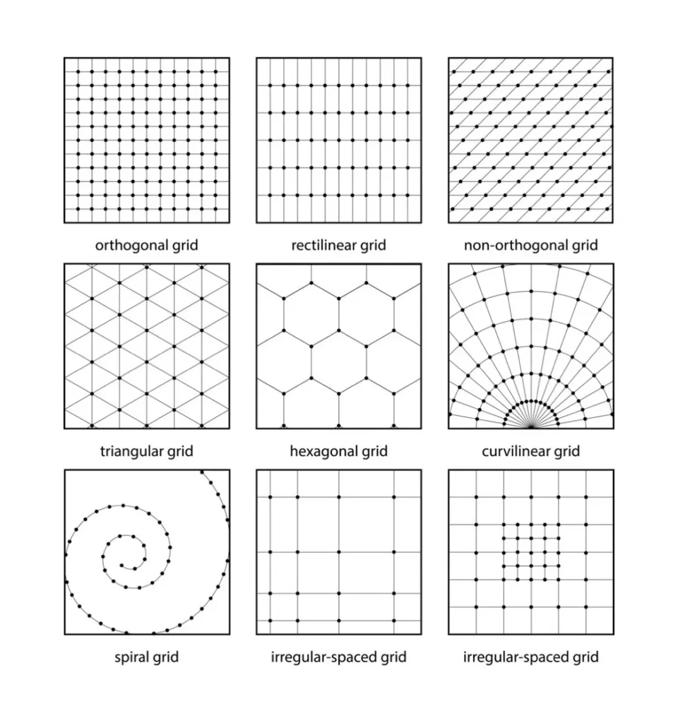
Designing within a square is not as simple as centring an image in a box.
In professional visual identity, the square represents a Euclidean challenge: how to create movement within a static, equal-sided shape.
To achieve this, master designers use Logo Grids. A grid provides the mathematical scaffolding that ensures a logo remains balanced, whether it is displayed on a 15-millimetre favicon or a 50-foot billboard.
One of the most critical frameworks used in iconic square logos—such as those by Apple or National Geographic—is the Golden Ratio (approximately 1.618).
By dividing the square into smaller sections based on this ratio, designers create a sense of “organic” perfection that the human eye finds inherently trustworthy.
Key Technical Considerations:
- Padding and Clear Space: A square logo requires a “safe zone”—usually calculated as 10-20% of the total width—to prevent the design from feeling claustrophobic within a container.
- Optical Alignment: Because of how human vision works, a perfectly centred object often appears slightly too low. Designers use optical centring to adjust the vertical axis, ensuring the mark feels anchored.
- The Power of 1:1: The 1:1 aspect ratio is the fundamental unit of the modern web. From Instagram tiles to LinkedIn company pages, the square is the only shape that requires zero cropping across every major social platform.
1. Microsoft: The Window to Tech’s Soul
Microsoft’s logo is widely regarded as the Mona Lisa of technology.
It is simple, mysterious, and easily identifiable. But how did this multi-coloured square become such an iconic emblem of the digital era?
The Evolution of an Icon
Microsoft did not achieve Squareness in a single step.
Do you remember the logo with a wavy flag? Yeah, let’s forget about that one. The current version dates back to 2012 and represents modernisation at its best:
- Four squares of different colours are located inside another square
- Each colour corresponds to a specific product: Windows (blue), Office (red), Xbox (green) and Bing (yellow)
- Being simple allows easy adaptability across devices
Why It Works
This design is like a machine where every detail has its role:
- It acknowledges the past (Windows) while reaching out towards future possibilities
- The bright colours catch attention but do not overwhelm or distract from other elements on a page
- It remains recognisable even if reduced considerably in size for use as a favicon or app icon
2. Instagram: Capturing Moments in a Square

The journey of Instagram’s logo is similar to that of a Polaroid – it started simple and grew more lively over time. But at its heart, it has always been about the square.
The Instagram logo has come into its own:
- It began as a detailed, old-school camera icon
- It became a simplified square with a rainbow gradient and white outline
- The current design still features a square shape, but with brighter colours that catch the eye more
The Square Frame
But what does this mean for the square?
- Reflects the app’s initial square photo format
- Gradient colours represent diversity in content found on the platform
- A simple camera icon in the centre encourages visual storytelling
This symbol shows us that sometimes you need to change while keeping true to your roots – only then will something become legendary.
3. American Express: The Blue Box of Luxury

The blue square emblem of American Express has always been considered the VIP room of the world of finance, meaning it is exclusive, recognisable and timeless.
It’s a testament to its timelessness:
- This logo was introduced in 1975 and has changed little since then.
- Bold sans-serif fonts fit neatly into a blue square.
- This design is easy to recognise even from afar because of its simplicity.
Why It Is Better Than The Rest
This is more than just aesthetics; it’s also about how you feel:
- Blue represents trustworthiness and professionalism
- Square conveys stability and security
- Minimalistic designs reflect brands’ no-nonsense attitude towards money matters
Sometimes, you must be different by being simple and consistent with your beliefs — that’s what the American Express logo shows.
4. Adobe: The Red Giant of Creativity

The logo of Adobe is like that friend who is always ahead of the curve – smooth, sophisticated and impossibly cool.
But how did this red square become the symbol for creative software worldwide?
From A to Awesome
The evolution of Adobe’s logo is a lesson in refinement:
- Started with a stylised ‘A’ in 1982
- Changed into the current red square with ‘Adobe’ written in neat white text
- Its simple design allows it to be used across all Adobe product lines.
Colouring Outside the Lines
Admittedly, not only is the Adobe logo catchy, but also significant.
- Red represents energy and passion for creativity
- The square shape stands for stability and reliability
- Clean font suggests precision and clarity.
Adobe’s logo shows that even in art, the most straightforward statement can sometimes be the most potent.
5. Dropbox: The Blue Box in the Cloud

The Dropbox logo is similar to a friendly marker post in the internet wilderness – simple, identifiable, and shows the direction to easier file sharing.
From Sketch to Success
The Dropbox logo has undergone many changes:
- It began as a detailed, skeuomorphic open box
- Progressed into a more straightforward design
- The current logo is five blue squares creating an abstract open box
Why It Floats Above the Rest
It is not only beautiful but also clever:
- Blue colour represents trust and dependability
- An open box shape implies availability and sharing
- Its simplicity enables recognition on different platforms
Sometimes, Dropbox’s emblem suggests you should use an intuitive design rather than a complex representation.
6. Facebook: The Social Square

Facebook’s logo is like that one friend you always recognise, no matter how much time has passed. It’s simple, it’s blue, and it’s everywhere.
The ‘F’ Evolution
Rather than revolutionise, Facebook’s logo journey has mainly been about refinement:
- It began with full “Facebook” text in a custom font
- Changed to lowercase “f” in a blue square
- Brighter blue with more rounded corners, while keeping the “f” for its present design
Why it Works
This logo is not only recognisable but also practical:
- Its blue colour stands for reliability and trustworthiness
- Lowercase “f” is friendly and approachable, too
- The square shape fits well as an app icon or profile picture on any platform where needed
Facebook’s logo shows that the most straightforward design is sometimes the most shareable.
7. BBC: The Blocks of British Broadcasting
Over the ocean, we find a logo that has appeared on British TV screens for years and years – the BBC’s three squares. It’s like having a best friend you’ve never met; it feels so familiar and comforting.
A Case Study in Staying Power
This is the same logo the BBC has used since 1997. So, it’s been around longer than some of its viewers have been alive! Yet, despite this fact, the logo does not appear dated due to its simplicity and strength. Think of it as similar to Her Majesty’s corgis – they remain an iconic British institution that never goes out of fashion.
Simplicity breeds strength
What makes this such an effective design? Well, it is all about being bold with no room for nonsense. According to the BBC, the three squares with letters within them serve as building blocks for conveying information, representing different aspects of education, information sharing and entertainment.
This clever use of black & white can be likened to someone saying, “We don’t need bright colours flashing in our faces to get noticed.” Our content speaks for itself.” In a multicoloured world filled with logos screaming for attention, this black-and-white beauty quietly commands it by keeping away
8. Chase Bank: The Abstract Square of Finance
Chase Bank’s logo looks like a modern art piece in the financial district — abstract, intriguing and surprisingly memorable.
Simple Banking
Here is how Chase’s logo has evolved into what it is today:
- Started with a simple text-based logo
- Changed to four blue triangles forming an abstract square
Why It Works
This logo isn’t just good-looking; there’s depth behind those shapes and colours:
- The colour blue represents trustworthiness and professionalism within the financial industry.
- Stability can be inferred from the abstract square shape.
- The four triangles could symbolise a chimney (home) or liquid assets (water).
In finance, the most reliable image sometimes leaves something to the imagination.
9. National Geographic: The Golden Square of Exploration
The window to the world best describes the National Geographic Society’s logo. Simple, bold, and promising.
From Text to Icon
Nat Geo’s emblematic transformation embodies one principle: simplicity redefined.
They started with a text-based logo that spelt out their full name
This evolved into their current design – a golden yellow square with a white border
Why It Captures the Imagination
This logo is more than just eye-catching; it’s symbolic, too:
- The yellow square could be seen as representing an open window or portal through which we can learn about other cultures and places around the globe
- Yellow also brings thoughts of sunshine, warmth, adventure, exploration…
- As well as being easily identifiable across all forms of media due to its simple design, which gives it high recognition value among viewers who may have never seen any previous versions, let alone recognised them instantly upon seeing this one!
- Sometimes, you don’t need fancy shapes or elaborate designs to convey such vast amounts of information contained within our planet Earth itself, but rather something plain like having different colours placed side by side according to specific rules so that they form images in people’s minds without them consciously knowing why or how they do this!
So what does National Geographic’s logo say about representing the world’s worth? Sometimes, it takes simplicity.
10. Flipboard: The Red Square of Digital Reading

Flipboard’s logo resembles a book that begs to be opened. It’s clean, strong, and practically forces you to flip through its pages.
From Idea to Icon
Flipboard’s logo has always been centred around the concept of ‘flip’:
It started with a folded page resembling a stylised ‘F.’
Then, it shifted into what we have now – an intense red square with a white ‘F’, which still keeps that folded appearance
Why It Works So Well
This symbol doesn’t just catch your eye; it also has depth:
- The colour red is attention-grabbing and suggests excitement or energy
- The letter F in the design smartly represents flipping through content while reading books or magazines on this app
- Square shapes are perfect for app icons – they’re simple but bold enough not to get lost in cluttered home screens
In this digital era, where everything can be accessed online — from news articles to novels — Flipboard proves that even something that may look nothing more than an attractive box at first glance can still be opened because who knows what wonders might lie inside?
11. The Lego Group: Building Blocks of a Brand
Right, let’s talk about a logo that is literally the product it represents. Lego.
It’s genius in its simplicity.
That bright red square is as recognisable as the bricks themselves.
The Building Blocks of an Icon
The logo we know and love today has been around since 1973, with a slight clean-up in 1998.
It’s barely changed because it doesn’t need to.
- A solid red square that grabs your attention instantly.
- The company name is in a friendly, rounded white font.
- It’s playful but also solid and dependable, just like their bricks.
Why It Clicks
Look, the magic here is how the design speaks directly to what they do.
- The square shape isn’t just a box; it symbolises a building block, the foundation of creativity.
- Red is the colour of energy, excitement, and passion. Perfect for a kid’s toy.
- It works everywhere, from a massive sign on a Legoland park to a tiny icon on a website.
Lego’s logo doesn’t just sell a product; it sells the idea of building something.
And it does it all from inside one perfect red square.
12. Gap: A Case Study in Brand Identity

The 2010 attempt by Gap Inc. to modernise its logo remains one of the most studied failures in the history of graphic design. For decades, the “Blue Box” logo—a navy square with elegant Spire font—had stood as a symbol of “Classic American” style. It was a masterpiece of Minimalist Branding.
In October 2010, without warning, the company replaced this icon with a white background, black Helvetica text, and a tiny, gradient-filled blue square hovering over the letter ‘p’. The backlash was instantaneous.
Why did it fail so spectacularly?
- Loss of the “Container”: By shrinking the square to a mere decorative element, the brand lost its sense of authority and “containment.” It looked like a generic startup rather than an established retail giant.
- The “Crowdsourcing” Era: One of the first major brand failures of the social media age. It proved that customers feel a sense of “ownership” over a brand’s visual identity.
- Poor Execution of the Gradient: In 2010, the trend was moving toward Flat Design. Gap’s use of a dated gradient inside a small square made the brand look like it was chasing old trends rather than setting new ones.
The takeaway for any business considering a square logo is clear: the box isn’t just a border; it is the Brand Anchor. If you remove the anchor, the brand drifts into irrelevance.
Subconscious Geometry: What the Square Signals to the Brain
In the field of Semicotics, shapes are never neutral. They carry “primordial” meanings that influence consumer behaviour before a single word of copy is read.
The square, with its four equal sides and 90-degree angles, is the visual representation of the earth, the four seasons, and the four cardinal directions.
When a brand like American Express or Chase Bank adopts a square, they are making a specific psychological promise:
- Stability and Grounding: Unlike circles (which imply movement and change) or triangles (which imply direction and risk), the square implies a foundation. This is why it is the “gold standard” for the Financial Services and Legal sectors.
- Efficiency and Logic: The square is a man-made shape; it rarely occurs in nature with such precision. This associates the brand with technology, engineering, and a human-led organisation.
- Containment and Security: A square acts as a “vault.” For companies like Dropbox, the square logo tells the user, “Your data is safely enclosed within our walls.”
| Attribute | Square Logo | Circular Logo |
|---|---|---|
| Perception | Authority, logic, security | Community, infinity, movement |
| Best For | B2B, finance, tech infrastructure | Consumer goods, non-profits, sports |
| Digital Fit | Perfect (app icons, favicons) | Moderate (requires padding in square containers) |
Designing for the Smallest Screen: Favicons and App Icons
In 2026, a logo must perform at 16×16 pixels just as well as it does on a retina display. Square logos have a distinct advantage here, but they require strict technical adherence to Display Standards.
The Favicon Strategy
A favicon (the small icon in your browser tab) is the ultimate test of a square logo. If your logo is too complex—like the original 1980s Microsoft wavy flag—it blurs into a mess at small scales. This is why Meta (Facebook) and Instagram use single letters or ultra-simplified glyphs.
App Icon Guidelines (iOS & Android)
- Corner Radius: While the design is “square,” modern operating systems (like Apple iOS) automatically apply a “mask” or corner radius. Designers must ensure that no critical part of the logo sits in the corners.
- The “Squircle”: Many modern brands now design in a “squircle”—a mathematical hybrid of a square and a circle—to appear softer and more modern while retaining the structural benefits of the square.
- Safe Zone (The 80% Rule): Keep your primary brand mark within the central 80% of the square to avoid being cut off by platform-specific masks.
Iconic Square Logos by Industry
| Brand | Primary Colour | Key Meaning | Best Practice Tip |
| Microsoft | Multi (Red/Blue/Green/Yellow) | Diversification & Ecosystem | Use colour to represent different product “pillars.” |
| American Express | Centurion Blue | Trust & Heritage | High-contrast white text on a dark box ensures legibility. |
| National Geographic | Global Yellow | Exploration & Discovery | Use the square as a “portal” or “frame” for content. |
| Adobe | Spectrum Red | Creativity & Power | Simplify the glyph so it is recognisable as a single letter. |
| BBC | Monochrome (Black/White) | Authority & Truth | Blocks can be used as building units for sub-brands. |
| Lego | Bright Red | Playfulness & Construction | Mimic the physical product shape in the logo geometry. |
Conclusion
From technology giants to financial powerhouses, these square logos show that thinking inside the box can sometimes result in out-of-the-box success. They’re not just good-looking but hardworking brand ambassadors who pack a lot of meaning into a small space.
The best square logos are like well-written haikus—they say so much with so little. Simple yet profound, ordinary yet captivating. In a world filled with visual noise, these little squares cut through by blending in seamlessly wherever they end up.
So, give it some love the next time you come across a square logo. Chances are you’re looking at a little marvel of design, psychology and branding all wrapped up in one tidy package. Who knew squares could be so cool?
FAQs
Are square logos better for mobile app icons?
Yes. Because app stores (Google Play and Apple App Store) use square or “squircle” containers, a square logo maximises the available “real estate,” making your app stand out more clearly on a user’s home screen compared to a horizontal logo.
Why do so many tech companies use blue square logos?
In colour psychology, blue represents intelligence, communication, and trust. When combined with the stability of a square, it creates a “safe” image for companies that handle sensitive user data, such as Facebook, LinkedIn, and Dropbox.
What is the ideal padding for a square logo?
Generally, you should maintain a “clear space” of at least 10% to 20% of the total width of the square. This ensures the logo doesn’t feel “cramped” and remains legible when placed next to other design elements.
Can a square logo feel too aggressive?
It can. The sharp 90-degree corners of a square can sometimes feel “rigid” or “cold.” To combat this, many modern brands use “rounded corners” to soften the look while maintaining the square’s professional structure.
Should I include my full company name inside the square?
Only if the name is short (3-5 letters). For longer names, it is better to use a “lettermark” (like the BBC) or a symbol inside the square, with the full name placed to the side or below the box in a responsive version.
How often should a square logo be updated?
There are no strict guidelines for this, though brands usually refresh their logos every 5-10 years. However, some iconic ones have remained unchanged for many decades.
Can you animate a square logo?
Yes! Brands increasingly create animated versions of their logos for digital platforms, bringing their branding to life.
Are there any industries where square logos are ubiquitous?
They are prevalent across many sectors, notably in technology, finance and social media enterprises.
How do I know if my brand needs a square logo?
Reflect upon your brand’s personality traits and industry requirements; also consider where this visual identity mark will be utilised – if stability/professionalism is met with digital friendliness, then yes, go ahead with squares!
Can simplicity harm my design idea here?
Too much simplicity can sometimes hurt when designing emblems, but try to find a balance between these qualities that still speaks volumes about who you are.

