The Microsoft Logo: A History of Rebrands, Risks, and Lessons
Most people recognise the four-colour square.
It’s clean, simple, and sits on billions of devices worldwide.
But that friendly little window is the fifth primary logo in Microsoft’s nearly 50-year history. And the journey to get there is much more interesting than the final result might suggest.
This isn’t just a history lesson for design nerds. It’s a pragmatic look at how a visual identity evolves with a business, from a two-person garage startup to a trillion-dollar global behemoth.
The story of the Microsoft logo is a masterclass in adaptation. It’s messy, opinionated, and packed with real-world lessons for any entrepreneur staring at their branding and wondering, “Is this still right for us?”
Here’s the core lesson, right up front: your first logo doesn’t have to be your last. In fact, it shouldn’t be. Brand evolution shows a healthy, growing business, not indecision.
Let’s break down each logo, why it existed, what it was trying to achieve, and what you, as a business owner, should steal from its playbook.
- Your first logo can be "good enough"—launch quickly; logos should evolve as the business grows.
- Brand context matters: designs must fit the era, audience, and product environment they live in.
- Rebrands should be strategic responses to business shifts, not cosmetic whims or trend-chasing.
- Distinctive logomarks build internal culture and external recognition; they galvanise teams and customers alike.
- Simplicity and consistency scale best—simple marks are versatile, recognisable, and support unified ecosystems.
1975-1979: The “Groovy” Logo of a Fledgling Partnership
The Context: Gates, Allen, and a World of Mainframes
In 1975, “Micro-Soft” was just two guys, Bill Gates and Paul Allen, writing a BASIC interpreter for the Altair 8800. The tech world was a binary landscape of massive, room-sized corporate mainframes and a small, passionate subculture of electronics hobbyists. There was no in-between.
The company’s name was a simple, functional portmanteau: Microcomputer + Software. Their business was built on a single, audacious bet: that computers would one day be on every desk and in every home. Their brand needed to get them in the door, nothing more.
The Design: A Psychedelic Vibe for the Disco Era
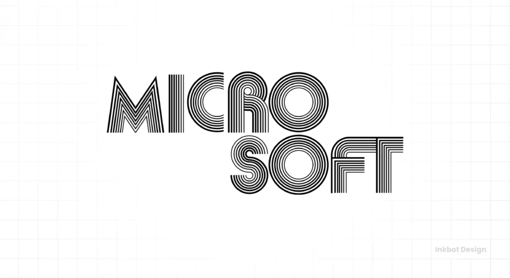
The first logo looks like it was pulled directly from an episode of The Brady Bunch. It has a funky, almost psychedelic vibe composed of concentric lines forming each letter. It’s pure 1970s.
This wasn’t the product of a high-priced branding agency. It was likely designed by Gates and Allen themselves using a programming language. It screams “startup” with every swirling line. The two-line “Micro-Soft” treatment literally represented the name’s origin. It’s a logo born of its time and was created by the people who founded the company.
The Real-World Takeaway: Don’t Be Afraid to Look Like a Startup
Here’s the first crucial lesson. Your first logo’s job is simply to get you started. It doesn’t need to win awards, and it certainly doesn’t need to be “timeless”—a concept I find utterly useless. A logo needs to be timely.
This logo was perfect for 1975. It captured the free-wheeling, experimental energy of the early personal computing scene. It was made with their tools and the day’s aesthetic.
For any entrepreneur, the takeaway is clear: A “good enough” logo that lets you launch your business is infinitely better than a “perfect” logo that you spend six months and thousands of dollars debating. Get started. You can, and should, change it later.
1980-1982: The “Heavy Metal” Rebrand for a Serious Business
The Context: The Dawn of the PC and MS-DOS
By 1980, things were changing fast. Microsoft had officially incorporated, moved to Washington, and was about to land the deal of a lifetime: providing the operating system for the IBM Personal Computer. The name was consolidated from “Micro-Soft” to “Microsoft.”
This was a significant pivot. Their audience was no longer just fellow hobbyists; it was IBM, the most serious, buttoned-up technology company on the planet. They needed to look less like a disco and more like a corporation.
The Design: Sharp, Aggressive, and Very ’80s
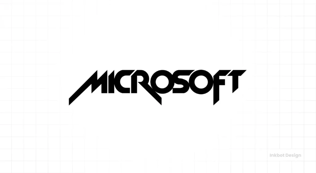
Out went the groovy lines, in came the jagged edges. Designed in-house, the 1980 logo was a dramatic shift. The new wordmark was rendered in a sharp, angular, all-caps font. It looked like a heavy metal band logo or a futuristic car company.
The distinctive, stylised M, R, and F give it a memorable rhythm. The whole thing feels aggressive, technological, and confident. It reflects the Gordon Gekko “greed is good” era of business—unapologetic and built to dominate.
The Real-World Takeaway: Your Logo Must Match Your Ambition
This rebrand was a statement of intent. It told the world, specifically partners like IBM, “We are a serious, powerful software company.” It was a visual declaration that the startup phase was over.
As their business model and target audience shifted, their branding had to follow suit. They didn’t cling to the old logo for sentimental reasons. They ruthlessly ditched it for one that served their new strategic goals.
The lesson here is critical: If you’re trying to move upmarket, land bigger clients, or pivot your business, your visual identity needs to make that journey with you. Don’t let your old branding keep you from who you’re trying to become.
1982-1987: The “Blibbet” – Giving the Brand a Soul
The Context: Becoming a Household Name
The “heavy metal” logo already felt dated in just two years. Microsoft was growing at an explosive rate. They were on their way to becoming a household name with products like MS-DOS. The company was maturing, and its identity needed to mature with it.
The trend in corporate branding at the time was moving towards unique, ownable symbols. Apple had its iconic Apple. IBM had its famous blue stripes. Microsoft wanted a mark of its own.
The Design: Hello, “Blibbet”
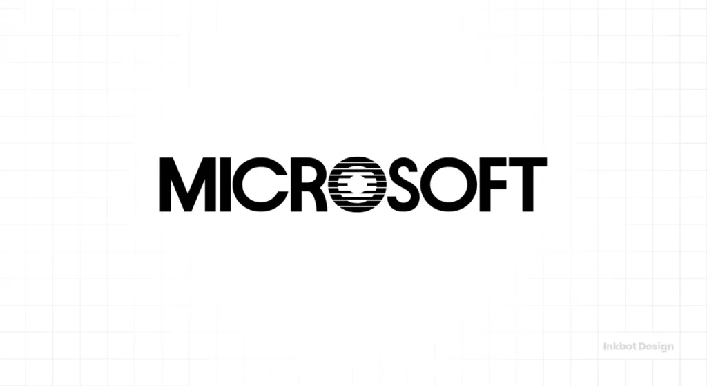
Enter the “Blibbet.” Scott Baker’s 1982 logo introduced a new, friendlier, sans-serif logotype. But the hero of this redesign was the stylised “O,” filled with horizontal lines that made it look like a CD or a stack of records.
Internally, it was affectionately nicknamed the “Blibbet.” It was distinctive, memorable, and gave the company a symbol they could use as a standalone graphic element. For the first time, Microsoft had more than just a name; it had a mark. It was often featured on company letterheads, packaging, and the famous green t-shirts employees wore.
The Real-World Takeaway: A Logomark Can Build an Internal Culture
The Blibbet wasn’t just an external marketing tool; it became a beloved piece of internal culture. It gave the rapidly growing team of “Microsofties” something to rally around. It was their symbol, a badge of honour from a company changing the world.
This demonstrates the power of a distinctive brand element. It can create an emotional connection that a simple wordmark can’t. It gives your team something to put on a t-shirt, a coffee mug, or a laptop sticker.
The lesson for small businesses is that your brand isn’t just for customers. A strong, unique visual identity, even just a simple logomark, can galvanise your team and build a sense of shared purpose. A great logo design is an investment in your company culture.
1987-2012: The “Pac-Man” Logo and 25 Years of Dominance
The Context: The Windows Era and Global Ubiquity
In 1985, Microsoft launched Windows 1.0. By 1987, the PC revolution was in full swing, with Microsoft at the epicentre. The company was going public and becoming a corporate titan. The friendly, slightly quirky “Blibbet” started to feel out of step with their newfound status as a dominant, aggressive market leader.
They needed a logo that conveyed strength, stability, authority, and forward momentum. They needed a logo for a global empire.
The Design: Simple, Italic, and Unmistakable
Scott Baker was once again tasked with the redesign. The result was the “Pac-Man” logo, which was nicknamed because of the triangular slash in the “o” that looked like the video game character.
The font is a heavyweight, no-nonsense Helvetica Black Italic. The italics imply speed and progress. The bold weight screams strength and confidence. There are no symbols, no frills, just the name. The clever ligature connecting the “o” and “s” was a subtle nod to the “software” part of the business, but it was secondary to the sheer power of the wordmark.
The Real-World Takeaway: When You’re the King, Look Like the King
This logo is pure, unadulterated confidence. It has zero ambiguity. It doesn’t need to explain what Microsoft does; it just needs recognition. And it worked.
This logo presided over Microsoft’s absolute dominance for an astonishing 25 years—an eternity in the tech world. This logo was a constant through the launch of Windows 95, the rise of the internet, and the dot-com bubble. It became one of the most recognised brand marks on the planet through sheer repetition and market power.
The lesson is powerful: once your business achieves a dominant or well-established position in your market, your branding can often be simplified to a confident statement. Its primary job shifts from explanation to pure recognition. Don’t over-design it.
2012-Present: The “Four Squares” and a Unified Ecosystem
The Context: A Multi-Product Company Facing a Crisis
By 2012, the world was different. The “Pac-Man” logo, once a symbol of dominance, now feels old. Microsoft was seen by many as a legacy company, a dinosaur. Apple, with its sleek minimalism, was the undisputed king of cool. Google owned the web.
Worse, Microsoft’s brand was a mess. They had a massive portfolio of hugely successful products—Windows, Office, Xbox, Bing—but they all had different logos, different design languages, and no visual connection. The brand was fragmented.
The company was betting its future on a radical strategic shift with the launch of Windows 8, which introduced the “Metro” design language—a clean, colourful, tile-based interface. The entire company was redesigned around this principle, and the master brand logo had to lead the charge.
The Design: A Symbol to Rule Them All
After 25 years, the italic wordmark was retired. Developed by an internal team, the new logo was the most significant change in the company’s history. For the first time, it featured a symbol alongside the company name.
The symbol is a grid of four squares, a direct and intentional reference to the Windows logo. But the colours were chosen to represent the diversity of Microsoft’s portfolio:
- Blue for Windows
- Red for Office
- Green for Xbox
- Yellow is for… well, the fourth colour is debated, but it can represent Surface or Bing.
The logotype was changed to the Segoe font, which is Microsoft’s proprietary typeface used across its products. It’s clean, geometric, and notably, not italicised. The message changed from aggressive forward motion to stable, accessible, and helpful.
The Real-World Takeaway: Your Logo Must Serve Your Business Strategy
This is the most important lesson of all. The 2012 logo didn’t appear because a designer thought squares looked nice. It was created to solve a critical business problem: a fragmented brand confusing customers and hurting the company’s image.
The four-square mark became the visual anchor for a massive, company-wide design system. It created a consistent thread to tie together software, hardware, and services. It only works because it perfectly reflects the product strategy it was designed to support.
The best rebrands are driven by business strategy, not fleeting design trends or a CEO’s personal taste. Your logo should be the most concentrated version of your business plan. It’s the tip of the spear. If you’re considering a rebrand, the first question isn’t “What should it look like?” The first question is “What business problem are we trying to solve?”
Getting this right is what separates a world-class brand from an amateur one. It’s the kind of strategic thinking that underpins any truly effective logo design service.
What Can Your Business Learn From Microsoft’s Logo Journey?

Looking back at nearly five decades of visual identity changes, a few clear, actionable principles emerge for any business owner.
Lesson 1: Your First Logo Is Not Your Final Logo
Microsoft has had five prominent logos. They weren’t afraid to kill their darlings when the business demanded it. Stop agonising over creating a “timeless” masterpiece from day one. It’s a myth. Focus on building a logo that works for your business right now. You have permission to change it later.
Lesson 2: Context is Everything
The “Groovy” logo would look absurd today, but it was perfect for 1975. The “Pac-Man” logo felt dated by 2012, but was the ideal symbol of corporate power in 1987. A logo doesn’t exist in a white gallery space. It exists on your website, in your app, on your packaging, and in your customers’ minds. Its success is entirely dependent on its context.
Lesson 3: A Rebrand Must Have a Reason
Microsoft never changed its logo out of boredom. A fundamental shift in business strategy triggered each redesign:
- 1980: From partnership to corporation.
- 1982: From utility to brand.
- 1987: From growing company to market dominator.
- 2012: From fragmented products to a unified ecosystem.
Ask yourself and your team before you call a designer: “Why are we doing this?” You don’t need a new logo if you don’t have a concrete business answer. You just need a new coffee mug.
Lesson 4: Simplicity Often Wins in the Long Run
Notice the overall trend across 47 years: from complex and decorative (1975) to brutally confident and straightforward (1987), and finally to a clean, symbolic, and incredibly versatile mark (2012). The simpler a logo is, the more places it can live. The current logo works as a tiny favicon on a browser tab and on the side of a 50-story building. That flexibility is a strategic advantage.
The Story Isn’t Over
The history of the Microsoft logo is a story of adaptation. It’s a pragmatic journey, not an artistic one. It shows a company willing to change its face to meet the demands of a changing world.
The four squares aren’t the end of the story. As Microsoft continues to evolve with AI, cloud computing, and technologies we can’t yet imagine, its visual identity will have to grow.
The real lesson isn’t in any logo but in the company’s willingness to change.
So, what stage is your business in? Does your logo reflect who you are today, or who you were five years ago? It might be time for a conversation if you’re wrestling with that question.
Frequently Asked Questions (FAQs)
How many logos does Microsoft have?
Microsoft has had five primary corporate logos since its founding in 1975. The logos were introduced in 1975, 1980, 1982, 1987, and 2012.
Who designed the current Microsoft logo?
The current Microsoft logo, introduced in 2012, was created by an internal team of designers at Microsoft as part of a company-wide brand unification effort.
What is the font used in the current Microsoft logo?
The current Microsoft logotype uses Segoe UI, Microsoft’s proprietary brand font, which is also used extensively in its software and marketing materials.
What do the four colours in the Microsoft logo mean?
The four colours in the logo symbol represent Microsoft’s diverse product portfolio. Generally, Blue is associated with Windows, Red with the Office suite, Green with Xbox, and Yellow is thought to represent Surface or Bing.
What was the “Blibbet” logo?
The “Blibbet” was the nickname for Microsoft’s 1982 logo. It featured a distinctive, stylised “O” with horizontal lines that became a beloved internal symbol for the company’s culture during the 1980s.
Why did Microsoft use an italic logo for 25 years?
The 1987 “Pac-Man” logo used Helvetica Black Italic to convey a sense of speed, progress, and forward momentum. It represented Microsoft’s aggressive and dominant position in the software industry during that era.
Was the first Microsoft logo designed by Bill Gates?
While not definitively confirmed, it is widely believed that founders Bill Gates and Paul Allen created the first “Groovy” logo in 1975, likely using a computer program to generate unique, concentric-line lettering.
What is the difference between a logotype and a logomark?
A logotype (or wordmark) is a logo based solely on the company’s name in a specific font (e.g., the 1987 Microsoft logo). A logomark (or symbol) is an image or icon that represents the brand (e.g., the four squares in the current logo). Microsoft’s current logo is a combination of both.
How often should a company change its logo?
There is no set schedule. A company should change its logo only when there is a significant strategic reason, such as a major shift in business model, a merger, a change in target audience, or the need to unify a fragmented brand identity. Change for the sake of change is rarely a good idea.
What makes the current Microsoft logo effective?
The current logo is effective because it’s simple, flexible, and directly tied to the company’s product strategy. The four-square symbol is instantly recognisable, works at any size, and serves as a visual anchor for its entire ecosystem of products and services.
Your brand’s visual identity isn’t static art; it’s a hard-working business tool. If your logo doesn’t reflect your current strategy and future ambitions, it’s not working hard enough.
Take a look at your own branding. Is it a true reflection of where your business is heading? It may be time to explore what a strategic logo design can do for you. Or, if you’re ready to start the conversation, you can request a quote from us today. Find more branding insights on the Inkbot Design blog.
