The Rolls-Royce Logo: Automotive Luxury & Heritage
If you are looking for a lesson in how to build a reputation that survives wars, recessions, and corporate buyouts, look no further than the nose of a Rolls-Royce.
Most startups I consult with change their visual identity more often than they change their office coffee filters. They chase trends. They panic when engagement drops. They pivot.
Rolls-Royce, conversely, is the master of staying put. They understand that in the luxury market, consistency isn’t just boring—it’s currency.
The Rolls-Royce logo—comprising the “Double R” monogram and the “Spirit of Ecstasy”—is arguably the most recognisable symbol of wealth in human history.
But for entrepreneurs and small business owners, it offers more than just automotive history; it provides a blueprint for high-value perception.
Let’s strip down the engine and look at the chassis of this brand. We are going to explore how a handshake in Manchester in 1904 led to the ultimate example of timeless branding, and what you can steal from their playbook for your own business.
- Rolls‑Royce pairs a rational Double R monogram with the emotive Spirit of Ecstasy, balancing engineering authority and romantic aspiration.
- Relentless consistency: the brand refines but preserves core identity for over a century, making longevity a form of luxury currency.
- 2020 Pentagram rebrand modernised digital use—Purple Spirit, Riviera Nights type, and simplified Spirit—without eroding heritage.
- Placement and materiality matter: the Parthenon‑inspired grille pedestal and premium finishes elevate the logo’s perceived value.
The Origins: When Charles Met Henry
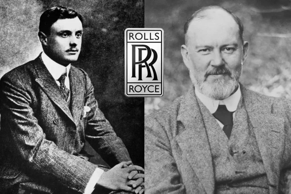
To understand the logo, you have to understand the tension at the heart of the brand. It’s a marriage of opposites.
- The Aristocrat: The Honourable Charles Rolls. Adventurous, wealthy, a skilled aviator and car salesman. He understood the market and the “flash.”
- The Engineer: Henry Royce. A miller’s son, an obsessive perfectionist, focused entirely on mechanics and reliability.
They met at the Midland Hotel in Manchester on May 4, 1904. The partnership was straightforward: Royce would build the cars, and Rolls would sell them.
The Birth of the Hyphen
The visual identity started with the name. It wasn’t “Rolls and Royce.” It was Rolls-Royce. The hyphen is significant. It represents the unbreakable bond between the two distinct personalities. In design terms, it balances the visual weight of the two names, creating a symmetrical block of text that feels stable and grounded.
Never underestimate the power of typography in a name. If they had gone with “Rolls & Royce,” the ampersand would have added a whimsical, flowing element. The hyphen is mechanical. It is structural. It fits the product.
The Double R Monogram: The Anchor of Identity
The badge on the radiator grille—the famous “Double R”—is a masterwork of Art Nouveau simplicity. It consists of two overlapping capital R’s.
Design Analysis
- Serif Typography: The font used is a sturdy, slab-like serif. It denotes authority, history, and traditionalism.
- Interlocking Shape: The two letters support each other, forming an interlocking shape. It’s a visual metaphor for the partnership.
- The Rectangle: The monogram is usually enclosed in a vertical rectangle. In psychology, vertical shapes suggest dominance, power, and superiority (think Greek columns or skyscrapers).
The Mystery of the Red to Black Shift
Here is a piece of design trivia that is often shared, but usually misinterpreted.
Originally, the Double R letters were red. In the early 1930s, they changed to black. The popular myth is that the colour was changed to black as a sign of mourning when Henry Royce died in 1933 (Charles Rolls had died much earlier in an aviation accident in 1910).
The Reality:
While a romantic story, the truth is purely aesthetic. Henry Royce decided—before he died—that red clashed with the colour of some of the bespoke paint jobs customers were ordering. If you bought a green car, the red badge looked garish. Black was neutral. It was chic. It went with everything.
The Lesson for Entrepreneurs:
Never let your ego or sentimentality get in the way of your product’s aesthetic. Royce changed his own logo to ensure the customer’s car looked better. That is humility in design.
The Spirit of Ecstasy: More Than a Hood Ornament
While the Double R is the corporate stamp, the “Spirit of Ecstasy” is the soul. This is the flying lady on the hood (bonnet). It serves as the emotive counterpart to the mechanical grid of the radiator.
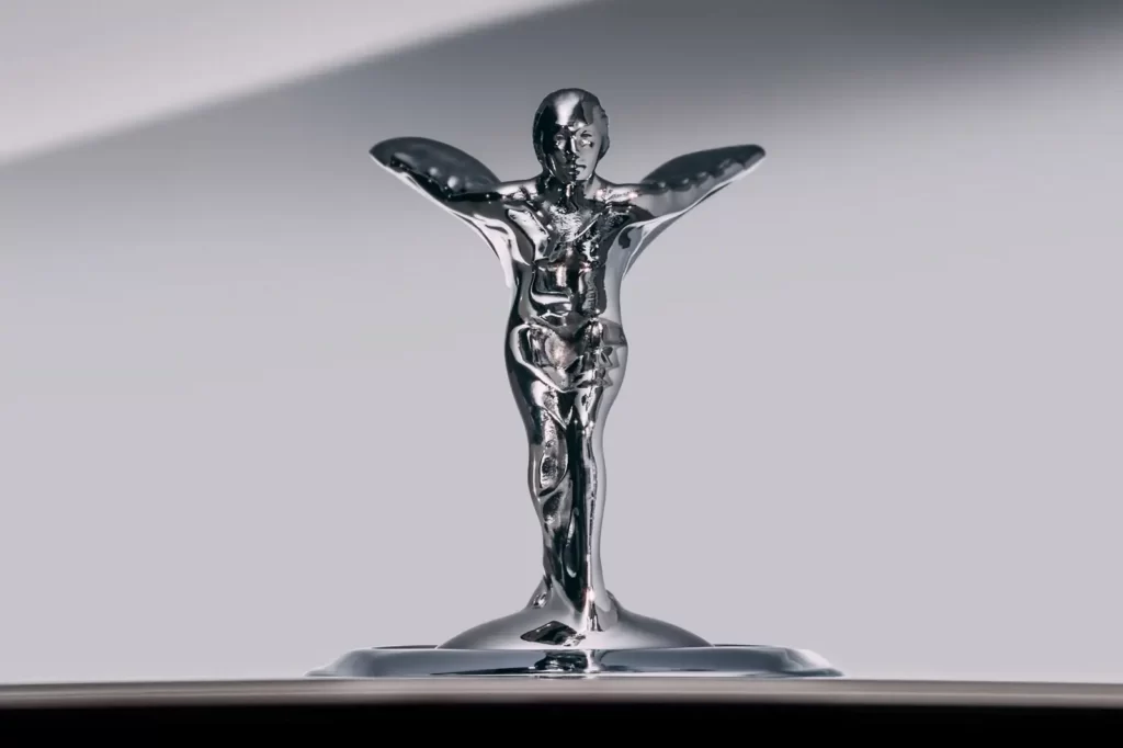
The Tragic Muse
The sculpture wasn’t originally a standard factory part. It began as a custom commission by John Montagu (a pioneer of the automobile movement) for his private Rolls-Royce.
The model for the statue was Eleanor Thornton, Montagu’s secretary and secret lover. Their relationship was hidden due to her lower social status. The sculptor, Charles Sykes, captured her with her finger to her lips—the “Whisper”—symbolising their secret love affair.
Later, Sykes modified the design into the version we know today: a woman leaning forward into the wind, arms outstretched, her dress billowing like wings. It represents speed, silence, and grace.
Why This Matters for Your Brand
Rolls-Royce effectively has two logos:
- The Rational (Double R): Appeals to the logical brain. Engineering, reliability, structure.
- The Emotional (Spirit of Ecstasy): Appeals to the heart. Romance, speed, freedom, beauty.
Takeaway: Strong brands often strike a balance between these two elements. You need a trust mark (your official logo), but do you have a visual element that captures the feeling of your brand?
The 2020 Pentagram Rebrand: Digital Luxury
Fast forward to 2020. Rolls-Royce is owned by BMW. The world has gone digital. The intricate, metallic 3D rendering of the Double R badge appears unappealing on an iPhone screen.
Enter Pentagram, the world-famous design agency. Their task: Modernise the Rolls-Royce identity without destroying a century of heritage. No pressure.

The Problem with “Blanding”
We’ve all seen luxury brands destroy their heritage recently. Burberry, Saint Laurent, Balmain—they all switched to identical, bold, sans-serif fonts. We call this “blanding.” They traded character for readability.
Rolls-Royce (and Pentagram) refused to do this.
The Pentagram Solution
- The Purple Spirit: They introduced a signature colour, “Purple Spirit,” paired with a metallic Rose Gold. Why? Because purple has historically been associated with royalty and wealth, it is rarely used in the automotive sector. It allows them to own a colour lane distinct from the dark blues and blacks of competitors.
- Simplified Spirit: They redrew the Spirit of Ecstasy. The previous digital version was too detailed and fussy. The new illustration is cleaner, facing right (forward, into the future), and works at small sizes.
- Typography (Riviera Nights): They moved away from the Gill Sans font that had been used for years. They adopted a typeface called ‘Riviera Nights’, which is similar to Gil Sans but with sharper, more engineered edges. It retains the British quirkiness but feels more modern.
Why It Worked
They optimised for digital without losing the “Royal” feel. They didn’t just flatten the logo; they curated a visual language (the purple, the rose gold, the illustration style) that feels expensive even on a website.
If you are struggling to make your business look high-end on a budget, sometimes a professional audit is necessary. This is where our logo design services come in—we ensure your brand scales from a business card to a billboard without losing its soul.
Visual Architecture: The Parthenon Grille
We cannot discuss the logo without discussing its placement. The Rolls-Royce radiator grille is designed to look like the Parthenon temple in Greece.
This is deliberate. The Parthenon embodies classical perfection, mathematical harmony, and enduring beauty. By placing the Double R badge at the top centre of this grille, Rolls-Royce is claiming those attributes for the car.
Furthermore, the grille is never perfectly straight. The vertical slats are slightly curved (entasis) to appear straight to the human eye, just like the columns of the Parthenon. This is an obsession with optical perception.
The Branding Lesson: Context is King
Where you place your logo is as important as the logo itself.
- Rolls-Royce places it on a pedestal (the grille).
- Apple places it in the glowing centre of the laptop.
- Where are you placing your logo? Is it slapped in the corner, or is it given room to breathe?
Comparative Analysis: Rolls-Royce vs. The Field
To truly understand the “Double R,” we must examine it in relation to its peers. Let’s compare how Rolls-Royce handles branding versus its closest historical rivals.
| Brand Attribute | Rolls-Royce | Bentley | Mercedes-Benz |
| Primary Icon | Double R Monogram | Winged B | Three-Pointed Star |
| Mascot | Spirit of Ecstasy | Flying B (Optional) | None (Historically hood ornament, now mostly grille embedded) |
| Typography | Serif / Humanist Sans (Riviera) | Sans Serif (Modern) | Sans Serif (Corporate) |
| Dominant Shape | Vertical Rectangle | Horizontal Wings | Circle |
| Brand Archetype | The Ruler / The Sage | The Hero / The Explorer | The Creator / The Ruler |
| Key Emotion | “Effortless” | “Performance” | “Engineering” |
Observation: Notice the Vertical vs. Horizontal distinction. Bentley is about speed (wings, horizontal). Rolls-Royce is about stature (vertical grille, upright badge). The design dictates the expectation of the driving experience.
Typography: The Voice of the Brand
For decades, Rolls-Royce utilised a variation of Gill Sans. This is the quintessential British font (used by the BBC, the London Underground, and the Church of England).
By using Gill Sans, Rolls-Royce was subtly signalling: “We are a British Institution.”
However, in the 2020 rebrand, the shift to Riviera Nights was a strategic move. Gill Sans has become ubiquitous. It’s on sale signs and public transport. It lost its exclusivity. Riviera Nights retains the geometry of Gill Sans (the “humanist” touch) but clips the terminals to give it a more machine-tooled metal appearance.
Typography Tips for Entrepreneurs
- Avoid Default Fonts: If your logo is in Arial or Times New Roman, you are telling the world you didn’t care enough to choose.
- Cultural Context: Rolls-Royce used a British font to emphasise heritage. If you are a tech startup, a clean Swiss-style font implies efficiency. If you are a bakery, a humanist font implies warmth. Choose fonts that speak your language.
The Psychology of Luxury Branding
Why does the Rolls-Royce logo command such respect? It isn’t just because the cars are expensive. It’s about Semiotics—the study of signs and symbols.

1. Symmetry = Stability
The Double R is perfectly symmetrical. In evolutionary psychology, symmetry is often associated with health and genetic fitness. In branding, it indicates financial stability and organisational order. You don’t worry that a Rolls-Royce is going to break down; the logo assures you it is balanced.
2. Complexity vs. Simplicity
High-end luxury brands can afford to be intricate (think of the heraldic crests of Porsche or Cadillac). However, ultra-luxury brands often opt for simplicity. The Double R is simple. Hermès is simple. Chanel is simple.
Complexity often implies you are trying too hard to prove your value. Simplicity implies you have nothing to prove.
3. Consistency Over Time
This is my biggest pet peeve with modern businesses. Rolls-Royce has barely touched the core of its logo in 120 years.
- Coca-Cola: Consistent.
- Nike: Consistent.
- Rolls-Royce: Consistent.
- Pepsi: Changes every decade.
Which group do you trust more?
How to Apply “Rolls-Royce Thinking” to a Small Business
You might be thinking, “I run a coffee shop or a SaaS platform, not a billion-dollar car company. How does this help me?”
Here is the translation of luxury heritage into a practical strategy:
1. Define Your “Spirit of Ecstasy”
You have a name and a logo. But what is your totem?
- If you are a coffee shop, maybe it’s the specific shape of your cups.
- If you are a consultant, maybe it’s a signature framework or diagram you use.
Find the emotional hook that sits alongside your rational business name.
2. The “Black Badge” Strategy
Rolls-Royce introduced the “Black Badge” series—blacked-out chrome, more power, targeted at younger, edgier millionaires (rappers, tech moguls). They didn’t change the company name; they just created a sub-brand.
Advice: Don’t rebrand your whole company just to reach a new demographic. Create a sub-brand or a specific product line that resonates with them while maintaining the core parent brand’s stability.
3. Obsess Over Application
The Rolls-Royce logo is enamel. It is polished. It is weighted.
If you print your logo, use high-quality paper. If you have a website, ensure the SVG is crisp on Retina screens. If your logo appears pixelated or unprofessional, your service will likely be perceived as cheap.
4. Storytelling is Free
The story of Eleanor Thornton (the secret lover) adds millions of dollars of value to the brand. It costs nothing to tell a story.
What is the story behind your business? Did you start it in a garage? Did you invent your product to solve a problem for your grandmother? Dig up your history and weave it into your brand identity.
The BMW Influence: Maintaining Identity in a Conglomerate
In 1998, a bizarre battle occurred. Volkswagen bought the Rolls-Royce factory and the Bentley brand. BMW bought the rights to the Rolls-Royce name and logo.
For a few years, it was a mess. However, BMW eventually took over entirely.
The fear was that Rolls-Royce would become “just a fancy BMW.” It didn’t. Why? Because BMW understood Brand Sovereignty. They allowed Rolls-Royce to maintain its separate headquarters (Goodwood), its distinct design language, and its unique identity.
The lesson here is clear: If you acquire a business or expand into a new niche, respect the distinct identity of that entity. Don’t homogenise everything.
Conclusion: The Art of Standing Still
The Rolls-Royce logo teaches us that in a world of constant motion, there is immense power in standing still.
They didn’t change the logo when the internet was invented. They didn’t change it when they were bought by the Germans. They didn’t change it when SUVs became popular. They refined, polished, and adapted it, but never abandoned it.
Your brand doesn’t need to be a luxury car to be timeless. It just needs to be honest, consistent, and executed with pride.
If you’re reviewing your current branding and realise it lacks that “Double R” stability, or if you are about to launch and want to get it right the first time, we should talk.
Do you want to build a brand that lasts 100 years?
Request a Quote for Logo Design Today
Frequently Asked Questions (FAQs)
Who designed the Rolls-Royce logo?
The “Double R” monogram was designed by the founders, Charles Rolls and Henry Royce. The “Spirit of Ecstasy” mascot was sculpted by Charles Sykes.
Why did the Rolls-Royce logo change from red to black?
It was changed by Henry Royce’s decision (shortly before his death) because the red lettering often clashed with the custom colour choices of their clients. Black was viewed as more neutral and elegant.
What is the woman on the hood of the Rolls-Royce called?
She is called the “Spirit of Ecstasy.” She is also affectionately known as the “Silver Lady” or the “Flying Lady.”
Is the Rolls-Royce logo symmetrical?
Yes, the Double R monogram is a study in symmetry, representing balance and stability.
Who is the model for the Spirit of Ecstasy?
The model was Eleanor Thornton, the secret mistress of John Montagu, 2nd Baron Montagu of Beaulieu.
Can you steal the Spirit of Ecstasy?
No. On modern Rolls-Royce cars, if you try to grab the ornament, a mechanism instantly retracts it into the radiator shell to prevent theft.
What font does Rolls-Royce use?
Historically, they used Gill Sans. Since the 2020 rebrand by Pentagram, they have used a bespoke typeface called “Riviera Nights.”
What is the Rolls-Royce “Black Badge”?
It is a sub-brand of Rolls-Royce targeting a younger, edgier demographic, featuring blacked-out chrome, increased power, and a darkened version of the Spirit of Ecstasy.
Does BMW own the Rolls-Royce logo?
Yes. BMW Group acquired the rights to the Rolls-Royce name and logo in 1998, taking full control of production in 2003.
Why is the Rolls-Royce grille shaped like that?
It is modelled after the Parthenon temple in Greece, utilising “entasis” (slight curvature) to create an optical illusion of perfectly straight lines, symbolising classical perfection.


