The 25 Best Pharmacy Logos (What They Teach About Trust)
Your pharmacy isn’t a 19th-century apothecary. It’s a modern healthcare business.
And in a world of digital prescriptions, wellness apps, and direct-to-consumer brands, your logo is no longer just a sign on your building.
It’s your app icon. It’s your website favicon. It’s the tiny mark on a pill packet that must communicate trust, professionalism, and care in under a second.
As a branding consultant who has reviewed thousands of logos, I’ve seen independent business owners repeatedly make the same mistakes. They design for their shop window, not for the digital world. They lean on clichés because they think it’s ‘what a pharmacy should look like.’
This is a fatal flaw. A cheap-looking logo implies cheap, or worse, untrustworthy service.
Before we get to the good stuff, let’s clear the air. My job is to help you avoid these mistakes.
- The Mortar & Pestle: Unless you are literally a compounding-only pharmacy that hand-grinds herbs, drop it. It’s dated, complex, and says nothing unique about you.
- The “Swooshy Human”: That generic, abstract stick figure reaching for the stars. It’s a clipart-level graphic that means nothing and is instantly forgettable.
- The “Rx” Bolt-On: Just taking your business name and slapping a clunky ‘Rx’ symbol next to it. It’s not a design; it’s a label.
- Ignoring Versatility: A logo with tiny, thin text that looks great on a 10-foot sign but vanishes into an unreadable smudge as an app icon or on a mobile website.
- Weak or Aggressive Fonts: Your typography is your “bedside manner.” Flimsy, thin fonts feel weak. Aggressive, sharp fonts can feel alarming. It’s a balance of authority and care.
This article isn’t just a gallery of pretty pictures. It’s a strategic breakdown of what works, what fails, and what you, as an entrepreneur, can steal for your own brand. This is a core part of strategic logo design and branding, and for a pharmacy, the stakes couldn’t be higher.
- Design for digital-first use: logos must be simple, bold, and readable as tiny app icons (32x32px) and large signage.
- Communicate trust and clarity: choose colours (blue/green), balanced typography, and symbols that signal professionalism and care.
- Differentiation over clichés: avoid mortar‑and‑pestle, generic crosses or Rx; use unique wordmarks, monograms or abstract marks aligned to your niche.
The 25 Best Pharmacy Logos: A Critical Breakdown
I’ve grouped these 25 examples into categories to illustrate how different parts of the market address the same problem. I’ll use a mix of real-world giants and conceptual “types” that independent owners can learn from.
Category 1: The Major Chains (The Behemoths)
These brands have multi-million dollar budgets. They play it safe, but their logos are built for maximum recognition.
1. CVS Health
- What it is: A simple, geometric heart logomark, often used alongside a clean, bold sans-serif wordmark.
- Why it works: This was a masterstroke. They shifted from a generic “CVS/pharmacy” wordmark to the “CVS Health Heart.” It instantly reframed the business from a convenience store that sells prescriptions to a healthcare company. It’s simple, bold, and works perfectly as an app icon, conveying “care” without being cheesy.
- The SBO Takeaway: Don’t be afraid to drop legacy symbols. A simple, bold, abstract shape (like a heart or shield) can be far more powerful and memorable than a complex, traditional icon.
2. Walgreens
- What it is: A classic, flowing script wordmark.
- Why it works: This is all about legacy and trust. The script font feels personal, like a signature on a prescription. It’s stood the test of time and evokes feelings of heritage and reliability. The big “W” is a highly recognisable monogram.
- The SBO Takeaway: A custom wordmark can be your entire logo. If you go this route, it must be unique and highly legible. This style works well for a “friendly, neighbourhood” pharmacy.
3. Boots (UK)
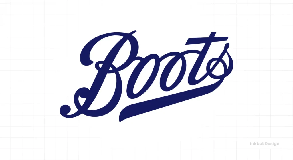
- What it is: The brand name in a classic, heavy serif font, almost always housed in a blue lozenge shape.
- Why it works: Authority and heritage. Like Walgreens, the Boots logo has been around for a long time. The strong, academic-looking serif font conveys authority and trust, evoking associations with institutions like universities or banks. The blue lozenge makes it a distinct, ownable “badge.”
- The SBO Takeaway: “Traditional” doesn’t have to mean “dated.” A strong serif font can convey a sense of establishment and trust, which is ideal for a pharmacy.
4. Rite Aid
- What it is: A simple wordmark next to a shield icon that contains an abstract mortar and pestle.
- Why it works: It’s a clever modernisation. They kept the mortar and pestle but abstracted it into a clean, modern shape inside a shield. The shield reinforces the concepts of “protection” and “safety.” The blue and red colour palette is classic “trust” and “attention.
- The SBO Takeaway: If you must use a traditional symbol, abstract it. Simplify it down to its core elements. Make it part of a larger, cleaner shape, such as a shield or circle.
5. Shoppers Drug Mart (Canada)
- What it is: A simple, red, sans-serif wordmark. Often paired with a red-and-white maple leaf symbol.
- Why it works: Simplicity and national pride, the logo itself is just a clean wordmark. Its strength is in its simple, bold colour and its association with the national brand. It’s functional and clear.
- The SBO Takeaway: Sometimes, a clean font in a single, bold colour is all you need. Don’t over-design it.
Category 2: The Digital Disruptors (The New Guard)
These companies thrive or fail based and their app icon. Their branding is minimalist, digital-first, and designed to build trust with a new generation.
6. Hims
- What it is: A bold, custom sans-serif wordmark. The standalone ‘h’ is often used as the logomark.
- Why it works: It’s confident, masculine, and looks more like a modern fashion brand (think Warby Parker) than a pharmacy. This is 100% intentional. It’s discreet, stylish, and breaks all the “healthcare” rules to appeal to its target demographic, who value discretion.
- The SBO Takeaway: Know your niche audience. Hims doesn’t want to look like CVS. They aim to establish a premium, direct-to-consumer lifestyle brand.
7. Hers
- What it is: The sister brand to Hims, using a similar (but slightly softer) custom sans-serif typeface.
- Why it works: It creates a brilliant brand family. It’s instantly recognisable as being related to Hims, but the softer curves and colour palette give it a distinct, feminine-coded energy. It’s a masterclass in building a complementary brand.
- The SBO Takeaway: If you run multiple related services (e.g., a pharmacy and a separate wellness spa), use a consistent typographic style or “architecture” to tie them together.
8. Ro (Roman)
- What it is: A simple, geometric sans-serif wordmark. The ‘o’ is a perfect circle, giving it a friendly, open feel.
- Why it works: It’s approachable, clean, and feels like a tech company. “Ro” is concise, straightforward, and easy to recall. The logo is the name. It’s humble and direct, which builds trust.
- The SBO Takeaway: A short, memorable name in a clean, sans-serif font is a powerful combination for a digital-first world.
9. Capsule
- What it is: A wordmark in a soft, rounded, sans-serif font. The ‘C’ is often used as a standalone icon.
- Why it works: The name is the metaphor. “Capsule” is a perfect name for a prescription delivery service. The logo’s rounded, friendly font feels approachable and easy, just like their service promises to be.
- The SBO Takeaway: If you have a great, evocative name, let it do the talking. Don’t crowd it with a symbol.
10. Alto Pharmacy
- What it is: A clean wordmark, but their key brand asset is the ‘A’ monogram, which is formed from two simple, overlapping shapes.
- Why it works: It’s a fantastic, simple, and ownable monogram. It feels like a “location” pin (delivery) and an ‘A’ at the same time. It’s an abstract mark that is unique to them.
- The SBO Takeaway: A monogram (using your pharmacy’s initials) can be a brilliant logo. It’s simple, timeless, and works perfectly as an app icon.
11. GoodRx
- What it is: A wordmark with a “+” logomark that cleverly incorporates a heart.
- Why it works: It’s clever, but not too clever. It combines three ideas into a straightforward icon: The “G” for Good, the “Rx” for pharmacy, and the heart for “health.” It’s friendly, innovative, and memorable.
- The SBO Takeaway: A multi-layered symbol can work if it’s executed this cleanly. This is a rare example of an “Rx” symbol being used well.
12. PillPack (by Amazon)
- What it is: A simple wordmark. The brand’s power comes from its system: the pre-sorted pill packets. The logo is secondary to the Amazon “smile” it now lives under.
- Why it works: The product is the brand. The logo is purely functional, designed to sit cleanly next to the dominant Amazon logo. It’s clear, legible, and unobtrusive.
- The SBO Takeaway: Sometimes your process or service is your authentic brand. Your logo just needs to be a clean, professional label.
Category 3: Independent & Compounding (Conceptual Types)
Most small business owners aren’t competing with CVS or Hims. They are local businesses. Here are eight conceptual “types” of logos that work brilliantly for independent pharmacies.
13. The Modern Apothecary
- What it is: Imagine a clean, elegant serif font (like a modern Bodoni) for the name. Above it, a single, minimalist line-art leaf or herb stem.
- Why it works: This screams “curated,” “premium,” and “natural.” It’s for the pharmacy that specialises in high-end wellness products or bespoke compounding. It feels both traditional (with the serif) and modern (in its minimalism).
- The SBO Takeaway: This is how you use a “natural” symbol correctly. It’s subtle, elegant, and supports a premium positioning.
14. The Community Chemist
- What it is: A friendly, bold, rounded font for the name (e.g., “The Grove Pharmacy”). The icon is a simple monogram of the initials (“GP”) inside a circle.
- Why it works: It’s warm, approachable, and stable. The rounded font feels like a smile. The monogram-in-a-circle is a classic “badge” of quality. This feels like a place you’ve trusted for 20 years.
- The SBO Takeaway: A monogram is a timeless, personal, and highly effective logo for a local, single-location business.
15. Precision Compounding
- What it is: A sharp, geometric, sans-serif typeface. The logo is an abstract, molecular-style graphic (e.g., a simple hexagon or connected dots).
- Why it works: This communicates “science,” “precision,” and “technology.” It’s perfect for a specialist compounding pharmacy that works closely with doctors. It looks technical and trustworthy.
- The SBO Takeaway: Your logo should reflect your speciality. If you are high-tech, look high-tech. Ditch the leaves and mortars for clean, geometric lines.
16. The Holistic Practice
- What it is: A combination mark using a slightly lighter, airy sans-serif font and a simple, hand-drawn-style icon of three leaves or a water droplet. Colours are earthy (sage green, terracotta, beige).
- Why it works: It feels calm, gentle, and holistic. The branding moves away from “medical” and towards “wellness.” The hand-drawn element adds a human, personal touch.
- The SBO Takeaway: A “human touch” (like a slightly imperfect icon) can build trust and differentiate you from cold, corporate chains.
17. The Urban Pharmacy
- What it is: A very bold, condensed, all-caps sans-serif wordmark. No symbol. A thick underline or a plus sign. (e.g., “METRO+”).
- Why it works: It’s fast, modern, and confident. This is for a 24/7 pharmacy in a busy city centre. It’s not trying to be warm and fuzzy; it’s trying to be efficient and available.
- The SBO Takeaway: Your logo can communicate your unique value proposition. If you’re all about speed and convenience, a bold, simple wordmark is perfect.
18. The Pet Pharmacy
- What it is: A playful but professional logo—a clean sans-serif font paired with a clever icon that combines a medical cross and a paw print.
- Why it works: It’s instantly clear what the business does. It merges the “medical” (cross) with the “customer” (paw) in one simple, memorable mark.
- The SBO Takeaway: If you serve a very specific niche, incorporate it directly into your logo. Don’t make people guess.
19. The Classic Wordmark
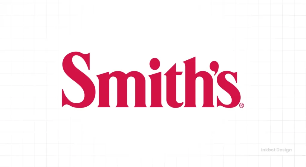
- What it is: Simply the family name (“Smith’s Pharmacy”) in a timeless, authoritative serif font. Think of a classic law firm or tailor.
- Why it works: It’s a pure legacy, a statement of personal ownership and accountability. The family name is the brand. It implies a promise from a real person.
- The SBO Takeaway: If your pharmacy is built on your family name and reputation, that is your strongest asset. Make it the logo.
20. The Minimalist Mark
- What it is: Just a simple, abstract mark: a single dot, a plus sign, or a circle. The name is written in a very clean, light, secondary font.
- Why it works: It’s pure tech. It’s all about the app. This is a digital-only service. It’s the “less is more” approach, communicating simplicity and ease of use.
- The SBO Takeaway: A minimalist logo signifies a simple and streamlined user experience. If your entire business is an app, this is a strong direction to take.
Category 4: International & Other Notables
21. Chemist Warehouse (Australia)
- What it is: A “no-frills” logo. A prominent, bold, sans-serif wordmark in red and yellow. It’s loud and functional.
- Why it works: It’s not trying to be elegant. It’s communicating “warehouse” and “low prices.” The bright, jarring colours are designed to grab attention and scream “discount.” It’s the “IKEA” or “Costco” of pharmacies.
- The SBO Takeaway: Your logo should match your business model. If you are a high-volume, discount provider, a logo that looks like a “sale” tag is actually perfect.
22. Lloydspharmacy (UK)
- What it is: A clean wordmark, often paired with a simple “plus” symbol. The key is the deep, reassuring “Lloyds green.”
- Why it works: The colour is the brand. That specific shade of green is instantly recognisable in the UK. It’s associated with “go,” “health,” and “safety.” The logo is simple, but the brand colour is powerful.
- The SBO Takeaway: You can own a colour in your local market. A simple logo in a powerful, consistent colour can be more effective than a complex icon.
23. Pharmaca
- What it is: An “integrative pharmacy.” Their logo is a clean, modern sans-serif wordmark with a stylised leaf for the mark.
- Why it works: It’s a perfect encapsulation of their mission: “pharma” (the word) + “natural” (the leaf). It’s a simple, clever, and elegant way to show they bridge the gap between traditional medicine and holistic wellness.
- The SBO Takeaway: Look for clever ways to modify a single letter in your name to tell your story. It’s a great way to create a unique wordmark.
24. The Red Cross
- What it is: The quintessential symbol of aid.
- Why it works: It serves as a global symbol of neutrality, aid, and medical assistance. It’s not a brand logo (and in most countries, it’s illegal to use it for a commercial business), but it’s the most effective “trust” symbol in history.
- The SBO Takeaway: The power of a simple, geometric shape. It’s not a lesson in logo design, but in the power of simple, universal symbols.
25. A Conceptual “Plus” Logo
- What it is: Imagine a logo that is just a simple, Swiss-style plus sign (+). The name of the pharmacy is written cleanly beside it.
- Why it works: The plus sign is the ultimate, positive, minimalist symbol in healthcare. It means “health,” “add,” “positive,” and “safety.” It’s not a religious cross. It’s modern, clean, and infinitely versatile.
- The SBO Takeaway: This is perhaps the strongest abstract symbol for a new, modern pharmacy. It’s positive, clear, and works everywhere.
What Actually Makes a Pharmacy Logo “Good”?
A great pharmacy logo isn’t about being clever. It’s about fulfilling a core promise. It must be, above all else, a beacon of trust.
Your logo must instantly answer these subconscious questions for the customer:
- Is this place professional and legitimate? (Authority)
- Will they take my health seriously? (Care)
- Is this a modern service or a dusty old shop? (Relevance)
- Can I trust them with my data and my life? (Security)
To achieve this, your logo needs to nail four things:
- Trust: It feels secure, authoritative, and caring.
- Clarity is instantly recognisable as a health-related brand.
- Versatility: It works as a 32x32px app icon and a 10-foot sign.
- Differentiation: It stands out from the other 10 pharmacies in your area.
The Symbolism Trap: Common Icons Analysed
Founders often ask, “Should I use a cross? A leaf?” Most of these symbols are shortcuts, and many carry significant emotional baggage. I built this table to break down the pros and cons.
| Symbol | Traditional Meaning | Modern Interpretation / Risk | Consultant’s Verdict |
| Mortar & Pestle | Compounding, tradition, alchemy | Dated, old-fashioned, irrelevant for most modern pharmacies. | Avoid. It ages your brand by 50 years. Use it only if you are a high-end, bespoke compounding specialist. |
| Rod of Asclepius | Medicine, healing, Greek mythology (The correct medical symbol) | Often confused with the Caduceus (two snakes, which means commerce). It’s complex. | Use with caution. It’s a valid medical symbol, but it’s not a brand. It’s better as a secondary “trust mark” than a primary logo. |
| The Green Cross | First aid, safety, pharmacy (common in Europe/UK) | Generic. In some regions, it’s so common it’s basically a public utility sign, not a brand. | Avoid. You can’t own it. It’s like trying to trademark a stop sign. It’s a category signifier, not a logo. |
| ‘Rx’ Symbol | Prescription, pharmacy | It can look clunky, technical, and cold. | Avoid as the primary graphic. It’s a label, not an identity. A strong wordmark is almost always better. |
| The Heart | Care, health, wellness | It can be cliché if not executed well. | A strong contender. CVS proved it can be done. It shifts the focus from “pills” to “health.” Requires clever design to avoid looking cheesy. |
| The Leaf / Plant | Natural, holistic, wellness | Overused by “wellness” brands. It can be misleading if you’re a traditional pharmacy. | Use only if it aligns with your brand. If you specialise in natural or holistic remedies, it’s a perfect fit. Otherwise, it’s dishonest. |
| The Shield | Protection, security, safety | It can feel corporate or like an insurance company. | A good abstract option. A shield conveys safety and trust. Rite Aid uses this well. Better than a mortar and pestle. |
Your Logo’s “Bedside Manner”: Colour & Typography
A logo isn’t just a symbol. The two most important choices you’ll make are font and colour.
Colour Psychology for Health & Trust
- Blue: This is the king of healthcare. It communicates trust, security, intelligence, and professionalism. It’s the colour of “big tech” (IBM, Intel) and “big trust” (banks). A deep blue is almost always a safe, strong choice.
- Green: The other top contender. It means health, nature, wellness, and calm. It’s a very restorative and positive colour. It’s ideal for brands embracing holistic or natural wellness.
- White: Use it as a space, not a colour. It means cleanliness, sterility, and simplicity. A great logo has plenty of white space around it, allowing it to “breathe.”
- Red: Use this with extreme caution. Red means urgency, emergency, and attention. The Red Cross uses it for a reason. It can be stressful. It’s better as a “call to action” button colour than a primary brand colour, unless you’re a discount brand like Chemist Warehouse.
- Orange/Yellow: Friendly, optimistic, and cheerful. It can be great for a paediatric or community-focused pharmacy, but it can also look “cheap” or “discount” if not handled with care.
Typography: Your Brand’s Voice
- Serif Fonts (e.g., Times New Roman): These have the little “feet” on the letters. They feel traditional, authoritative, established, and credible. Think of a doctor’s university degree or a newspaper. Use this if you want to project a sense of heritage, premium quality, and timeless authority.
- Sans-Serif Fonts (e.g., Helvetica, Arial): These have clean, modern lines. They feel modern, clean, approachable, and digital-friendly. They are the default for tech and digital startups. Use this if you want to feel contemporary, easy to use, and friendly. This is the right choice for 90% of new pharmacies.
- Script Fonts (e.g., Cursive): Avoid. They are hard to read, look dated, and fail the “app icon” test completely. Walgreens gets away with it because of 100 years of brand equity. You don’t have that luxury.
A 5-Step Plan for Your Own Pharmacy Logo
You’ve seen the examples. Now, what about you?
- Step 1: Define Your Niche. You cannot be everything. Who are you? The high-tech, fast-delivery service? The warm, friendly community hub? The premium, holistic wellness specialist? Your logo must reflect this one thing.
- Step 2: Analyse Competitors (To Differentiate). Look at every pharmacy within a 5-mile radius. Are they all green? Use blue. Are they all using traditional serif fonts? Use a clean, modern sans-serif. Your first job is not to look like them.
- Step 3: Brainstorm Concepts (Beyond the Clichés). Ban the mortar and pestle from your brainstorming. What else could you be? A monogram? A shield? An abstract plus sign? A clever wordmark?
- Step 4: The 32-Pixel Test. Design your top 3 concepts. Now, shrink them down to 32×32 pixels. Can you still tell what they are? Are they a blurry smudge? If it fails this test, it’s not a good logo. It must work as a tiny app icon.
- Step 5: Hire a Professional. You’ve just read 3,000 words on this. It’s complex. Your logo is the face of your business, and it serves as a critical tool for building trust. This is not the place to save a few hundred pounds on a cheap contest site.
This is where a professional logo design service becomes an investment, not a cost. A good designer won’t just “make a picture”; they will go through this entire strategic process with you.
If you’re ready to create a brand that builds immediate trust and sets you apart, we should talk. You can get a no-nonsense quote right here.
Conclusion: Your Logo is Your First Promise
Your pharmacy logo is a compressed signal of trust. It’s the very first thing a new customer will see, and it will instantly set their expectations.
It promises professionalism. It promises care. It promises security.
If your logo is lazy, generic, or dated, it may signal that your service is, too. If it’s clear, modern, and professional, it tells the customer they are in safe hands.
Don’t settle for a cliché. Demand a logo that is as professional and trustworthy as you are.
Frequently Asked Questions (FAQs)
What is the best colour for a pharmacy logo?
Blue and green are the top choices. Blue communicates trust, security, and professionalism. Green communicates health, nature, and wellness.
Should I use a mortar and pestle in my pharmacy logo?
I strongly advise against it unless you are a specialist compounding pharmacy. It’s a dated cliché that makes your brand look old-fashioned and complex.
What’s wrong with using a green cross?
It’s a generic, public-domain symbol, not a brand. You can’t own it, and it won’t differentiate you from anyone else. It’s a sign, not a logo.
What’s the difference between the Rod of Asclepius and the Caduceus?
The Rod of Asclepius (one snake, one rod) is the correct ancient Greek symbol for medicine and healing. The Caduceus (two snakes, winged staff) is the symbol for commerce and trade. Many American health organisations mistakenly use the commerce symbol.
What makes a pharmacy logo “digital-first”?
A digital-first logo is simple, bold, and highly legible at a small size (such as an app icon or website favicon). It avoids thin lines, complex details, and fussy fonts.
Is a wordmark (text-only) enough for a pharmacy logo?
Absolutely. Brands like Capsule, Hims, and Ro prove that a strong, unique, and clean wordmark can be more effective than a logo with a symbol. It’s clean, confident, and modern.
What font style is best for a pharmacy?
A clean, modern sans-serif font is the most versatile choice. It feels approachable, clean, and works well on-screen. A classic serif font can also work if you’re aiming for a “traditional, authoritative, premium” feel. Avoid script fonts.
How can an independent pharmacy logo compete with CVS?
By not trying to look like CVS. Differentiate. If they are a big, corporate-blue brand, be the warm, friendly, green community brand. Use a monogram or a unique wordmark that feels personal, not corporate.
What is the “32-pixel test”?
It’s shrinking your logo design down to 32×32 pixels (the size of a small icon) to see if it remains legible and recognisable. If it turns into a blurry mess, it’s a failed design.
How much does a professional pharmacy logo cost?
It varies, but you’re not buying a file; you’re investing in a strategic process. A professional logo from a reputable agency, such as Inkbot Design, is a critical business asset that will build trust for years. It’s an investment, not an expense.
Next Steps
You’ve seen the good, the bad, and the lazy. If your current logo feels more like a history lesson than a reflection of your healthcare future, it’s time for a chat.
Would you like to see how we’d approach your pharmacy’s logo and brand identity?

