The NASA Logo Design: Branding, Bureaucracy, and Guts
Let’s get one thing straight.
The endless debate over NASA’s “Meatball” versus its “Worm” logo is one of the most tedious conversations in the design world. People argue about it like it’s a football rivalry, picking a team based on which one “looks cooler” or “feels more nostalgic.”
They’re missing the entire point.
This isn’t a beauty contest. This is a brutal, 60-year case study in strategy, politics, and the sheer logistical hell of branding one of the most complex organisations on Earth.
This is the story of two logos, built decades apart, to solve two completely different problems. One is a dense, symbolic coat of arms. The other is a hyper-logical, minimalist branding system.
For an entrepreneur or a business owner, there are more practical lessons in the NASA logo saga than in a dozen marketing textbooks.
So forget which one you “like.” Let’s look at why they exist and what you can steal for your own business.
- The NASA logo debate is a 60-year study in strategy, politics, and practical branding, not just aesthetics.
- The Meatball solved heraldry and legitimacy but failed logistically; it’s complex and hard to reproduce.
- The Worm and its Graphics Standards Manual provided a simple, scalable system prioritising function and consistency.
- Key lessons: design for the job, create a brand system, resist nostalgia, and use multiple marks strategically.
The Two NASAs, The Two Logos: A 30-Second Primer
Before we dive in, you need to know the players. These are the two primary logos in NASA’s history.
The “Meatball” (The Insignia)
This is the original, official insignia from 1959. It’s a complex, illustrative-style seal. It’s dense with meaning, patriotism, and a sense of “everything we do.” It’s the one you see on all the Apollo mission photos.
The “Worm” (The Logotype)
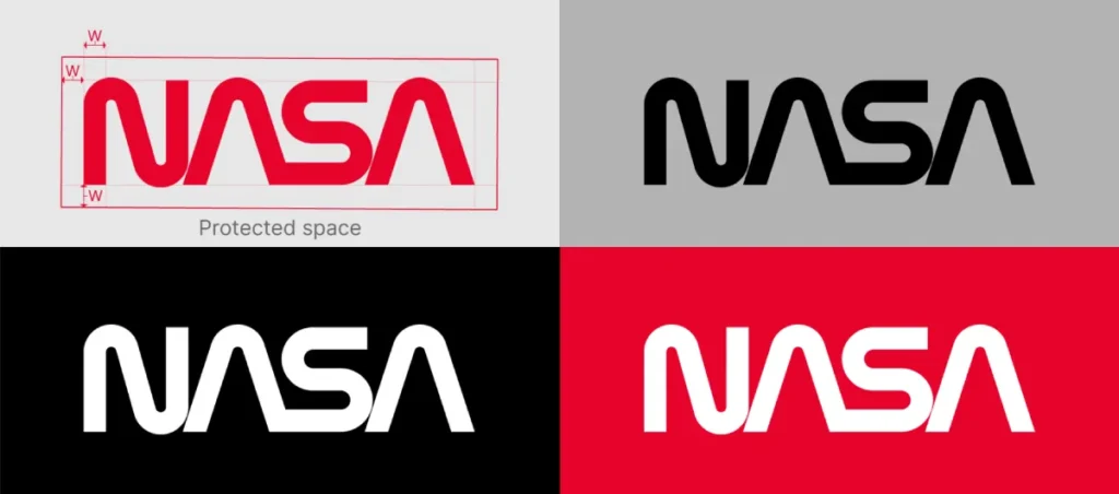
This is the minimalist, red, typographic mark from 1975. It’s just four letters: N-A-S-A. It’s stark, futuristic, and has zero visual connection to the Meatball. It’s the one you see on the side of the Space Shuttle.
They couldn’t be more different. And that was entirely the point.
The Original: Deconstructing the “Meatball” (1959)
To understand the Meatball, you have to understand the world it was born into.
Who Designed It?
The Meatball was designed in 1959 by James Modarelli, an illustrator at the NASA Lewis Research Center (now the Glenn Research Center).
It wasn’t a “logo design” in the way we think of it today. It was an evolution of other seals. Modarelli was tasked with creating an official insignia that represented this brand-new agency.
What Does It All Mean? (The Symbolism)
Unlike a modern, abstract logo, the Meatball is a literal bundle of symbols. It’s less of a logo and more of a heraldic crest.
- The Blue Sphere: Represents a planet (assumed to be Earth).
- The Stars: Represent space.
- The Red Vector: This is the most “insider” bit. It’s a shape representing an airfoil (a wing), a nod to NASA’s predecessor, NACA (National Advisory Committee for Aeronautics). It represents aeronautics.
- The White Orbit: Represents space travel and trajectory.
The Real Problem the Meatball “Solved”
In 1959, NASA had a heraldry problem, not a branding problem.
It needed to combine the identity of the old, established NACA with a new, exciting “space” mission. It had to look official, patriotic, and serious. It had to look good on a medal, a flag, and at a press conference.
The Meatball did that job perfectly. It’s a dense, proud, committee-approved design that screams “U.S. Government” and “The Future” all at once.
The Massive Problem It Created
The Meatball is a fantastic insignia. It is a terrible logo.
It’s a nightmare to reproduce.
Think about the world in the 1960s and 70s. This mark had to be:
- Stitched onto patches.
- Stencilled onto the side of rockets.
- Printed on low-quality paper.
- Transmitted over (terrible) television broadcasts.
- Faxed.
- Engraved on metal.
It’s a “high-information” logo. It has multiple colours, thin lines, small stars, and complex shapes. When you shrink it, it turns to mud. When you try to reproduce it in one colour, it falls apart.
For an agency that was about to stamp its identity on millions of assets, from tiny screws to 300-foot-tall Saturn V rockets, this was a logistical catastrophe.
The Revolution: Why the “Worm” Was a Work of Genius (1975)
By the mid-1970s, the Meatball’s flaws were obvious. But the change didn’t come from inside NASA. It came from the top.
The Context: The Federal Design Improvement Program
Believe it or not, this entire saga was kicked off by President Richard Nixon.
In 1971, he initiated the Federal Design Improvement Program, a government-wide effort to clean up the terrible, messy, and inefficient design used by federal agencies. The U.S. government was spending a fortune on disjointed and ugly design, and this program was meant to fix it.
NASA, as the most visible and futuristic agency, was selected as a prime test case.
The Designers: Richard Danne & Bruce Blackburn
The government hired the New York design firm Danne & Blackburn to tackle NASA’s identity.
They were brought in to create a system, not just a pretty picture. They quickly realised the Meatball was functionally unusable as the core of a modern visual identity.
So they did the bravest thing a designer can do. They threw it out.
The Real Hero: The NASA Graphics Standards Manual
The “Worm” (the red logotype) was just the tip of the iceberg. The real genius of the 1975 rebrand was the NASA Graphics Standards Manual.
This was an 80+ page book of iron-clad rules.
It dictated everything.
- The Logotype: How to draw it, how to space it.
- The Colour: That specific, vibrant red (PMS 179).
- Typography: The official font (Helvetica) and how to use it.
- Grid Systems: How to lay out publications.
- Vehicle Markings: Exactly how the logo should appear on a van, a plane, and the Space Shuttle.
- Stationery: Letterheads, business cards, everything.
This is the single most important lesson for any business owner. A logo is useless without a system for using it.
Danne & Blackburn didn’t just deliver a JPG. They delivered an entire language. It created a unified, professional, and consistent brand for NASA for the first time.
Why the “Worm” Design Was So Smart (And Hated)
The logotype itself was a masterpiece of minimalist, functional design.
It’s just four letters, N-A-S-A. The “A”s are rendered as “nose cones,” with the crossbar removed. The “S” is a smooth, continuous curve, like a trajectory.
It was futuristic, simple, and aggressive. But its main strength? It was impossible to mess up.
It’s one colour. It scales infinitely. You can stencil it, stitch it, or print it at the size of a postage stamp, and it’s still undeniably “NASA.” It looked incredible on the pure white fuselage of the Space Shuttle. It was, in short, the perfect solution to the Meatball’s problem.
Of course, the old guard at NASA hated it.
The engineers, the test pilots, the Apollo-era veterans… they felt it was “castrated.” They called it “the worm.” They missed their wings, their stars, and their planet. They felt this sterile, typographic mark disrespected the “human” element of their work.
The ‘Worm’ Gets Axed: The 1992 Return of the Meatball
For 17 years, the Worm was the face of NASA. It was the logo of the Space Shuttle era. Then, overnight, it was gone.
Meet Dan Goldin
In 1992, NASA got a new Administrator, Dan Goldin.
Goldin was an engineer, not a brand strategist. And he hated the Worm. He famously called it a “slithering, snake-like” thing.
The “Challenger” Context
Goldin didn’t just have a personal distaste for the logo. He was walking into an agency with a morale problem.
The 1986 Challenger disaster had shattered the public’s perception of NASA. The Worm, once a symbol of the future, was now the logo associated with a period of tragedy, bureaucracy, and failure.
Goldin wanted to boost morale. He wanted to bring back the “magic.” And to him, that magic was the Meatball. It was the logo of the “glory days”—the Apollo missions, the moon landings.
The Branding Mistake
With a single memo, Dan Goldin killed the Worm and brought the Meatball back as the primary agency logo.
From a branding perspective, this was a massive mistake.
He made a multi-million dollar decision based on personal preference and nostalgia, not strategy.
He instantly threw away 17 years of brand equity and a perfectly functional, efficient design system. And, most importantly, he re-introduced the original problem.
The Meatball was still a nightmare to reproduce. Now, in the new digital age of 1992, it had to be rendered on low-resolution websites and in PowerPoint presentations, where it looked even worse.
He didn’t solve a problem. He created one, all in the name of “morale.”
The Resurrection: Why the Worm is Back (And What it Means)
For 28 years, the Worm was dead. It lived on only in design blogs and history books.
Then, in 2020, it came back.
The SpaceX Demo-2 Mission (2020)
As the SpaceX Falcon 9 rocket rolled out to the launchpad for the Demo-2 mission—the first crewed flight from U.S. soil in nine years—designers watching online lost their minds.
There, on the side of the rocket, was the Worm.
It was clean, beautiful, and looked impossibly futuristic on the sleek, modern SpaceX hardware.
Why Bring It Back? Strategy, Not Just Nostalgia.
This wasn’t a mistake. This was a brilliant strategic move by NASA Administrator Jim Bridenstine.
The Worm is not the main logo again. The Meatball is still the primary identifier for the agency.
The Worm has been brought back as a secondary mark to be used for specific, high-profile applications. It’s now used to signify the future. It’s on the Artemis program hardware, which is going back to the Moon. It’s used on commercial partnerships, like the SpaceX missions.
NASA is finally using both logos strategically.
- The Meatball represents the institution—the history, the government agency, the “all-of-NASA.”
- The Worm represents the mission—the future, cutting-edge technology, and commercial partnerships.
It’s no longer “one or the other.” It’s “the right tool for the right job.” It only took them 60 years to figure it out.
5 Brutal Lessons from the NASA Logo Saga for Your Business
Okay, so who cares about 60 years of government branding? You should. This story is a goldmine of practical lessons for your business.
Lesson 1: Your Logo Must Solve a Problem, Not Just Look Pretty
The Worm solved a reproduction problem. The Meatball solved a heraldry problem.
Before you ever talk about colours or fonts, you must answer this question: What job is my logo doing?
Is it for a tiny app icon? Then it needs to be dead simple. Is it to be stitched on high-end merchandise? Then it can have more detail. Is it for a construction company’s vans and site hoardings? It needs to be bold and visible from 100 feet away.
Stop asking if a logo is “pretty.” Start asking if it’s functional.
Lesson 2: A Logo is Useless Without a System
This is the big one. Danne & Blackburn didn’t just deliver a logo. They delivered the 80-page Graphics Standards Manual.
Your business needs this too. Even if it’s just a 2-page PDF.
It needs to define:
- Your exact brand colours (HEX, CMYK, Pantone).
- Your official brand fonts (one for headlines, one for body text).
- Logo spacing rules (how much “clear space” to leave around it).
- Logo “don’ts” (don’t stretch it, don’t change the colour, don’t put it on a messy background).
A logo without a brand guide is just a drawing. A logo with a brand guide is a professional identity.
Lesson 3: Expect Internal Resistance (And Have Guts)
The engineers at NASA hated the Worm. They felt it disrespected their heritage.
When you rebrand, your team, your partner, your family, and your long-time customers will have an opinion. Humans are hard-wired to dislike change.
Listen to the feedback, but remember: a logo is not a democracy. It is a strategic business decision.
Danne & Blackburn had the guts to tell the rocket scientists that their beloved Meatball was a functional failure. You need to have the guts to make the right call for your business, even if it’s unpopular in the short term.
Lesson 4: Don’t Let Nostalgia Drive Your Rebrand
Dan Goldin’s 1992 decision to kill the Worm was 100% driven by nostalgia. It was a logistical step backwards that cost a fortune to implement.
Your “first logo,” the one you drew on a napkin, might feel comfortable. It might remind you of the “good old days” of your startup.
It might also be holding you back.
Be objective. Does your logo still represent who you are? Does it work on all the platforms you use today (like Instagram, TikTok, etc.)? Don’t let your nostalgia cost you customers.
Lesson 5: Your “Brand” is a Toolbox, Not a Single Tool
The most advanced branding lesson comes from NASA today. They use both logos.
Your brand is a toolbox. You should have:
- A primary logo (your main mark).
- A secondary logo (a stacked or horizontal version).
- An icon or sub-mark (for app icons, favicons, or social media profiles).
- A wordmark (just your name in your brand font).
You don’t use a sledgehammer to hang a picture frame. And you shouldn’t use your full, complex logo in a tiny app icon. Modern NASA proves that a flexible, smart system always beats a single, rigid mark.
So, Should Your Logo Be a “Meatball” or a “Worm”?
This is the real question for you as an entrepreneur.
When to Use a “Meatball” (A Complex Insignia)
You should lean towards a “Meatball” (a complex, illustrative, or heraldic logo) if:
- You are a university, a government body, a social club, or a guild.
- Your brand is built entirely on heritage, tradition, and trust (e.g., a 100-year-old law firm).
- You need to communicate a lot of complex ideas in one mark.
- You have the budget and control to manage its complex reproduction.
For 99% of businesses, this is not the right approach.
When to Use a “Worm” (A Simple Logotype/Mark)
You should lean towards a “Worm” (a simple, clean logotype or abstract mark) if:
- You are a startup, a tech company, a consumer product, or any brand built on simplicity and the future.
- Your logo needs to work on a tiny app icon and a giant billboard.
- You need to be ableto hand your logo to any vendor and have it look right every time.
Honestly, for almost every small business owner reading this, your goal should be to create your own “Worm.” A simple, unique, scalable, and memorable mark.
The Real Question You Should BeAsking
Stop arguing about which NASA logo is “better.”
The NASA logo story isn’t about red vs. blue, or circles vs. lines. It’s about a 60-year struggle between complexity and simplicity, between nostalgia and the future, between emotion and logistics.
Your company is having the exact same fight, just on a smaller scale.
The real question isn’t “Which logo do I like?”
The real question is: “Which problem is my logo solving?”
Getting that answer right is the entire job of professional logo design.
Still Arguing? FAQs about the NASA Logo Design
What is the official NASA logo?
The official primary insignia of the agency is the “Meatball” (the blue sphere with the red vector). The “Worm” logotype was re-instated in 2020 as a secondary logo for specific uses.
Who designed the NASA “Meatball” logo?
The Meatball was designed in 1959 by James Modarelli, an illustrator at the NASA Lewis Research Center.
Who designed the NASA “Worm” logo?
The Worm was designed in 1975 by Richard Danne and Bruce Blackburn of the firm Danne & Blackburn, as part of the Federal Design Improvement Program.
Why did NASA stop using the “Worm” logo?
In 1992, NASA Administrator Dan Goldin retired the Worm. He disliked it personally and wanted to bring back the “Meatball” to boost morale and evoke the “glory days” of the Apollo era, following the Challenger disaster.
Why is the “Worm” logo back?
NASA brought the Worm back in 2020, first appearing on the SpaceX Demo-2 mission rocket. It is now used strategically as a secondary logo to represent the future, high-profile missions (like Artemis), and commercial partnerships.
What is the meaning of the NASA “Meatball” logo?
It’s a collection of symbols: the blue sphere is a planet, the stars represent space, the red chevron (or vector) represents aeronautics, and the white orbital path represents space travel.
What is the meaning of the NASA “Worm” logo?
It is a purely typographic logotype. The design is abstract, but the “A”s can be seen as rocket nose cones, and the continuous “S” can be seen as a trajectory curve. Its “meaning” is in its modernism and simplicity.
What is the NASA Graphics Standards Manual?
It was a comprehensive rulebook created by Danne & Blackburn in 1975 that accompanied the Worm logo. It defined the entire visual system for NASA, from fonts and colours to vehicle markings, ensuring brand consistency.
What is the “Vector” logo?
The “Vector” logo is a simplified, one-colour version of the Meatball’s red chevron and orbit. It was often used on astronaut patches and unofficial merchandise but was never the agency’s primary official logo.
What’s the main lesson for a small business from the NASA logos?
That a logo is a functional tool, not just art. Its success depends on its fitness for purpose. A simple, scalable logo (like the Worm) paired with a strong set of brand rules is almost always more effective than a complex, illustrative logo (like the Meatball).
Ready to Solve Your Own Branding Problem?
The NASA story proves that a logo isn’t just a detail—it’s a strategic decision that reflects your mission, solves your problems, and defines your future. Most businesses are still using a “Meatball” when they desperately need a “Worm.”
If you’re ready to stop guessing and build an identity that actually works, you need a system.
We build those systems. Explore our logo design services to see how we create brands that are built for the future. Or, if you’re ready to talk strategy, request a free quote today.

