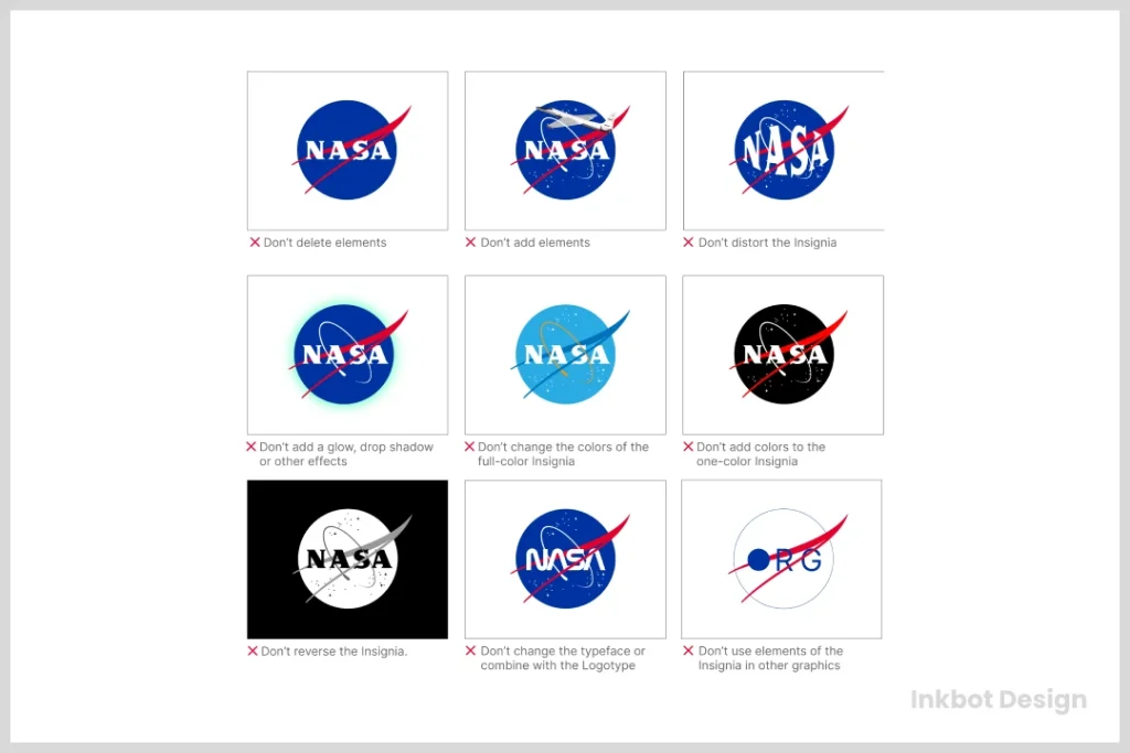
Logo Testing: The Scalability & Monochrome Stress Test
Your new logo looks magnificent on a 27-inch iMac 5K display. The gradients are subtle; the kerning is tight; the energy is palpable. You are ready to launch.
Stop.
You are examining your brand in a laboratory setting. It is safe, backlit, and features high resolution.
However, in the wild, your logo will not be displayed on a Retina display. It will be embroidered onto a cheap polyester polo shirt. It will be blasted in black ink onto a thermal receipt paper that fades in the sun. It will be compressed down to 16 pixels in a browser tab alongside a dozen competitors.
If your logo relies on perfect conditions to work, you do not have a logo; you have a pretty picture. And pretty pictures are expensive liabilities.
I have seen businesses spend thousands on a rebrand, only to realise their beautiful new icon turns into an indistinguishable smudge when printed in the sponsorship footer of a black-and-white event programme.
This isn’t just an aesthetic annoyance; it is a functional failure that costs money to fix.
Real logo testing is not about asking your spouse if they “like the blue.” It is about forensic stress testing.
It is about stripping the design down to its bare essentials—removing colour, effects, and scale—to see if the core concept remains intact.
- Logos must work in harsh real-world conditions, not just on high‑res, perfectly lit screens.
- Scalability is critical—design simplified variants (submark, favicon) for 16×16 and small sizes.
- Monochrome (1‑bit) readability is essential for printing, vinyl, stamps, receipts, and embroidery.
- Provide vector masters (AI/EPS/SVG), optical adjustments, and minimum size rules in guidelines.
- Design a responsive logo system and dark‑mode variants to survive busy contexts and partner grids.
What is Logo Testing?
Logo Testing is the technical process of evaluating a visual identity’s performance across various media, sizes, and colour restrictions. It prioritises functionality and legibility over subjective aesthetics.
A logo passes the stress test if it remains identifiable and legible when subjected to:
- Extreme Reduction: Scaling down to favicon size (16×16 pixels).
- Binary Reduction: Converting to 100% Black and White (no greyscale).
- Contextual Hostility: Placement on visually noisy backgrounds or clashing textures.
If the mark fails any of these technical hurdles, it is not ready for market.
The Scalability Stress Test: From Billboards to Favicons
Scalability is the first casualty of amateur design. Most people assume scalability means “can I make it big?” With vector software (Adobe Illustrator), making a logo the size of a building is trivial. The math handles the curves.
The real challenge is making it small.
When you shrink a logo, you battle the physical limitations of the display medium. On a screen, this is the pixel grid. On paper, it is the bleed of the ink.
The 16-Pixel Gauntlet
The most ruthless environment for a modern brand is the favicon—the tiny icon that sits in your browser tab. Standard favicons are 16×16 pixels.
If your logo relies on thin lines, intricate distinctiveness, or text to be recognised, it will die here.
The Rule of Thumb: If your logo cannot be drawn with a thick marker pen on a post-it note and still be recognised from across the room, it will likely fail the favicon test.
Technical constraints occur because of “anti-aliasing.” When a vector line falls between two pixels on a screen, the computer attempts to blend the colours, resulting in a blurry, grey edge rather than a sharp line. At small sizes, this turns a crisp logo into a fuzzy blob.
The “App Icon” Squircle
Mobile operating systems impose their own rules. iOS does not display square icons; it masks them into a “squircle” (a square with rounded corners). Android allows more freedom but increasingly pushes for adaptive icons.
If your logo has essential details in the corners, they will be sliced off. I see this constantly with framed logos or badges. The frame gets clipped, leaving an awkward, broken geometry.
The Fix: You need a “responsive” logo system. This means you don’t just shrink the main logo; you also have a simplified variant specifically designed for small sizes.
- Primary Logo: Full wordmark + Icon + Tagline (Large print).
- Secondary Logo: Wordmark + Icon (Website header).
- Submark: Icon only (Social media avatar).
- Favicon: Simplified Icon (Browser tab).
Proper logo design and branding aren’t about one static image; it’s about a modular system that adapts to the available real estate.
The Monochrome Mandate: The “Fax Machine” Test
This is where 90% of Dribbble portfolios fail.
Designers love gradients. They love drop shadows. They love transparency. But there are dozens of manufacturing processes that do not support these features.
1-Bit vs. Greyscale
Do not confuse “Black and White” with “Greyscale.”
- Greyscale: Uses shades of grey (0% to 100% black). This allows for depth and shading.
- Monochrome (1-Bit): Strict black or white. Ink or no ink. Pixel on or pixel off.
Why does this matter? Consider a vinyl cutter plotting a sign for a shop window. The blade cannot cut a “fade.” It cuts a line. Consider a rubber stamp. Consider laser etching on metal. Consider the thermal receipt printer at a coffee shop.
If your logo relies on a 10% grey separation to define the shape of the icon, that distinction vanishes in a 1-bit environment. The two shapes merge into one silhouette. If the silhouette is unrecognisable, the brand is invisible.
The Economic Impact of Colour
This is not just about aesthetics; it is about your profit margin.
Screen printing (for t-shirts, tote bags, merchandise) is priced per colour. A logo with a 4-colour gradient requires four separate screens, four setups, and four runs.
- 4-Colour Print Run (500 shirts): High setup cost, higher unit cost.
- 1-Colour Print Run (500 shirts): Low setup cost, maximum profit margin.
If your logo cannot work in a single colour, you are essentially paying a “complexity tax” on every piece of merchandise you ever produce.
Real-World Example:
Look at the Starbucks logo evolution. Their original 1971 logo was a detailed woodcut-style brown illustration. It was beautiful, but a nightmare to reproduce at small sizes. Over decades, they stripped away the text, the outer ring, and the intricate shading.
Today, the Siren is a flat, solid green shape. It works on an app button and is stamped on a corrugated cardboard cup.
| Feature | The Amateur Approach | The Professional Approach |
| Colour Reliance | Uses colour to define shapes (e.g., red circle on blue square). | Uses negative space and contrast to define shapes. |
| Gradients | Relies on gradients for “pop” or 3D effects. | Uses flat shapes; gradients are an optional overlay, not a structural element. |
| File Formats | Delivers JPEGs or PNGs. | Delivers EPS, SVG, and AI files with outlined strokes. |
| Inversion | It looks like a photo negative when placed on dark backgrounds. | Has a dedicated “Dark Mode” variant with corrected optical weight. |
The “Embroidery Failure” Check
Embroidery is the final test of a logo. It is a physical medium with low resolution and high mechanical stress.
A digital pixel has no dimension. A thread has thickness. You cannot embroider text smaller than 4-5mm in height and expect it to be legible. The threads will bunch up, creating a knot of colour that looks like a mistake.
I recently audited a construction firm that had a “distressed” grunge texture in its logo. On screen, it looked rugged. When they tried to get it embroidered on high-visibility jackets, the embroidery machine interpreted every little “grunge” speck as a start-stop command.
The result was a jacket that looked as if it had been chewed by moths, and the production cost tripled due to the increased stitch count.
The Test:
Print your logo at a width of 5cm. Can you see clear gaps between the lines? If the gaps are hairline thin, they will close up when stitched.
The Contextual Stress Test: Dark Modes and Busy Backgrounds
Your logo will not always sit on a pristine white background. It will sit on a dark website footer, a chaotic photo in a brochure, or a glass door.

The Dark Mode Problem
With the rise of system-wide Dark Mode on iOS, Android, and Windows, your logo must be readable in both light and dark modes.
However, you cannot simply “invert” the colours.
- If you invert a black text logo, it becomes white. That’s fine.
- But if your logo has a specific brand colour (e.g., a red bull), inverting the red might turn it cyan, which breaks the brand identity.
- Alternatively, if your logo features a shadow, inverting it can turn the shadow into a glowing light, which appears unnatural.
You need a specific brand identity file set that includes a “Dark Mode” asset—usually a white logo with the brand-coloured elements adjusted for contrast against a dark grey background, not just mathematically inverted.
The “Partner Page” Graveyard
Visit any conference website and review the “Sponsors” section. It is usually a grid of 20+ logos plastered over a grey or white background.
Some logos pop. Others disappear. The ones that disappear usually suffer from:
- Low Contrast: Grey text on a white background.
- Poor Aspect Ratio: An extremely wide, horizontal logo that gets crushed to fit a square grid.
- Fine Detail: intricate illustrations that turn to noise.
If you are a B2B business, your logo must stand out in these “logo graveyards.” It needs strong, heavy weights and high contrast.
Consultant’s Reality Check
In my years running Inkbot Design, the most awkward conversations happen when a client falls in love with a watercolour mark.
I once had a client, a boutique bakery, who was adamant about a logo featuring a hand-painted watercolour croissant. It was a lovely art. It looked great on the proposal PDF.
Then came the reality check. They wanted to print it on brown kraft paper bags. Since watercolour relies on the white of the paper for luminosity, printing it on brown paper made the croissant look like a bruise.
They then wanted to cut vinyl stickers for the shop window. You cannot vectorise a watercolour wash effectively for vinyl cutting without it looking like a jagged topographic map.
We had to rebuild the entire brand identity from scratch, creating a solid vector version of the croissant for functional use and keeping the watercolour illustration solely for digital and high-end offset print packaging.
The Lesson: Do not confuse an illustration with a logo. An illustration is for decoration; a logo is for identification. If you need help separating the two, please request a quote, and we can explore ways to simplify your asset library.
Technical Standards for Passing the Test
To ensure your logo passes these tests, you must adhere to strict technical standards during the design phase.

1. Vector is Non-Negotiable
You must have a vector master file (in AI, EPS, or SVG format).
- Raster (JPEG/PNG/GIF): Made of pixels. Scales poorly.
- Vector: Made of mathematical paths. Scales infinitely.
According to W3C standards, Scalable Vector Graphics (SVG) allow for resolution-independent rendering, essential for modern responsive web design. If your designer only sends you a PNG, you have been taken advantage of.
2. Optical Balancing
A logo that is mathematically centred often looks off-centre to the human eye. This is due to visual weight. A triangle, for example, feels lighter at the top than at the bottom.
Professional testing involves “optical correction.” We nudge the element until it looks centred, ignoring the grid. This ensures that when the logo is placed in a circular avatar (like on Twitter, X, or LinkedIn), it doesn’t appear to be falling off the edge.
3. Minimum Size Definition
Your brand guidelines must specify a “Minimum Size.” This is the point of failure—the size at which the logo becomes illegible.
- Print: Usually around 20mm wide.
- Digital: Usually around 50-100 pixels wide.
Below this size, the guidelines should mandate the use of the “Submark” or icon only.
The Verdict
Logo testing is the insurance policy for your brand. It protects you from the embarrassment of illegible business cards, the cost of failed embroidery runs, and the invisibility of a poor digital presence.
A robust logo is like a robust vehicle; it should run on smooth tarmac (your website) and off-road (a grainy black-and-white invoice) without breaking down.
If you are looking at your current logo and worrying that it might not survive the 1-bit challenge or the 16-pixel crush, it is time to fix it. A logo that doesn’t work is just a decoration.
Would you like me to review your current logo files to ensure they meet these scalability standards?
Frequently Asked Questions
What is the difference between a vector and a raster logo?
A vector logo (AI, EPS, SVG) is built using mathematical formulas, allowing it to be scaled infinitely without losing quality. A raster logo (JPEG, PNG) is built using pixels; if you enlarge it, it becomes pixelated and blurry. You must always have a vector master file for professional printing.
Why does my logo look blurry on my website?
This usually happens for two reasons: either you are using a low-resolution raster file that has been stretched, or the logo has not been “pixel-hinted” for small sizes. For the best results, use an SVG file or a PNG exported at exactly twice the display size (for Retina screens) to ensure crisp edges.
Can I use a photograph as my logo?
No. Photographs are continuous-tone raster images. They cannot be easily separated into spot colours for screen printing, they do not scale without pixelation, and they fail the monochrome (black and white) test. A logo should be a graphic symbol or wordmark, not a photo.
What is a responsive logo?
A responsive logo is a brand identity system that adapts to different screen sizes. It includes a full version for large desktop screens, a simplified version for tablets, and a strict icon/symbol for mobile devices and favicons. This ensures legibility across all devices.
Why do I need a black and white version of my logo?
You need a black and white (monochrome) version for manufacturing processes that do not support colour or gradients, such as vinyl cutting, laser engraving, receipt printing, and embroidery. It also ensures that your brand remains legible in high-contrast environments, such as black-and-white newspapers or legal documents.
How small can my logo be scaled?
Your main logo should be legible at roughly 20-25mm in print. However, your brand icon (or favicon) must be recognisable at 16×16 pixels. If your main logo is too complex for this size, you must create a simplified “submark” specifically for small-scale use.
What is the “Fax Machine Test” in logo design?
The Fax Machine Test is a check to see if a logo retains its clarity and identity when converted to a low-quality, high-contrast black-and-white image. While fax machines are rare today, the principle applies to photocopying, thermal printing (such as receipts), and low-bandwidth digital rendering.
Does my logo need to work in Dark Mode?
Yes. With the prevalence of Dark Mode on operating systems and apps, your logo must be visible on dark backgrounds. This often requires a specific “negative” version of your logo where dark text is swapped for white, and brand colours are optically adjusted to ensure sufficient contrast.
Why is embroidery difficult for complex logos?
Embroidery uses physical thread, which has thickness (unlike digital pixels). Intricate details, gradients, and tiny text (under 5mm) cannot be stitched accurately. The threads bunch up, making the design look messy. Logos intended for uniforms must be simplified.
How do I test if my logo is scalable?
To test scalability, zoom out until the logo is the size of a postage stamp on your screen. Can you still read the company name? Can you distinguish the icon? Then, convert it to 100% black and white. Is it still recognisable? If the answer to either is “no,” the logo requires optimisation.

