The Lamborghini Logo: A Masterclass in Rivalry Branding
The Lamborghini logo is a legendary symbol of automotive rivalry, born from a famous feud between founder Ferruccio Lamborghini and Enzo Ferrari in the early 1960s.
Ferruccio chose the ‘Raging Bull’ as a direct challenge to Ferrari’s Prancing Horse, reflecting his zodiac sign (Taurus) and his passion for Spanish bullfighting.
Set in a black shield with gold detailing, the bull is not just a logo but a powerful statement of intent: to build a more aggressive, powerful, and uncompromising supercar.
- Logo born from Ferruccio Lamborghini’s feud with Enzo Ferrari; the Raging Bull directly challenges Ferrari’s Prancing Horse.
- Black-and-gold shield conveys controlled, luxurious power—positioning Lamborghini as audacious, wealthy, and authoritative.
- Consistent, bold typography and minimal revisions show brand confidence; stewardship preserved core identity after Audi’s 1998 acquisition.
- Three key branding lessons: pick an enemy, be confident (avoid needless rebrands), and ensure product fulfils the brand’s promise.
The Most Important Rule of Branding: Have an Enemy
Modern marketing often discusses “finding your niche” or “understanding your customer avatar.” That’s fine. But the most potent brands in history were frequently built on a simpler, more primal foundation: they had an enemy.
An enemy gives you focus. An enemy gives you a story. An enemy gives you a reason to exist.
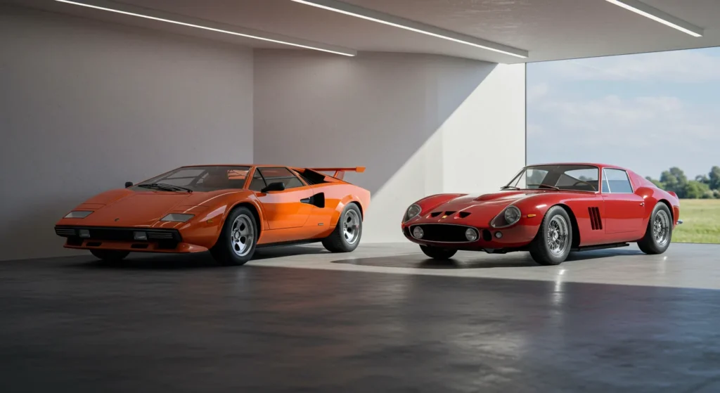
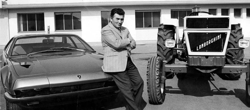
For Lamborghini, that enemy had a name: Enzo Ferrari. In the early 1960s, Ferruccio Lamborghini was a wealthy industrialist who had made his fortune building tractors. He was successful, respected, and a connoisseur of fine sports cars—including several Ferraris.
The Legend of the Faulty Clutch
The story is so good that it’s become a business legend. Ferruccio was frustrated with the recurring clutch problems in his Ferrari 250GT. Being a master mechanic, he identified that the clutch was the same type he used in his tractors and that a better solution was available.
He sought a meeting with Enzo Ferrari to suggest an improvement.
Enzo, a man known for his towering arrogance, was not amused. He allegedly dismissed the tractor manufacturer with a scathing insult: “The problem is not the car, but the driver. Let me make cars. You stick to driving tractors.”
That single moment of dismissiveness was the inciting incident. It was the spark. Ferruccio didn’t just get angry; he got a mission. He would build his Grand Touring car—a better, more reliable, and more sophisticated car than Ferrari could produce.
Automobili Lamborghini was founded in 1963 not just to build cars, but to beat one man. Its entire brand identity was forged in the fire of this personal feud.
Deconstructing the Raging Bull: A Symbol of Calculated Defiance
When it came time to create a logo, Ferruccio didn’t hire a committee. He didn’t run focus groups. He channelled the core purpose of his new venture: to be the absolute antithesis of his rival.
Every element of the Lamborghini logo can be seen as a direct, calculated response to Ferrari’s.
The Bull vs. The Horse: A Direct Challenge
Ferrari’s emblem, the Cavallino Rampante or “Prancing Horse,” symbolises elegance, grace, and aristocratic heritage. It rears up on its hind legs, light and almost dancing. It speaks of motorsport pedigree and refined speed.
Ferruccio chose a Raging Bull.
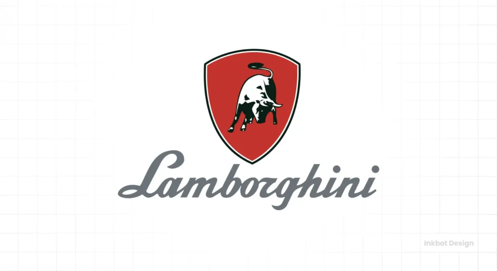
It’s the polar opposite. Where the horse is elegant, the bull is brutal. The bull is grounded, muscular, and immensely powerful, whereas the horse is light. The bull isn’t prancing; it’s hunched forward, ready to charge. It is a symbol of raw, untamable force.
The official story is that Ferruccio, a Taurus, chose the bull because it was his zodiac sign and he had a passion for Spanish bullfighting. This is true, and it makes for a great personal touch. But don’t let the convenient personal link distract from the strategic genius. He chose the one animal that could mentally and symbolically gore the prancing horse.
The Shield: A Statement of Strength and Heritage
Both logos use a shield shape, but for different effects. The shield is a classic heraldic device, immediately communicating heritage, quality, and invincibility.
For Lamborghini, the shield acts as a container for the bull’s raw power. It gives the aggressive energy a sense of stability and permanence. It says, “This isn’t just chaos; this is controlled, engineered power.” It grounds the brand in a tradition of Italian craftsmanship, even though it was a brand-new company.
Black and Gold: The Colours of Power and Prestige
Ferrari is synonymous with Rosso Corsa, the racing red of Italy. Lamborghini needed to create a different psychological association.
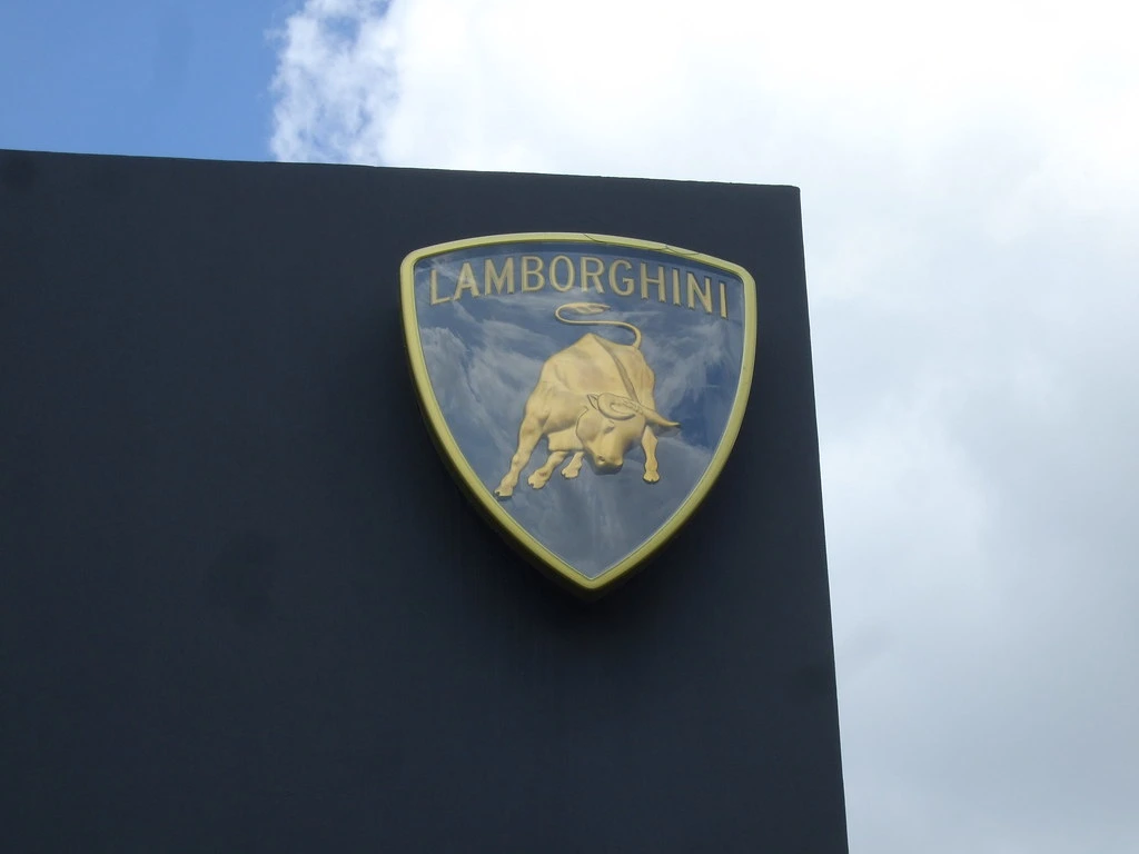
The choice of black and gold was deliberate.
- Black is the colour of authority, power, sophistication, and mystery.
- Gold is the colour of luxury, wealth, victory, and the highest quality.
This combination created a new kind of automotive identity. It wasn’t about the racetrack but being the most audacious, luxurious, and powerful statement on the road. It positioned the car not as a racer’s tool, but as a tycoon’s trophy.
The Unmistakable Typography: Bold and Direct
There are no delicate, flowing scripts in the Lamborghini logo. The typeface used is a strong, capitalised, sans-serif font. It’s assertive, modern for its time, and unapologetically direct.
The founder’s name, “LAMBORGHINI,” sits proudly above the bull. This wasn’t just a company name; it was Ferruccio’s signature and guarantee. His name was on the line, a direct challenge to Enzo’s.
The Evolution of the Logo: A Lesson in Confidence
One of the most powerful lessons from the Lamborghini brand is its consistency. Lamborghini has demonstrated immense confidence by barely touching its core identity for over 60 years in a world of constant redesigns and relaunches.
1963-1972: The Original Monochrome
The very first logos were more illustrative. They appeared in monochrome—often black and white or silver on a red shield—and the bull was slightly more detailed. It was the foundation, but the brand had yet to codify its iconic look fully.

1972-1998: The Birth of an Icon
In 1972, the logo was simplified and refined into a globally recognised form. This is when the black and gold colour scheme was firmly established. The bull became a cleaner, more powerful silhouette, and the “LAMBORGHINI” text was given its distinct, bold character. This was the moment the brand found its forever look.

1998-Present: The Audi Refinement
When Audi AG acquired Lamborghini in 1998, many purists feared the German automotive giant would sand down the brand’s sharp edges. They worried the raging bull would be tamed.
They were wrong.
The changes made to the logo were minimal and respectful. The bull was slightly refined to be sleeker, the font was subtly updated for better legibility, and the gold was given a somewhat less brassy tone. The effect was a sharpening, a polishing of the existing icon. It was an act of brand stewardship, not a revolution.
This is a critical lesson for any business owner navigating a sale or acquisition. A strong, well-defined brand identity is a valuable asset that a smart owner will preserve, not destroy. This type of careful brand stewardship is central to any successful logo design strategy.
Three Brutal Lessons Every Entrepreneur Can Learn from the Lamborghini Logo
Looking at a supercar logo might seem like a world away from running a small business. It’s not. The principles that make the Raging Bull iconic are universal.
Lesson 1: Your Brand Needs a Point of View (and an Enemy)
Stop trying to please everyone. The most potent brands stand for something, which means they must also stand against something. Don’t build your brand in a vacuum. A great competitor gives you clarity, a story, and a target to aim for.
Now, ask yourself: who is the Ferrari to your Lamborghini? Who is the established player you define yourself against? You don’t have a strategy if you don’t have an answer. You just have a product.
Lesson 2: Confidence is Quiet; Insecurity is a Rebrand
Lamborghini’s minimal logo changes scream confidence. The company knew who it was in 1972 and has seen no need for a fundamental shift. It has been busy proving its point, not redefining it.
Contrast that with businesses that change their logo, colours, and messaging every few years. What does that signal to the market? It signals a lack of vision. It signals instability. It signals that the leadership team is chasing trends instead of building a legacy. A rebrand is not a strategy; it’s often a sign that you never had one in the first place.
Lesson 3: Your Logo is a Promise; Your Product is the Proof
The Raging Bull logo would be a joke if slapped on the front of a sensible family minivan. It works because the cars that wear it live up to its promise.
The Lamborghini Miura, released in 1966, was arguably the first supercar. The Countach looked like a spaceship that had landed from the future. Every car Lamborghini built was an extension of the logo’s ethos: aggressive, audacious, and completely over the top.
The lesson is simple: your visual identity is a promise. Your product or service is the fulfilment of that promise. Make sure they are aligned. The first step is ensuring your visual identity aligns with your core business values. If you’re ready to define that promise, you can request a quote to see how we can help.
The Lamborghini Logo Isn’t for Everyone—And That’s Why It Works
The Lamborghini brand is not subtle. It’s loud, polarising, and unapologetic. The logo is a perfect reflection of this. It doesn’t invite you in; it challenges you.
This is its greatest strength.
By refusing to be a bland, universally “likeable” mark, the Raging Bull has cultivated a fanatically loyal tribe of followers. You either get it, or you don’t. And the brand doesn’t care one bit about those who don’t.
That is the final, most brutal lesson. In a crowded marketplace, the opposite of love isn’t hate; it’s indifference. The worst thing your brand can be is forgettable.
So, is your brand brave enough to be a Raging Bull in a world of Prancing Horses?
Explore more branding case studies and design insights on the Inkbot Design blog.
Frequently Asked Questions About the Lamborghini Logo
What does the Lamborghini logo mean?
The Lamborghini logo features a “Raging Bull” ready to charge. This symbolises power, speed, and aggression. Founder Ferruccio Lamborghini chose the bull because he was a Taurus (his zodiac sign) and was passionate about Spanish bullfighting. Strategically, it also represents a powerful, earth-bound force in direct contrast to Ferrari’s elegant “Prancing Horse.”
Why is the Lamborghini logo a bull?
Founder Ferruccio Lamborghini’s zodiac sign was Taurus, the bull. He was also profoundly interested in bullfighting, and many Lamborghini car models, such as the Miura, Diablo, and Murciélago, are named after famous fighting bulls or breeds.
What is the history behind Lamborghini and Ferrari’s logos?
The Lamborghini brand was created from a rivalry between Ferruccio and Enzo Ferrari. Lamborghini’s choice of a powerful, aggressive bull is widely seen as a direct challenge to Ferrari’s graceful prancing horse, establishing an immediate brand narrative of being the more brutish and powerful alternative.
Has the Lamborghini logo ever changed?
Yes, but only subtly. The original 1963 logo was more illustrative. It was simplified in 1972 to the iconic black and gold shield. The most recent update was in 1998 after Audi’s acquisition. It involved minor refinements to the bull and typography to make it look cleaner and more modern, but the core design remained intact.
What are the colours of the Lamborghini logo?
The official colours are black and gold. Black represents power, authority, and sophistication, while gold signifies luxury, wealth, and high quality.
What is the shape of the Lamborghini logo?
The logo is in the shape of a shield, or escutcheon. This classic shape conveys heritage, strength, and protection, giving the aggressive bull a sense of legitimacy and permanence.
What font is used for the Lamborghini logo?
The Lamborghini logo uses a custom sans-serif typeface. It is a bold, capitalised font designed to be assertive, modern, and easily legible, reinforcing the brand’s powerful image.
Who designed the original Lamborghini logo?
Ferruccio Lamborghini himself is credited with conceiving the core concept of the Raging Bull within the shield. He was heavily involved in all aspects of his company’s initial branding, ensuring it reflected his vision and his direct challenge to Ferrari.
Is the bull on the logo specific?
The bull is not a depiction of a particular famous fighting bull. It is a stylised representation of the concept of a raging bull, embodying the characteristics of strength and determination that Ferruccio wanted his brand to represent.
What is the key branding lesson from the Lamborghini logo?
The key lesson is the power of “calculated antagonism.” By defining itself in direct, bold opposition to a primary competitor (Ferrari), Lamborghini created a powerful and instantly understandable brand identity. It teaches businesses to have a strong point of view and not to be afraid of being polarising.
Does Audi own Lamborghini?
Yes, Automobili Lamborghini S.p.A. has been owned by the German Volkswagen Group through its subsidiary Audi AG since 1998.
How does the Lamborghini logo influence its car design?
The logo’s promise of raw power and aggressive design is directly reflected in the cars. Lamborghini vehicles are known for their sharp, angular lines, low-slung profiles, and extreme performance—they are the physical embodiment of a “raging bull.”
Your brand’s identity is its sharpest tool. The Lamborghini story proves that a logo from clear strategy and conviction can build a legacy for decades. If you’re ready to stop being forgettable and forge an identity with a real point of view, our team at Inkbot Design can help. Explore our logo design services to see how we build brands that mean business.

