10 Famous Failed Logo Redesigns: How Ego and Bad Strategy Cost Billions
A new logo will not fix your broken business.
Let’s get that out of the way first.
A fresh coat of paint on a crumbling wall is still a crumbling wall. Yet, time and again, boards and marketing departments get seduced by the idea of a “fresh start.”
They believe a new visual identity can magically signal innovation, reconnect with a younger audience, or wash away years of corporate neglect.
It can’t.
A logo has one primary job: to be a reliable memory trigger. It’s a tiny visual shortcut connecting a customer’s brain to every experience, product, and feeling associated with your brand.
Changing it carelessly isn’t a fresh start; it’s giving your company self-induced amnesia and asking your customers to forget you.
We will dissect 10 of the most infamous rebranding failures in modern history. These aren’t just cautionary tales; they’re expensive, real-world masterclasses in what not to do.
These lessons are vital for entrepreneurs and small business owners who can’t afford a multi-million-pound do-over.
- A new logo cannot fix underlying business issues; it requires a strategic reason for change.
- Brand identity must connect emotionally with customers and represent history and values.
- Clear and simple designs are more effective than overly complicated or abstract logos.
- Understand your audience's perception; a logo must resonate with the customer base.
- Successful redesigns honour past equity while evoking a strong, clear future vision.
The One Question Most Brands Forget to Ask
Before thinking about colours, fonts, or symbols, you must answer one brutally honest question: “Why are we really doing this?”
The wrong answers are depressingly familiar. They sound like this:
- “Our CEO is bored with the old one.”
- “The new marketing director wants to make their mark.”
- “All our competitors have minimalist logos now.”
- “We just feel like we need a more modern look.”
These are reasons rooted in ego, boredom, and trend-chasing. They are recipes for disaster.
The correct answers are strategic and unavoidable. They sound like this:
- “We’ve merged with another company and need a new unified identity.”
- “Our business model has fundamentally pivoted, and the old logo is now misleading.”
- “We’re facing serious legal issues with our current trademark.”
- “Our original logo was designed in 1978 and is technically impossible to render correctly on a smartphone screen.”
You should stop now if your reason isn’t on that second list. If you proceed, you risk ending up in our Hall of Shame.
The Hall of Shame: 10 Case Studies in Rebranding Failure
1. Gap (2010): The Poster Child for Public Outcry
The Before: The iconic, confident, all-caps serif font inside a dark blue box. It was a globally recognised asset for over 20 years. It was simple, effective, and owned.
The After: A bland, lowercase Helvetica wordmark followed by a small, gradient-blue square awkwardly on top of the ‘p’. It looked like a cheap default font from a PowerPoint slide.
The Backlash: The internet exploded. It was immediate, vicious, and universal. A website called “Make Your Own Gap Logo” went viral, allowing users to create their own terrible versions, highlighting the lazy nature of the redesign. After six days and an estimated $100 million spent, Gap scrapped the new logo and reverted to the classic blue box.
The Analysis: This is a textbook case of a brand completely undervaluing its hard-won equity. They traded a distinct, recognisable symbol for a piece of soulless corporate modernism that could have represented a cloud storage company or a regional bank. It was a catastrophic failure to appreciate what they already had. This is the “blanding” epidemic in its purest form.
The Takeaway for Entrepreneurs: Your logo doesn’t just belong to you; it belongs to your customers. Never underestimate their emotional connection to the visual mark they’ve associated with you for years.
2. Tropicana (2009): Ditching Decades of Brand Equity
The Before: An orange with a red-and-white striped straw stuck directly into it. It was genius. It communicated “fresh orange juice” instantly, with no translation needed.
The After: A generic, sterile carton featuring a glass full of orange juice. The brand name was turned on its side in a thin, wispy font. It looked like every other store’s own-brand carton.
The Backlash: This was a commercial cataclysm. Sales plummeted by a staggering 20% in the two months following the change. This represented a loss of over $30 million for parent company PepsiCo. Angry customers couldn’t find their favourite juice on the shelves. They didn’t recognise the new packaging.
The Analysis: The design agency, Arnell, focused on “modernising” the aesthetic but forgot the logo’s functional job. The old design was a brilliant piece of functional communication. The new design was just a picture of the product. By trying to look more sophisticated, they made themselves invisible.
The Takeaway for Entrepreneurs: A logo can be a practical tool. Does your design help a customer make a split-second decision in your favour? Or does it just add to the noise? Clarity sells.
3. Pepsi (2008): Death by PowerPoint
The Before: The familiar, symmetrical “Pepsi Globe” that had been a part of global culture for decades, with its equal red and blue hemispheres separated by a wavy white line.
The After: A slightly tilted version of the globe, creating what was meant to be a “smile.” On its own, it was a questionable tweak. But the absolute failure wasn’t the mark; it was the justification.
The Backlash: The logo itself was met with a shrug. The disaster was the leak of the 27-page design brief from the Arnell Group (them again). Titled “Breathtaking,” the document was an impenetrable mess of pseudo-scientific jargon, referencing the golden ratio, the earth’s magnetic fields, and Hindu spiritual geometry to justify a simple logo tweak. It became an industry-wide laughingstock.
The Analysis: This is the pinnacle of design-by-committee absurdity. It shows what happens when a simple design change gets tangled in corporate politics and needs a ridiculously over-intellectualised defence to get approved. It made Pepsi look foolish and exposed the branding world’s worst, most self-important tendencies.
The Takeaway for Entrepreneurs: Have an apparent, simple reason for your design choices. If you can’t explain your new logo to a customer in one sentence without sounding like a charlatan, you have failed.
4. Kraft Foods (2009): The Bland and the Pointless
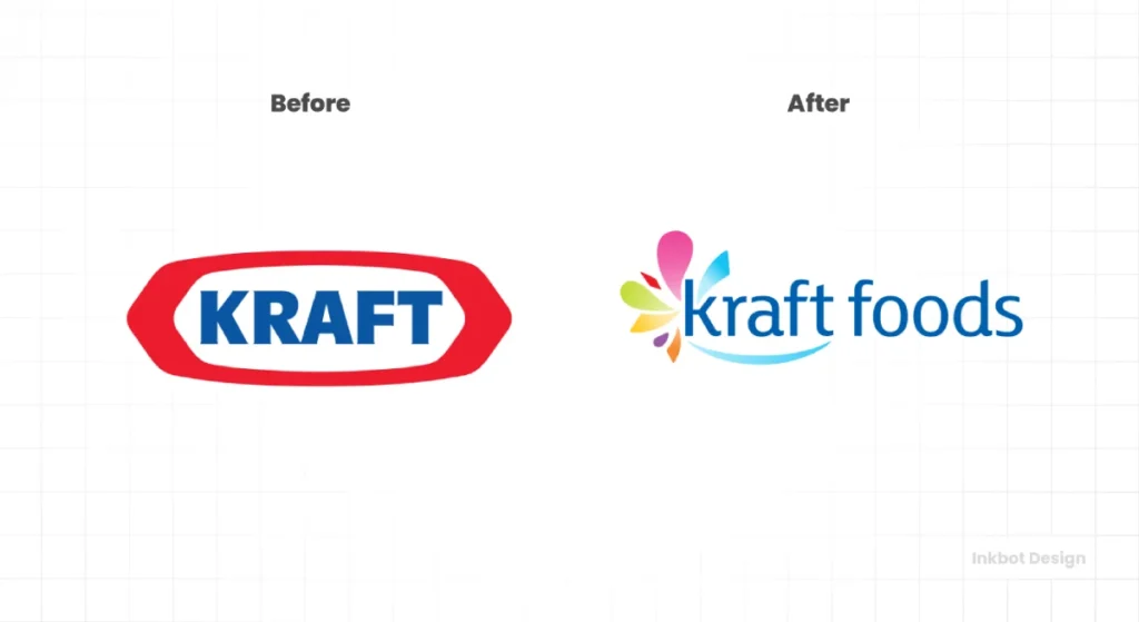
The Before: The bold, classic, red-and-blue “racetrack” logo. It felt solid, authoritative, and quintessentially American. It was a mark of a food giant.
The After: A weak, lowercase wordmark in a generic red font, followed by a strange multi-coloured “flavour burst” star. The tagline “make today delicious” was crammed underneath. It was a mess.
The Backlash: The reaction was less anger and more confusion and mockery. The new logo lacked the weight and authority of the original. It looked flimsy and unfocused. During a corporate split, Kraft eventually tweaked it and abandoned the new direction a few years later.
The Analysis: This is what happens when a design tries to be everything to everyone. The committee wanted it to feel more “friendly” (lowercase), “vibrant” (the starburst), and “inspirational” (the tagline). In trying to do everything, it accomplished nothing. It had no core idea.
The Takeaway for Entrepreneurs: A logo’s job is to identify, not explain, your mission statement. Pick one idea and execute it with confidence.
5. Animal Planet (2008): When a Rebrand Loses the Plot
The Before: A friendly and clear logo featuring a stylised elephant reaching for a small globe. It said it all: animals and the planet. Simple.
The After: A new wordmark with a bizarrely aggressive, sideways ‘M’. The rest of the letters were bold and stark. The friendly elephant and the planet were gone.
The Backlash: The audience was just confused. Why was the ‘M’ on its side? Was it meant to be an animal? A tooth? It felt primal and aggressive, which was a strange fit for a channel known for beloved shows about puppies and pandas.
The Analysis: This was a failure of strategy. The channel wanted to shift its brand to be more “primal” and attract a more adult audience. However, the execution was so abstract that it lost all connection to the core subject matter. Instead of “primal,” it just read as “random.”
The Takeaway for Entrepreneurs: Your logo must align with your core business. You can be abstract, but the feeling and energy of the mark must align with the product or service you provide.
6. Leeds United (2018): How to Enrage 10,000 Fans in a Day
The Before: A classic football shield, incorporating the White Rose of York and the club’s initials. A symbol of heritage and local pride.
The After: A generic, faceless illustration of a figure doing the “Leeds Salute” (thumping their chest). It looked like a stock graphic from a cheap football manager video game.
The Backlash: This was the most ferocious public backlash on this list. A Change.org petition demanding the club scrap the new crest gained over 77,000 signatures in a matter of days. Stunned by the sheer volume and venom of the response, the club was forced into a humiliating U-turn almost immediately.
The Analysis: A complete and utter failure to understand the audience. This goes beyond customers; this is about a tribe. A football crest isn’t a corporate logo; it’s a sacred symbol of identity, history, and community. They tried to replace a century of heritage with a corporate emblem, and the fans rightfully rejected it. This is Audience Amnesia in its most potent form.
The Takeaway for Entrepreneurs: Know your tribe. If you serve a passionate, dedicated audience with a strong sense of culture, you do not mess with their symbols without deep, respectful consultation.
7. Uber (2016): The “Bits and Atoms” Fiasco
The Before: The simple, stylish, and highly recognisable black-and-white “U” wordmark.
The After: A confusing set of abstract shapes. A shape inside a hexagon for driver partners and a circle for riders. The recognisable “U” was gone from the app icon.
The Backlash: Widespread confusion. People who were opening their phones had no idea what the new app icon was. The story behind it—something about “bits and atoms” representing the digital network and the physical world—was far too complex and intellectual for a logo to convey.
The Analysis: A classic case of a company overthinking its own identity. They created a “brand system” that might have looked clever on a presentation slide but failed the most crucial test for an app icon: can a user find it instantly? By trying to be smart, they sacrificed clarity.
The Takeaway for Entrepreneurs: Clarity trumps cleverness every single time. Your logo should be a mental shortcut, not a puzzle. Getting that identity right is difficult, so a professional logo design process prioritises instant recognition over a complex backstory.
8. London 2012 Olympics: An Invitation to Controversy
The Before: For its bid, London used a graceful, ribbon-like design in the colours of the Olympic rings, forming the shape of the River Thames. It was elegant, conventional, and safe.
The After: A jagged, graffiti-inspired, neon-coloured collection of shapes roughly spelt out “2012”. Wolff Olins designed it for a reported £400,000 and intended it to be modern, bold, and “for the kids.”
The Backlash: It was an immediate and international PR disaster. The public hated it. A petition for it to be scrapped received nearly 50,000 signatures. More alarmingly, its abstract nature became a Rorschach test for controversy. One animated promotional video was pulled after fears it could trigger seizures in people with photosensitive epilepsy. Iran threatened to boycott the Games, claiming the shapes spelt out the word “ZION.” Others famously saw the cartoon character Lisa Simpson performing a lewd act.
The Analysis: Much like the Airbnb redesign, this was a catastrophic failure to anticipate public interpretation. In an attempt to be edgy and disruptive, they created a symbol so abstract it became a blank canvas for mockery and conspiracy. It was a design so desperate to avoid boredom that it became actively hostile to a significant portion of its audience. The goal of an Olympic logo is to be unifying; this one was intensely divisive.
The Takeaway for Entrepreneurs: When you create an abstract symbol, you lose control of its meaning. Before you commit, show it to a broad, diverse audience. If you have to spend five minutes explaining what it’s supposed to be, it has already failed.
9. Yahoo! (2013): A Failure of Process
The Before: The quirky, cheerful, purple “yodel” logo. It was a product of the dot-com era’s playful spirit. While a bit dated, it was instantly recognisable and had personality.
The After: After a bizarre marketing campaign called “30 Days of Change,” where the company showcased a different (and mostly terrible) new logo option every day for a month, they landed on… a thin, bevelled, purple wordmark that lacked all the character of the original.
The Backlash: The public spectacle of the 30-day campaign was widely seen as a gimmick that betrayed a total lack of conviction. Instead of building excitement, it annoyed people and made Yahoo! look indecisive. The final logo was universally panned as a bland, soulless, and weak replacement that looked like it was designed by a committee in the late 90s.
The Analysis: This wasn’t just a design failure but a process failure. A logo redesign should be a confident, strategic move. Yahoo! turned it into a month-long public display of insecurity. By showing 29 other options, they invited the public to find a favourite, ensuring that the final choice would disappoint almost everyone. It was a masterclass in how not to manage a creative transition.
The Takeaway for Entrepreneurs: Have conviction. Do your research, make a strategic choice, and execute it confidently. Never crowdsource your core identity or reveal your internal indecision to the world.
10. X (formerly Twitter): How to Destroy a Global Icon Overnight

The Before: The Twitter bird, “Larry T. Bird.” One of the most recognisable and valuable brand assets in the world. It was synonymous with real-time news, global conversation, and the very concept of a short online post (“a tweet”). It was a verb. It was a cultural phenomenon.
The After: A generic, black-and-white, sans-serif letter ‘X’ sourced from a font user a decade ago.
The Backlash: The move was met with global bewilderment, scorn, and financial analysis that suggested the decision had wiped out somewhere between $4 billion and $20 billion in brand value, literally overnight. Users, advertisers, and the media were confused. The cultural language built over 15+ years (“tweet,” “retweet”) was rendered obsolete. The physical sign on Twitter’s San Francisco HQ was crudely removed, resulting in a police standoff. It was rebranding as pure, chaotic vandalism.
The Analysis: This is the ultimate lesson on what happens when the ego is the sole driver of a rebrand. There was no strategy, transition plan, or respect for the colossal brand equity built over a decade. It was an impulsive act that disregarded millions of users’ emotional and functional connection with the bird. It replaced a symbol of connection and conversation with a character that means “unknown” or “cancel.”
The Takeaway for Entrepreneurs: Your brand is not your plaything. It is a shared asset that lives in the minds of your customers. Destroying one of the world’s most famous brands for a personal whim is not a lesson in bold leadership but in breathtaking hubris.
3 Key Lessons to Avoid a Rebranding Disaster

If you only remove three things from these multi-million-dollar blunders, make them these.
1. Respect Your History, Don’t Erase It
As Gap and Tropicana learned the hard way, brand equity is a real, tangible asset. The visual cues you’ve built up over the years have value. A redesign should seek to evolve and strengthen that equity, not throw it in the bin for the sake of looking “new.”
2. Strategy First, Design Second
Pepsi and Animal Planet show what happens when the “why” is flawed. Your strategy must be rock solid before a single pixel is pushed. Design is the answer to a strategic question, not the strategy itself.
3. Your Audience is the Final Judge
Leeds United and Airbnb provide the ultimate lesson in public perception. You can have the most strategically sound, aesthetically beautiful logo in the world, but if your audience hates it or mistakes it for a set of genitals, you’ve lost. Public perception is reality. Test your work.
So, Is It Time For a New Logo?
After reading these stories, the prospect of a redesign can feel terrifying. It should be. It’s a high-stakes decision that deserves serious, sober consideration.
Return to that first question: “Why are we really doing this?” If you have a solid, strategic answer, redesigning might be right.
The best redesigns are evolutions, not revolutions. They honour the past while positioning the brand for the future.
Navigating these pitfalls is complex. It requires a deep respect for brand history and a clear-eyed view of business objectives. It’s about more than just drawing a pretty picture.
If these stories feel uncomfortably familiar and you’re grappling with a brand that feels stuck, it might be time for a strategic conversation.
When you’re ready to explore a redesign that prioritises strategy over trends, talk to an expert. You can request a quote to connect with designers who understand these risks and know how to build a brand that lasts.
Famous Failed Logo Redesigns (FAQs)
What is the most famous failed logo redesign?
The 2010 Gap redesign is arguably the most renowned failure due to the speed and intensity of the public backlash and the company’s swift reversal in just six days.
Why did the Tropicana rebrand fail so badly?
The Tropicana rebrand failed because it destroyed brand recognition. Customers couldn’t find the product on crowded shelves, leading to a direct and immediate 20% drop in sales. It sacrificed a functional, communicative design for generic aesthetics.
How much did the Pepsi logo cost?
The Arnell Group was paid $1 million for the 2008 Pepsi logo redesign. The real cost came in the public mockery of the leaked justification document, which damaged the brand’s credibility.
What is brand equity, and why is it essential for a logo?
Brand equity is the value a company has built up in its name and visual marks over time. It’s the trust and recognition in the minds of consumers. A logo is a key container of this equity, so changing it carelessly can wipe out a valuable asset.
How can a small business avoid a logo redesign failure?
The best way is to have an apparent strategic reason for the change (not just boredom), understand your audience’s connection to your current brand, and work with a professional designer who prioritises strategy over trends.
What is the difference between a brand refresh and a rebrand?
A brand refresh is an evolution—modernising the existing logo (e.g., tweaking fonts or colours). A rebrand is a revolution—a complete change of the logo and brand identity, usually tied to a fundamental shift in business strategy.
Why do so many companies switch to minimalist logos?
The trend towards minimalism (often called “blanding”) is driven by a desire for digital-friendliness (simpler logos work better as small app icons) and an attempt to appear modern and clean. However, it often results in a loss of personality and distinctiveness.
How long did the failed Gap logo last?
The failed 2010 Gap logo officially lasted less than one week before the company reverted to its classic design.
Is a wordmark or a symbol better for a new business?
A wordmark (a logo based on the company’s name) is far better for almost all new businesses. It builds name recognition directly. A symbol-only logo is only effective once a brand has achieved widespread fame.
What should I look for in a logo designer?
Look for a designer or agency that asks you about your business strategy, target audience, and competitive landscape before they ever talk about fonts or colours. A good designer is a strategic partner, not just an illustrator.
Can a brand recover from a failed redesign?
Yes. Brands like Gap and Tropicana recovered by listening to their customers and quickly reverting to their beloved original designs. Airbnb recovered by sticking with its new design and allowing it to become accepted over time. A quick, humble response is key.


