The Principles of eCommerce Web Design That Actually Work
Your ecommerce website is not a piece of art. It’s not your personal creative outlet. It is not something you build to win design awards or impress your mates down the pub.
Your ecommerce website is a tool. A machine. And its only job is to sell your products. Full stop.
The internet is littered with “stunning” websites that are ghost towns. They’re beautiful, animated, clever… and don’t make a penny. They are monuments to a designer’s ego, not a business owner’s bank account.
This isn’t another article praising the latest pointless design trend. This is a guide to building an ecommerce site that works.
One that is clear, fast, trustworthy, and ruthlessly focused on turning visitors into customers.
Forget everything else.
- Make your value proposition crystal clear within five seconds so visitors instantly know who you are and what you sell.
- Prioritise usability: simple navigation, powerful search, and a frictionless, guest-friendly checkout to reduce abandonment.
- Build trust with authentic photos, genuine reviews, clear policies, and visible secure payment badges.
- Optimise for speed and mobile first; fast, lightweight pages and big tappable controls drive higher conversions.
Why Most ‘Beautiful’ Ecommerce Sites Fail
I once took on a client who was incredibly proud of their website. And they had every right to be. It had won two design awards. It was featured on all the trendy gallery sites. It had slick animations, a unique layout, and gorgeous, atmospheric photography.
Their sales? Abysmal.
We tracked user sessions and watched in horror as people struggled to find the products. They couldn’t figure out the “creative” navigation. The “Add to Cart” button was so stylised it was practically camouflaged. It was a beautiful, expensive, and utterly useless failure.
So we ripped it all out. We replaced the clever navigation with straightforward language. We installed a large, conspicuous orange button. We simplified the layout so the products were front and centre.
The design community would have hated it. But sales tripled in two months.
That’s the great deception. You’ve been told that “good design” is what matters. But what they mean is aesthetics. What you need is practical design. They are not the same thing.
The Only Three Things Your Ecommerce Site Needs to Do
You can ignore 99% of the web design advice if you just focus on these three things. Your site must be:
- Understood in 5 Seconds. A visitor should land on your homepage and know instantly who you are, what you sell, and why they should care. If they have to think, you’ve already lost.
- Unbelievably Easy to Use. The entire process should be frictionless, from finding a product to checking it out. Obvious. Idiot-proof. Any confusion, any moment of hesitation, costs you money.
- Obviously Trustworthy. People are handing over their card details to you. You need to look legitimate, secure, and professional. Any hint of amateurism will send them running.
That’s it. That’s the entire job description. Anything that doesn’t serve one of these three goals is a distraction.
Function Over Form: The “Boring” Website Philosophy
Look at Amazon. Is it beautiful? No. It’s a cluttered mess. It’s about as aesthetically pleasing as a tax form.
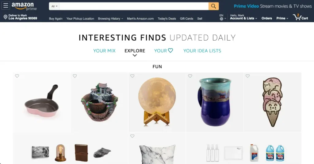
But it’s arguably the most effective ecommerce machine ever built.
Why? Because it’s fast. Its search function is magnificent. The product pages provide all the information you need. The “Buy Now” button is unmissable. It’s ruthlessly efficient.
This is the philosophy you must adopt. Clarity over cleverness. Speed over style. Sales over awards. A “boring” website that is fast, clear, and easy to use will make you more money than a “stunning” work of art, every single time.
The Anatomy of an Ecommerce Site That Prints Money
Right, let’s stop talking theory. The success of your site hinges on getting a few key pages and elements right. Focus your energy here, not on picking the perfect shade of grey for your footer.
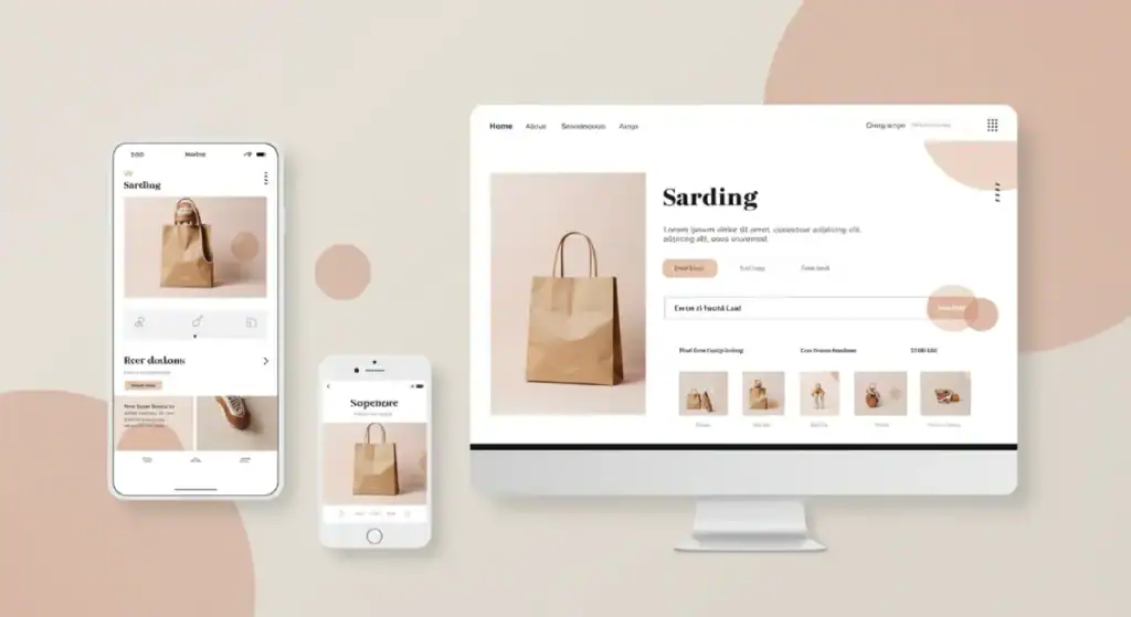
The Homepage: Your 5-Second Pitch, Not Your Masterpiece
The homepage has one primary job: get people off the homepage. It’s a signpost, not a destination. When a new visitor lands here, they are asking one question: “Am I in the right place?”
You have five seconds to answer them.
Your homepage must have:
- A Clear Headline: State Your Value Proposition. Don’t say “Artisanal Goods for the Modern World.” Say “Handmade Leather Wallets That Last a Lifetime.” Be specific.
- An Obvious Call to Action (CTA): What is the #1 thing you want them to do? “Shop New Arrivals.” “Browse Men’s Collection.” Make it a button. Make it stand out.
- A High-Quality Hero Image: Show your product in its best light—no terrible stock photos. Show a real person using or wearing your real product.
- Social Proof: Logos of publications you’ve been featured in. A snippet of a 5-star review. Something that says “other people trust us.”
That’s it. Don’t clutter it with your life story or a feed of your latest 12 blog posts. Get them to the next step.
Navigation & Search: Don’t Make People Think
Old search bars looked for exact text matches. If a user typed “crimson dress” and you labelled it “red gown,” they found nothing.
Modern Vector Search (AI) understands that crimson = red and gown = dress.
Tools like Algolia or Shopify’s semantic search don’t just find keywords; they find products that match specific search queries.
Pro Tip: Implement “Zero Results” pages that recommend popular items instead of a dead end.
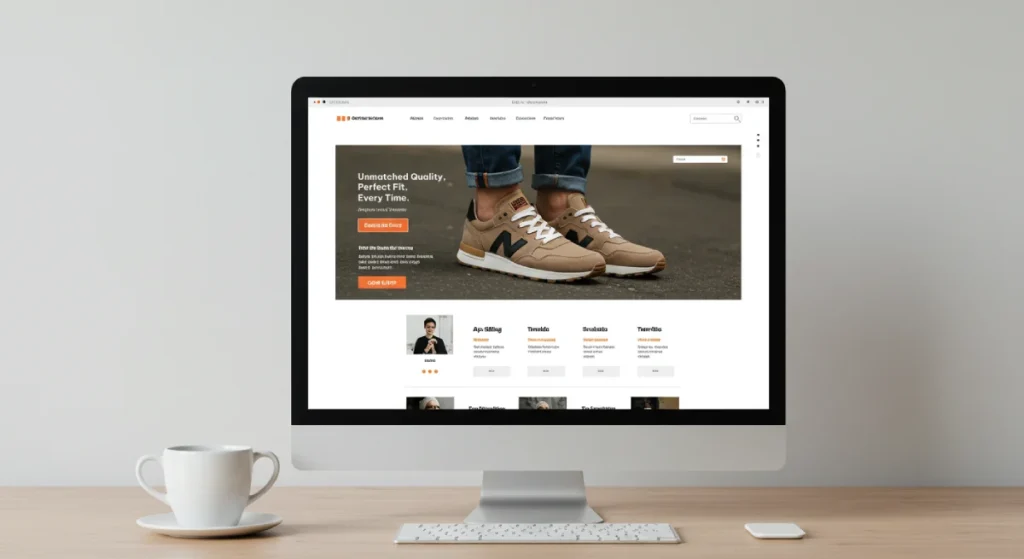
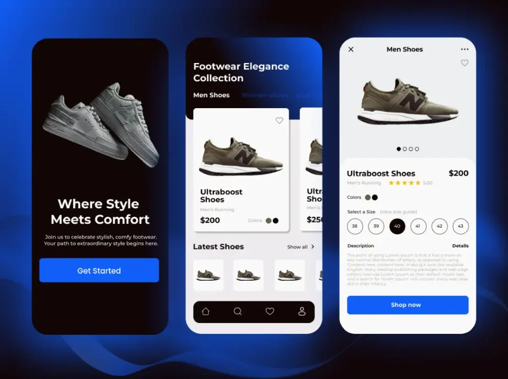
Product Pages: The Real Heart of Your Store

Forget the homepage. The product page is the most important page on your website. This is where the sale is won or lost. All of your advertising, your social media, your emails—it all leads here. Don’t mess it up.
A great product page has a holy trinity of elements.
- 1. Killer Photography: This is the single most critical element. Your customer cannot touch or hold your product. Your photos have to do all the work. You need multiple high-resolution shots from every angle. You need in-context images showing the product in use. Show the scale. Show the texture. If it’s a piece of clothing, show it on a person. The video is even better. Don’t skimp on photography. It is your product.
- 2. Compelling, Clear Copy: Write a product description that sells. Start with the benefits, not the features. Instead of “Made with 100-gsm paper,” try “Thick, smooth paper that won’t bleed through, so you can use your favourite fountain pen.” Use bullet points to make features easy to scan. Anticipate every question a customer might have about size, materials, care instructions, and what’s in the box, and answer it on the page. If availability is limited, clearly explain back order vs pre order so customers know what to expect before purchasing.
- 3. An Unmissable CTA: The “Add to Cart” or “Buy Now” button should be the most visually dominant thing on the page. It needs to be big. It requires a contrasting colour. A user should be able to spot it instantly without thinking. Test it. Does it scream “CLICK ME”? If not, make it bigger and brighter.
The Cart & Checkout: Your Final Hurdle
You’ve done the hard work. They’ve added a product to their cart. Now, your only job is to get out of the way and take their money. The checkout process should be straightforward and easy to use.
- Don’t force account creation. This is a conversion killer. Always offer a guest checkout option. You can ask them to create an account on the “thank you” page after they’ve paid.
- Show all costs upfront. The number one reason for cart abandonment is unexpected costs. Be transparent about shipping and taxes in the cart before proceeding to checkout.
- Make it look secure. Display your payment providers’ logos prominently. Seeing familiar names like Stripe, PayPal, and Apple Pay provides a massive psychological boost in trust.
Getting this checkout flow perfect is one of the most high-impact things you can do. It’s a fundamental part of professional ecommerce web design that separates the pros from the amateurs.
The Truth About Ecommerce Platforms
Entrepreneurs love to agonise over this choice. The reality is simpler than you think. For 95% of you, there are only two genuine contenders.
Shopify: The Default for a Reason
Shopify is the market leader because it just works. It’s an all-in-one solution that handles hosting, security, and payment processing, so you can focus on creating and selling your products.
- Pros: Incredibly easy to set up and manage. Fast, secure, and reliable. A vast ecosystem of apps and themes.
- Cons: You pay a small transaction fee in addition to payment processor fees (unless you use Shopify Payments). The cost of apps can add up.
- Best for: The vast majority of small and medium-sized businesses. Choose Shopify to get up and running quickly and avoid technical maintenance.
WooCommerce: The Power & The Pain
WooCommerce is a free plugin that turns a WordPress website into an online store. It offers ultimate flexibility but comes with a massive catch.
- Pros: It’s open source and free. You have 100% control over every aspect of your store, with no transaction fees.
- Cons: You are the one responsible for everything. You must purchase hosting, install SSL certificates, manage security updates, and resolve issues when they arise. And they will break.
- Best for: Businesses with specific, custom requirements or those with a technical staff member. Don’t choose this to save money unless you value your time at zero. The headaches often outweigh the benefits.
A Quick Word on the Others
Yes, there are BigCommerce, Squarespace, and others. They all have their place. However, most small businesses will be best served by either the plug-and-play simplicity of Shopify or the raw power of WooCommerce. Don’t overthink it.
Essential Ingredients Most Amateurs Forget
Building the pages is one thing. Infusing them with the right ingredients is another key factor. These things may seem small, but they have a significant impact on your sales.
Blistering Speed is a Feature
A slow website doesn’t just feel bad; it actively costs you money. According to statistics from Portent, a site that loads in 1 second has a conversion rate 3x higher than a site that loads in 5 seconds [source]. Every millisecond counts.
How do you get faster?
- Compress your images. This is the biggest offender. Use tools like TinyPNG before you upload anything.
- Choose good hosting. If you’re using WooCommerce, avoid using cheap £5-a-month shared hosting. Invest in quality.
- Limit your apps/plugins. Every app you add to Shopify or plugin to WordPress can slow down your site. Be ruthless. If it’s not essential, eliminate it.
Mobile Isn’t Just “Important”—It’s Everything

Stop designing your website on a big desktop monitor. More than 64% of online traffic now comes from mobile devices [source]. Your site must be created with the thumb in mind first.
This means big, tappable buttons. Simple navigation that works on a small screen. Readable text without pinching and zooming. Every design decision should be stress-tested first on a mobile phone view.
Mobile vs. Desktop: The 2026 Reality Check
Don’t just take my word for it. The data shows exactly where the money is moving. (Source: Statista & Google Retail Reports 2025)
| Metric | Desktop | Mobile |
| Traffic Share | 32% | 68% |
| Add-to-Cart Rate | 8.5% | 10.4% |
| Cart Abandonment | 65% | 82% ( Needs simpler checkout!) |
| Avg. Session Duration | 5 mins | 2.5 mins (Speed is critical) |
I remember watching a user test for a client’s site once. I was sitting there with my cup of tea, which was slowly going cold as I watched this poor woman try to buy a dress on her iPhone.
The “checkout” button was so tiny and tucked into a corner that she couldn’t tap it without hitting two other links. She gave up after three attempts. That company didn’t just lose a sale; they lost a customer forever.
Building Trust When You’re Not Amazon
Amazon can get away with a functional but ugly site because everyone trusts it. You don’t have that luxury. You must actively build trust when someone lands on your page.
- Real Social Proof: Don’t use fake testimonials. Use a reputable service like Loox or Trustpilot to gather honest reviews with photos. Showcase user-generated content from Instagram.
- Clear, Accessible Policies: Your shipping and returns policies shouldn’t be hidden. Link to them clearly on your product pages and in your footer. An easy returns policy is a powerful sales tool.
- Tell Your Story: Have an “About Us” page that shows the real people behind the business. A short video or candid photos can build trust more than any security badge.
- Trust Seals: Use the logos for your payment providers. A “Secured by Stripe” logo is reassuring. But don’t overdo it—a wall of 15 badges looks desperate and spammy.
Inclusive Design (It’s Not Just About Lawsuits)
Accessibility isn’t just a legal checkbox; it’s a market expansion strategy. In 2026, over 15% of the global population lives with some form of disability.
- Colour Contrast: Ensure your grey text on a white background is actually readable.
- Screen Readers: Can a blind user navigate your checkout? If not, you’re blocking sales.
- Keyboard Navigation: Power users (and those with motor impairments) rarely use a mouse. Test your site using only the
Tabkey.
The Stat: Accessible websites have an average 20% wider audience reach.
Stop Wasting Money: Common Ecommerce Design Sins
Here’s a quick-fire list of things I see daily that need to stop. If your website does any of these, fix it now.
- Image Carousels/Sliders. They are pure poison for conversions. People don’t wait for them to rotate; they slow down your site. Pick your best image and your strongest message and stick with it.
- Aggressive Pop-ups. The “JOIN OUR NEWSLETTER” pop-up that appears one second after you land on a site is infuriating. Let people breathe. Give them a chance to see if they like what you sell before you demand their email address. Collecting emails is only useful if they are valid, so incorporating email verification ensures your newsletter list stays clean and effective.
- Meaningless Stock Photos. Nobody is fooled by the perfectly groomed, multi-ethnic group of models laughing at a laptop. Use real photos: your product, your workshop, your team. Authenticity sells.
- Forgetting the Footer. The footer is a critical safety net. People instinctively scroll there when they’re looking for contact info, shipping policies, FAQs, or your social media links. A well-organised footer is a sign of a professional site.
- Inconsistent Branding. Using one font in your logo, another for your headlines, and a third for your body copy looks amateurish. Keep your colours, fonts, and tone of voice consistent. It builds recognition and trust.
Your Website is Never ‘Finished’
Here’s the last piece of brutally honest advice: launching your website is the start line, not the finish line.
The idea that you build a site and it’s “done” is a fantasy. An effective ecommerce site is constantly evolving. You must listen to your customers, not through a focus group, but through their actions.
Use free tools like Google Analytics to see which pages people visit and where they drop off. Use tools like Hotjar to create heatmaps that show where people click (and where they don’t).
Watch how people use your site. Do they struggle to find the search bar? Add a bigger one. Are they abandoning their carts at the shipping page? Your shipping costs might be too high.
The work is never done. You test, you measure, you tweak. A 1% improvement in your conversion rate may not sound like much, but over a year, it can translate to tens of thousands of pounds in extra revenue.
The Invisible Salesperson: Schema Markup
Your website caters to two audiences: humans and search engines (Google). You need to speak the robot’s language using Schema Markup.
- Product Schema: Tells Google your price, stock level, and star rating so it appears directly in search results.
- MerchantReturnPolicy: Highlights your “30-Day Free Returns” right in the SERP.
- Shipping Details: Displays delivery times before a user even clicks.
Result: Listings with rich snippets get 20-30% higher click-through rates.
Final, Unfiltered Thoughts
Let’s circle back to the beginning. Your ecommerce website is a tool designed to do one thing: make money.
Every decision you make about its design must be filtered through that lens. Does this fancy animation make it easier to make a purchase? No. Ditch it. Does this “creative” layout make the value proposition clearer? No. Ditch it.
Focus obsessively on the fundamentals.
Clarity. Speed. Trust.
That’s the whole game. Get those three things right, and you’ll have a website that not only wins awards but also wins you a business.
Take the Next Step
We’ve laid out the principles. Seeing how they apply to your business is another matter. If you want a brutally honest assessment and a plan to build a site that works, that’s what our web design services are for.
You can request a customised quote tailored to your specific needs here.
You’ll find more no-nonsense advice on our blog if you’re still learning.
Frequently Asked Questions (FAQs)
What makes a good ecommerce web design?
A good ecommerce design is simple, fast, and easy to use. It should effectively communicate the company’s value proposition, showcase products with high-quality images, and offer a seamless checkout process. Function and clarity always win over aesthetics.
How much does an ecommerce website cost?
The cost varies wildly. A basic Shopify site can be set up for a few hundred pounds, while a custom build on WooCommerce can run into the tens of thousands. The better question is about ROI. A well-designed £10,000 site that generates £100,000 in sales is cheaper than a £1,000 site that produces nothing.
What is the best platform for a small business?
For most small businesses, Shopify is the best choice. It’s easy to use, secure, and lets you focus on your products. WooCommerce is a powerful alternative if you need deep customisation and have technical support available.
What is the most crucial page on an ecommerce site?
The product page. It’s where the customer decides to make a purchase. All your marketing efforts lead here, so it’s where you should focus the most design and copywriting effort.
How can I make my website more trustworthy?
Use high-quality, original photography. Display genuine customer reviews and testimonials (social proof) to establish trust and credibility. Be transparent with all costs, especially shipping. Have clear, easy-to-find returns and privacy policies. Show the faces behind the brand on an “About Us” page.
Why aren’t my visitors making a purchase?
Common reasons include: unexpected shipping costs, a slow website, a confusing checkout process, a lack of trust signals, poor product images, or a confusing value proposition. Use analytics to find where users are dropping off.
Do I need a blog on my ecommerce site?
You don’t need one, but it can be a powerful tool for SEO and building authority. It can drive significant traffic if you can commit to creating genuinely helpful content related to your products (e.g., a skincare brand blogging about routines). Don’t start one if you can’t maintain it.
How many products should I start with?
You can start with just one. Launching with one great product, excellent photos, and a compelling description is better than waiting until you have 50 products ready. Get started, get feedback, and grow from there.
What are the most essential things on a product page?
High-quality images from multiple angles, a clear price, a compelling product description focusing on benefits, easy-to-find options (size, colour), and a large, obvious “Add to Cart” button.
How important is page speed?
Extremely. A delay of even one second can significantly decrease your conversion rate. Slow speed is one of the top reasons visitors abandon a site. Image optimisation is the single best way to improve it.
Should I offer discounts?
Strategic discounting (e.g., for first-time buyers or during a sale period) can be effective. Constant, site-wide discounts can devalue your brand and train customers never to pay full price. Use them thoughtfully.
What payment options should I offer?
At a minimum, all major credit cards should be accepted through a provider like Stripe. Offering accelerated checkouts via PayPal, Apple Pay, and Google Pay is also crucial, as it removes friction for users. “Buy Now, Pay Later” options, such as Klarna, can also increase conversions.


