The 7 Types of Logos: Which Is Best for Your Brand?
Most founders pick a logo type by looking at their competitors and copying them.
That is arguably the single most expensive mistake in early-stage branding. Because logo type doesn’t just determine how your mark looks, it determines how your brand is encoded in memory.
Wordmarks and mascots create different neural pathways.
Abstract marks and pictorial icons trigger different recognition mechanisms. Get this choice right once, and it compounds for decades. Get it wrong, and you’re redesigning inside three years.
Before we get into the seven types, take a look at some of the world’s famous logos — the patterns in which types dominate which sectors are not accidental.
- Choose logo type to match your stage, budget and channels; it encodes memory, so copying competitors is costly.
- Commission a responsive logo system with master lockup, sub-marks and micro-assets; a single file is not a brand.
- Distinctiveness is built by repetition and strict governance. Consistent application, not design quality alone, drives recognition; colour is a structural digital asset.
What Are the Types of Logos?
The seven types of logos are distinct mark categories — wordmarks, lettermarks, pictorial marks, abstract marks, mascot logos, combination marks, and emblem logos — each encoding brand identity in memory through different visual mechanisms.
Key components:
- Recognition vs recall: Pictorial and abstract marks build visual recognition; wordmarks build name recall. These are not the same cognitive process.
- Scalability vs personality: Simple geometric marks scale across every digital surface; mascots sacrifice scalability for emotional resonance.
- System vs standalone: Most established brands run combination marks as a system, with sub-marks broken out for different contexts.
The 7 types of logos — wordmarks, lettermarks, pictorial marks, abstract marks, mascot logos, combination marks, and emblem logos — differ primarily in how they encode brand identity into consumer memory, not merely in their visual appearance.
1. Wordmark Logos
What a Wordmark Is and When It Actually Works
A wordmark logo is the brand name set in a customised typeface with no accompanying icon or symbol. Google, Coca-Cola, FedEx, and Visa all use wordmarks as their primary marks.
The wordmark earns its place when the brand name itself is distinctive enough to carry meaning, and when the business has the budget or longevity to make it ubiquitous.
The mistake founders make is treating the wordmark as the safe, budget-friendly choice. It is not.
A wordmark requires more media spend to achieve equivalent recognition compared to a pictorial mark, because there is no visual shortcut — a buyer must consciously read and recall the name rather than recognise a shape.
Research from the Ehrenberg-Bass Institute for Marketing Science at the University of South Australia shows that distinctive assets must be both famous and unique to serve as reliable memory triggers.
A wordmark set in a commodity typeface (think: any generic sans-serif chosen because it “looks clean”) achieves neither.
Wordmarks (Symbolic Encoding): These require the Visual Word Form Area (VWFA). The brain must decode letters as phonemes before mapping them to a brand identity. This is why Custom Lettering is essential; if the font is generic, the brain ignores it as “background text.”
The wordmarks that work — Coca-Cola’s Spencerian script, the FedEx arrow hidden in the negative space — succeed not because they are wordmarks, but because they embed a secondary visual distinctive element within the letterforms. The type is not neutral. It is the icon.
Custom lettering costs more upfront. It pays back over decades. Off-the-shelf system fonts set in a standard weight do not.
A wordmark is not the risk-averse choice — it is one of the highest-stakes logo decisions a founder can make. Without genuine typographic distinctiveness, it defaults into a commodity. The brands that succeed with pure wordmarks invest heavily in making their letterforms themselves a memorable visual device. The type must do the work an icon would otherwise do.
2. Lettermark Logos
The Lettermark: Power Tool or Cop-Out?
A lettermark — also called a monogram logo — reduces the brand name to its initials: IBM, CNN, HP, NASA, HBO.
The lettermark elegantly solves one specific problem: a long, difficult-to-render brand name. International Business Machines is a mouthful and typographically ungainly at small sizes. IBM is not.
The problem is that founders reach for lettermarks far too early. IBM spent decades establishing “International Business Machines” as a brand before abbreviating. The lettermark worked because the equity was already built.
For a two-year-old startup with no brand recognition, a lettermark is letters without meaning — a random combination of shapes that says nothing to anyone who hasn’t already been told what the company does.
The lettermark earns its place in two scenarios: the brand name is genuinely difficult to render across digital touchpoints, or the abbreviation itself has cultural traction that predates the visual identity.
Applying this form to a business with no established equity is not branding — it is placeholder design dressed up as minimalism.
One further consideration: lettermarks are among the most frequently duplicated logo types. Because the design space is constrained (you are working with two or three letters), the likelihood of visual collision with another brand’s mark is meaningfully higher.
The Wordmark vs logomark decision tree requires more rigour than most founders apply.
Lettermarks are equity-compressors, not equity-builders. They only function as a distinctive asset when the underlying brand name already has meaning. Using initials to abbreviate a name that nobody yet knows is not minimalism — it is erasure.
3. Pictorial Mark Logos
Why Pictorial Marks Are the Most Misunderstood Logo Type
A pictorial mark — sometimes called a logo symbol or brand mark — is a standalone image used to represent a brand without text.
Apple’s apple. Twitter’s bird. Nike’s swoosh (technically abstract, but so associated with a specific idea that it functions pictorially). Shell’s shell.
The pictorial mark is the logo type most founders want, and the least founders are ready for. Here is why: the image has zero inherent brand meaning on day one.
The Nike swoosh was meaningless before Nike made it meaningful through 40 years of consistent, globally distributed association with athletic excellence. Without that investment, it is just a tick.
Research by Ipsos and Jones Knowles Ritchie, testing over 5,000 brand assets across 26,000 consumers globally, found that fewer than one in five brand logos — 19% — achieve what the researchers categorised as “gold” distinctiveness.
The determinant was not the logo’s design quality, but its sustained consistency in application over time. A pictorial mark inconsistently applied across three years of brand touchpoints performs worse than a generic wordmark consistently applied over the same period.
Digital consumers typically grant brands 1.7 to 2.5 seconds of attention before scrolling past during social media feeds. Pictorial Marks that use Literal Imagery(e.g., an actual apple for Apple) convert focal attention to brand recall 30% faster than Abstract Marks.
The pictorial mark is the right choice when: the brand has the media budget and timeline to invest in memory-building, the image can carry category cues without becoming generic (Shell’s shell communicates energy; Apple’s apple communicates… something harder to articulate — which is precisely why it works), and the business genuinely intends to operate the logo as a long-term asset, not a starting point.
For early-stage SMBs without the runway to build visual recognition from scratch, the standalone pictorial mark is an expensive experiment.
Pictorial marks do not arrive with meaning — they acquire it. Every brand that treats an image as a symbol on day one is borrowing against recognition equity it has not yet earned. The mark becomes distinctive through consistent exposure, not intrinsic design quality.
4. Abstract Mark Logos
Abstract Marks: The Highest Risk, Highest Reward Logo Type
An abstract mark is a geometric or non-representational symbol used in place of a literal image: Pepsi’s circle, the Adidas three stripes, the Chase Bank octagon, the Airbnb Bélo.
Unlike pictorial marks, abstract marks make no claim to represent something recognisable. They succeed or fail on the strength of consistent brand association over time.
The abstract mark is the correct choice in three specific situations. First, when the business operates across multiple categories and no single image can accurately represent them all.
Chase Bank does not sell one product — an abstract mark avoids the category-specificity problem. Second, when the brand intends to operate globally and literal imagery would carry unwanted cultural associations in certain markets.
Third, when the brand has a genuinely distinctive brand personality that is better expressed through form and colour than through representation.
Abstract Marks (Structural Encoding): These rely on Geometric Analysis. Unless the shape is highly unique (like the Chase Octagon), the brain may categorise it as a generic UI element rather than a Distinctive Brand Asset.
Abstract marks carry a specific compounding risk that most founders are not warned about.
Because the form carries no literal meaning, any variation in application — a wrong shade, a different weight, an unexpected proportion — degrades recognition without the safety net that a letter or a recognisable image provides.
The Ehrenberg-Bass Institute’s research on distinctive brand assets is explicit on this point: consistency of application, not quality of design, drives recognition.
Abstract marks demand a higher standard of brand governance than any other logo type. Without rigorous application discipline, the investment evaporates.
Abstract marks are not designed — they are built through repetition. The form itself is almost arbitrary. What matters is whether your organisation has the governance, budget, and patience to apply it with enough consistency and frequency that it accumulates meaning. Most SMBs do not, which is why abstract marks fail more often than any other type of mark for businesses with annual revenue under £ 10 M.
5. Mascot Logos
The Mascot Logo: Unfashionable, Underrated, Commercially Potent
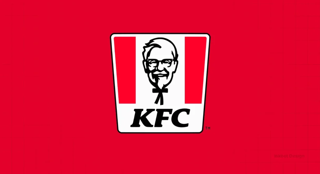
A mascot logo uses an illustrated character to represent the brand — the KFC Colonel, the Michelin Man (Bibendum), the Geico Gecko, and Duolingo’s Duo.
The mascot fell out of fashion in the early 2010s as flat design and startup minimalism dominated. It is now quietly delivering some of the best brand recall numbers of any logo type.
The reason is neurological. Research from the Ehrenberg-Bass Institute on distinctive brand assets consistently finds that brand characters score in the top tier for both fame and uniqueness — above logos, colours, and taglines.
A mascot triggers more neural activation than a geometric mark because the human brain is wired to process faces and characters as meaningful social entities. We remember people — or character analogues — more readily than we remember shapes.
Mascot Logos (Social Encoding): These activate the Fusiform Face Area (FFA). Humans are evolutionarily primed to detect faces. A Mascot Logo bypasses traditional shape analysis, leading to near-instantaneous emotional connection.
The mascot is not appropriate for every category. It works where emotional warmth is a purchase driver — insurance, food and drink, education, retail, and financial services positioned around trust rather than prestige.
It rarely works in premium luxury or highly specialised B2B technology, where the warmth reads as flippancy.
For founder-led businesses with a clear personality, the mascot logo is one of the most underused strategic tools in brand identity.
Its unfashionability is, perversely, an argument for it: in a landscape of identical sans-serif wordmarks, a character stands out.
In a market saturated with minimalist wordmarks and abstract icons, the mascot logo is the contrarian move, backed by data. Characters encode faster, recall higher, and age better than geometric marks — provided the brand dares to commit to one and the discipline not to redesign it every three years.
6. Combination Mark Logos
The Combination Mark: The Most Practical Logo Type in Existence
A combination mark pairs a symbol — pictorial, abstract, or letterform — with a wordmark or lettermark. The Rolex crown alongside the name. Adidas’s trefoil with the wordmark. Lacoste’s crocodile with the brand’s logo.
The combination mark is, by a significant margin, the most versatile and commercially useful logo type for businesses at any stage.
The combination mark solves three problems simultaneously. It builds recognition through the visual symbol while also boosting name recall through the wordmark — two cognitive pathways for the price of one.
It allows sub-marks to be broken out as the brand matures: once the symbol has achieved sufficient recognition, the wordmark can be dropped, and the icon can stand alone. And it provides clear hierarchy guidance for layout — the symbol anchors position, the wordmark provides context.
This is the logo form to use when commissioning an Inkbot Design logo design for a business at launch or early-stage growth.
A well-constructed combination mark gives a brand the flexibility to operate as a full identity system from day one: full lockup for primary applications, symbol-only for app icons and social avatars, wordmark-only for contexts where the symbol would reduce legibility.
The one mistake to avoid with combination marks: designing the symbol and the wordmark as inseparable. If they only ever function together, the brand has no flexibility.
The symbol must be strong enough to stand alone, and the wordmark must be clear enough to function independently. Build the system, not the lockup.
A combination mark is not a compromise between a symbol and a wordmark — it is a brand architecture decision. When designed with sub-mark versatility in mind, it delivers greater long-term return than any single-element mark, because it builds two distinct memory pathways simultaneously.
7. Emblem Logos
Emblem Logos: Heritage, Authority, and the Risk of Dated Design
An emblem logo contains the brand name within a symbol — a badge, seal, crest, or shield. Starbucks, Harley-Davidson, the NFL, Manchester United, most universities and government bodies use emblems.
The emblem communicates heritage, authority, and institutional weight. It signals that the brand has been around long enough to have earned a crest.
That is also its primary weakness. Emblems are inherently complex, which creates two problems in 2026.
First, they perform poorly at small sizes — an emblem that reads beautifully on a shop fascia or a jacket patch becomes illegible at 32 pixels, which is where most digital brand impressions are made.
Second, the visual complexity that conveys heritage in a physical context reads as business in a digital feed, where the competition for attention is extreme and dwell time is measured in milliseconds.
Emblems work for businesses where the purchase decision is significantly influenced by perceived heritage and institutional credibility — craft beer, premium spirits, heritage automotive, established professional services firms, sports franchises.
They are a poor choice for software companies, digital-native startups, or any business whose primary customer acquisition channel is social media.
The emblem can work in a responsive logo system — a simplified icon extracted from the badge for digital-first applications, with the full emblem reserved for physical or formal contexts.
This is how Starbucks operates: the full Starbucks wordmark-and-siren emblem exists, but the brand’s digital presence runs almost entirely on the simplified siren mark. That is not an accident — it is deliberate system thinking.
Emblem logos do not translate easily to digital environments, and no amount of redesign will overcome the fundamental constraint of visual complexity at small sizes. The brands that succeed with emblem identities in 2026 are those that have built responsive logo systems — a simplified extraction for digital, the full crest for physical heritage applications.
Sector-Specific Selection: The ROI of Logo Types
In 2026, the choice of a visual category is no longer an aesthetic preference; it is a strategic allocation of capital based on sector-specific Cognitive Competition.
Each industry possesses a different Visual Saturation Point, requiring specific Logo Types to achieve Market Penetration.
| Industry Sector | Recommended Logo Type | Primary Cognitive Driver | 2026 Success Benchmark |
| Fintech & Neo-Banking | Wordmark + Abstract Symbol | Trust & Precision | High legibility at 16px |
| FMCG & Food/Drink | Mascot or Pictorial Mark | Emotional Warmth | 0.4s recognition speed |
| B2B SaaS & Enterprise | Wordmark (Custom Type) | Authority & Scale | Distinctive letterform (e.g., “G”) |
| Luxury & Fashion | Lettermark or Emblem | Heritage & Scarcity | Embossing/Physical viability |
| Professional Services | Combination Mark | Reliability | System-wide consistency |
| Education & Non-Profit | Emblem (Responsive) | Institutional Weight | Cross-platform crest extraction |
Strategic Guidance for Founders:
Startups in crowded markets (e.g., SaaS, App Development) should avoid pure Abstract Marks without a minimum annual marketing budget of £ 500,000.
Without the capital to “buy” meaning for a geometric shape, these brands remain invisible.
Conversely, Mascot Logos provides a 22% higher recall rate for consumer-facing brands with limited media spend, as the human brain prioritises character recognition over structural decoding.
The Responsive Logo Architecture: A Hierarchy of Extraction
To survive the fragmentation of digital surfaces in 2026, every Logo Type must follow a Responsive Hierarchy. This ensures that Brand Equity is preserved from a giant billboard down to a tiny browser Favicon.
The Four-Stage Extraction Process:
- The Master Lockup (Desktop/Print): The full Combination Mark including the symbol, wordmark, and tagline.
- The Secondary Lockup (Tablet/Mobile): The tagline is removed. The Wordmark and Symbol are rearranged for horizontal or vertical space.
- The Brand Mark (App Icon/Social): The Wordmark is removed entirely. Only the Pictorial, Abstract, or Mascot remains.
- The Micro-Asset (Favicon/Notification): The Symbol is simplified to its most basic geometric essence. For an Emblem, this might mean extracting a single letter or a core icon from the crest.
The Black-and-White Myth: Why This Classic Rule Is Hurting Modern Brands
The advice has been repeated in every logo design brief, every design school curriculum, and every online tutorial for the past 30 years: your logo must work in black and white.
The rationale was sound when it was written. Fax machines. Single-colour newspaper ads. Rubber-stamp applications.
Black-and-white printing was unavoidable, and a logo that collapsed without colour was a practical failure.
In 2026, for the majority of SMBs and startups, that rationale no longer applies.
Spotify, Discord, Airbnb, and Monzo were designed for digital-first environments where colour is guaranteed. Their brand identities are built around colour as a distinctive asset, not as an optional enhancement.
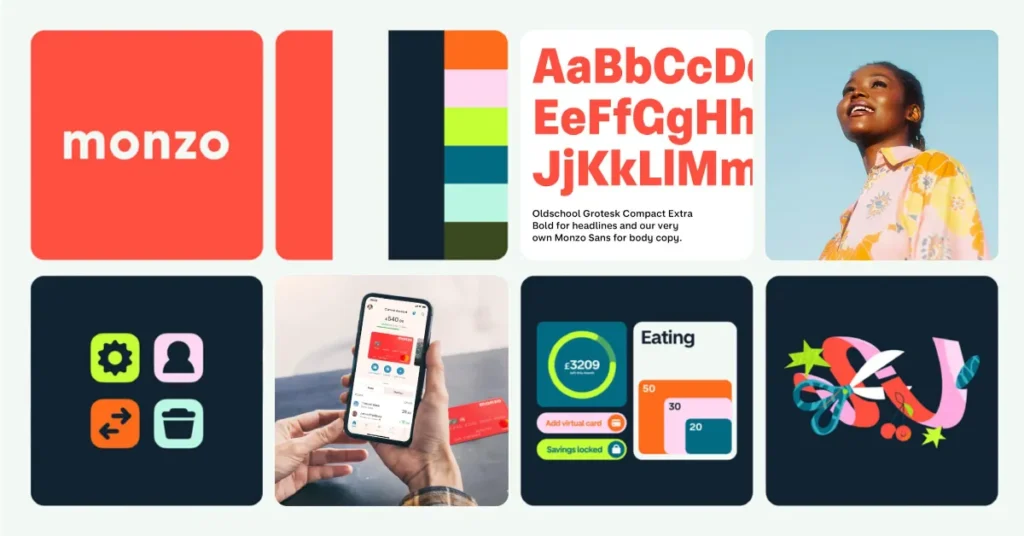
Spotify’s green is not decoration — it is a recognition trigger. Airbnb’s Coral/Rausch is not a styling choice — it is a brand distinctive asset in the Ehrenberg-Bass framework.
Stripping colour from these marks does not test their resilience; it destroys the primary mechanism through which they are recognised.
The persistent advice to “test your logo in black and white” has a specific unintended consequence: it makes designers and founders water down colour decisions.
A bold, distinctive colour palette gets softened because someone asks, “But will it work in greyscale?” The result is a safer, less distinctive mark that performs worse in the digital environments where the business actually lives.
There are scenarios where greyscale viability still matters: embossing and engraving on physical products, single-colour merchandise, and newspaper advertising, if that is a genuine channel. But these apply to a shrinking proportion of modern SMBs.
If your business does not regularly appear in single-colour print, optimising for single-colour print at the cost of digital colour distinctiveness is a bad trade-off.
The directive: design for your actual distribution channels, not for a constraint that has not applied to most businesses for a decade. If your channels are entirely digital, colour is not a nice-to-have — it is a structural component of how your mark will be recognised.
The “works in black and white” rule was created to address a printing issue. Most modern SMBs do not have a print problem. Applying a 1980s constraint to a digital-first brand identity doesn’t test resilience — it systematically undermines the colour distinctiveness that digital recognition depends on.
The State of Logo Design in 2026
The most significant structural shift in logo design over the past 18 months is not a visual style — it is a systems approach to identity.
The question “which logo type is best?” has become “how does this mark behave across a system?”
Logos are no longer designed as single, fixed marks — they are built as systems that adapt across platforms, formats, and environments.
Google’s “G” mark is the canonical example: it behaves differently across Search, Android, Chrome, and Workspace, while the underlying visual identity remains consistent.
For founders commissioning a logo in 2026, this shift has a practical implication: the deliverable is not a file — it is a system.
A primary lockup, a sub-mark for icon applications, an outlined version for light/dark contexts, and a responsive variant for very small sizes. Brands that commission only a primary lockup and then try to adapt it ad hoc consistently produce inconsistent brand output.
That inconsistency directly undermines the recognition-building identified by the Ehrenberg-Bass Institute as the primary driver of logo effectiveness.
On the AI front, designers are using tools to rapidly produce logo variations, patterns, and textures that adhere to a brand’s core guidelines — particularly through Adobe Firefly 3 and Canva’s AI logo generator, both significantly updated in 2024–2025.
This has changed the dynamics of amateur logo creation at the low end of the market, with Canva reporting that its AI logo tools are generating millions of outputs monthly.
The implication for any SMB considering an AI-generated logo is not that the output is necessarily poor — some AI-generated marks are technically competent — but that a generated mark will not be a distinctive asset by definition. It is, by construction, drawn from existing visual patterns.
Distinctiveness requires divergence from the norm, and AI generators are trained to produce the norm.
Rather than overhauling an entire brand from top to bottom, leading brands in 2025 took the approach of tweaking the logo, enhancing visual language with modern layout, updated illustrations, and secondary colour palettes — less of a big change, and more of a considered update.
JP Morgan Payments exemplified this: preserving established brand equity while introducing contemporary visual refinement. This is the correct approach for any SMB with a functioning identity — evolution within the existing distinctive asset framework, not wholesale redesign.
The logo placement implications of this system’s approach are also worth noting.
A mark designed only as a single lockup will be placed incorrectly — squeezed, stretched, or awkwardly cropped — in digital environments by anyone who didn’t commission the full system. The design of the mark and its governance are not separate conversations.
The Wrong Way vs The Right Way: A Technical Comparison
| Decision Point | The Wrong Way | The Right Way | Why It Matters |
| Logo type selection | Copying the visual style of market leaders in your sector | Matching logo type to your stage, budget, and channel mix | Market leaders have decades of recognition equity that you do not have |
| Wordmark font choice | Using a system font or a free Google Font | Commissioning custom lettering or licensing a premium typeface | Commodity typefaces produce commodity distinctiveness |
| Colour application | Testing in black and white first and softening colours accordingly | Designing for your actual channels; greyscale only if genuinely needed | Watering down the colour reduces the primary digital recognition mechanism |
| Deliverable format | One primary lockup in PNG | Full system: vector source files, primary lockup, sub-mark, icon variant, dark/light versions | Single-format logos fail the moment they leave the context they were designed for |
| Distinctiveness testing | Asking whether “you like it” | Testing against category competitors for visual uniqueness | Ehrenberg-Bass research confirms that fame and uniqueness — not subjective appeal — drive recognition |
| Redesign trigger | Boredom or a new designer’s preference | Measurable drop in brand recognition or a structural business change | Logos abandoned before building equity waste every pound spent on them |
| Application governance | Ad hoc sizing and colour adjustments by different team members | A brand standards document with minimum size, clear space, and colour specifications | Inconsistent application is the single fastest way to destroy recognition equity |
The Verdict
Founders do not fail at logo design because they pick the wrong visual style. They fail because they make a strategic asset decision using aesthetic criteria, then compound the error by commissioning a single deliverable rather than a system.
The choice between a wordmark, pictorial mark, mascot, or combination mark is not a preference question — it is a memory architecture question. Each type encodes your brand into a buyer’s mind through a different mechanism, at a different cost, over a different timeline.
The Tropicana case is instructive precisely because the original pack design succeeded not through aesthetic sophistication but through distinctive assets that consumers could recognise quickly — elements that uniquely evoked the brand.
The moment those were removed, 20% of sales evaporated within two months.
The same logic applies in the opposite direction. Building a distinctive mark of any type requires sustained, consistent application over the years.
The Ehrenberg-Bass Institute’s research into brand distinctiveness shows that recognition is built through repetition and consistency, not through the quality of the design itself.
Choose the logo type that matches your budget for recognition-building, your channel mix, and your willingness to commit. Commission a system, not a file. Apply it without variation for longer than feels comfortable.
Ready to get this right from the start? Explore Inkbot Design’s logo design services — strategic identity work built for founders who understand that a logo is a long-term asset, not a launch-day necessity.
FAQ
What is the most popular type of logo?
Combination marks — a symbol paired with a wordmark — are the most widely used logo type across all business sizes and sectors. They build two distinct recognition pathways simultaneously, offer greater flexibility across digital and physical applications, and allow brands to evolve by separating the symbol from the wordmark as brand recognition grows.
Which logo type is best for a startup?
Combination marks or wordmarks are the most appropriate choices for early-stage businesses. Standalone pictorial marks and abstract marks require sustained media investment to build meaning, which most startups cannot maintain. A combination mark provides immediate clarity — the wordmark delivers name recall, while the symbol begins building visual recognition.
What is the difference between a wordmark and a lettermark?
A wordmark renders the full brand name in a customised typeface — Google, Coca-Cola, FedEx. A lettermark uses only the brand’s initials — IBM, CNN, HBO. Wordmarks build name recognition directly; lettermarks abbreviate established equity. Lettermarks rarely succeed for businesses without pre-existing brand recognition, as they reduce an unknown name to unknown initials.
Is it true that logos must work in black and white?
This rule was created for print environments — fax machines, newspaper ads, single-colour merchandise — that are irrelevant to most modern SMBs. For digital-first businesses, colour is a structural recognition mechanism, not optional decoration. Designing for greyscale first systematically weakens colour distinctiveness. Apply the rule only if black-and-white print is a genuine distribution channel for your business.
How long does it take for a logo to become distinctive?
The Ehrenberg-Bass Institute for Marketing Science identifies “fame and uniqueness” as the two characteristics that define a genuinely distinctive brand asset. Fame — meaning widespread recognition across buyers and non-buyers alike — typically requires years of consistent, high-reach application. There is no reliable shortcut; distinctive assets are built through repetition, not designed into existence.
What is a mascot logo, and when should I use one?
A mascot logo uses an illustrated character to represent a brand — the KFC Colonel, the Michelin Man, and Duolingo’s Duo. Mascots perform exceptionally well on brand recall because the human brain processes character analogues as social entities, encoding them more reliably than abstract shapes. They are most effective in categories where emotional warmth is a purchase driver, such as food, drink, insurance, education, and retail. They rarely work in premium luxury or specialist B2B technology.
Why do some brands drop their wordmark from their logo?
Brands drop their wordmark when their symbol has achieved sufficient fame and uniqueness to function as a standalone recognition trigger without the name. Mastercard removed its wordmark in 2019 after five decades of consistent double-circle application. Apple, Nike, and McDonald’s have all transitioned to icon-only applications in digital contexts for the same reason. This is not a design trend — it is the measurable endpoint of sustained distinctiveness-building.
What is an emblem logo?
An emblem logo encloses the brand name within a symbol — a badge, seal, crest, or shield. Starbucks, Harley-Davidson, and most universities and sports clubs use emblems. They convey heritage and institutional authority but perform poorly at small screen sizes due to visual complexity. Successful emblem brands in 2026 extract a simplified icon from the full emblem for digital applications, using the crest for physical and formal contexts.
What is the difference between a pictorial mark and an abstract mark?
A pictorial mark uses a recognisable image — Apple’s apple, Shell’s shell, the Twitter bird. An abstract mark uses a non-representational geometric form — the Pepsi circle, the Adidas three stripes, the Chase octagon. Both require sustained investment to build meaning, but abstract marks carry a higher risk because there is no literal image to anchor early-stage comprehension. A viewer seeing the Pepsi circle for the first time has no inherent reason to connect it with anything.
How many logo variations does a brand actually need?
A functional brand identity system requires a minimum of four variants: a full primary lockup (symbol plus wordmark), a sub-mark or icon version for small applications, a reversed version for use on dark backgrounds, and a single-colour version for situations where colour reproduction is restricted. Brands operating across merchandise, digital, and print typically need six to eight variants. One primary lockup delivered as a PNG is not a brand system — it is a starting point.
When should I consider rebranding my logo?
Rebrand a logo when there is a measurable decline in brand recognition, a structural business change that makes the current identity inaccurate (new category, merger, pivot), or a genuine operational failure — the mark does not function at required sizes or across required channels. Boredom, aesthetic preference, and “it looks dated” are not sufficient justifications. Research by Designalytics found that at least 40% of validated redesigns result in persistent sales losses, meaning most rebrands underperform the original.
Can I use an AI logo generator for a serious brand?
AI logo generators — including Canva’s AI logo tool and Adobe Firefly-powered generators — can produce technically competent marks rapidly. The structural limitation is that they are trained on existing visual patterns and therefore produce results consistent with what has already been designed. Distinctiveness requires divergence from the norm. A brand that needs to be recognisable in a competitive category cannot achieve that through a tool that optimises for the visual centre of gravity of its training data.


