
Brand Consistency Across Channels: Revenue System Guide
Brand consistency is not about looking the same. It is about being recognised — and those are two very different things.
Brands that confuse the two end up with sterile, interchangeable identities that tick every style guide box and generate no commercial momentum whatsoever.
The distinction matters because recognition is an asset that compounds.
Every consistent touchpoint a customer encounters adds fractional equity to how they perceive and recall your brand. Miss one channel, introduce a conflicting tone, deploy an off-palette social post — and you do not lose one interaction. You erode the compound.
The Lucidpress State of Brand Consistency report, updated in 2026 by the brand management platform Marq, found that consistently presenting a brand across all platforms is associated with a 10–20% increase in overall revenue among surveyed companies. That is not a soft branding metric. That is money.
Building the infrastructure that makes consistency effortless — not enforced — is what we call a Brand operating system.
It is the architecture that sits beneath guidelines, governing how identity decisions get made across teams, channels, and time. Without it, you have a PDF nobody reads and a Slack channel full of arguments about the correct shade of teal.
- Brand consistency is about being recognised, not identical; recognition compounds across touchpoints into measurable commercial value.
- A Brand operating system is a living infrastructure embedding guidelines into workflows, tooling, and templates, not a static PDF.
- Consistent presentation across channels lifts revenue by roughly 10 to 33%, per surveys from Lucidpress and industry research.
- Prevent AI tonal dilution with Identity Injection: use a Brand Lexicon, Structural Fingerprinting, Contextual Guardrails, and human review.
- Operationalise consistency: embed approved templates in tools like Canva, locked components, automated checks, and quarterly living‑doc audits.
What Is Brand Consistency?
Brand consistency is the practice of maintaining aligned visual identity, tone of voice, and messaging across every customer touchpoint — digital, physical, and interpersonal — to build recognition that compounds into measurable commercial value over time.
Key Components:
- Visual cohesion — Logos, colour, typography, and imagery follow a unified system across all channels, not just the website.
- Tonal alignment — The brand’s voice remains recognisably itself, whether you are writing a LinkedIn post, a client proposal, or a 404 page.
- Operational enforcement — Consistency is achieved through systems and workflows, not by hoping your team remembers the guidelines
Brand consistency is the practice of maintaining aligned visual identity, tone of voice, and messaging across every customer touchpoint to build recognition that compounds into measurable revenue over time.
Why Most Brands Get This Wrong From the Start
Consistency is treated as a visual problem. It is actually a systems problem.
Ask any founder three years into their business whether they have brand guidelines, and most will say yes. Ask whether those guidelines cover how their customer service team responds on Instagram DMs, how their invoice template looks, or what tone their automated onboarding emails use — and the answer changes quickly.
According to Capital One Shopping Research’s 2024 brand statistics analysis, approximately 95% of companies have brand guidelines, but only 25–30% actively use them across their organisation.
That gap — between having the document and having the discipline — is where brand equity quietly dies.
The problem is structural. Brand guidelines are static artefacts. They get created at a brand launch or refresh, distributed once, and then live in a Google Drive folder that most employees visit only when they need a logo file for a PowerPoint deck.
Meanwhile, the brand accumulates dozens of micro-inconsistencies: slightly different hex values, varied capitalisation, conflicting taglines used by different team members, and social posts that feel nothing like the website copy.
None of these feels consequential individually.
Compounded across 500 customer touchpoints a month, they prevent the brand from building the recognition equity that drives revenue. A customer who sees your LinkedIn post, visits your website, and receives your email newsletter should encounter the same brand, not three vague relatives of it.
The fix is not a thicker set of brand guidelines. It is a brand operating system: a live infrastructure that embeds consistency into workflows rather than relying on individuals to remember rules.
The difference between a brand that compounds in value and one that erodes year-on-year almost always comes down to the gap between documentation and operation. Having guidelines proves intent. Having a system delivers consistency. The two are not interchangeable, and conflating them is the most expensive mistake a growing brand can make.
The Myth: Having Brand Guidelines Equals Having Brand Consistency

Brand guidelines were a practical solution to a 1990s production problem. In the era of print, broadcast, and physical retail, controlling brand output meant controlling the suppliers who produced that output — printers, advertising agencies, signage companies.
A guidelines document provided external parties with the visual specifications they needed to produce on-brand work.
That rationale has not aged well.
Capital One Shopping Research found that approximately 95% of organisations have brand guidelines, but only around 30% have guidelines that are widely used and recognised throughout the organisation. That is not a guidelines problem. It is a delivery mechanism problem.
The document was designed for a production ecosystem that no longer exists. Today, brand output comes from marketing teams, sales reps posting on LinkedIn, customer support agents writing live chat responses, and automated email sequences set up once and forgotten. None of these people consults a guidelines PDF before they write.
The brand that wins in 2026 does not have better guidelines. It has better tooling. Brand templates baked into Canva workspaces. Tone-of-voice checkers in email platforms. Approved imagery libraries rather than stock site access. The brand system replaces memory-dependent compliance with friction-free defaults.
Spotify and Discord — two of the most visually distinctive brands of the past decade — do not derive their consistency from rigorous adherence to guidelines.
They derive it from product-level design systems where the brand is built into the components. You cannot produce an off-brand Spotify button because the off-brand option does not exist in the component library.
That is the ambition every growing brand should have at the level of whatever tooling they can afford.
The myth that guidelines equal consistency is not harmless. It is actively expensive. Brands that believe the document is the system stop investing in the infrastructure.
They refresh the guidelines every two years, circulate them once, and then wonder why the brand feels incoherent three months later.
Brand guidelines answer the question “what should our brand look like?” A brand operating system answers the question “how does our brand consistently show up regardless of who is doing the showing?” The first is necessary. The second is what actually produces revenue. Brands that confuse the two spend money on documentation and starve the infrastructure that makes that documentation matter.
What Brand Consistency Actually Does to Revenue
The commercial case for brand consistency is no longer theoretical.
Lucidpress surveyed over 400 brand management experts and found that companies estimated a 10–20% increase in overall revenue growth if their brand was maintained consistently across all channels.
A separate analysis of the data, cited by multiple research aggregators through 2024, puts the average revenue increase from consistent brand presentation at 23%, with some studies finding gains as high as 33%.
According to Capital One Shopping and Renderforest 2024 data, 68% of companies report that brand consistency has contributed at least 10% to their revenue growth.
Large enterprises with agency retainers and brand teams do not drive that number. The majority of respondents are mid-market businesses that systematised their consistency without significant investment.
The mechanism is cognitive, not mystical. Recognition reduces friction. When a potential client sees your brand across three channels over a period of weeks and the brand reads consistently across all three, their brain registers familiarity, which it interprets as trustworthiness.
They are more likely to click, enquire, and convert. When the brand shifts visually or tonally between channels, the brain registers a slight dissonance. Individually imperceptible. Statistically devastating at volume.
The Gap Debacle: $100 Million for Six Days

In October 2010, Gap — the American clothing retailer whose blue-box logo had been part of the visual vocabulary for two decades — unveiled a new identity.
Gap replaced its iconic blue box logo with a minimalist redesign without any warning or engagement strategy, triggering mass backlash and over 14,000 parody versions within days.
Designed by Laird and Partners Creative Agency in New York, the rebranding cost the company $100 million. The company did not warn customers about the new logo or explain the rationale.
The internet response was immediate and merciless. The brand reverted to its original logo after just six days, having spent millions on a redesign that lasted less than a week.
Gap’s error was not aesthetic. It was architectural. A brand built over 20 years of consistent presentation had accumulated enormous recognition equity.
The overnight switch discarded that equity and replaced it with visual noise that did not connect to any meaningful change in product, positioning, or experience.
Once broken, consistency cannot be reset to zero. It goes into debt.
A brand is not just what it looks like today. It is the accumulated weight of every consistent impression it has made on every person who has ever encountered it. Erasing that overnight — without strategic justification and audience preparation — does not create a fresh start. It creates a recognition deficit that takes years of disciplined consistency to repay.
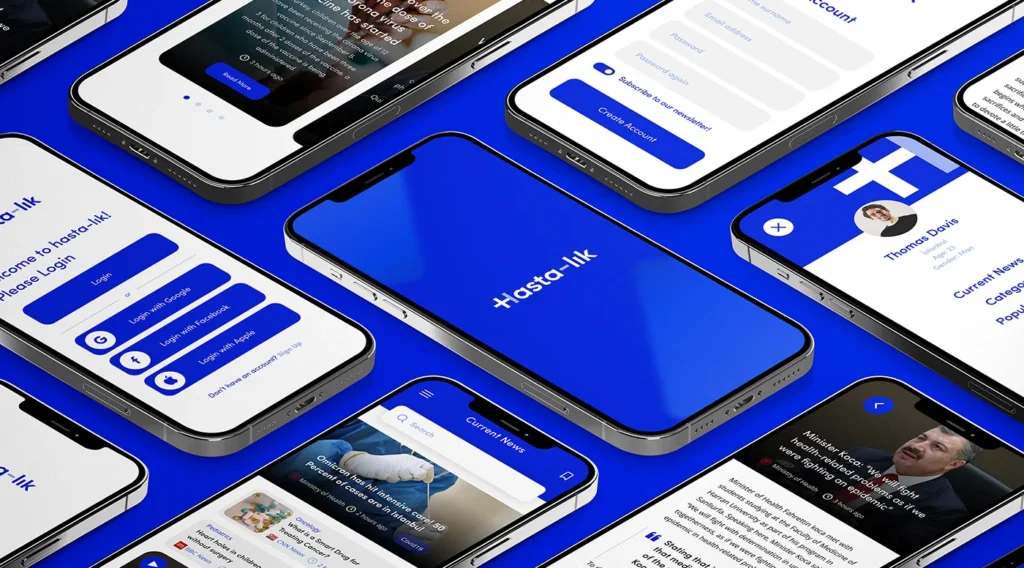
Brand Consistency Across Specific Channels
Consistency is not one problem. Several simultaneous problems need to be solved in parallel.
Social Media: Where Brands Go Off-Script
Social media is the most common place where brand consistency collapses, and the most visible one. The pressure to be timely, reactive, and native to each platform creates a gravitational pull toward off-brand content.
The correct answer is not to fight that pull with rules. It is to build brand flexibility into your guidelines from the start.
A brand voice that can flex between LinkedIn (measured, evidence-led) and Instagram (more direct, more visual) without losing recognisable character is not inconsistent — it is platform-intelligent.
A brand that sounds corporate on LinkedIn, chaotic on Instagram, and robotic in email is not being flexible. It is being incoherent.
Companies that report consistent branding across their channels associate it with a 10–20% increase in revenue growth, according to surveys of brand management professionals.
The mechanism of social specifically is reach compounding: when your audience recognises your content before they see your name, they are more likely to engage — and each engagement amplifies distribution.
The practical fix is not complex. Defined content pillars that map to brand values. Approved visual templates for every format.
Tone-of-voice examples specific to each platform. None of this requires a large budget. All of it requires intentional decision-making that most SMBs defer until the inconsistency becomes obvious.
Email: The Most Underestimated Brand Channel
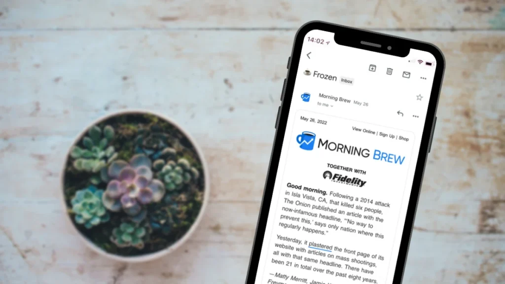
Email is the channel where brand consistency is most casually violated and least frequently audited.
Automated welcome sequences written by a copywriter two years ago. Transactional emails generated by your platform with default styling.
Sales outreach written by individual reps in whatever voice feels natural to them that day. Newsletter editions that have drifted in tone over twelve months of production.
Each of these is a brand interaction. Most businesses treat them as operational outputs rather than brand touchpoints — which is why a customer can receive four emails from the same company in a week and reasonably wonder whether they are from the same organisation.
The audit is straightforward. Pull every automated email and every template in use. Read them aloud in sequence. If they do not sound like the same person and look like the same brand, you have a consistency deficit hiding in your most direct customer communication channel.
Website: Where Inconsistency Gets Expensive

Your website is typically the first environment where a prospect forms a considered opinion about your brand. It is also, for most growing businesses, a patchwork of content created at different times by different people, which means it frequently displays internal brand drift in real time.
The result is a website that technically says the right things but does not sound or feel coherent. Prospects notice this even when they cannot articulate it. They register it as a form of untrustworthiness — the brand equivalent of a business card with a different phone number than the website.
Every channel a brand occupies is either an asset that builds recognition or a liability that fragments it. There is no neutral position. A social post that does not look or sound like your brand is not simply inactive — it is actively diluting the recognition equity that every other touchpoint is working to build.
AI Governance 2026: Maintaining Tonal Persistence in Generative Workflows
The rapid adoption of Generative AI and Large Language Models (LLMs) has created a “Tonal Homogenisation” crisis.
As of early 2026, over 82% of mid-market businesses use OpenAI, Anthropic, or Google Gemini to produce at least 40% of their customer-facing copy.
Without a robust governance framework, these tools default to a “Generalist Average”—a voice that is grammatically correct but lacks the unique Entity-Attribute-Value (EAV) markers that define a specific brand.
The Framework for Tonal Persistence
To prevent identity dilution, organisations must transition from generic prompting to Identity Injection. This involves three specific architectural layers:
- The Brand Lexicon (Semantic Layer): A machine-readable database of “Allowed,” “Preferred,” and “Forbidden” terminology. For example, a luxury brand like Jaguar might forbid the word “cheap” in favour of “accessible,” and “fast” in favour of “effortless.”
- Structural Fingerprinting (Syntactic Layer): Specific rules regarding sentence length, paragraph density, and the use of active vs. passive voice. A technical brand like Discord requires high-density, low-fluff factual sentences, whereas a lifestyle brand may prioritise emotive, rhythmic prose.
- Contextual Guardrails (Pragmatic Layer): Logic that dictates how the voice “flexes” based on the user intent. A brand must sound authoritative during a Customer Support interaction on WhatsApp but remains playful on TikTok.
The Risk of “Synthetic Drift”
Synthetic Drift occurs when AI-generated content is fed back into the brand’s own training data, creating a feedback loop that slowly erases the original human-designed brand personality. CoSchedule’s 2026 State of Marketing report found that brands without a dedicated “Human-in-the-Loop” (HITL) audit process saw a 30% decline in Brand Distinctiveness scores over a 12-month period.
Jaguar’s 2024 Collapse: Brand Consistency in Reverse
In November 2024, Jaguar unveiled a “Copy Nothing” rebrand that traded its iconic leaping cat and performance-driven legacy for abstract fashion imagery and pastel visuals, with no cars shown in the launch video.
By April 2025, Jaguar had sold just 49 vehicles across Europe, down from 1,961 in the same month the previous year — a 97.5% decline. Global unit sales fell to 26,862 in FY24/25, compared to 180,833 in 2018.
The Jaguar case is more complex than the headline suggests: the brand simultaneously stopped producing legacy models and pivoted to an EV-only lineup, which accounts for some of the sales gap.
Meanwhile, BMW’s EV sales rose 32%, and Audi’s grew over 50% in the same period — brands that pivoted to electric while preserving their brand DNA rather than discarding it.
The lesson is not that rebranding is fatal. It is that severing the connection between new identity and accumulated brand equity produces a recognition void. When customers can no longer locate the brand they knew in the new version, they do not adapt. They leave.
As one analysis noted, the rebrand generated 1,300% growth in brand readership and nearly 1 billion impressions — but those impressions did not translate into the trust and purchase intent that a consistent evolution would have sustained.
AI Brand Monitoring Is Now Table Stakes
In 2024 and 2025, a new category of tooling emerged specifically for brand consistency monitoring at scale. Platforms including Frontify, Bynder, and Brandfolder added AI-powered consistency checking features that audit published content against brand standards in real time.
Canva’s enterprise Brand Kit functionality, significantly expanded in 2024, automated template compliance at the point of creation rather than after the fact.
The operational shift matters. First-generation brand management was about education: tell people the rules. Second-generation was about enforcement: audit what they produce.
Third-generation is about elimination: make the off-brand option harder to choose than the on-brand one.
Brands operating in the third generation do not need to discipline inconsistency. They have engineered it out.
In 2026, brand consistency is no longer primarily a creative challenge. It is a systems and tooling challenge. The brands that achieve it reliably are not those with the best guidelines or the most disciplined teams — they are the ones that have made inconsistency operationally difficult to produce.
The “Consistency Scorecard” Metrics
A modern brand audit should result in a single, actionable score.
| Metric | Goal | Measurement Method |
| Visual Uniformity | >95% | Automated pixel-match vs. Brand Kit. |
| Tonal Persistence | >90% | AI sentiment and vocabulary analysis. |
| Entity Health | 100% | Checking for correct usage of the Brand Name and Product Names. |
| Asset Freshness | >98% | Checking that no “Archived” assets are still live. |
Brand Consistency in Practice
| Decision Point | The Wrong Way | The Right Way | Why It Matters |
| Brand guidelines format | 80-page PDF distributed once at launch | Living document in Notion/Confluence, updated quarterly, linked in every relevant workflow | PDFs get opened once and forgotten; living docs stay relevant |
| Social media production | Any team member can create content in their preferred tool | Pre-built Canva templates by format with locked brand elements, only copy editable | Eliminates visual inconsistency at source without slowing production |
| Email templates | Each campaign is designed individually by whoever is available | Master template library for every email type, reviewed for brand compliance quarterly | Transactional emails are a brand touchpoint most businesses never audit |
| AI content production | Generic ChatGPT prompt, publish | Brand-trained AI with documented tone examples, a banned vocabulary list, and sentence structure guidance | AI defaults to a homogeneous voice that erases tonal distinctiveness at volume |
| New team member onboarding | Share the PDF guidelines on day one | 90-minute brand immersion session with live examples and voice exercises | Brand consistency requires internalisation, not just documentation |
| Channel-specific voice | Same copy adapted for every channel | Defined voice modifiers per channel (LinkedIn: measured; Instagram: direct; email: personal) | Identical copy on every platform reads as tone-deaf, not consistent |
| Photography and imagery | Mix of stock photography, custom shots, and whatever team members upload | Approved image library with defined art direction — mood, subject, colour treatment | Visual inconsistency in photography is the most common unaudited brand gap |
10 Questions to Audit Your Brand Consistency Right Now

Before spending another pound on marketing, run through these. They will tell you more about your brand’s commercial health than any analytics dashboard.
1. Can a new prospect identify your brand’s positioning in under ten seconds on every channel you occupy?
Pull up your website homepage, your most recent Instagram post, and your LinkedIn company page simultaneously. If someone encountering these for the first time cannot determine what you do, who you do it for, and why you are different, your consistency is failing at the point of first impression.
2. Does your brand voice sound like the same person across email, social media, and sales materials?
Brand voice inconsistency is more damaging than visual inconsistency because it signals internal misalignment to prospects. Read your last five customer emails and your last five social posts aloud. If they sound like different people, they are functioning as different brands.
3. When was the last time you audited your automated emails for brand compliance?
Most businesses set up email automation once and do not revisit it. Sequences written 18 months ago reflect an earlier version of the brand. They are live, reaching customers, and are almost certainly off-brand.
4. Do every member of your team articulate your positioning the same way when asked verbally?
Ask three people in your business what you do. If the answers are substantively different, your brand consistency problem exists internally before it exists externally.
5. Does your brand have defined visual standards for photography and imagery, or just for the logo?
Most brand guidelines cover logos, colour palettes, and typography. Almost none prescribe photography style, illustration aesthetic, or image content standards. Yet photography is frequently the most immediately noticed visual element on a website or social feed.
6. Are your service or product descriptions consistent across your website, proposal templates, and verbal sales pitches?
Service descriptions drift over time. A branding agency that describes itself as “strategic” on the website, “creative” in proposals, and “results-focused” in sales conversations is offering three different positioning signals to the same prospect during a single decision cycle.
7. Does your brand have a defined position on key industry questions, and is that position stated consistently?
Point-of-view content is one of the most powerful signals of brand consistency in the B2B space. If your blog says one thing and your founder says another on a podcast, the contradiction reads as either confusion or a lack of conviction.
8. How long would it take a new team member, contractor, or agency to produce fully on-brand work without asking for help?
The answer to this question is a direct measure of how systematised your brand consistency is. If the honest answer is “several weeks” or “they would need to ask someone,” your brand depends on tacit knowledge rather than documented systems—and it will fragment every time personnel change.
9. Does your brand experience feel consistent between the marketing content and the actual client experience?
The most overlooked consistency gap is between marketing and delivery. A brand that communicates one personality in its marketing and then delivers a completely different experience in client communications has a trust problem, not a brand problem.
10. Have you checked whether your brand reads consistently across light and dark mode, mobile and desktop, and print and digital?
Technical inconsistency — logos that look different on dark backgrounds, colours that shift in print, typography that breaks on mobile — is the silent killer of brand perception. Most businesses have it and have never audited for it.
The Verdict
Brand consistency is a compounding commercial asset, not a creative principle. The brands that build it systemically outperform those that trust in guidelines and individual compliance.
The evidence is not subtle: companies maintaining consistent brand presentation report revenue increases of 23–33%, according to research by Lucidpress and Demand Metric conducted in 2016 and updated in 2019.
The Gap debacle lost $100 million in six days by abandoning two decades of accumulated recognition equity without strategic justification.
Jaguar’s 2024 rebrand, which severed the brand’s visual and tonal connection to its heritage, coincided with a period when the brand sold 49 cars across Europe in a single month, while BMW and Audi grew EV sales by 32% and 50%, respectively, by evolving rather than erasing.
The thesis at the start of this guide holds: consistency is about recognition, not sameness. A brand can flex its voice by channel, evolve its visual system over time, and expand into new markets — and remain entirely recognisable throughout, provided the changes are deliberate, systematic, and anchored to the accumulated equity that came before.
The question is not whether you have brand guidelines. Around 95% of companies do. The question is whether you have a brand system — one that makes the consistent choice easier than the inconsistent one for everyone who represents your brand, across every channel they use.
If you want to find out where your brand system is failing before your competitors do, Inkbot Design’s strategic brand services are built around exactly this kind of operational diagnosis. Start by reading the related content below, or get in touch directly to discuss what a brand audit looks like for your specific situation.
Frequently Asked Questions
Why is brand consistency important for small businesses?
Brand consistency is disproportionately valuable for small businesses because it amplifies limited marketing budgets. A recognisable brand earns more from every impression than an inconsistent one — meaning a small business that maintains consistency competes more effectively with larger competitors spending significantly more across the same channels.
What is the difference between brand consistency and brand guidelines?
Brand guidelines document the visual and verbal standards a brand aims to follow. Brand consistency is the operational outcome of applying those standards reliably across every channel and touchpoint. Most businesses have guidelines. Far fewer have the systems, tooling, and workflows that produce actual consistency. The document is not the deliverable — the recognisable experience is.
How does brand consistency affect customer trust?
Recognition functions as a trust signal. When customers encounter a brand that looks and sounds the same across multiple channels over time, their brain registers that as reliability and competence. Inconsistency registers as disorganisation or, in the case of significant identity shifts, as deception. Trust is built through repeated, consistent, accurate impressions — not through any single brand moment.
What are the most common brand consistency mistakes businesses make?
The most damaging mistakes are: treating guidelines as the system rather than building operational infrastructure; failing to audit automated communications that were set up years ago; producing AI-generated content without brand-trained parameters; allowing verbal positioning to drift independently of written brand materials; and conflating visual consistency (logo, colour) with brand consistency (voice, message, experience).
How often should brand guidelines be updated?
Brand guidelines should be reviewed at least once a year and updated whenever a meaningful change occurs in the business — such as a new service offering, a shift in target audience, or a market repositioning. The more important operational change is to ensure that whenever guidelines are updated, the templates, tooling, and workflows that operationalise them are updated simultaneously. A refreshed PDF with unchanged templates produces no change in brand output.
Is it true that bigger brands are more consistent than small ones?
Not automatically. Brand consistency correlates with operational sophistication, not budget. A bootstrapped B2B founder who builds consistent templates, defines a clear voice, and audits their channels quarterly will produce a more consistent brand experience than a VC-backed startup with a large marketing team and no brand governance. Consistency is a discipline issue before it is a resource issue.
What does brand consistency look like for a B2B services business?
For a B2B services business, brand consistency is primarily about tone and positioning. It means the website, proposals, LinkedIn presence, case studies, and verbal sales conversations all articulate the same positioning — the same answer to “what do you do, who do you do it for, and why are you the right choice.” Visual consistency matters, but a B2B services brand that sounds coherent across channels will outperform one that looks consistent but says different things depending on who is writing.
How do you measure brand consistency?
Measure it through: recognition testing (can your target audience identify your brand from isolated elements?), channel audits (does each channel reflect your current positioning?), team alignment checks (do all representatives articulate positioning the same way?), and conversion rate analysis by channel (inconsistent channels typically underperform due to reduced trust). None of these requires expensive research — most can be done with existing team members and a structured audit framework.
What is the relationship between brand consistency and SEO?
Brand consistency reinforces SEO performance because a coherent entity signal — consistent brand name, positioning, and associated topics across all content — helps search engines and AI systems develop a confident understanding of what your brand represents. Inconsistent positioning across your content signals semantic confusion to crawlers, which reduces topical authority and ranking confidence in competitive categories.
Does brand consistency mean the brand can never change?
Brand consistency is not brand rigidity. Consistent brands evolve — they update their visual systems, expand their voice, and enter new markets. The difference between evolution and inconsistency is continuity of equity: successful brand evolution preserves what customers already recognise and builds on it. The Gap 2010 debacle and Jaguar’s 2024 rebrand both failed because they severed that continuity rather than extending it.
What channels should brand consistency cover?
Every channel where the brand produces output is a consistency requirement: website, social media, email (including automated sequences), sales materials and proposals, verbal communications and sales scripts, recruitment and employer brand content, packaging and physical materials, and client-facing documents such as invoices, reports, and onboarding packs. Most audits reveal significant gaps in the last three categories.
How is brand consistency different from brand authenticity?
Brand consistency is operational: does the brand look the same as it has always looked? Brand authenticity is perceptual: does the brand appear to behave in accordance with the values it claims to hold? The two are related but not identical. A brand can be visually consistent while being perceived as inauthentic — as BP demonstrated with its environmental rebrand in 2000, which maintained consistent imagery while contradicting the values it claimed. Authenticity requires that the consistent brand signal accurately reflects the underlying business behaviour.
