Bugatti Logo Design: Mastering Luxury Branding on Any Budget
Ever stood in front of a Bugatti, mouth agape, wondering how a car could cost more than most people’s lifetime earnings? 🤯
I have.
And let me tell you, it’s not just about the engineering marvel under the hood. It’s about the brand. The prestige. The legacy.
All of which are encapsulated in that small, oval badge adorning the front grille.
You see, logos aren’t just pretty pictures. They’re the visual shorthand for everything a brand represents. And few logos pack as much punch in such a small space as Bugatti’s.
But here’s the kicker: You don’t need Bugatti’s budget to create a logo with impact.
I learned this the hard way when I started Inkbot Design. We operated on a shoestring budget, but I knew our branding needed to exceed its weight.
So, I dove deep into the world of luxury branding, dissecting the strategies of the greats. And Bugatti? They’re the cream of the crop.
In this post, we will dissect the Bugatti logo, uncovering the secrets of its success. But more importantly, we’ll explore how you can apply these principles to your brand – without breaking the bank.
Ready to turbocharge your branding? Let’s dive in.
🔰 TL;DR: The Bugatti logo embodies a century of automotive excellence, blending heritage with modernity. This comprehensive brand study explores its evolution, design elements, and psychological impact. We’ll uncover how Bugatti’s iconic emblem has become synonymous with luxury, performance, and exclusivity – and how you can apply these branding principles to your business, regardless of your budget.
| Company Name | Bugatti Automobiles SAS |
|---|---|
| Founded | 1909 |
| Founder | Ettore Bugatti |
| Headquarters Location | Molsheim, Alsace, France |
| Estimated Value | Approximately €1.5 billion (2024) |
| Parent Company | Bugatti Rimac Group |
| Notable Models | Veyron, Chiron, Divo |
| Industry | Automotive |
| Key People | Mate Rimac (CEO) |
- Bugatti's logo represents a century of luxury, blending heritage with modern design elements and visual shorthand for prestige.
- Every design aspect serves a purpose, from the oval shape symbolising sophistication to the red colour conveying power.
- Adaptability across various contexts is crucial, ensuring the logo remains recognisable in both physical and digital forms.
- Rebranding strategies focus on maintaining core elements while embracing innovation, as demonstrated in Bugatti's 2022 changes.
- Luxury branding principles can be applied to any business, proving that impactful design doesn't require a huge budget.
The Evolution of an Icon: Bugatti’s Logo Through the Ages
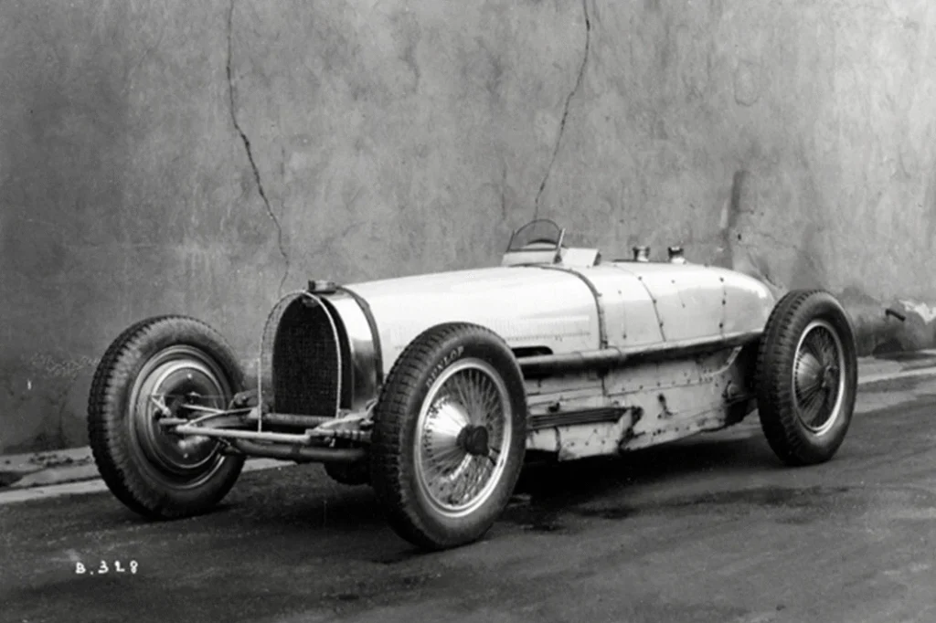
The Birth of a Legend (1909)
It’s 1909, and Ettore Bugatti has just founded his eponymous company in Molsheim, France. The world of automobiles is still in its infancy, but Bugatti has a vision.
The original Bugatti logo was a thing of beauty:
- An oval shape 🥚
- The letters ‘EB’ (Ettore Bugatti’s initials) in a stylised Art Nouveau font
- 60 dots surrounding the oval, reminiscent of a string of pearls
But why an oval? Why not a circle or a square?
Here’s the genius: The oval shape mimics the radiator grille of Bugatti’s early cars. It’s a perfect blend of form and function, beauty and practicality.
And those 60 dots? They weren’t just decorative. They represented safety bolts, a nod to the engineering excellence that would become Bugatti’s hallmark.
The Roaring Twenties: A Logo Evolves (1920s)
As the 1920s rolled in, Bugatti made waves in the automotive world. Their cars were winning races, turning heads, and setting new standards for luxury.
The logo evolved, too:
- The oval remained, but the ‘EB’ initials were emphasised less with ‘BUGATTI.’
- The font became bolder and more confident.
- The 60 dots? They stayed, a reminder of the brand’s origins
This evolution wasn’t just about aesthetics. It was a statement. Bugatti was no longer just Ettore’s pet project. It was a brand in its own right, ready to take on the world.
The Modern Era: Simplification and Sophistication (1990s-2022)
Fast forward to the 1990s. After changing hands several times, Bugatti was under the Volkswagen Group umbrella.
The logo got a facelift:
- The oval became more elongated
- The ‘BUGATTI’ text was modernised
- The 60 dots were reduced to a more subtle design element
But here’s the clever bit: Despite these changes, the essence remained. The logo was still instantly recognisable as Bugatti.
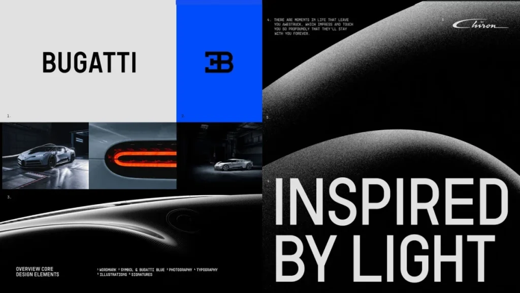
A New Look in 2022 for Bugatti
Bugatti’s not just slapping on a new coat of paint. They’re going for a complete transformation. But here’s the clever bit – they’re doing it while staying true to their roots.
The iconic EB logo? Untouched. Why? Because some things are sacred, mate.
But everything else? That’s getting a significant overhaul.
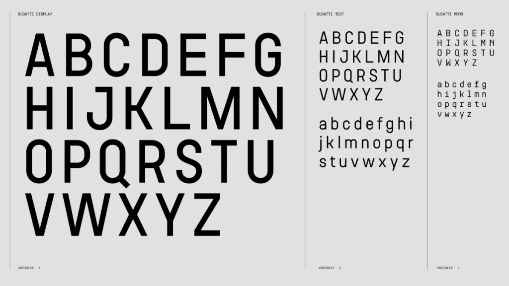
A Typeface with a French Accent
Interbrand, the brains behind this rebrand, didn’t just pick a font out of a hat. They dug deep into Bugatti’s French heritage.
They looked at:
- Vintage French street signs (ooh la la!)
- Bugatti’s photo archives
The result? A custom typeface that’s:
- Sleeker than a freshly waxed Chiron
- More modern than your gran’s new iPhone
Bugatti Blue: Because Why Not?
Do you know how some brands have that one colour? Is that just them? For Coca-Cola, it’s red. For Facebook, it’s blue.
Well, Bugatti’s staking its claim on a vibrant new shade of blue. It’s not just any blue. It’s Bugatti Blue. 🔵
Why blue? Well, it’s:
- A nod to their French roots
- Bold and eye-catching
- It probably looks amazing on a car (just saying)
More Than Just a Pretty Face
Now, here’s where it gets interesting. Bugatti’s not just after a new look. They’re after a whole new identity.
They want to go from:
❌ Exclusive hyper sports car manufacturer
✅ Luxury brand that can hold its own in 2022 (and beyond)
It’s like when I shifted Inkbot Design from “we make logos” to “we craft brand experiences. Suddenly, we were playing in a whole new league.
Bugatti’s not rushing this. They’re rolling out the new look gradually:
- Social media channels (because that’s where the cool kids hang out)
- Stationery (for those of us who still use paper)
- New event setups (imagine the launch parties!)
The Big Question: Will It Work?
Look, rebrands are tricky. For every success story, there’s a “New Coke” disaster waiting in the wings.
But here’s my take: Bugatti’s playing it smart.
They’re:
- Keeping what works (that EB logo isn’t going anywhere)
- Updating what needs updating (hello, sleek new typeface!)
- Thinking big picture (it’s not just about cars anymore)
Decoding the Design: What Makes the Bugatti Logo Tick?
Colour Psychology: The Power of Red
Why does the Bugatti logo use red? It’s not just because it looks good (though it does).
Red is:
- Associated with power, passion, and excitement
- Eye-catching and memorable
- A colour that increases heart rate and creates a sense of urgency
In the context of luxury cars, red signals:
- Performance
- Speed
- Desirability
But Bugatti doesn’t use just any red. Their specific shade (Pantone 485C, for the design nerds out there) is carefully chosen to convey sophistication and all those other attributes.
Typography: More Than Just Letters
The Bugatti wordmark isn’t just text. It’s a carefully crafted piece of art.
Key features:
- Sans-serif font for a modern, clean look
- All capitals to convey strength and authority
- Slight italicisation suggesting forward movement and speed
Fun fact: The current Bugatti font is custom-designed. You can’t just download it from a font website. It’s as exclusive as the cars themselves.
Shape Psychology: The Power of the Oval
The oval shape of the Bugatti logo isn’t just a nod to their radiator grilles. It’s a powerful psychological tool.
Ovals are:
- Associated with femininity, birth, and life
- Seen as more friendly and approachable than sharp-edged shapes
- Suggestive of global reach and inclusivity
Using an oval, Bugatti softens the hard, masculine edge often associated with high-performance cars. It’s a subtle way of saying, “Yes, we’re powerful but also sophisticated.”
The Bugatti Logo in Action: More Than Just a Badge
Merchandise: The Logo as a Status Symbol
Ever seen someone wearing a Bugatti-branded shirt? Chances are, they don’t own a Bugatti. But they want to be associated with the brand.
That’s the power of a strong logo. It becomes more than just a company identifier. It becomes a status symbol.
Bugatti has capitalised on this by:
- Creating a range of high-end merchandise
- Licensing their logo for use on luxury goods
- Maintaining strict control over how and where their logo is used
The result? The Bugatti logo is now a luxury brand in its own right, extending far beyond the automotive world.
Digital Presence: Adapting to the Screen
In today’s digital age, logos need to work across many platforms. The Bugatti logo excels here.
On their website and social media:
- The logo is often used without the oval, allowing for more flexible placement
- The red is sometimes replaced with white for better contrast
- Animated versions bring the logo to life
But here’s the clever bit: Despite these adaptations, the logo remains instantly recognisable. That’s the hallmark of great design.
Partnerships: Lending Prestige
Bugatti doesn’t just slap their logo on any old product. When they do partner with other brands, it’s always high-end.
Recent examples:
- Bugatti x Champagne Carbon (limited edition champagne)
- Bugatti x Jacob & Co. (luxury watches)
- Bugatti x Gillette (high-end razors)
In each case, the Bugatti logo lends an air of exclusivity and luxury to the partner brand. It’s a win-win situation that further cements Bugatti’s position at the pinnacle of luxury.
Lessons from Luxury: Applying Bugatti’s Branding Principles to Your Business
Now, I know what you’re thinking. “This is all good for a luxury car brand, but how does it apply to my small business?”
Fair question. Let me share a story.
When I started Inkbot Design, our budget was tight, and our client list was… well, let’s just say it was more of a client “hope list” at that point.
But I knew we needed to look the part to attract high-end clients. So, we applied some of the principles we’ve just discussed:
- Consistency is key: We developed a strong visual identity and stuck to it across all platforms. Just like Bugatti’s logo remains recognisable on a car grille or a website, our branding was consistent everywhere.
- Quality over quantity: Instead of churning out mediocre content, we focused on creating a few high-quality pieces. This mirrored Bugatti’s approach of producing a limited number of exceptional cars.
- Tell a story: We crafted a compelling narrative around our brand, just as Bugatti’s logo tells the story of their heritage and values.
- Adapt without losing identity: We ensured our logo worked across all platforms, from business cards to social media profiles, while always remaining true to our core design.
The result? Within a year, we were attracting clients who previously wouldn’t have given us a second glance. Our branding punched above its weight, just like we needed it to.
The Future of Luxury Branding: Where Does Bugatti Go From Here?
As we look to the future, it’s clear that luxury branding is evolving. So, what might this mean for Bugatti?
Embracing Sustainability
With the growing focus on environmental issues, luxury brands must show their green credentials. Bugatti has already started this journey:
- In 2023, they announced plans for their first fully electric vehicle
- Their merchandise now includes items made from recycled materials
Prediction: The Bugatti logo might incorporate green elements or be used alongside eco-friendly messaging in the coming years.
Virtual Reality and the Metaverse
As virtual and augmented reality become more prevalent, luxury brands are exploring new ways to engage customers. Bugatti is no exception:
- They’ve already created virtual showrooms
- Limited edition NFTs featuring the Bugatti logo have been released
The Bugatti logo might be adapted for 3D environments, becoming an interactive element in virtual worlds.
Personalisation at Scale
Luxury is increasingly about unique experiences. Bugatti already offers extensive customisation options for their cars, but this could extend to their branding:
- Allowing customers to personalise the Bugatti logo on their vehicles (within strict guidelines, of course)
- Creating limited edition logo variations for special events or collaborations
The challenge will be maintaining brand integrity while offering these personalised touches.
Wrapping Up: The Enduring Power of Great Branding
So, what have we learned from our deep dive into the Bugatti logo?
- Consistency builds recognition: Despite evolving over a century, the core elements of the Bugatti logo have remained consistent, creating instant recognition.
- Simplicity is sophisticated: The logo’s clean lines and simple oval shape exude elegance without trying too hard.
- Every element has meaning: From the oval shape to the red colour, each aspect of the logo serves a purpose.
- Adaptability is crucial: The logo works across various mediums and contexts, from car grilles to digital screens.
- A logo is more than just a symbol: It distils a brand’s values, history, and aspirations.
Remember, you don’t need a Bugatti-sized budget to create impactful branding. By applying these principles thoughtfully, any business can create a logo and brand identity that resonates with its audience and stands the test of time.
Ready to rev up your branding? At Inkbot Design, we’re passionate about helping businesses of all sizes create logos and brand identities that make an impact. Whether starting from scratch or trying to refine your existing branding, we’re here to help.
Don’t let your brand idle in neutral. Let’s shift gears and accelerate your business together. 🏎️💨
FAQs
How old is the Bugatti logo?
The original Bugatti logo was created in 1909 when Ettore Bugatti founded the company.
Has the Bugatti logo ever changed?
Yes, the logo has evolved, with significant updates in the 1920s and 2022, but it has maintained its core elements.
What do the dots around the Bugatti logo represent?
The dots originally represented safety bolts, symbolising Bugatti’s engineering excellence.
Why is the Bugatti logo red?
Red conveys power, passion, and excitement – qualities of the Bugatti brand.
Is the Bugatti logo trademarked?
Yes, the Bugatti logo is a registered trademark fiercely protected by the company.
Can I use the Bugatti logo for my project?
No, the Bugatti logo is proprietary and can only be used with explicit permission from Bugatti.
What font does Bugatti use in its logo?
Bugatti uses a humanistic narrow typeface named Ff-two. It has a tall x-height, square-ish curves and open terminals.
Has Bugatti ever released memorable edition logos?
While the core logo remains consistent, Bugatti has created particular variations for limited edition models and collaborations.
How does Bugatti’s logo compare to other luxury car brands?
Bugatti’s logo stands out for its oval shape and use of red, contrasting with many other luxury car brands that use more angular shapes or cooler colours.
Does Bugatti use its logo differently in different countries?
While the logo remains consistent globally, its application may vary slightly to comply with local regulations or cultural preferences.
How has digital technology affected the use of Bugatti’s logo?
Digital platforms have allowed for more dynamic logo uses, including animated versions and adaptations for various screen sizes.
What’s the most expensive item with the Bugatti logo?
While exact figures aren’t public, limited edition Bugatti cars prominently featuring the logo have sold for tens of millions.


