Branding for Banks: A Guide to Building Unbreakable Trust
Traditional banks are panicking because of a generation of customers who live on their phones and a swarm of fintech startups nipping at their heels.
Their response? Slap on a bright new coat of paint, download a friendly-looking font, and start talking like a Silicon Valley tech bro.
It’s a disaster.
They are desperately chasing “cool” and in the process, they are torching the one thing they cannot afford to lose: trust.
Effective financial branding has never been about being liked. It’s about being trusted. It demands a strategy built not on fleeting trends, but on what I call “Appropriate Character.”
This is the simple idea that a brand’s personality must be appropriate for its job.
And a bank’s job is to be the most sober, reliable, and competent entity in your life.
- Trust is vital for banks, emphasising reliable and secure financial services over trendy marketing tactics.
- Three pillars of financial branding: Unquestionable Trust, Ruthless Clarity, and Maniacal Consistency are essential for success.
- Focusing on character alignment and clear messaging is crucial to avoiding brand misrepresentation and maintaining consumer trust.
- Modern banks should prioritise competence and reliability rather than chasing fleeting trends or "cool" aesthetics.
Why Branding for Banks Isn’t Like Selling Trainers

Branding a bank fundamentally differs from branding almost any other product or service. If you buy the wrong pair of trainers, you get a blister.
If you choose the wrong bank, you could lose your life savings. The stakes are astronomically higher.
Think of it this way: you are about to have major surgery.
Do you want the surgeon who cracks jokes, wears a loud shirt, and calls you “mate”? Or do you like the one with a steady hand, a calm voice, and an air of unshakable competence?
You want the competent one—every single time.
Your relationship with your bank is the same. It is a relationship built on a solemn promise of security and stewardship.
Yet, countless financial institutions are dismantling this character in a misguided attempt to appear more “human” or “approachable.” They forget that in finance, “approachable” is secondary to “reliable.”
Public trust reflects this disconnect. Only 62% of global consumers trust the financial services sector to do what is right.
When almost half your potential customer base views you with suspicion, your brand’s primary job is not to be charming. It’s to be demonstrably, boringly, trustworthy.
The Unbreakable Foundation: 3 Pillars of Financial Branding
To build a brand with the right character, you need a foundation of stone, not sand. It rests on three non-negotiable pillars. Get these right, and everything else follows. Get them wrong, and no amount of slick marketing can save you.

1. Unquestionable Trust
This isn’t a feature; it’s the entire product. For a financial brand, trust is the air it breathes. Every decision—from the thickness of the lines in your logo to the encryption on your app—must be made to build and maintain trust.
It’s conveyed through stability in design, a professional tone, and transparent communication about security. It is the absolute, unyielding baseline.
2. Ruthless Clarity
Confusion breeds suspicion. Complexity is the enemy of trust. A financial brand must pursue clarity with a ruthless passion.
This means no jargon in your terms and conditions, no confusing interfaces on your app, and no ambiguity about fees or charges.
The more precise you are, the more control a customer feels. The more control they feel, the more they trust you.
3. Maniacal Consistency
Your brand must be the same entity everywhere, every time. The voice on the phone must match the text on the website, which must match the feeling of the app, which must match the design of the ATM.
Consistency creates a predictable, reliable experience. Inconsistency is jarring and the fastest way to make a customer feel that the organisation is chaotic and untrustworthy.
A single crack in the facade can bring the whole house down.
Deconstructing the Financial Branding Landscape
The financial world isn’t a monolith. The branding challenges and strategies differ wildly depending on which tribe an institution belongs to. Understanding this context is the first step to getting it right.
Tribe 1: The Legacy Institutions (The “Dreadnoughts”)
These are the giants: HSBC, Chase, Barclays, Bank of America. They are the aircraft carriers of the financial world. Their branding goal is a delicate balancing act.
They must project their immense size and history as a key benefit—implying stability and security—while simultaneously trying not to appear like dinosaurs.
Their common pitfall is inauthenticity. It doesn’t look modern when a 200-year-old institution starts using emojis in its push notifications or runs ads featuring TikTok dancers. It looks like a dad at a disco. It’s awkward and transparently desperate.
Their challenge is to innovate their services without sacrificing their core character of being a stable, enduring Dreadnought.
Tribe 2: The Credit Unions (The “Community Champions”)
Credit unions have a decisive, built-in advantage. They are not-for-profit and owned by their members. Their branding goal should be to shout this from the rooftops.
The entire brand should be built around community, shared values, and a “people-first” ethos fundamentally different from a shareholder-driven bank.
Their common pitfall is looking small-time. To seem local and friendly, their branding can sometimes be amateurish or less secure than the big banks.
The key is to fuse the community message with a visual and verbal identity that screams professionalism and competence.
A credit union like Navy Federal Credit Union does this well, branding for a specific, massive community (the US armed forces and their families) while projecting strength and scale.
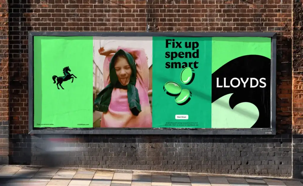
Tribe 3: The Challenger Banks (The “Sea of Sameness”)

Here we find the fintech darlings: Monzo, Starling, Chime, Revolut. They arrived to disrupt the old guard with technology, low fees, and superior user experience. Their branding aims to project innovation, simplicity, and a clear break from the past.
Their overwhelming pitfall—and my biggest pet peeve—is that they all looked exactly the same. They have created a new uniform for themselves.
It’s a simple formula:
- Pick a one-word, slightly aspirational name.
- Design a minimalist logo in a clean, geometric sans-serif font.
- Choose a shockingly bright colour—coral, turquoise, neon green, or vibrant purple.
- Issue a vertically-oriented debit card in that colour.
This aesthetic was disruptive for about five minutes. It’s just a generic signal for “I am an app-based bank.”
It shows a complete lack of individual brand strategy, replaced by lazy trend-chasing. They’ve successfully disrupted the business model but have failed to build unique, defensible brands.
Deconstructing the Brand: The Practical Elements
A brand isn’t an abstract concept. It’s a collection of tangible assets that create a perception in the customer’s mind.
The Name: Your First Promise
A name is a container for meaning. The best financial brand names often suggest their core benefit. First Direct implies speed and straightforwardness. Ally Bank suggests a partner on your side.
These are simple, clear, and professional. The name itself begins the work of building trust. Vague or overly playful names start the relationship on a weak footing.
The Slogan & Messaging: What You Stand For in 5 Words
Your slogan is your promise, distilled. Compare “The world’s local bank” (HSBC’s old slogan) with something generic like “Banking for the future.”
The first makes a specific, grand claim about its global reach and local knowledge. The second is meaningless fluff. Your messaging must be rooted in a tangible benefit to the customer, reinforcing your core pillars of trust and clarity.
The Visual Identity: Beyond a Blue Logo
The visual elements of your brand are a powerful, non-verbal communication tool.
- Typography: The obsession with friendly, rounded sans-serif fonts has become a cliché. A well-chosen serif font can communicate heritage, authority, and seriousness in a way that a default geometric sans-serif cannot. The choice of typeface is a declaration of character.
- Colour: Yes, blue is the dominant colour in banking. There’s a reason: colour psychology links it to trust, stability, and calm. It’s a safe, practical choice. The fintech rebellion against blue led to the vibrant neon palette, but it lost all meaning as they all adopted it. A flash of neon might get attention, but a deep, stable colour builds confidence.
- The Logo: A bank’s logo isn’t a piece of modern art but a seal of approval. It is a signature guaranteeing the security of the institution. It should be strong, balanced, and timeless. Complex, trendy, or flimsy logos feel temporary and, by extension, untrustworthy.
The visual similarity is undeniable. This isn’t differentiation; it’s convergence.
The Tone of Voice: How You Speak Matters More Than What You Say
The language your brand uses is critical. There’s a fine line between being approachable and being unprofessional. Consider these two notifications for a large payment:
- “CONFIRMED: Your payment of £2,500.00 to ‘Creative Solutions Ltd’ has been successfully processed on 08/08/2025. Ref: 74B3-21A9.”
- “Woo! You just paid Creative Solutions Ltd £2,500. Awesome! ✨”
The first is transparent, professional, and secure. It gives you all the information you need. The second is unnerving. The attempt at celebration feels inappropriate for a serious financial transaction.
The tone of voice must always align with the gravity of the situation. For a bank, that means a default setting of clear, respectful, and professional.
Why Your App Can’t Be Your Entire Brand
Many new banks, even some old ones, are completely obsessed with their mobile app.
They pour millions into creating a seamless, beautiful digital experience. This is important, but it is not the entire brand.
A brand is the sum of all its parts.
Every single interaction shapes a customer’s perception. This includes:
- The clarity and speed of your website.
- The professionalism and helpfulness of a call-centre employee.
- The cleanliness and functionality of an ATM.
- The design and readability of a paper statement.
- The way your name appears on a direct debit list.
A multi-million-pound app is worthless if a customer has a terrible 30-minute phone call trying to solve a simple problem.
Focusing on one channel while letting others decay is like building a beautiful front door on a house with a collapsing roof. It’s a holistic system; every touchpoint must be consistent in character and quality.
A Blueprint for a Rebrand That Doesn’t Alienate Everyone
The process must be handled with extreme care if you are considering a rebrand for a financial institution. This isn’t about picking new colours. It’s about redefining your promise to your customers.
Step 1: Define Your “Appropriate Character.” Before you look at a single competitor, look inward. Who are you, and who are you for? A national bank for everyone? A credit union for teachers? A digital bank for freelance creatives? Your character must be authentic to your purpose and your audience’s needs.
Step 2: Audit Every Single Touchpoint. Create a comprehensive list of where customers might interact with your brand, from the app store listing to the hold music on your phone lines. Grade each one on its adherence to the Trust, Clarity, and Consistency pillars.
Step 3: Build from the Foundation. Every new design, copy, or process decision must be filtered through those three pillars. Does this new font feel more or less trustworthy? Does this new feature make things clearer or more complex? Does this new script sound consistent with our web copy? If the answer is no, discard it.
Step 4: Execute with Precision. This is not a task for an intern or a junior marketing team. A financial rebrand is a serious, foundational process impacting every business corner. Executing a rebrand of this magnitude requires a clear, strategic vision.
It’s the kind of foundational work we focus on in our brand identity services. It demands meticulous planning and a deep understanding of the weight of the brand’s promise.
Competence is the New “Cool”
The path forward for banks and credit unions is not to desperately chase the latest trend. It’s to have the courage to double down on what they should be: stable, secure, clear, and competent.
Stop trying to be your customer’s friend. They have friends. What they need from you is a guardian for their financial future.
In a world of noise, hype, and fleeting digital trends, a financial institution’s most powerful and disruptive brand position is to be the most reliable entity in the room.
Forget “cool.” Start delivering competence. That’s the brand that will win.
Frequently Asked Questions (FAQs)
What is the most common mistake in branding for banks?
The most common mistake is chasing trends, particularly tech startups’ “friendly” and “approachable” aesthetic. This often undermines the core brand pillar of trust and security.
Why is ‘trust’ so critical in financial branding?
Unlike most products, banking services safeguard a person’s economic well-being. Without trust, a bank has no product. It is the absolute foundation upon which everything else is built.
How is credit union branding different from bank branding?
Credit union branding should lean heavily into its unique structure: member-owned and community-focused. The key differentiator is the “people-first” or “member-first” ethos, which should be the central theme of its messaging and identity.
Do logos and colours matter for a bank?
Yes, immensely. They are non-verbal signals of character. Traditional colours like blue and strong, balanced logos subconsciously communicate stability and professionalism. Inconsistent or overly trendy visuals can create a sense of unease.
Is it possible for a traditional bank to feel modern without looking silly?
Absolutely. Modernity should be expressed through superior service, clear communication, and excellent technology (like a seamless app). The brand’s character can remain stable and professional while its service delivery is innovative.
What is the “Sea of Sameness” in fintech branding?
It refers to the trend of many challenger and app-based banks adopting an almost identical visual identity: a one-word name, a minimalist logo, and a bright, neon-coloured vertical card.
Why is consistency so crucial for a financial brand?
Consistency across all channels (app, website, call centre, branches) creates a predictable and reliable experience. Inconsistency signals chaos and disorganisation, which erodes a customer’s trust in the institution’s ability to manage their money correctly.
What does “Appropriate Character” mean for a bank?
This means that the brand’s personality should fit its purpose. For a bank, the appropriate character is competence, security, clarity, and reliability, not playfulness or excessive casualness.
Can a bank have a strong brand with a bad mobile app?
In today’s market, it’s nearly impossible. The digital experience is a core channel. However, a great app cannot save a brand that fails in other areas, like customer service or clear communication. The entire system must be strong.
What’s the first step in a successful bank rebrand?
The first step is internal. Before any creative work begins, the institution must clearly define its core purpose, audience, and “Appropriate Character.” Strategy must always precede design.
Take the Next Step
Building a brand in the financial sector is a high-stakes, high-reward endeavour. It requires more than a new logo; it demands a clear, disciplined strategy built on a deep understanding of your customer and your role in their lives.
If you’re grappling with these challenges, you need a partner who understands that trust is the ultimate currency. We build brands on the foundations of stone, not sand.
Explore our approach to branding or, if you’re ready to get serious about building an unbreakable brand, request a confidential quote today.

